05-02-2022, 06:49 AM
.jpg)
.jpg)
.jpg)
.jpg)
.jpg)
.jpg)
.jpg)
.jpg)
.jpg)
Motorcycles from imagination, after studies.
.jpg)
Will attempt to draw this again, but with refs this time!
.jpg)
.jpg)
.jpg)
|
Dominicque's Sketchbook
|
|
05-02-2022, 06:49 AM
.jpg) .jpg) .jpg) .jpg) .jpg) .jpg) .jpg) .jpg) .jpg) Motorcycles from imagination, after studies. .jpg) Will attempt to draw this again, but with refs this time! .jpg) .jpg) .jpg)
05-02-2022, 06:53 AM
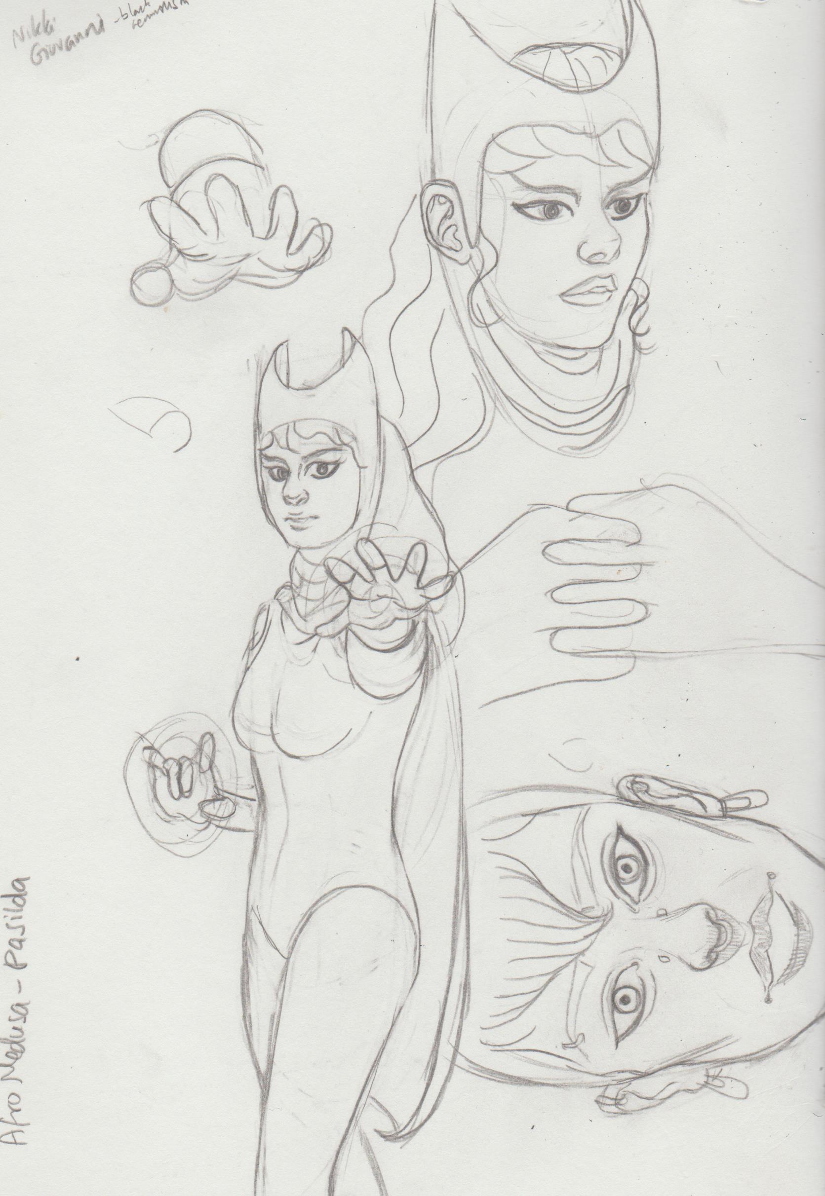.jpg) 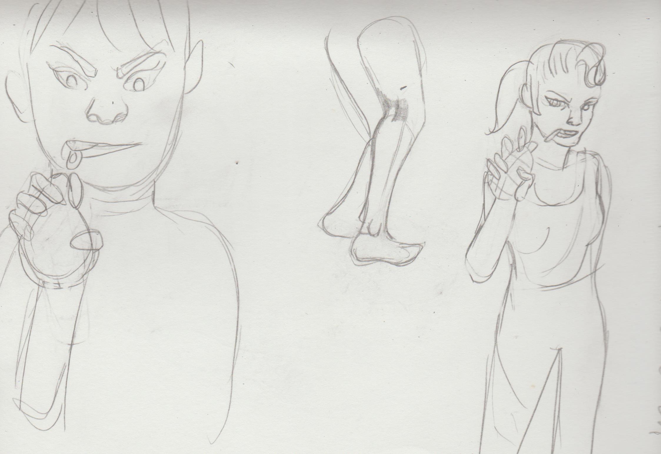.jpg) 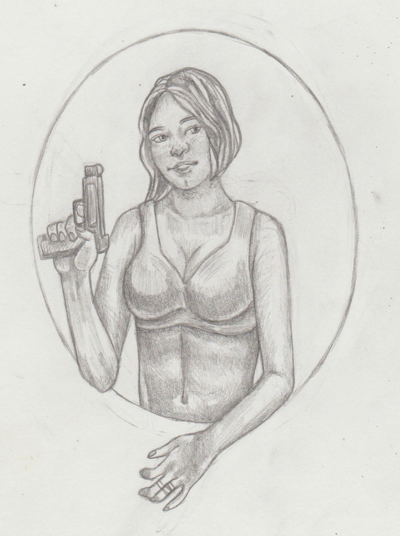.jpg) 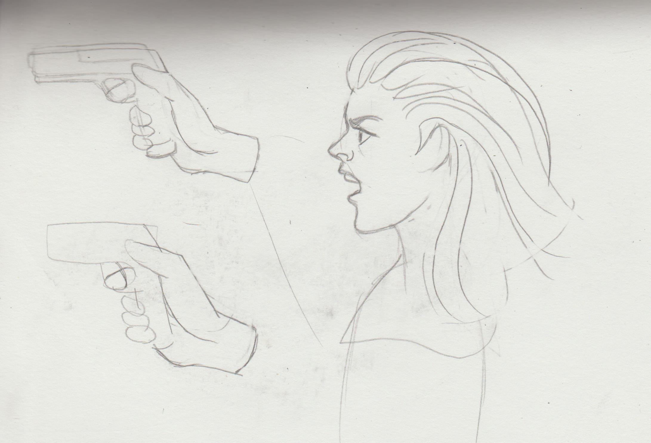.jpg) 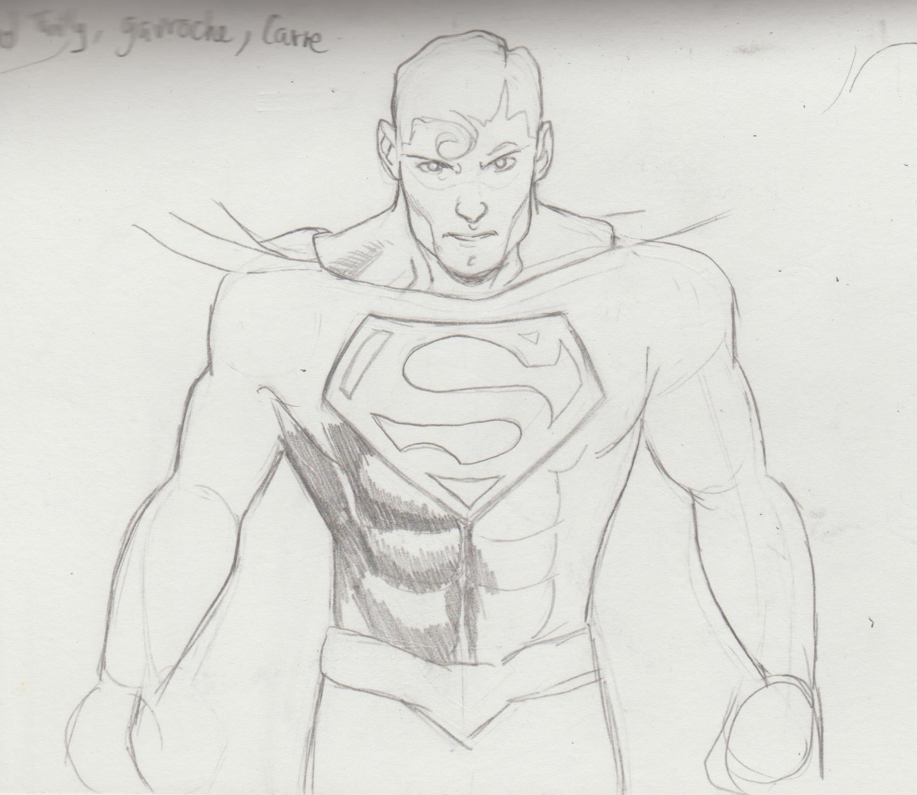.jpg) 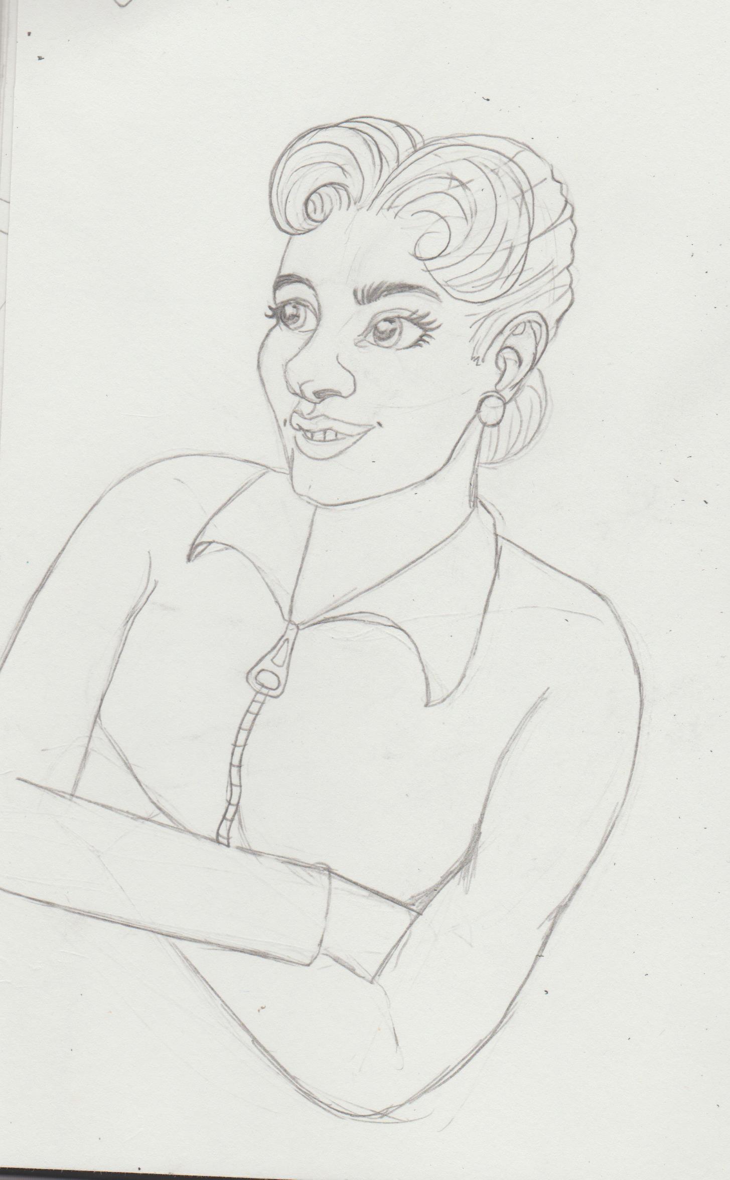.jpg) 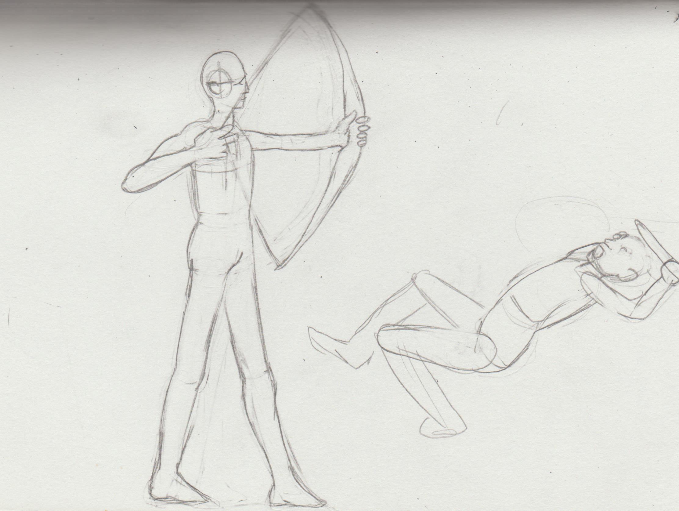.jpg) .jpg)
05-02-2022, 10:13 PM
Danny Rand and Misty Knight in a photo booth. Really miss them as a couple Marvel. *hint* *hint*
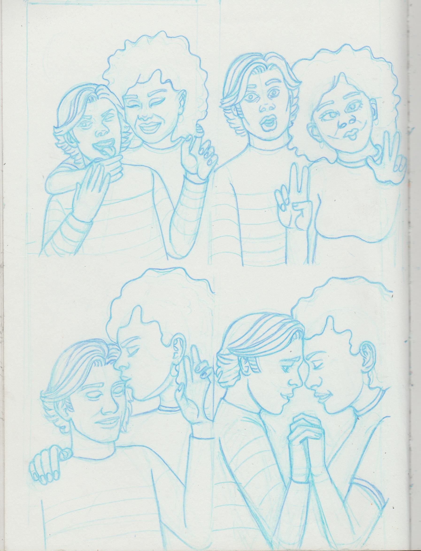.jpg) 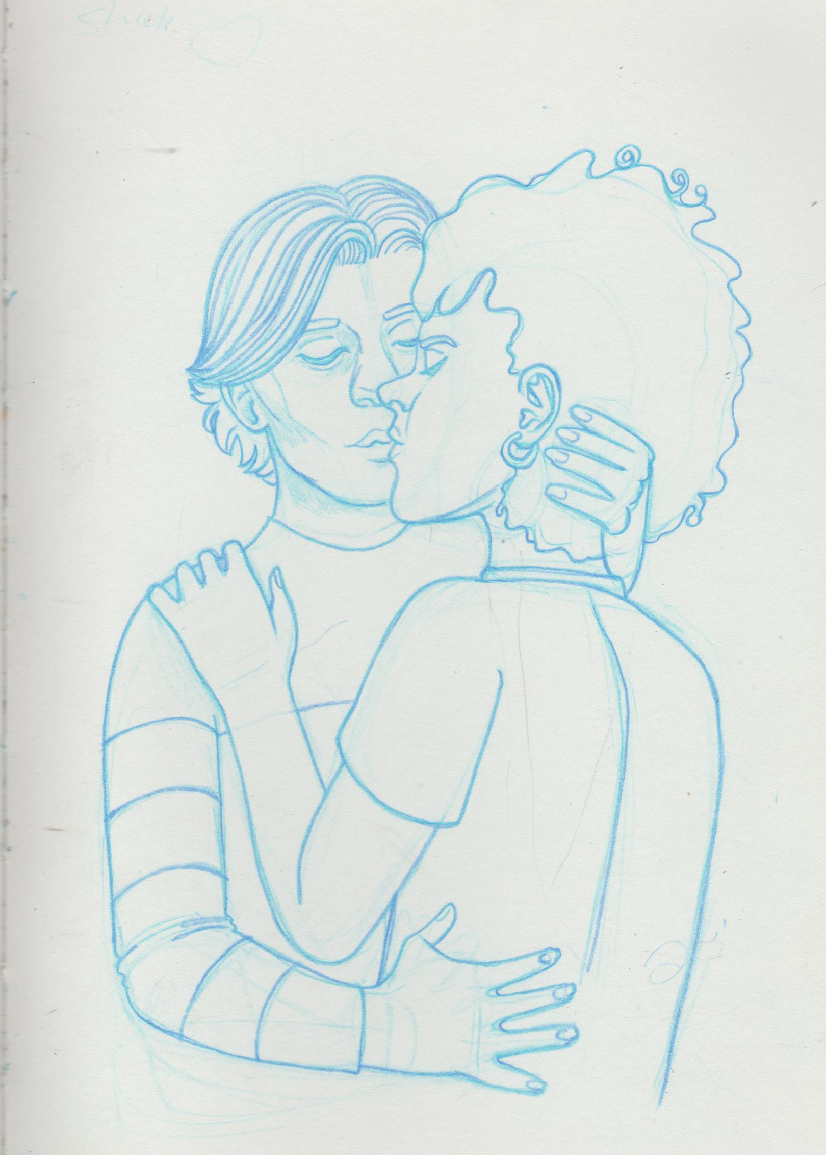.jpg) Why not have my first (8 page) comic be of how I would draw/write their wedding? 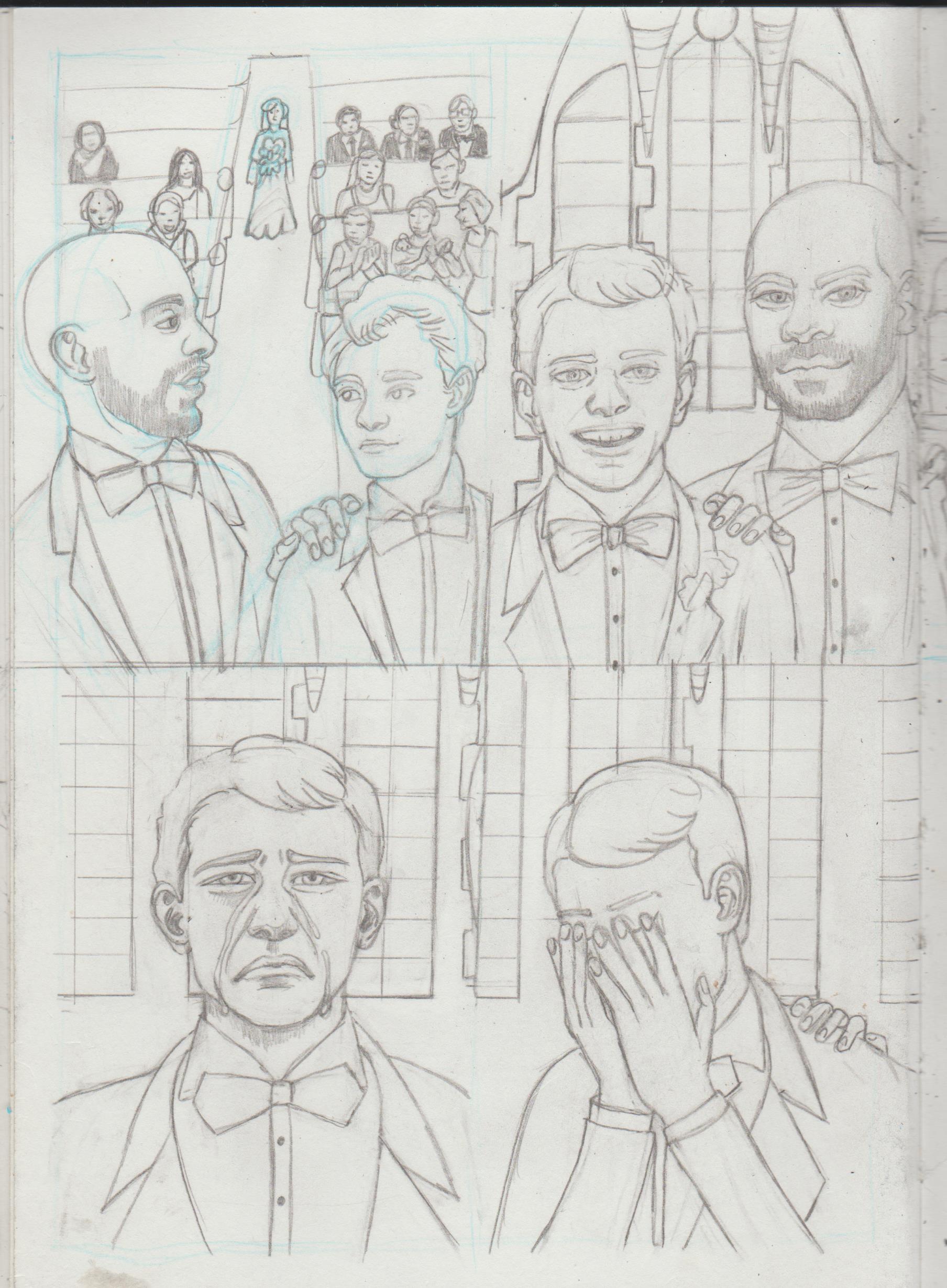.jpg) 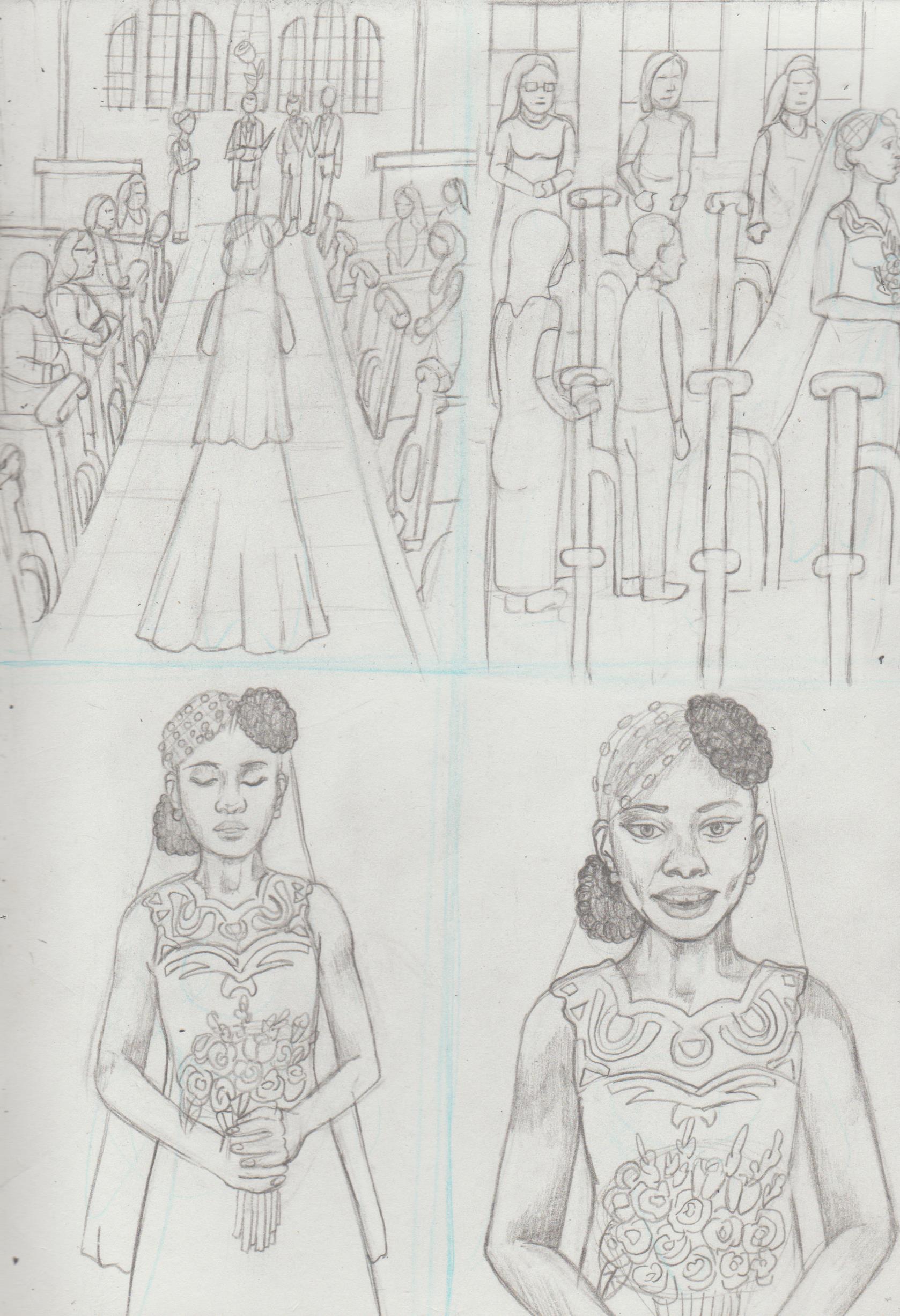.jpg) 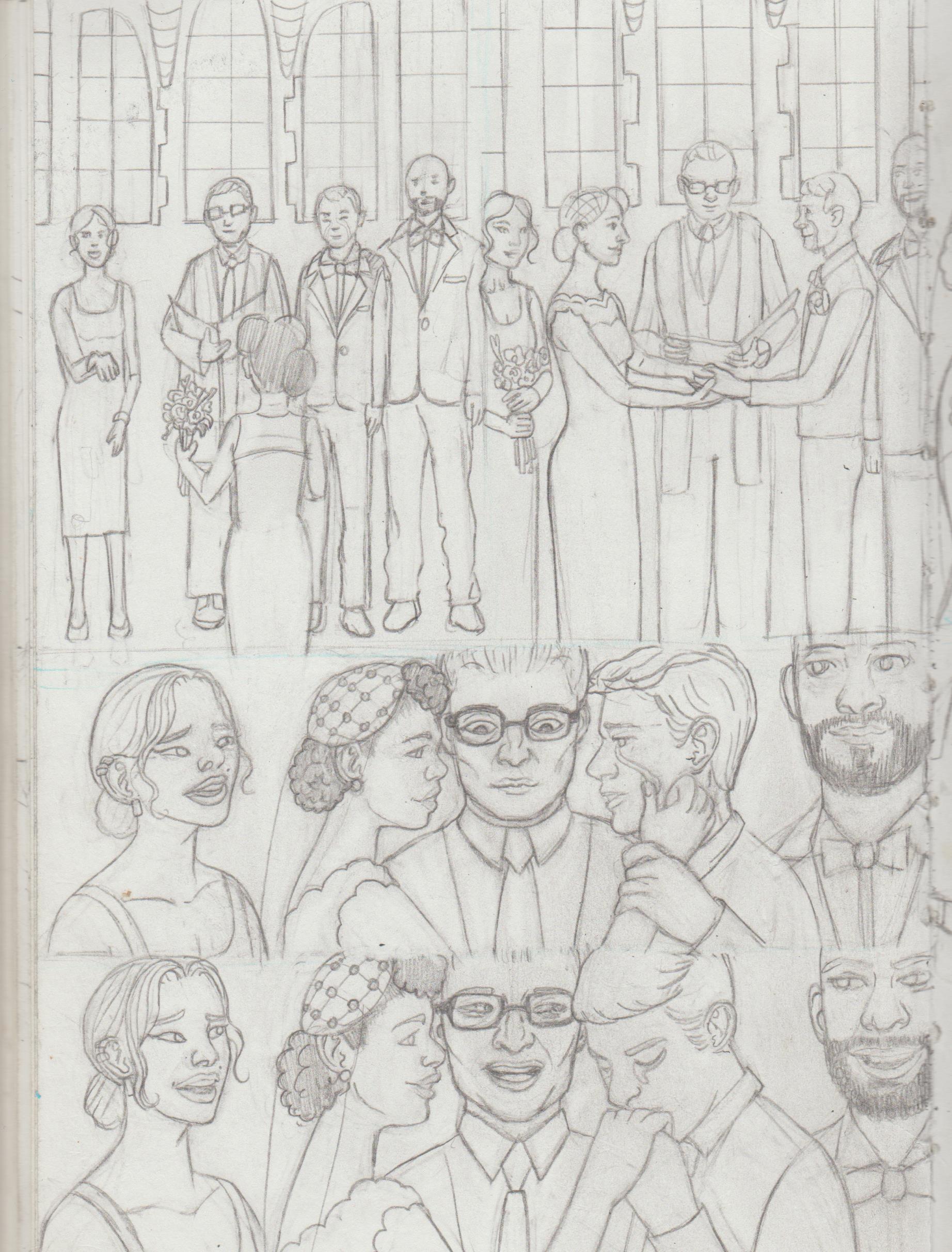.jpg) 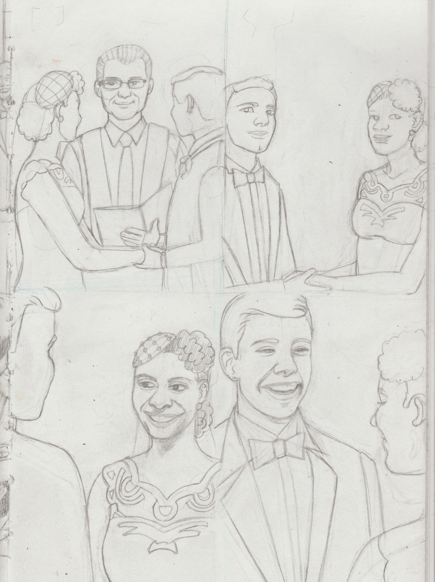.jpg) 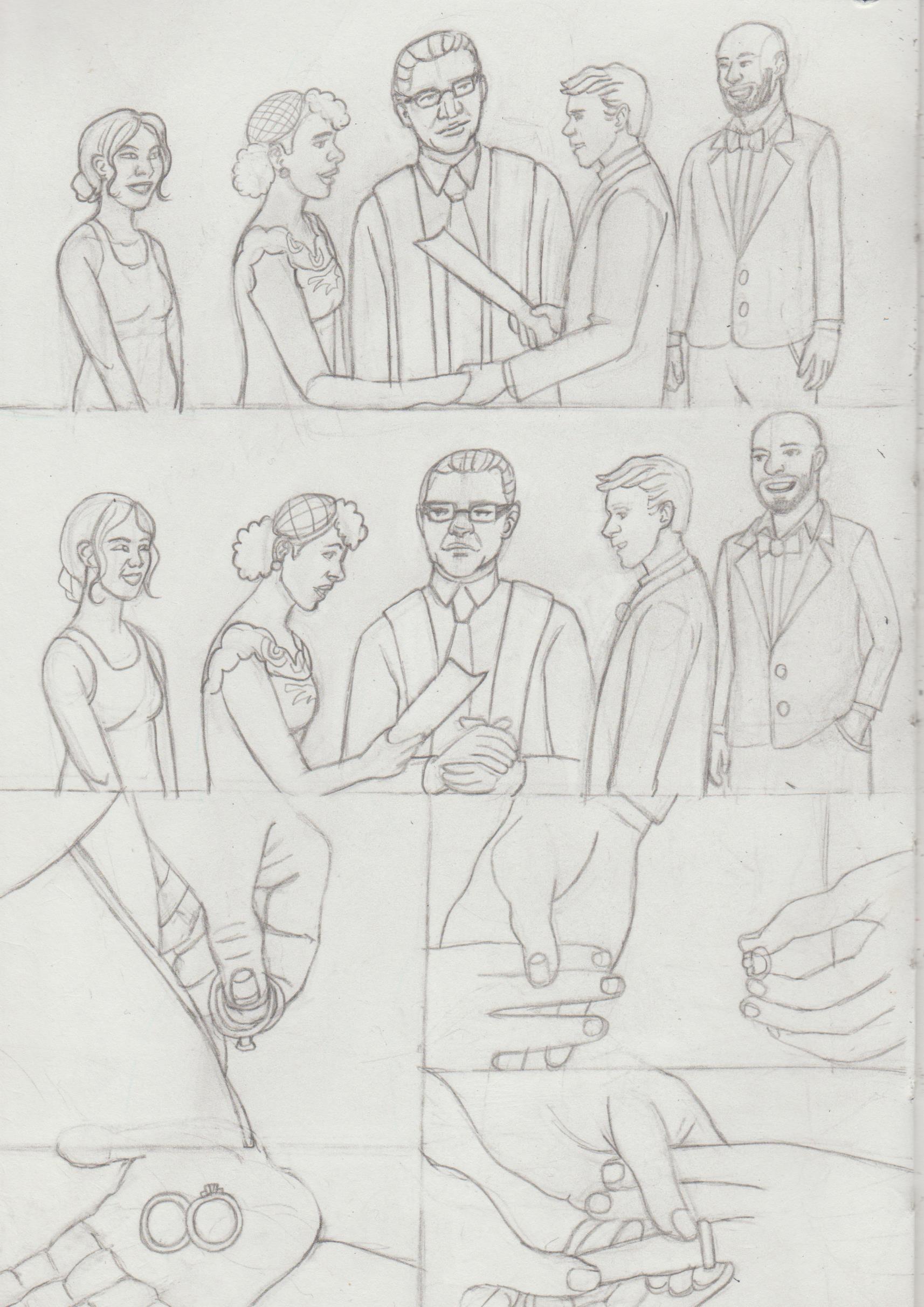.jpg) I know Danny is facing the other way for the kiss, but I didn't have a ref for that, so... 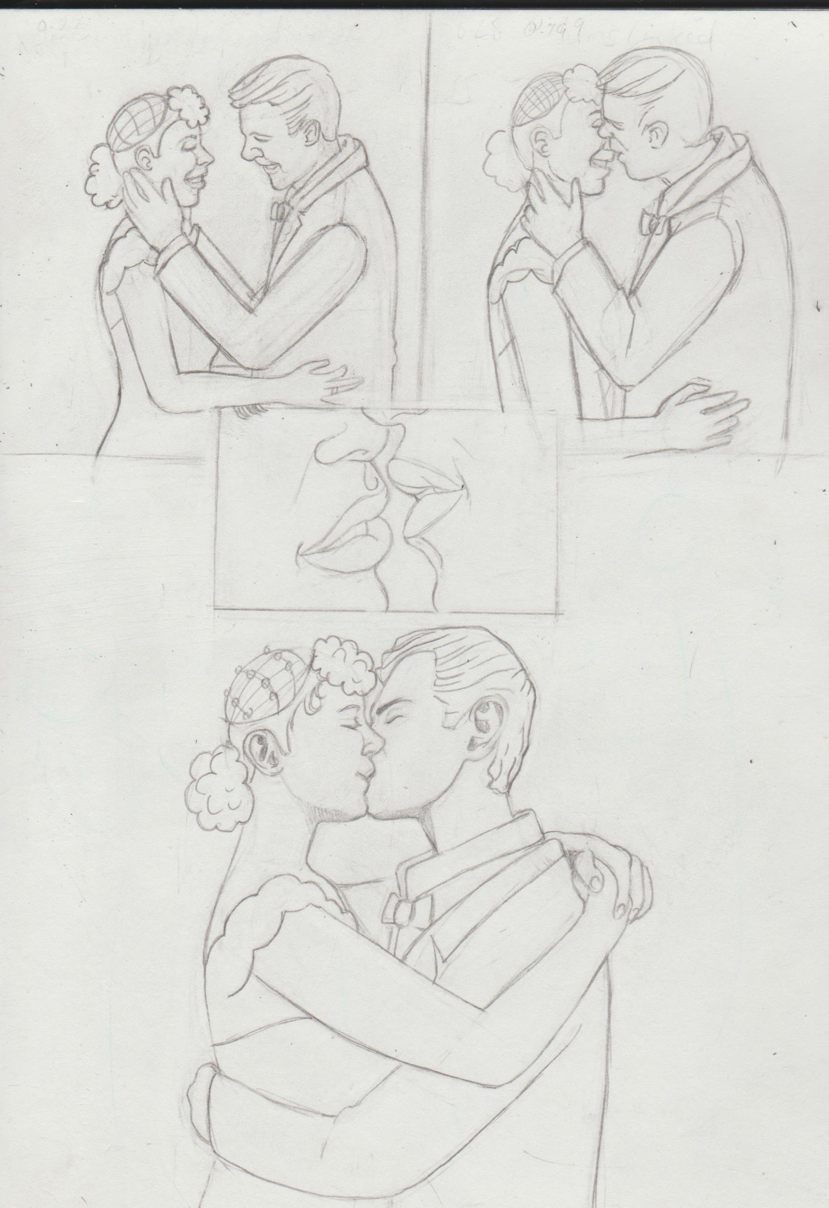.jpg) 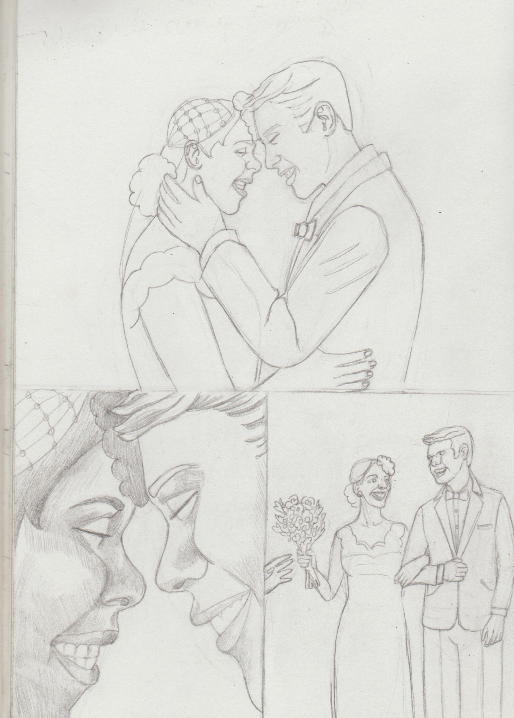.jpg) 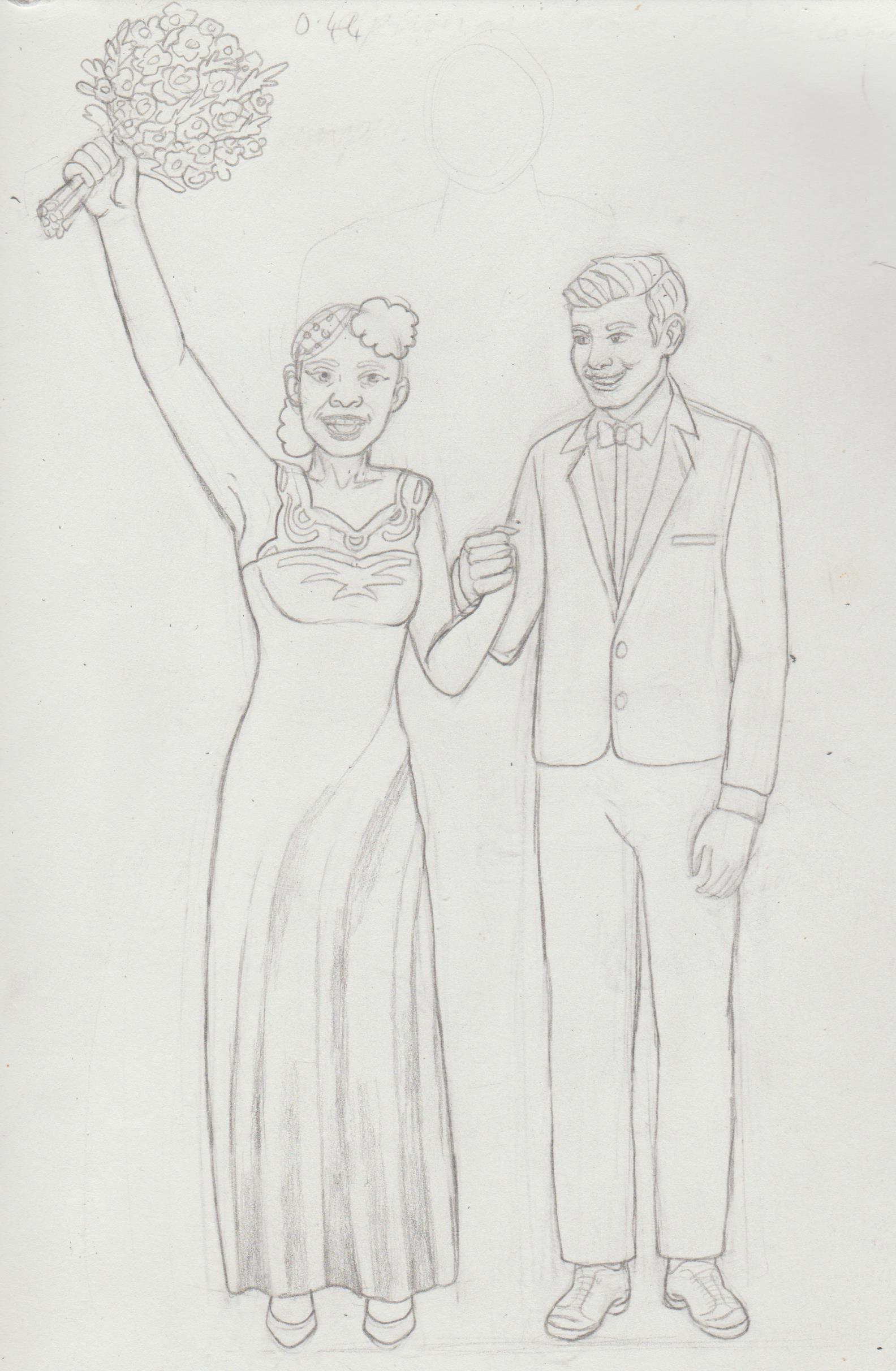.jpg)
05-03-2022, 05:09 AM
Nice amount of new art! I can tell that you have really been on your grind!
Your faces are very expressive and read clearly! I also think you have a nice sense of facial anatomy and anatomy overall. The biggest things I see that you could work on is placing objects in 3D space and posing your characters. Sometimes, some of your drawings seem a bit flat, and without thought put into where the shape would actually be placed in a 3D space. My suggestion is that you try to read up a bit on perspective, for example, the Scott Robertson books! Studying them should yield good art gains!
05-12-2022, 06:36 AM
(05-03-2022, 05:09 AM)Zorrentos Wrote: Nice amount of new art! I can tell that you have really been on your grind! Hi Zorrentos, thanks for stopping by! That's good to know, I'm trying to do more than the 'pretty girl looking bored'. It's needed especially if I want to illustrate stories. I've been looking at references and think Kevin Maguire is the don when it comes to facial expressions. Yeah, that's something I'm trying to practice, but sometimes I'm just not sure how to do it. Perspective is sooo hard. It's the reason I HATE drawing feet. I have 'perspective made easy', but I deffo want to look into the Robertson book and 'Sketching- The Basics'. Books not just for concept artists, but also product designers. This is a project 10 years in the making. I had the idea of drawing posters based on the different 'Punk' genres, i.e. Cyberpunk, Steampunk and Dieselpunk, but I was scared in case it looked bad/using references, but I actively did now!. 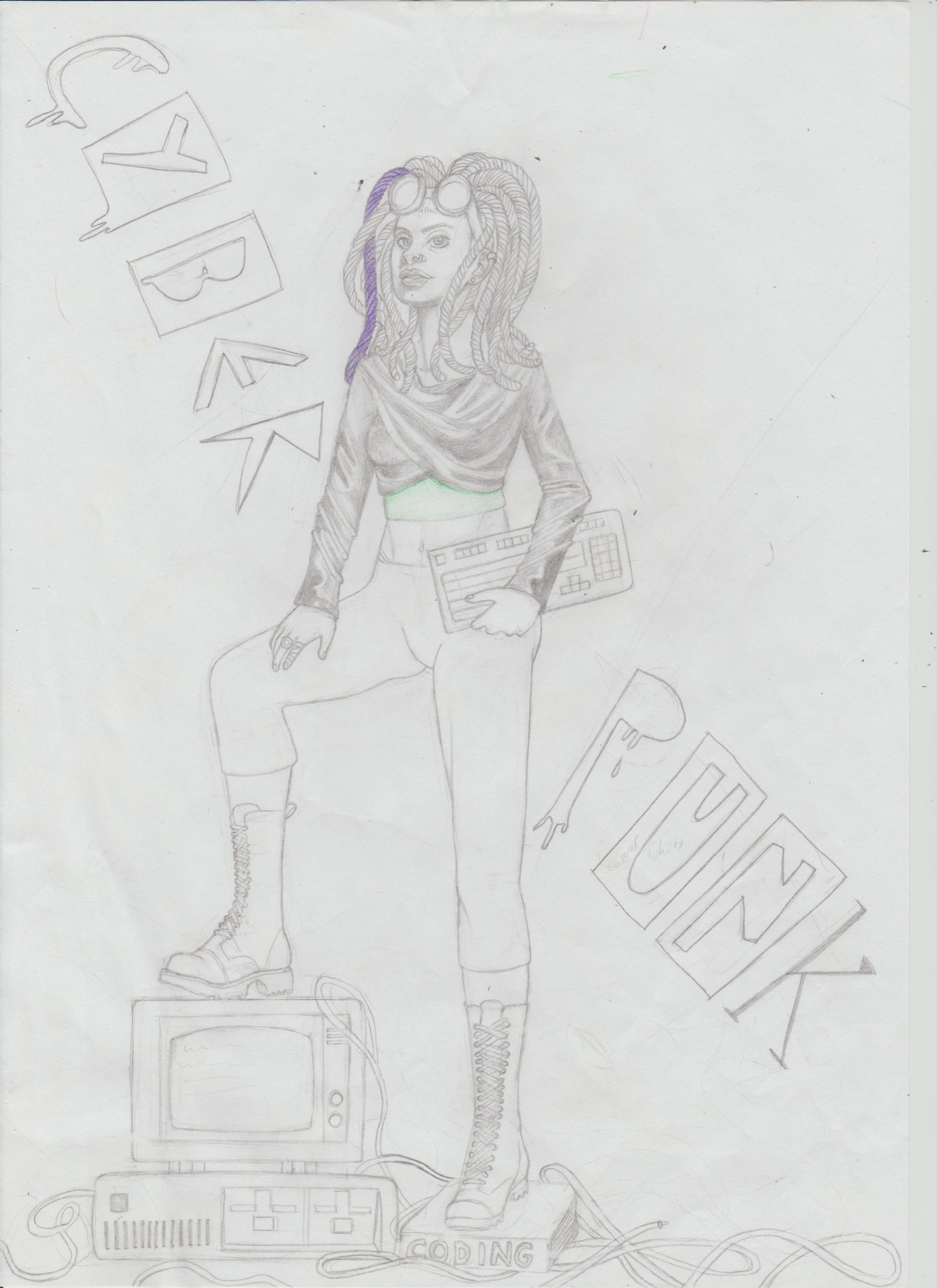 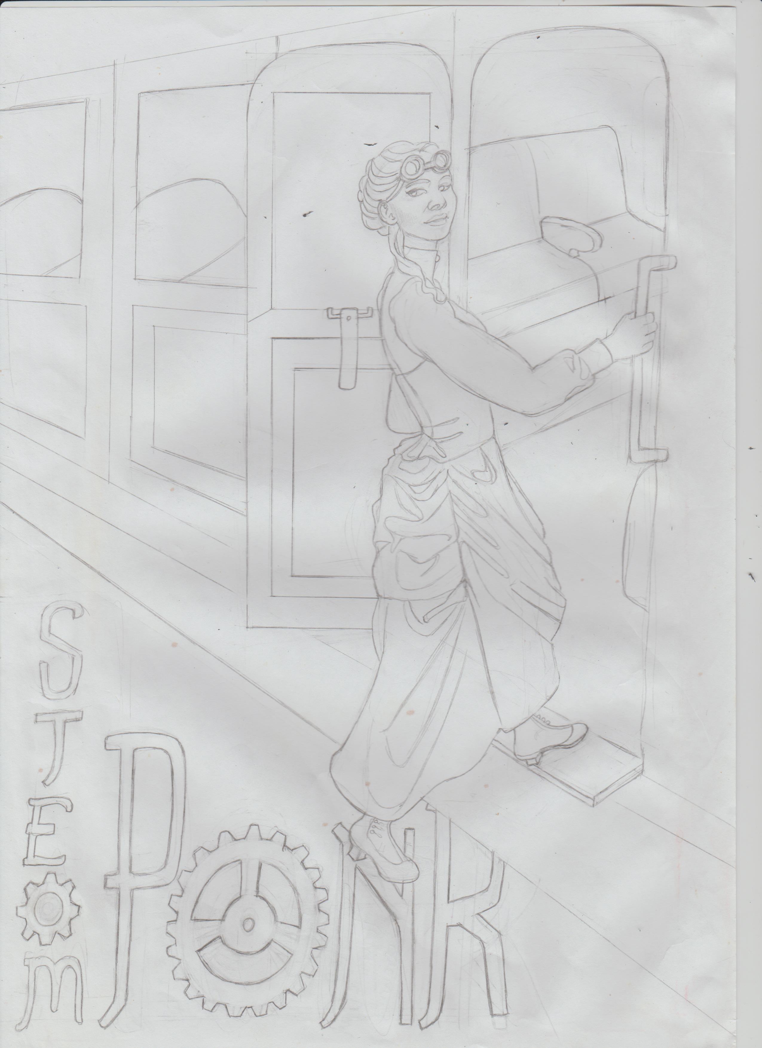.jpg) 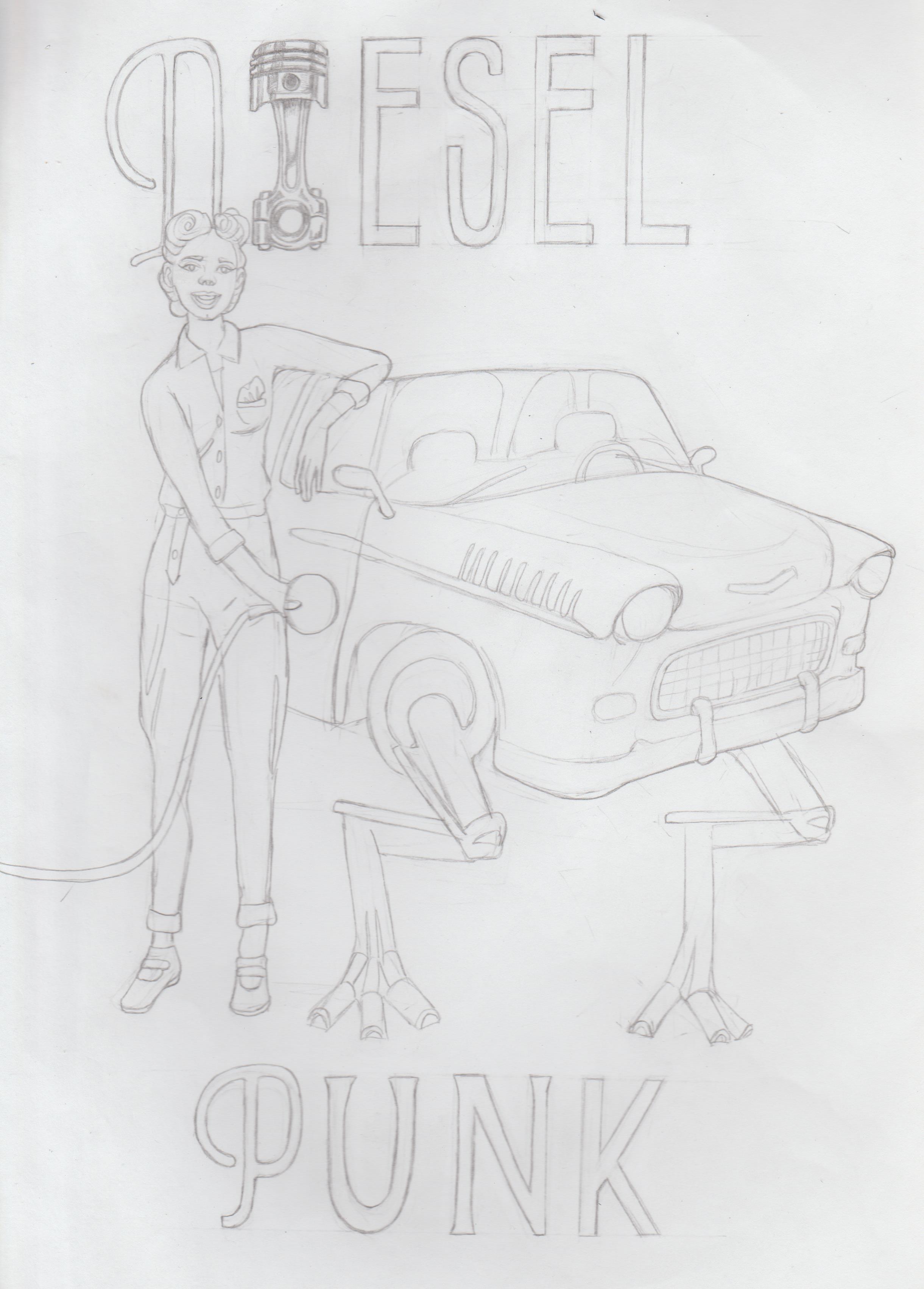.jpg) Bonus points for off perspective and the 'Diesel' girl being out of scale. I had fun with these, even though it took ages. I want to colour them. Here is a redraw of: 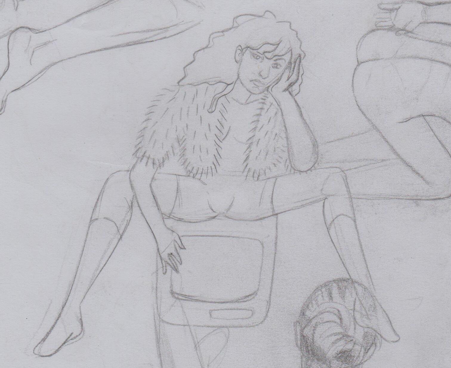 This time with the use of references. 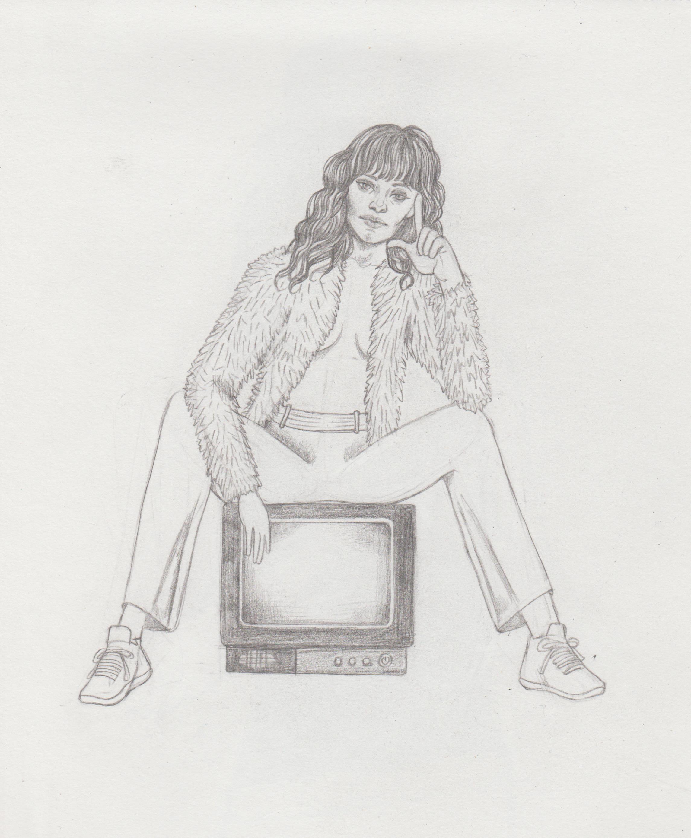.jpg) A girl drawn for my university's 'Creative Writing journal'. The theme is 'The Book of Water'. I'm not sure how well it reads, whether it looks like the pattern of water, or just a pattern. 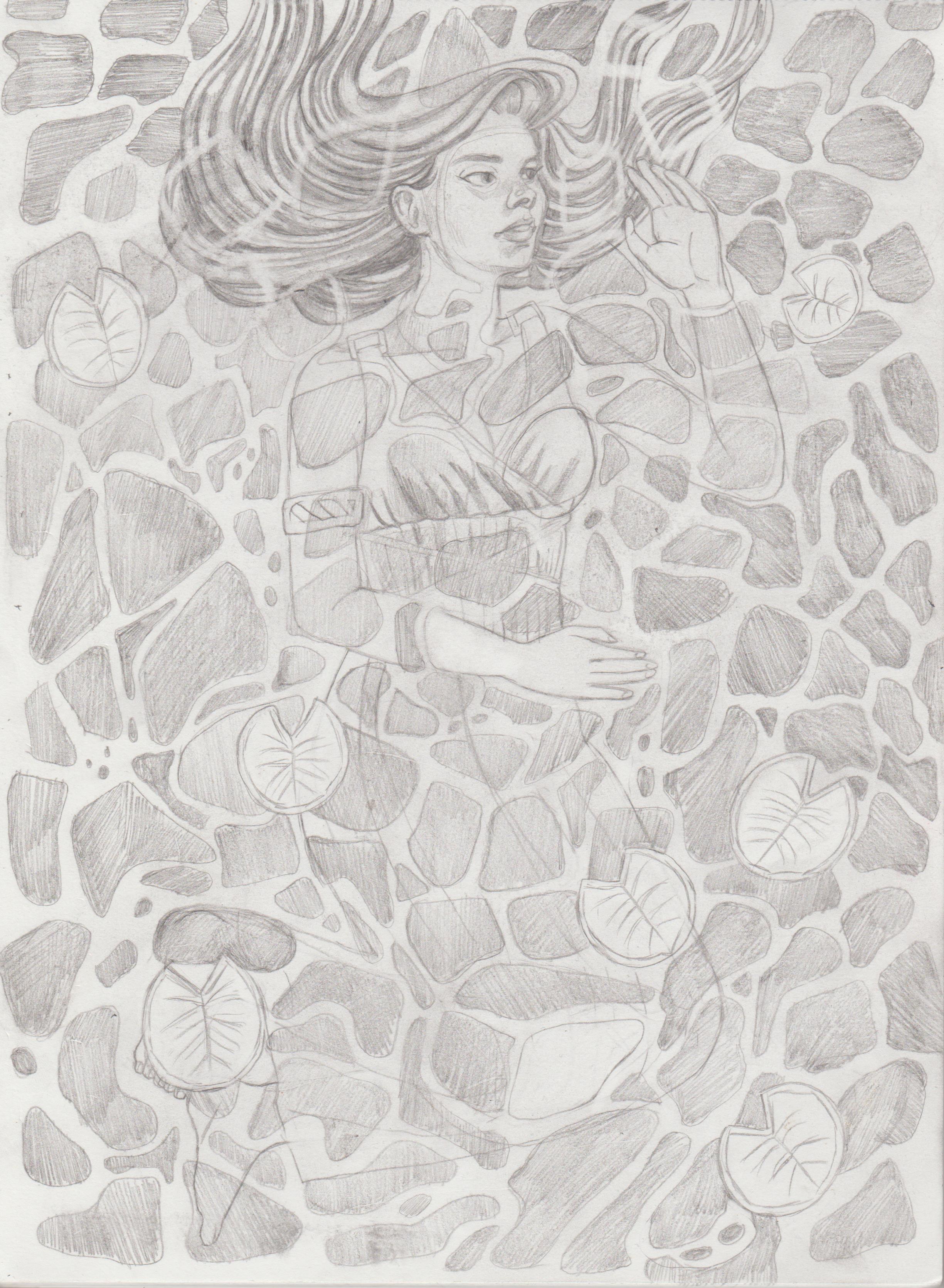.jpg)
05-12-2022, 05:56 PM
the last piece looks great. Love the face and although the water pattern doesn't read too much like water at first glance, it still has a cool abstract feel to it.
Admittedly it's probable a really hard subject to tackle with a pencil medium. either or it's still a great piece ^^
05-12-2022, 06:22 PM
(05-12-2022, 05:56 PM)Crowbit Wrote: the last piece looks great. Love the face and although the water pattern doesn't read too much like water at first glance, it still has a cool abstract feel to it. Hi Crowbit, it was supposed to be the pattern of water, like in: feeling like a fish out of water by maryanne nguyen on Dribbble (Would have posted as a picture, but tried three times and the site wouldn't let me.) The deadline was this Monday, so I did what I could, even though it would probably be more obvious with colour. Some people with the help of the lily pads could tell she was at least underwater. Thanks for the compliment and for stopping by!
07-11-2022, 01:59 AM
Nice to see CD is not defunct, was a little bit worried there.
A concept of a girl being lifted up/pecked by birds via the skin. Will develop later. 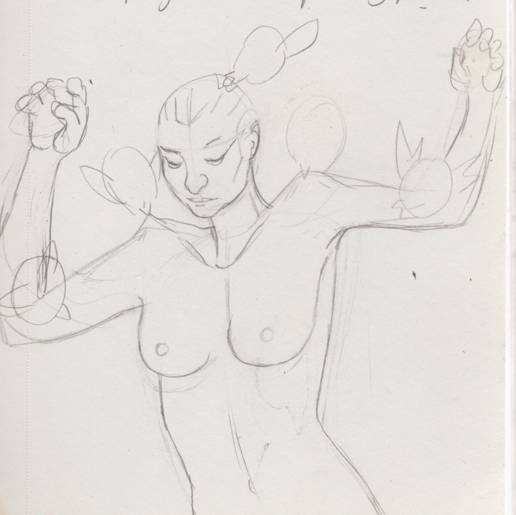.jpg) Trying to practice horses. 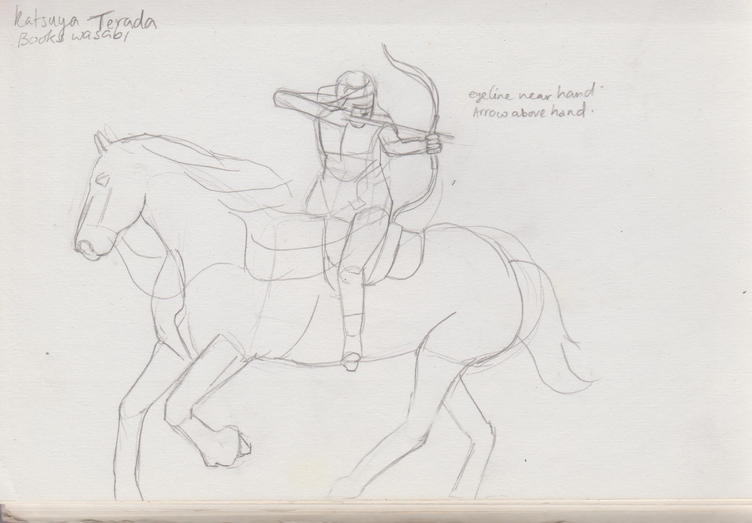.jpg) 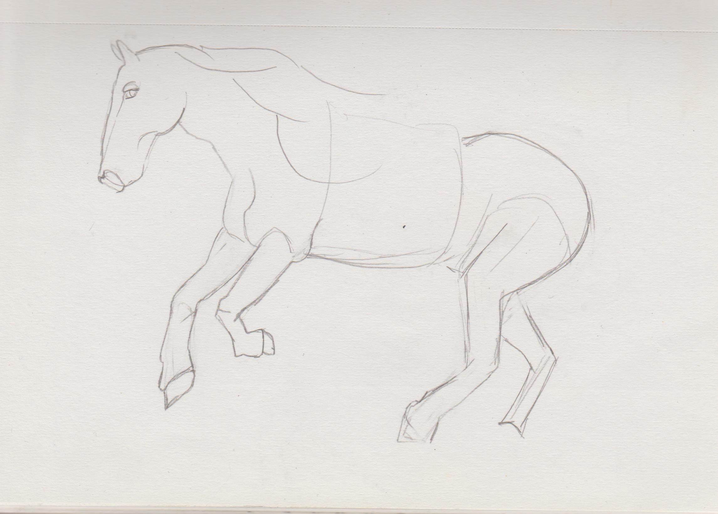.jpg) 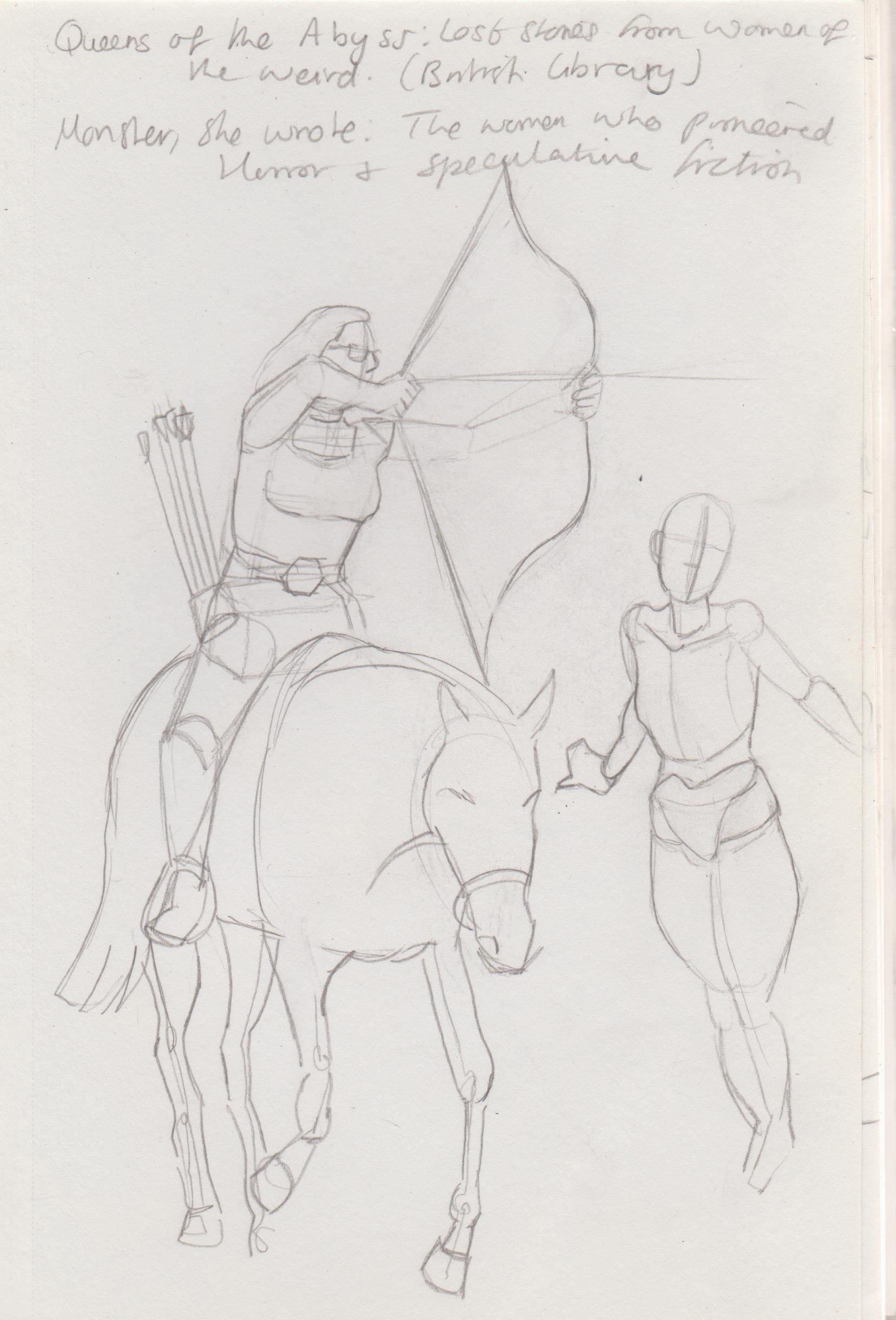.jpg) Tried to draw her from the front. Very difficult. 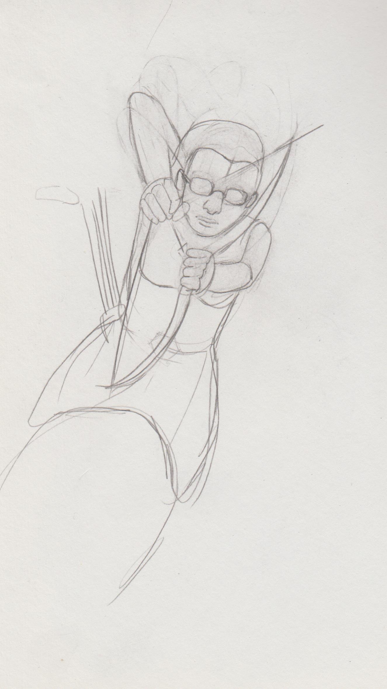.jpg) Love Tran Nguyen and her use of pleated fabrics. 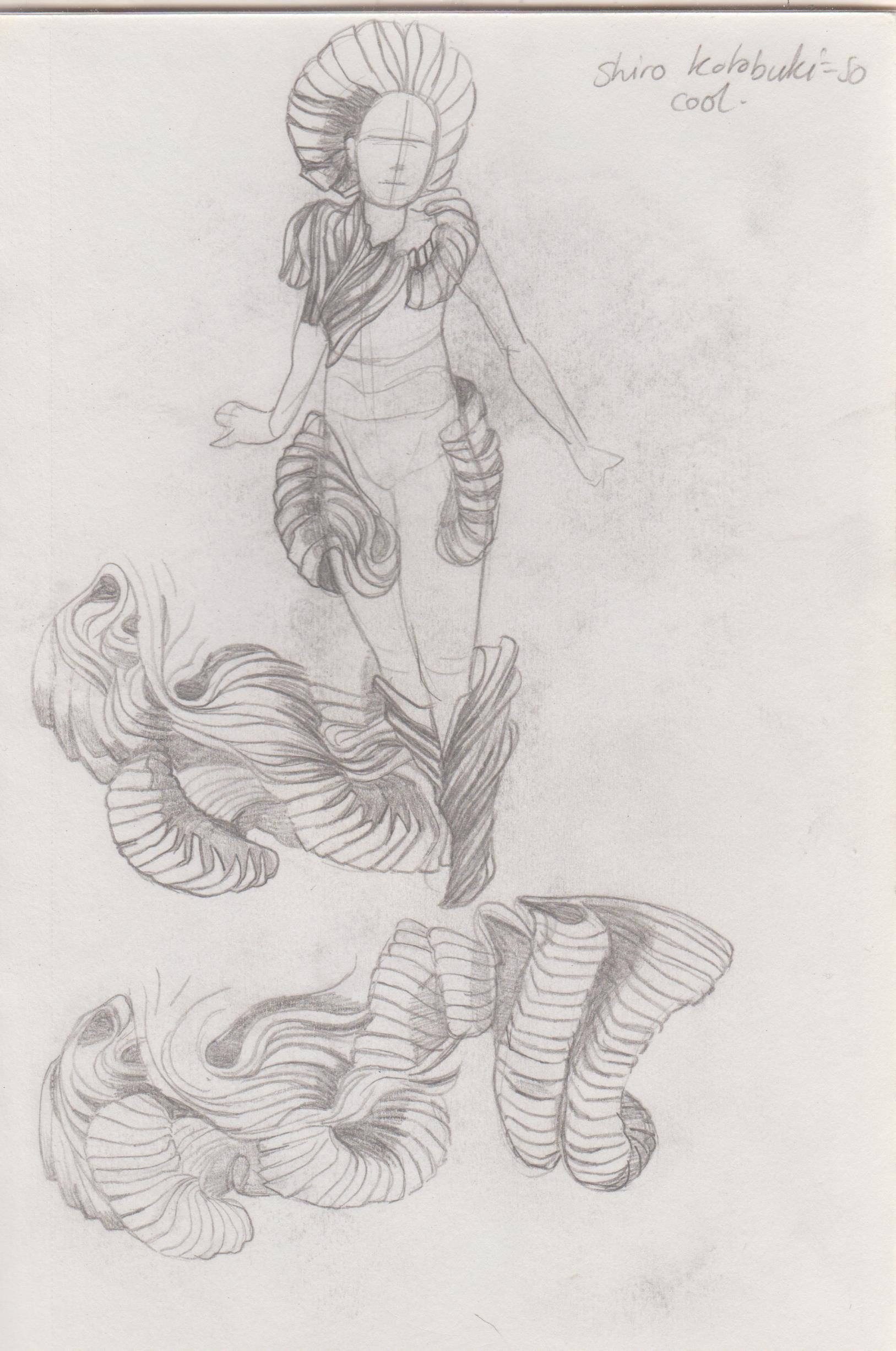.jpg) 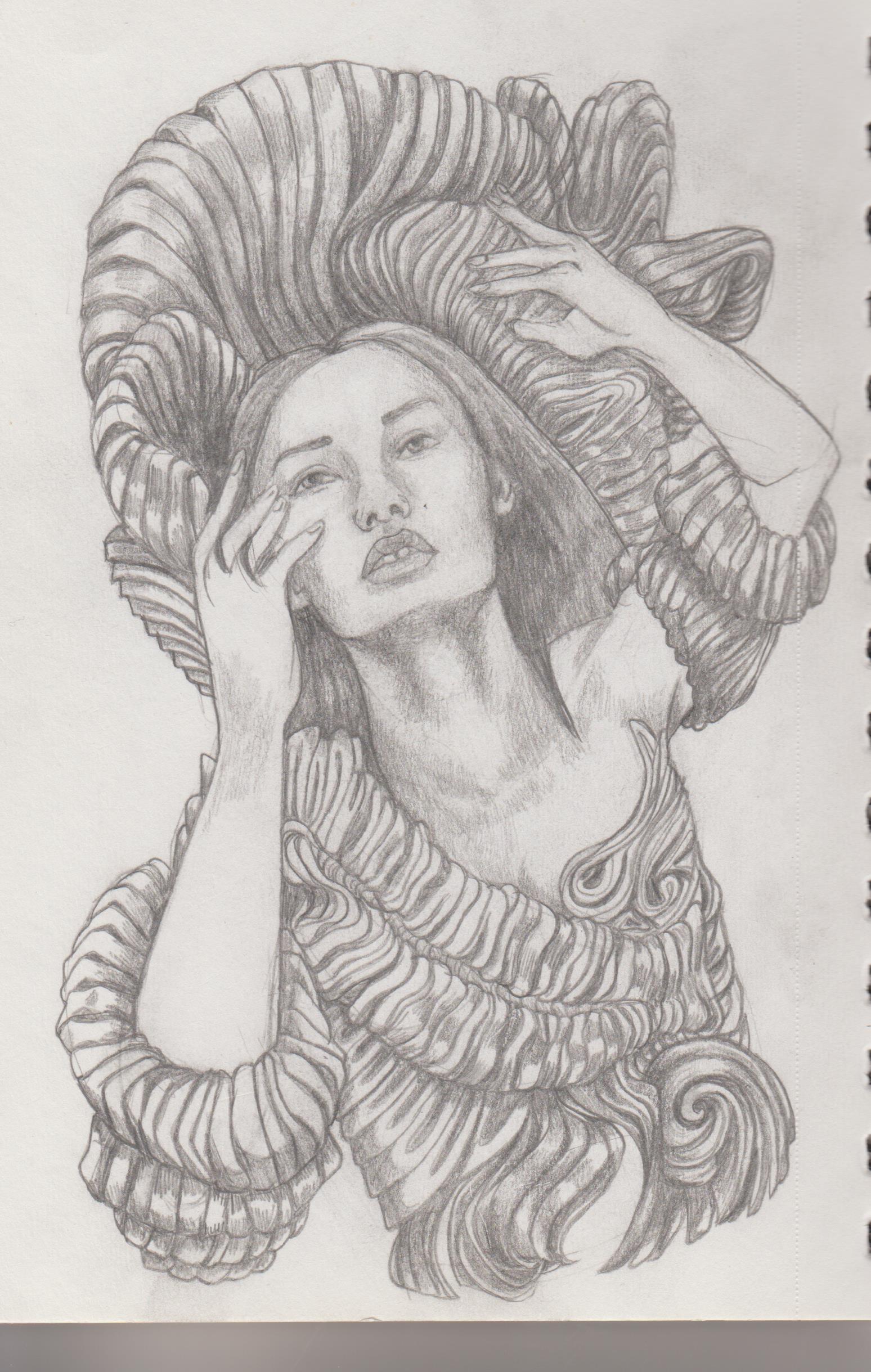.jpg) 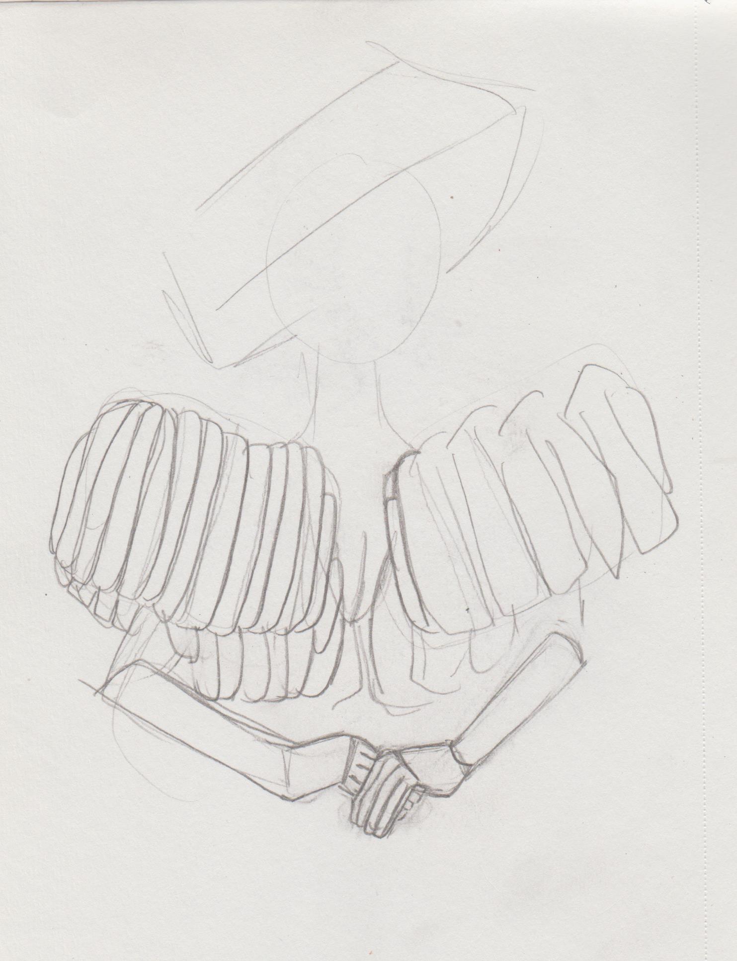.jpg) 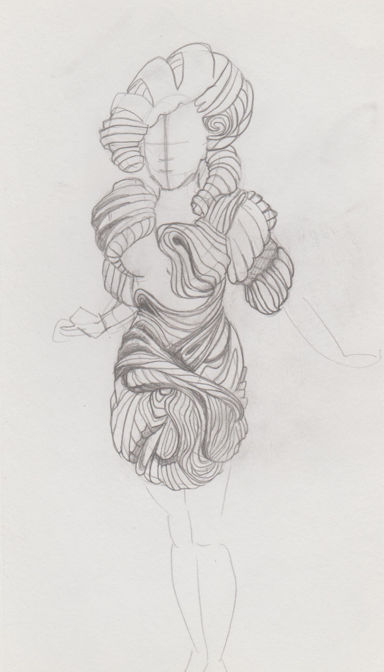.jpg)
07-16-2022, 02:46 AM
Nice updates! I would focus in on more on your construction to help give your figures a more refined approach. Keep it up!
08-04-2022, 06:51 AM
(07-16-2022, 02:46 AM)cgmythology Wrote: Nice updates! I would focus in on more on your construction to help give your figures a more refined approach. Keep it up! Hi CG, thanks for stopping by. I will keep that in mind. I've been pretty busy with finishing uni and doing my internship (it's an illustration project), that I haven't had time to upload a lot. Here is some older work. Here is some fanart of Cabal A.K.A 'Nightbreed' by Clive Barker. 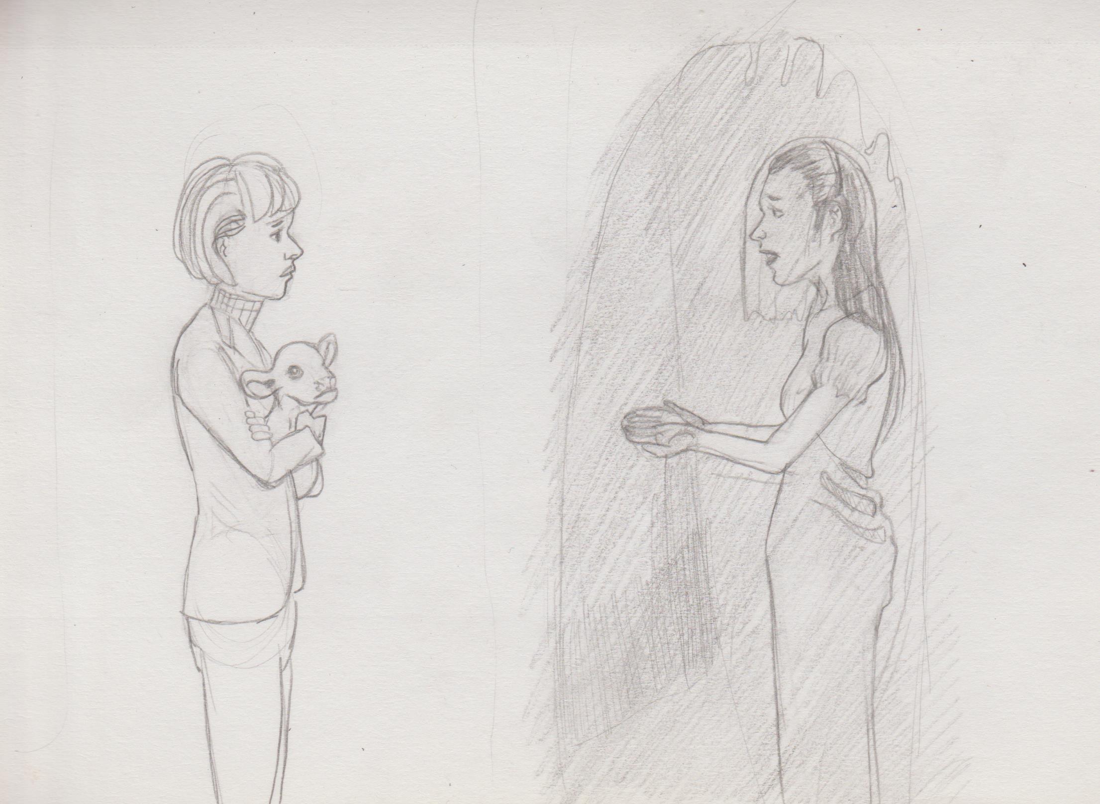.jpg) The following is mostly comic studies: .jpg) 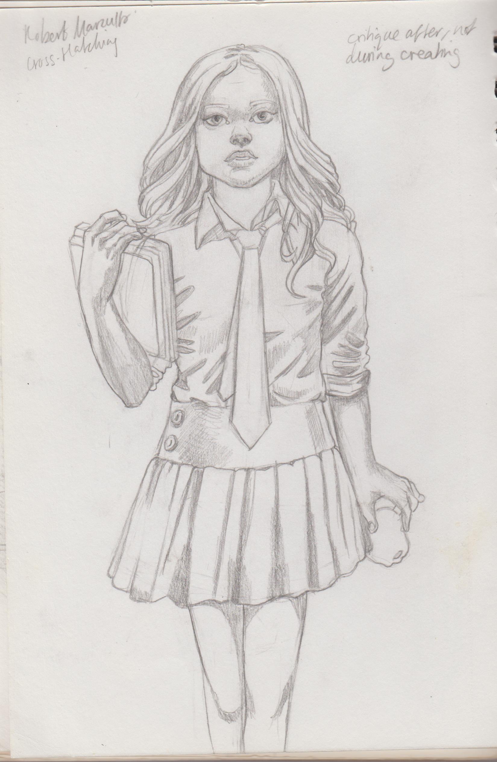.jpg) 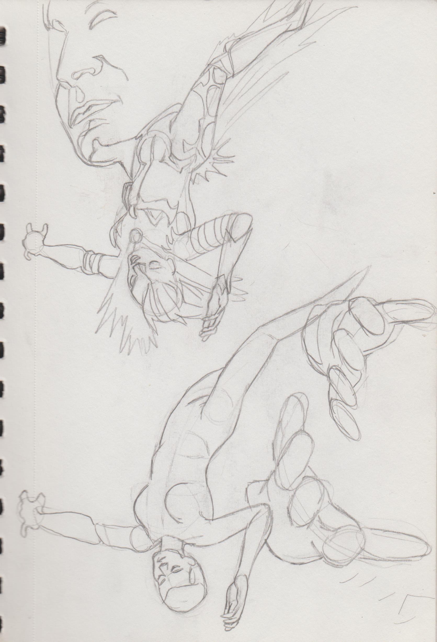.jpg) 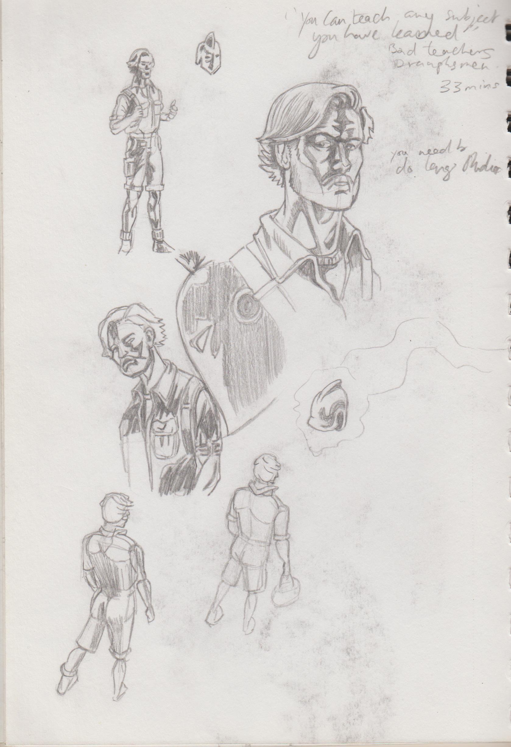.jpg) 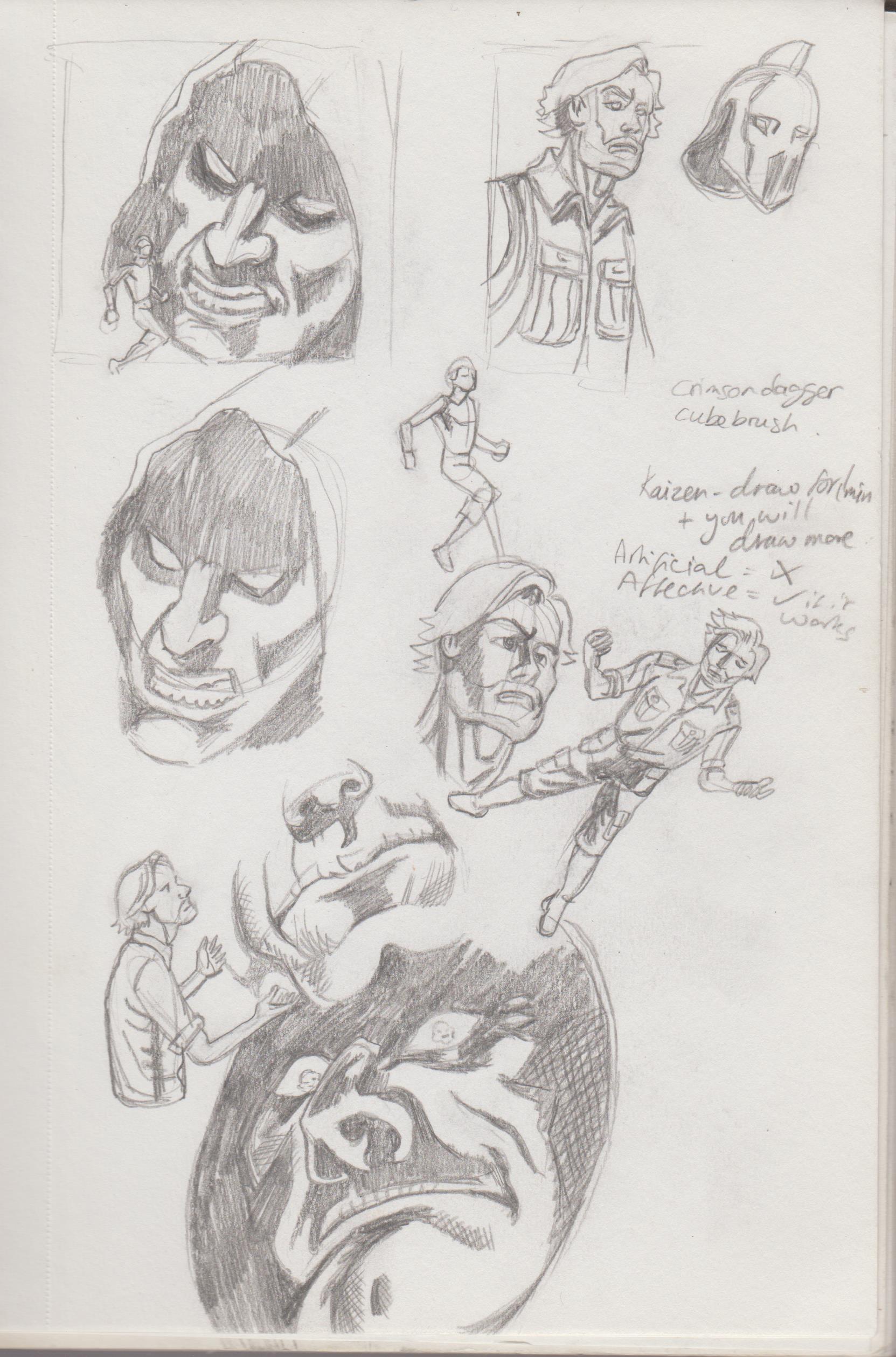.jpg) 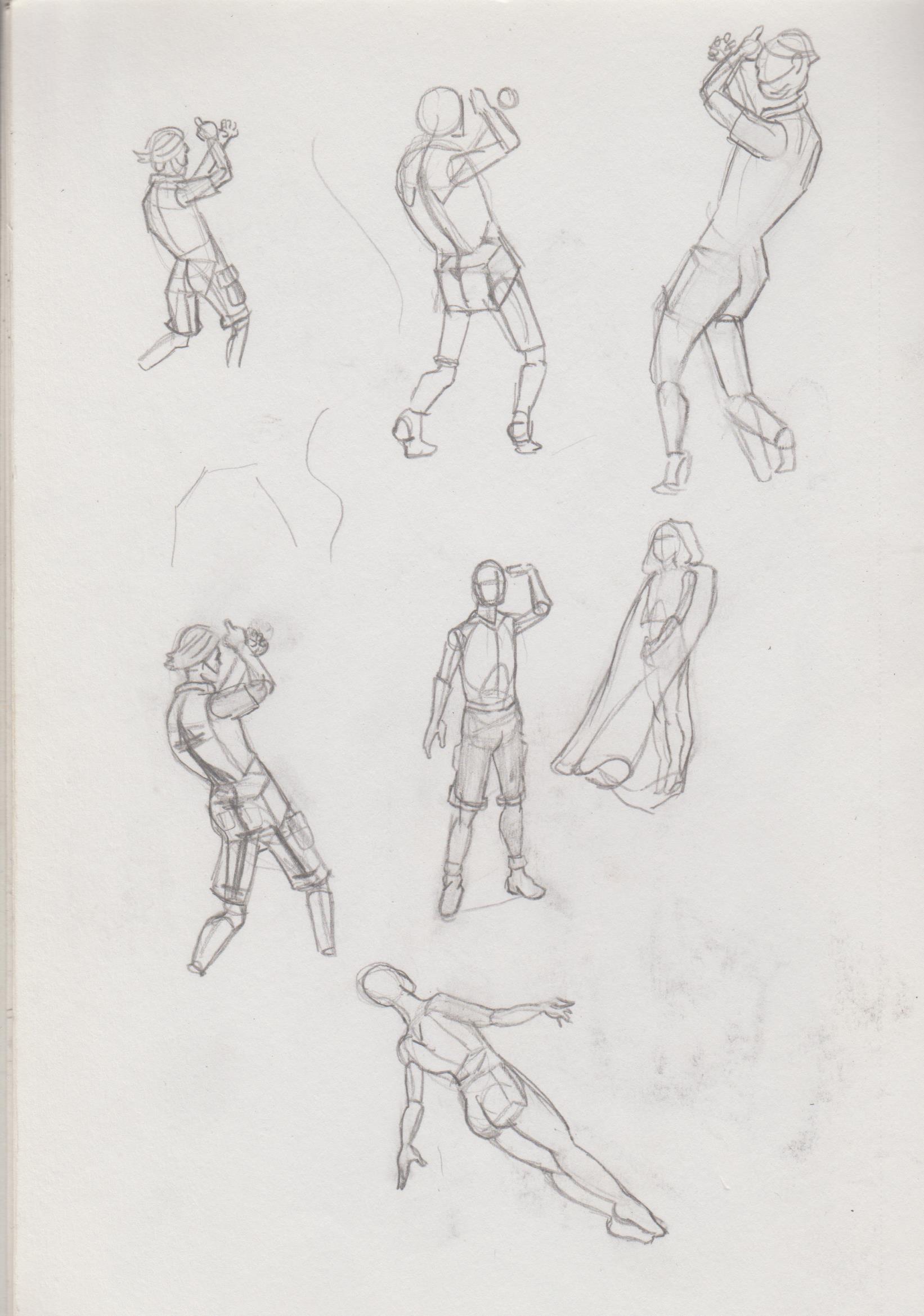.jpg) 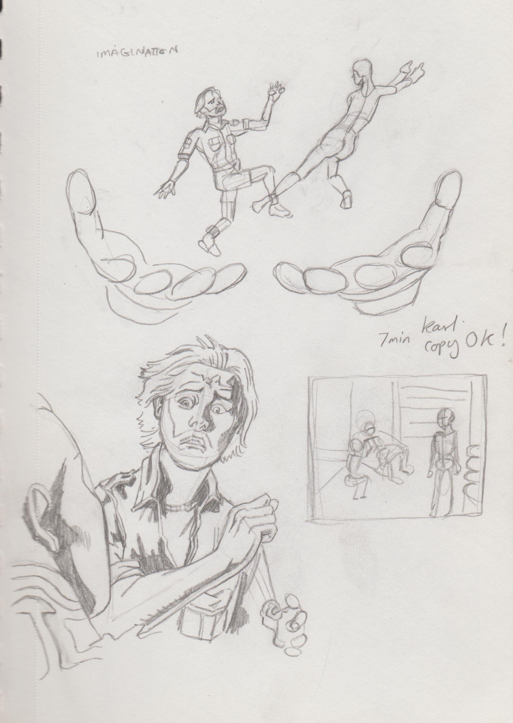.jpg) 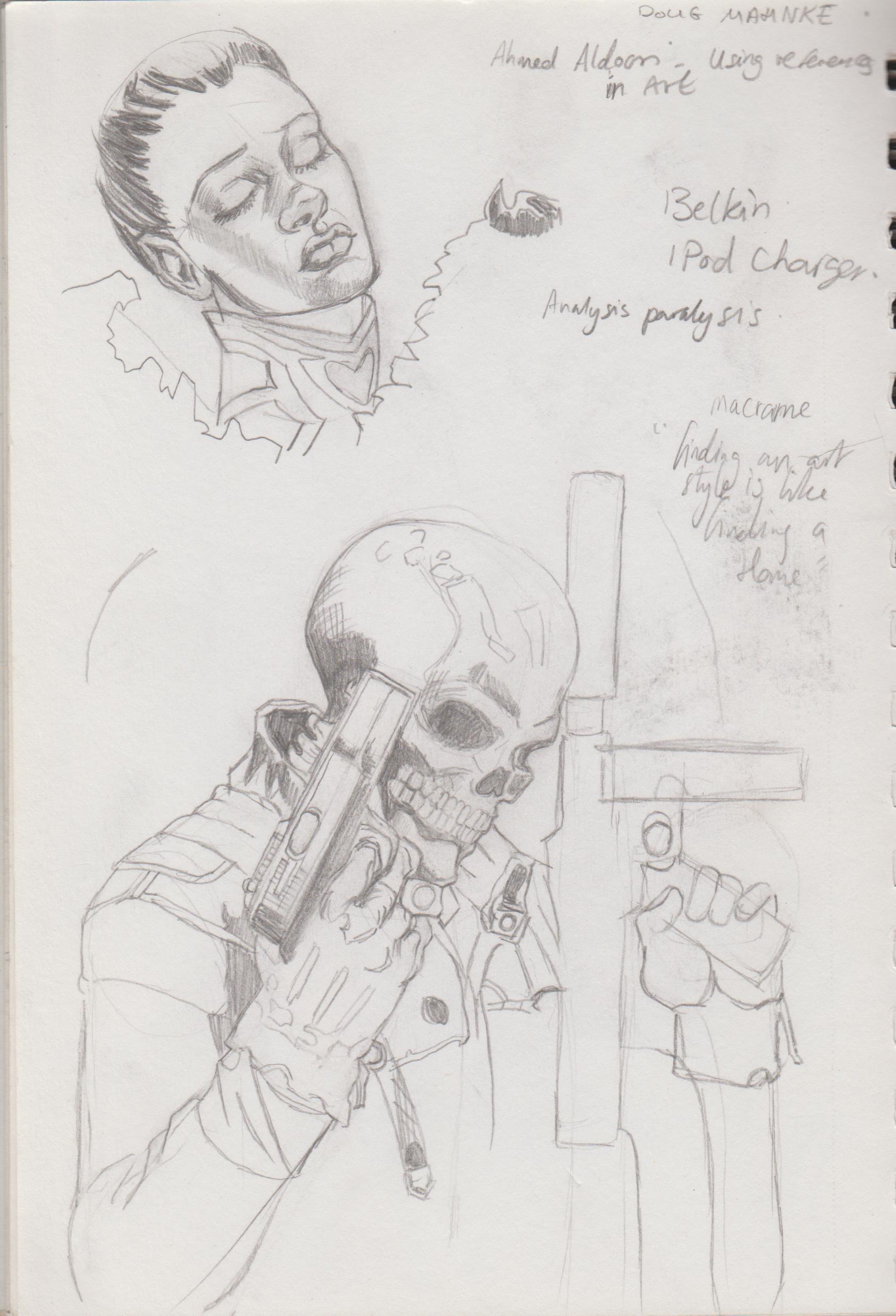.jpg) 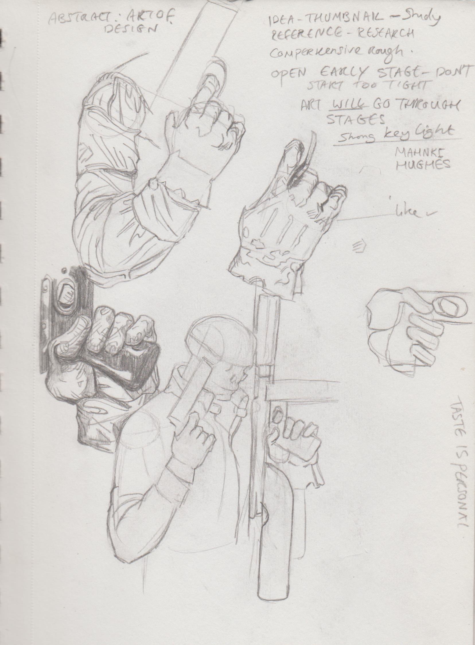.jpg) I used design elements and combined them. 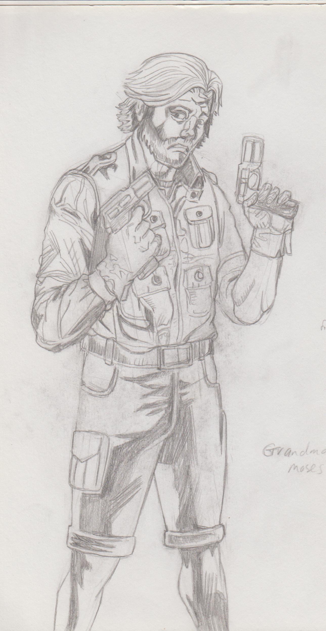.jpg) Some more studies: 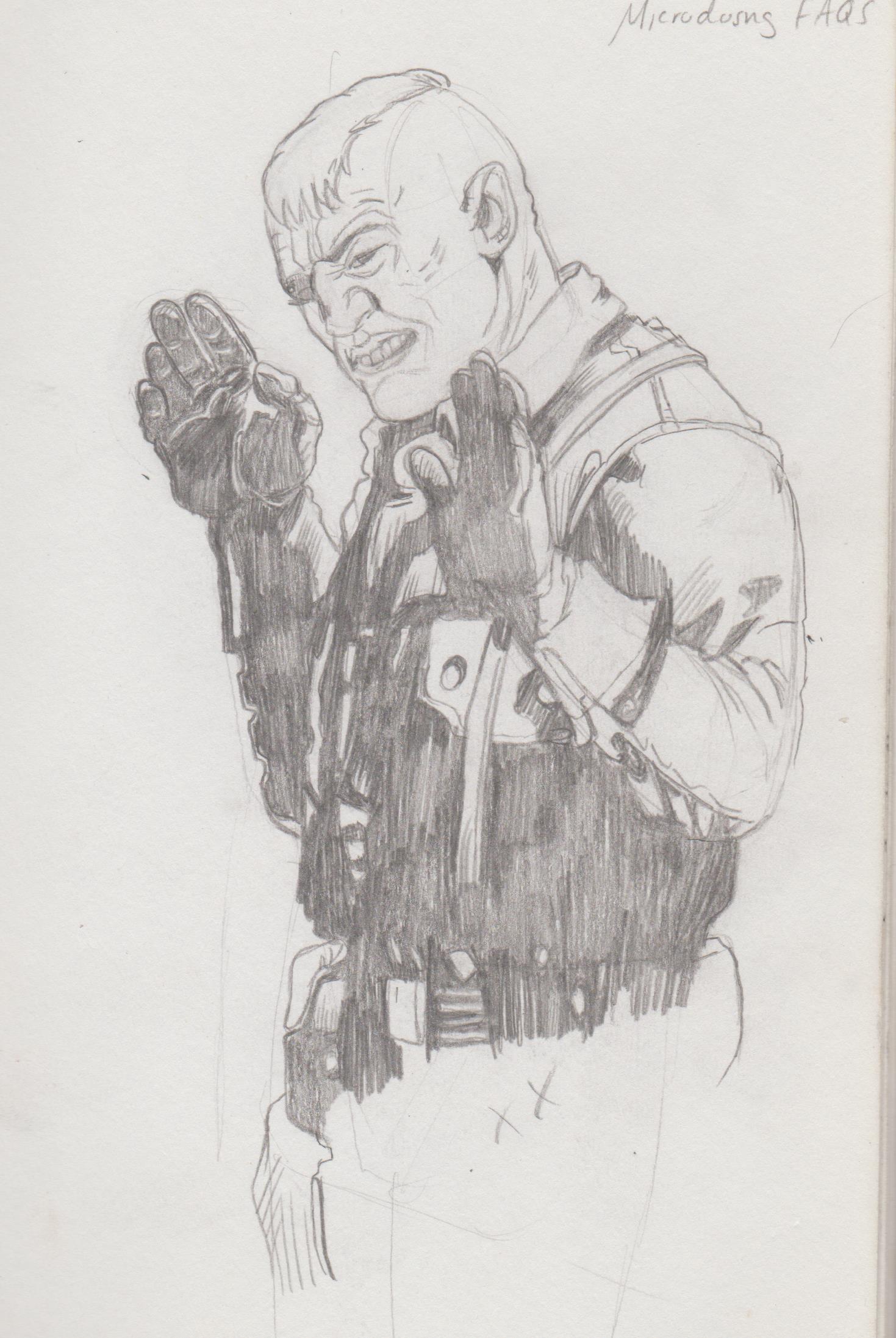.jpg) 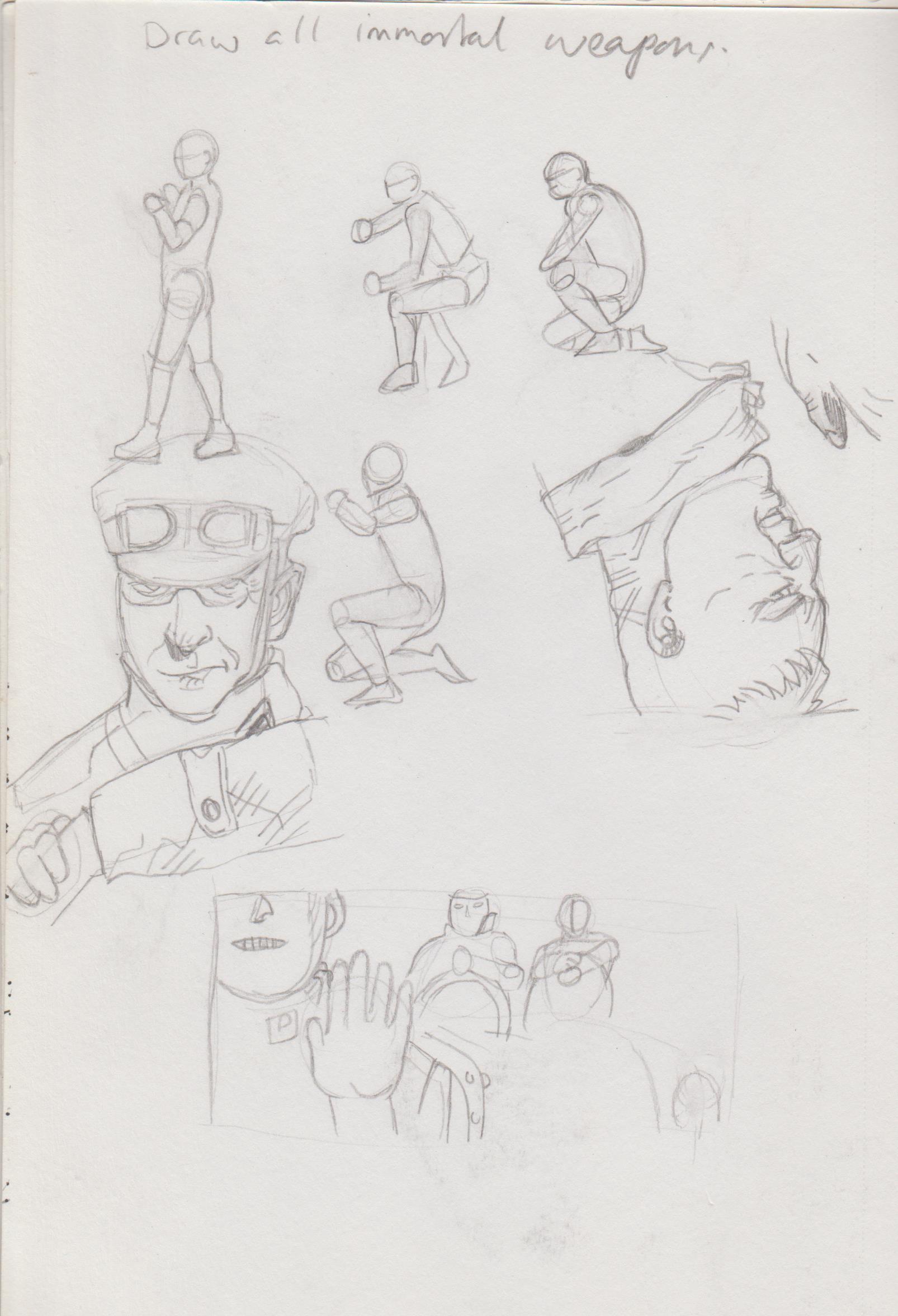.jpg) 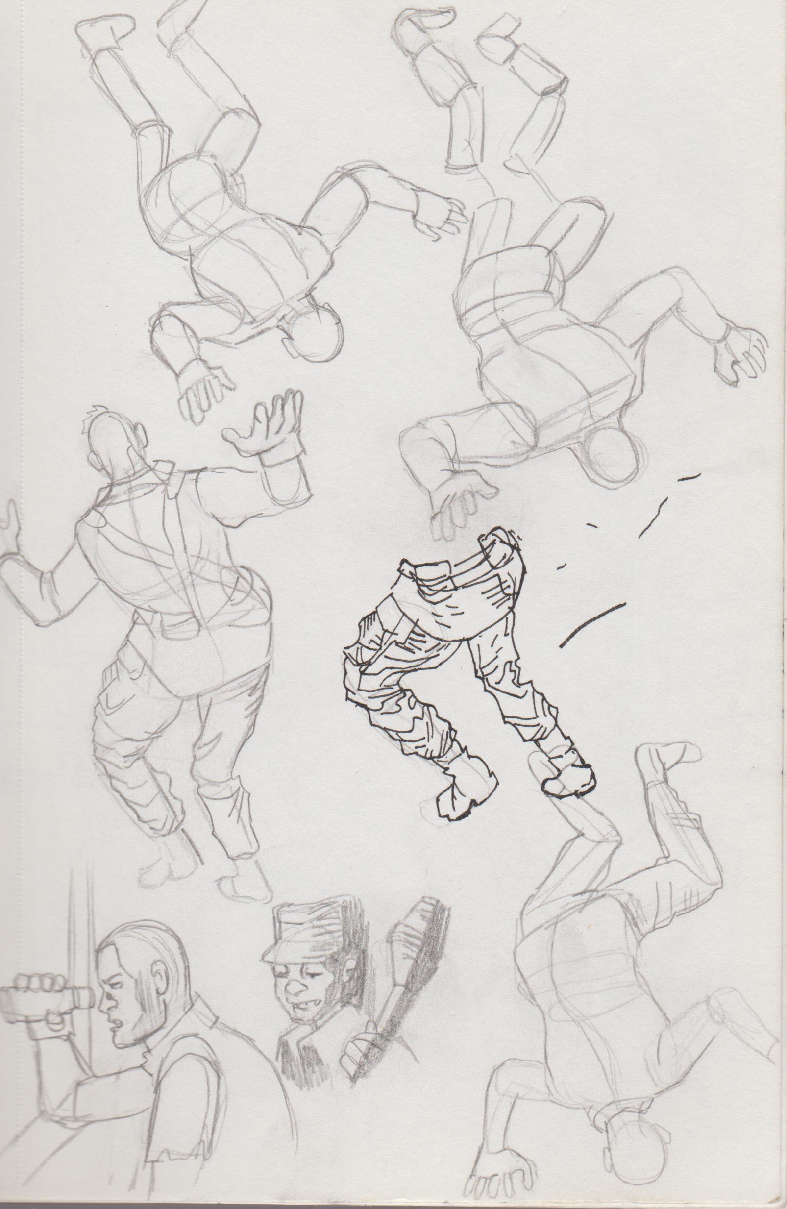.jpg) 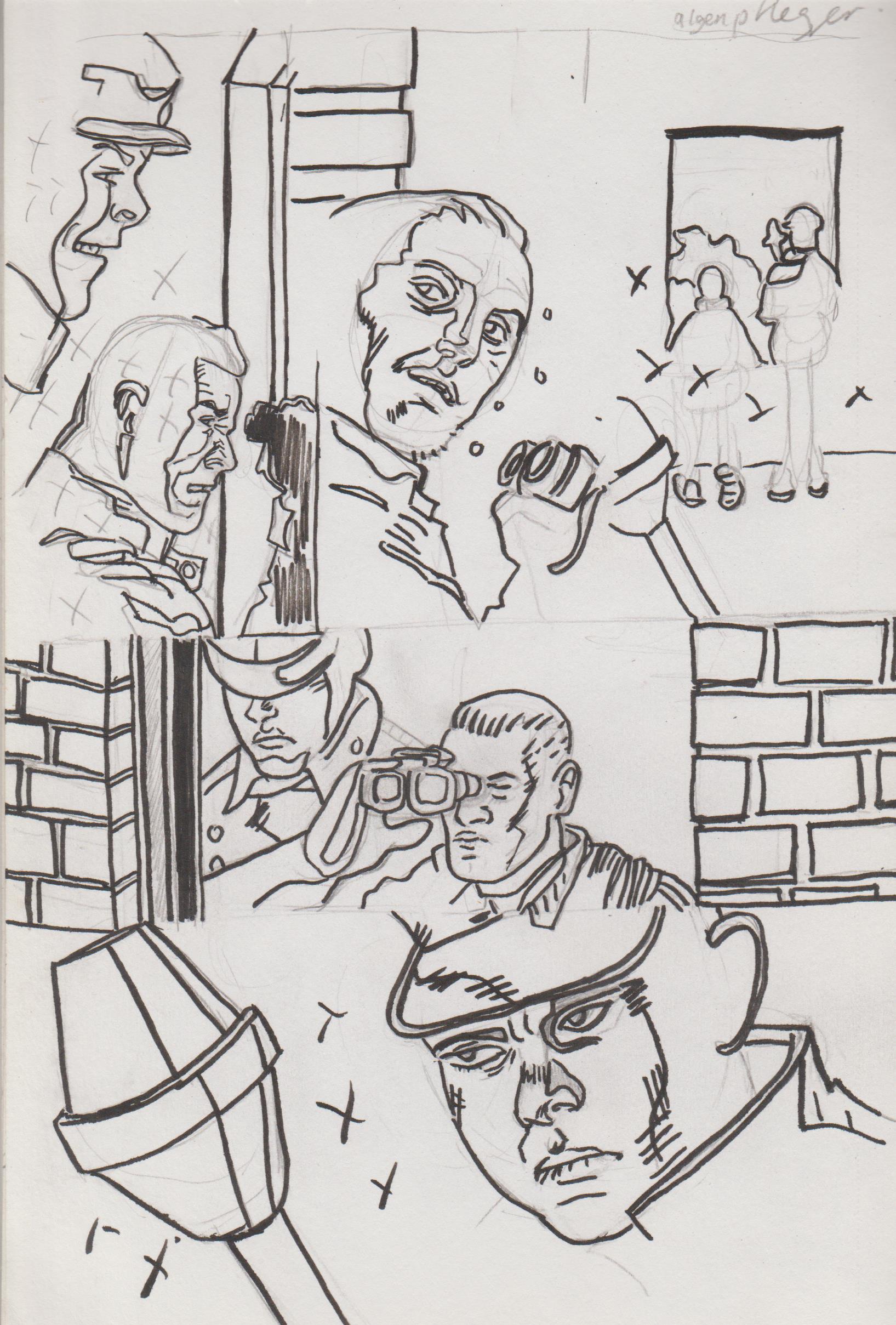.jpg) Trying to draw from imagination, again. 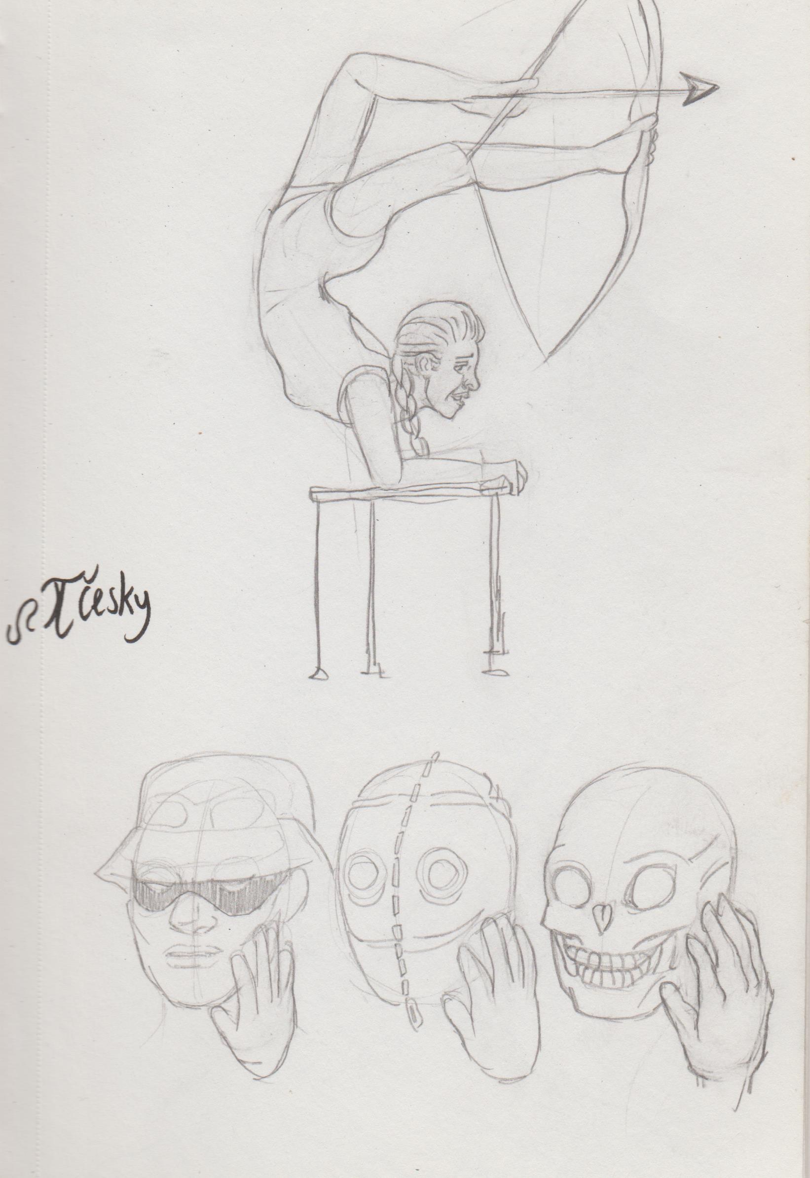.jpg) Combining, again: 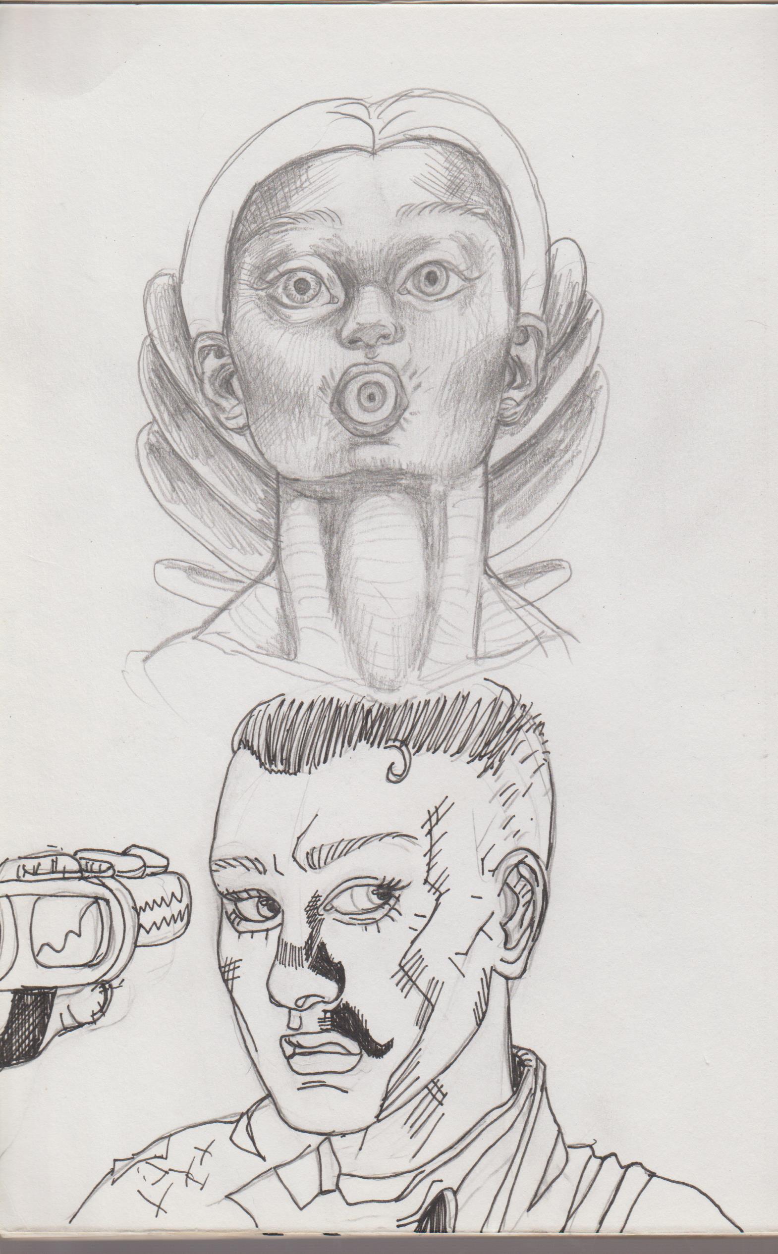.jpg) 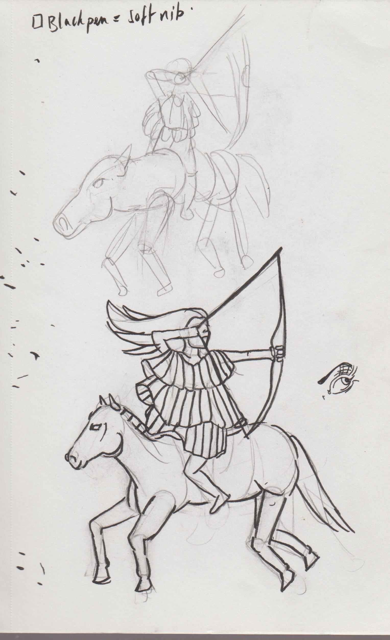.jpg) 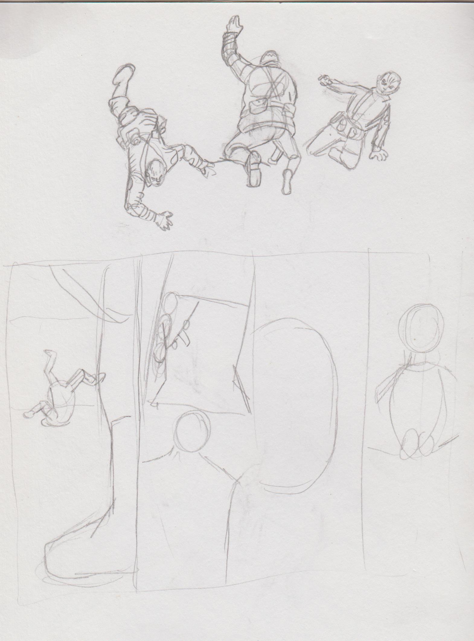.jpg) Using the pose, again. 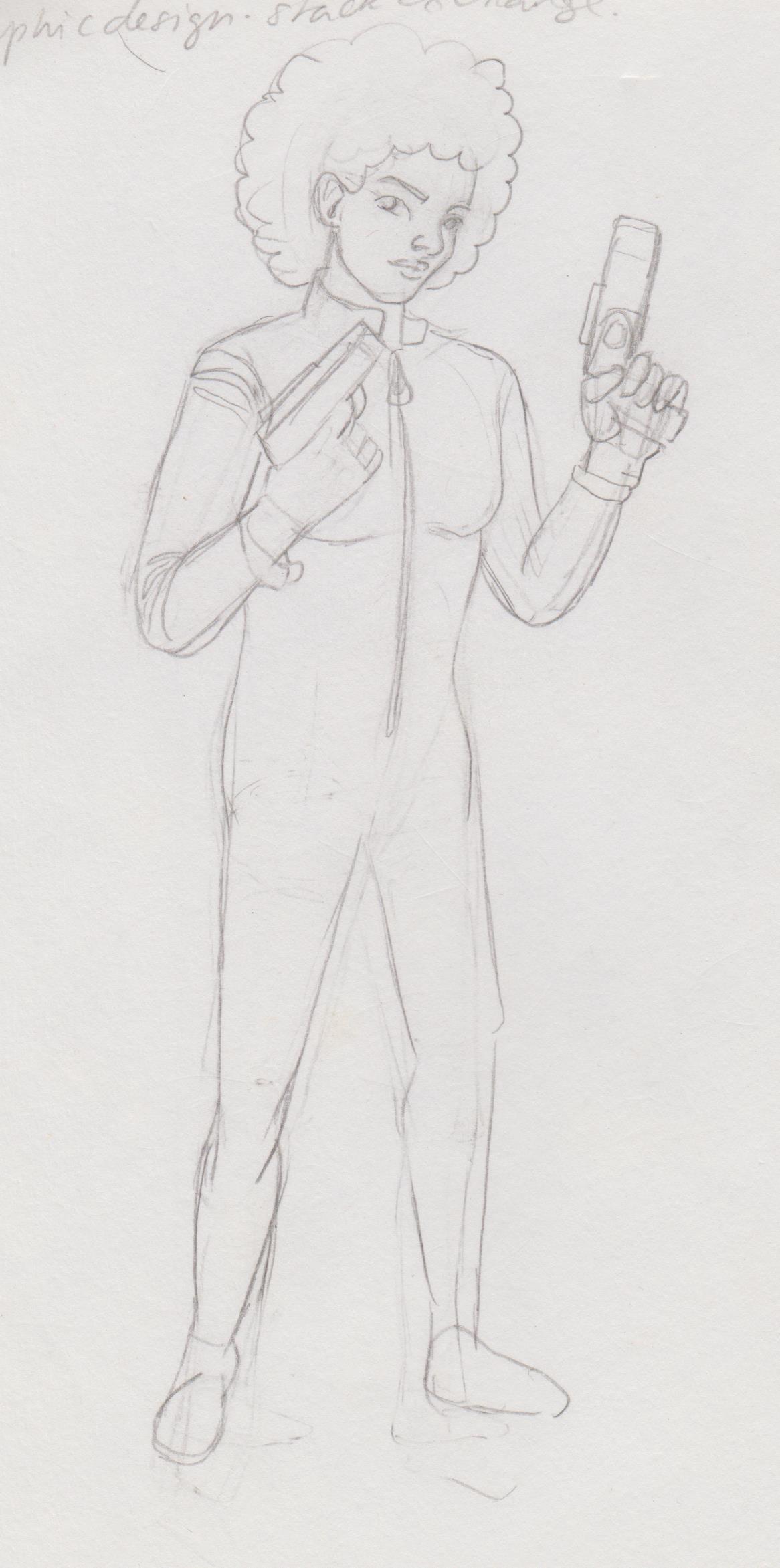.jpg) 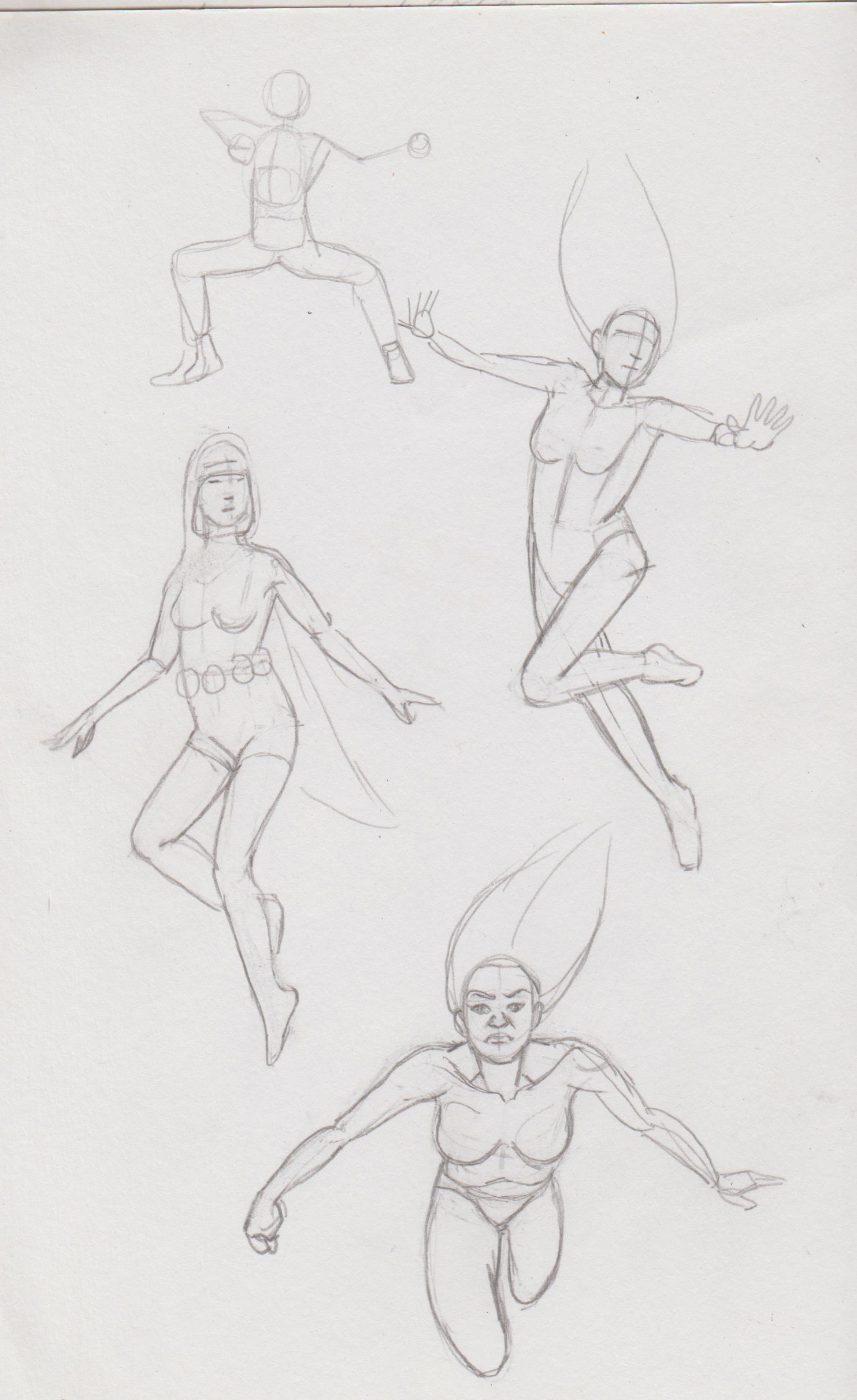.jpg) Deffo wanna learn to draw more 'superheroesque' poses.
01-01-2023, 09:46 AM
Long time; no update. After four years my undergrad career has finally draw to a close. Felt like a whimper, not being able to go abroad or even start a dissertation. Like what. Two big uni-planned-years-beforehand just never panned out, so that was a mighty (and at times) upsetting disappointment. However, I did get a 2:1, which I'm very relieved about. Just trying to figure life out post-uni. Completed an internship where I drew a company. They left people with learning difficulties get jobs. I'll be posting some of the work that I scanned, they have all the rest now.
But, first, I tried to traditionally colour a version of the flowing water girl. Umm, it didn't come out the way I wanted. Still have no clue about the whole paint thing. But, I tried. Believe I added details with coloured pencil, because the image was just disappearing. Deffo a different feel from the pencil version. .jpg) This was a good chance for me to get more accustomed with coloured pencil. Still working out blending and how to get the graininess of the paper that comes through. I was really rejuvenated to do this project after volunteering at Birmingham Design Festival and get to hear professional illustrators speak about their projects and workflow. 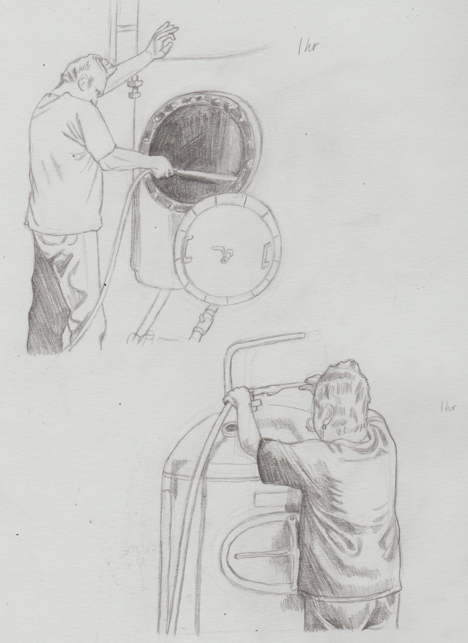.jpg) .jpg) 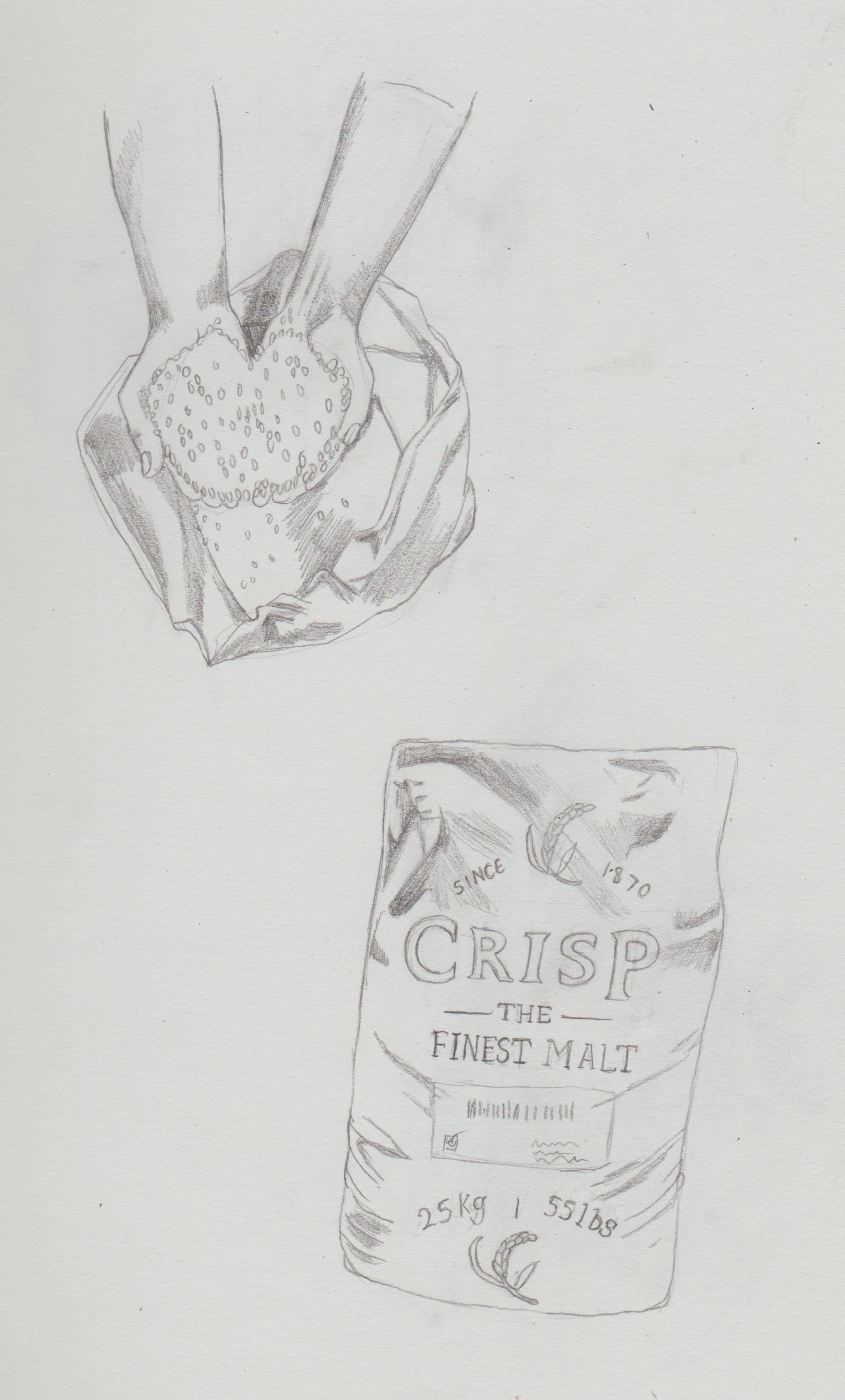.jpg) 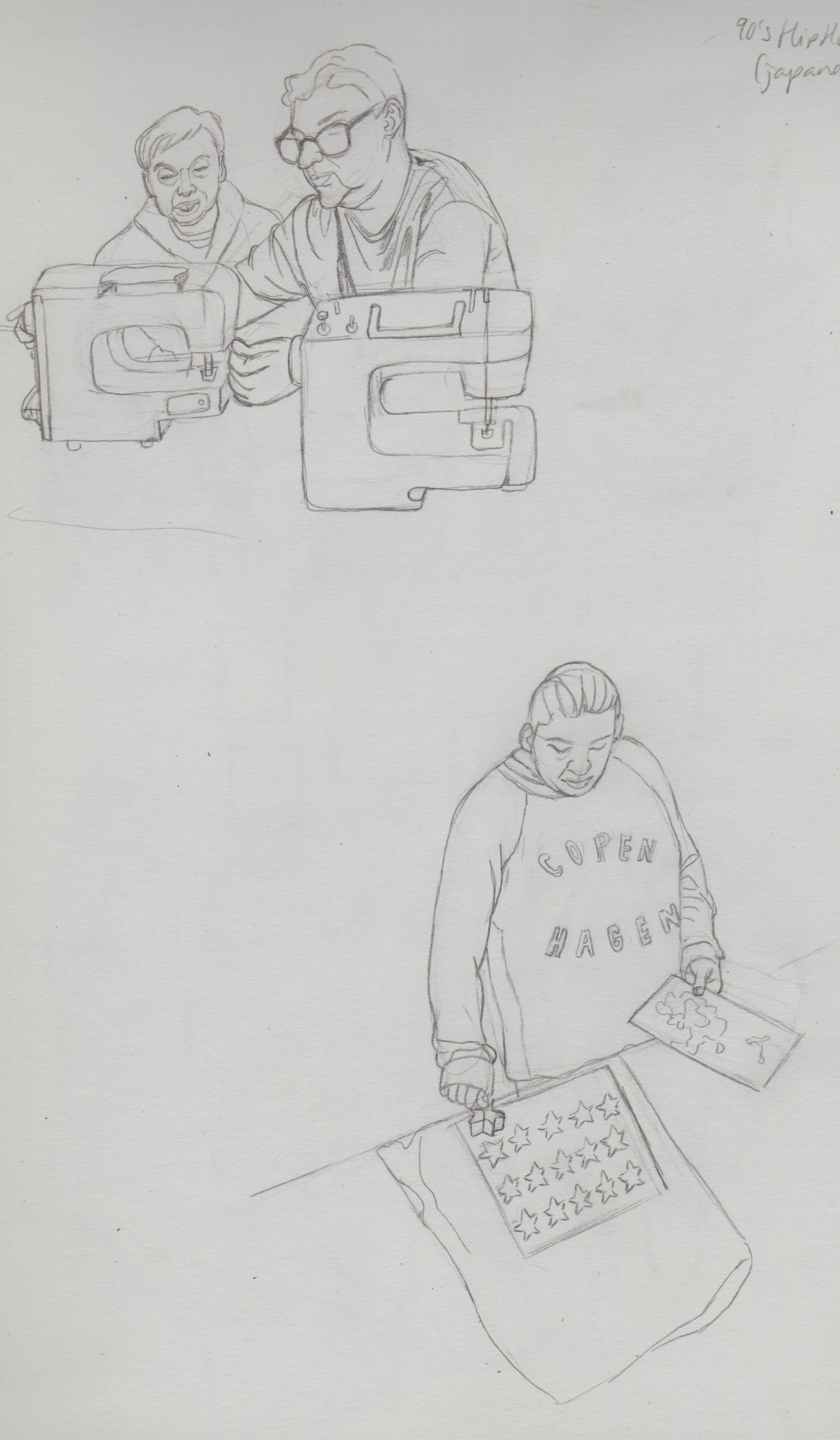.jpg) 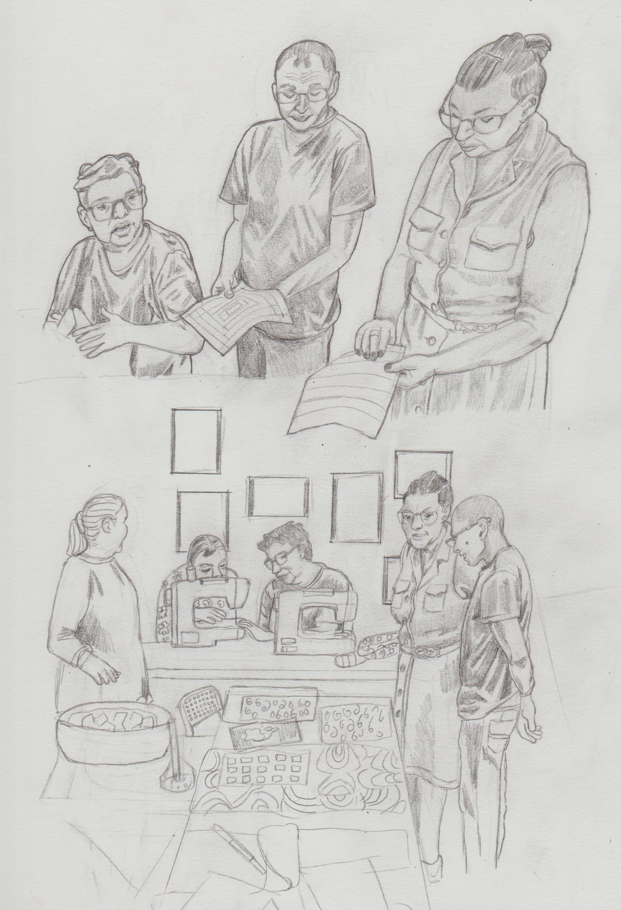.jpg) .jpg) .jpg) 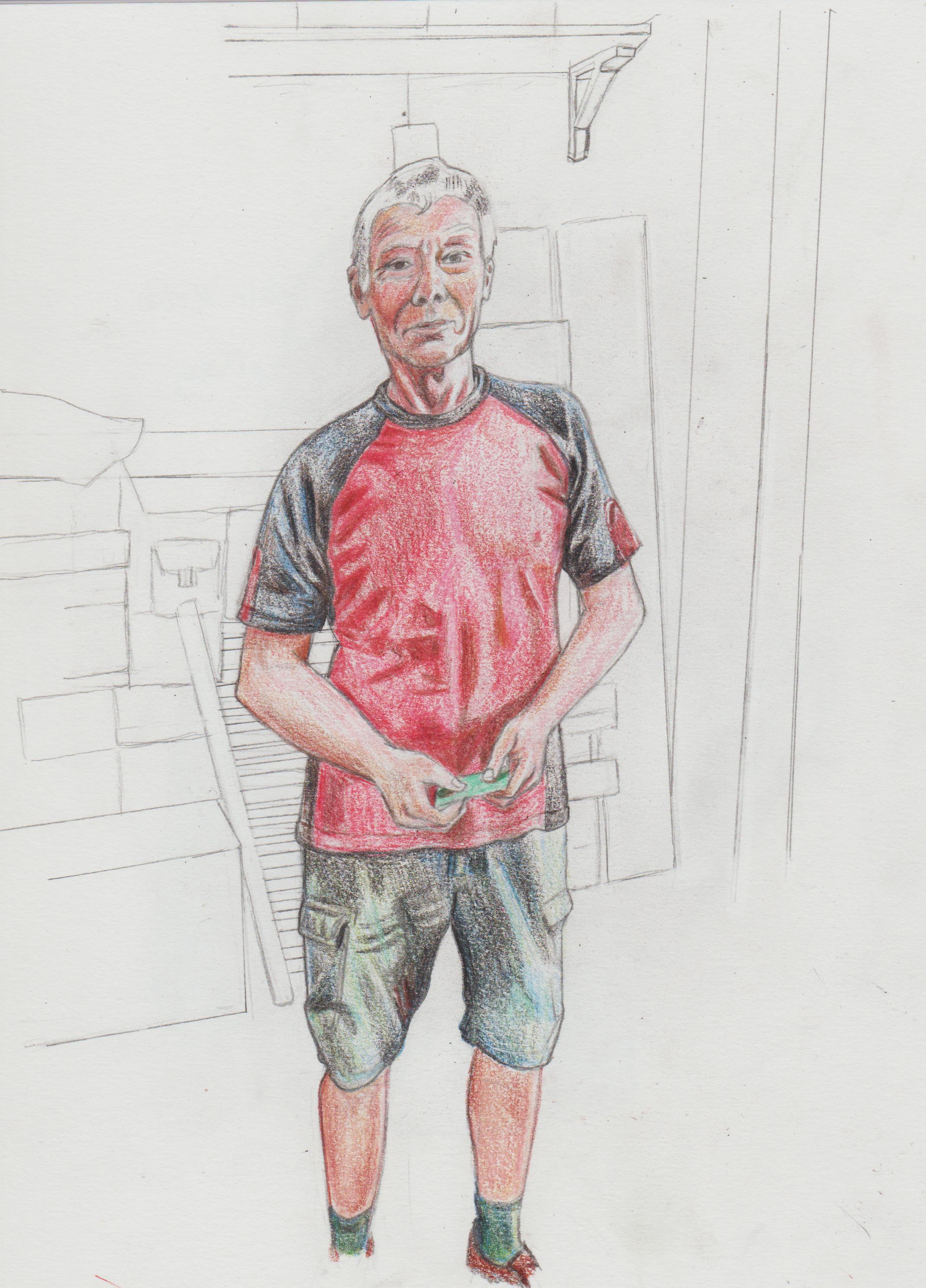.jpg) 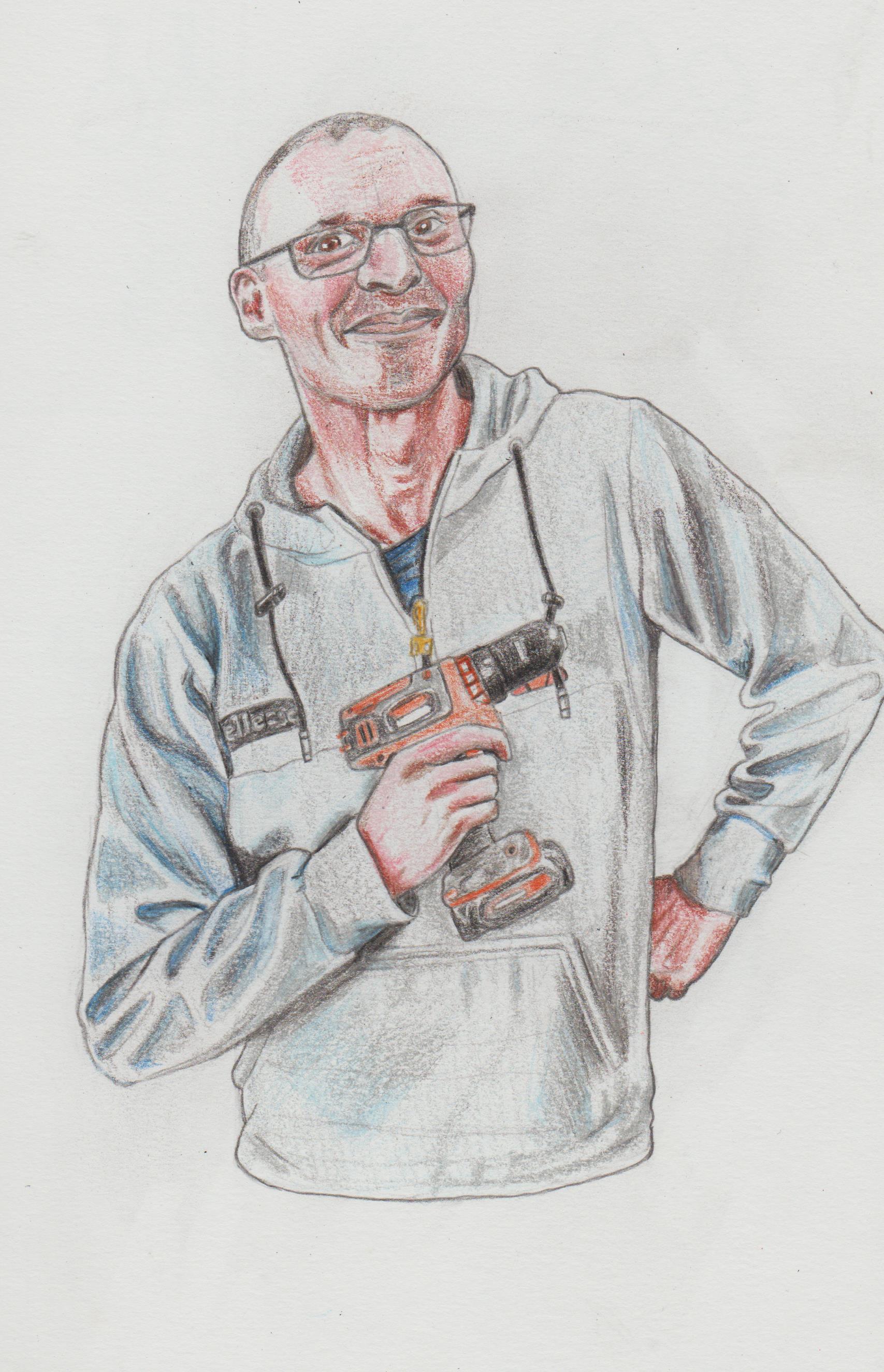.jpg) .jpg) .jpg) .jpg) .jpg) .jpg) 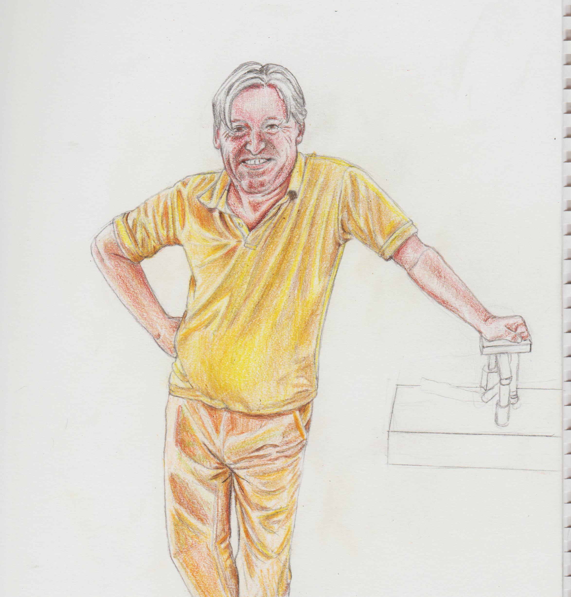.jpg) Girl I drew from uni. 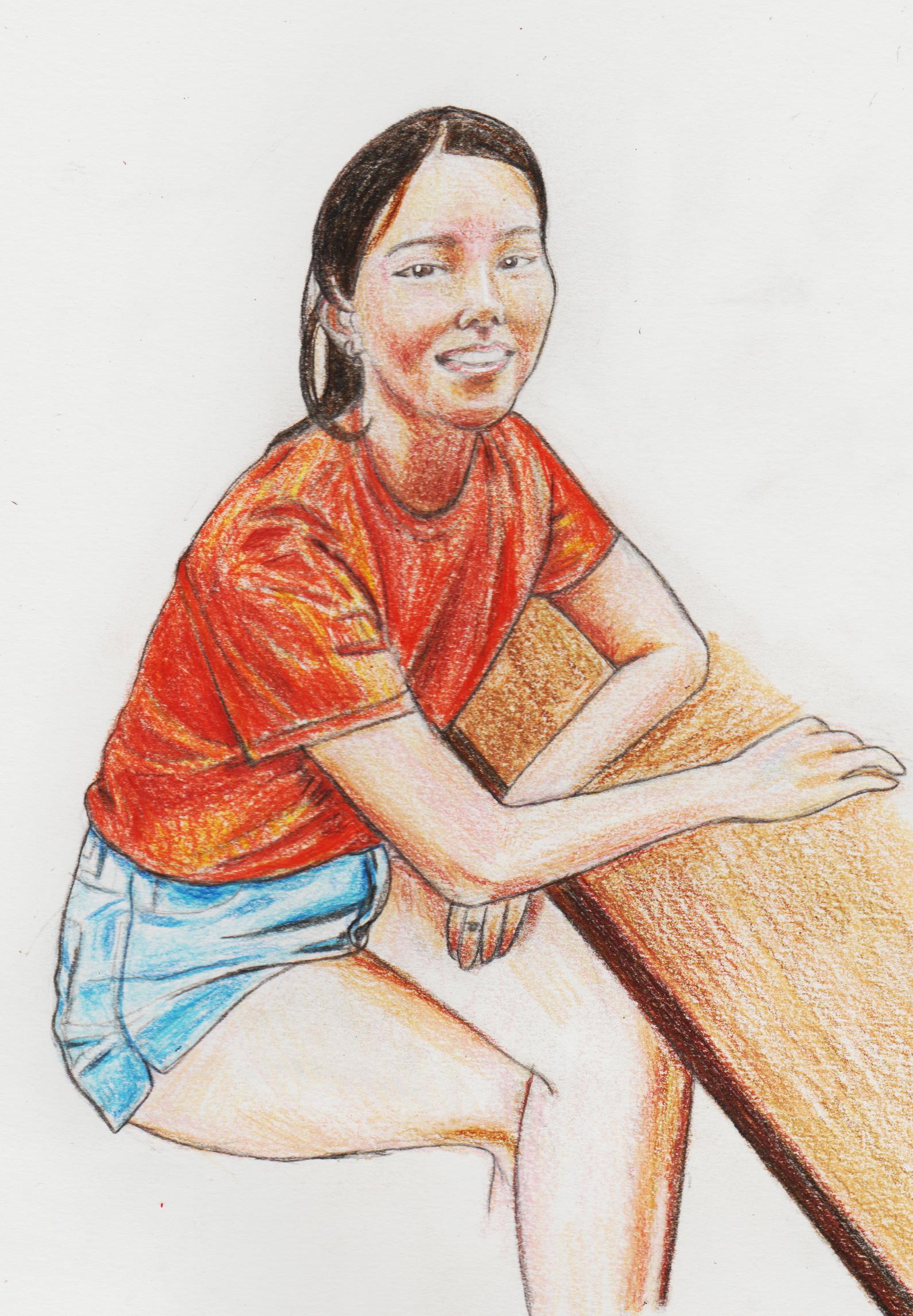.jpg)
01-01-2023, 10:03 AM
Some pencil drawings from a house party.
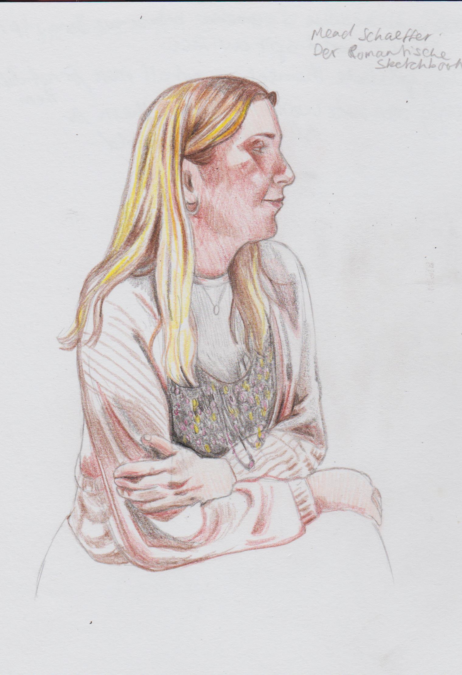.jpg) 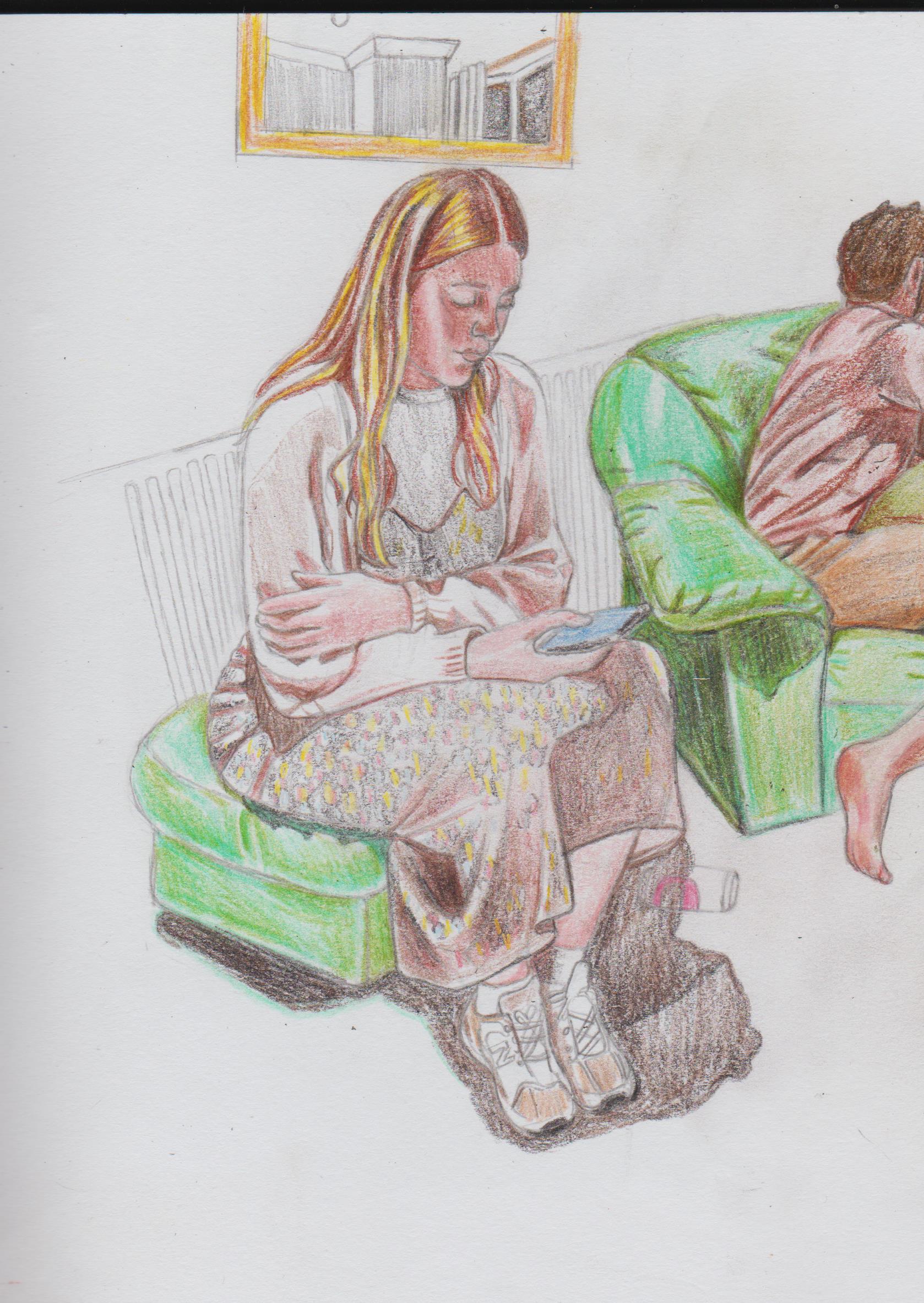.jpg) 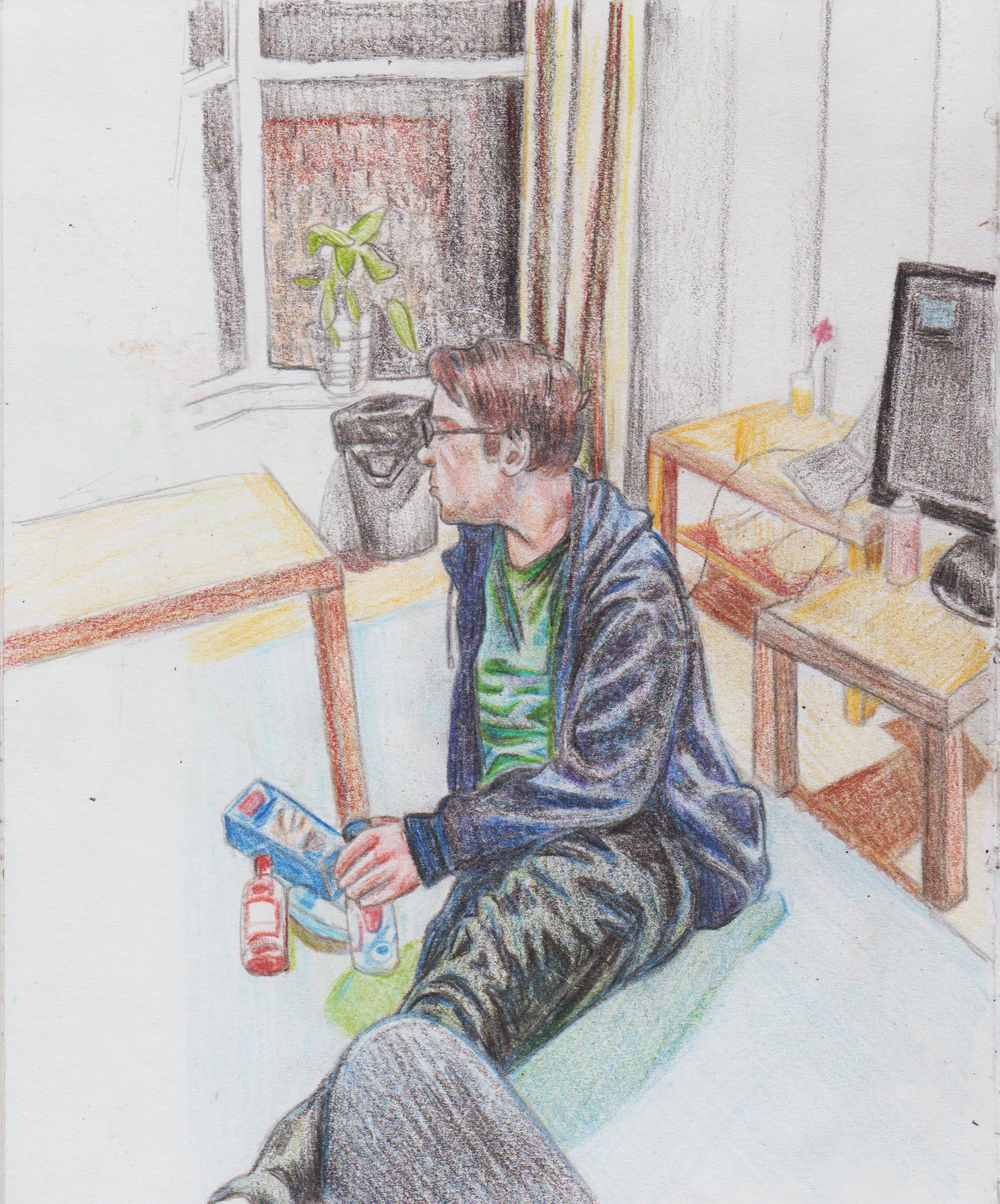.jpg) 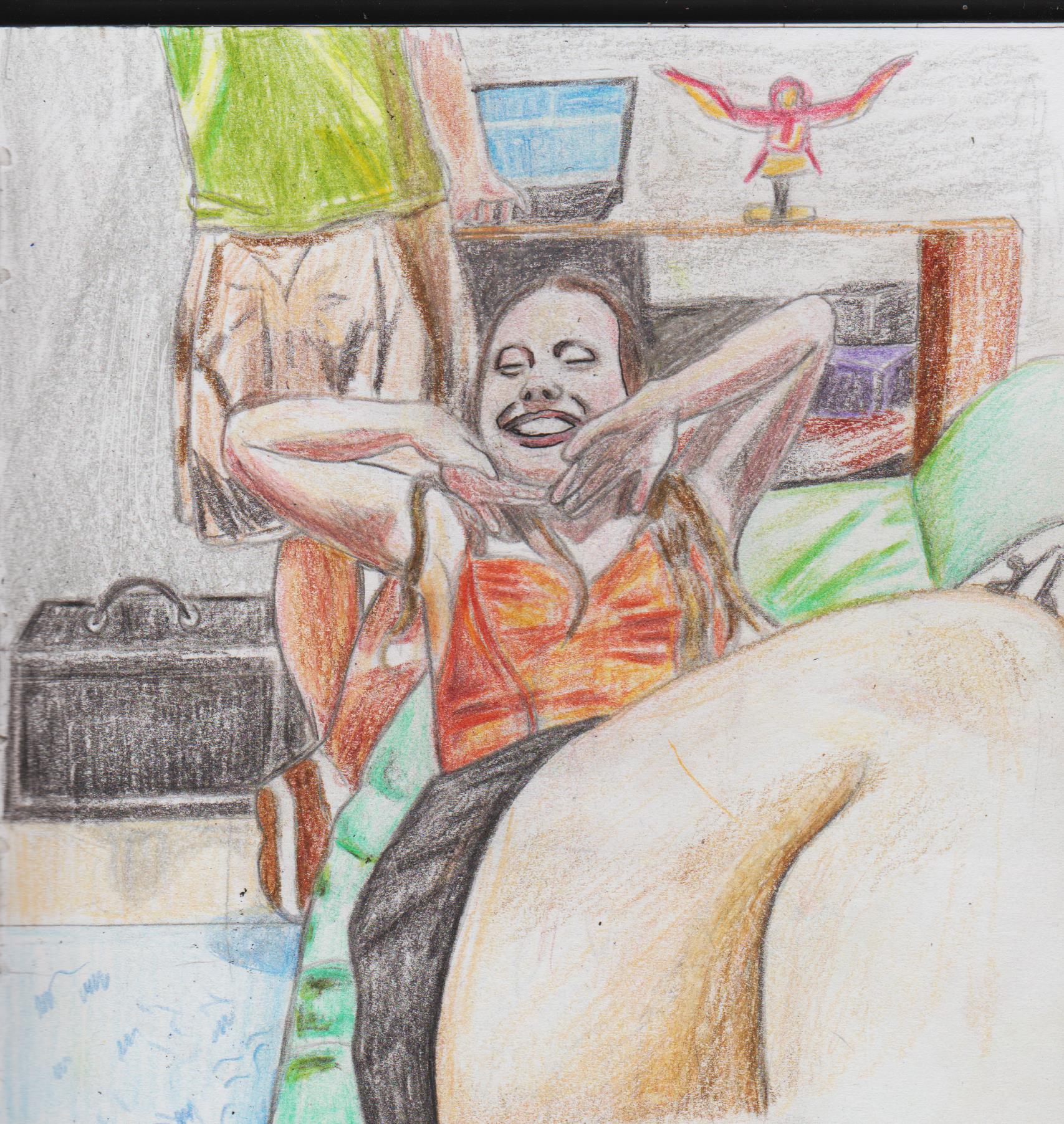.jpg) 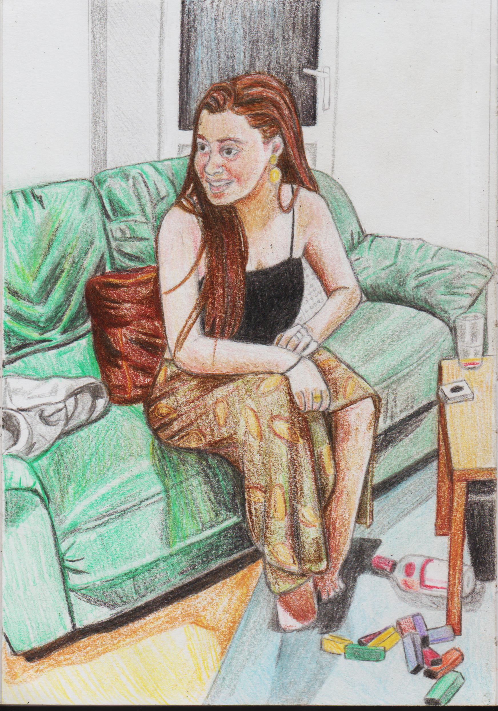.jpg) Same girl, and girls I met during the the Women's World Cup. 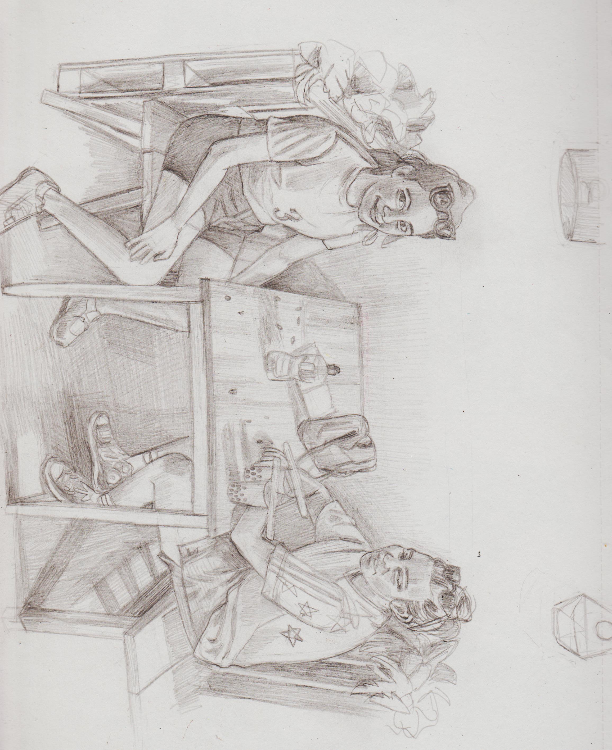.jpg) 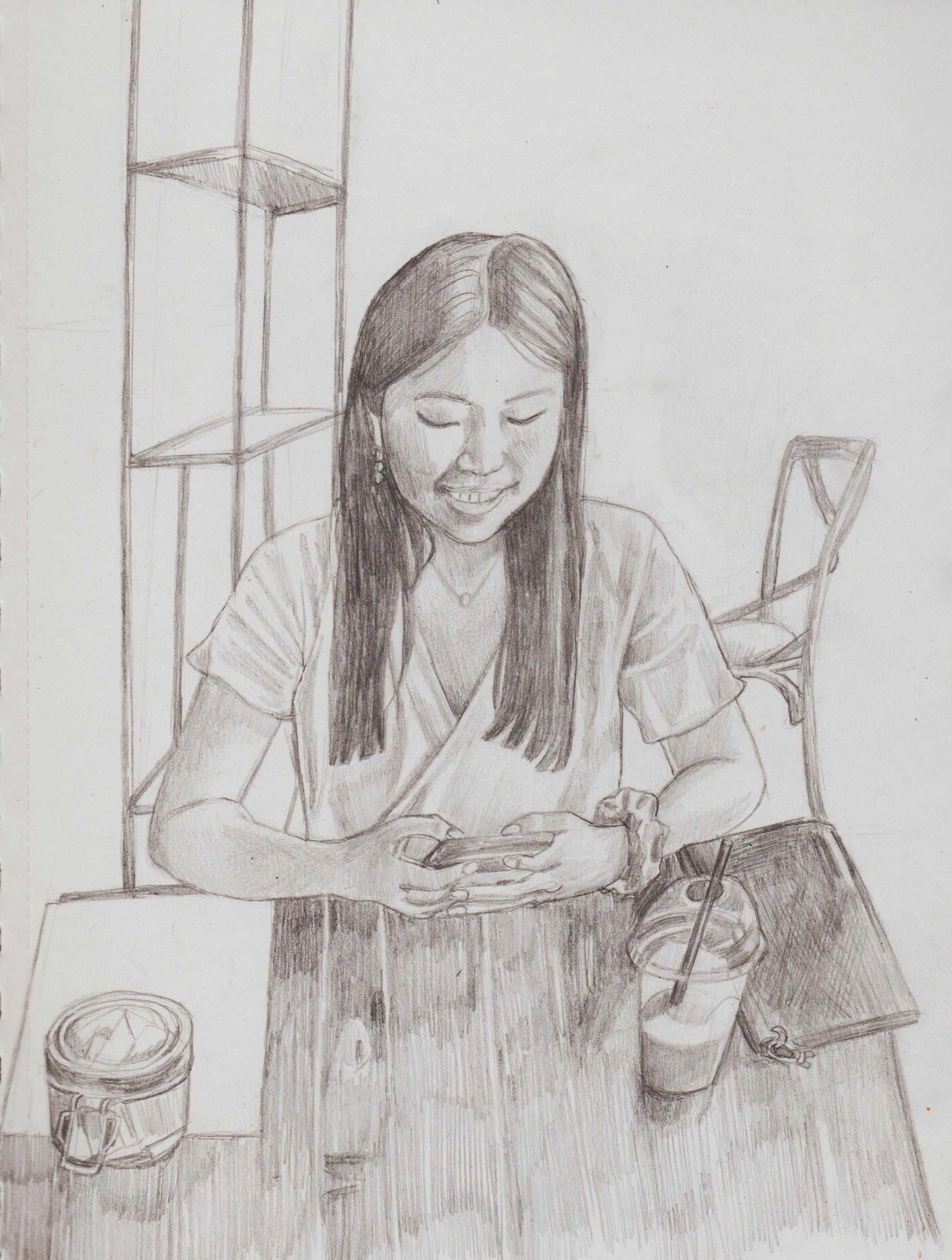.jpg)
01-01-2023, 07:09 PM
Colored pencil damn that a thing i didn't seen around her for such a long time thank you for that and happy new years.
01-02-2023, 04:04 AM
(01-01-2023, 07:09 PM)darktiste Wrote: Colored pencil damn that a thing i didn't see that around her for such a long time thank you for that and happy new years. Hi Darktiste, figured I'm try and grasp coloured pencil was because I wanna make my work look more finished, and I met a guy doing portfolio reviews that most clients would want illustrators that can produce coloured works and artists just getting commissioned doing monotoned Black and White work is rare (think his phrasing was more pointed than that). Then I went to the talk on Crispin Finn, they use just a limited White, Red and Blue palette and saw Ink artists, so clearly not totally true. Trying to use gouache paints, but still don't know how to blend, knowing the technique to use the right about of water, so it's not too dry or too wet that it blots out the entire drawing nor do I know how to add details, but I'm so used to using exclusively pencil, coloured pencil isn't that just of a jump compared to a wet medium. As part of my Linguistics degree in my last year I completed a module all around 'Constructed Languages' where I had to explaining the morphosyntax and pragmatic features of my Conlang. The Conlang has a case system very similar to Russian and Czech. The aliens are called 'Thealeí' or the Thea people. I designed them, then created a comicbook around a dialogue. Front and side profile and a Thea warrior and a Thea youth. 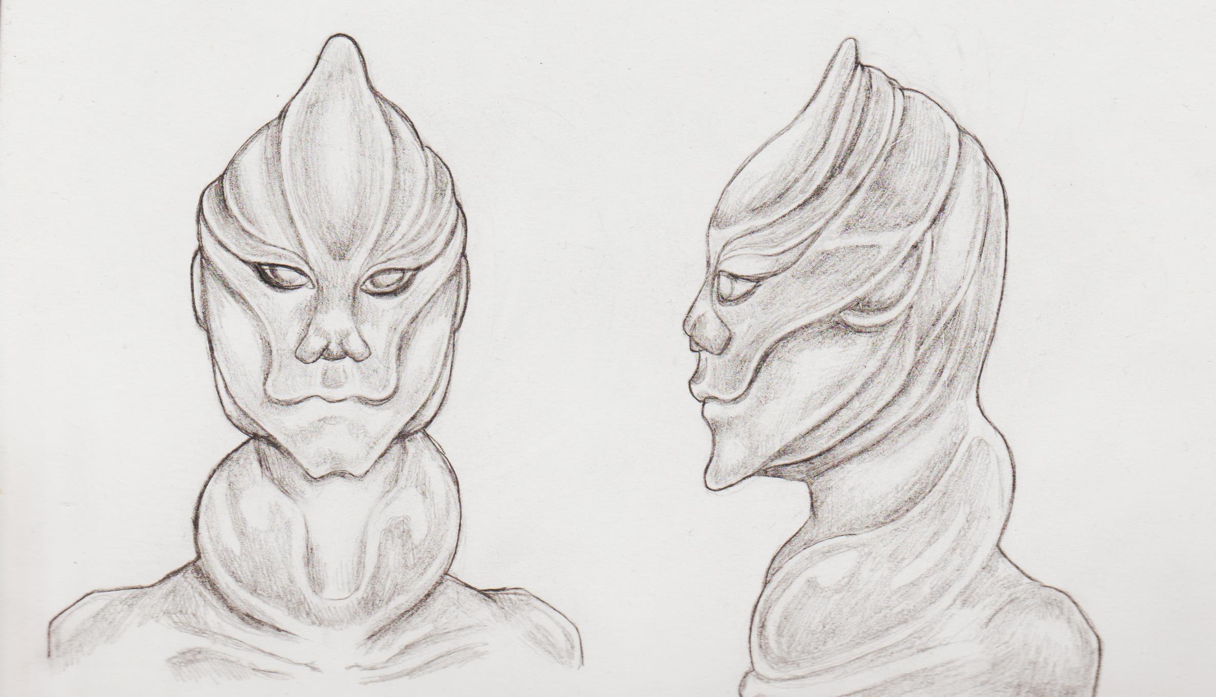.jpg) 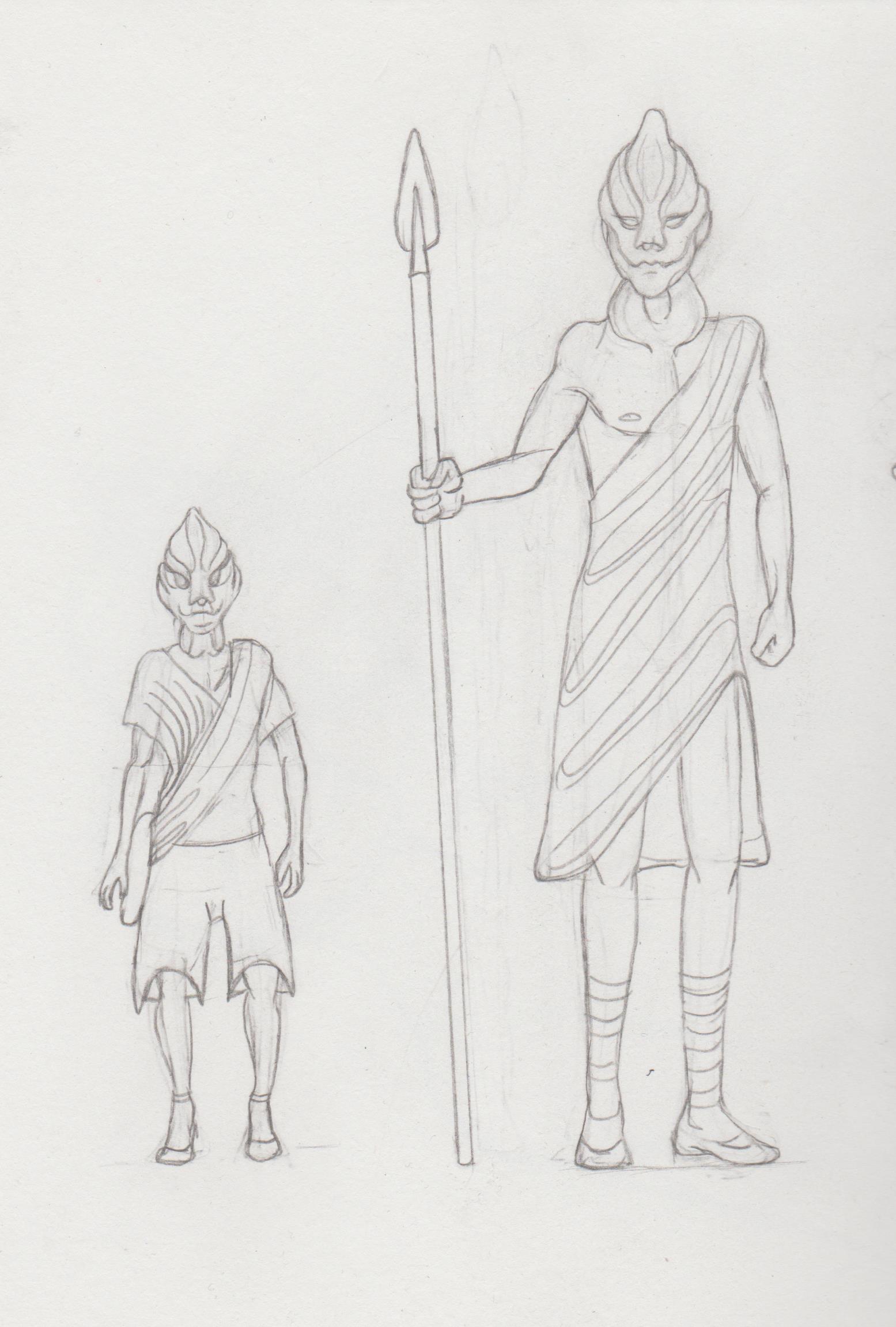.jpg) Here is the dialogue translation. Didn't include the gloss, in case people didn't understand. However, if you want to read it let me know. For context they are at a friend's wedding. Priests are very important in this water exulting culture. Maylek: Hello, how [are] you? Andrian: Hello, MayQi! Good! How are you? (Qi= honorific) *folds arms and rubs them together* Andrian: Just made a new boat and drying shells to add to the canopy. Maylek: And your family? Andrian: Mother just finished her tapestry and father retired... Maylek: And Jaboki? Andrian: Brat azhbezizal a azhstatsal phillo! Brother [Azh- a way to refer to the deceased] ran off and [Azh-]became a fool! Maylek: Azh? Is he dead? Andrian: He should well be. Maylek: He always was quite dry. [A culture focused on water/fluid including the anatomical feature in their necks. 'Kressie= Stupid'. Andrian: Erlas blempoli hebbal saugal. Het onk blaku–Ah VarQi! The problems he has caused. It's bullshi-- Ah! VarQi! I mean Priest Varka Luke (Priest honorific) How are you ma? (Ma= politeness particle) Fairgaly. (Pronominal expression) *both bow their heads* *Varka blows a small circle around their heads* Varka: Ha Ha. very good. It's a beautiful day for a wedding. Maylek: It's good to see you. Ah. You always loved to collect shells for the Priest. Varka: Please, it is just me. Speak informally. The last two panels should be swapped, according to the script. That's why they is an invert arrow between them. 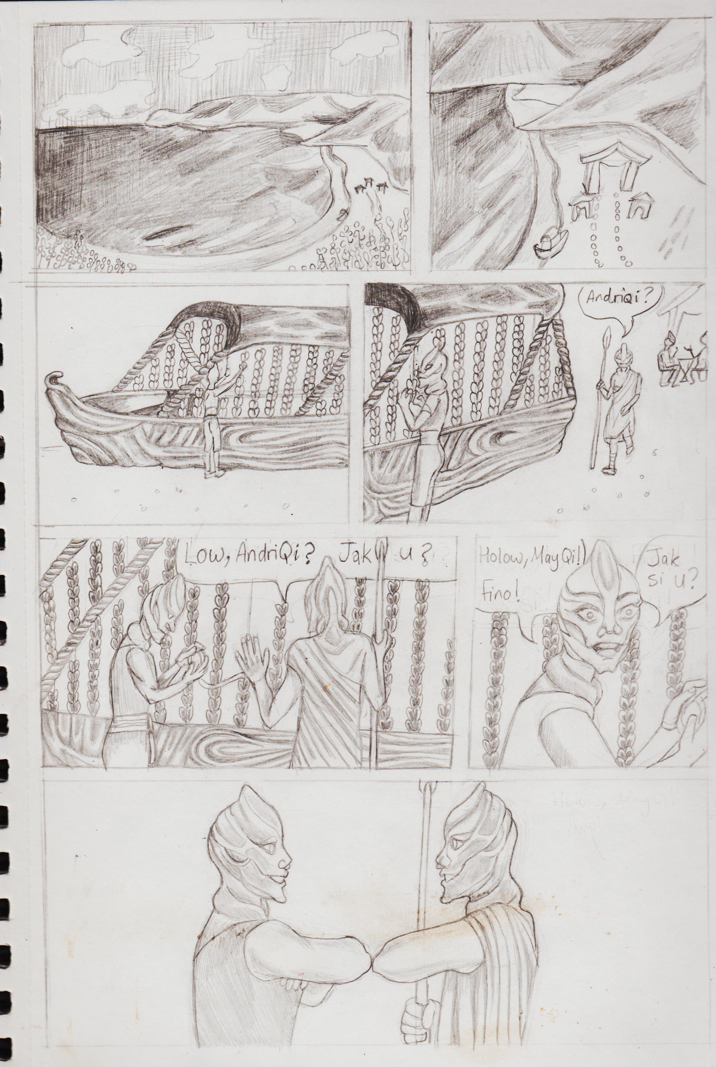.jpg) 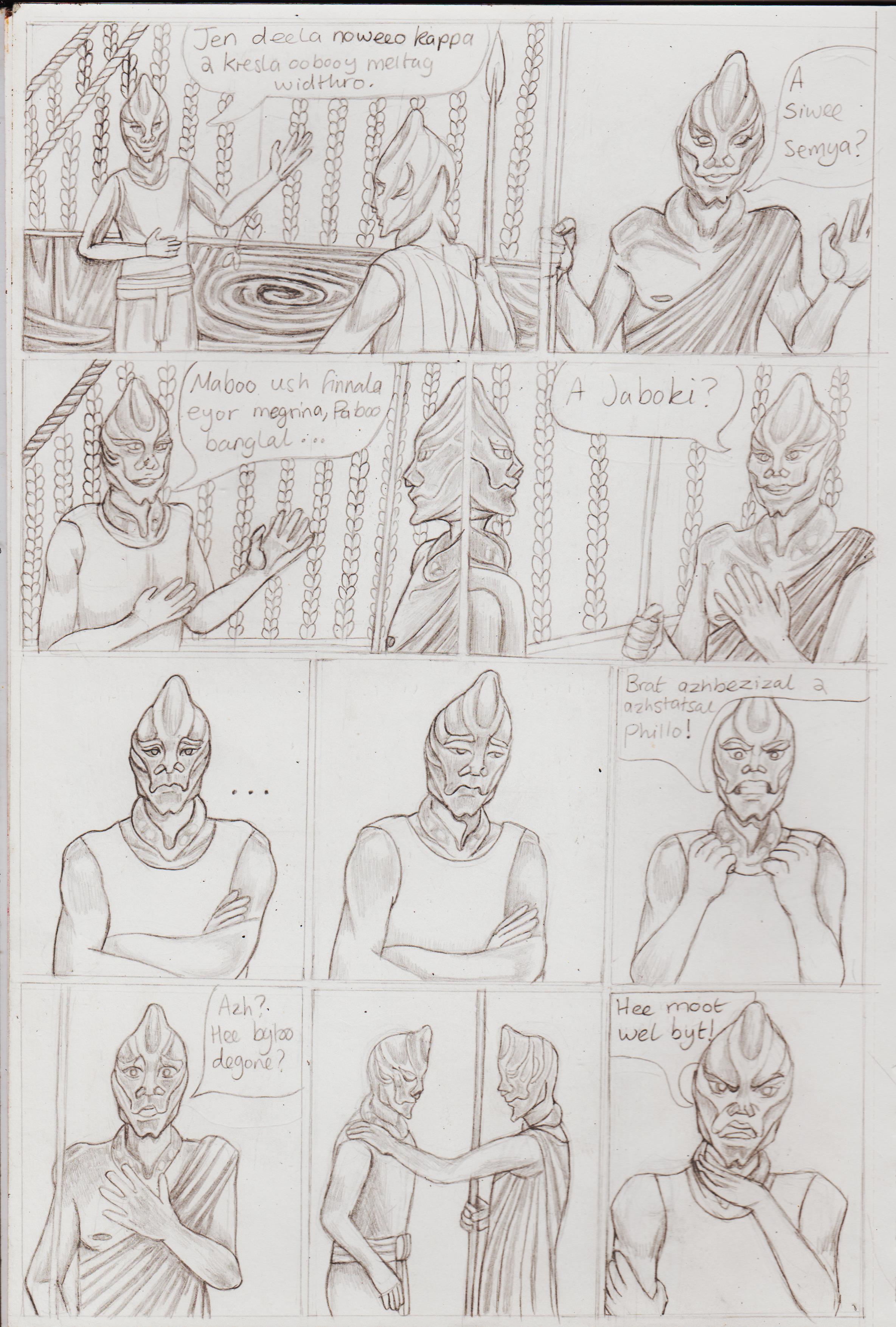.jpg) 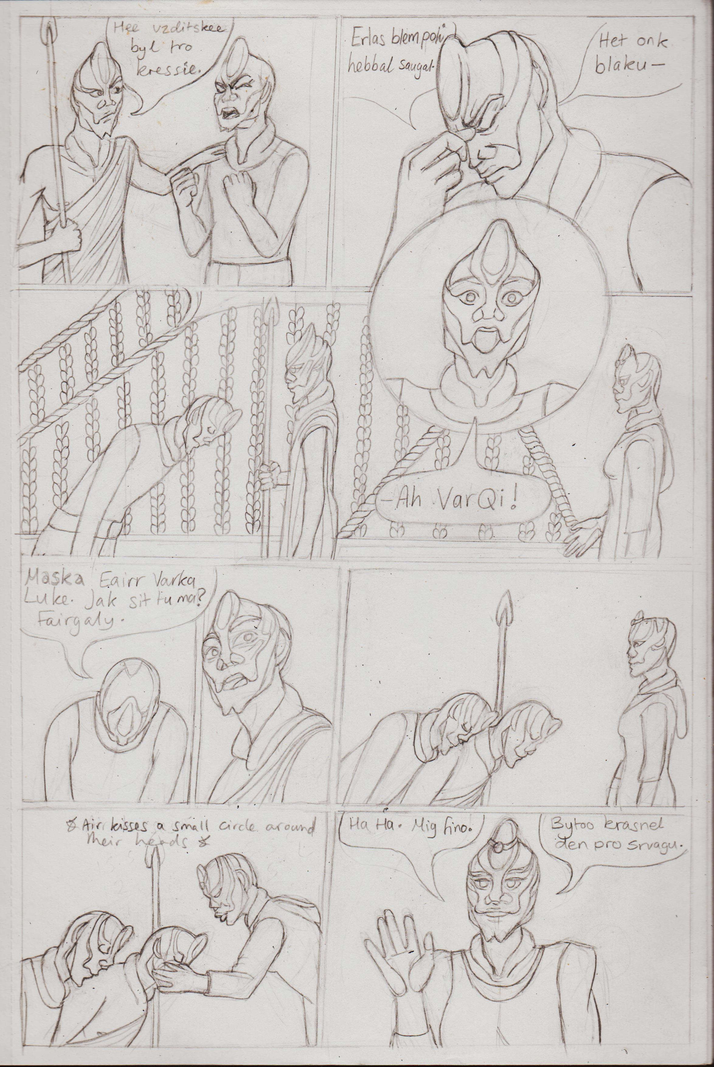.jpg) 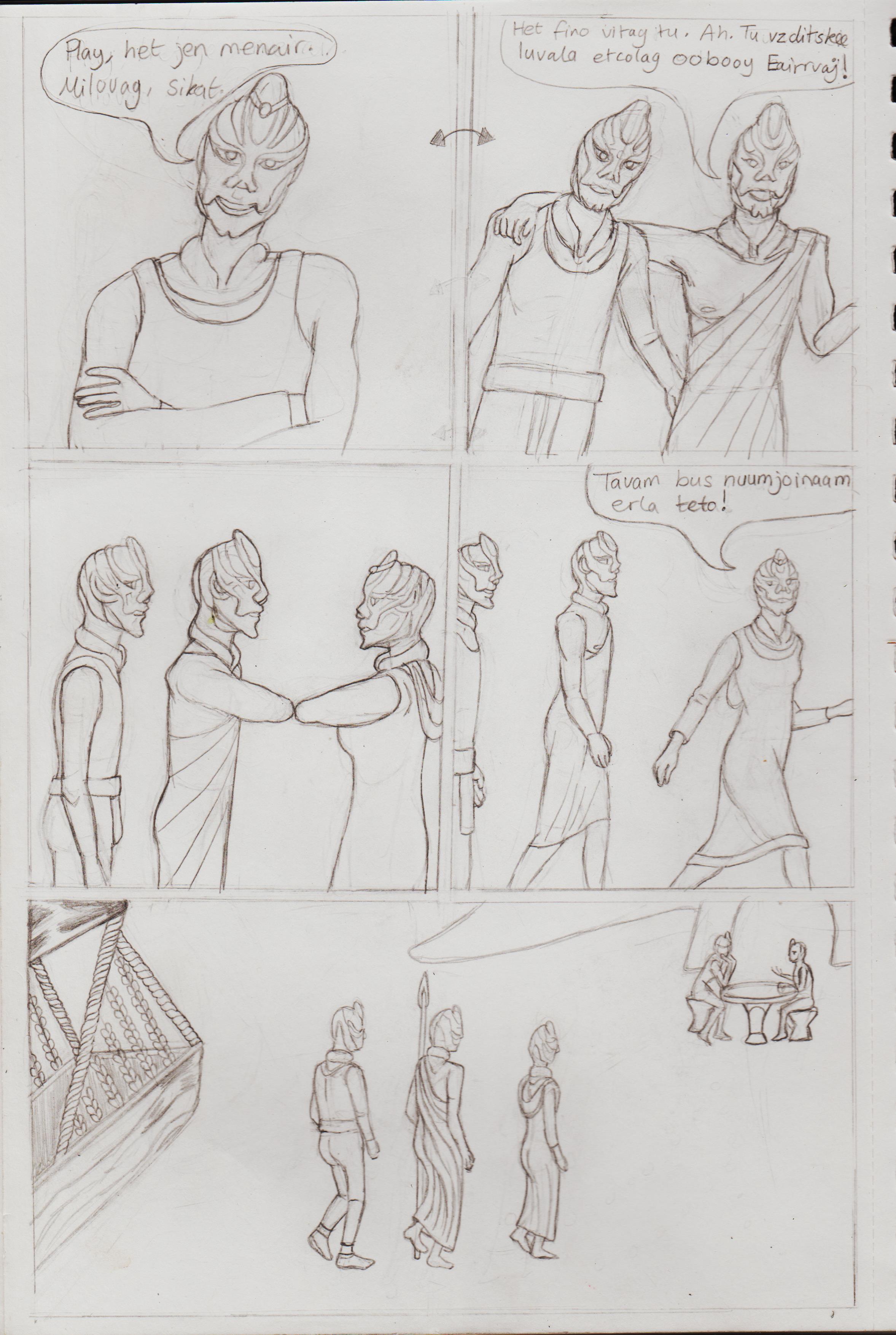.jpg) More individualisation of the three characters. Bottom drawing faces at different angles is very hard for me to grasp. They still look incredibly flat. 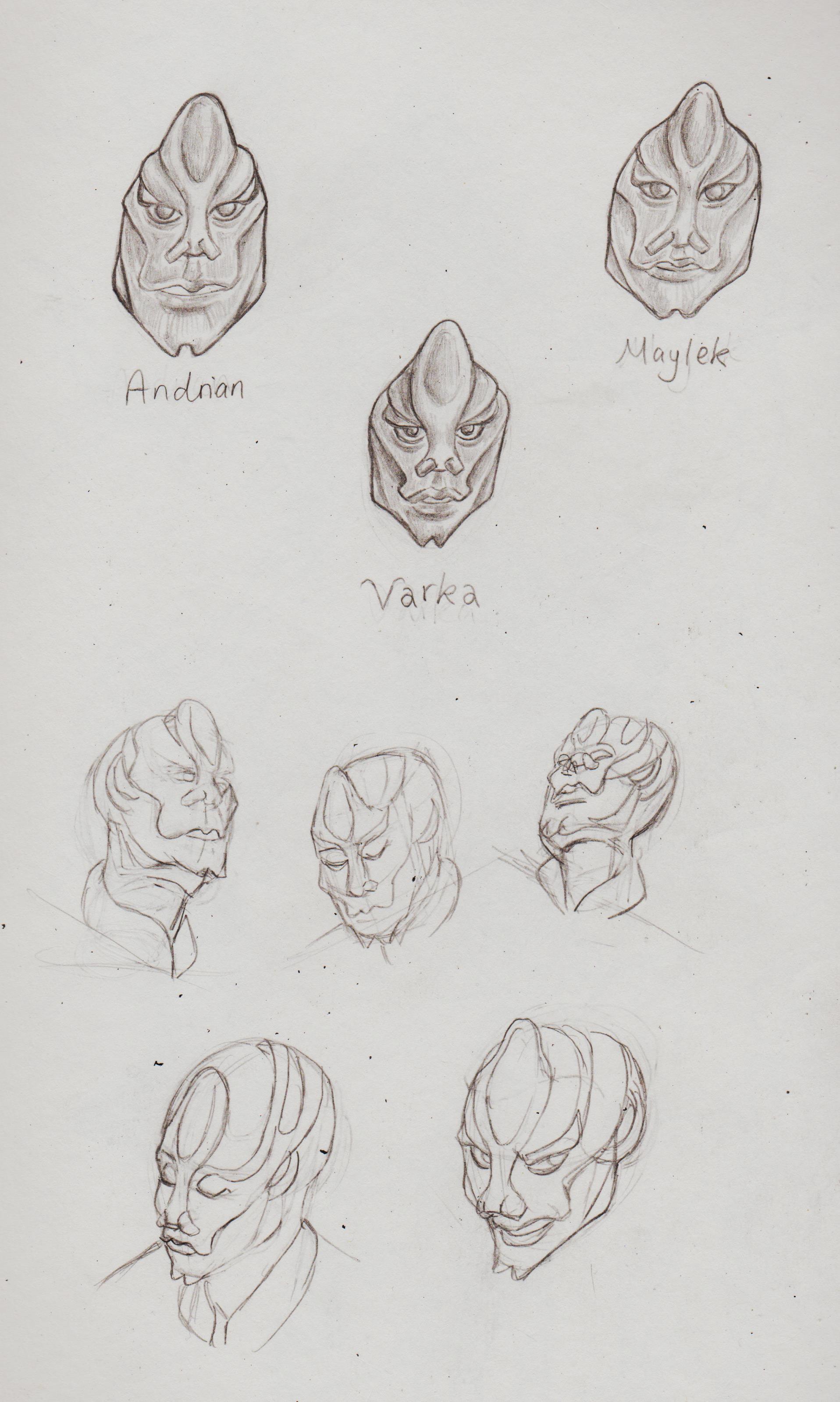.jpg)
01-03-2023, 12:50 AM
Nice work here! I really dig the designs for your alien like characters of your recent post. I would focus a bit more on construction and gesture at this stage of your development. Keep it up!
01-03-2023, 05:31 AM
(01-03-2023, 12:50 AM)cgmythology Wrote: Nice work here! I really dig the designs for your alien like characters of your recent post. I would focus a bit more on construction and gesture at this stage of your development. Keep it up!Hi CG, thanks for the feedback. I've focused on construction and gesture for so long, I forgot about imaginative works. But, I'll keep it in mind, maybe now it will stick! Using references and applying. The Iron Fist was by imagination. 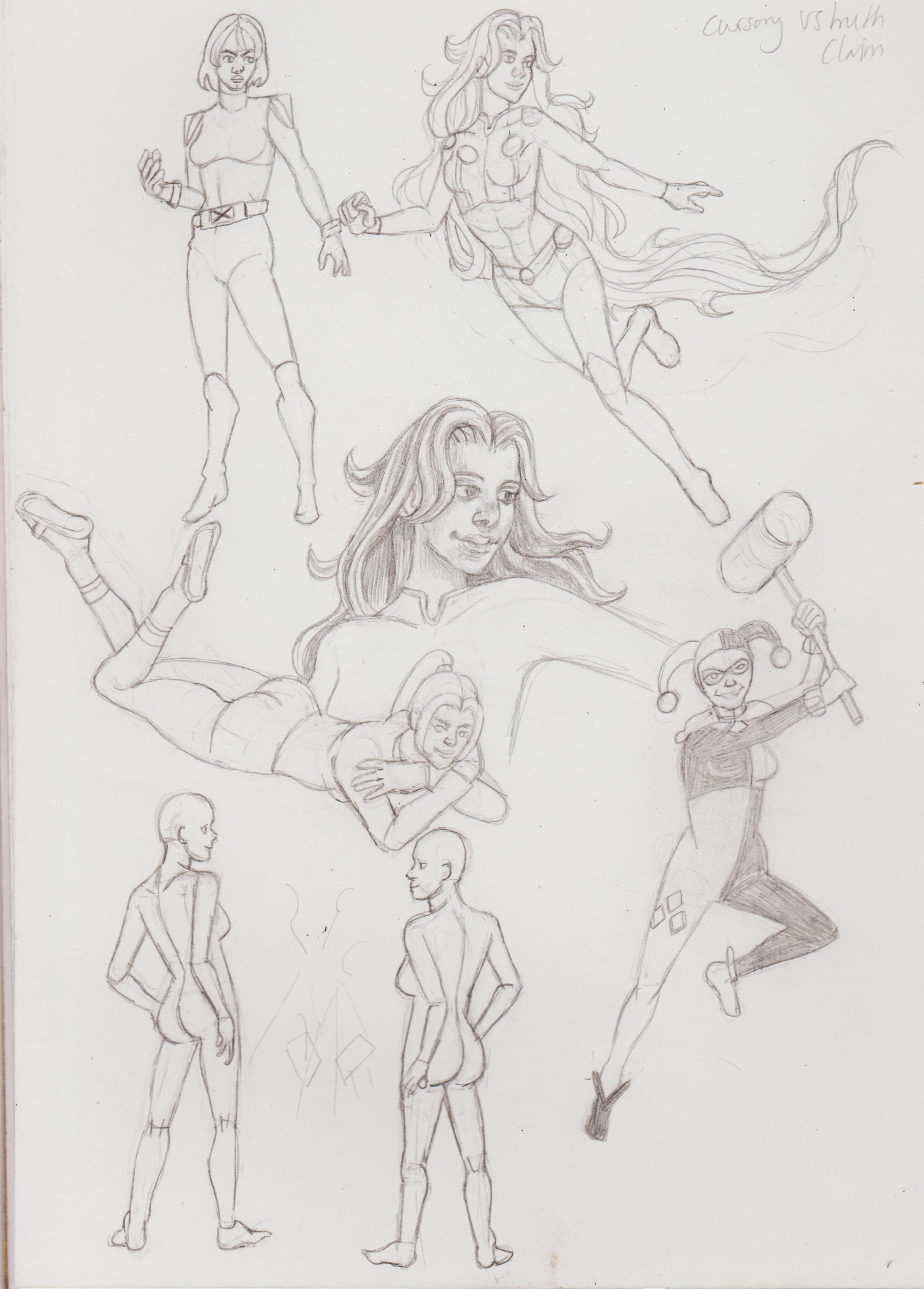.jpg) 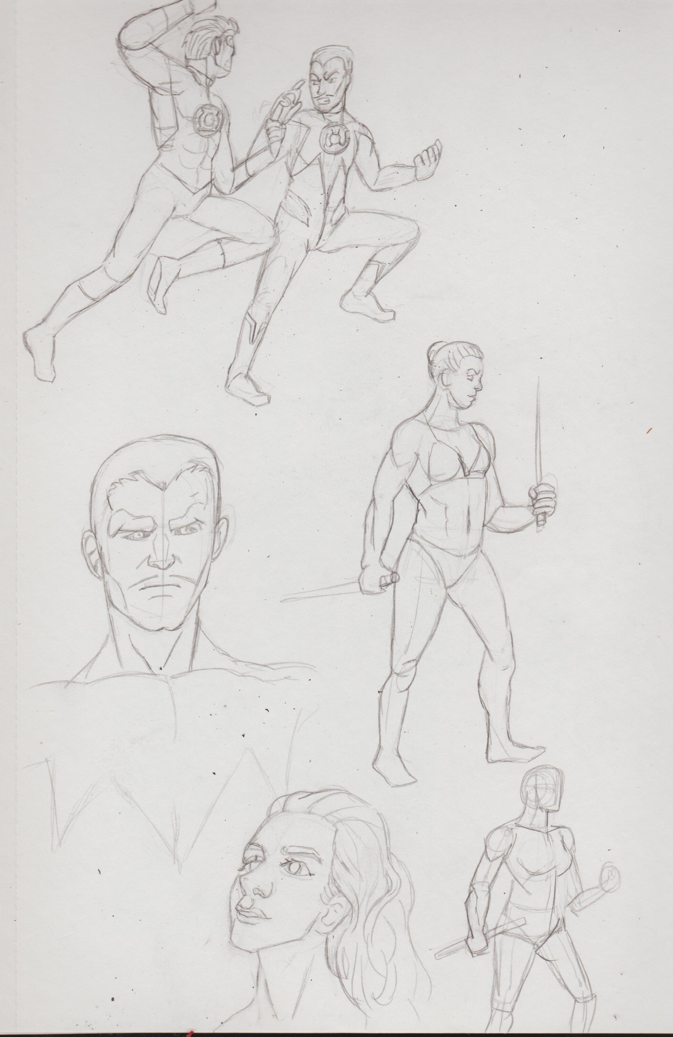.jpg) 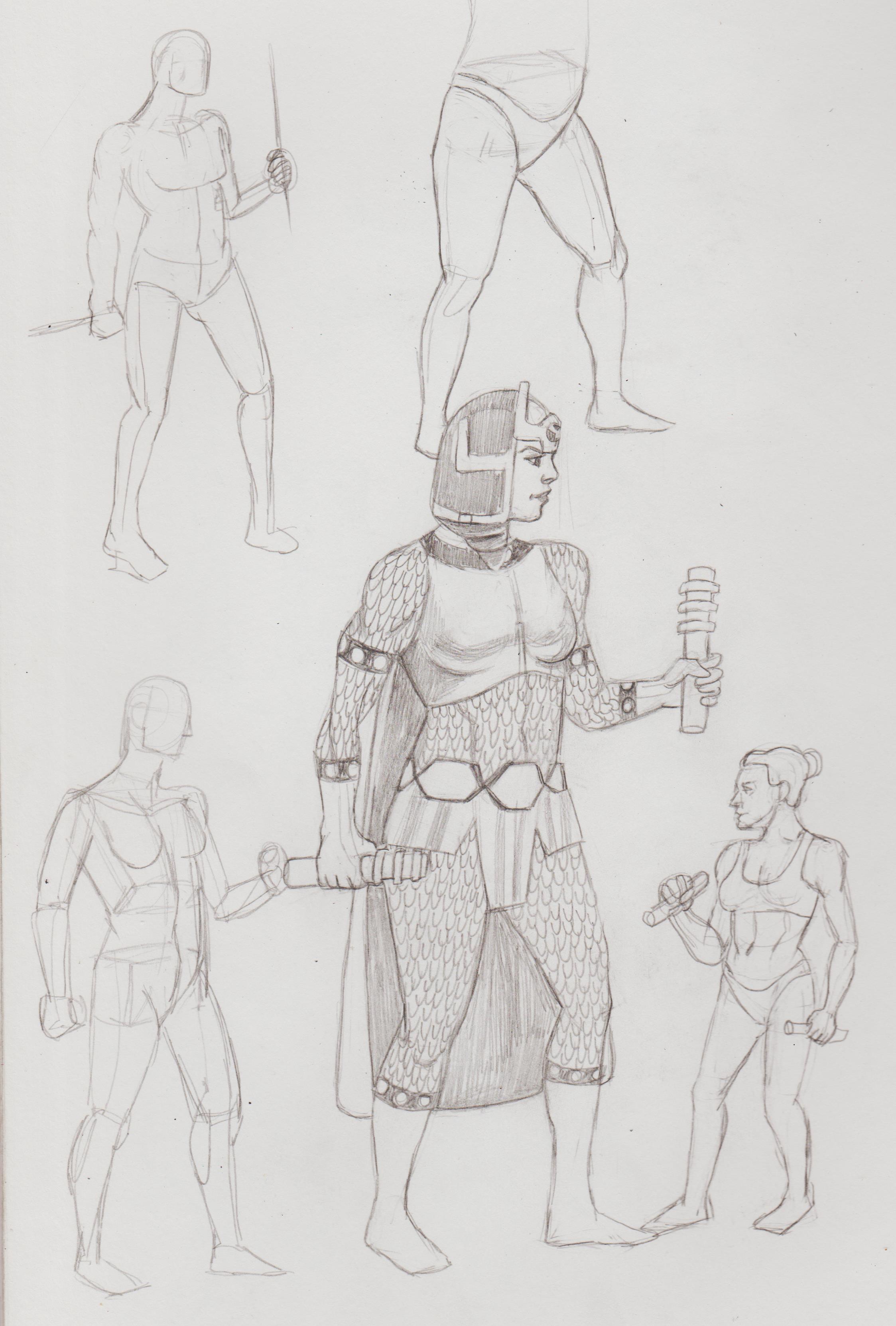.jpg) 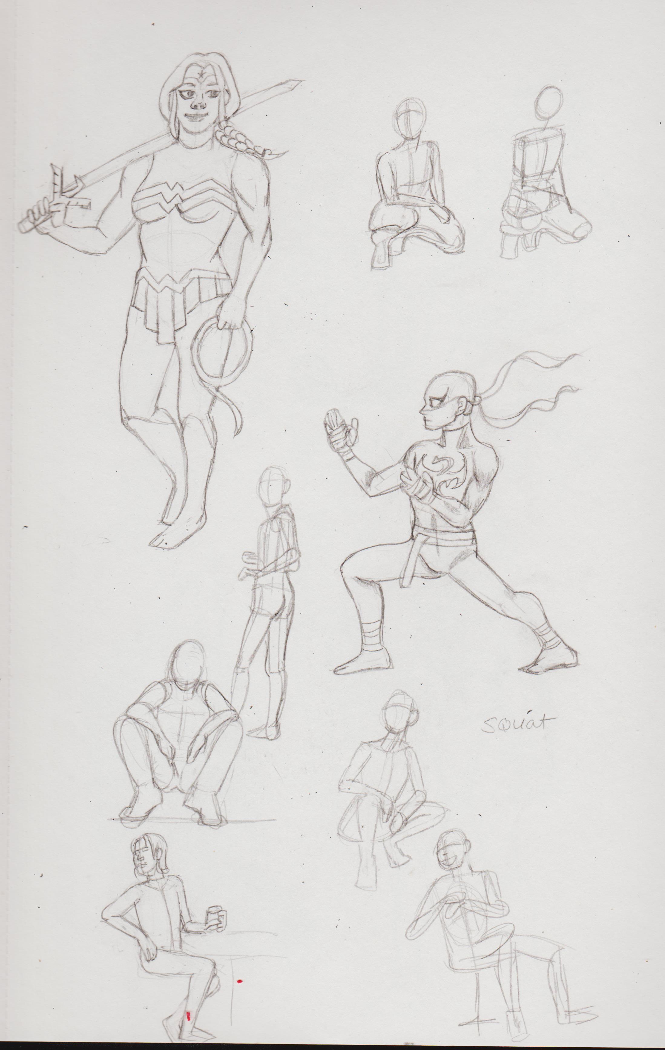.jpg) 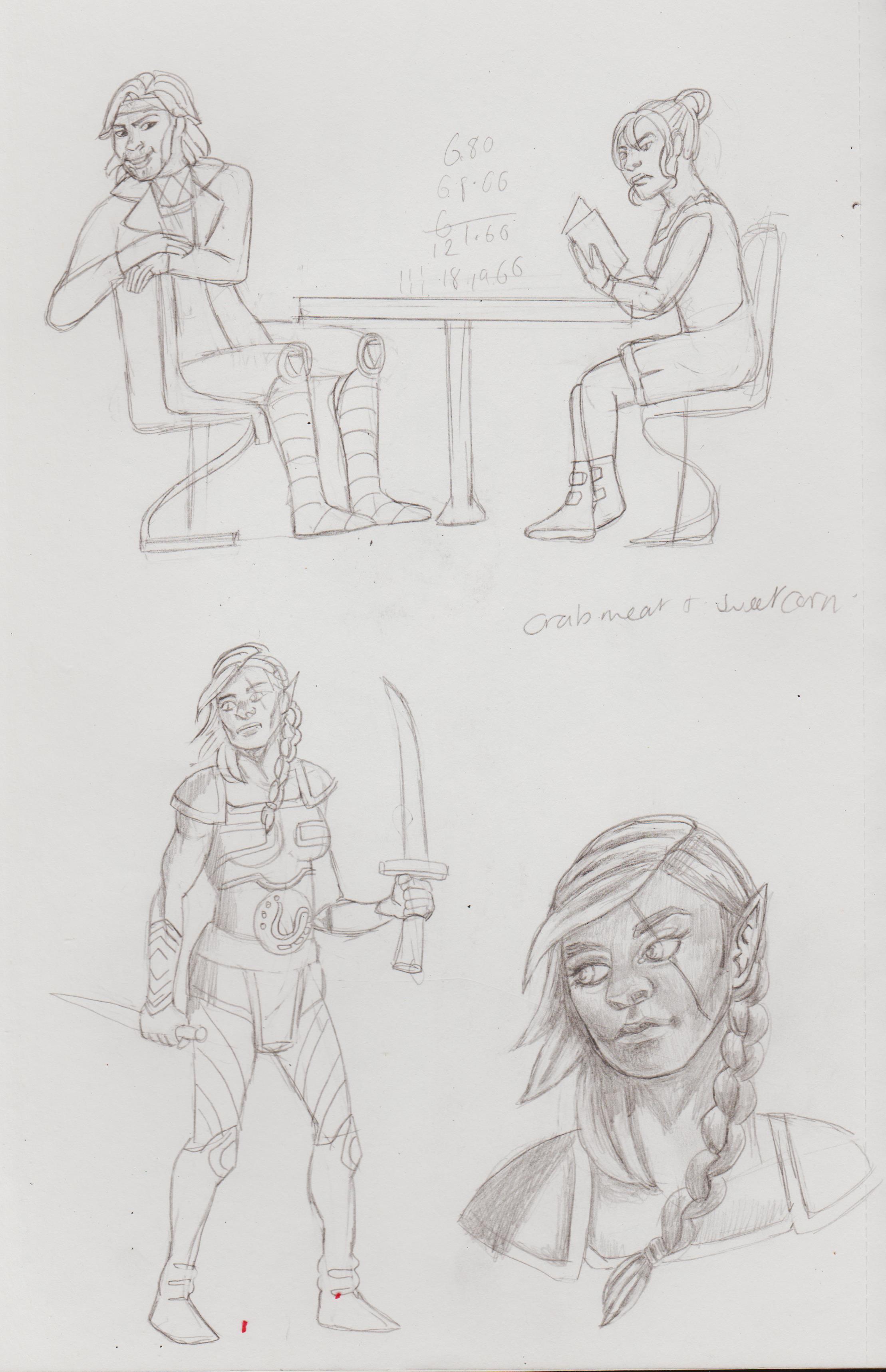.jpg) 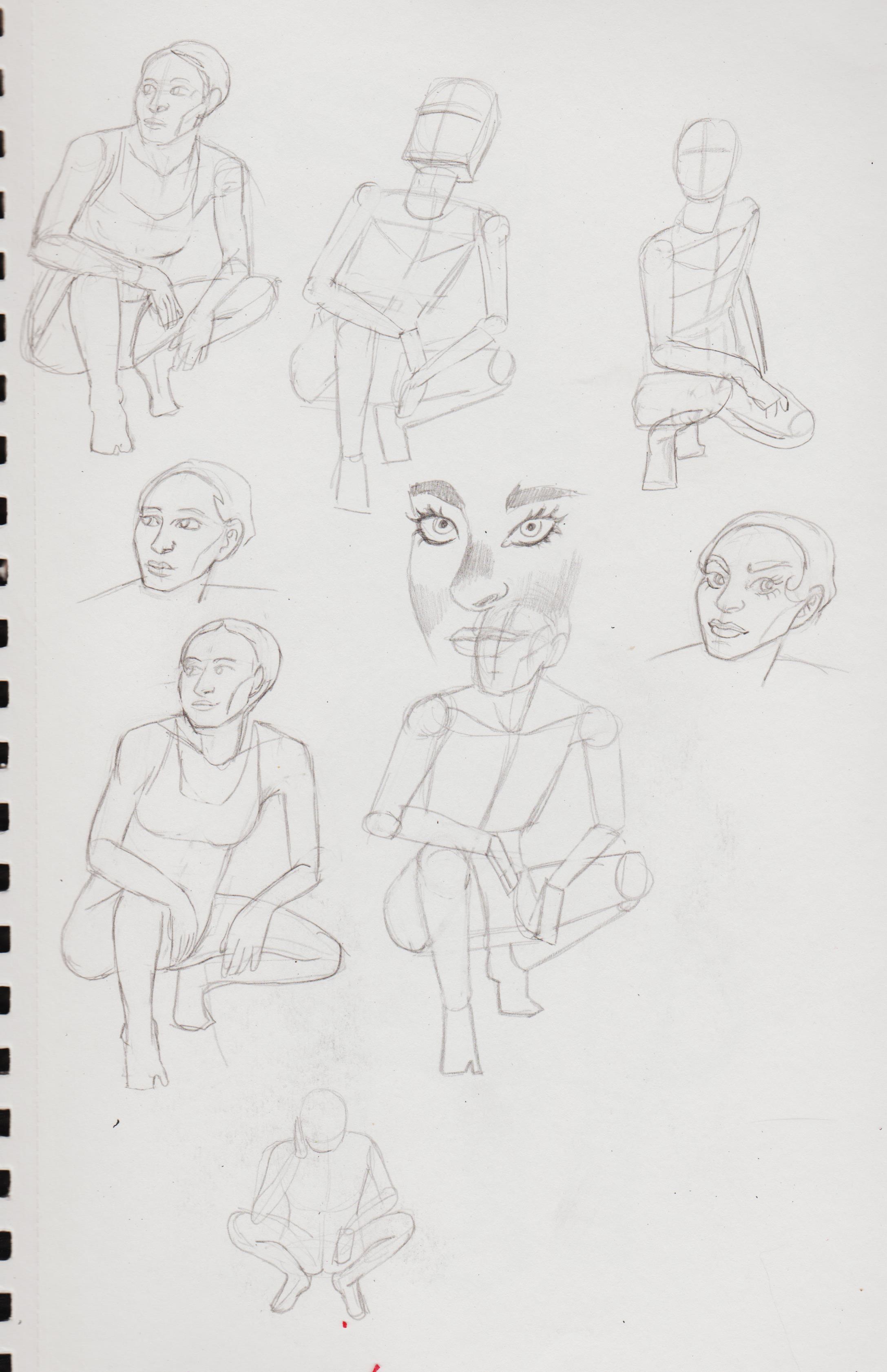.jpg) 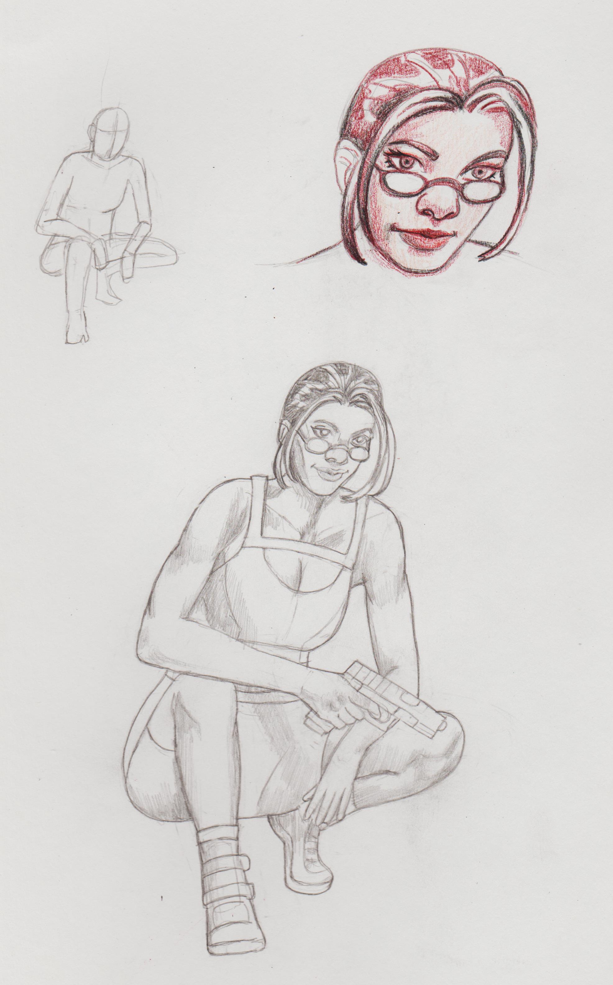.jpg) 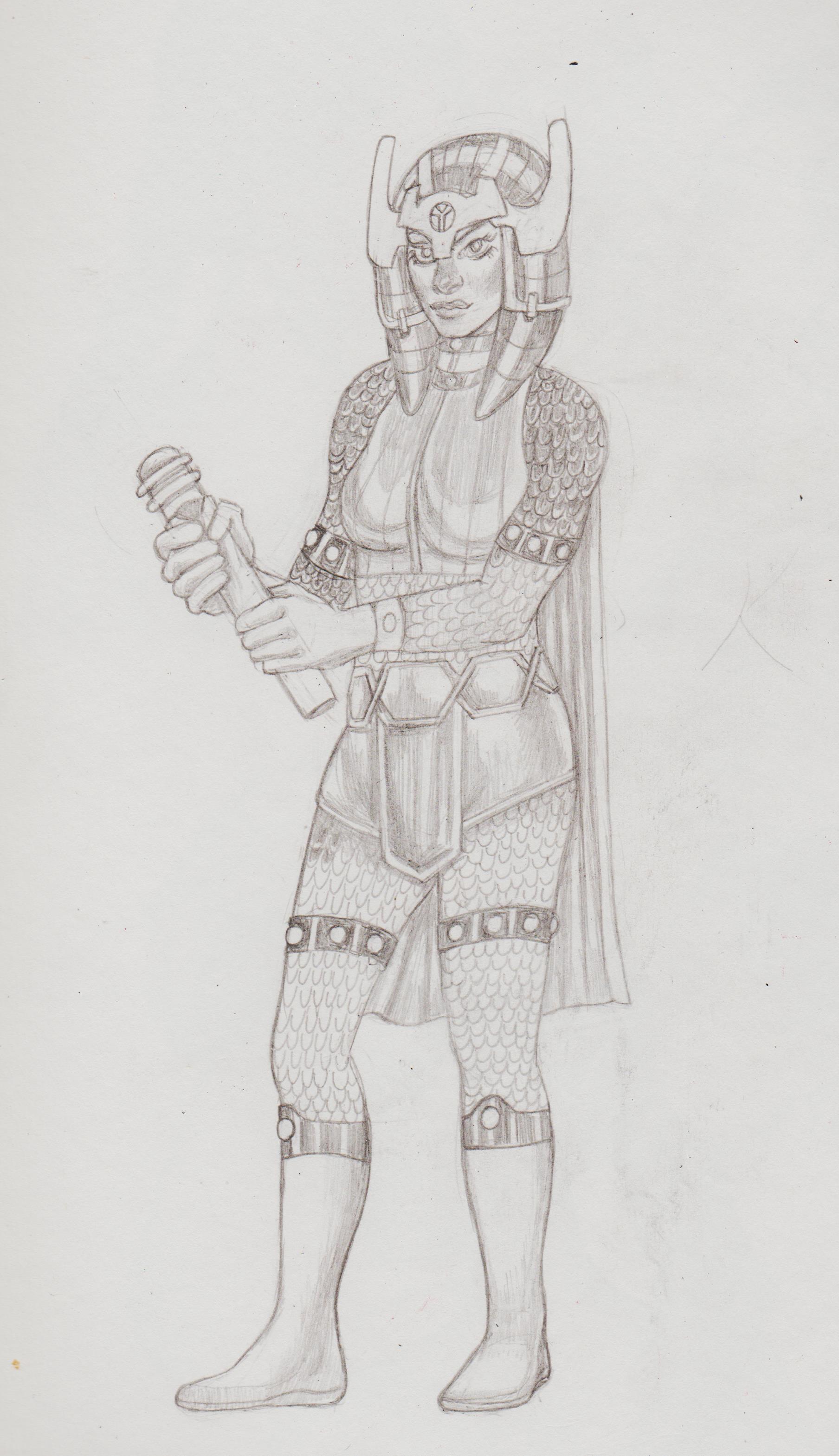.jpg) 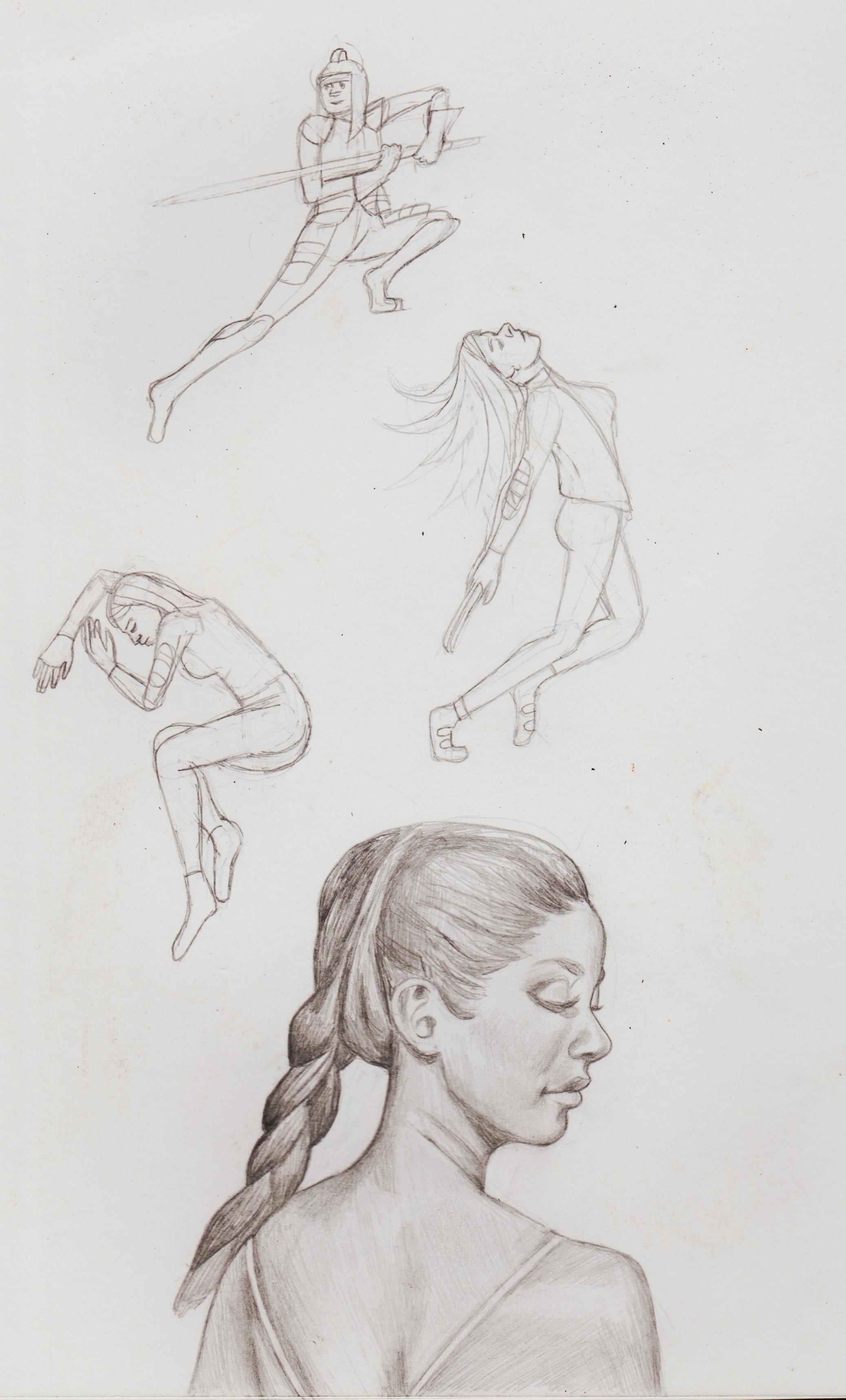.jpg) 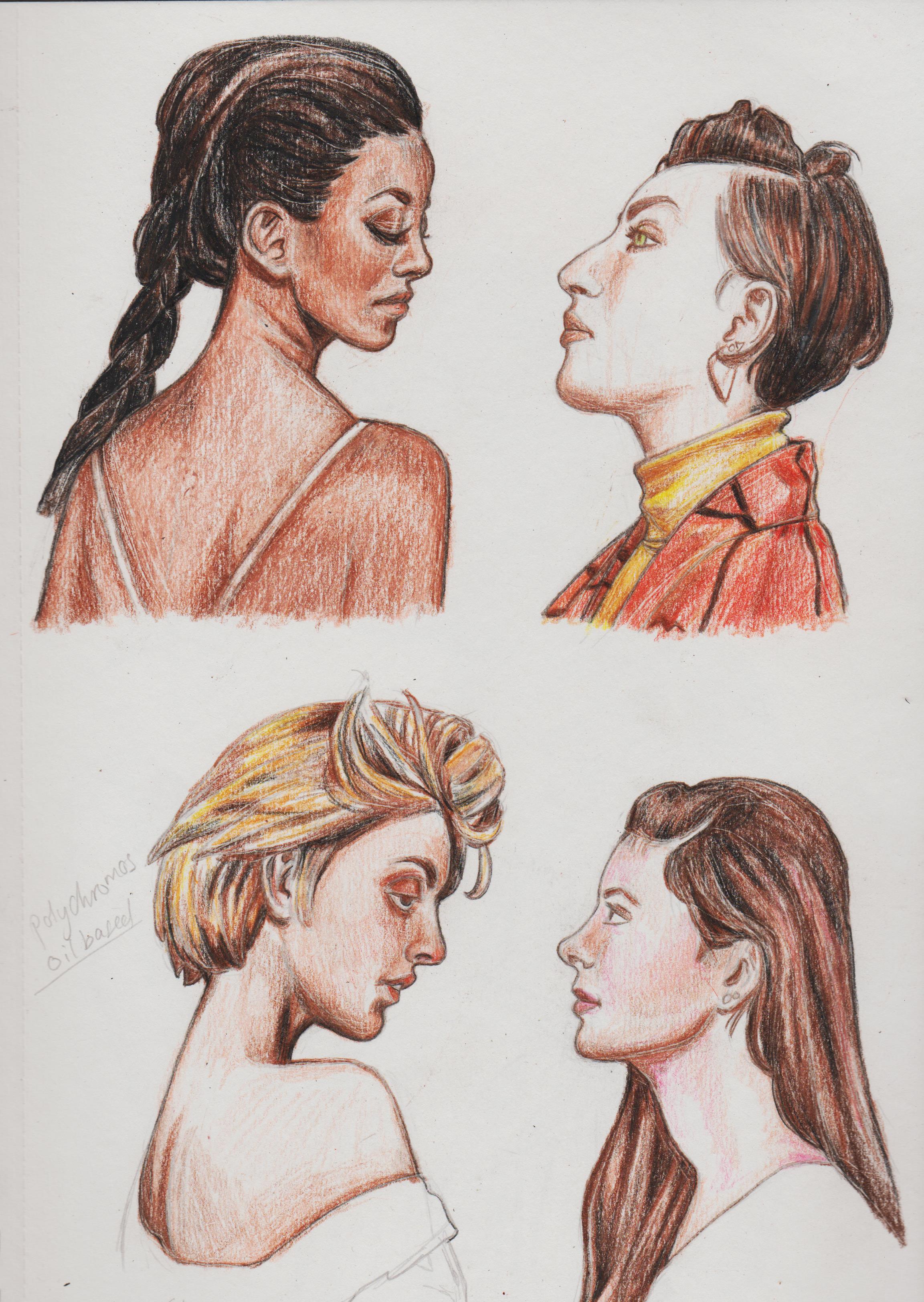.jpg) Does anyone know the right placement/position of this fist? Seems off, but don't know how. 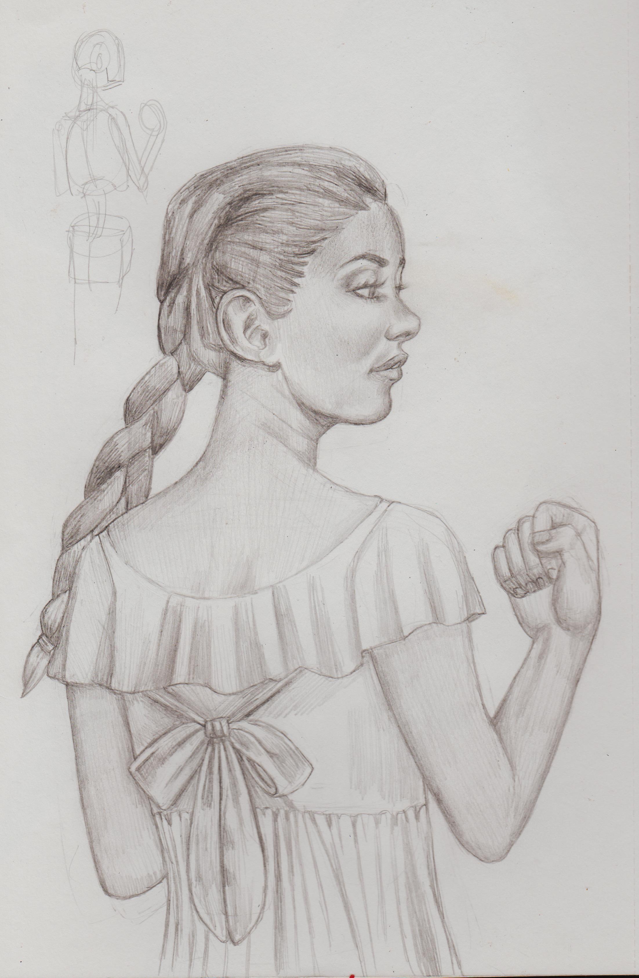.jpg)
01-03-2023, 08:40 AM
01-03-2023, 08:45 PM
(01-03-2023, 08:40 AM)Dominicque Wrote:(01-03-2023, 06:47 AM)darktiste Wrote: The cake is always as good as the base cake mix. It mean that you can do cake(art) anyways you want but if you leak a proper cake(art process) recipe it gonna be much harder.That why respecting the fundamental practice is important. If you want to make beautiful cake that cool but it doens't mean it well bake. Which is to say beauty doesn't win by itself a uncook cake is still uncook no matter the amount of glitter and icing on top. Fundamental over imagination specially in the early years of a an artistic journey is important it not to say you must discard imagination just have a greater appreciation from observation and take the time to develop a well form artistic process that work to your advantage. It probably better to draw 10 drawing with intention with a recap at the end and a critic to decide what you want to do next than 20 draw just because you feel you have to express it just to throw it into the pile in your drawer desk with no leasson being receive. There is value in inspiration and drawing for yourself. Let not be fool by what i said but there a line that must be drawn to try to pick what give meaning to your work. The problem i see right now is that you believe you should be focusing on anatomy not character do you want to move away from copying other artist or not?You seem to like drawing character the most so it only natural that i suggest moving into more anatomy study.The problem is i am not sure you understand how to do a study it something i have no seen or little of. Remember if this kill it for you take some and leave some we don't have all the same art goal this is just to give an other perspective because if we don't take any other perspective than were own why be on a forum at all... for the praise i guess... but for that i argue there better space than a forum where i think the mentality is growth.
01-04-2023, 04:21 AM
(01-03-2023, 08:45 PM)darktiste Wrote:(01-03-2023, 08:40 AM)Dominicque Wrote:(01-03-2023, 06:47 AM)darktiste Wrote: The cake is always as good as the base cake mix. It's the fact that I was one of those people that was worried about being accurate so much, their only significant artistic output for years was studies and just that. I've posted some earlier. But, it makes me much too goal focused, when I need to evolve my mind-set to be more 'progress' motivated, because I'm too busy thinking of all the anatomy and perspective and colour theory, etc I need to know, before I even draw what I want that it makes me hate drawing and I don't want that. So, along side studies, I'm now making a concerned effort to just draw the things I want (with the help of references and artists I admire as influence). I'm not discounting academic art study of course, that's how you improve and I want to be a great artist. However, I also need to learn how to draw for pleasure and not be afraid of posting 'unpolished' things. I'm trying to do my studies that align and can be directly applied to a picture I'm working on, rather than just random images. I hope the information will stick better that way. |
|
« Next Oldest | Next Newest »
|