Zizka's Sketchbook (Nudity and Vulgarity, NSFW)
Aye! Well I always intend mock-ups to be coded in so I try to cram in as much info as possible.

[Image: uvlzWG7.jpg]
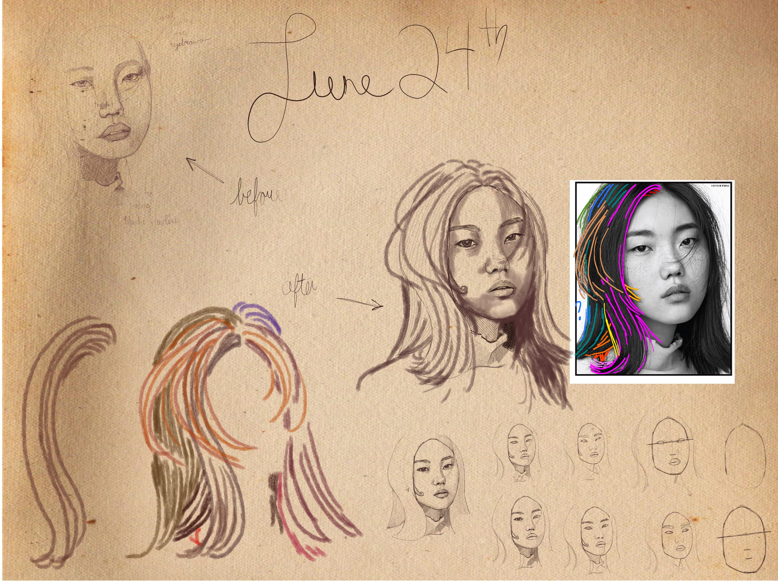
So I think I've worked this one as much as I can. The issue is of course the hair but without guidance it's something I'll struggle with so it's going to be a trial and error approach until I get it right.

More hands (with reference this time!):
10. [Image: dZEOlez.png]
11. [Image: Qb0kZMT.png]
12. [Image: c8mdr9S.png]
13. [Image: EhRcwDb.png]
14. [Image: MttFfpR.png]
15. [Image: HPuriWC.png]
16. [Image: 5kGAJ1m.png]
Reply
Hey Zizka, you're doing great and are consistantly improving!!!

I tried to do a paintover for the hair, as locks of hair that originate from the skull,  then twist and turn, go in front or behind other strands...
Sometimes it's hard too see in the photo, so it's also personal interpretation, as well as personal preference what to enhance or downplay, or change.

Reply
Alright, I've worked some more on this:
[Image: 5pXrwmv.jpg]
I've tried to further shade like Ash's edit.

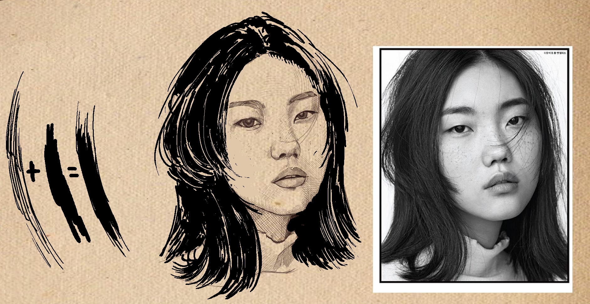
My question is the following. In order to darken the hair on the right I tried two different ways. In A I tried to crosshatch and in B I just painted over with a semi-transparent brush. I'd rather stick to strict hatching but I find that doing so makes the hair stop looking like hair. 

In Vagabond, the hair isn't rendered as many strokes. It's a paint bucket head of hair with some erased patches to depict hair. 

So this is where I'm at now: Should I go for the Vagabond route of hair rendering or continue to stick to simple lines to do so?
Reply
There is no answers to a stylistic choose it a matter of personal taste.What ever convey what you looking to deliver in the ''deadline'' you want to reach.

Honestly if you want to go anywhere doing project you gotta have to start to think about time.Not that the shortest route is always the best but that finishing is always preferable to not finishing.

I don't really understand why you would have taken the reference if it wasn't to use it that just my 2 cent.

But your problem is that in the reference of the girl you don't have strong highlight to turn into white spot right now.Even if you increased the contrast it might have help you better define the subtile shading of the face but it will not change the nature of your light source intensity the light here doesn't seem to be directly pointed at her but look like the result of light reflecting on a white board of some kind.It like they took the photo on a cloudy day.It where the importance of being able to do your own photo might come in handy as it save time.

I tried some level ajustment but the result aren't really to great in my opinion.I tried to approch the reference as much as possible and still try to retain believability.But her hair is still not as white as it is in the vagabond reference which would need to be adjusted to better fit the style if that close to what your trying to get to.

If you have photoshop you can try to learn more about the level option ajustment.

Also don't hesitate to cut away hair that are superflue and distracting.


Attached Files Image(s)


My Sketchbook

Perfection is unmeasurable therefor it impossible to reach it.
Reply
Do you have a tablet with pressure sensitivity? The hair in vagabond is done with a brush or a brush pen  as far as I can tell.

For Vagabond I only found timelapses, so a bit too fast to really understand:
vagabond inking time lapse
[/url][url=https://www.youtube.com/watch?v=xcCHYPXy5jc]vagabond - drawing a manga page
the artistic evolution of Vagabond
Slower example, look for the inking of the hair (look at 2:07' or 2:17')
akihito yoshitomi
David Finch has very nice videos, this one shows inking with a brush:
David Finch - spotting blacks

One approach: make lines that follow the direction of the hairlocks, then go in with a bigger brush to make black areas. You can draw with your background color or eraser to bring lighter strands back in. This was 5 to 10 minutes I think, it's a pretty loose approach, but you can work on nicer lines by going more slowly (or fixing with the background color/eraser). I didn't really look where the light parts should be, so it's not the best drawing, but I just wanted to quickly show this way of working.

Reply
You might want to consider grabbing great exemplar master pieces of the look or approach you're wanting to achieve and doing studies of them. Then you can use the insight gained in your ongoing work. This is one of the most efficient ways of learning about a specific approach or technique without having to reinvent the wheel yourself, or rely on someone holding your hand every step of the way

Reply
@Who: Yes, maybe trying to reproduce hair rendering of other authors would help because just looking doesn't always give me much insight.
[Image: lmoLo1C.jpg]
Kentaro Miura (Berserk)

[Image: fxGlyv2.jpg]
Takehiko Inoue (Vagabond)

[Image: YA8MFmS.png]
Junji Ito (Various)

Ito's depicting of hair is the most daring to me. Maybe wait for a while before attempting this one!

@Ash: Yes, I have a Huion. As always nice edit.

I use Krita and my knowledge of what's under the hood is very limited. I'd really like to use brushes which recreates a brush pen especially to get those narrow ends for lines but I struggle to do so. 

@Darktiste: I don't use deadlines. What makes you think I won't be using the reference? Anyhow, don't worry too much about how I handle my project. I've finished games before so I know what I'm doing and how to manage my time and manage my team. Let's stick to commenting on the art as opposed to what's peripheral to it ;).
Reply
Ok new update. Thanks to Ash's edit, I'd say this is definitely going in the right direction hair-wise:
[Image: gYxXh5Y.jpg]
Reply
Almost but you are missing how much the highlight is stronger and the texture much more subtile.It depend if you want to go realistic or manga.Personally from the 3 manga you reference i find vagabond to be the best in between.

Shadow side=Black
Light fall off=Line where hair bunch up
Highlight=White

What i note is that the look of the hair strend change as it move around the head but that because we are above him in the reference.The general method would be the one use on the side of the hair .Think of a small clump of grass blowing in the wind to start the root of the hair then picture yourself the flow of a waterfall that switch back to long blade of black grass.Don't make to many loose hair but rather point leaving the smaller hair for the end.


Attached Files Image(s)


My Sketchbook

Perfection is unmeasurable therefor it impossible to reach it.
Reply
Another devil's advocate question. Are you trying to learn to draw manga or learn a more naturalistic approach? For some reason I thought it was the latter.
Not to say you can't try different approaches, but being very specific in these choices matter, when it comes to knowing what you are actually trying to achieve with your individual study choices.
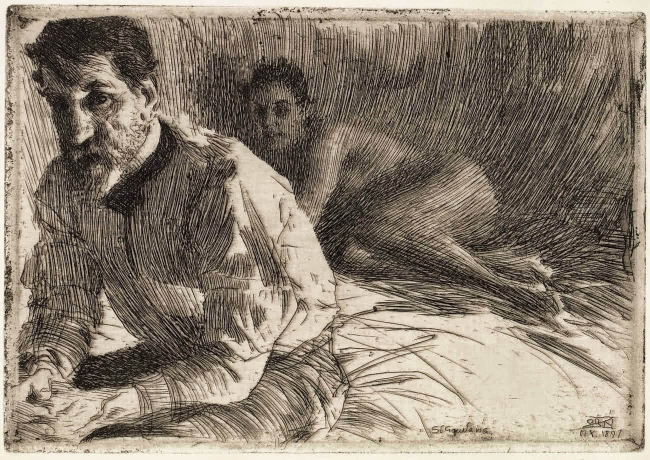
For example look up Zorn's sketches for some amazing naturalistic but still quite defined linework. The Russian academic approach also often uses linework and form hatching, though not ubiquitously.

If manga, you probably should use a brush more aligned to inking, than the sorta pencily/biro brush you have been using. Krita has some ink sets I think, but I make my own customs or use these as a base to tweak. Standard hard round, full opacity brush with size linked to pressure works fine.

Read this. The "size" curve in the brush settings is what you want to enable and play with
https://docs.krita.org/en/reference_manu...tions.html

Also realise many manga artists seem to use photo or custom built pattern fills for their broad tonal fills and then probably go back in manually with customising the fill to the situation it is being used in.

Much slower to do this all by hand. Clip studio seems to have a more comic specific focused tools and work flow as well, if this is something you see yourself doing a lot of in the future.

Reply
I'd say realistic but no smudging, just lines. Manga hair seemed like a good compromise while I make the realistic transition. Any other artist I should look up for the ''Russian academic approach''. I don't suppose that's something I could google since it's likely too broad as an approach.

I think you mean this by Zorn:
[Image: u3HTkGt.jpg]

It's cool and definitely a style I'd like to have (although the upper right looks unfinished if I'm going to nitpick haha).

The only problem I see is I can't reverse engineer the process like I could with Vagabond art. It seems to me that he just has to experience to wing rendering hair with lines without some sort of clear method.
Reply
mmm, nope. I'm not sure who that image is by but it's definitely not one by Anders Zorn. Probably someone inspired by or aping his approach and tagging it, or something like that.

I meant these, from the OG.
In terms of not being able to "reverse engineer". It's really up to you what you want to learn from. I was just a bit surprised with the manga focus I guess given you seemed to want to understand a naturalistic approach more. That said, anything that helps one simplify the complex into more understandable chunks can be useful. I guess I just like jumping straight into the deep end that I know I'd like to swim in XD.  
You probably won't know what specific insight you will gain from doing any master study really. I never do. I have ideas on what I'd like to learn, but I always learn something novel about how the artist may have been thinking or approaching the work. 

You can learn a lot simply by observing and making notes, but definitely best to attempt it as well imo.
Notice Zorn doesn't outline the edges of any form with a single line, it's all built into the way the value arrangement is developed. He also uses directional rhythms for his linework with some thought to the form's planes/direction as well as the overall composition's flow, instead of the more prescriptive, hatching consistent directions across the piece. Also note how he covers much more ground with fewer lines, and yet, the naturalistic read is better than in your attempts. How, why? These are all things you may observe as you go through and do a study.
Since you're thinking about hair atm, look at how he has handled it. The edges are rarely defined with a single line for the most part, which makes for a softer edge treatment, which makes things more realistic. The drawings are handled like paintings, not photographs.

Whatever the technique, hatching or otherwise, as I mentioned in an earlier comment the deeper fundamental here is in understanding how value arrangement and grouping is primary to any form or image read.  All technique is largely used to execute that arrangement. So you really also want to understand and practice effective value grouping without necessarily having to spend a week or more each time, painstakingly rendering one image which doesn't really have a particularly interesting value arrangement in the first place (last asian girl portrait for example)

The painstaking long focused study has its place of course, as does quicker study and using other techniques other than hatching, like block shading value for example, which allows you to cover more ground quickly, which allow you to practice that aspect more efficiently.

Russian academic artists are not easy to search for online, maybe due to the language barrier. Can search Ilya repin academy, and their work. As I said they don't have a specific linework style, but they do utilise hatched strokes in more naturalistic ways. Here are some random examples some Russian
Other great inkers Bernie Wrightson, Franklin Booth, Sergio Toppi. All masters, all different.

Reply
Interesting message! I like the art but I don't want to smudge like for the woman portrait. I want to use lines exclusively.

Progress for today:
[Image: SqY6Siw.jpg]

I want to get rid of the contour lines once I'm done like that Zorn drawing. Will continue tomorrow, lots of stuff to redo most notably the nose. I like the ear and value practice is better than last time.
Reply
[Image: rcFOnk1.jpg]

Update for now. I might spend more time on this today or it might get to tomorrow. You'll notice I'm trying to shade darker areas by spacing the lines closer as an experiment.

So I'm wondering about a couple of things:

a. Can perpendicular hatching ever work?
b. Should lines always follow form? Because I'm finding examples of both lines which follow form and lines which don't so I'm undecided.

Examples:
Vagabond (which don't follow form):
[Image: Pd0Ix6A.png]

[Image: WPjFsuD.png]

Which follow form:
[Image: ctjzMSW.png]

What do you guys think?
Reply
I'm not an expert on hatching, but my 2 cents are:

a. Can perpendicular hatching ever work?

I hesitate to say that something can never work, because I'm always surprised at what people can do. There's always exceptions to the rule. But generally, no it doesn't work. Crossing the lines at a diagonal is much better.

For example, this engraving. Notice how the crossed lines meet with a narrow X, much less than 90 degrees. So it creates these little diamonds in between each line. b. Should lines always follow form? Because I'm finding examples of both lines which follow form and lines which don't so I'm undecided.

It can be either way. Sometimes the lines are there to create relief by making a different tone, or covering an area in tone flatly to push it back. In that case the lines are like a screen on top of the form. And sometimes the lines don't curve around the form completely, but are kind of bent over it, so it's both. There's a lot of different styles.

For your studies I would pick one at a time though. 

I also want to say that with hatching, there's a lot going on underneath the surface technique as well. Like Who showed with the Zorn etchings, it's not the lines so much that are important, but the value structure. Hatching is just a technique to put down value on paper, but you still have to know what values to put down! So I would do value studies without hatching as well, but it's up to you.

Reply
I think it mostly a matter of where should i emphasis the form and where do i have large section of hatching i could simplify.As a professional you are always looking to meet your deadline expectation so you work toward efficacity without compromising to much on the quality.

Since it a face in your reference he mostly putting emphasis on the nose mouth and eye face a more time consuming normally specially the hair if it need good rendering.I would doubt that the perpendicular line where a mistake.

When he as to do larger character he can't really allow himself to do those long line because they would draw to much attention compare to the rest that follow the form.So it also a matter of as i said emphasis if you create hatching that are different in there pattern you immediatly create contrast which can attract the eye so in is drawing even if still a large area of hatching it small enough that it doesn't distract from the story.

My Sketchbook

Perfection is unmeasurable therefor it impossible to reach it.
Reply
Update for today:
[Image: cec5u9g.jpg]

@Joseph: I thought shading a face was good value practice. You are talking about a more specific exercise I think. I'll look into it.
Reply
(06-30-2021, 06:50 AM)Zizka Wrote: @Joseph: I thought shading a face was good value practice. You are talking about a more specific exercise I think. I'll look into it.
 It is. But I think the past few days you have been concerned more with style than substance. You will get further toward your goals I think by focusing more on the big picture. Think more about how you can you use hatching to make smooth gradations out of shadows to indicate form, perhaps.

Reply
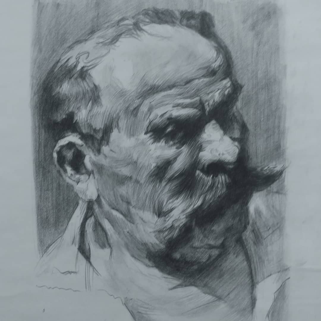
Practice for today. I wrote down each step I take in order to make this so that I can get critique of my process as well which is essentially mostly instinct:
[Image: r6ZkIsu.jpg]

Smooth gradation would be lot easier by using smudging but nothing worthwhile ever comes from being easy. Gotta keep at it!
Reply
At step 3 you are possibly hurting your accuracy by overlaying.I don't know if you pick that method from one of my intervention but i think i have been pretty clear that this is a correction method it meant to be use at the end normally to check how good of a work you did with the lineart. It not to modify anything but to note where you have miss calculated it just a tool to check where you are in term of accuracy if you use it anywhere else it probably hurting yourself .Of course here i say it perfectly fine since you trying to go directly to the value part of the drawing so basicly it like your trying to speed run to a certain point of the fundamental.So if your intention was to go directly to value you could have skip 1,2 and directly go to overlay done the whole line art aspect aswell as using the overlay and than really start what you were interest to pratice which is step 7 to 9(value).

Here a perfectly good advise if you want to do what i call speed running a fundamental is to not take complex subject matter which slow you down to the point your interest in.For example your interest by value what i would suggest would be to just go google some lineart with black and gray value you than trace over the line art part then you keep the reference open and once your done with the line art you use the value of the reference to start praticing your hatching value pratice this would have no value this process i how i would approch dealing with hatching specifically.One other simple exercise would be more abstract but even more straight to the point you create a random shape and than you define the light intensity and direction. This one is a more advance technic that require understand of light which you have not really shown to much so far so it just to point out that the more you know the more you can refine your process.
Of course everytime i talk about speed running certain fundamental i have to remind people the importance of mixing fundamental so that they can acess where they stand when it come to putting it all together.

My Sketchbook

Perfection is unmeasurable therefor it impossible to reach it.
Reply


Forum Jump:


Users browsing this thread: 88 Guest(s)