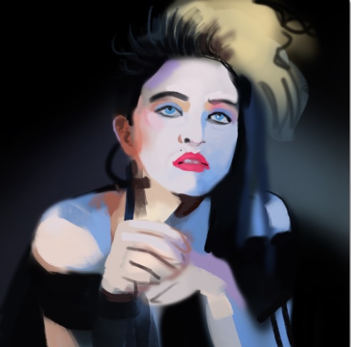
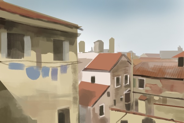
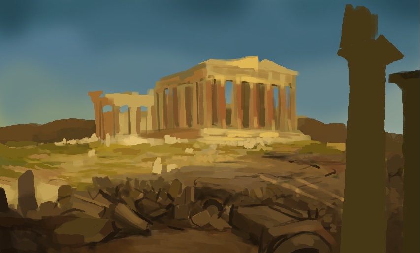
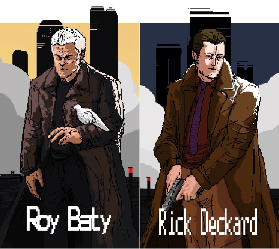
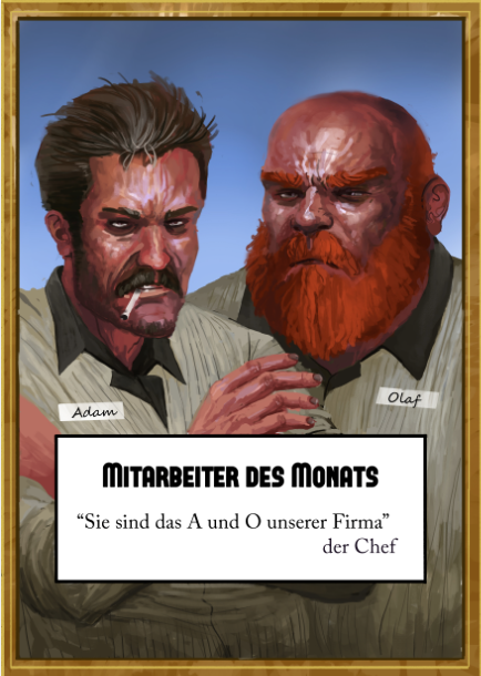
Pushin' though hard times.
#41
@BenFlores: Thanks a lot. Faces are still my absolut horror. I just need to do more :(

Sorry just two study pages. I f'ed up the rest of the photos and now have to reshoot them.


Reply
#42
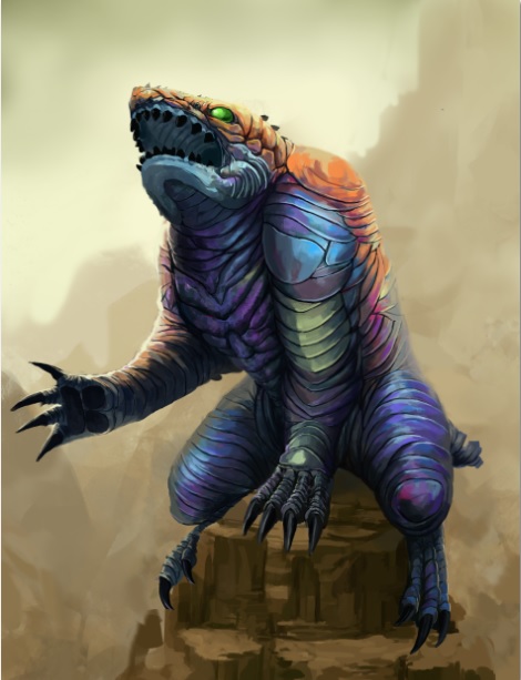
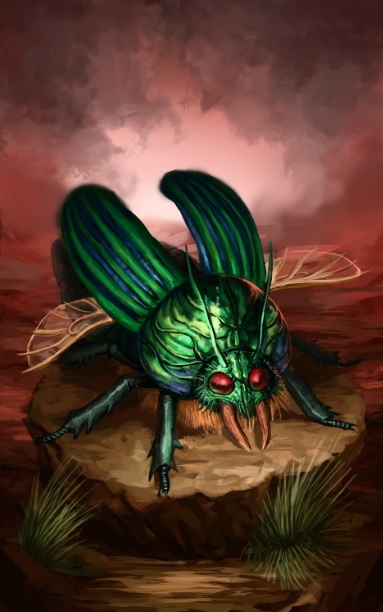
Just an update. Two illustration I did for a book. Moar to come :)


Reply
#43
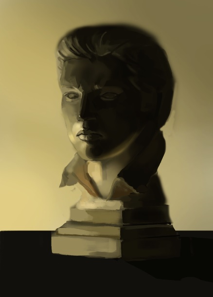
Two studies:


Reply
#44
Loving those monster illustrations! You have me intrigued about that book now. ;)

Reply
#45
@Stardustlarva: The book is called the Legend of Zero by Sara King but the illustrations will be featured in a special edition box as far as I know.

Here are two more creatures I'm allowed to show :D


Reply
#46
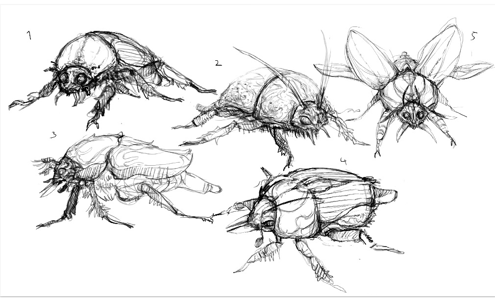
two studies.


Reply
#47
Just a little sketch.

Reply
#48
Lost my appartment and got terrible sick. Now I'm back yo.

Reply
#49
Üpdate! Three quick studies:


Reply
#50
Some mixed stuff.


Reply
#51
A study:


Reply
#52
Another Study: Also unfinished due me being busy as fuck :(


Reply
#53
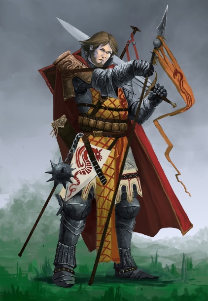
A paizo character I did for fun.

Reply
#54
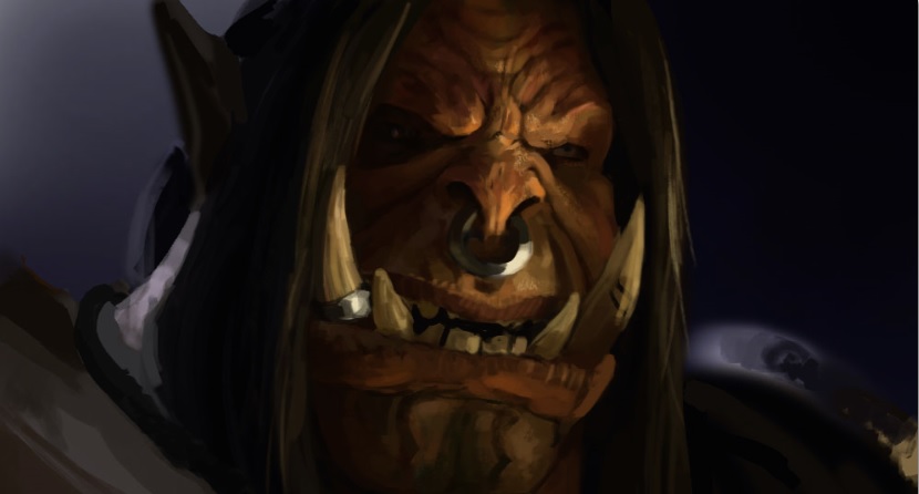
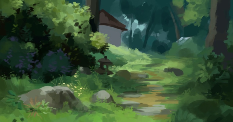
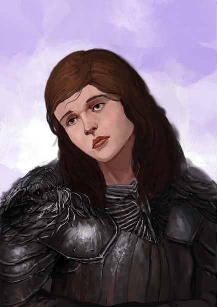
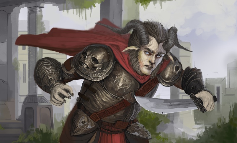
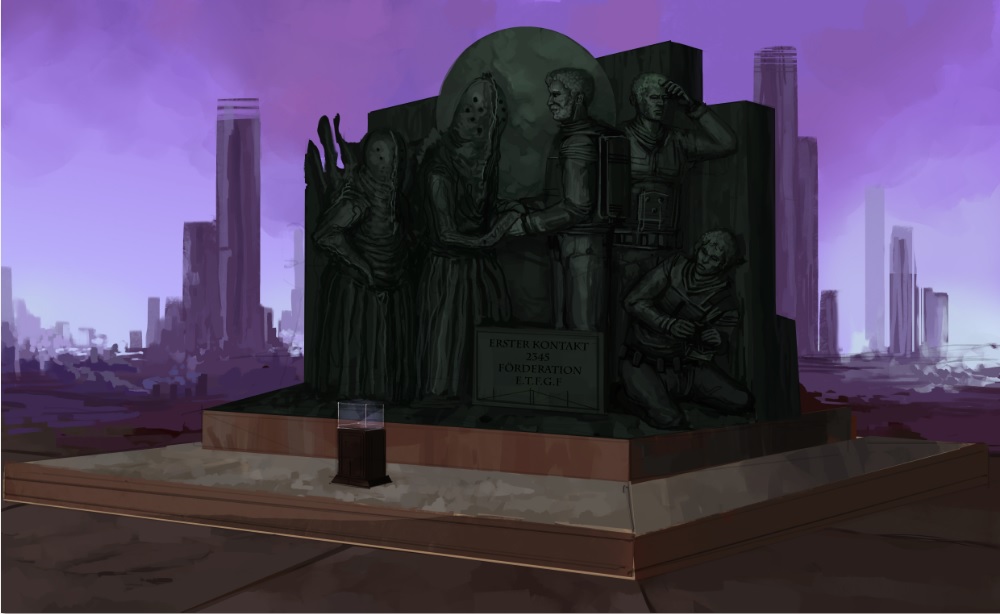
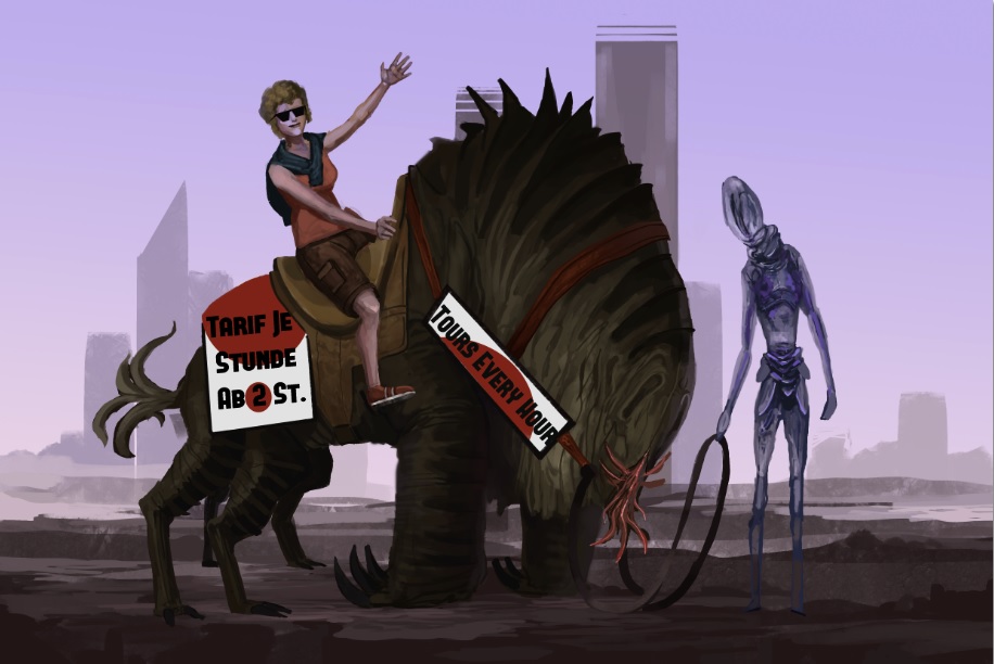
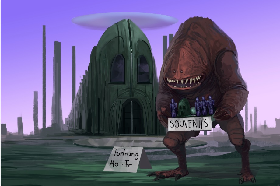
Heya sorry for the lack of updates. I'm already bad at doing so but at the moment things just kinda suck for me. I wanted to get into an art school but basically every single one I applied for rejected me. :(

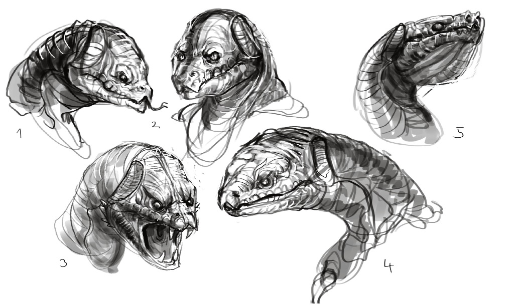
Anyways here is some stuff.  I had to do these pieces in five days. and I'm still not very fast. If was quite difficult.


Reply
#55
Yooooo Zip! Welcome back!

Oh god, sucks to hear about your apartment though, hope all's good

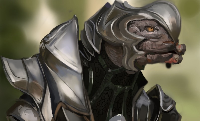
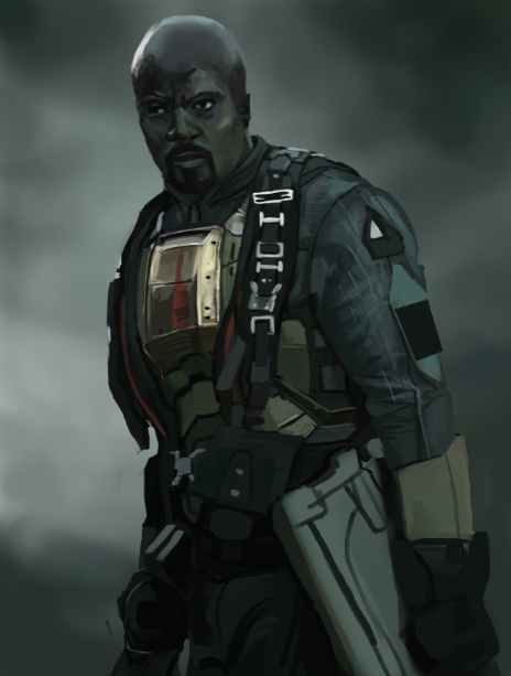
I love me some hardworkers and you're one of them! Absolutely love the metal on that Arbiter man
Also, please never stop, I can't stop scrolling up and looking at these armour designs you've done... so fckin' rad!

Keep it comin' Zipfelzeus <3

sketchbook | pg 52
"Not a single thing in this world isn't in the process of becoming something else."
I'll be back - it's an odyssey, after all
Reply
#56
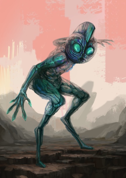
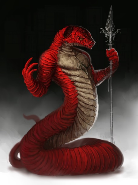
Jesus dude, your creatures are fucking awesome, specially the last one... fuck, I wish I coul design faces like that, I also love that he has 2 different legs haha.
Anyways, watch out for the perspetive, specially for the green 4 legged one, try putting the creature withing a box or just drawing perspective lines to make sure the weight and perspective feel right.

Awesome creatues, seriously :)


Reply
#57
@smrr: Thanks a lot! Yes I found a rather well solution for my appartment issues, but at first things seems very bad since finding a single person appartment is nearly impossible here if you don't want to live in some really crappy hoods.

@Gilger: Thank you! Yes perspective is still and issue I'll hopefully find some way to fix this. I though about doing some more complex illsutration as practice since this way you have draw things in different perspectives.

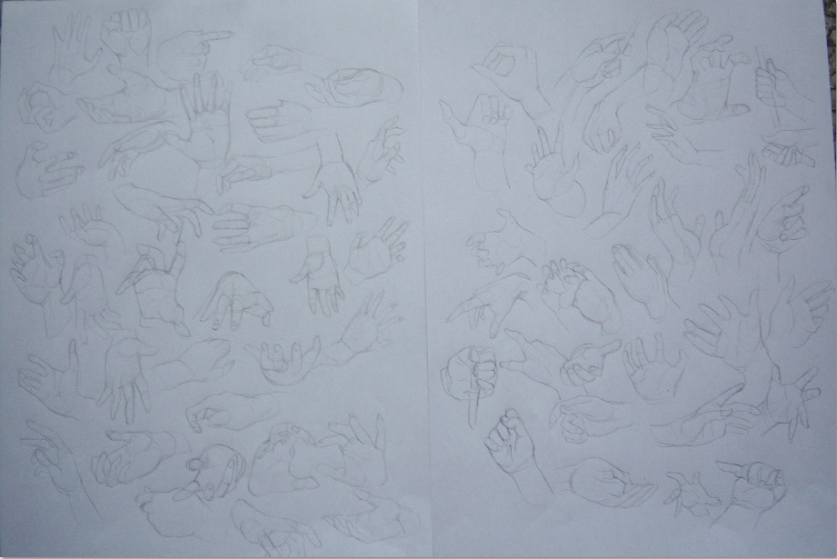
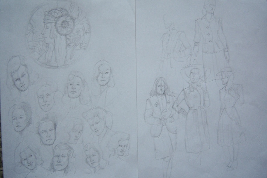
two studies from 3d renders. Also hopefully more traditional stuff is coming soon. I finally have a camera.


Reply
#58
Wow you're quite good at drawing and rendering armor. I especially like the goat guy with skull shoulder pads. For #54, besides working on perspective as Gliger said, you can try experimenting more with composition. For example, I think in the last piece, the shapes of the red lizard guy and the large green building look very similar- they're competing for the viewer's attention. So varying their relative sizes or changing their shapes can create a stronger focus point.
Reply
#59
@kmink: Thanks for the advice! Compostion is added to the list of stuff to look out for haha. I still have that book from andrew loomis on composition lying around here somewhere, I should start rereading it, thanks again!
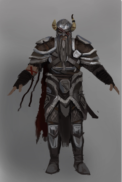
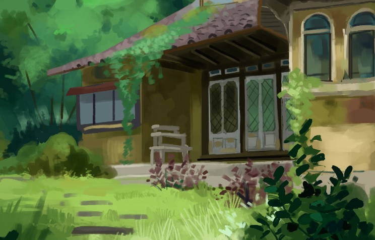
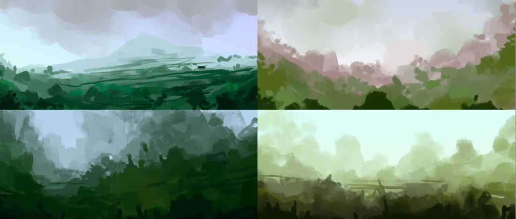
Enviroment study plus some color compostions.


Reply
#60
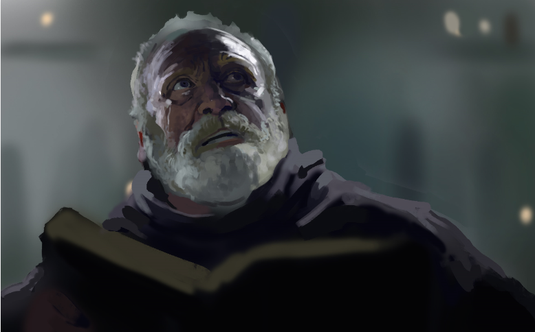
Forgot to post these: A study plus some stupid work I needed to do.... 


Reply


Forum Jump:


Users browsing this thread: 250 Guest(s)