12-04-2023, 07:47 AM
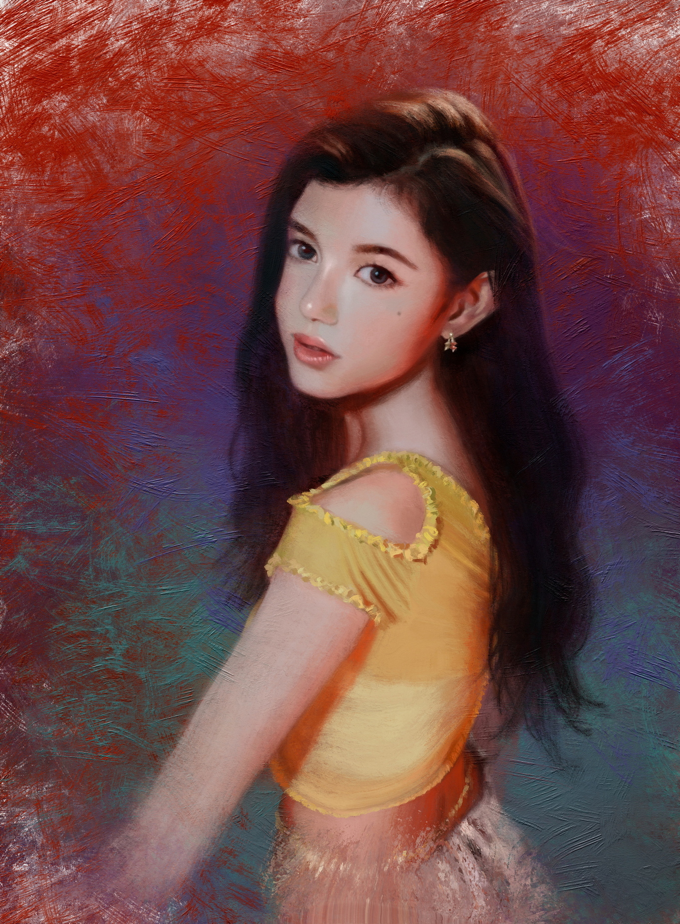
Here's a work-in-progress, maybe about 85% done. I was just painting the background in Rebelle 7 (closed beta testing) with the updated brush engine, and the improved expressiveness is nice.

|
Lunatique's Sketchbook
|
|
12-04-2023, 07:47 AM
Here's a work-in-progress, maybe about 85% done. I was just painting the background in Rebelle 7 (closed beta testing) with the updated brush engine, and the improved expressiveness is nice.

12-04-2023, 09:56 AM
Oh you finally got the beta of version 7 :) So the rack "brush" got some more randomization? Also it can affect the impasto (maybe it already could in 6).
I'm still brewing my comments on your previous posts but being in a very different world right now makes it hard to be articulate.
12-04-2023, 11:12 AM
The update brush engine has some improvements and I can get more expressive brushwork, but that final hurdle of dynamic bristles is not here yet, and I'll continue to hound them about it until they either finally do it, or tell me it's simply not possible (which I doubt, because if Adobe can do it, so can they).
Take your time on that comment. We're in no hurry.
12-12-2023, 08:32 AM
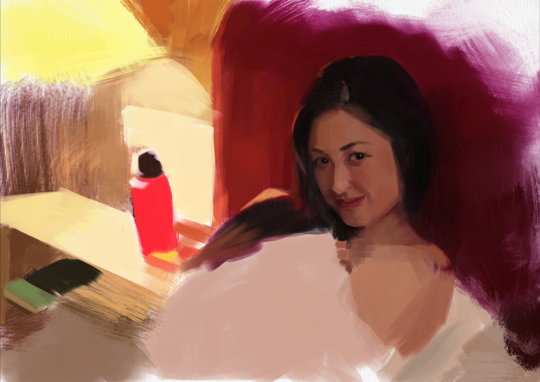
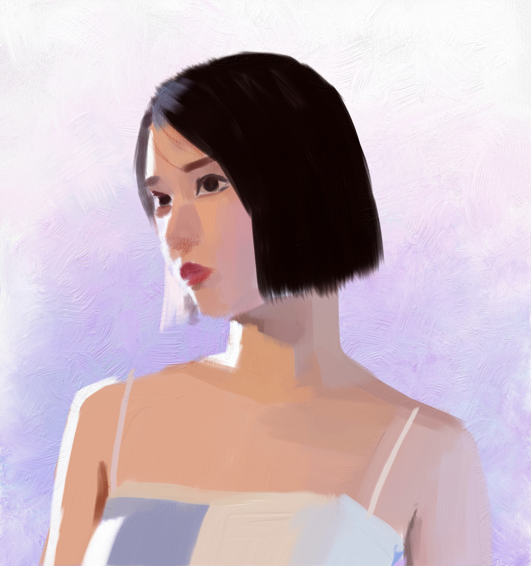
A couple of work-in-progress portraits:
  Some more newer and older works:  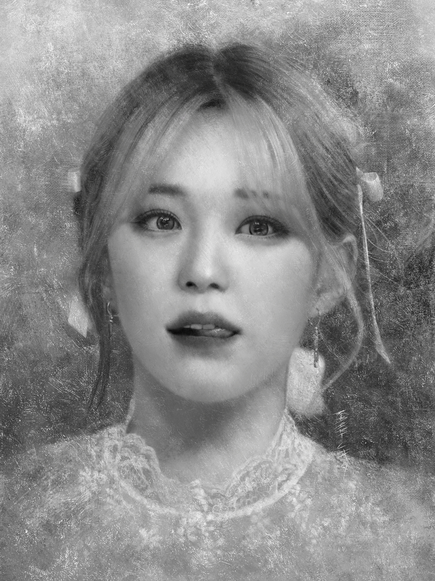 This is actually the second version. The first version was dark purple and Sony asked me to redo it as black instead (this was for Spiderman 3). They provided the sketch and I was hired to paint the sketch into a fully rendered version. 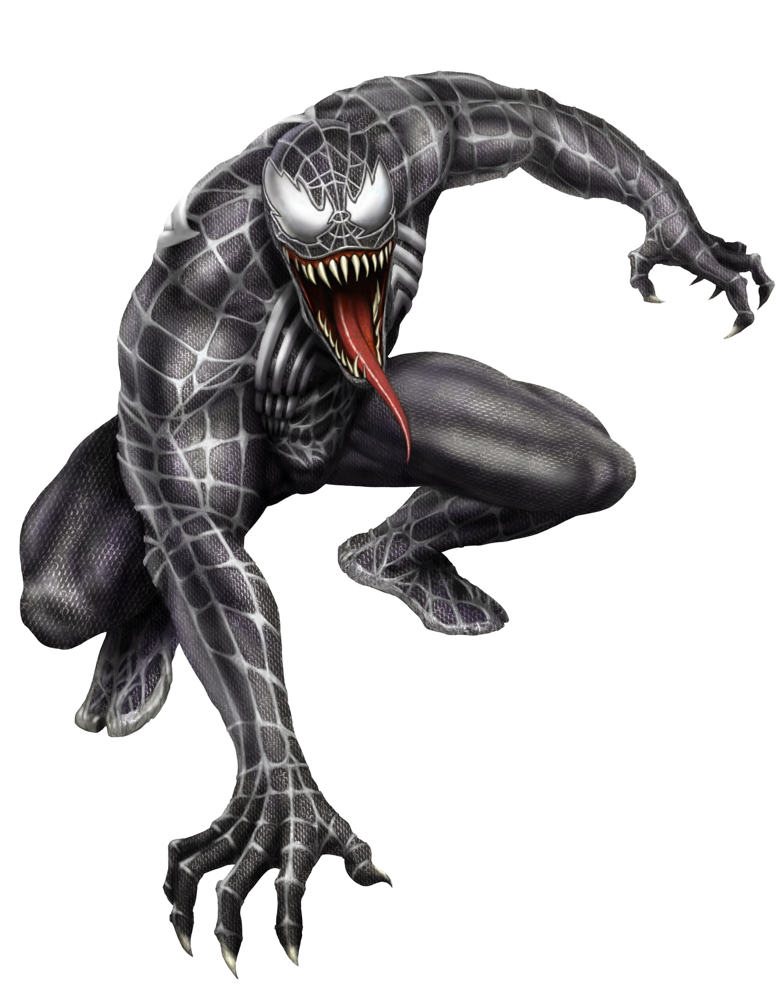 This one was for a sci-fi shooter game that unfortunately got cancelled. I was also the composer for the game and here's the main theme: https://ethereality.info/ethereality_web...rsion2.mp3  
12-13-2023, 04:02 PM
Hey, late welcome to the forum!
I'm not really much into landscapes myself but I'll share some thoughts when I was reading what you were saying about portraits vs. landscapes. Your portraits are really good, but the approach you have to portraits doesn't work for landscapes. It looks to me like you tend to go in and render everything evenly with about the same amount of focus and detail, going for realism mostly. For a portrait, we're just naturally drawn to the face. It's like you're saying, you have a natural interest in portraits, in looking at a human face, that you're not going to naturally have with painting rocks, trees, etc. Treating things equally in a non-portrait, larger image breaks down, IMO. The artist has to build an interest where there isn't anything special (unless you have a really awesome ref image, I guess). Composition and artistic choice matters a lot more. The landscape images that really appeal to me are more like the artist is just playing around with the art fundamentals. Things are really abstract. They're pushing interesting shapes, colors, textures, contrast until they have something cool. If I were going to dive into landscapes I would try that more. https://www.artstation.com/artwork/VYVwZ https://www.artstation.com/artwork/N8dWq https://www.deviantart.com/mr--jack/art/...-435264105
12-14-2023, 10:14 AM
(12-13-2023, 04:02 PM)ThereIsNoJustice Wrote: Hey, late welcome to the forum! Thanks for the welcome! I agree with what you said about landscapes, and when I look at landscapes by painters I love, those are the things I notice too. My favorites are painters like Richard Schmid and Mark Bodges. Schmid is my ultimate favorite because he's a master at portraits, landscapes, and still life, and paints them with the same amount of passion and was very prolific in all of them. I have all of this books and DVDs and IMO there has never been a greater painter--perhaps not even Sargent, Zorn, and Sorolla. I'm familiar with the artists you linked, and I look at studies like that a lot, including ones from artists like John Park, Robh Ruppel, and other well-known concept artists and traditional painters. BTW, I own all of Greg Rutkowski's brush packs (and a bunch of other artists' brush packs. I've spent several hundred dollars on them). But as we all know, being able to analyze and appreciate the qualities of other artists' work, doesn't meanto n you can just apply them to your own. It takes a lot of time and effort to incorporate the qualities you admire in others into your own work, and art hasn't been my main creative focus for more than 15 years, so in order to develop more in the area I'd like, I'd have to steal time from writing novels, and I can't really do that because becoming a full-time author is more important to me than becoming a better artist--at least it has been in the last 13 years or so. Whatever amount of time I do get to spend on art, I just gravitate towards portraits because I simply enjoy doing them more and want to get better at them more. Maybe at some point I'll get more excited about painting landscapes and do more of them.
12-17-2023, 05:01 PM
Awesome updates! I remember some of those from ages ago, haha. You did a great job with them.
You current WIP is looking solid as well, very solid brushwork and vibrant colors which I dig. Very much looking forward to seeing developed further, keep it up!
12-18-2023, 11:57 AM
Hehe, I love the cartoony birds :D
About the first of your last two WIPS I like the abrupt color/light contrast, and about the second one I'm very interested to see how you'll make these blues do the spellbinding. ThereIsNoJustice beat me to the bit about landscape painting. Yeah, basically, cheating is the rule, not the exception, unless you need to make some totally unknown extraterrestrial environment believable. The same magic can be applied to the portrait of someone whom everybody knows, but not to a portrait that's meant to make us discover the person. Lizard brains: I'm easily bored when I draw a comic panel with no characters in it, or at least a speech balloon. Come to think of it, I don't draw them anymore. I agree with your analysis of the power of single illustrations. There are exceptions when the viewer knows the context of it though. I got Rebelle 7 :) Tried a bit of inking and watercolor comic, I see the potential but probably won't be able to invest the time until I finish my current comic. I like the cosmic-scale intro of your game music, and the development is true to the shooter genre :)
12-20-2023, 10:48 PM
"Schmid is my ultimate favorite because he's a master at portraits, landscapes, and still life, and paints them with the same amount of passion and was very prolific in all of them."
Yeah, Schmid is great. No doubt about that. "But as we all know, being able to analyze and appreciate the qualities of other artists' work, doesn't meanto n you can just apply them to your own." I see what you're saying, but I'd make the argument that going to the fundamentals is often less work than what you're doing. Maybe. Like if you look at those paintings I linked, it's really about picking some nice shapes, values, and edges using some of those fancy texture brushes. That sounds a lot easier than trying to render out all the tree branches, or something like that. Anyway, you've reminded me to go open up Alla Prima again...
12-21-2023, 10:44 AM
(12-20-2023, 10:48 PM)ThereIsNoJustice Wrote: I see what you're saying, but I'd make the argument that going to the fundamentals is often less work than what you're doing. Maybe. Like if you look at those paintings I linked, it's really about picking some nice shapes, values, and edges using some of those fancy texture brushes. That sounds a lot easier than trying to render out all the tree branches, or something like that. In my case, I'm looking for a balance between selective detail and expressiveness. Ideally, I'd want my landscapes to be more detailed than the studies you posted, but still with enough expressive brushwork. Here are some examples of the look I'm targeting (from Schmid, Bodges, and Sargent): 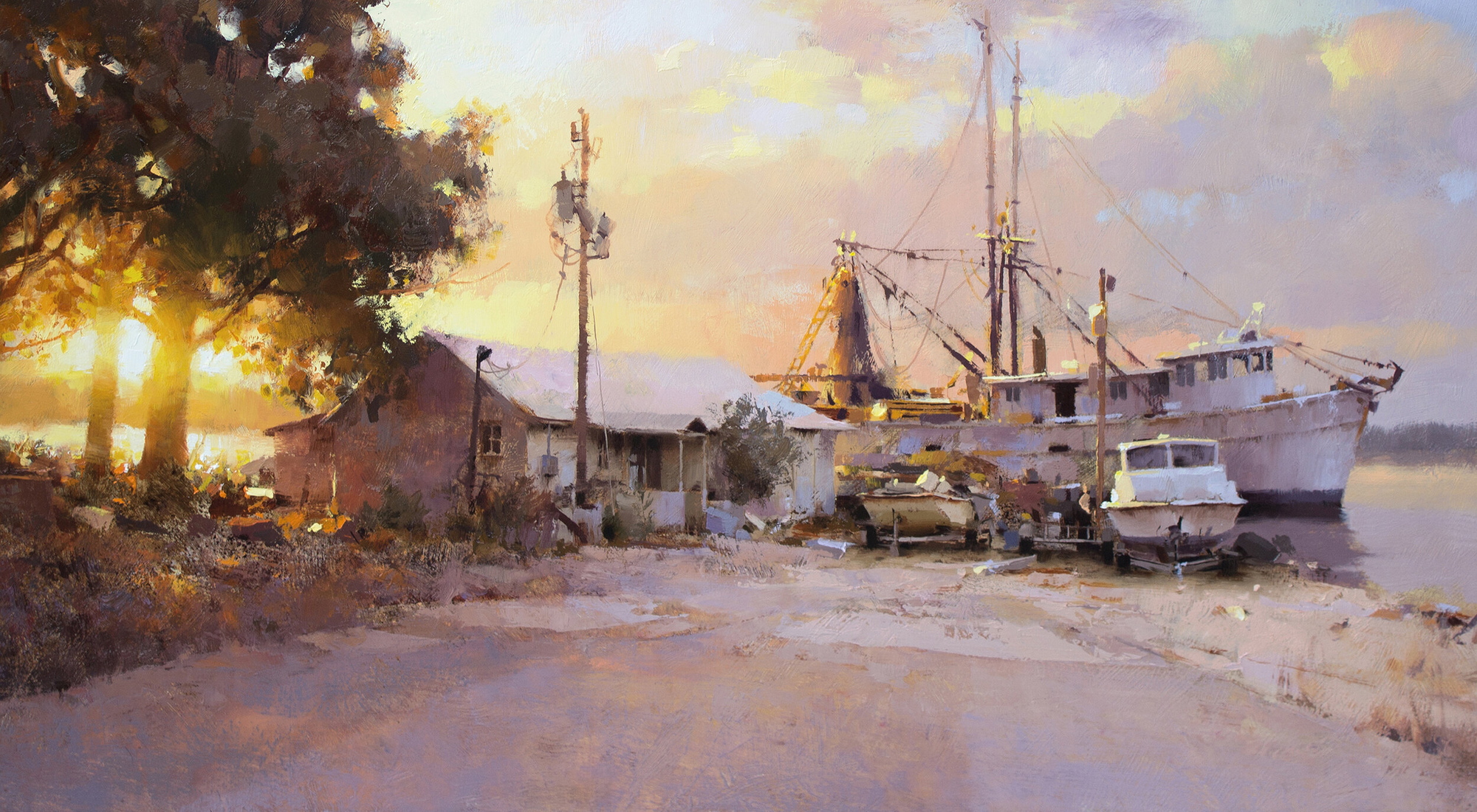 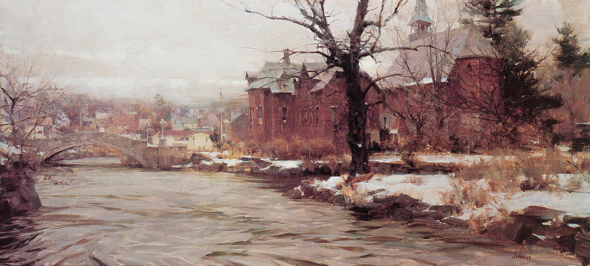 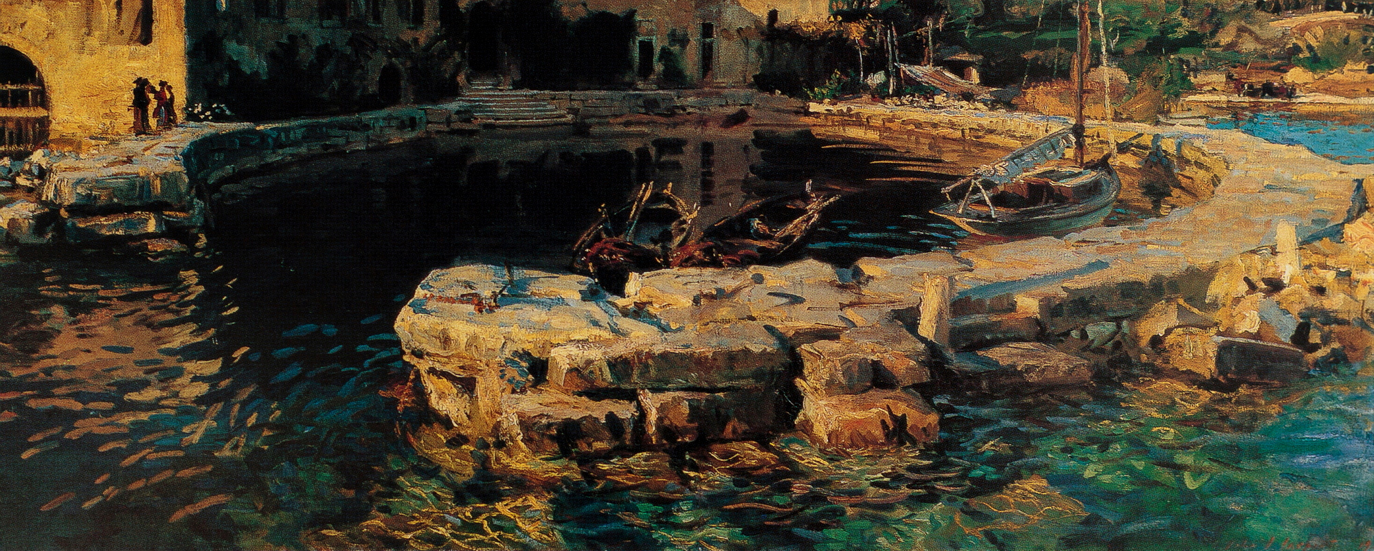 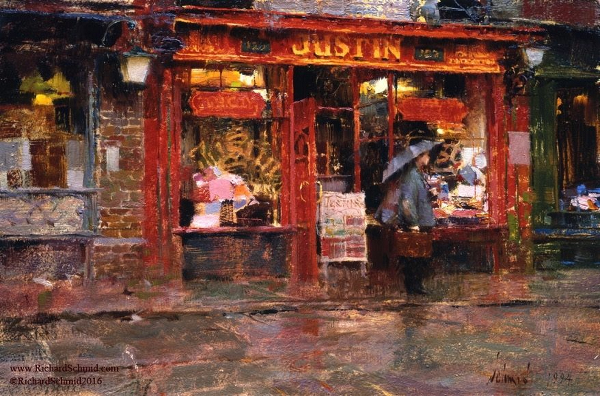 After I'm done with the current portrait I'll maybe switch to landscapes for a while.
12-27-2023, 06:51 AM
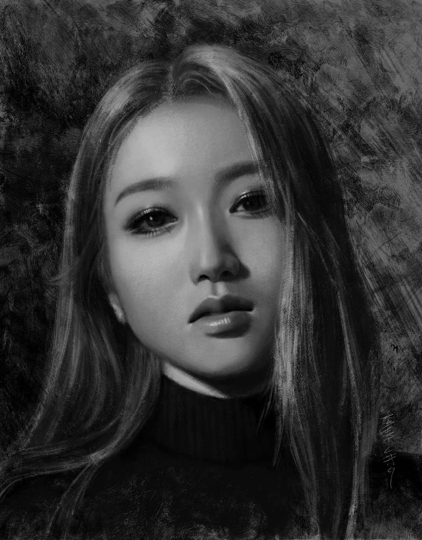
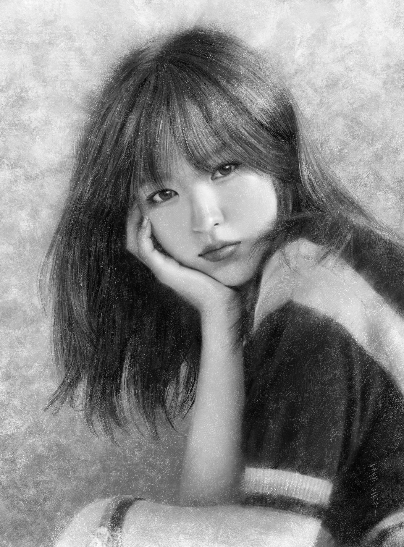
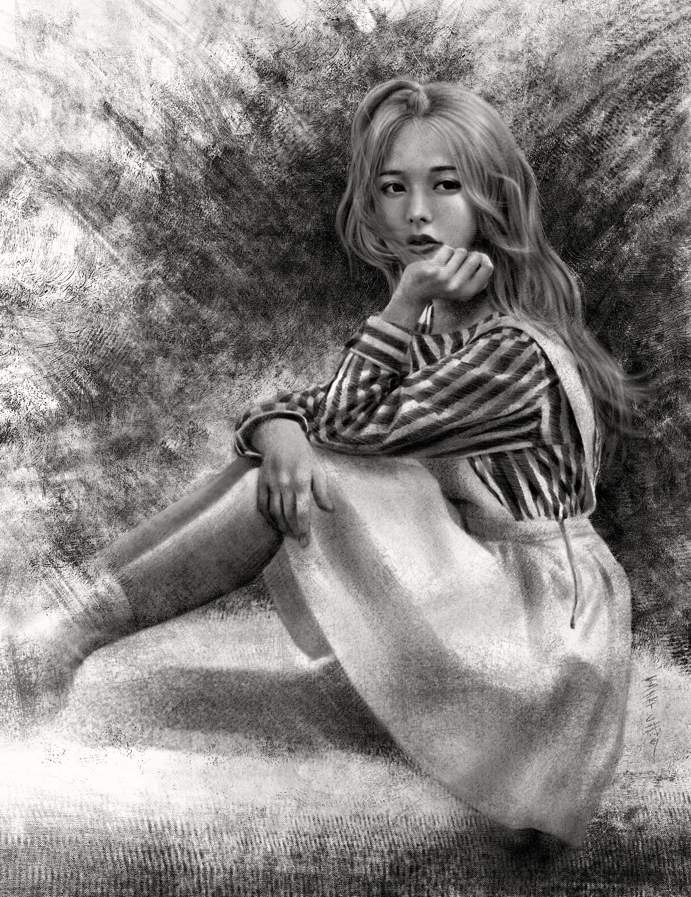
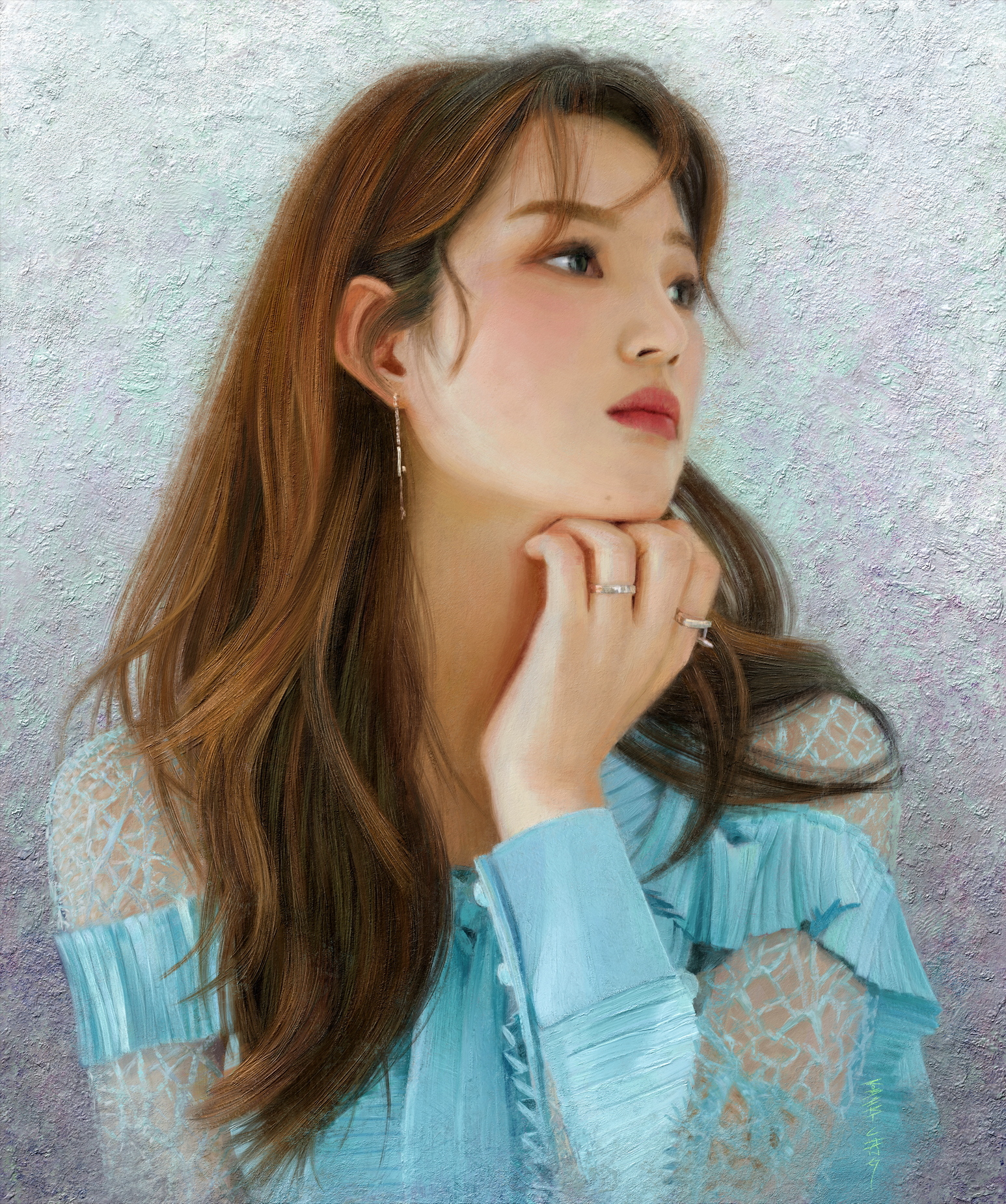
Some more portraits.
   .jpg)
12-28-2023, 07:18 PM
Really like the way you painted the lips and eyebrows in that first portrait. Good stuff.
I did notice something on the last portrait. The right side (of the image) of her mouth, there is a little dark strip. I guess that's the upper lip on the far side. It feels like it's just dark enough that it grabs my attention and looks a little odd. Anyway, it's a minor nitpick. The hair looks great on that one, too.
12-28-2023, 11:25 PM
Love the latest batch of portraits. Very well drawn and painted, and the textured/traditional look you achieve is very well done and convincing. Great job!
12-29-2023, 07:06 AM
(12-28-2023, 07:18 PM)ThereIsNoJustice Wrote: Really like the way you painted the lips and eyebrows in that first portrait. Good stuff. Yeah, it's the upper lip seen from that angle with her head tilted. Lips are weird since they have a lot more changes in form than most people realize, and the planes can turn so much depending on the angle of the face. I remember when I did realistic 3D modeling of the head for the first time, it really struck me just how much turning of the form the lips did towards the corner and as they curved into the mouth, even after having studied anatomy for years. I thought maybe I overdid the impasto bristle marks for the hair. I had to reign in the urge to put impasto strokes on everything since it's so fun to paint with in Rebelle. Just because I can doesn't mean I should. (12-28-2023, 11:25 PM)cgmythology Wrote: Love the latest batch of portraits. Very well drawn and painted, and the textured/traditional look you achieve is very well done and convincing. Great job! Thanks! The funny thing is, the background textures took at least as long as the actual portrait. My backgrounds for portraits aren't elaborate or anything, but they always take forever because I try really hard to make them work with the overall composition and look natural, and I always want to make the shapes more interesting, except they just end up looking awkward. More often than not, after hours of trying, I just end up with the most boring simple textures instead of expressive and bold brushstrokes.
01-23-2024, 12:12 PM
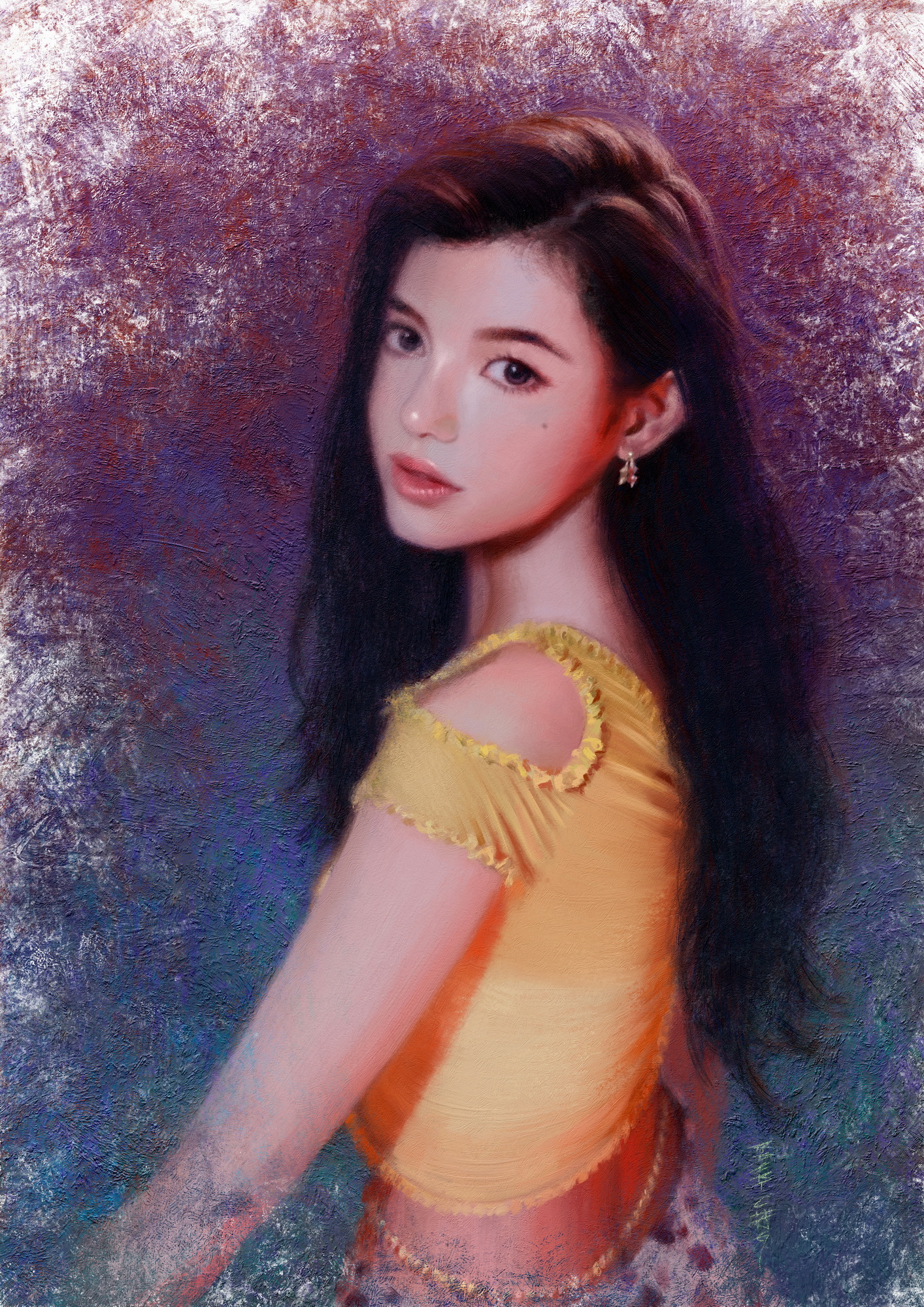
I finished this portrait, but not sure which version's background I prefer.
01-23-2024, 01:48 PM
Really skillfully masterful and beautiful work here. I love all that have going on here. You've really done an amazing job at making the digital medium look very naturally analog.
LEGEND'S SKETCHBOOK_001
To all artists struggling to create and are intimidated by A.I. (anti-imagination)  "Everything has been done, but not by you" "Everything has been done, but not by you" 
01-27-2024, 10:18 AM
(01-23-2024, 01:48 PM)Lege1 Wrote: Really skillfully masterful and beautiful work here. I love all that have going on here. You've really done an amazing job at making the digital medium look very naturally analog. Thanks! It was always my intent to push digital to look more like natural media, and it wasn't really possible early in the development of digital art--not even when Craig Mullins revolutionized digital painting with his traditional approach, because the brush engines always had those telltale signs of digital appearance, no matter how painterly the brushwork was. It's really been in that last several years that digital painting software has reached the point of getting so close that even some artists can't tell anymore, unless they were familiar with that specific art software and know its brush engine's telltale signs. BTW, here's the timeplapse video of the painting process: [/url][url=https://youtu.be/3E80iF-2juI?si=6rO5mAlkzLfDJSeg] A few of the steps: 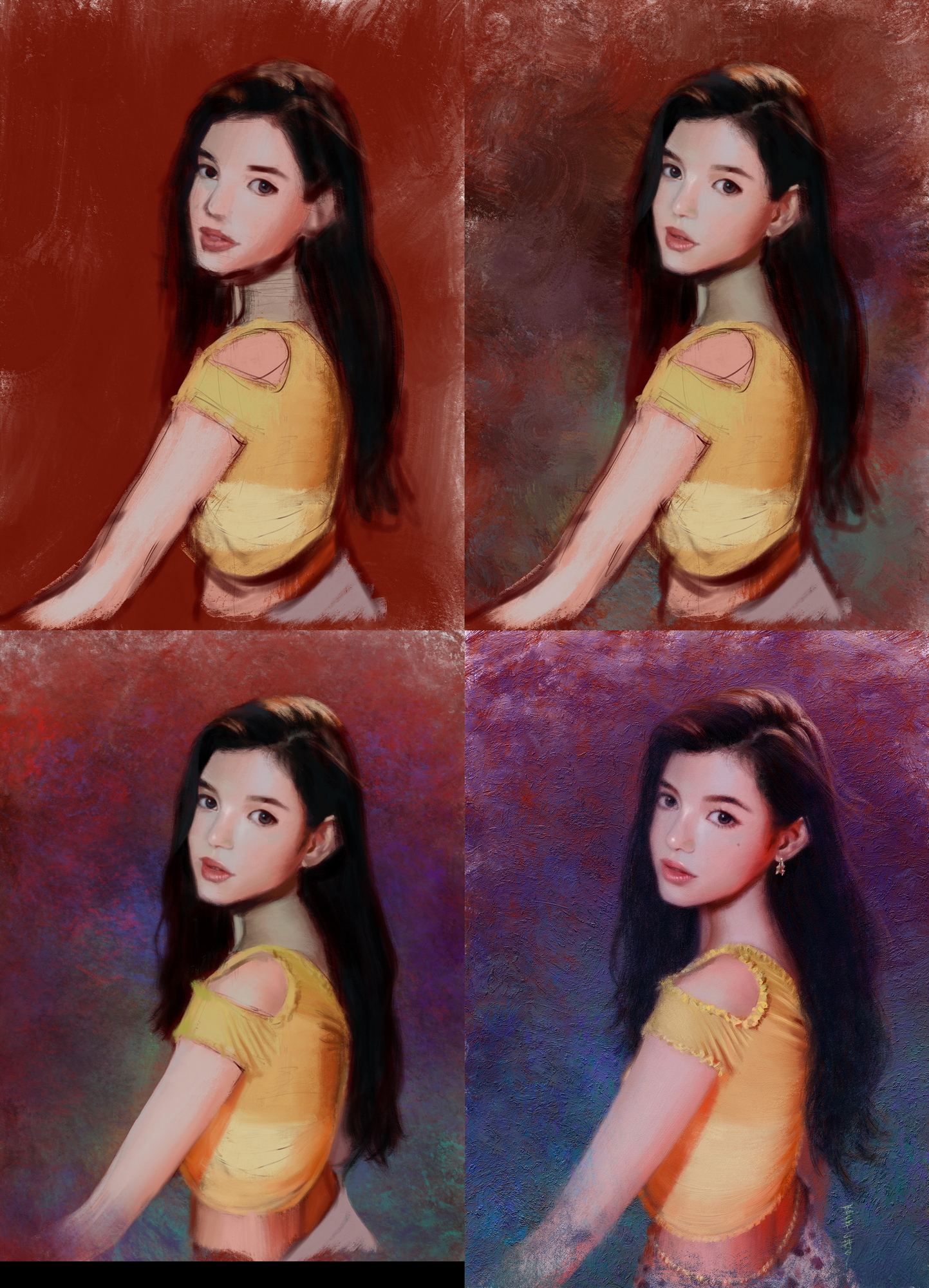
01-28-2024, 11:42 AM
(01-27-2024, 10:18 AM)Lunatique Wrote:Absolutely incredible and thank you so much for sharing the video and the process pics. I'm not gonna lie, when I first started browsing your sketchbook I really was thinking that these were photo paint overs in software like Corel Painter with the cloning, or something, but seeing your works and progress, and especially the video really seal the deal that it is indeed all real. You should be very proud and happy about your accomplishments with what you are able to produce in the visual arts, and you are by far the best that I have seen when it comes to really merging painterly and realism. Thank you again for the great advice on my sketchbook again. I create mostly from imagination but am getting into light studies and using reference more.(01-23-2024, 01:48 PM)Lege1 Wrote: Really skillfully masterful and beautiful work here. I love all that have going on here. You've really done an amazing job at making the digital medium look very naturally analog.
LEGEND'S SKETCHBOOK_001
To all artists struggling to create and are intimidated by A.I. (anti-imagination)  "Everything has been done, but not by you" "Everything has been done, but not by you" 
01-31-2024, 05:33 PM
Great work with your latest! I think I prefer the second one, as the white background at the top in the first one is a bit too much, it detracts from the figure IMO. Great brushwork altogether as always, keep it up Robert!
02-01-2024, 08:31 AM
Just awesome work!
I've seen the 'angel girl' piece somewhere before. Was it in Spectrum? http://crimsondaggers.com/forum/attachme...ed-rgb.jpg |
|
« Next Oldest | Next Newest »
|