Monsieur-Beefy
Unregistered
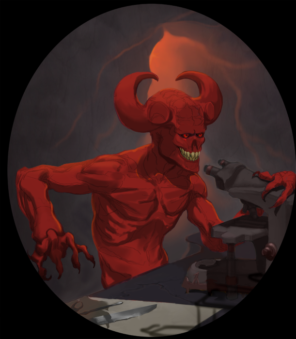
> Hey, my name is Mick Scott, and I want to draw for a living.
> I'm 16, and when I grow up I want to work on stuff like D&D, Pathfinder, and Magic because I play all those things! My plan is to draw every day until I get there. My favorite artists are Wayne Reynolds, Prometheus|ANJ, Clement Sauve, and Marko Djurdjevic. My largest inspirations are Algenpfleger and Robogabo and Dave Rapoza. I'm in my first year of college.
>I'm not setting any real deathline goals, but by summer of 2013 I really want to be:
-done with college and high school
-beginning my search for work
-exercising everyday
-and most importantly I want to have a comfortable understanding of perspective, anatomy, color, and value.
I've been posting every day for a month now on CA and I want to keep that up for the next year as well.
> That's about it so here I go! First is some half recent stuff. I've also got a book on CA which has all the exact same stuff in it :D


Holy shit you're 16 and in college already!? Congrats man. Keep working hard, you're well on your way it appears.
Posts: 43
Threads: 0
Joined: Feb 2012
Reputation:
0
Mick, that's an excellent set of goals and you're already well on your way to developing the skills that you will need. I know that you're already WAY better than I was at 16.
For the most part, the critique will be all the same, but it's very valuable: do studies, learn anatomy and form and shape design, draw a LOT and do tons of sketches. That being said:
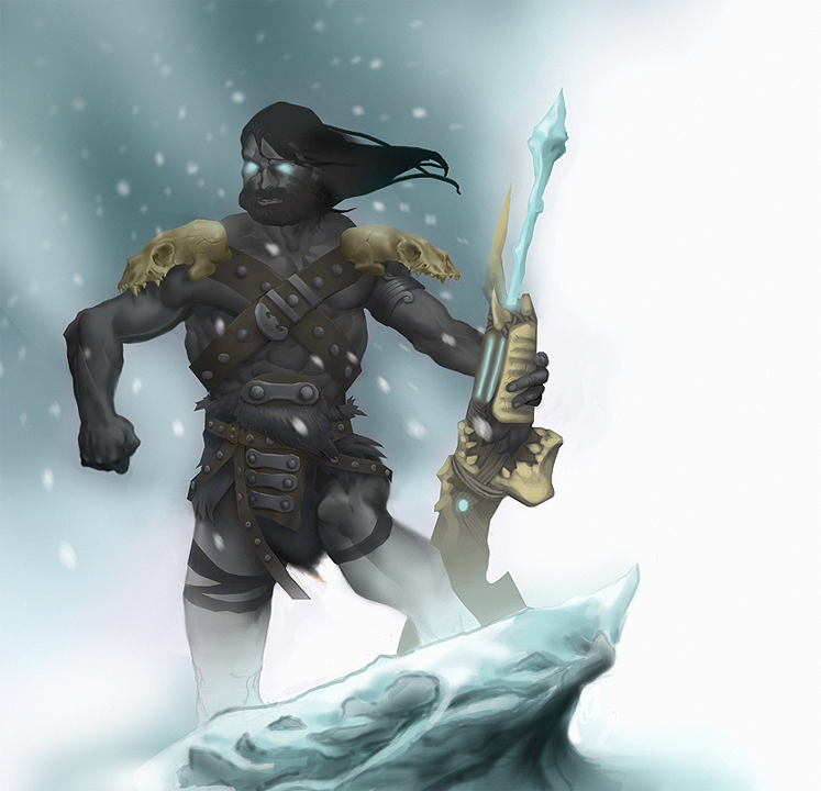
This first piece already has some interesting forms and finishing power to it. You're already heavily designing the silhouette of the character and the shape language of the composition. I have noticed that you completely obscured the feet - and I believe this is a mistake. They're hard, and it might not look the best, but the sooner you learn how to properly ground your characters, the better they will eventually look because you've worked out center of gravity and how to make two objects look like they're actually touching. The instinct to use soft brushes is a good one, but see if you can simplify your gradients further, or perhaps just make the value progression much more subtle.
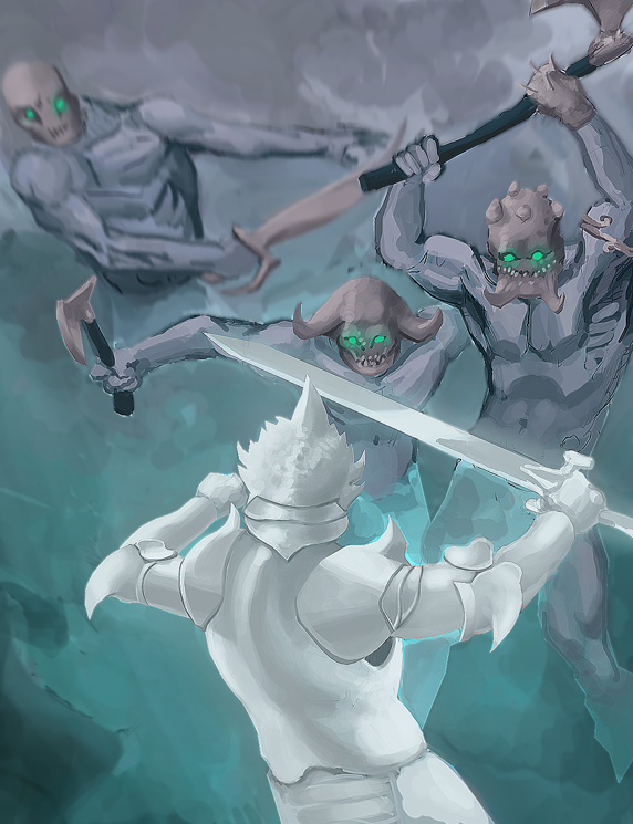
So I see you've discovered the magic of sharpening filters: be warned! Sometimes they will make a piece look more "finished" since they true up your edges and make things more distinct. However, sometimes a nice lost edge is what you need in a certain location... and if you run more than one sharpening filter on the same image you end up with little jaggy artifacts on your edges. Used sparingly these filters are a blessing, but they can be easily taking too far. Secondly, I know this is hard, but try to collect the different elements of your image into easily identifiable value groups. You definitely have the white foreground guy separated out, but the figures in the background look like they're trying just a little bit too hard to stay out of each others' way. You'll definitely want to figure out how to properly have things overlap. James Gurney wrote an excellent piece about "busy edges" that I think applies to your work.
One thing above all: PRIORITIZE! Figure out what is the most important part of the image, then the next most important part, then so forth and so on down the line. What kind of story are you trying to communicate, or what sort of character are you drawing? The anatomy, shape design, colors, and everything else should be SLAVE to this primary objective. Then take the next most important part. The shape design is much more important than the value structure, the values and lighting are more important than the colors, the colors are more important than getting the little buckles and skeleton teeth rendered meticulously.
I hope all this helps, and I'd also like to say that if you ever have any questions or wish to receive any crits, feel free to shoot me an email or msg me on aim or gtalk. I'm usually around.
Monsieur-Beefy
Unregistered
@ Seth Lange : Thanks bro. I'm in running start, so both high-school and college really, but I'm doing the college full time and not doing any of the high-school haha.
@ Lake : Thank you soo much for this post. Not only is this advice incredibly helpful, but I'm also a huuuge fan of yours. Your third section on prioritizing the various elements is something I really identified with.
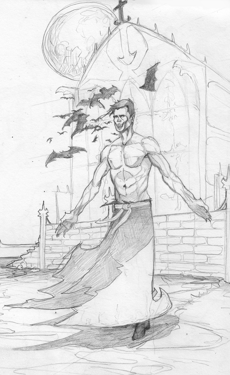
Truth be told, I haven't done more than 15-20 paintings digitally before. Right now it feels like I'm learning faster than I can paint. In that second image I posted the whole thing was drawn with a hard circle brush on like 70% opacity and like no pressure settings. In the first image I posted (which is more recent) I drew most of it with lasso tool and a really really soft 100% opaque circle brush with pressure sensitivity set to opacity. Anyways, I'm haven't really developed a process I'm comfortable with yet, and right now it feels like every single one of my paintings is completely different in both style and process because of it.
This here is something I'm working on currently:

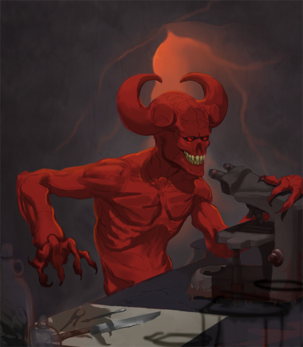
I want to direct the composition up the microscope to his face then back down the arm and so on in a big circle but I feel like it keeps getting sucked out both the bottom right and the top left.
I really wish I could do something like this but I know I should find a solution instead.

Monsieur-Beefy
Unregistered
@ 7Brushes : Thank you!
- -

All out. No refs. I was trying to see how well I could draw from just my mind. This is pretty close to maximum power for me right now. I wanted to add wolves, but I can't even imagine what they really look like so didn't add them. His skirt-thing is super dumb too. ah well.
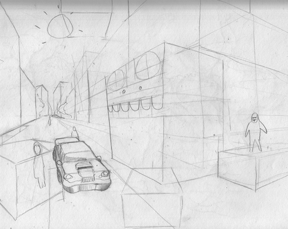
Also, basically everything I learned about perspective today:

Monsieur-Beefy
Unregistered
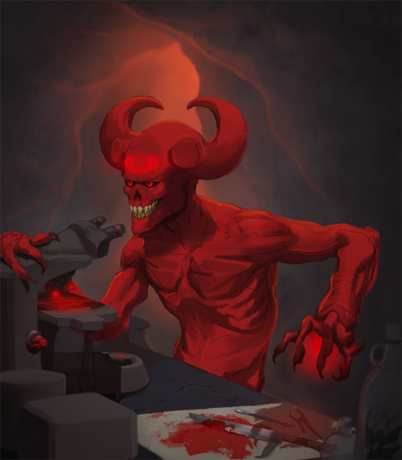
Okay, I think I'm "done". By that I mean I'm frustrated enough that I want to paint it all over from the very beginning.
The character is Belial's head virologist, a demon by the name of Nosferyke. The demon-mark he bears upon his forehead reads 'to purify'
It is his task to create a plague so very devastating that . . .
everyone will die!
haha.:sleepy:

Posts: 43
Threads: 0
Joined: Feb 2012
Reputation:
0
That knife in the front is the most kickass part of this whole piece! Whatever method you are using for that (small cast shadow and lasso/soft brush) is working.
I would caution you about two things:
First, be wary about some parts of the concept - does Belial's chief virologist need to use modern scientific equipment? Could the plague be created magically? What, other than the pentagram, can be made more "hellish" about his tools? From a design standpoint a lot of this looks like throwaway stuff, and I know that you can do better.
Second, I'd like to bring up the idea of what I call "saturation tiering" - everything in your image is SO RED that none of it really stands out and it begins to look much more monochromatic than it actually is. Be very selective about where the most saturated parts of your image are and you'll find that the brighter areas will jump out at you much more. For an interesting exercise, take a piece and actually plan out which parts, in order from most to least, will have what level of saturation.
Monsieur-Beefy
Unregistered
@ lake : I agree. felt really good about that part. It was actually for a contest where I had to combine technology and magic, so the modern technology was necessary. The implementation of it was pretty terrible though, and your probably right about being able to do much better. I might redraw this differently soon, just to see how much I can improve on the original. Also yeah, too much red. I tried to get some orange and purple in there, but it just got washed away. I still don't know much about color, but your saturation tiering idea is something the will help me a lot in planning my compositions I think. I guess it meshes pretty efficiently with your previous post and the concept of prioritization as well. Thanks again ;D
--
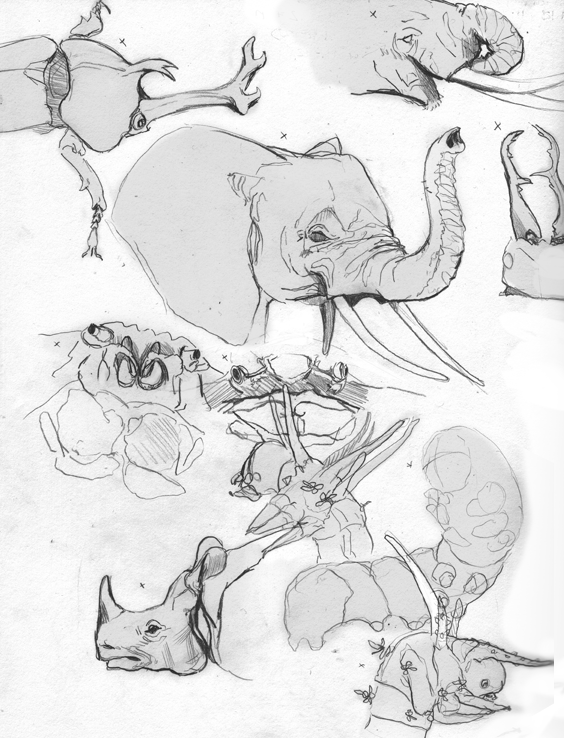
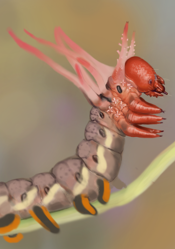
I think I'm gonna go for bloodsport 6, so today I just drew animals until I found one I liked. Settled on caterpillars. more to come tomorrow :D

Posts: 43
Threads: 0
Joined: Feb 2012
Reputation:
0
Dude!
The elephant and rhino drawings are sick - mad props!
Monsieur-Beefy
Unregistered
@ lake : Thanks ;D
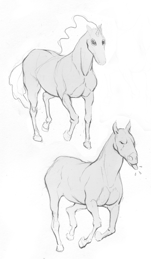
I was gonna do a six legged exoskeletonned horse thing with tusks like a beetle, but I have decided against it for three reasons. 1) I want to go fantasy not astronauts now, which means the reduced gravity necessary for such a creature to exist is not as simple to come by. 2) I want it to look like a monster not a lame-o herbivore. 3) I realize now, horses look stupid.
So, back to caterpillars. I'm gonna do a [real] study of a hickory horned devil tomorrow.

Posts: 160
Threads: 3
Joined: Jan 2012
Reputation:
10
You sir are a credit to today's youth. Fantastic job on the horses, you've managed to capture all the the major forms while maintaining a nice degree of economy. Waste not want not...or something. Anyways, I can't wait to see your take on the caterpillars. You have quite the future ahead of you.
Posts: 127
Threads: 4
Joined: Jan 2012
Reputation:
1
cool beans, off to a good start ;D
Monsieur-Beefy
Unregistered
@ CoreyKLamb : Thanks bro. I try to use line weight as much as I can to emphasize form.
@ rich4rt : Thanks!
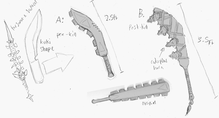
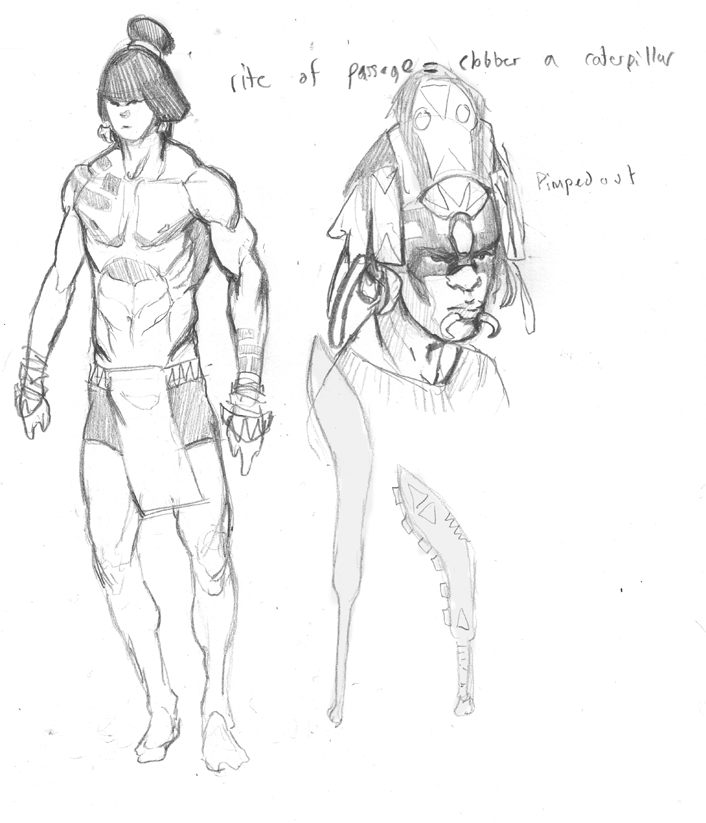
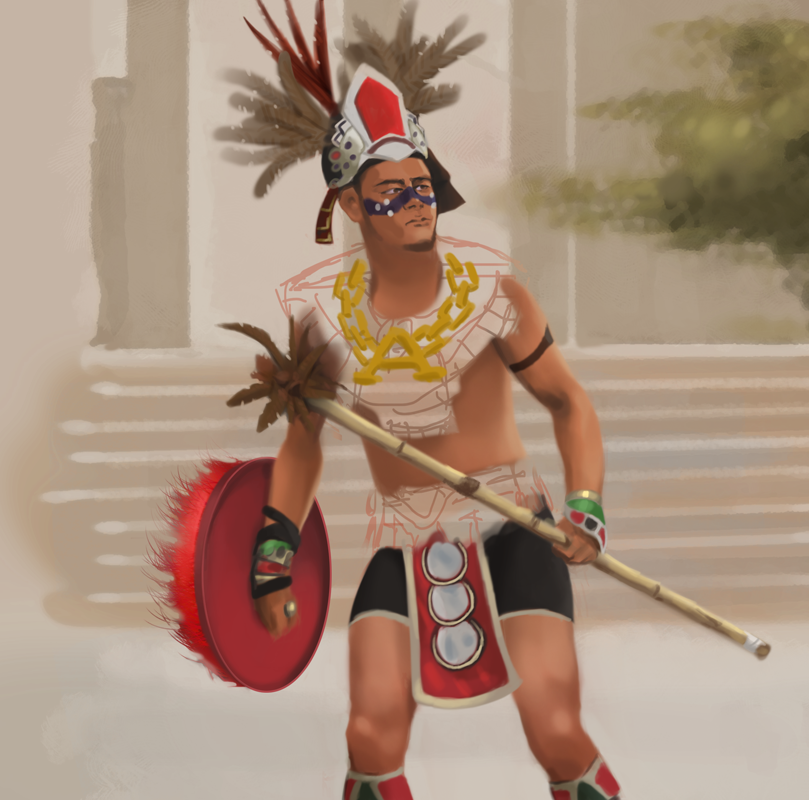
I didn't have time to finish the color study today. I'll post it tomorrow! I'm going Mayan for my culture. The idea is that this mayan frat boy has to go out and paddle a caterpillar, then dress in its skin, to become an accepted member of his fictional society :huh: He goes in with a club and a loincloth then after the fight he has acquired the right to wear cool pimped out Mayan clothes. like in 300 when the kid spears that wolf. basically.


Monsieur-Beefy
Unregistered
Aww maaaan. still not done :-/ I've spent like 4 hours on this so far haha.
I'm learning a lot about color that I never noticed before, but mostly I've learned to work on a larger canvas. What you see here is 100% zoom haha.

Posts: 43
Threads: 0
Joined: Feb 2012
Reputation:
0
Caterpillar is looking good, dude.
I'd say perhaps spend longer messing around with the colors before trying to render anything - it's more important that you get the general structure of the colors correct than it is to have any sort of details.
Monsieur-Beefy
Unregistered
@ lake : yeah. I've been kind of 'glazing' with color layers on like 5-10% to fix stuff which isn't a very good solution. Which parts look most wrong to you?
Didn't finish again today. My primary goal right now is just gonna be to get faster I think. Also, family double dash tournament kept me busy :blush:
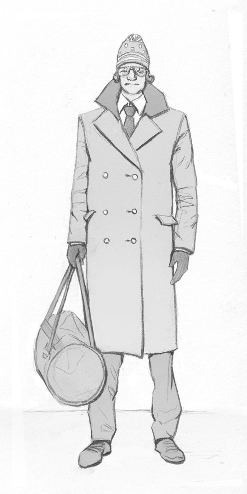
anyways. A-to-the-Z-to-the-T-E-C, there ain't no fighter fancier than me:

Should I be posting the images I'm using for reference on these?
Monsieur-Beefy
Unregistered
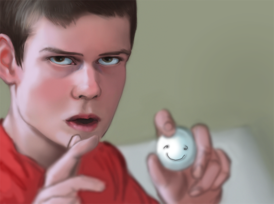
I had a three day weekend today, so I was kinda just in the mood to chill. From a photo:

Posts: 36
Threads: 5
Joined: Jan 2012
Reputation:
1
Great job on these studies man. As you draw more you will automatically get faster since you recognize shapes and values and can automatically block them out without having to look at your reference all the time.
(02-20-2012, 05:27 PM)Monsieur-Beefy Wrote: Should I be posting the images I'm using for reference on these?
Unless you want a crit specific to the reference or something like that, there's no need. We're all here to learn so using reference is a given.
Posts: 112
Threads: 0
Joined: Jan 2012
Reputation:
13
keep it up man, looking good.
|
