Posts: 465
Threads: 2
Joined: Mar 2013
Reputation:
18
Posts: 448
Threads: 1
Joined: Feb 2013
Reputation:
6
Those rendering studies on the last study are amazing, well done!
And don't give in! You can watch cartoons once you're old, imagine how much binge watching you can do if you don't watch them for like 20 years! lol.
Posts: 1,527
Threads: 24
Joined: Dec 2012
Reputation:
70
Welcome back Sam!
Shiiiiet. I feel like many of us know that feeling, heh. At least you know when you need to pick yourself out of it~
In periods like this, it really is good recovery to just draw whatever makes you happy. Whatever that may be. Focusing on goals is also a great idea.
Aaaand just quietly: KILLING THE ANATOMYYYYY. :D
Also, now I have a strange urge to watch Digimon.
Looking forward to le next update, Sam! Keep calm and cartoon on!
sketchbook | pg 52
"Not a single thing in this world isn't in the process of becoming something else."
I'll be back - it's an odyssey, after all
Posts: 350
Threads: 15
Joined: Jun 2012
Reputation:
18
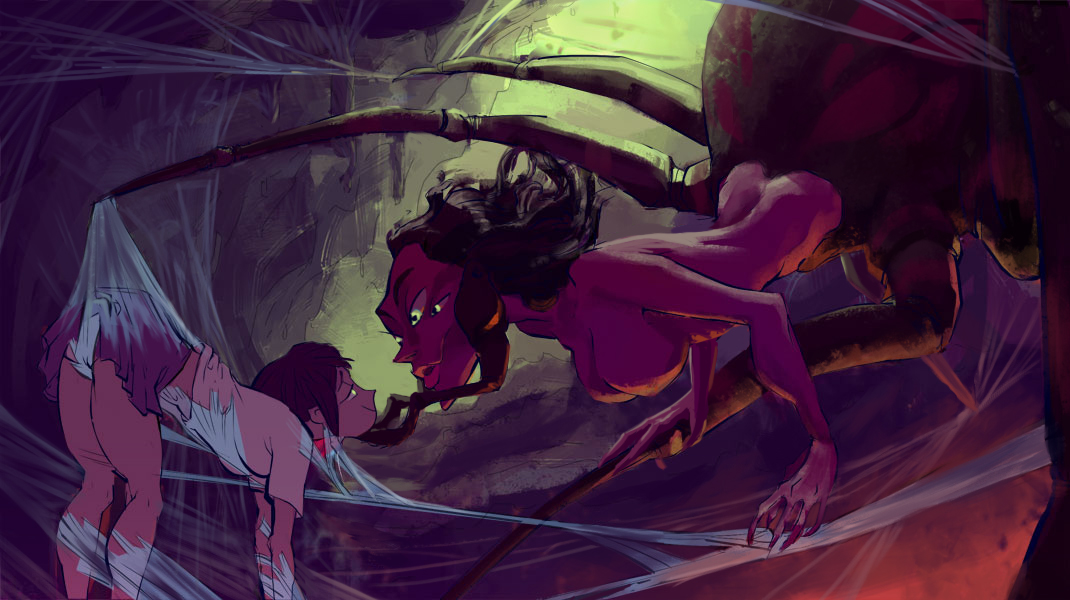
Hey, sam! Been awhile since I was here. As always your sketches are great! I'm really fond of that spider queen lady you were doing a few pages back, you ever finish that? The girls with the outfit malfunctions on the last page were fun too, haha. I can definitely relate to the feeling dead thing. It is pretty awful, especially when you start to want night to come so you can just sleep instead of be awake(before noon even comes around.) Every so often I end up doing that tho and it reminds me how much I want to do this and kinda refuels me out through fear, haha. Have you ever considered streaming? Good way to make yourself work! Keep pushing, dude!
Posts: 573
Threads: 17
Joined: Mar 2012
Reputation:
7
Ho Sam,
I really love your sketches, I just wished you would finish some of them. :)
I love how much you draw man, it is really inspiring to see so many nice lines. As for crits, I would suggest you do some constructed backgrounds since that is asked of a storyboard artist as well (which is something I could definitely see you being). And maybe try some more realistic characters here and there.
I will be back ;)
Oh and for the feeling dead thing, maybe it helps to attend a life drawing class and talk to other people. Usually being with other people that are nice is helping a lot when I feel down. Or reading a good book or taking a walk when the senses are overwhelmed with internet-stimulus ;)
Posts: 274
Threads: 0
Joined: Feb 2014
Reputation:
3
I'm digging the energy in your sketches, particularly those Digimon ones. I'd like Digimon more if the actual series looked like that!
Posts: 465
Threads: 2
Joined: Mar 2013
Reputation:
18
Posts: 1,118
Threads: 12
Joined: Nov 2013
Reputation:
63
Cool designs so far. I have the same problem with focusing all on naked figures and feeling lost with costumes.
Posts: 350
Threads: 15
Joined: Jun 2012
Reputation:
18
woo videl! I like the guard uniform, I was gonna suggest repeating the M shape from his faceguard in the thigh area of his mail but it looks like you may have tried that and didn't like it? I like that weapon design too, were those actual things or did you make 'em up? pretty cooool~ keep the work coming! 
Posts: 465
Threads: 2
Joined: Mar 2013
Reputation:
18
Thanks guys! repeating that shape's a good idea..and the swords are a special order for the comic, they're and egyptian weapon called a kopesh, but they're made by dwarves in the story so I made it bulkier and added a hammer. Which is most likely total bullshit design. >_>
Did someone say finished stuff? here's an actual real live WIP! GOD WHAT IS COLOR D:
![[Image: tRqnG5H.jpg]](http://i.imgur.com/tRqnG5H.jpg)
![[Image: baY57AC.jpg]](http://i.imgur.com/baY57AC.jpg)
any thoughts or crits would be cool, I'm at that point where I can't see what this looks like anymore @_@
Posts: 448
Threads: 1
Joined: Feb 2013
Reputation:
6
This last one is looking sooo good.
I'll leave this link here which I think it totally fits your linework and it might help you on them colors, if you already know him nevermind.
http://gh-graphics.blogspot.com.br/
Posts: 350
Threads: 15
Joined: Jun 2012
Reputation:
18
Big ol' crit for ya buddy!

First, I'm gonna say that I do love this piece so far. I changed/added a lot but I think you are already on a great track.
The first big thing I noticed is that this is a giant queen spider and this is her lair but, there are almost no spiderwebs anywhere. There is the bit the girl is being spun in and that is pretty much it. So I started putting some spider webs all about the cave, treating them as comp tools to frame the area of interest as well as help lead the eye. Then I was looking at the legs and how they fan out and I think you're fond of that so I tried to keep it. But it didn't look like she was standing on anything in particular and it occurred to me that could just be in her web. Conveniently helping the narrative of her catching the girl. I also spread the under lighting on the rock because it was causing a tangent with the web
Now for the ladies themselves. I assumed the girl isn't just really fond of spiders and is actually under a trance, which I like. The first thing I thought of was that scene in Jungle Book when Ka is hypnotizing Mowgli and both of their eyes are going nuts. I didn't quite go that direct but I tried to pull the same idea in. Linking their eyes together in some visual way. I used the green you have in the background to make the eyes really pop. There are a lot of ways to actually do this idea so just go with whatever you like the most I think. I would suggest making the queen's pupils smaller though, it makes her more predatory. I also put some patterns on the queen's body. I tried to mimic the base shapes in her face, repeating the eyes and eyebrows. The first set of spider legs conveniently act as her mandibles(which she is missing one of!). I also put some rings on her legs here and there, mostly just so that the leg coming into the foreground is a little easier to read. You can do whatever pattern here you'd like if you don't like what I did, but try to fill that big space without pulling attention from their faces. In retrospect, you could do patterns on the human part of her as well.
Knock her out, Sam! You got thiiiis!
![[Image: Lokq1NC.gif]](http://i.imgur.com/Lokq1NC.gif)
Posts: 850
Threads: 4
Joined: Mar 2013
Reputation:
21
Whaaaat's that talk about not knowing color, that spider piece is coming along super nice! I agree with atrenr, some more spiderwebs are a nice way to introduce some more compositional lines and details. Other than that, two minor things that look off to me, although I'm not 100% sure about them: First one is the lower arm of Mrs. Spider, that muscle standing out there looks really too pronounced to me for her slim body. Not sure if it should make her look more arachnid, but it it made me go "huh" when I saw it. Second thing is how her torso connects to the spider-part - her body is not really that twisted, is it? Lowering the left butt cheek slightly or adjusting the rim on her back a bit might already fix this.
Keep it up! Looking really cool :)
Posts: 465
Threads: 2
Joined: Mar 2013
Reputation:
18
Thanks a lot guys! Love Barret Hanna's art, but I'd never really taken the time to study or synthesize it...might try and pull some of his techniques for this! Really glad I decided to get back into this piece, I'm excited to take it to a finish! Great points all, getting some more visual flow and patterning in there is a cool idea. Though I perosnally think I need some ares with less detail to give the image some mystery and rest...I'll see what happens!
Love the trance suggestion, I actually had that scene with Kaa in mind when I was doing the preliminary sketches for this! Just, with a lesbian spider instead of pedosnake. that's how I roll, I think. Why I didn't do the eye thing I don't know, it definitely helps the focal point and story. Really cool to see you picked up on the similarities :D
Good call adding the other arm and the other mandible ( just for the record they're actually pedipalps), I was scared I'd mess up the silhouette by adding them in but it's my job to find a solution that looks good AND makes sense in space >:0 I like the arm caressing her spiderleg, might add that in. It's much nicer business than just having the hand be there like I decided to!
here's another progress shot, haven't had time to make your changes yet, will try and get to em tomorrow! Biggest thing was I fiddled around with making the lines thicker and more decorative to match the painting style. Might take something from garret's book and wind up taking those out anyway. such WIP. very decisions to be made.
![[Image: BaPfGat.jpg]](http://i.imgur.com/BaPfGat.jpg)
Posts: 7
Threads: 2
Joined: Aug 2014
Reputation:
0
Your work is looking great as ever Sam :)
Posts: 465
Threads: 2
Joined: Mar 2013
Reputation:
18
Posts: 206
Threads: 5
Joined: Aug 2014
Reputation:
1
That's lookin pretty nice. I think you could also try to do some sort of eye to eye connection effect if you don't want to affect them too much.
Also: https://www.youtube.com/watch?v=SBfnjRC2zNI
Sorry for that ^
Posts: 465
Threads: 2
Joined: Mar 2013
Reputation:
18
Posts: 465
Threads: 2
Joined: Mar 2013
Reputation:
18
Posts: 465
Threads: 2
Joined: Mar 2013
Reputation:
18
|
![[Image: RVR1mKq.jpg]](http://i.imgur.com/RVR1mKq.jpg)
![[Image: 5mcypxe.jpg]](http://i.imgur.com/5mcypxe.jpg)
![[Image: xLRZgzV.jpg]](http://i.imgur.com/xLRZgzV.jpg)
![[Image: HczUOT5.jpg]](http://i.imgur.com/HczUOT5.jpg)
![[Image: FOJMLrO.jpg]](http://i.imgur.com/FOJMLrO.jpg)
![[Image: YIDcTV5.jpg]](http://i.imgur.com/YIDcTV5.jpg)
![[Image: imI80AN.jpg]](http://i.imgur.com/imI80AN.jpg)
![[Image: YYbTWUB.jpg]](http://i.imgur.com/YYbTWUB.jpg)
![[Image: M8qTLQa.jpg]](http://i.imgur.com/M8qTLQa.jpg)
![[Image: jFLcqxk.jpg]](http://i.imgur.com/jFLcqxk.jpg)
![[Image: VXRdzF9.jpg]](http://i.imgur.com/VXRdzF9.jpg)


![[Image: EuYhcKr.jpg]](http://i.imgur.com/EuYhcKr.jpg)
![[Image: NpR3dER.jpg]](http://i.imgur.com/NpR3dER.jpg)
![[Image: wnWVZzL.jpg]](http://i.imgur.com/wnWVZzL.jpg)
![[Image: kmNZCnn.jpg]](http://i.imgur.com/kmNZCnn.jpg)
![[Image: LLP9yRp.jpg]](http://i.imgur.com/LLP9yRp.jpg)
![[Image: 5hoxXF7.jpg]](http://i.imgur.com/5hoxXF7.jpg)
![[Image: D4v2HL5.jpg]](http://i.imgur.com/D4v2HL5.jpg)
![[Image: mrMKU3S.jpg]](http://i.imgur.com/mrMKU3S.jpg)
![[Image: x4dYKGl.jpg]](http://i.imgur.com/x4dYKGl.jpg)
![[Image: Vkoc8Bv.jpg]](http://i.imgur.com/Vkoc8Bv.jpg)
![[Image: bAVEpFk.jpg]](http://i.imgur.com/bAVEpFk.jpg)
![[Image: 5tZynb6.jpg]](http://i.imgur.com/5tZynb6.jpg)
![[Image: D4w4cO7.jpg]](http://i.imgur.com/D4w4cO7.jpg)
![[Image: bdHEJf1.jpg]](http://i.imgur.com/bdHEJf1.jpg)
![[Image: RmYcW4b.jpg]](http://i.imgur.com/RmYcW4b.jpg)
![[Image: 6uTsCkj.jpg]](http://i.imgur.com/6uTsCkj.jpg)
![[Image: kiYnEop.jpg]](http://i.imgur.com/kiYnEop.jpg)

![[Image: tRqnG5H.jpg]](http://i.imgur.com/tRqnG5H.jpg)
![[Image: baY57AC.jpg]](http://i.imgur.com/baY57AC.jpg)

![[Image: Lokq1NC.gif]](http://i.imgur.com/Lokq1NC.gif)
![[Image: BaPfGat.jpg]](http://i.imgur.com/BaPfGat.jpg)
![[Image: DEjpIX9.jpg]](http://i.imgur.com/DEjpIX9.jpg)
![[Image: C1YbbTc.jpg]](http://i.imgur.com/C1YbbTc.jpg)
![[Image: NgTFI73.jpg]](http://i.imgur.com/NgTFI73.jpg)
![[Image: J61Jvh9.jpg]](http://i.imgur.com/J61Jvh9.jpg)
![[Image: 5lUY5o1.jpg]](http://i.imgur.com/5lUY5o1.jpg)
![[Image: oUHi16F.jpg]](http://i.imgur.com/oUHi16F.jpg)
![[Image: XYfRI8A.jpg]](http://i.imgur.com/XYfRI8A.jpg)
![[Image: jiR9KRA.jpg]](http://i.imgur.com/jiR9KRA.jpg)
![[Image: zxDYA2l.jpg]](http://i.imgur.com/zxDYA2l.jpg)
![[Image: JVqTczL.jpg]](http://i.imgur.com/JVqTczL.jpg)
![[Image: uf6R4rI.jpg]](http://i.imgur.com/%5BIMG%5Dhttp://i.imgur.com/uf6R4rI.jpg)
![[Image: TtNXULS.jpg]](http://i.imgur.com/TtNXULS.jpg)
![[Image: 5RFv1uX.jpg]](http://i.imgur.com/5RFv1uX.jpg)
![[Image: Ilzh4bS.jpg]](http://i.imgur.com/Ilzh4bS.jpg)
![[Image: 7P8DFNr.jpg]](http://i.imgur.com/7P8DFNr.jpg)
![[Image: zXKPcs5.jpg]](http://i.imgur.com/zXKPcs5.jpg)
![[Image: KaGhWXc.jpg]](http://i.imgur.com/KaGhWXc.jpg)
![[Image: kYrdUO9.jpg]](http://i.imgur.com/kYrdUO9.jpg)
![[Image: Gw1IAiO.jpg]](http://i.imgur.com/Gw1IAiO.jpg)
![[Image: Wd6sfNj.jpg]](http://i.imgur.com/Wd6sfNj.jpg)
![[Image: hZtgmRM.jpg]](http://i.imgur.com/hZtgmRM.jpg)
![[Image: uIu3tWN.jpg]](http://i.imgur.com/uIu3tWN.jpg)
![[Image: ZVzkNlT.jpg]](http://i.imgur.com/ZVzkNlT.jpg)
![[Image: UrMS32L.jpg]](http://i.imgur.com/UrMS32L.jpg)
![[Image: 5p7dGUe.jpg]](http://i.imgur.com/5p7dGUe.jpg)
![[Image: SLlFgn3.jpg]](http://i.imgur.com/SLlFgn3.jpg)
![[Image: T9kf3kj.jpg]](http://i.imgur.com/T9kf3kj.jpg)
![[Image: OTK3pfz.jpg]](http://i.imgur.com/OTK3pfz.jpg)
![[Image: X7Qtz5l.jpg]](http://i.imgur.com/X7Qtz5l.jpg)
![[Image: syOzxMb.jpg]](http://i.imgur.com/syOzxMb.jpg)
![[Image: PLxXSow.jpg]](http://i.imgur.com/PLxXSow.jpg)
![[Image: X6bAPzd.jpg]](http://i.imgur.com/X6bAPzd.jpg)
![[Image: 0A5KGwA.jpg]](http://i.imgur.com/0A5KGwA.jpg)
![[Image: 4Bhhx5V.jpg]](http://i.imgur.com/4Bhhx5V.jpg)
![[Image: gH45HKT.jpg]](http://i.imgur.com/gH45HKT.jpg)
![[Image: QW4DKur.jpg]](http://i.imgur.com/QW4DKur.jpg)
![[Image: dChfJGu.jpg]](http://i.imgur.com/dChfJGu.jpg)
![[Image: QVYrx6v.jpg]](http://i.imgur.com/QVYrx6v.jpg)
![[Image: 8i7RjQp.jpg]](http://i.imgur.com/8i7RjQp.jpg)
![[Image: 8x2qOSl.jpg]](http://i.imgur.com/8x2qOSl.jpg)
![[Image: ybsSaYy.jpg]](http://i.imgur.com/ybsSaYy.jpg)
![[Image: DrGLVsM.jpg]](http://i.imgur.com/DrGLVsM.jpg)
![[Image: zYkqiwl.jpg]](http://i.imgur.com/zYkqiwl.jpg)
![[Image: eWOVpnx.jpg]](http://i.imgur.com/eWOVpnx.jpg)
![[Image: 1s4bq5K.jpg]](http://i.imgur.com/1s4bq5K.jpg)
![[Image: RLsYdqV.jpg]](http://i.imgur.com/RLsYdqV.jpg)
![[Image: cIPGsgs.jpg]](http://i.imgur.com/cIPGsgs.jpg)
![[Image: UmWqmoh.jpg]](http://i.imgur.com/UmWqmoh.jpg)
![[Image: aPBTJNG.jpg]](http://i.imgur.com/aPBTJNG.jpg)
![[Image: TwZ5kAV.jpg]](http://i.imgur.com/TwZ5kAV.jpg)
![[Image: 57zhu0r.jpg]](http://i.imgur.com/57zhu0r.jpg)
![[Image: 5094kxz.jpg]](http://i.imgur.com/5094kxz.jpg)
![[Image: pedHNlS.jpg]](http://i.imgur.com/pedHNlS.jpg)
![[Image: Paw7vVK.jpg]](http://i.imgur.com/Paw7vVK.jpg)
![[Image: 1vSBkxQ.jpg]](http://i.imgur.com/1vSBkxQ.jpg)
![[Image: oVixacy.jpg]](http://i.imgur.com/oVixacy.jpg)
![[Image: S4xeVTk.jpg]](http://i.imgur.com/S4xeVTk.jpg)
![[Image: Iw7Ilwq.jpg]](http://i.imgur.com/Iw7Ilwq.jpg)
![[Image: nUPiGdm.jpg]](http://i.imgur.com/nUPiGdm.jpg)
![[Image: KTxDD7z.jpg]](http://i.imgur.com/KTxDD7z.jpg)
![[Image: qVlEKT3.jpg]](http://i.imgur.com/qVlEKT3.jpg)
![[Image: OzZp8kf.jpg]](http://i.imgur.com/OzZp8kf.jpg)
![[Image: WZxJYsA.jpg]](http://i.imgur.com/WZxJYsA.jpg)
![[Image: rkhqbZp.jpg]](http://i.imgur.com/rkhqbZp.jpg)
![[Image: 7jfOmpH.jpg]](http://i.imgur.com/7jfOmpH.jpg)
![[Image: GArIrOA.jpg]](http://i.imgur.com/GArIrOA.jpg)
![[Image: rB6AlHG.jpg]](http://i.imgur.com/rB6AlHG.jpg)
![[Image: PzrlIGr.jpg]](http://i.imgur.com/PzrlIGr.jpg)
![[Image: IeR12Bw.jpg]](http://i.imgur.com/IeR12Bw.jpg)
![[Image: UznO4Ex.jpg]](http://i.imgur.com/UznO4Ex.jpg)
![[Image: OvZgVFY.jpg]](http://i.imgur.com/OvZgVFY.jpg)
![[Image: UvZxmqU.jpg]](http://i.imgur.com/UvZxmqU.jpg)
![[Image: AQ9JQS5.jpg]](http://i.imgur.com/AQ9JQS5.jpg)