Posts: 273
Threads: 2
Joined: Dec 2012
Reputation:
10
@darktiste
Thanks for the feedback, but I know how to do a clean pencil drawing if I want to. As I said, these are NOT that. These are throwaway notes for learning, and I treat them as such, they're not meant to be pretty, and I certainly am not going to pay attention to finishes like lineweight with these.
Cleaner drawing of the Dragonborn Paladin character - these lines will not be in the final, either, I'll paint on top of them, these are just more refined guides:
![[Image: KhFg2mv.jpg]](https://i.imgur.com/KhFg2mv.jpg)
And some dragon body sketches, all following tutorials from Neondragon's book - I know, it's a drawing book for kids, but I'm taking it easy for now, and I'm actually learning a lot from these:
![[Image: 7WuTQdT.jpg]](https://i.imgur.com/7WuTQdT.jpg)
![[Image: xDUb3oK.jpg]](https://i.imgur.com/xDUb3oK.jpg)
![[Image: MUV72aW.jpg]](https://i.imgur.com/MUV72aW.jpg)
![[Image: 0j1nGyb.jpg]](https://i.imgur.com/0j1nGyb.jpg)
Posts: 273
Threads: 2
Joined: Dec 2012
Reputation:
10
Dragon muscle study, probably not entirely accurate:
![[Image: 3v28HDo.jpg]](https://i.imgur.com/3v28HDo.jpg)
Some half-assed dragon skull and dragon/bat wing anatomy studies:
![[Image: BUCmean.png]](https://i.imgur.com/BUCmean.png)
Warm-up character portrait, going for a loosely painted style and failing:
![[Image: aeon_priestess_kuipania_by_olooriel_dd80...3NLkcXcwho]](https://images-wixmp-ed30a86b8c4ca887773594c2.wixmp.com/f/49818fb6-cafe-4ef9-9a8c-7e46845861fe/dd80wcg-022f0aeb-a64b-40a9-b3c3-2327c020c72a.jpg/v1/fill/w_894,h_894,q_70,strp/aeon_priestess_kuipania_by_olooriel_dd80wcg-pre.jpg?token=eyJ0eXAiOiJKV1QiLCJhbGciOiJIUzI1NiJ9.eyJzdWIiOiJ1cm46YXBwOjdlMGQxODg5ODIyNjQzNzNhNWYwZDQxNWVhMGQyNmUwIiwiaXNzIjoidXJuOmFwcDo3ZTBkMTg4OTgyMjY0MzczYTVmMGQ0MTVlYTBkMjZlMCIsIm9iaiI6W1t7ImhlaWdodCI6Ijw9MTA4MCIsInBhdGgiOiJcL2ZcLzQ5ODE4ZmI2LWNhZmUtNGVmOS05YThjLTdlNDY4NDU4NjFmZVwvZGQ4MHdjZy0wMjJmMGFlYi1hNjRiLTQwYTktYjNjMy0yMzI3YzAyMGM3MmEuanBnIiwid2lkdGgiOiI8PTEwODAifV1dLCJhdWQiOlsidXJuOnNlcnZpY2U6aW1hZ2Uub3BlcmF0aW9ucyJdfQ.iL5j8FI4EsZyIRIVtrEOLcNyThRvufHPV3NLkcXcwho)
Another character portrait that originally was supposed to match the previous one, but then I decided to concentrate on my lacking forms and anatomy instead of trying for a style that would just end up looking messy as long as I don't have the foundations down. Briefly considered redoing the previous one to match, but probably would be a waste of time.
![[Image: Banh8Eb.png]](https://i.imgur.com/Banh8Eb.png)
Then I got sad that I couldn't participate in #portfolioday because not only do I not have a portfolio - I don't even have enough finished and recent (less than 2 years old) work to fill a twitter post. So I finished up this sketch I did last year to try and have at least four images for next portfolioday (October 8th).
![[Image: demon_medic_by_olooriel_ddbgroz-pre.jpg?...Jd5AZcNZlc]](https://images-wixmp-ed30a86b8c4ca887773594c2.wixmp.com/f/49818fb6-cafe-4ef9-9a8c-7e46845861fe/ddbgroz-7e1b6633-8fe6-4825-b349-04dabd6b22c6.png/v1/fill/w_857,h_933,q_70,strp/demon_medic_by_olooriel_ddbgroz-pre.jpg?token=eyJ0eXAiOiJKV1QiLCJhbGciOiJIUzI1NiJ9.eyJzdWIiOiJ1cm46YXBwOjdlMGQxODg5ODIyNjQzNzNhNWYwZDQxNWVhMGQyNmUwIiwiaXNzIjoidXJuOmFwcDo3ZTBkMTg4OTgyMjY0MzczYTVmMGQ0MTVlYTBkMjZlMCIsIm9iaiI6W1t7ImhlaWdodCI6Ijw9OTQzIiwicGF0aCI6IlwvZlwvNDk4MThmYjYtY2FmZS00ZWY5LTlhOGMtN2U0Njg0NTg2MWZlXC9kZGJncm96LTdlMWI2NjMzLThmZTYtNDgyNS1iMzQ5LTA0ZGFiZDZiMjJjNi5wbmciLCJ3aWR0aCI6Ijw9ODY2In1dXSwiYXVkIjpbInVybjpzZXJ2aWNlOmltYWdlLm9wZXJhdGlvbnMiXX0.74LkSPdI3gIK7X72itoO3qIxyV2iw3BaTJd5AZcNZlc)
Posts: 273
Threads: 2
Joined: Dec 2012
Reputation:
10
Small update - I should stop collecting stuff until I feel that it's enough to "warrant a post", because it never is. Starting tomorrow, I will try posting daily wips and studies, just everything I do - maybe that will be more motivating. Clearly, what I've been doing isn't working well, so time to switch it up.
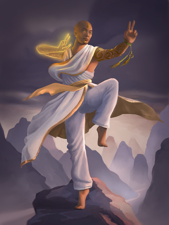
This *was* the final of the Dragonborn pic, but I just got a pro critique on it and will probably rework it based on that:
![[Image: dddwp3c-6004e0a4-a23b-405d-a7d8-64b2a5ab...4QBMUIGVa8]](https://images-wixmp-ed30a86b8c4ca887773594c2.wixmp.com/f/49818fb6-cafe-4ef9-9a8c-7e46845861fe/dddwp3c-6004e0a4-a23b-405d-a7d8-64b2a5abbfad.png?token=eyJ0eXAiOiJKV1QiLCJhbGciOiJIUzI1NiJ9.eyJzdWIiOiJ1cm46YXBwOiIsImlzcyI6InVybjphcHA6Iiwib2JqIjpbW3sicGF0aCI6IlwvZlwvNDk4MThmYjYtY2FmZS00ZWY5LTlhOGMtN2U0Njg0NTg2MWZlXC9kZGR3cDNjLTYwMDRlMGE0LWEyM2ItNDA1ZC1hN2Q4LTY0YjJhNWFiYmZhZC5wbmcifV1dLCJhdWQiOlsidXJuOnNlcnZpY2U6ZmlsZS5kb3dubG9hZCJdfQ.BCMVmGlfxnfKp7VaqCo6f6DWUUrkzWtny4QBMUIGVa8)
Small dnd character portrait for fun, just to play with limited colours and strong contrasts:
![[Image: de0npzk-f8d1191e-5894-4b32-b9a4-3a246c49...aOVNWbRSsU]](https://images-wixmp-ed30a86b8c4ca887773594c2.wixmp.com/f/49818fb6-cafe-4ef9-9a8c-7e46845861fe/de0npzk-f8d1191e-5894-4b32-b9a4-3a246c49567d.png?token=eyJ0eXAiOiJKV1QiLCJhbGciOiJIUzI1NiJ9.eyJzdWIiOiJ1cm46YXBwOiIsImlzcyI6InVybjphcHA6Iiwib2JqIjpbW3sicGF0aCI6IlwvZlwvNDk4MThmYjYtY2FmZS00ZWY5LTlhOGMtN2U0Njg0NTg2MWZlXC9kZTBucHprLWY4ZDExOTFlLTU4OTQtNGIzMi1iOWE0LTNhMjQ2YzQ5NTY3ZC5wbmcifV1dLCJhdWQiOlsidXJuOnNlcnZpY2U6ZmlsZS5kb3dubG9hZCJdfQ.ZnnNCvwg6ibtT_5pwSifWZenT9wqw8o1naOVNWbRSsU)
Thumbnail to Final (cover for an imaginary boardgame):
![[Image: nTwTc91.jpg]](https://i.imgur.com/nTwTc91.jpg)
![[Image: pSwIobK.jpg]](https://i.imgur.com/pSwIobK.jpg)
Current WIP of a non-canon Planeswalker:
![[Image: GLiTxOz.jpg]](https://i.imgur.com/GLiTxOz.jpg)
Posts: 240
Threads: 8
Joined: Dec 2012
Reputation:
39
that tomb of the sphynx image is awesome
Posts: 432
Threads: 70
Joined: Mar 2020
Reputation:
69
Agreed, that Tomb of the Sphinx image is very striking. I was surprised to learn that it's not for a real game.
Posts: 76
Threads: 2
Joined: Mar 2013
Reputation:
3
Tomb of the Sphinx image is super cool!! Love the colors,in ur face composition and the text is well done too!
Posts: 3,337
Threads: 37
Joined: Aug 2013
Reputation:
234
He could be a planewalker from kamigawa i would find that interesting.
Posts: 273
Threads: 2
Joined: Dec 2012
Reputation:
10
Thank you so much everyone! I wish I was working on real games ;)
I can't take credit for the title text though, that was given as part of the challenge.
Aaand of course I didn't stick with my plans of posting more. 2020 really drained all my energy, I don't know. I was already burned out from the two years before and kinda needed a relaxing year to fill my reserves back up, and this... wasn't it :/
I'll try my best for this one, but I'm so done with new year's resolutions, so this emphatically isn't one. For the record, my resolution for 2020 was to "get out more" LOL
Process for the "Planeswalker" piece from composition to values and color:
![[Image: Db6xNPk.png]](https://i.imgur.com/Db6xNPk.png)
And the final version, not Magic quality of course, but by my standards I think it's still a somewhat solid piece?
![[Image: de2kanb-5967ad2a-e44d-4ec5-af00-53aaf2b0...2c3LbXSXAk]](https://images-wixmp-ed30a86b8c4ca887773594c2.wixmp.com/f/49818fb6-cafe-4ef9-9a8c-7e46845861fe/de2kanb-5967ad2a-e44d-4ec5-af00-53aaf2b01282.png?token=eyJ0eXAiOiJKV1QiLCJhbGciOiJIUzI1NiJ9.eyJzdWIiOiJ1cm46YXBwOiIsImlzcyI6InVybjphcHA6Iiwib2JqIjpbW3sicGF0aCI6IlwvZlwvNDk4MThmYjYtY2FmZS00ZWY5LTlhOGMtN2U0Njg0NTg2MWZlXC9kZTJrYW5iLTU5NjdhZDJhLWU0NGQtNGVjNS1hZjAwLTUzYWFmMmIwMTI4Mi5wbmcifV1dLCJhdWQiOlsidXJuOnNlcnZpY2U6ZmlsZS5kb3dubG9hZCJdfQ.m9pz825tDRJ-MIhbKlzt-nqnldWazc2AE2c3LbXSXAk)
Portrait study that I changed into a fantasy race for another challenge:
![[Image: ZYEkL8z.png]](https://i.imgur.com/ZYEkL8z.png)
Posts: 460
Threads: 10
Joined: Mar 2016
Reputation:
64
Welcome back to CD! I think we all feel a bit drained after 2020. Hopefully, you will feel a lot more inspired this year around with lots of good, creative work produced as a result.
I think that your latest pieces are really solid! Great work on those! I did a bit of overpainting on one of them. The artwork itself was already really great, so I'm not sure I even improved it in any way, but I did get a few ideas looking at it.
Basically, I think there may be some conflicting interests in the image. You have a lot of hard edges and contrast in values on several areas of the image, so I tried to soften a few edges, add a small vignette, and tried to bring a bit more contrast to the face area where I presume the focal point is at. It's just a few suggestions and experiments, so feel free to use it or not! :)

Posts: 3,337
Threads: 37
Joined: Aug 2013
Reputation:
234
Reallly solid i think what could elevate this would be the use of different element to create scale for example you have use the concept of overlap and repeating element but what is missing is the use the concept of putting in what is refer to as scale unit or in other word something we know the size of and help use understand the scale of object inside your scene.One thing you could also add for extra point would be an visual indication of wind maybe you could add a bit of dust flying around in generally the use of leaf is a good way to show movement.Of course those are more comment to push your work to a even greater standard.
Posts: 1,065
Threads: 4
Joined: Jan 2016
Reputation:
43
Really nice updates here, really enjoy your latest character designs especially. The dragon one is especially cool, really nice spin on the whole theme. Keep it up!
Posts: 273
Threads: 2
Joined: Dec 2012
Reputation:
10
@Zorrentos: Thank you for the feedback and paintover! I really like the glow you added to the magical arm, and you're probably right about the edges and contrast on the clouds being too harsh, I'll have to keep that in mind for the future.
@darktiste: I didn't want to add too much busy movement with flying particles or such, but yeah, I probably should have added a better indication for scale on the background landscape.
@cgmythology: Thank you! :)
It's... been a while again. My motivation certainly has been better, but here's a little something I just finished - I hope to have some more soon!
![[Image: dehtlq1-7014e0c2-d159-45a1-a5a9-cb567e0d...HCclgf8254]](https://images-wixmp-ed30a86b8c4ca887773594c2.wixmp.com/f/49818fb6-cafe-4ef9-9a8c-7e46845861fe/dehtlq1-7014e0c2-d159-45a1-a5a9-cb567e0dbdda.png?token=eyJ0eXAiOiJKV1QiLCJhbGciOiJIUzI1NiJ9.eyJzdWIiOiJ1cm46YXBwOiIsImlzcyI6InVybjphcHA6Iiwib2JqIjpbW3sicGF0aCI6IlwvZlwvNDk4MThmYjYtY2FmZS00ZWY5LTlhOGMtN2U0Njg0NTg2MWZlXC9kZWh0bHExLTcwMTRlMGMyLWQxNTktNDVhMS1hNWE5LWNiNTY3ZTBkYmRkYS5wbmcifV1dLCJhdWQiOlsidXJuOnNlcnZpY2U6ZmlsZS5kb3dubG9hZCJdfQ.7iowuYqBW5vIFT7L7Ga-hDYVxC9owUIKrHCclgf8254)
Posts: 1,065
Threads: 4
Joined: Jan 2016
Reputation:
43
Very cool concept and sword design! I do think the values can be improved a bit, a more well balanced midtone for your colors and values would benefit it I think. Keep it up!
Posts: 273
Threads: 2
Joined: Dec 2012
Reputation:
10
(Somehow the post formatting buttons don't have any icons on them, is that just me or does anyone else have this problem?)
@ cgmythology
Thanks! Yeah, i have a tendency to not include enough midtones, I'm already trying to watch out for it, but it doesn't always work :/
Some landscape photo studies to get used to a new program (Rebelle4):
![[Image: E11dnb7WUAA6qlW?format=jpg&name=medium]](https://pbs.twimg.com/media/E11dnb7WUAA6qlW?format=jpg&name=medium)
![[Image: E1_flVnXoAIY3-G?format=jpg&name=large]](https://pbs.twimg.com/media/E1_flVnXoAIY3-G?format=jpg&name=large)
![[Image: E16Q7RfXsAU9U3U?format=jpg&name=medium]](https://pbs.twimg.com/media/E16Q7RfXsAU9U3U?format=jpg&name=medium)
This one doesn't quite fit in here, it was supposed to be traditional ink and watercolours, but I messed up by picking the wrong paper to work on, so I did it in Rebelle as well:
![[Image: E2uU4iCXMAUMOH6?format=jpg&name=small]](https://pbs.twimg.com/media/E2uU4iCXMAUMOH6?format=jpg&name=small)
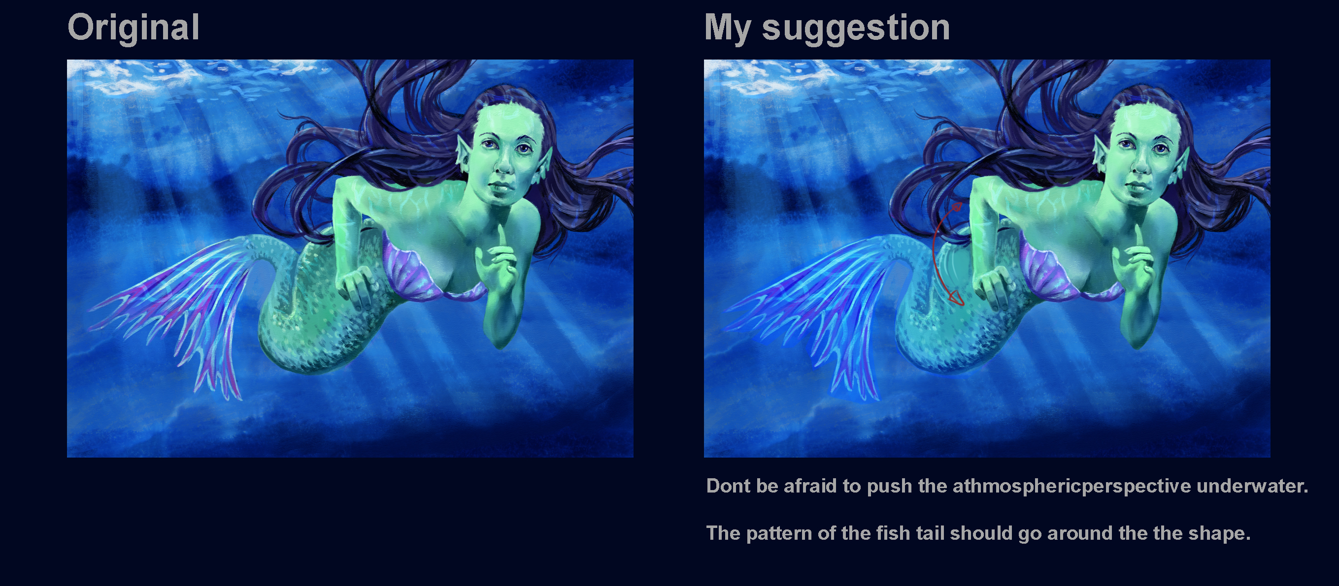
Mermay 2021:
![[Image: dekf3fn-65104160-f1cb-4736-836c-02ecfc3d...ArzHOwh50Y]](https://images-wixmp-ed30a86b8c4ca887773594c2.wixmp.com/f/49818fb6-cafe-4ef9-9a8c-7e46845861fe/dekf3fn-65104160-f1cb-4736-836c-02ecfc3d09bf.png?token=eyJ0eXAiOiJKV1QiLCJhbGciOiJIUzI1NiJ9.eyJzdWIiOiJ1cm46YXBwOjdlMGQxODg5ODIyNjQzNzNhNWYwZDQxNWVhMGQyNmUwIiwiaXNzIjoidXJuOmFwcDo3ZTBkMTg4OTgyMjY0MzczYTVmMGQ0MTVlYTBkMjZlMCIsIm9iaiI6W1t7InBhdGgiOiJcL2ZcLzQ5ODE4ZmI2LWNhZmUtNGVmOS05YThjLTdlNDY4NDU4NjFmZVwvZGVrZjNmbi02NTEwNDE2MC1mMWNiLTQ3MzYtODM2Yy0wMmVjZmMzZDA5YmYucG5nIn1dXSwiYXVkIjpbInVybjpzZXJ2aWNlOmZpbGUuZG93bmxvYWQiXX0.D6dOm32ixEoApqDTI91TRP9rurjpZCcZSArzHOwh50Y)
Posts: 460
Threads: 10
Joined: Mar 2016
Reputation:
64
The new mermay piece looks great! I love the gesture, design and color palette.
I only had a couple of notes, but these are not so much crits as maybe "things to try out" :)

Posts: 273
Threads: 2
Joined: Dec 2012
Reputation:
10
@Zorrentos
Thanks for the feedback! :) I did intend for the pattern to go around the tail, but I guess I didn't pull that off well (my 3d thinking is abysmal). The tail fin was supposed to come forward a little bit, so the atmospheric perspective was intended to be strongest in the middle of it - I also didn't want to lose the purple on the fin entirely.
Some more studies to get used to Rebelle!
Stillife (1 hour):
![[Image: E3sHe4oXwAgohnJ?format=jpg&name=small]](https://pbs.twimg.com/media/E3sHe4oXwAgohnJ?format=jpg&name=small)
Drapery (1 hour):
![[Image: E4BLfpaUUAEWAkT?format=jpg&name=medium]](https://pbs.twimg.com/media/E4BLfpaUUAEWAkT?format=jpg&name=medium)
Portrait (1h 1/2):
![[Image: E4MZdiZWYAQBES9?format=jpg&name=small]](https://pbs.twimg.com/media/E4MZdiZWYAQBES9?format=jpg&name=small)
And some terrible thumbnails for upcoming Illustrations!
Creepy crow:
![[Image: lUAarUB.png]](https://i.imgur.com/lUAarUB.png)
Floating magical circlet:
![[Image: BoDHvGT.png]](https://i.imgur.com/BoDHvGT.png)
Posts: 273
Threads: 2
Joined: Dec 2012
Reputation:
10
Value study in Rebelle, 30min:
![[Image: E4_qeATXEAIeQxN?format=jpg]](https://pbs.twimg.com/media/E4_qeATXEAIeQxN?format=jpg)
Updated composition thumbnails for the crow after feedback (still going with the third though):
![[Image: IF9jVoW.png]](https://i.imgur.com/IF9jVoW.png)
Value and colour thumnails for the above:
![[Image: EmRmwbm.png]](https://i.imgur.com/EmRmwbm.png)
Planning to practice traditional painting with the gouache set I just got for my birthday. Starting simple with a color reference chart and a gradient exercise, because I'm very much out of my depth here:
![[Image: tldmPhp.png]](https://i.imgur.com/tldmPhp.png)
![[Image: kaFnu9D.png]](https://i.imgur.com/kaFnu9D.png)
Posts: 273
Threads: 2
Joined: Dec 2012
Reputation:
10
First assignment for landscape painting course, first serious attempt at gouache:
![[Image: bwoVqG7.png]](https://i.imgur.com/bwoVqG7.png)
Final for the creepy Crow:
![[Image: deno4tu-98aa7d3f-ac82-4d73-ae39-adb75e56...EbBWQqsjsg]](https://images-wixmp-ed30a86b8c4ca887773594c2.wixmp.com/f/49818fb6-cafe-4ef9-9a8c-7e46845861fe/deno4tu-98aa7d3f-ac82-4d73-ae39-adb75e56767d.png?token=eyJ0eXAiOiJKV1QiLCJhbGciOiJIUzI1NiJ9.eyJzdWIiOiJ1cm46YXBwOjdlMGQxODg5ODIyNjQzNzNhNWYwZDQxNWVhMGQyNmUwIiwiaXNzIjoidXJuOmFwcDo3ZTBkMTg4OTgyMjY0MzczYTVmMGQ0MTVlYTBkMjZlMCIsIm9iaiI6W1t7InBhdGgiOiJcL2ZcLzQ5ODE4ZmI2LWNhZmUtNGVmOS05YThjLTdlNDY4NDU4NjFmZVwvZGVubzR0dS05OGFhN2QzZi1hYzgyLTRkNzMtYWUzOS1hZGI3NWU1Njc2N2QucG5nIn1dXSwiYXVkIjpbInVybjpzZXJ2aWNlOmZpbGUuZG93bmxvYWQiXX0.-dUA4xoU3Tn_MGpYZ5nGJwIge2SJbtqf9EbBWQqsjsg)
"Heavenly Guardian", just a personal piece I painted to let off some steam:
![[Image: denfwua-1f323e2b-1491-4eff-a541-2a3f3b7c...APH04F4oT4]](https://images-wixmp-ed30a86b8c4ca887773594c2.wixmp.com/f/49818fb6-cafe-4ef9-9a8c-7e46845861fe/denfwua-1f323e2b-1491-4eff-a541-2a3f3b7c0602.png?token=eyJ0eXAiOiJKV1QiLCJhbGciOiJIUzI1NiJ9.eyJzdWIiOiJ1cm46YXBwOjdlMGQxODg5ODIyNjQzNzNhNWYwZDQxNWVhMGQyNmUwIiwiaXNzIjoidXJuOmFwcDo3ZTBkMTg4OTgyMjY0MzczYTVmMGQ0MTVlYTBkMjZlMCIsIm9iaiI6W1t7InBhdGgiOiJcL2ZcLzQ5ODE4ZmI2LWNhZmUtNGVmOS05YThjLTdlNDY4NDU4NjFmZVwvZGVuZnd1YS0xZjMyM2UyYi0xNDkxLTRlZmYtYTU0MS0yYTNmM2I3YzA2MDIucG5nIn1dXSwiYXVkIjpbInVybjpzZXJ2aWNlOmZpbGUuZG93bmxvYWQiXX0.mstxur7aES1qgaB-ikS1K7_sgm-Hdi0bKAPH04F4oT4)
Dnd amulet for fun:
![[Image: delhx47-94871924-271e-4734-a024-63e89faf...HD-PfKf6VI]](https://images-wixmp-ed30a86b8c4ca887773594c2.wixmp.com/f/49818fb6-cafe-4ef9-9a8c-7e46845861fe/delhx47-94871924-271e-4734-a024-63e89faf74a2.png?token=eyJ0eXAiOiJKV1QiLCJhbGciOiJIUzI1NiJ9.eyJzdWIiOiJ1cm46YXBwOjdlMGQxODg5ODIyNjQzNzNhNWYwZDQxNWVhMGQyNmUwIiwiaXNzIjoidXJuOmFwcDo3ZTBkMTg4OTgyMjY0MzczYTVmMGQ0MTVlYTBkMjZlMCIsIm9iaiI6W1t7InBhdGgiOiJcL2ZcLzQ5ODE4ZmI2LWNhZmUtNGVmOS05YThjLTdlNDY4NDU4NjFmZVwvZGVsaHg0Ny05NDg3MTkyNC0yNzFlLTQ3MzQtYTAyNC02M2U4OWZhZjc0YTIucG5nIn1dXSwiYXVkIjpbInVybjpzZXJ2aWNlOmZpbGUuZG93bmxvYWQiXX0.GXejXLbbk0TLPETINmmiXEigtNiW5ZcrmHD-PfKf6VI)
Composition thumbnails for a Valkyrie:
![[Image: WFGToon.png]](https://i.imgur.com/WFGToon.png)
|
![[Image: KhFg2mv.jpg]](https://i.imgur.com/KhFg2mv.jpg)
![[Image: 7WuTQdT.jpg]](https://i.imgur.com/7WuTQdT.jpg)
![[Image: xDUb3oK.jpg]](https://i.imgur.com/xDUb3oK.jpg)
![[Image: MUV72aW.jpg]](https://i.imgur.com/MUV72aW.jpg)
![[Image: 0j1nGyb.jpg]](https://i.imgur.com/0j1nGyb.jpg)
![[Image: KhFg2mv.jpg]](https://i.imgur.com/KhFg2mv.jpg)
![[Image: 7WuTQdT.jpg]](https://i.imgur.com/7WuTQdT.jpg)
![[Image: xDUb3oK.jpg]](https://i.imgur.com/xDUb3oK.jpg)
![[Image: MUV72aW.jpg]](https://i.imgur.com/MUV72aW.jpg)
![[Image: 0j1nGyb.jpg]](https://i.imgur.com/0j1nGyb.jpg)


![[Image: 3v28HDo.jpg]](https://i.imgur.com/3v28HDo.jpg)
![[Image: BUCmean.png]](https://i.imgur.com/BUCmean.png)
![[Image: aeon_priestess_kuipania_by_olooriel_dd80...3NLkcXcwho]](https://images-wixmp-ed30a86b8c4ca887773594c2.wixmp.com/f/49818fb6-cafe-4ef9-9a8c-7e46845861fe/dd80wcg-022f0aeb-a64b-40a9-b3c3-2327c020c72a.jpg/v1/fill/w_894,h_894,q_70,strp/aeon_priestess_kuipania_by_olooriel_dd80wcg-pre.jpg?token=eyJ0eXAiOiJKV1QiLCJhbGciOiJIUzI1NiJ9.eyJzdWIiOiJ1cm46YXBwOjdlMGQxODg5ODIyNjQzNzNhNWYwZDQxNWVhMGQyNmUwIiwiaXNzIjoidXJuOmFwcDo3ZTBkMTg4OTgyMjY0MzczYTVmMGQ0MTVlYTBkMjZlMCIsIm9iaiI6W1t7ImhlaWdodCI6Ijw9MTA4MCIsInBhdGgiOiJcL2ZcLzQ5ODE4ZmI2LWNhZmUtNGVmOS05YThjLTdlNDY4NDU4NjFmZVwvZGQ4MHdjZy0wMjJmMGFlYi1hNjRiLTQwYTktYjNjMy0yMzI3YzAyMGM3MmEuanBnIiwid2lkdGgiOiI8PTEwODAifV1dLCJhdWQiOlsidXJuOnNlcnZpY2U6aW1hZ2Uub3BlcmF0aW9ucyJdfQ.iL5j8FI4EsZyIRIVtrEOLcNyThRvufHPV3NLkcXcwho)
![[Image: Banh8Eb.png]](https://i.imgur.com/Banh8Eb.png)
![[Image: demon_medic_by_olooriel_ddbgroz-pre.jpg?...Jd5AZcNZlc]](https://images-wixmp-ed30a86b8c4ca887773594c2.wixmp.com/f/49818fb6-cafe-4ef9-9a8c-7e46845861fe/ddbgroz-7e1b6633-8fe6-4825-b349-04dabd6b22c6.png/v1/fill/w_857,h_933,q_70,strp/demon_medic_by_olooriel_ddbgroz-pre.jpg?token=eyJ0eXAiOiJKV1QiLCJhbGciOiJIUzI1NiJ9.eyJzdWIiOiJ1cm46YXBwOjdlMGQxODg5ODIyNjQzNzNhNWYwZDQxNWVhMGQyNmUwIiwiaXNzIjoidXJuOmFwcDo3ZTBkMTg4OTgyMjY0MzczYTVmMGQ0MTVlYTBkMjZlMCIsIm9iaiI6W1t7ImhlaWdodCI6Ijw9OTQzIiwicGF0aCI6IlwvZlwvNDk4MThmYjYtY2FmZS00ZWY5LTlhOGMtN2U0Njg0NTg2MWZlXC9kZGJncm96LTdlMWI2NjMzLThmZTYtNDgyNS1iMzQ5LTA0ZGFiZDZiMjJjNi5wbmciLCJ3aWR0aCI6Ijw9ODY2In1dXSwiYXVkIjpbInVybjpzZXJ2aWNlOmltYWdlLm9wZXJhdGlvbnMiXX0.74LkSPdI3gIK7X72itoO3qIxyV2iw3BaTJd5AZcNZlc)
![[Image: dddwp3c-6004e0a4-a23b-405d-a7d8-64b2a5ab...4QBMUIGVa8]](https://images-wixmp-ed30a86b8c4ca887773594c2.wixmp.com/f/49818fb6-cafe-4ef9-9a8c-7e46845861fe/dddwp3c-6004e0a4-a23b-405d-a7d8-64b2a5abbfad.png?token=eyJ0eXAiOiJKV1QiLCJhbGciOiJIUzI1NiJ9.eyJzdWIiOiJ1cm46YXBwOiIsImlzcyI6InVybjphcHA6Iiwib2JqIjpbW3sicGF0aCI6IlwvZlwvNDk4MThmYjYtY2FmZS00ZWY5LTlhOGMtN2U0Njg0NTg2MWZlXC9kZGR3cDNjLTYwMDRlMGE0LWEyM2ItNDA1ZC1hN2Q4LTY0YjJhNWFiYmZhZC5wbmcifV1dLCJhdWQiOlsidXJuOnNlcnZpY2U6ZmlsZS5kb3dubG9hZCJdfQ.BCMVmGlfxnfKp7VaqCo6f6DWUUrkzWtny4QBMUIGVa8)
![[Image: de0npzk-f8d1191e-5894-4b32-b9a4-3a246c49...aOVNWbRSsU]](https://images-wixmp-ed30a86b8c4ca887773594c2.wixmp.com/f/49818fb6-cafe-4ef9-9a8c-7e46845861fe/de0npzk-f8d1191e-5894-4b32-b9a4-3a246c49567d.png?token=eyJ0eXAiOiJKV1QiLCJhbGciOiJIUzI1NiJ9.eyJzdWIiOiJ1cm46YXBwOiIsImlzcyI6InVybjphcHA6Iiwib2JqIjpbW3sicGF0aCI6IlwvZlwvNDk4MThmYjYtY2FmZS00ZWY5LTlhOGMtN2U0Njg0NTg2MWZlXC9kZTBucHprLWY4ZDExOTFlLTU4OTQtNGIzMi1iOWE0LTNhMjQ2YzQ5NTY3ZC5wbmcifV1dLCJhdWQiOlsidXJuOnNlcnZpY2U6ZmlsZS5kb3dubG9hZCJdfQ.ZnnNCvwg6ibtT_5pwSifWZenT9wqw8o1naOVNWbRSsU)
![[Image: nTwTc91.jpg]](https://i.imgur.com/nTwTc91.jpg)
![[Image: pSwIobK.jpg]](https://i.imgur.com/pSwIobK.jpg)
![[Image: GLiTxOz.jpg]](https://i.imgur.com/GLiTxOz.jpg)
![[Image: Db6xNPk.png]](https://i.imgur.com/Db6xNPk.png)
![[Image: de2kanb-5967ad2a-e44d-4ec5-af00-53aaf2b0...2c3LbXSXAk]](https://images-wixmp-ed30a86b8c4ca887773594c2.wixmp.com/f/49818fb6-cafe-4ef9-9a8c-7e46845861fe/de2kanb-5967ad2a-e44d-4ec5-af00-53aaf2b01282.png?token=eyJ0eXAiOiJKV1QiLCJhbGciOiJIUzI1NiJ9.eyJzdWIiOiJ1cm46YXBwOiIsImlzcyI6InVybjphcHA6Iiwib2JqIjpbW3sicGF0aCI6IlwvZlwvNDk4MThmYjYtY2FmZS00ZWY5LTlhOGMtN2U0Njg0NTg2MWZlXC9kZTJrYW5iLTU5NjdhZDJhLWU0NGQtNGVjNS1hZjAwLTUzYWFmMmIwMTI4Mi5wbmcifV1dLCJhdWQiOlsidXJuOnNlcnZpY2U6ZmlsZS5kb3dubG9hZCJdfQ.m9pz825tDRJ-MIhbKlzt-nqnldWazc2AE2c3LbXSXAk)
![[Image: ZYEkL8z.png]](https://i.imgur.com/ZYEkL8z.png)


![[Image: dehtlq1-7014e0c2-d159-45a1-a5a9-cb567e0d...HCclgf8254]](https://images-wixmp-ed30a86b8c4ca887773594c2.wixmp.com/f/49818fb6-cafe-4ef9-9a8c-7e46845861fe/dehtlq1-7014e0c2-d159-45a1-a5a9-cb567e0dbdda.png?token=eyJ0eXAiOiJKV1QiLCJhbGciOiJIUzI1NiJ9.eyJzdWIiOiJ1cm46YXBwOiIsImlzcyI6InVybjphcHA6Iiwib2JqIjpbW3sicGF0aCI6IlwvZlwvNDk4MThmYjYtY2FmZS00ZWY5LTlhOGMtN2U0Njg0NTg2MWZlXC9kZWh0bHExLTcwMTRlMGMyLWQxNTktNDVhMS1hNWE5LWNiNTY3ZTBkYmRkYS5wbmcifV1dLCJhdWQiOlsidXJuOnNlcnZpY2U6ZmlsZS5kb3dubG9hZCJdfQ.7iowuYqBW5vIFT7L7Ga-hDYVxC9owUIKrHCclgf8254)
![[Image: E11dnb7WUAA6qlW?format=jpg&name=medium]](https://pbs.twimg.com/media/E11dnb7WUAA6qlW?format=jpg&name=medium)
![[Image: E1_flVnXoAIY3-G?format=jpg&name=large]](https://pbs.twimg.com/media/E1_flVnXoAIY3-G?format=jpg&name=large)
![[Image: E16Q7RfXsAU9U3U?format=jpg&name=medium]](https://pbs.twimg.com/media/E16Q7RfXsAU9U3U?format=jpg&name=medium)
![[Image: E2uU4iCXMAUMOH6?format=jpg&name=small]](https://pbs.twimg.com/media/E2uU4iCXMAUMOH6?format=jpg&name=small)
![[Image: dekf3fn-65104160-f1cb-4736-836c-02ecfc3d...ArzHOwh50Y]](https://images-wixmp-ed30a86b8c4ca887773594c2.wixmp.com/f/49818fb6-cafe-4ef9-9a8c-7e46845861fe/dekf3fn-65104160-f1cb-4736-836c-02ecfc3d09bf.png?token=eyJ0eXAiOiJKV1QiLCJhbGciOiJIUzI1NiJ9.eyJzdWIiOiJ1cm46YXBwOjdlMGQxODg5ODIyNjQzNzNhNWYwZDQxNWVhMGQyNmUwIiwiaXNzIjoidXJuOmFwcDo3ZTBkMTg4OTgyMjY0MzczYTVmMGQ0MTVlYTBkMjZlMCIsIm9iaiI6W1t7InBhdGgiOiJcL2ZcLzQ5ODE4ZmI2LWNhZmUtNGVmOS05YThjLTdlNDY4NDU4NjFmZVwvZGVrZjNmbi02NTEwNDE2MC1mMWNiLTQ3MzYtODM2Yy0wMmVjZmMzZDA5YmYucG5nIn1dXSwiYXVkIjpbInVybjpzZXJ2aWNlOmZpbGUuZG93bmxvYWQiXX0.D6dOm32ixEoApqDTI91TRP9rurjpZCcZSArzHOwh50Y)

![[Image: E3sHe4oXwAgohnJ?format=jpg&name=small]](https://pbs.twimg.com/media/E3sHe4oXwAgohnJ?format=jpg&name=small)
![[Image: E4BLfpaUUAEWAkT?format=jpg&name=medium]](https://pbs.twimg.com/media/E4BLfpaUUAEWAkT?format=jpg&name=medium)
![[Image: E4MZdiZWYAQBES9?format=jpg&name=small]](https://pbs.twimg.com/media/E4MZdiZWYAQBES9?format=jpg&name=small)
![[Image: lUAarUB.png]](https://i.imgur.com/lUAarUB.png)
![[Image: BoDHvGT.png]](https://i.imgur.com/BoDHvGT.png)
![[Image: E4_qeATXEAIeQxN?format=jpg]](https://pbs.twimg.com/media/E4_qeATXEAIeQxN?format=jpg)
![[Image: IF9jVoW.png]](https://i.imgur.com/IF9jVoW.png)
![[Image: EmRmwbm.png]](https://i.imgur.com/EmRmwbm.png)
![[Image: tldmPhp.png]](https://i.imgur.com/tldmPhp.png)
![[Image: kaFnu9D.png]](https://i.imgur.com/kaFnu9D.png)
![[Image: bwoVqG7.png]](https://i.imgur.com/bwoVqG7.png)
![[Image: deno4tu-98aa7d3f-ac82-4d73-ae39-adb75e56...EbBWQqsjsg]](https://images-wixmp-ed30a86b8c4ca887773594c2.wixmp.com/f/49818fb6-cafe-4ef9-9a8c-7e46845861fe/deno4tu-98aa7d3f-ac82-4d73-ae39-adb75e56767d.png?token=eyJ0eXAiOiJKV1QiLCJhbGciOiJIUzI1NiJ9.eyJzdWIiOiJ1cm46YXBwOjdlMGQxODg5ODIyNjQzNzNhNWYwZDQxNWVhMGQyNmUwIiwiaXNzIjoidXJuOmFwcDo3ZTBkMTg4OTgyMjY0MzczYTVmMGQ0MTVlYTBkMjZlMCIsIm9iaiI6W1t7InBhdGgiOiJcL2ZcLzQ5ODE4ZmI2LWNhZmUtNGVmOS05YThjLTdlNDY4NDU4NjFmZVwvZGVubzR0dS05OGFhN2QzZi1hYzgyLTRkNzMtYWUzOS1hZGI3NWU1Njc2N2QucG5nIn1dXSwiYXVkIjpbInVybjpzZXJ2aWNlOmZpbGUuZG93bmxvYWQiXX0.-dUA4xoU3Tn_MGpYZ5nGJwIge2SJbtqf9EbBWQqsjsg)
![[Image: denfwua-1f323e2b-1491-4eff-a541-2a3f3b7c...APH04F4oT4]](https://images-wixmp-ed30a86b8c4ca887773594c2.wixmp.com/f/49818fb6-cafe-4ef9-9a8c-7e46845861fe/denfwua-1f323e2b-1491-4eff-a541-2a3f3b7c0602.png?token=eyJ0eXAiOiJKV1QiLCJhbGciOiJIUzI1NiJ9.eyJzdWIiOiJ1cm46YXBwOjdlMGQxODg5ODIyNjQzNzNhNWYwZDQxNWVhMGQyNmUwIiwiaXNzIjoidXJuOmFwcDo3ZTBkMTg4OTgyMjY0MzczYTVmMGQ0MTVlYTBkMjZlMCIsIm9iaiI6W1t7InBhdGgiOiJcL2ZcLzQ5ODE4ZmI2LWNhZmUtNGVmOS05YThjLTdlNDY4NDU4NjFmZVwvZGVuZnd1YS0xZjMyM2UyYi0xNDkxLTRlZmYtYTU0MS0yYTNmM2I3YzA2MDIucG5nIn1dXSwiYXVkIjpbInVybjpzZXJ2aWNlOmZpbGUuZG93bmxvYWQiXX0.mstxur7aES1qgaB-ikS1K7_sgm-Hdi0bKAPH04F4oT4)
![[Image: delhx47-94871924-271e-4734-a024-63e89faf...HD-PfKf6VI]](https://images-wixmp-ed30a86b8c4ca887773594c2.wixmp.com/f/49818fb6-cafe-4ef9-9a8c-7e46845861fe/delhx47-94871924-271e-4734-a024-63e89faf74a2.png?token=eyJ0eXAiOiJKV1QiLCJhbGciOiJIUzI1NiJ9.eyJzdWIiOiJ1cm46YXBwOjdlMGQxODg5ODIyNjQzNzNhNWYwZDQxNWVhMGQyNmUwIiwiaXNzIjoidXJuOmFwcDo3ZTBkMTg4OTgyMjY0MzczYTVmMGQ0MTVlYTBkMjZlMCIsIm9iaiI6W1t7InBhdGgiOiJcL2ZcLzQ5ODE4ZmI2LWNhZmUtNGVmOS05YThjLTdlNDY4NDU4NjFmZVwvZGVsaHg0Ny05NDg3MTkyNC0yNzFlLTQ3MzQtYTAyNC02M2U4OWZhZjc0YTIucG5nIn1dXSwiYXVkIjpbInVybjpzZXJ2aWNlOmZpbGUuZG93bmxvYWQiXX0.GXejXLbbk0TLPETINmmiXEigtNiW5ZcrmHD-PfKf6VI)
![[Image: WFGToon.png]](https://i.imgur.com/WFGToon.png)