CRIMSON CHOW #3 - The Tinkerer WIP
#1
Hello Daggers!

Welcome to the Crimson CHOW (Character of the Week)! This is a biweekly challenge which was created as a way to hone your skills in design and character creation, in a fun and competitive way. Each challenge, we will give you a short character prompt and it is your task to interpret the character as you imagine it, with your own unique spin. The winner will be chosen through a poll in the finals thread, and in addition to being able to pick the next challenge topic, his/her piece will be featured in the "Crimson Champions" Winner's thread!

Here is the passage:

"The part of him that was still human flinched at the smell of burning metal as he worked at replacing a broken gear in his central torso cavity. For him, it was a simple task, and he stood after a few minutes to check his work in the mirror - perfect, as always."

Your task: Design "The Tinkerer" - Master of the Mechanical.

Guidelines:
  • Photo textures, 3D, and traditional mediums are allowed.
  • There is no restriction on the character's gender, time period or culture.
  • Studies are recommended, but not required.
  • There is no restriction on image formats (horizontal, vertical, square).
  • Environment backgrounds are optional.
  • Keep in mind you are not required to stick to what is in the passage. It is more of a guide in terms of mood.
Rules:
  • You must post at least one WIP in the WIP thread to be accepted into the final poll.
  • Finals must be posted in the finals thread before the deadline.
  • At least 3/4 of the character must be visible (minimum from the knees up). No back views are allowed without a front.
  • Only ONE character please.
  • Only ONE submission per person in the finals thread.
  • Sketches, WIPs, or rushed artwork will not be accepted into the poll.
  • No fanart. We want to see your original, unique interpretations!
  • Have fun!

Deadline is Sunday, October 5 @10pm GMT

Reply
#2
my very very rough sketch idea ... doesn't include the metal parts in him yet ... but personally ... I dig the idea so I'll probably stick with it.


Attached Files Image(s)


Reply
#3
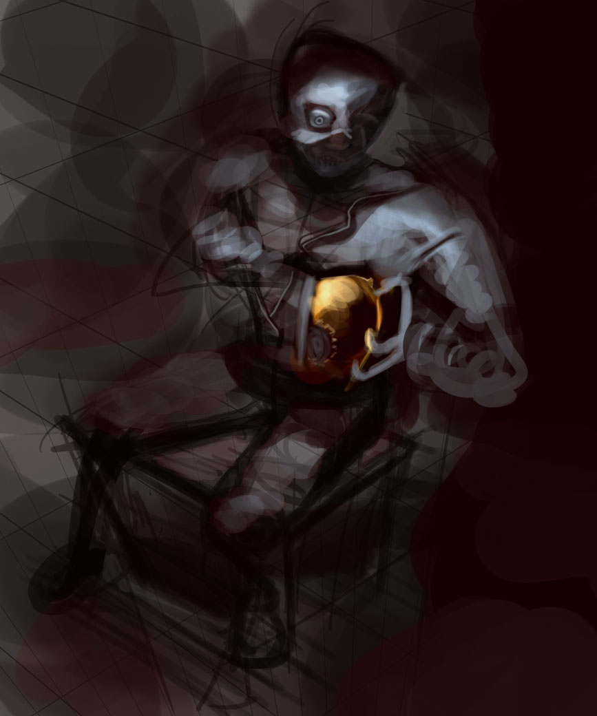
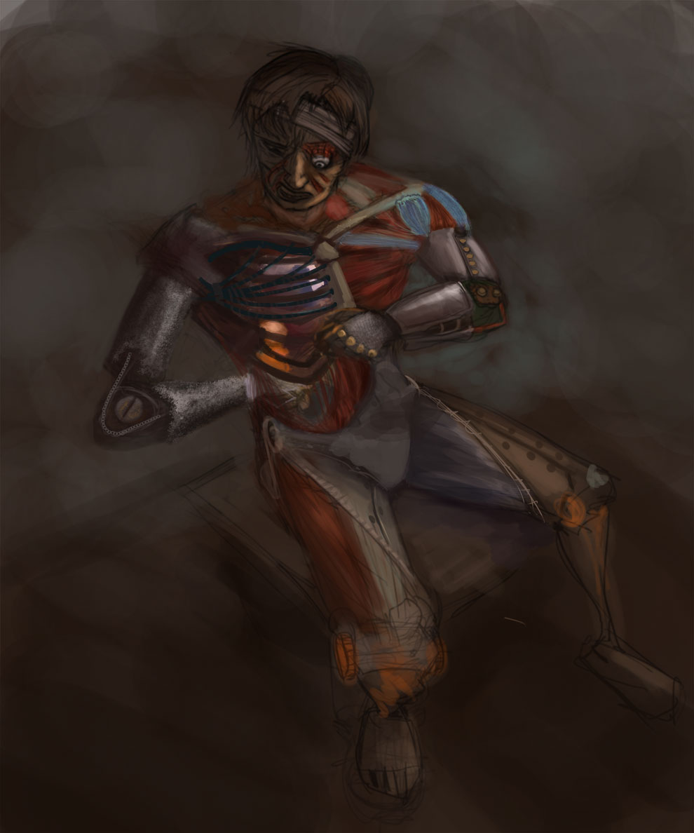
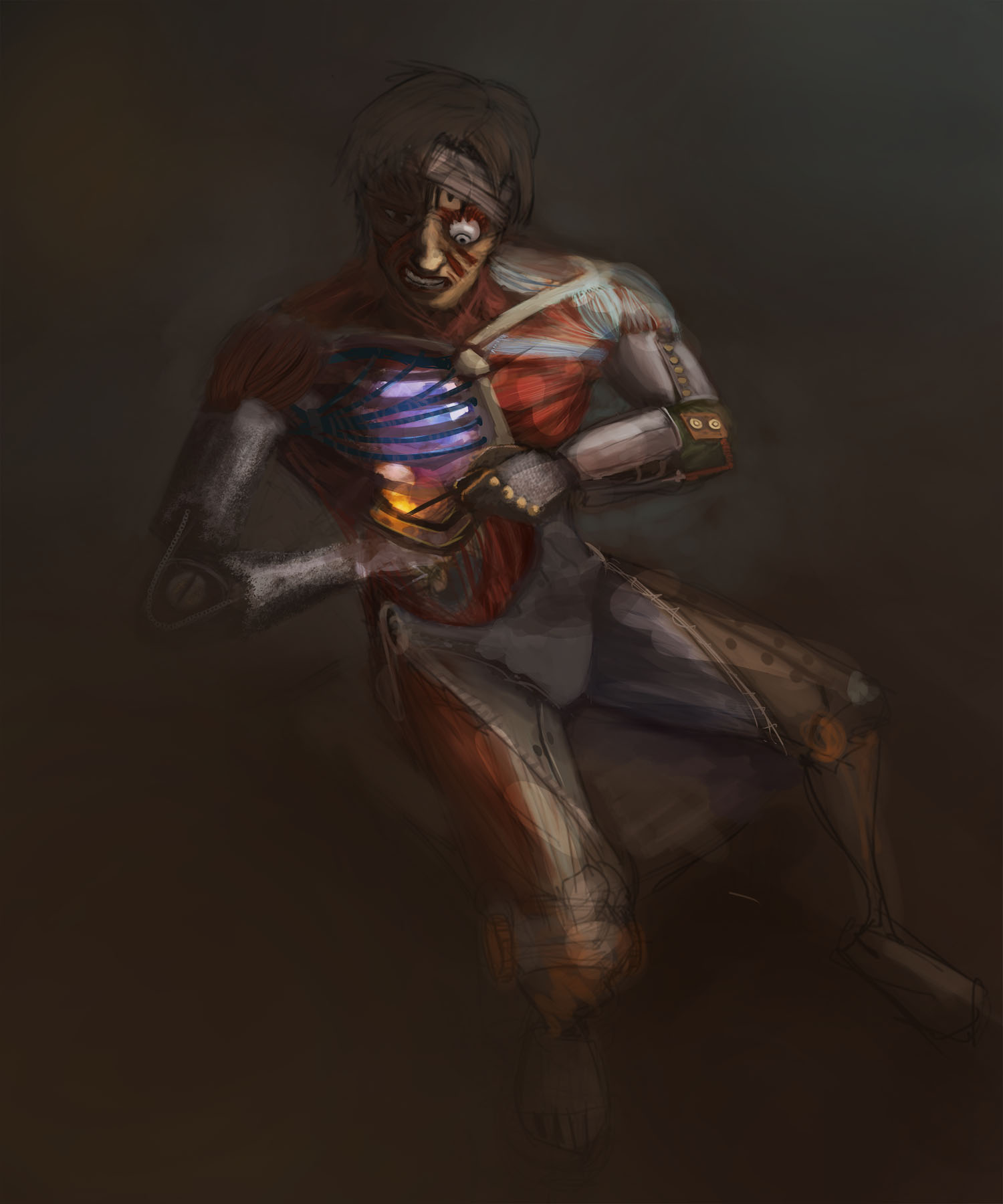
First idea, might scrap this one, but I like the contrast between skin and metal that this one will allow me to do. so may keep it.


Attached Files Image(s)


Reply
#4
Wow , awesome idea Jaik !

A lil bit of update ~ First time I'm actually trying to fully paint over something.

------

+ today's update because it would suck to post after my own post.

And yes , that's on critical level ... shieeee


Attached Files Image(s)


Reply
#5
Brainstorming
[Image: gm0YnqC.jpg]

Reply
#6
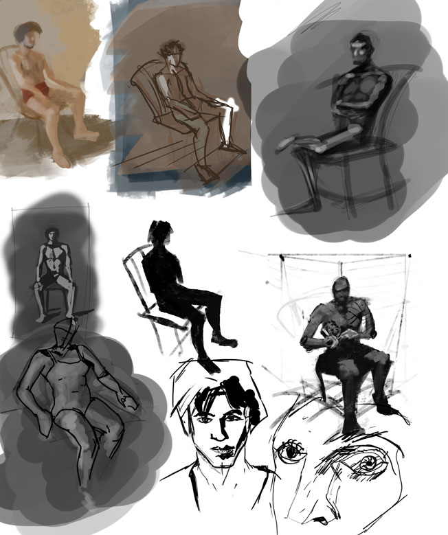
Studies.


Initial sketch.


Reply
#7
Probably wont stick with this idea but heres what I got so far.


Attached Files Image(s)


Reply
#8
Gonna try and participate, I really like seeing community stuff like this.

Few thumbnail sketches, getting kinda ridiculous bottom right haha. I'm leaning towards top right on the very middle perhaps. Make the things they're holding some sort of tools.


Attached Files Image(s)


Sketchbook ▲  Website ▲ TwitterArtStation ▲ Twitch ▲


Reply
#9
Starting this thing.

[Image: 1U15YOf.png]
[Image: GnsksTe.png]

Reply
#10


Update, thanks for the advice Homerid.


Reply
#11
I know I should do this in colour -____- but urrrgghhhh


Attached Files Image(s)


Reply
#12
I'm late for the party, but I brought some sketches and crits (those count as either orange juice and biscuits or beer and weed, you choose)

crackedskull- The last WiP shows a lot more of the overall details (I particularly like the work on the legs), but I think your initial sketch has way more impact with the lighting and color choices (this is my illustration side of the brain talking btw, ignoring design over mood and general prettiness :v)
The character could use a bit more gesture, think of the importance of the face and hands considering his description and role.
Maybe experiment bringing stuff from the earlier studies like the clothing and elements of old military portraits (that steampunk napoleon dude) Keep it up.

rafa- Those faces kick some serious butt, great stuff. The full body sketch looks amazing as well, very clean and stylized forms.
I like the pose and silhouette and find it hard to not nitpick stuff that doesn't really matter, but its everything I've got lol.
It's very early to describe what could be different materials and surfaces at this point but one thing I think is that some of the detail and patterns need to be more consistent. Take the padded-looking area on the thighs, it doesn't blend (?) very well with say the robotic transformer cannon-arm or the sleek speed shaped heel/boots.

Jonesoda- They look very loose and slightly grotesque. Go on :D

Hypnagogic_Haze- Some of the shapes remind me of the robot girl from Metropolis, nice start.

pnate- You're cooking something, and I can't wait to see it ;) Bottom left and center are my favorites.

Jaik- I like the idea and the execution is coming along nicely, but some of the parts seem to be inconsistent within the design. For example, a major part of his body is shaped like a centipede, but the structures on the arms have a way more rigid approach. The insect-like robotic body gives you a chance to find inspiration directly from nature, go nuts and grab some parts from mantises, glue them to a crab, slap some wings and turn the result into a robot.
I would also advice not to take my advice literally :P


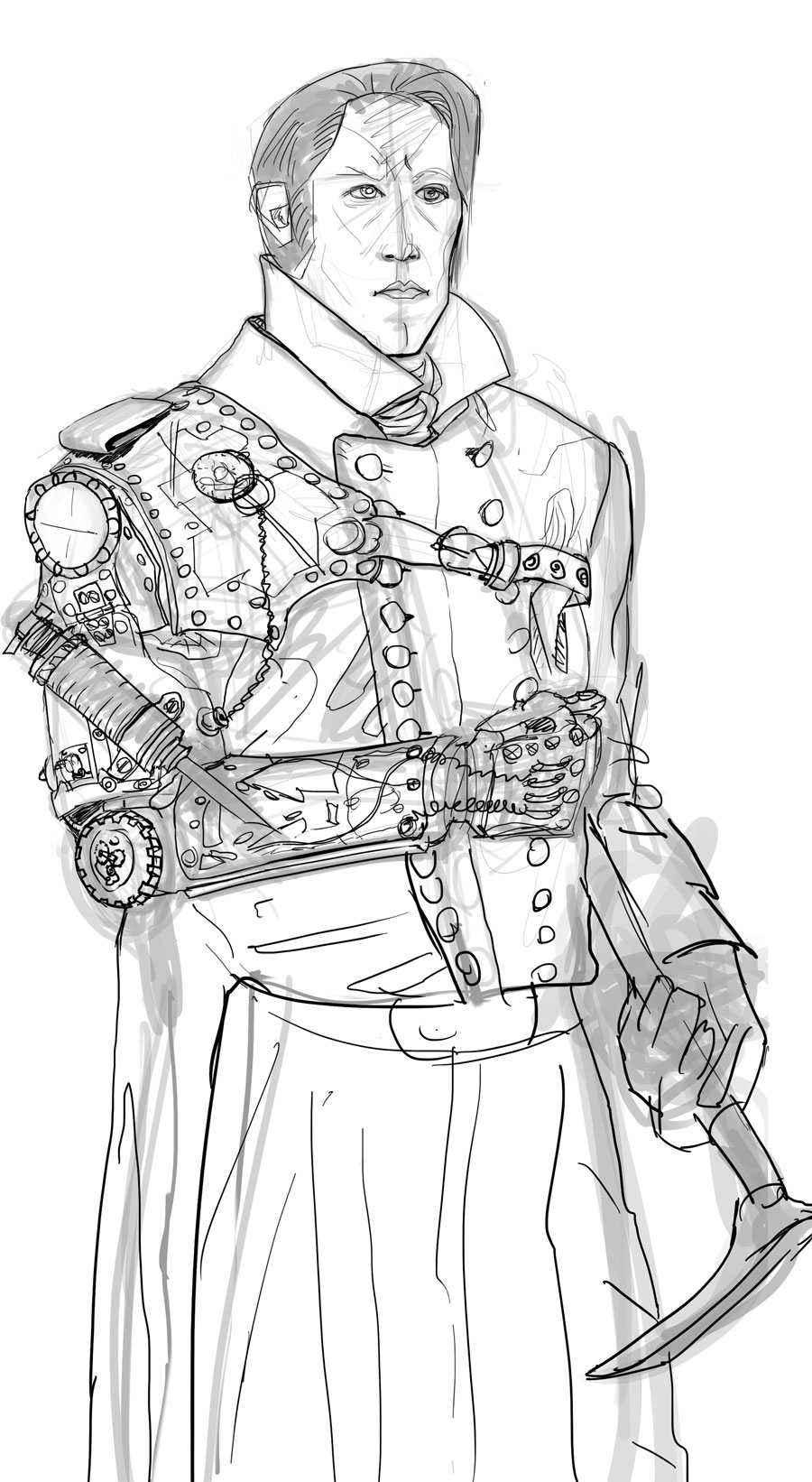
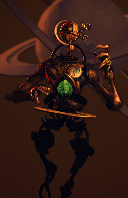
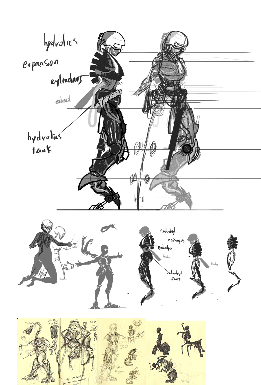
So here's a wip of my weird robo-creep thing.
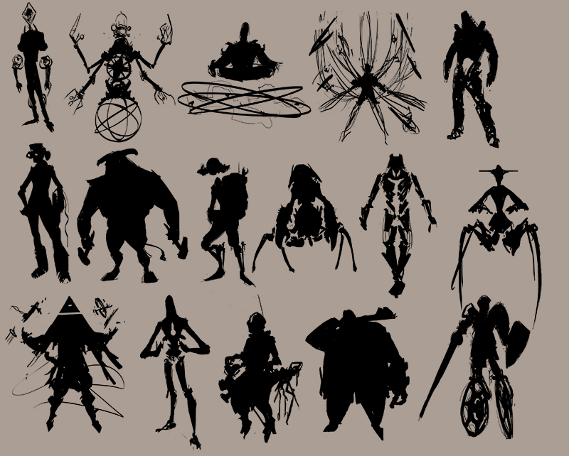
I sketched a variety of characters with shapes and silhouettes before committing so I could avoid going for a design I would finish hating just like my last ChoW attempt lol.
Following the character's name and description I went for the more ominous ideas, so I gathered my references and basically started bashing old diving suits with astrological clockwork devices :v And I just realized I may have overdone it with the mechanical stuff, need to put some flesh on it.


Good work guys, cya later.

Reply
#13
@homerid Woah, yours is looking totally rad!
Yea, kinda agree with you there, but I'm looking for more of a steampunky feeling then a sci-fi sleek, gonna try to render the metal more rusty.

[Image: wx0SAVA.png]

Reply
#14
Only started tonight :)


Reply
#15
Cutting it close to the deadline as usual. Hopefully get this one done before time.

Going for a Moebius-style space Jesus kind of theme here.

[Image: EqaVnrP.jpg]

Reply
#16
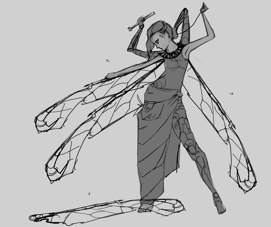
Sooo being a bit clueless with this topic because I can only think of generic scifi/steampunk stuff, I did some hands-on customer survey, asking the family what they's substitue/change/enhance if they could... here's what my design would look like if I followed through:
- Wings
- More legs
- More arms
- Trunk at front, tail at back
- better joints
- substitute nose by scent-hole
- night sight eye transplant
- eyelashes made from spider legs (don't ask)
- durable skin inlays
- jumping stilts
- substitute every body part I can't draw by a simpler mechanical version i.e. disc
- paint a normal human and just say 'the inside is completely mechanical' (duh)

Very late this time, but here's my WIP - a bit rougher than I'd like, but at least I'm slowly getting a bit clearer idea of where I want to go:


SketchbookDeviantartArtblog | Portfolio
Every feedback is appreciated!
Reply
#17
eyelashes made from spider legs ??? (sorry I just couldn't XD)

Reply
#18
Will finish tonight or tomorrow after getting back... and put it in SB... Robot and mechanical things are about as far from my comfort zone as Pluto is from Sun......


Focus.
Reply
#19
May take this guy to colour at a later date, but I ain't gonna have him finished enough looking for the finals thread deadline tonight, sadly.

[Image: kSmzMMI.jpg]

Reply


Forum Jump:


Users browsing this thread: 12 Guest(s)