11-22-2015, 07:34 PM
Heyo!
Good progress! I like the latest character, its full flava :)
I have some suggestions you could consider.
The contrast is is too similar from region to region, this makes forms of the body appear to be in the same position and space(flattening).
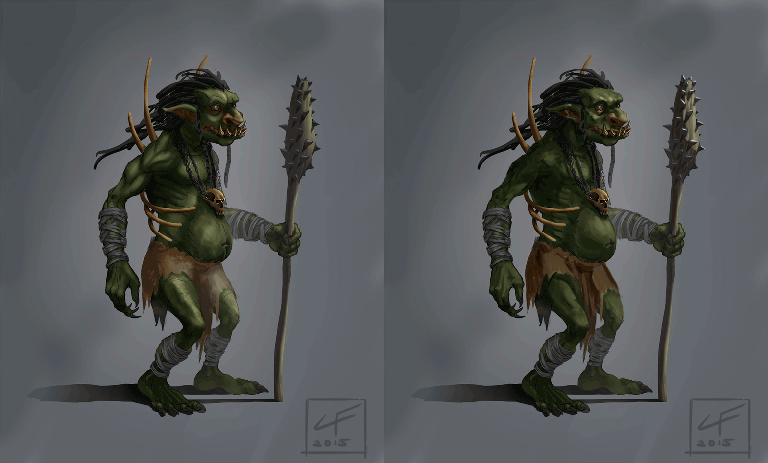
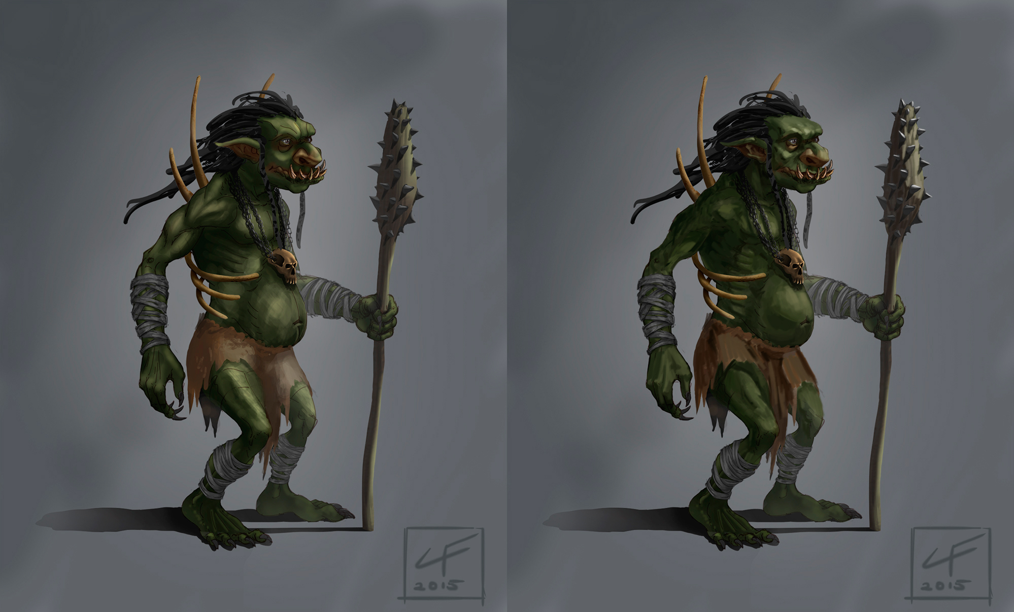
I did a breakdown of the contrasts by sampling swatches of the general light and dark colours of each region. If you squint your eyes at the swatches you can see what I mean.
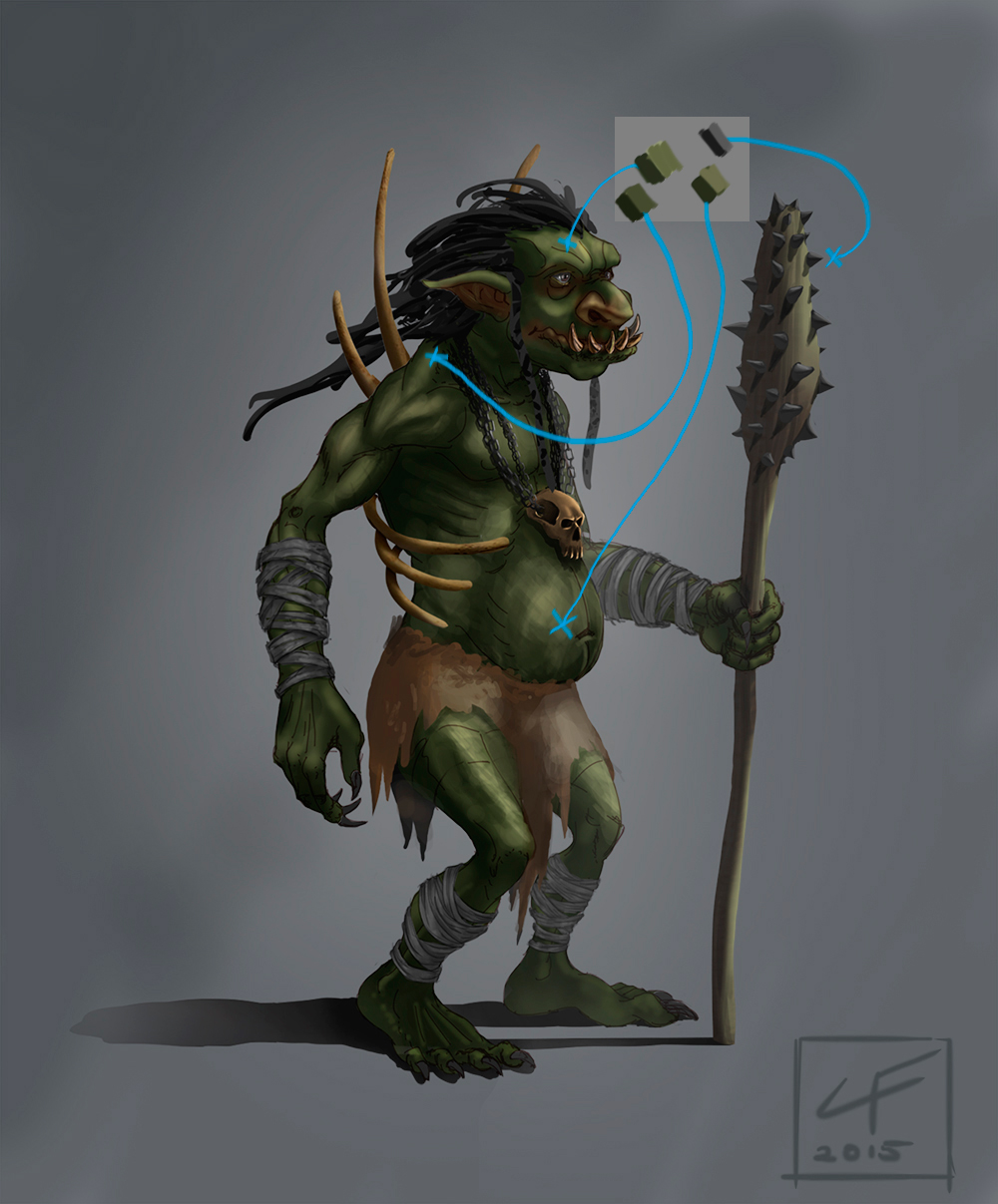
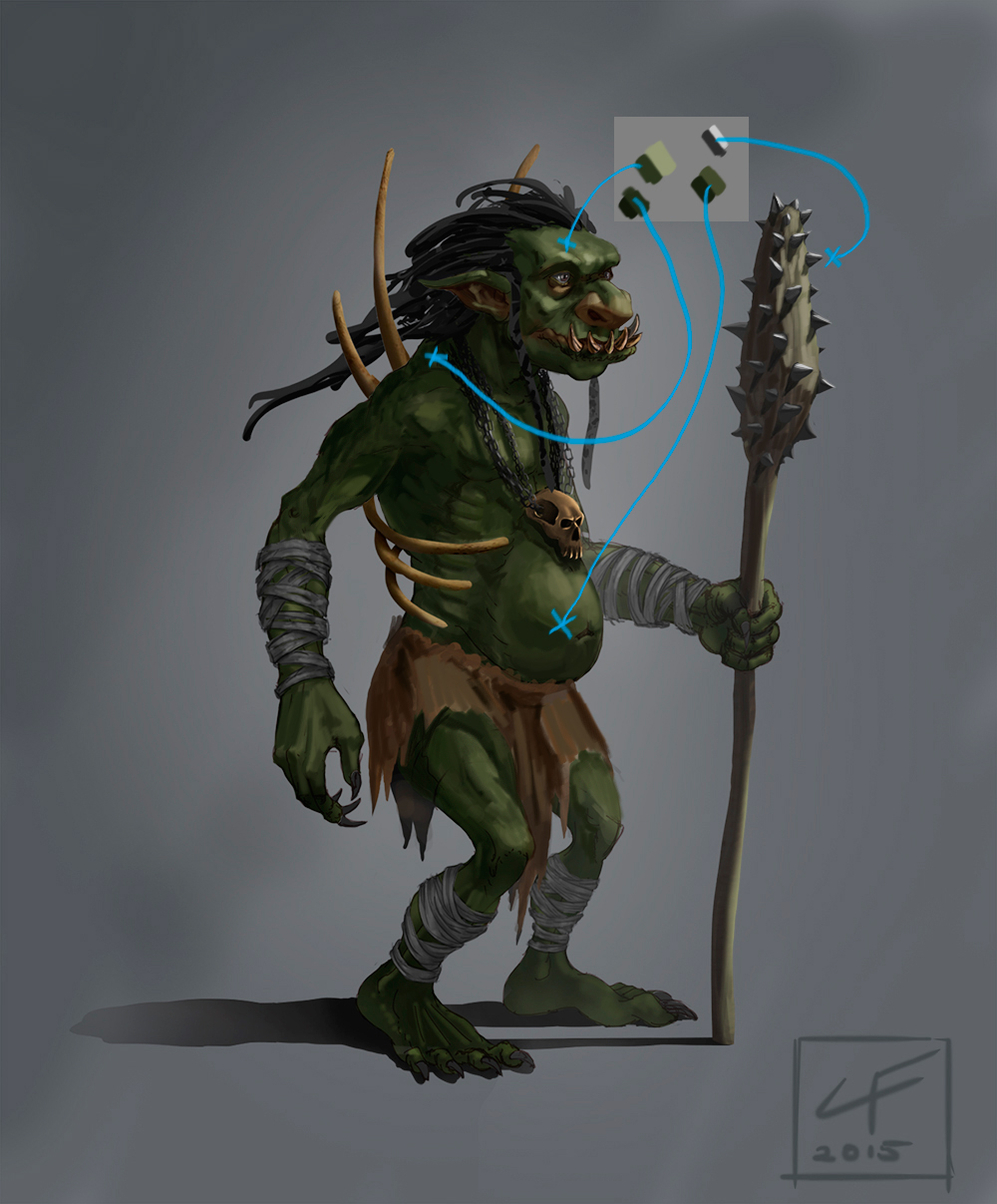
Parts of the body in shade or shadow, should not have "light" surfaces shaded too brightly. Breakdown the colours into simple light and dark selections and adjust them till the effect of form within light and space is conveyed comfortably. Gradiants and colour variations can come later.
Hope you find this useful to your work!
Keep truckin!
Good progress! I like the latest character, its full flava :)
I have some suggestions you could consider.
The contrast is is too similar from region to region, this makes forms of the body appear to be in the same position and space(flattening).


I did a breakdown of the contrasts by sampling swatches of the general light and dark colours of each region. If you squint your eyes at the swatches you can see what I mean.


Parts of the body in shade or shadow, should not have "light" surfaces shaded too brightly. Breakdown the colours into simple light and dark selections and adjust them till the effect of form within light and space is conveyed comfortably. Gradiants and colour variations can come later.
Hope you find this useful to your work!
Keep truckin!


![[Image: Paintover01.jpg]](http://www.gregpro.com/forums/Conceptorg/Paintover01.jpg)
