CC2 WIP Hobitts depository of cosmic horrors
#1
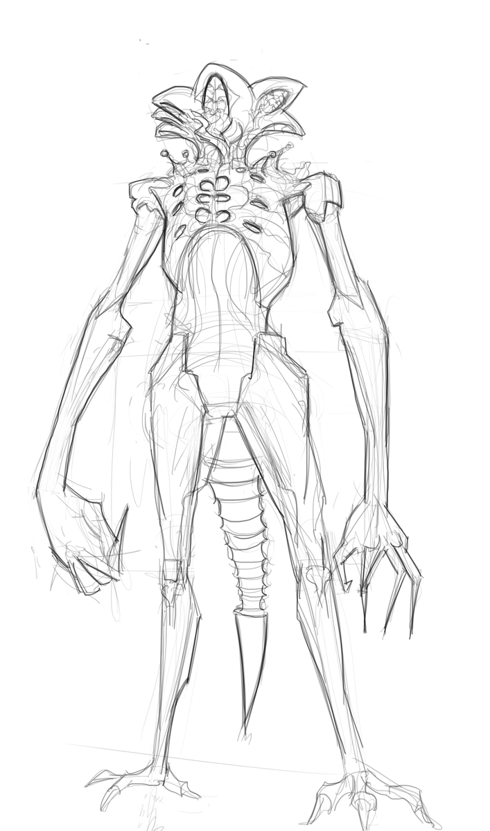
Alright Picked the second one source of the great ones always wanted to design  a lovecraftian monster!
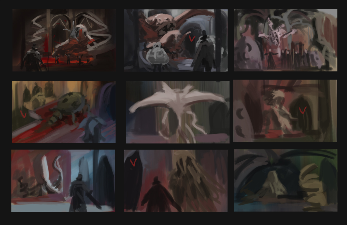
Here are color thumbnails  the point of these was to decide on a colour palette so the design and composition took a  back seat.


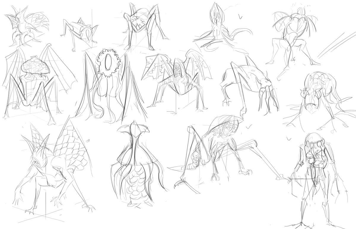
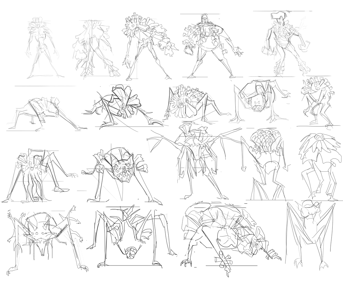
Here are quick sketches for the designs im thinking


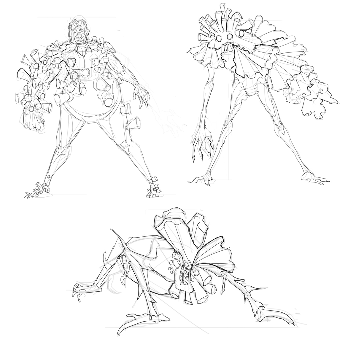
And picked the ones i liked and refined them a bit.Really like the first one.


Reply
#2
very nice, from the color comps to the creature designs, not much to say at this point as I guess your still exploring ideas, but awesome start...
Reply
#3
I like the first and third one :D

Reply
#4
Oooh, I really like that cat-eared creature in the top left. Looks like it could be totally terrifying but in that creepy familiar way because it's got kitty ears, lol.

DeviantArt YouTube | My Books and Comics

[url=http://arapersonica.deviantart.com/][/url]
Reply
#5
Thanks everyone!

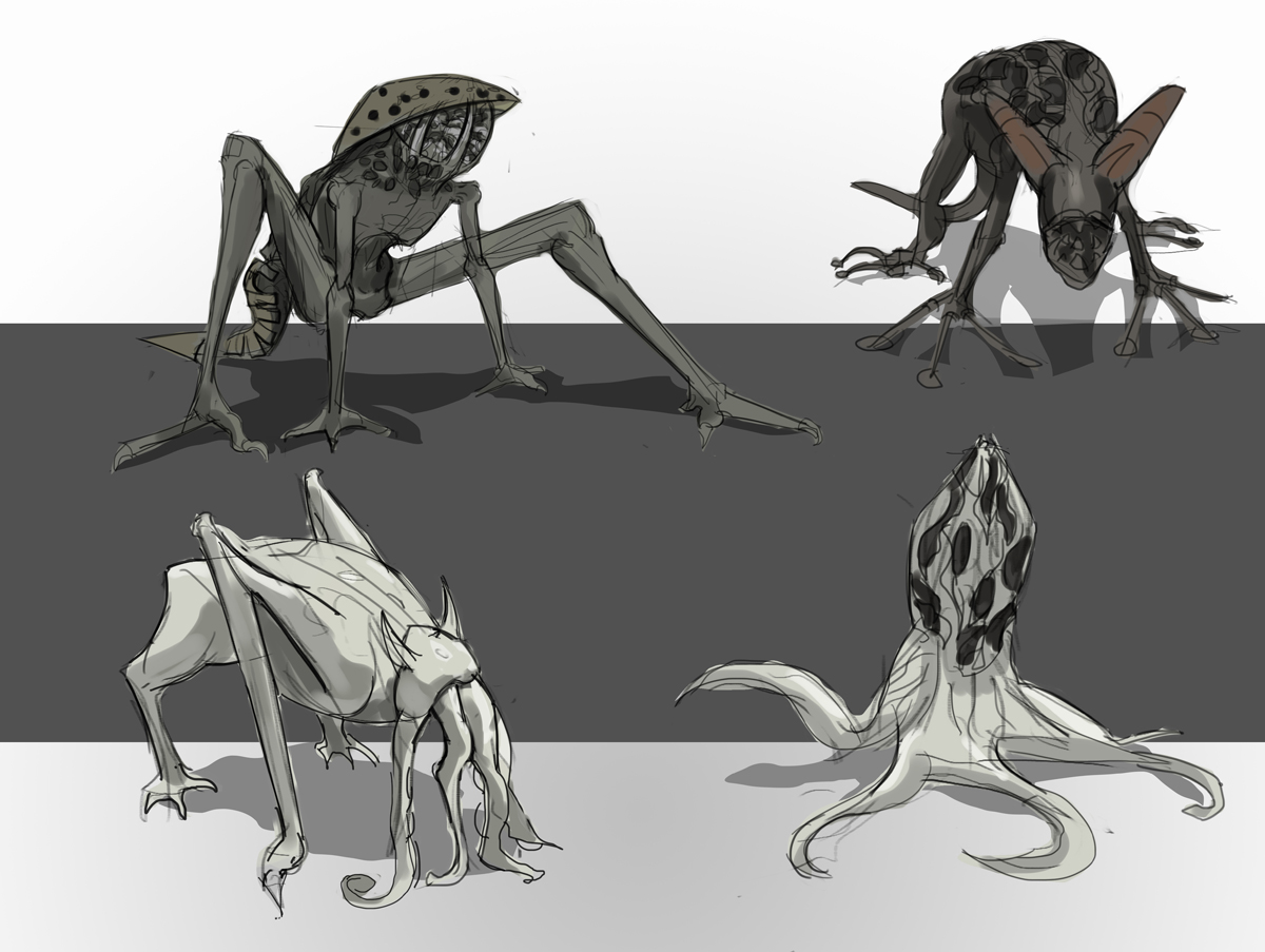
Alright a sketch and thumbnails and then i played around with those thumbnails and it gave me a few ideas so more sketches coming!


Reply
#6
First color sketch looks most appealing to me. Can't wait to see your Boss colored!

Reply
#7
You have some pretty cool variations for what parts of your monster might look like. I'm looking forward to seeing where that's going! Also, seconding Brushnoir. The first composition and the ones directly below it seem the strongest to me as well.

________________________
Project / Sketches / Paintings
Reply
#8
@Brushnoir Thanks!

@Lodratio ohh those are just color comps the composition is garbage on all of them ill dedicate time to composition those were just colour experiments

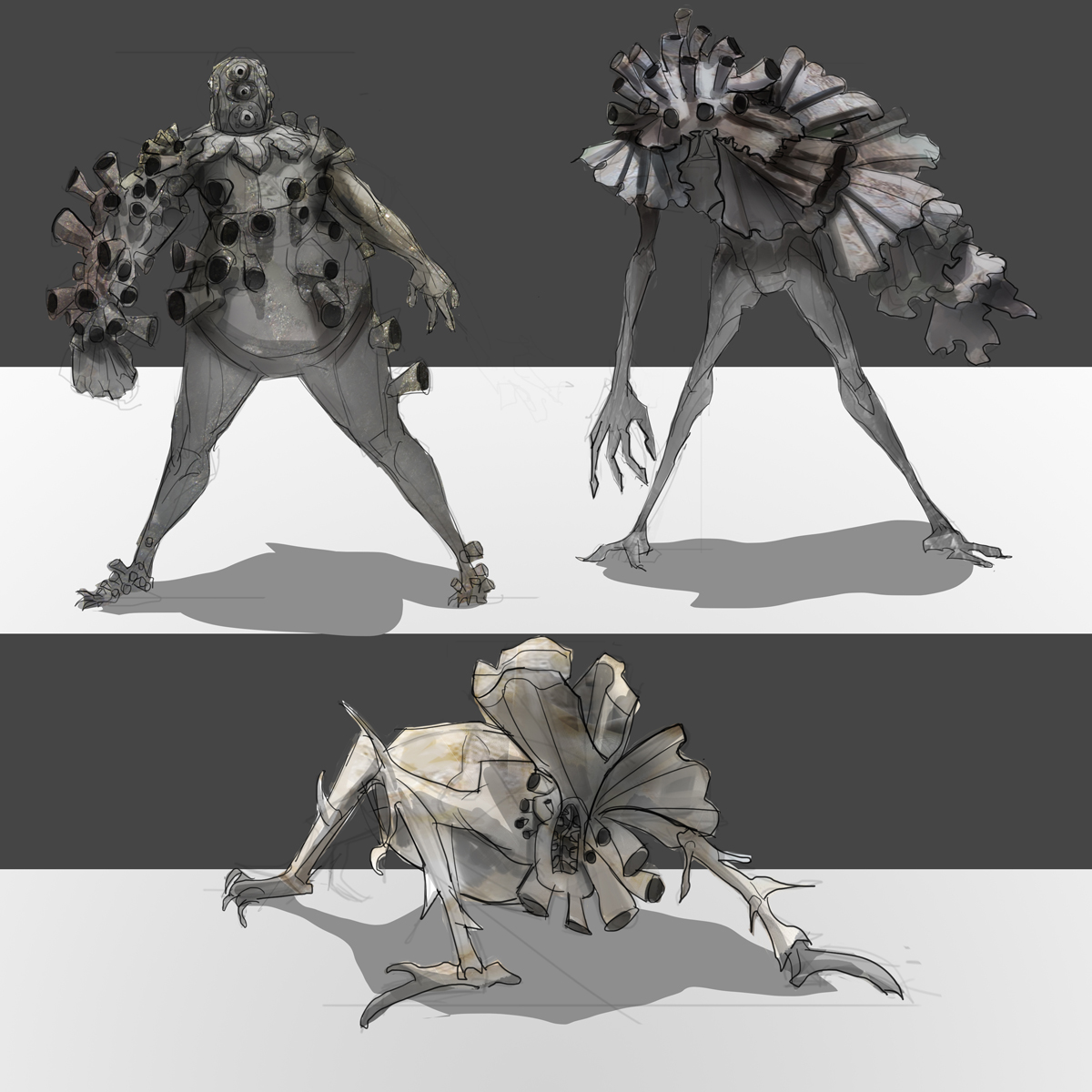
Alright todays thumbnails and sketch i will render those 3


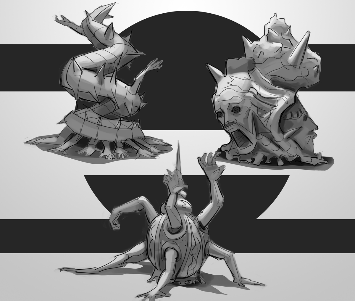
Alright at this point i feel the right and bottom one are strongest designs and ill stick to them now not sure which one to pick the top right one does seem quite bloodborne-ish, not sure.


Reply
#9
Such great design work! Keep it up and good luck choosing. Read up on Trypophobia, but not too much :) (shudder)

 YouTube free learnin! | DeviantArt | Old Folio | Insta
Reply
#10
Holy crap, that is so cool. It's great you do so many concepts, I can already see you're getting better at this.

Reply
#11
@Amit Thanks! I did had a vague idea of trypophobia when i designed these but it was not the initial goal.
@Piotr Thanks!

Alright experimented with the rendering and i think ill go for the top right he reads better, but i might change my mind later.


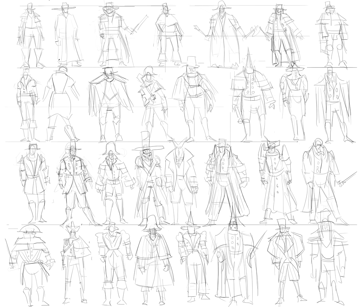
And thumbnails for the hunter, since i will most likely include him in the final. Tomorrow ill pick a few and refine them or maybe thumbnail more, will  design the statues and start working on composition since that will be crucial.


Reply
#12
Man your killing it! Really inspiring stuff, I'm def going to jump on some designs tomorrow. Can't wait to see where you take the hunter.
Reply
#13
@Legion Thanks!

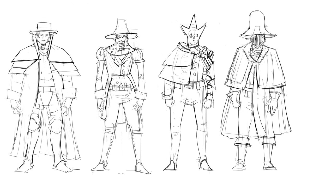
Alright here are the hunter sketches, i think ill go with the last one i like the way he turned out


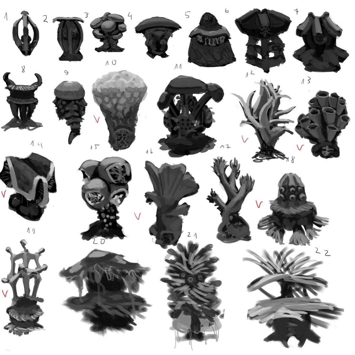
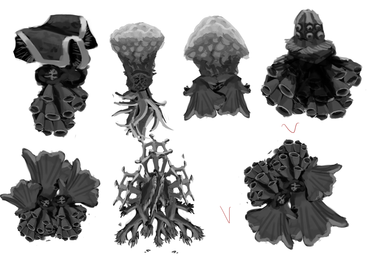
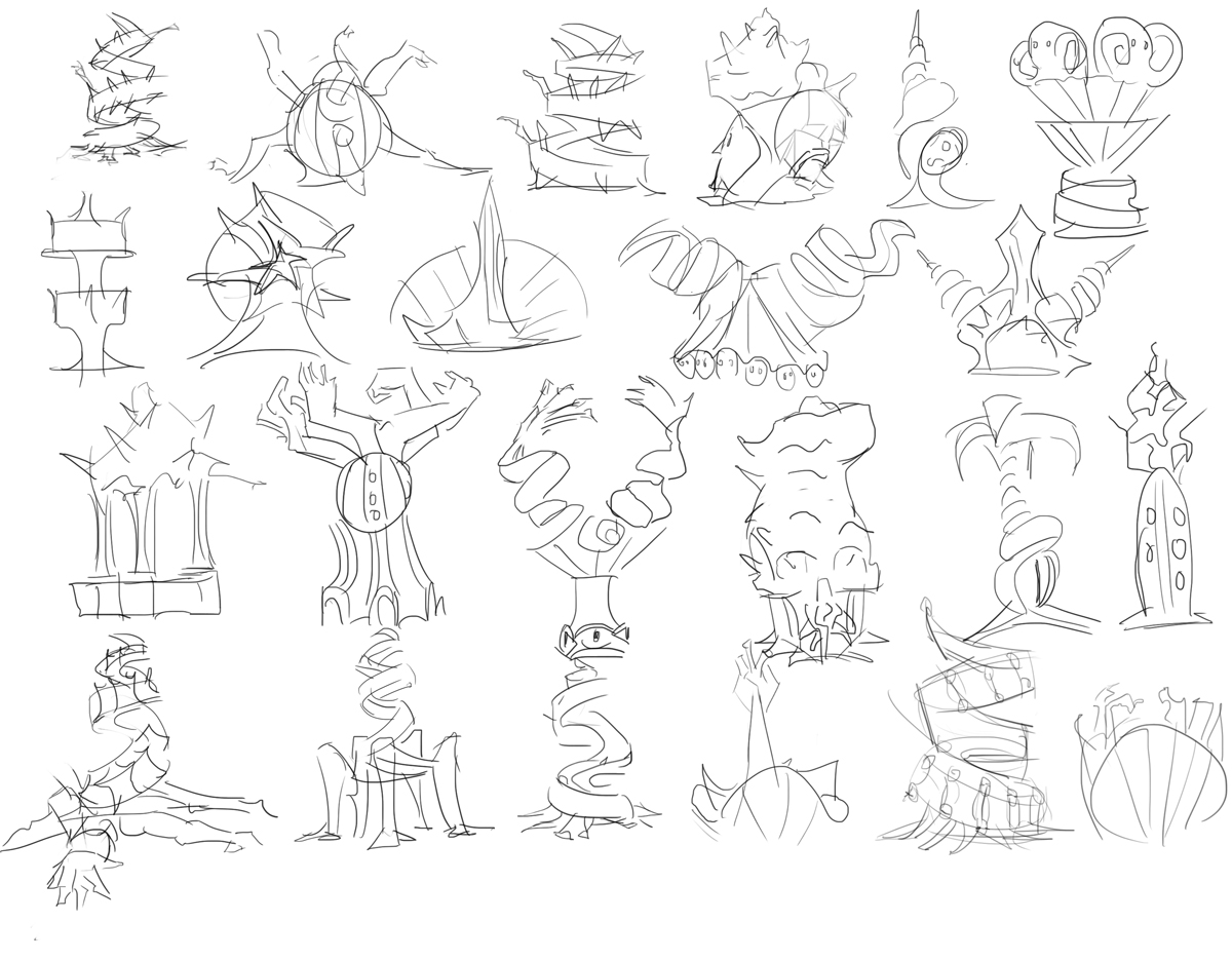
Statue thumbnails


statue renderings not sure with which one to go,will have to think about it


Reply
#14
Yep yep the top right Great One is awesome! So much work done, I must catch up!

Reply
#15
I like that spiraling statue, especially the arms coming out at the bottom. And the holes on the great one will look cool with blood pouring out as its rising out of the pool.

Reply
#16
@Neopatogen Thanks! drawing monsters can hardly be called work quite fun.
@Adam Thanks yeah the spiral one was my favorite when i designed these

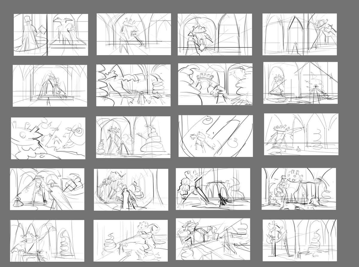
Alright now comes the difficult part... kind of. Composition

Here are some thumbnails don't like any of them tomorrow i think ill do them in values instead of lines.


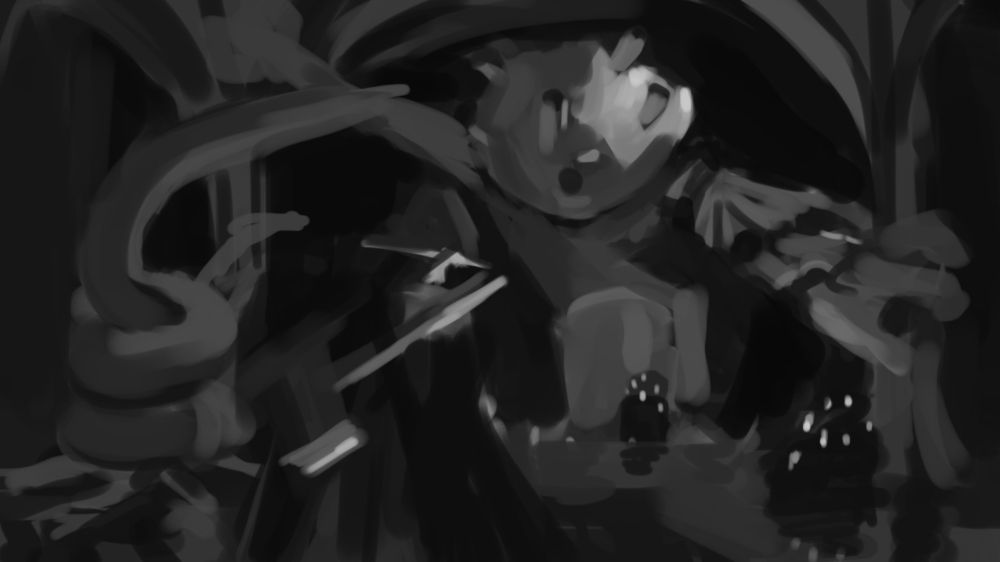
And here is a value sketch i do like the tonal arrangement  in this.


More stuff coming really want to make a nice composition!

Reply
#17
You're a concept art machine!

If you are reading this, I most likely just gave you a crappy crit! What I'm basically trying to say is, don't give up!  
----
IG: @thatpuddinhead
Reply
#18
Nice concepts bro...
Reply
#19
I'm sure value will help the comps. Even with the line weight its a little difficult to get a good read on those. That value sketch is quite nice though. I'm loving those statue designs too. Not what I would expect on a statue, but definitely fits the game I think. Well done.
Reply
#20
@John I wish!
@Black Phoenix thanks!
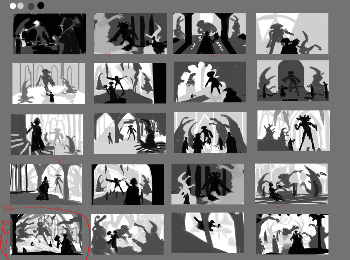
@ Thanks! Yes tried value thumbnails its easier since i dont have to draw on a tiny surface ( the thumbnail) which i find a bit tricky in digital ( im sure it just takes practice).

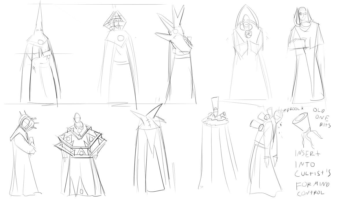
Anyway here are value comps i found the bottom left one quite interesting. So i think for now this is the framework for the comp. And it needs an additional element...bunch of cultist's so i designed some too.


I think ill stick with robed dudes with old one bits in them, no need to overdesign everything just throw in some catholic looking monk people in there and it will do.


Reply


Forum Jump:


Users browsing this thread: 5 Guest(s)