Posts: 178
Threads: 6
Joined: Jul 2015
Reputation:
18
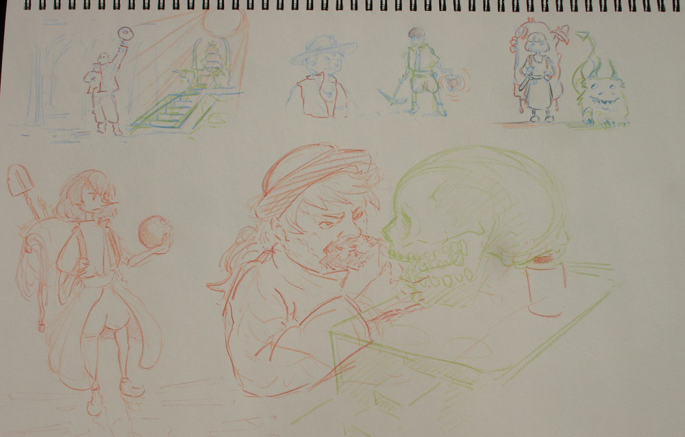
I don't have any definitive ideas for this one yet, but I want to get away from the kind of look I went with for GoT and Bloodborne. This time will be something much more stylized with a less serious feel to it, and what I want to focus on for now is making studies of a few pieces that capture that mood.


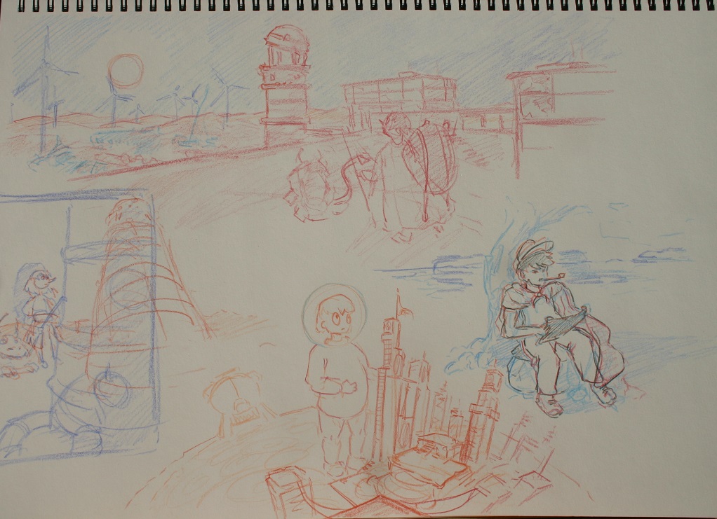
For now, I tried to come up with a few ideas for what the adventurer and the environment might look like. One idea I like is that the desert in question used to be an ocean, and we can see the remains of windparks, a lighthouse, and maybe stranded fisher boats. Not sure if an abandoned lighthouse counts as a ruin though.
(Edit because somehow the headline got screwed up...)
Posts: 1,970
Threads: 22
Joined: Apr 2012
Reputation:
243
Great to see you in on it again Lodratio :) You are a serial offender... of the best kind. Looking forward to more stylised stuff from you!
Posts: 178
Threads: 6
Joined: Jul 2015
Reputation:
18
@Amit: Thanks for the encouragement. I was a bit uncertain about doing something stylized for CC in the beginning, since most entries so far have been painterly semi-realism, but as you guys said that's a silly thing to worry about.
I figured it wouldn't make sense to go too far into concept exploration without knowing what kind of feel the character and the environment would have, so I'm starting off with some things to help with thinking about that.
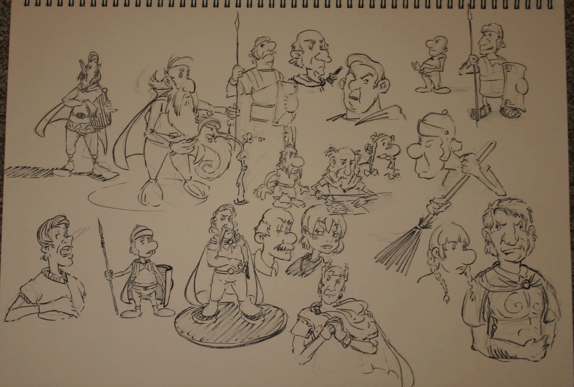
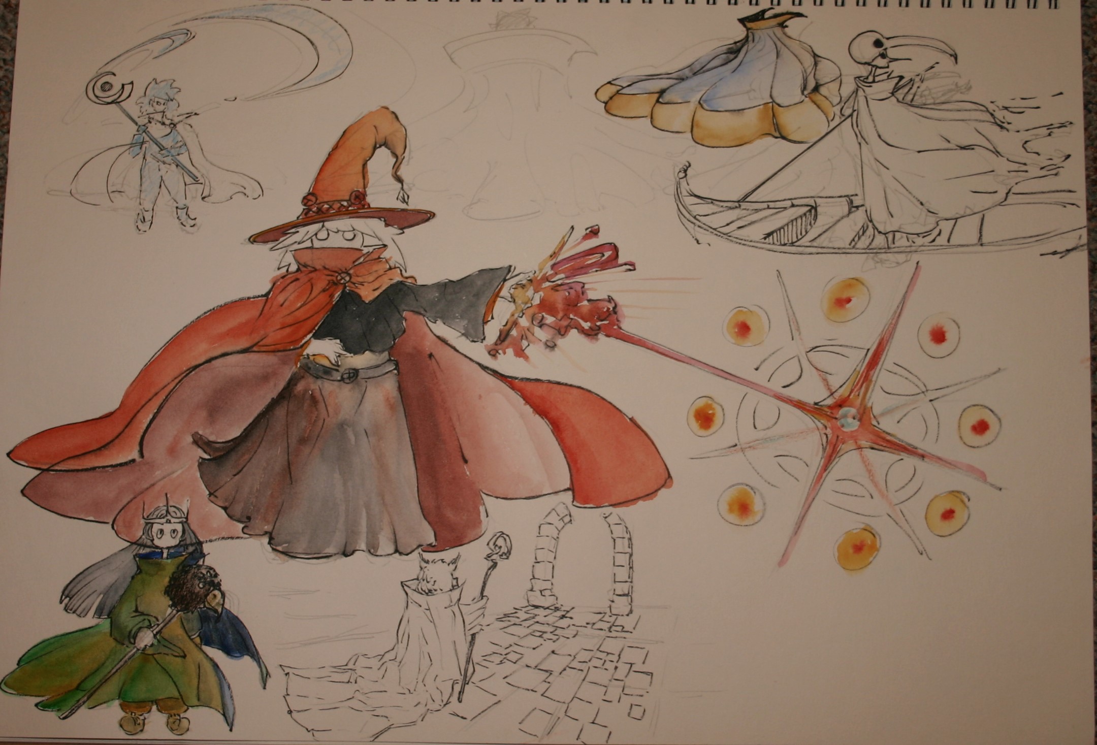
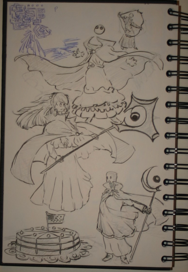
I did studies of asterix comics, which have a similar mood to what I might want to do. The way uderzo stylizes his characters is very interesting, and I bet I'll be able to steal some ideas from him. I also spent some time trying to figure out wind-dynamics on capes (Yes, treasure hunters do need cool looking capes, especially when there's deserts involved). Not that happy with the results yet, but it's still a step up for me.
Posts: 742
Threads: 28
Joined: Jan 2012
Reputation:
44
I love the style. ooking forward to more!
Posts: 297
Threads: 7
Joined: Mar 2016
Reputation:
14
Posts: 501
Threads: 10
Joined: Jan 2013
Reputation:
20
Interesting choice of style looking forward to the final!
Posts: 178
Threads: 6
Joined: Jul 2015
Reputation:
18
@ Piotr Now I have a mental image of a monkey hanging from a tree with an anticipatory look on its face.
@ BrushNoir If it doesn't go well I'll hold you responsible for jinxing it!
@Hobitt Thanks. It'd be interesting to hear which aspects of it you find appealing. Since I'm no that used to making thse kinds of decisions it can be hard to tell what works and what doesn't work at times.
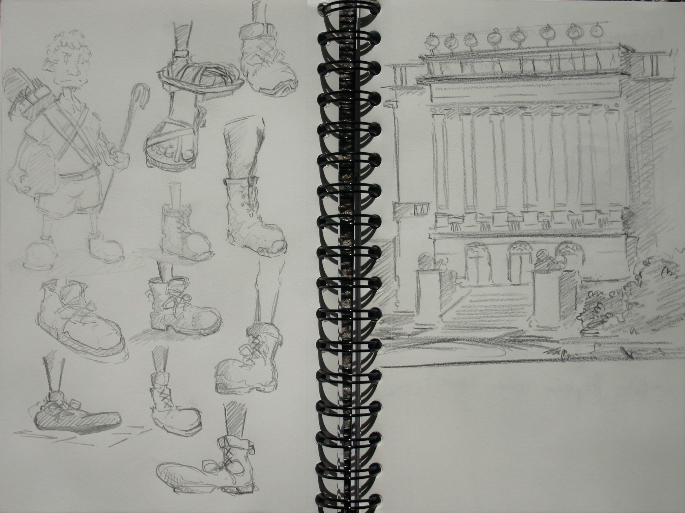
Still experimenting with different proportions for faces and bodies. Once you get away from trying to match what things 'really' look like, there's suddenly a lot of new choices to be made. At this point I could either do some studies, or try to come up with ideas for storytelling and compositions.
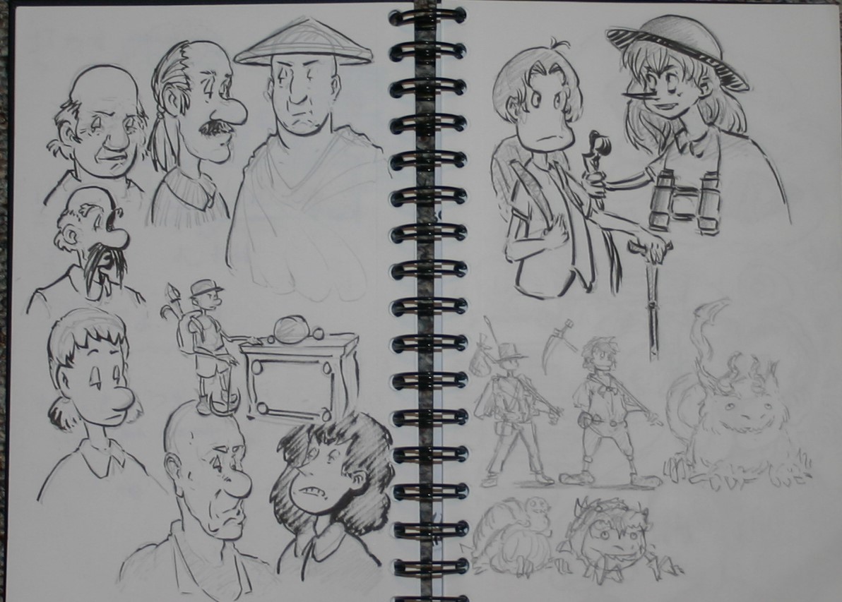
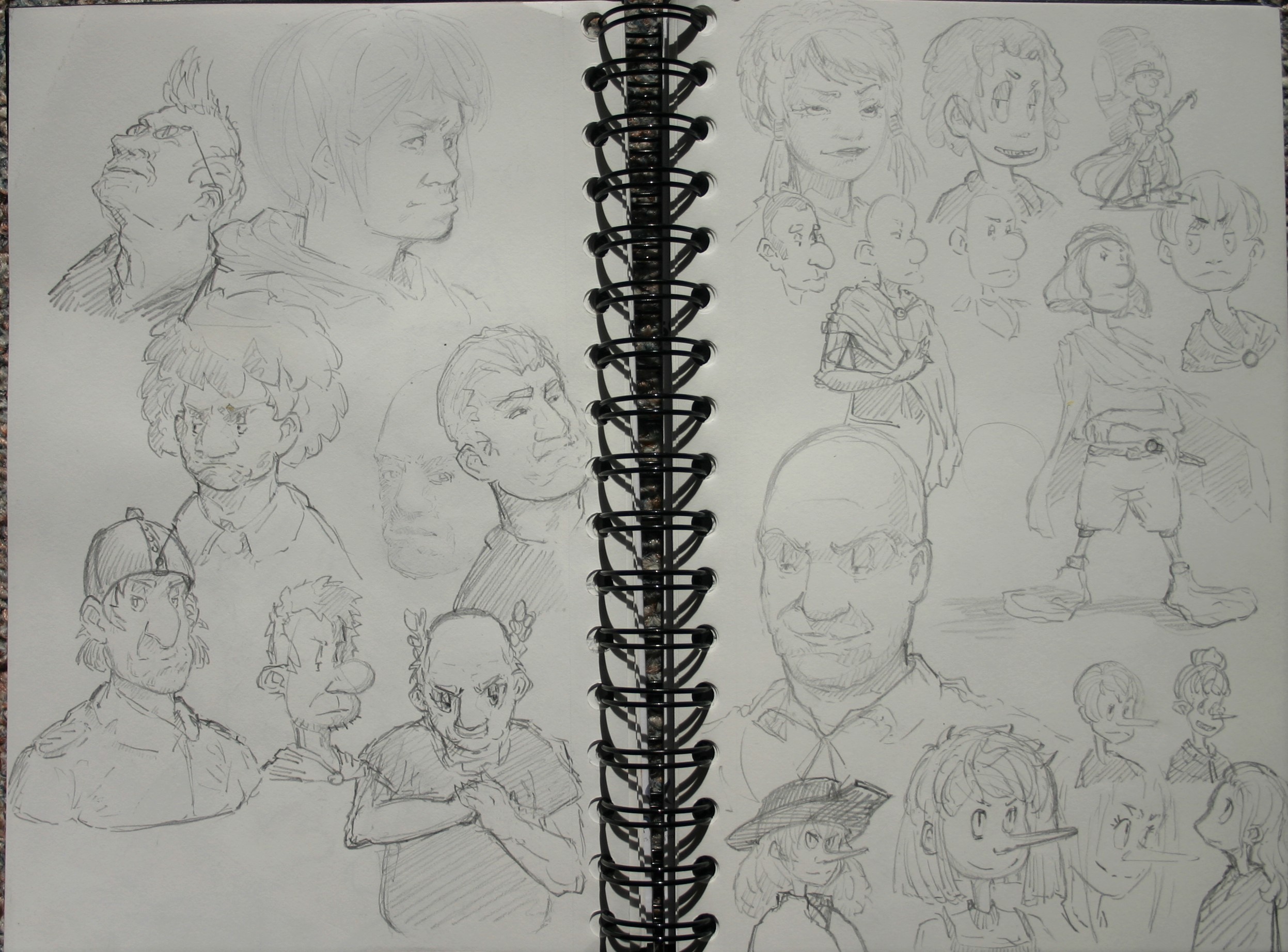
What kinds of boots do treasure hunters wear anyway?
Posts: 530
Threads: 14
Joined: Dec 2015
Reputation:
51
I like the guy in chinese hat and the cute monster creature with arrow-tail! Especially the creature! I wonder how it could be related to treasure hunting.
Posts: 47
Threads: 4
Joined: Aug 2014
Reputation:
1
Beautiful sketches and nice style, looking forward to seeing this develop more.
Posts: 501
Threads: 10
Joined: Jan 2013
Reputation:
20
I like the choice of style, because it gets rarely used and with this just trust your gut and look at your inspirations making the right choice is the most difficult task in art, good luck!
Posts: 178
Threads: 6
Joined: Jul 2015
Reputation:
18
@neo Chinese hat guy was just a doodle, but the dragon creature is supposed to be like a companion for my treasure hunter, because the options when creating avisually representable story involving just one character are so limited.
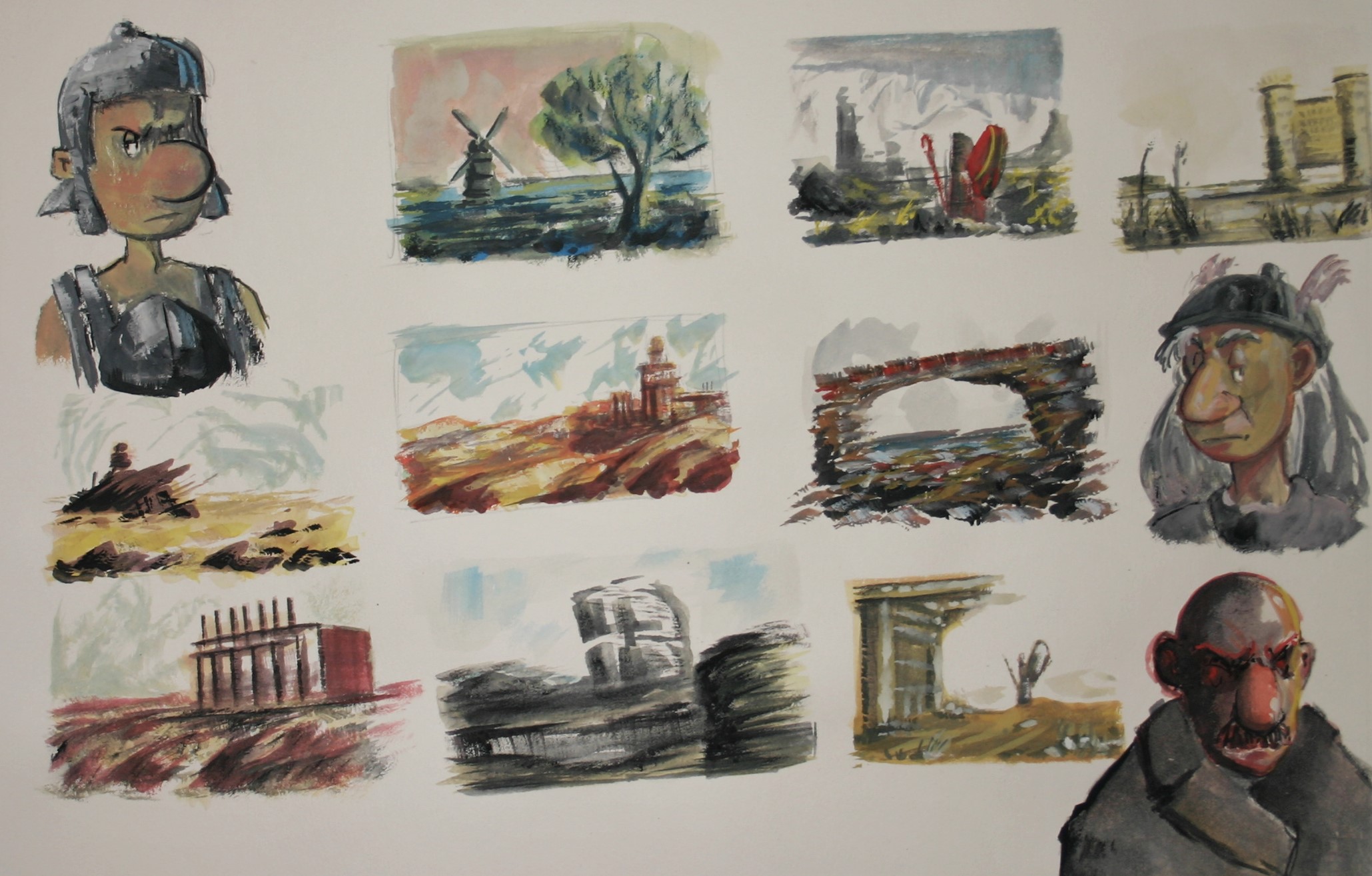
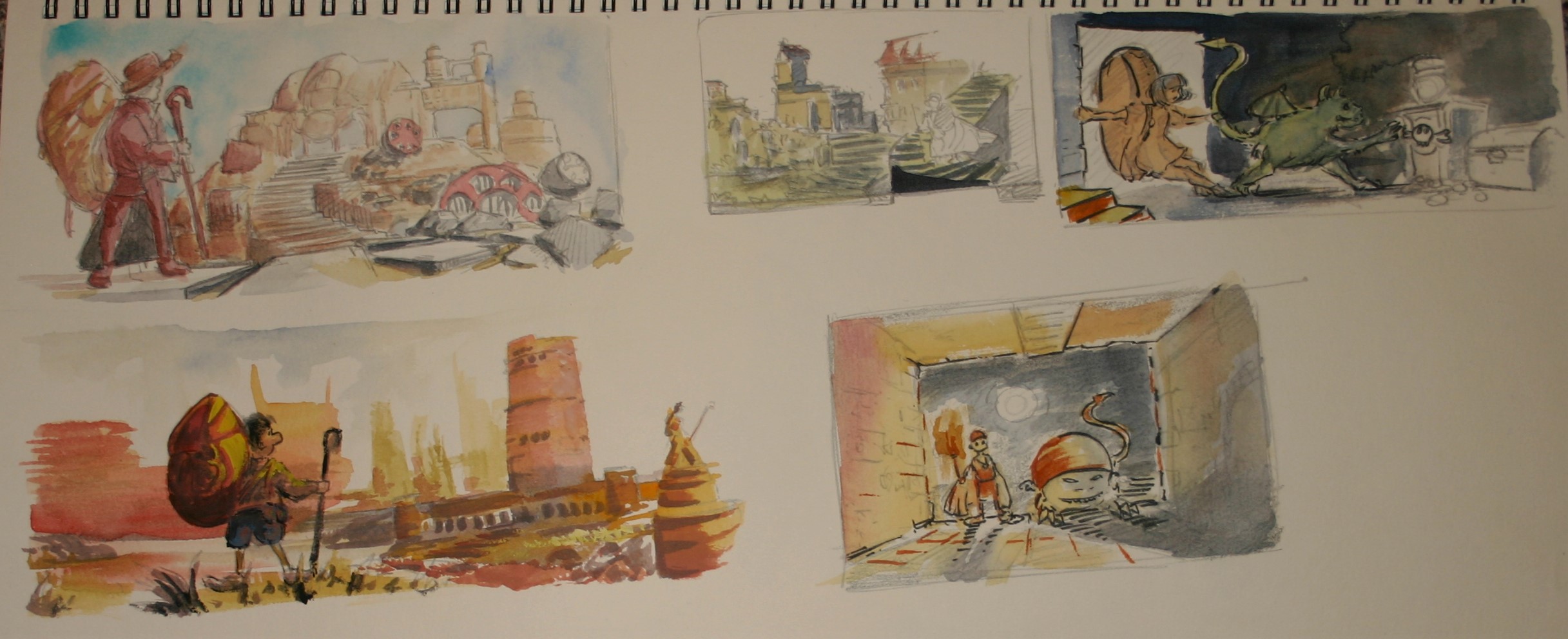
Yesterday I tried using the paints that have been sitting in my room catching dust for about half a year now. The first page of compositions was done with tempera colors. I was struggling with controling values, since they change pretty drastically when theydry, so the results are predictably terrible. On the second page I thinned them out and used them like watercolors instead, and actually got some decent results. (even then, most of these don't meet the conditions of the pitch, but don't worry, I'm homing in on it.)
I made some acrylic paintings as well, but since they aren't really CC related I think they should be posted somewhere else. The revolvers group might be a good place for that, right?
Posts: 178
Threads: 6
Joined: Jul 2015
Reputation:
18
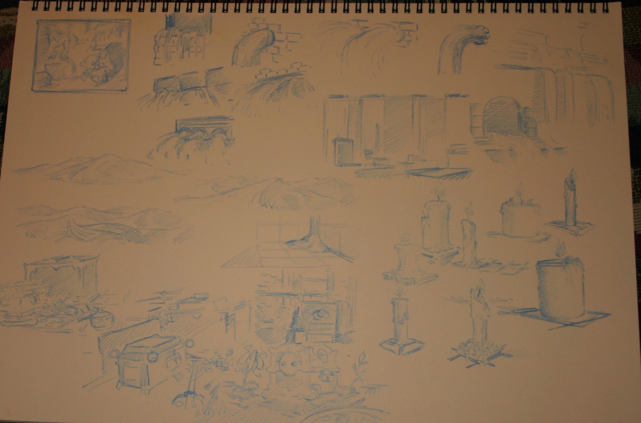
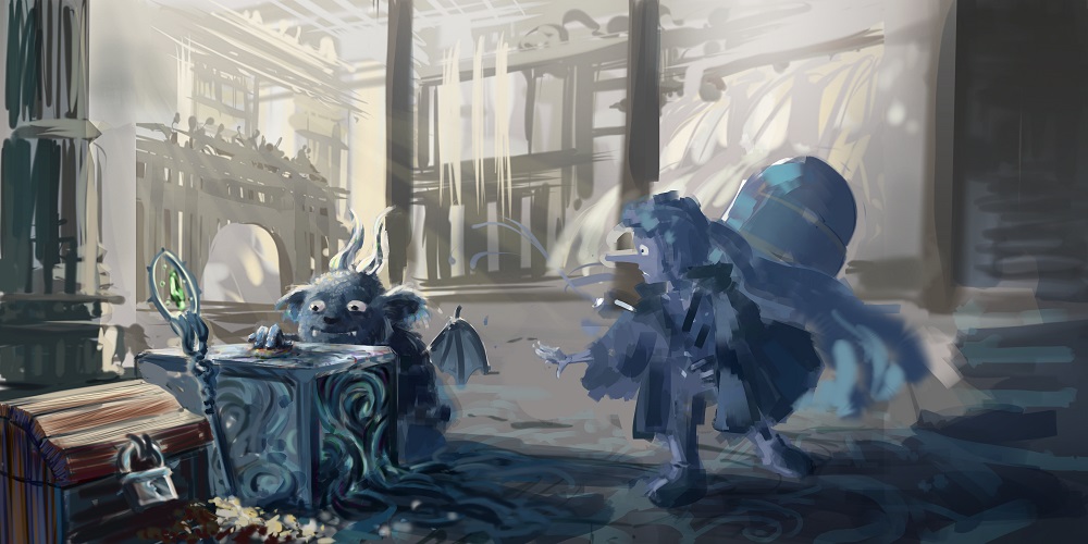
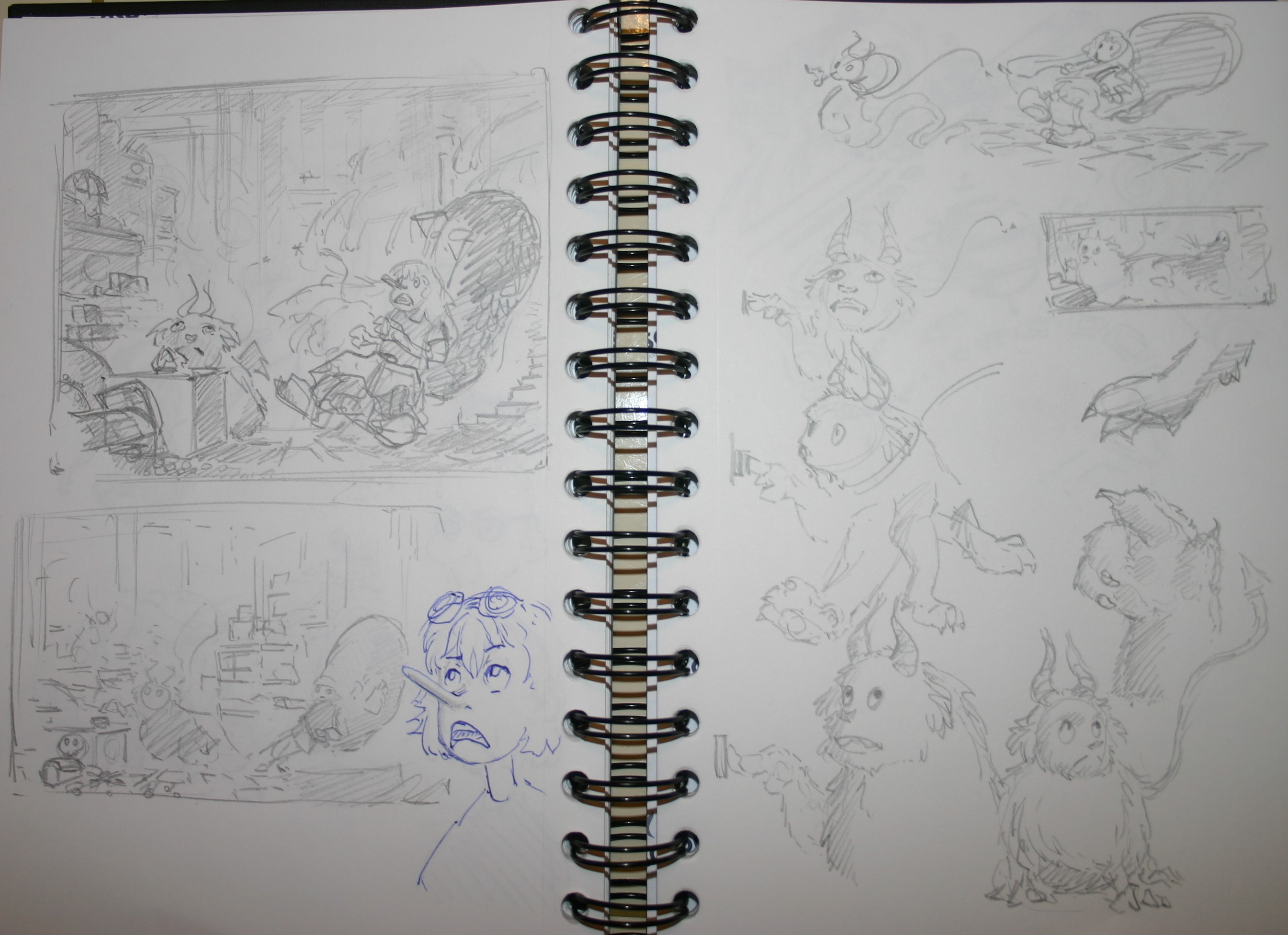
Not sure how well it reads in the photos, but I've been working on my composition and doing iterations of the smaller elements making up the picture, going through different ways of portraying sand, candles, treasure, and the treasure hunters animal companion.
I still need to do some studies to try and figure out how to do clean linework digitally, and I'll work on the design for my treasure hunter, but I think I know where I'm going with this.

Posts: 1,970
Threads: 22
Joined: Apr 2012
Reputation:
243
Ah, so adorable, that little creature in the top left comp. Nice storytelling and really setting a scene. I definitely want to see your final poece. GO get em!
Posts: 58
Threads: 3
Joined: Jan 2015
Reputation:
1
Love the Asterix's studies. remind me when I was younger. Can't wait to see the final painting, it sure going to stand out and not in a bad way!
Posts: 234
Threads: 11
Joined: Nov 2015
Reputation:
17
Such a cute style! I love to see this finished <3
Posts: 178
Threads: 6
Joined: Jul 2015
Reputation:
18
Thanks for the encouragement!
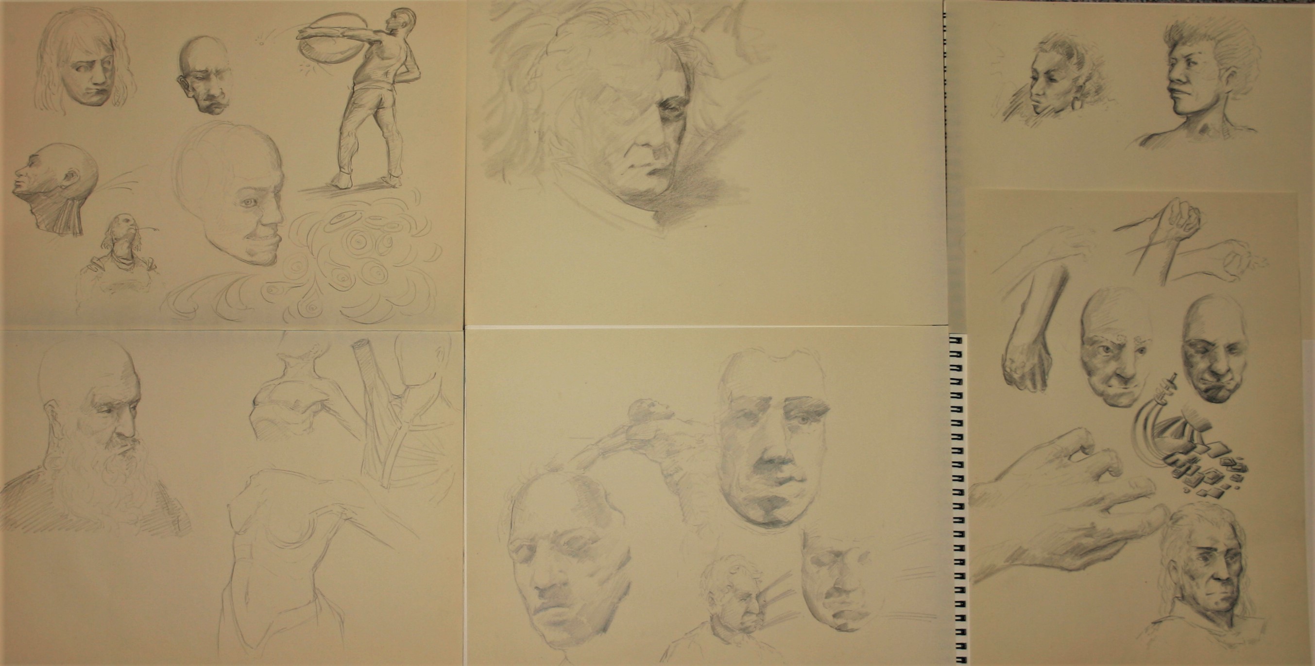
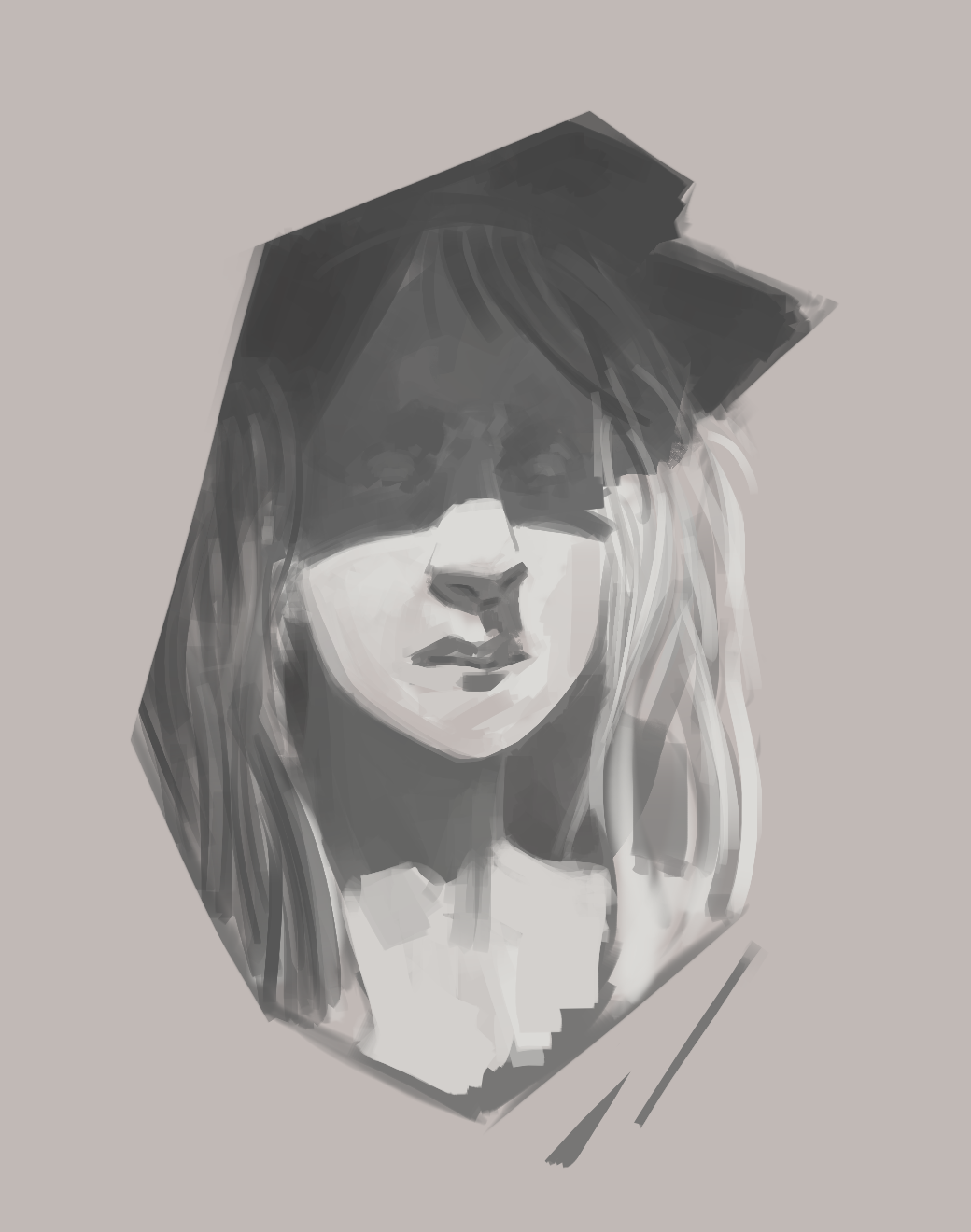
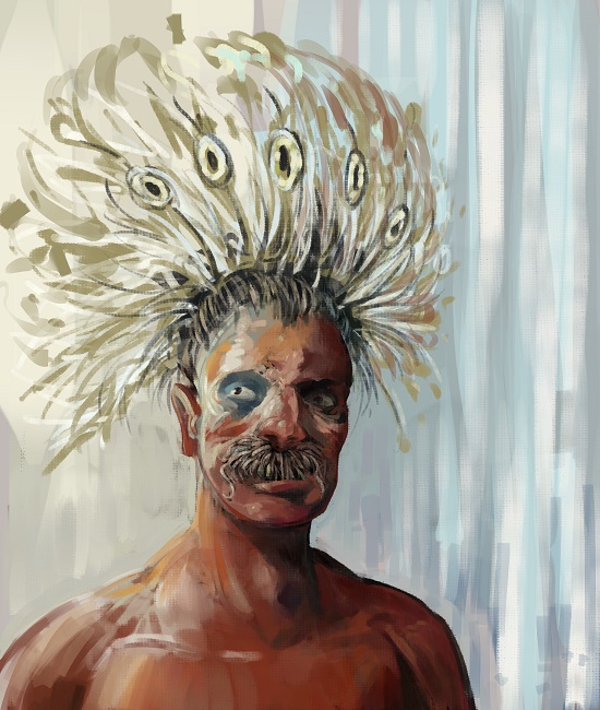
I'll post some work on the final either later today or early tomorrow, but for now I have something else I'd like to get feedback on. I'm trying to figure out value changes and edges and how they interplay to create forms. I want to apply that kind of shading to the environment as well as the figures in the final, rather than just doing gradients and simplified core-shadows, so I'm trying to figure out the abstract principles behind it, by looking at how it works on the face. If you could tell me what's working and where there are problems that would be great.

Posts: 178
Threads: 6
Joined: Jul 2015
Reputation:
18
Posts: 104
Threads: 7
Joined: Mar 2016
Reputation:
9
Hey Lodratio!
Your final is looking freaking awesome!! :D I'm excited to see how it comes out!!
As for your question on the shadow edges, I too am working on getting those things down. In the sketches you posted, it looks like the middle top one is definitely going in the right direction. Also, the face on the left in the middle bottom image also looks like it's going in the right direction with the traces of reflected light. Also the girl with the veil looks excellent! I love that kind of dynamic lighting :)
What helps me with edges applies a lot to that top middle one also, where you have a very subtle lightening of value by the man's cheek. Separating the values like that can be incredibly helpful in making the edges work I feel.
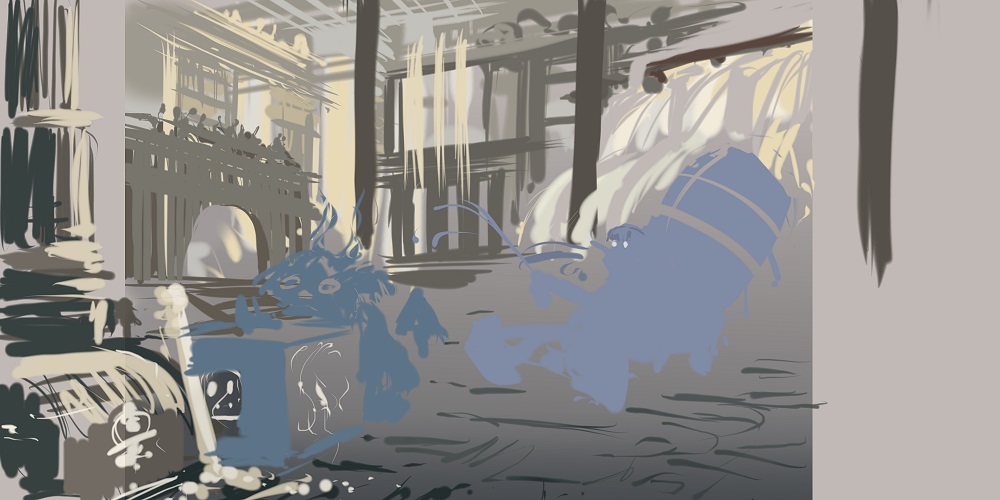
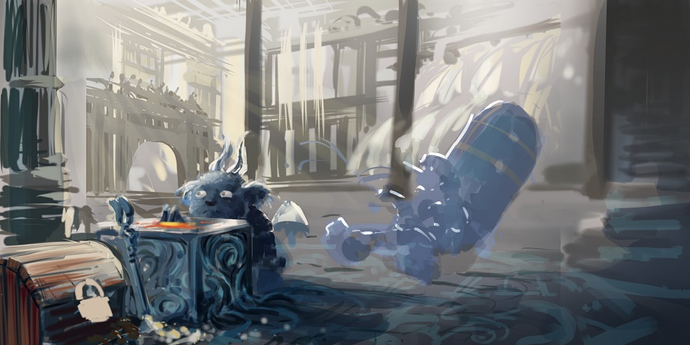
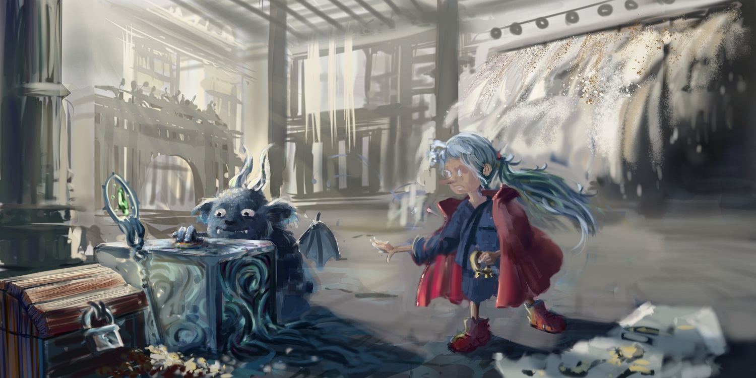
As for your latest WIP, I'm really loving the characters! It's still a bit rough, so some tightening up in the rendering is still needed, but overall I think it's going in the right direction. That little creature with the box is awesome; is the box glowing from the inside? That might be a cool thing to play with, if you still have the chance!
Keep going, I believe in you!! :D
Posts: 530
Threads: 14
Joined: Dec 2015
Reputation:
51
Awww the creature with the box is super cute!
Would be great to see some more rendering, but everything reads this way, too!
Posts: 178
Threads: 6
Joined: Jul 2015
Reputation:
18
Thanks for dropping by Ara!
Your analysis of my studies definitely helped me take another close look at them, and certain aspects worked better than others (for example, in some cases I thought of an entire edge as 'hard', when it really should have gradually gotten softer). It's pretty amazing how much of an impact those subtle differences have on a painting. In some areas you can be as rough as you like, take a lot of liberties and get away with it, and in others it's all about pixel perfect precision.
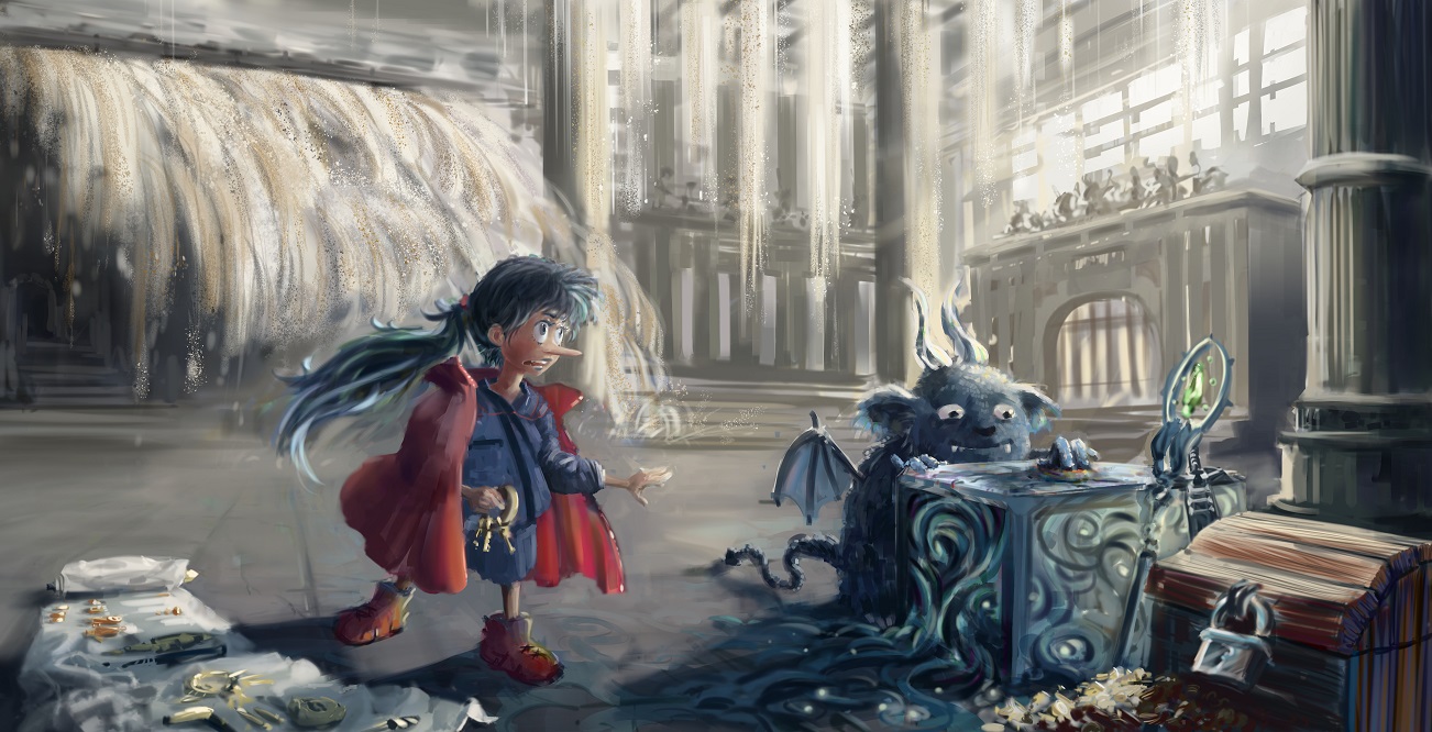
And Hi neo. I rendered it, just as you asked me to. (some parts look worse now, but overall it's better!(?))
It's great that everyone thinks the creature is cute... I just can't shake off the feeling that I've seen that exact facial expression somewhere before, and subconsciously stole it.
Well, Here's my final update for this CC. I should have taken a bit more time to figure out my composition and my treasure hunters pose, and maybe it would have been a good idea to use reference in some areas (cloth folds for example), but in any case this is a huge leap for me in terms of creating a complex, (somewhat) finished illustration that tells a story. I'm going to resist the urge to keep trying to correct it, and use what I've learned this time to do even better in the future!
Thanks to everyone who dropped by my thread, be it to give feedback or encouragement.


|
