_spec's stinky sketchbook
#61
Your color palette is so dope! Love the vibrancy to your pieces and also your figures have a nice expressive/stylized look as well.

Not sure if I can offer any crits at the moment lol, but I'm interested in how you go about understanding color and how you use it when rendering?

Can't wait to see more from ya!

@BenNissenArt
Reply
#62
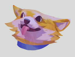
Dump!


Render practice... sort of


More render practice


iykyk


Reply
#63
(10-03-2021, 05:16 PM)darktiste Wrote: Personally i find the sword shape in the link piece to be to chaotic i would suggest something more symmetrical. Since the shape are so chaotic perhaps you could turn the piece it into a shadow link piece...
Agreed! I'd like to stick to his classic blue outfit though, so on second thought a sword w a simpler design may be the way to go. thanks!


(10-27-2021, 07:44 AM)Ben Nissen Wrote: Your color palette is so dope! Love the vibrancy to your pieces and also your figures have a nice expressive/stylized look as well.

Not sure if I can offer any crits at the moment lol, but I'm interested in how you go about understanding color and how you use it when rendering?

Can't wait to see more from ya!
Thank u Ben! It's a bit hard for me to explain... but i like to think of color as relative to what color is next to/around it, plus as long as the value is correct (not all of the time necessarily), things like hue+sat can be treated as secondaries with way more or less wiggle-room. color is such a weird thing for me because a lot of it also lies on intuition since I used to and still do color studies/plein airs quite often! I could talk forever about it though lol, hope that helps!


-

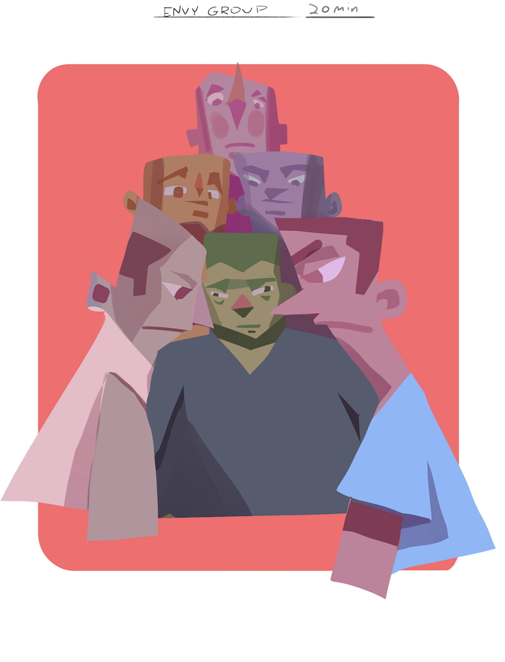
Tonights 20min speedpaint..... uhh sorry u had to look at this 


Reply
#64
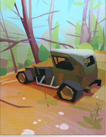
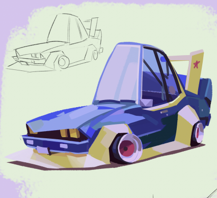
Abandoned car study using HEAVYPAINT for tonight. Probably one of my more detailed paintings using this app... i forgot how much fun heavypaint is! Totally should get back into these 


Reply
#65
Bit of an art-blocky day once i got home from work! It's a constant mental challenge but I'm slowly figuring out how to separate my work work from personal work where appropriate. Of course they both influence and cross-pollinate each other all the time, but times where my work work gets too "personal" and biased towards my drawing habits, and personal work get too "rigid" and overthought, is where i need to set the boundary. hahaha ya feel?


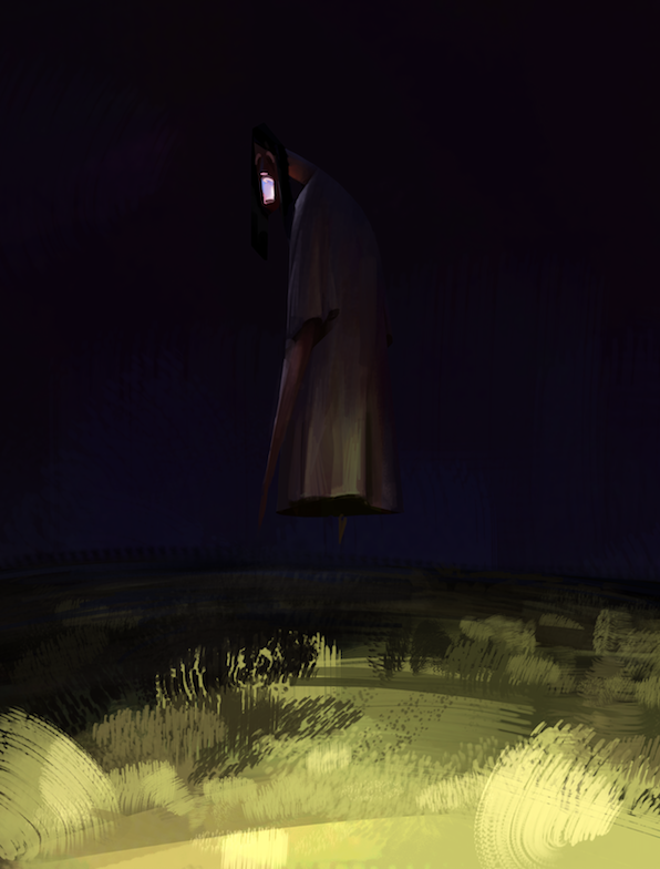
Also I sort of want to get more in to vis dev type of work... I love trying to capture a mood with lighting quickly and moving onto a new piece- maybe its a direction I can start injecting into my portfolio? hmm 


Reply
#66
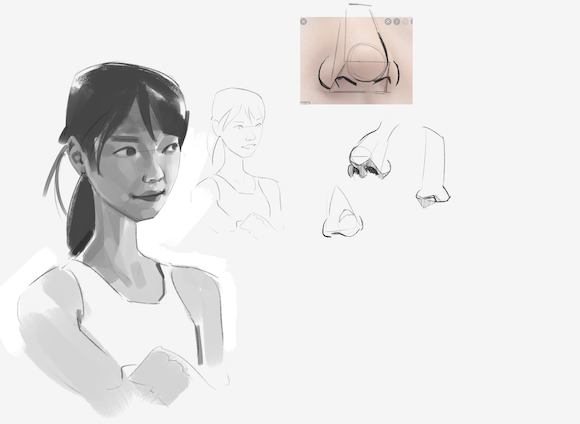
Some studies for tonight! I forgot how difficult it is to paint heads lol. No hard set goal or focus here- just trying to capture a vague likeness, distinguish and light the 3d forms, and keep my values and brush economy tidy. A bunch of places get pretty scratchy as far as i can already tell actually. I need to do more of these- i always forget how crucial the fundamental that these focus on are 


Reply
#67
Hi, Spec! Thanks for dropping by. Not sure if I can´t give you any crits since your painterly, stylized art is miles ahead of mine. Your lines are super clean and confident. It´s pretty obvious that you enjoy deviating from the reference image. Strong personal style...Others said it before, and it is still true: You truly know how to simplify form and light into shape.
Reply
#68
(11-19-2021, 09:03 AM)exartlurker Wrote: Hi, Spec! Thanks for dropping by. Not sure if I can´t give you any crits since your painterly, stylized art is miles ahead of mine. Your lines are super clean and confident. It´s pretty obvious that you enjoy deviating from the reference image. Strong personal style...Others said it before, and it is still true: You truly know how to simplify form and light into shape.
Thank u exartlurker! Yeah thats a good observation i always seem to forget- the more I try to 1:1 copy the reference, the worse it comes out! Guess I just need to tighen up my basic drawing/proportion skillz. Appreciate it! :)


-

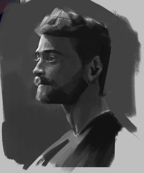
Tackled that Danielle Radcliff dude study again. I notice i really wonked the proportions on my first try


other:


Reply
#69
cool stuff. Your paintings usually come with a warm atmosphere which I like

Reply
#70
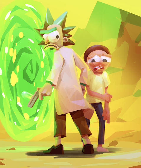
Rick!!!


Started some pokemon fanart the other night but realized most of what i had in the pencils were wrong perspective and proportion-wise. I'll probably stylize and simplify it even more before i try again (if i even get to it lol)


Reply
#71
I prefer the other sketch to the one you developped for the pokesketch.I think it as to do with the bottom shape which resemble arrow for that reason i think it don't do wonder to lead the eye it actually do the oposition will the smaller one the proportion make the face read first and the smaller shape support it and one principle of gesture if i remember correctly is to have the major mass seem to fall off but have a solid anchor point to the ground to add dynamism so it why to me it look more dynamic and well proportioned.But i don't know why i say that if it not just to support your own opinion.

(If you like pokemon you might want to check my sketchbook i did a series of pokehead from 1 to around 151+)(The intention was to get better at lineart at that time)

http://crimsondaggers.com/forum/thread-3737-page-6.html

My Sketchbook

Perfection is unmeasurable therefor it impossible to reach it.
Reply
#72
(11-26-2021, 11:45 PM)darktiste Wrote: I prefer the other sketch to the one you developped for the pokesketch.I think it as to do with the bottom shape which resemble arrow for that reason i think it don't do wonder to lead the eye it actually do the oposition will the smaller one the proportion make the face read first and the smaller shape support it and one principle of gesture if i remember correctly is to have the major mass seem to fall off but have a solid anchor point to the ground to add dynamism so it why to me it look more dynamic and well proportioned.But i don't know why i say that if it not just to support your own opinion.

(If you like pokemon you might want to check my sketchbook i did a series of pokehead from 1 to around 151+)(The intention was to get better at lineart at that time)

http://crimsondaggers.com/forum/thread-3737-page-6.html

Loving your pokeheads series!! That's such a fun idea. reminds me of when i was in grade school and tried drawing every legendary pokemon....up to gen 4 i think? It was a blast and now i feel motivated to do something similar. Thanks, and i agree- i'd probably need to spend more time on linework getting the overall gesture and proportion to work before laying down paint and such (as is my usual problem hahaha)


-

Dump!


worked on this a bit more....what's a rick without his morty??


Reply
#73
Hey you should try some lineart i think striving to having multiple style is such a refreshing and fun thing to have in your tool box but being really good at your own thing can pay off definitively.Perhaps try sometime less angular more organic to why not... nothing wrong with your style i dig it. Just keep thing fresh it important.Don't you think?

My Sketchbook

Perfection is unmeasurable therefor it impossible to reach it.
Reply
#74
(12-10-2021, 03:46 PM)darktiste Wrote: Hey you should try some lineart i think striving to having multiple style is such a refreshing and fun thing to have in your tool box but being really good at your own thing can pay off definitively.Perhaps try sometime less angular more organic to why not... nothing wrong with your style i dig it. Just keep thing fresh it important.Don't you think?

Agreeeed. I think I've been neglecting lineart lately and leaning on my painting/tone stuff quite a bit; kind of chilling in the realm of my comfort zone


-

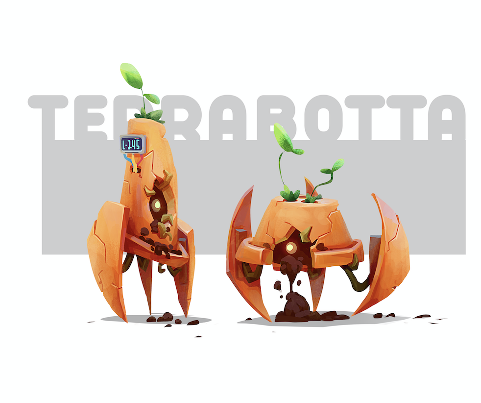
Dump!

Fun character!


Slowwwwly fleshing this one out lol


other:


Reply
#75
Hope y'all are well! here's a dump of some of the stuffs i've been working on. Trying to make the most of my holiday vacation before heading back to work 

might finish this... eventually 


Started this one.... making electronic music/beats has been one of my obsessive hobbies for like 10 years now- figured it'd be cool to start a series or something revolving around that. One concept for a body of work that's been rolling around in my head could be different types of fantasy-esque imaginative midi keyboards, w each one being animated in sync to one of my tracks. idk! 


studies. tryna do more anatomy/greyscale/fundamental stuff 


speedpaint from abstaction thingy


Reply
#76
Hi _spec,

Think this is the first time I've dropped into your SB.

By looking over your last coupla pages it's clear that you have some impressive drawing/painting chops.

But I gotta say I especially LOVE your whimsical characters and caricatures and your color 'sense.'

Enjoy the light-hearted humor in your work.

Anywho — keep 'em coming!

Reply
#77
Woooo Happy 2022 friends.

Here's tonights thang- a more visdev-focused study, where i'm aiming to capture the "mood" and lighting of the scene, pushing it primarily through color and light while saving time and energy by simplifying (NOT rushing, as i usually do lol) the shapes. I'm super happy with some of the simplification/abstractions going on here especially with the trees and grass too! the key was choosing the right brush, and using the lasso tool to create a definitive shape for it.
In general, working smart but clean is the key here.
One quick tip i found for colors is to start with ur object, but painted with suuper saturated colors- maybe even too saturated, then carve away at it on a 'color' layer clipped to it using black or white. This brings back in those "mature"/harmonious greys and neutrals while giving u the control to retain how much of that saturation u want without killing it entirely. I find this works better if the look ur going for is already saturated and you just want to tone it back a bit. Doing it w a textured brush could be cool, although in mine (the tree bark) i did and now there's a mess of too much texture.
Hope these type of shit write-ups are helpful! I find keeping a log helps me remember things better


other stuff over the past few dayz


finally finished this piggy! If u scroll up you might be able to catch snippets of it at different stages. For final art, I'm happy with the perspective/anatomy/proportion changes made, which involved a lot of canvas flipping to get him looking not wonky. It was tough not getting too attached to the paint i had already layed down and making the changes i saw that needed to be made but i'm happy i broke out of that comfort-zone thing a bit more


@Jephyr thanks so much dude!!! I really appreciate that. Ive been working hard at breaking out of my own ego/shyness shell and showing more of myself through my work in that exact way...yknow like taking myself and my work less seriously and just having fun in the purest sense. it's a hard thing for me to do so it means a lot to me that you notice it!

Reply
#78
Hey dude - really nice sketchbook - I love the lighting and the colours and I particularly admire your brush economy!

“Today, give a stranger one of your smiles. It might be the only sunshine he sees all day.” -- H. Jackson Brown Jr.

CD Sketchbook


Reply
#79
Very nice work! I wish I had feedback to offer but your skills are a bit above mine : D
I really enjoy your sense of color and light, as well as the shape design / your style.
Keep posting, I love to see it all!
Reply
#80
Thanks so much, y'all !

Went back to work this past week.... To be honest I miss how much time i had during break to draw and work on personal stuff but i guess i need to find a way to focus on that during the weekends/nights

did this sometime last weeeek. I was really into Hozure's loose painty sketches and wanted to sketch something similar, but it seems i lost focus at some point and started over rendering past the point of it being a painted "sketch"


Feeling kinda sick and shitty today but atleast had some fun with these


Reply


Forum Jump:


Users browsing this thread: 1 Guest(s)