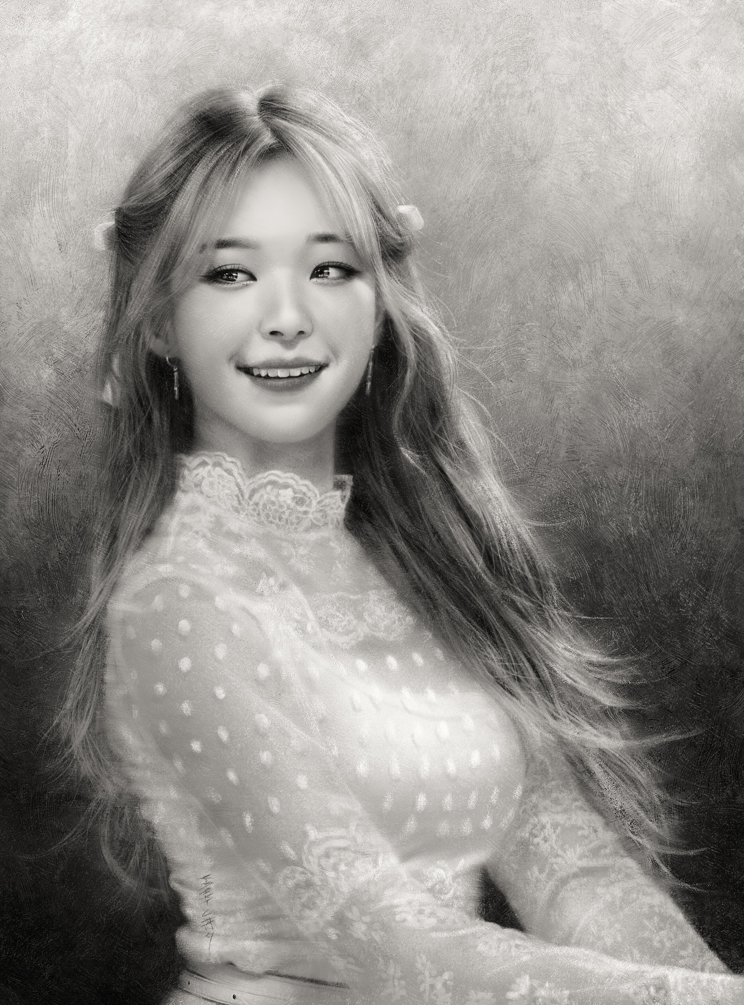
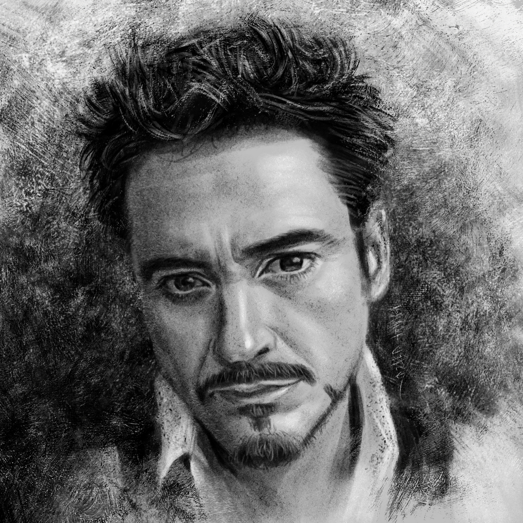
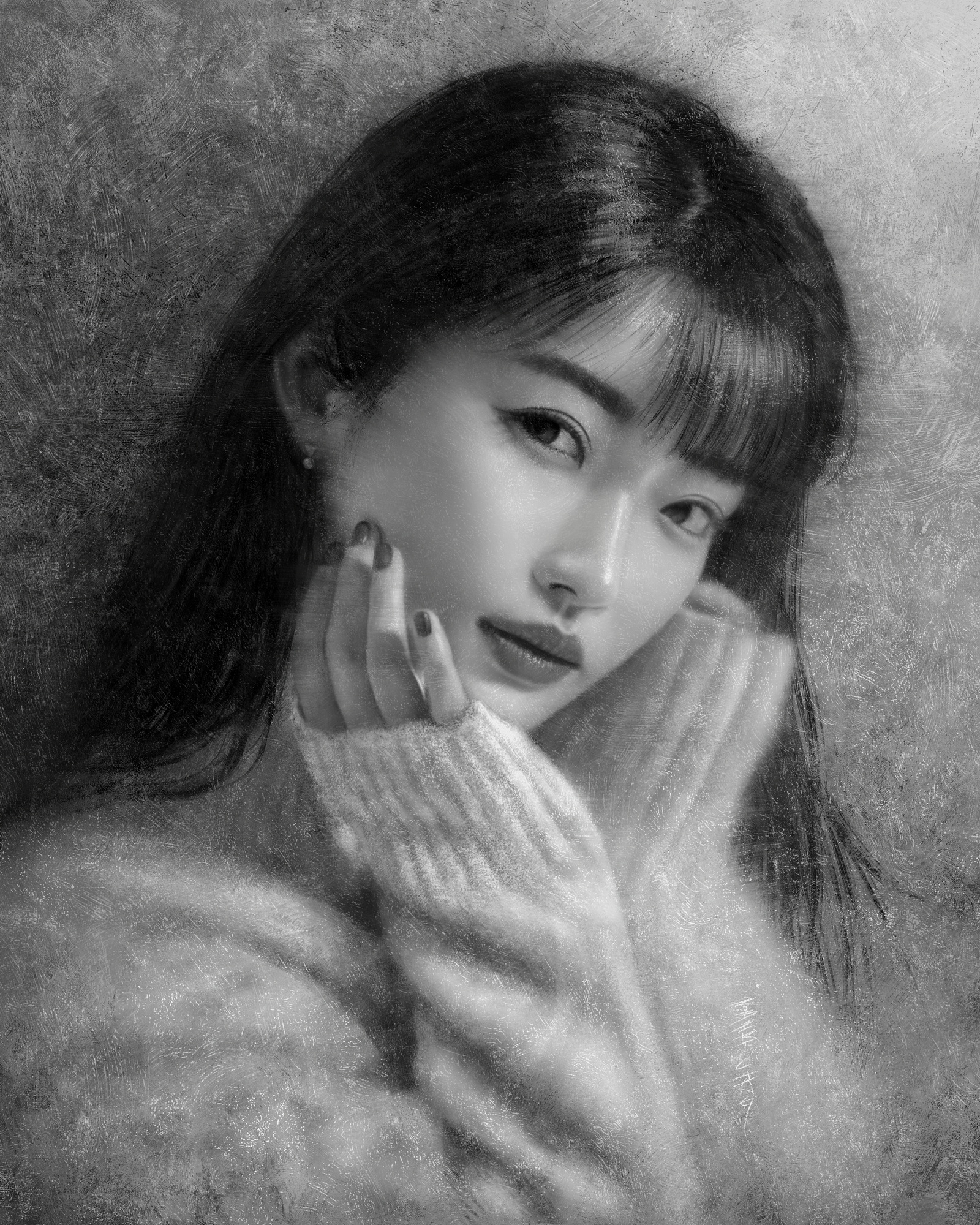
(04-08-2024, 07:41 PM)Damien Levs Wrote: Your portraits are insane. Amazing work here.
I literally have nothing to offer except that I hope I can get to this standard of portraiture in the future.
I was going to ask how long the RDJ one took, but you answered that in your text. 1 hour is crazy. I've pretty much only got a line drawing down in that time.
Looking forward to seeing more!
Thanks!
I looked at your sketchbook, and I think you have solid enough foundations to do portraits more quickly, but it'll take some work to get there.
As with any specialized subject matter and style, just dabbling in it won't get you to the level of proficiency you desire--you have to fully commit to it for a prolonged period of time. Although I did not specialize and focus on portraits in my art career, it was one of my favorite subject matters so I did a lot of it. By a lot, I mean I probably have done well over a hundred of them over the decades. And now that I'm no longer working in the entertainment industry as an artist, it's the only subject matter I still enjoy doing. All the other stuff--sci-fi/fantasy/horror concept art and illustrations, graphic novels--all that stuff just doesn't interest me much anymore, since I prefer to dedicate my imaginative side to writing novels instead.
I'll describe my history with portraits and offer some tips that might help you.
I got serious about art around age 14 (I'm 52 now), and I was immediately drawn to portraits, even though I lived and breathed anime and manga, as well as sci-fi/fantasy illustrations and American/European comics. The academic/classical side of Western art was in a way the lofty aspiration, and I would just stare at the works of masters like Bouguereau and Waterhouse and Sargent.
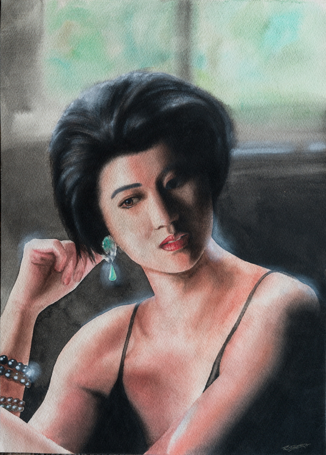
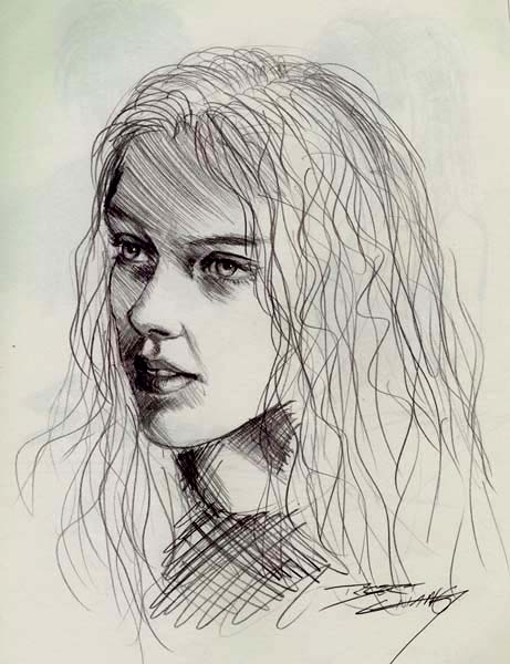
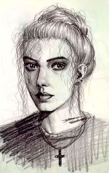
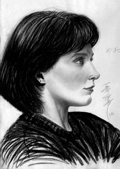
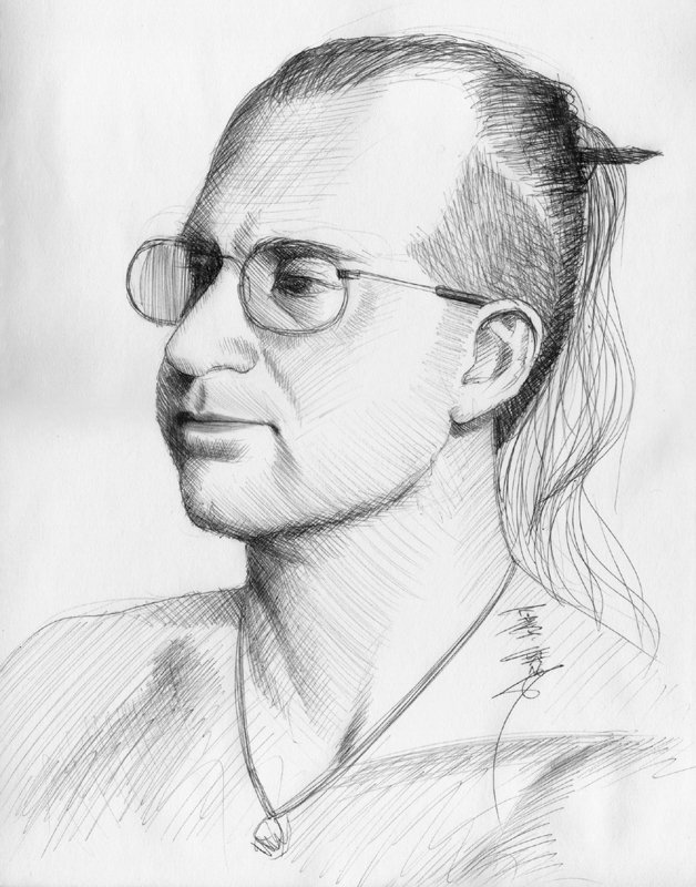
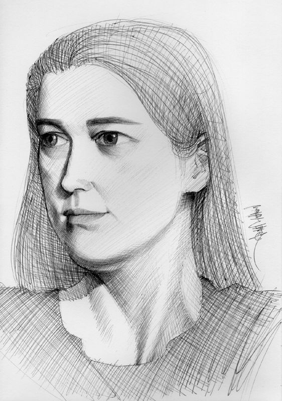
So from age 14 and on, I would do portraits often, and I didn't just draw/paint from photo references. I pushed myself to also do them from life, and the logistical limitations were beneficial in developing speed and accuracy, as well as making critical choices in what to selectively detail and what to merely suggest. Real-life models do not have the patience to sit there for hours on end, so I'd be lucky if I could get 30 minutes out of them, and I was forced to work quickly. I was also inspired by the portrait artists I've seen at the various art & wine festivals or at tourists spots, where they'd set up booths and draw customers in a very short amount of time and capture their likeness and essence. Although I had no intention to ever do that type of work for a living, it was still a fun challenge to myself to be able to do the same. I'll show you some of my early portraits done from life and from photo references during my formative years (they're all from life unless I specify a piece was from reference):
This one was a friend who liked to model for me from time to time, and I think I was 16 when I did this one:

Here's one from photo reference, done with one of those plastic-tipped ink pens, around the same time:

Some of you might recognize this one, as the original was by Boris Vallejo, whose work I referenced. I did this also around age 16.

This was also from reference, and I did a lot of these types of mixed media portraits.

This one was when I was slightly older, around 18/19 (the same year I became a full-time comic book artist). It was the fiancé of my friend's best friend:

This is her with makeup on:

This one is a year or two later when I was about 19/20. She was the GF of my GF's ex's at the time:

This one was when I was around 25, and my GF at the time. This one portrait from life took the longest (at that time) because she sat down to watch The Devil's Advocate and I started drawing (I had already seen the movie but she hadn't), and by the time the movie ended, I also finished drawing:

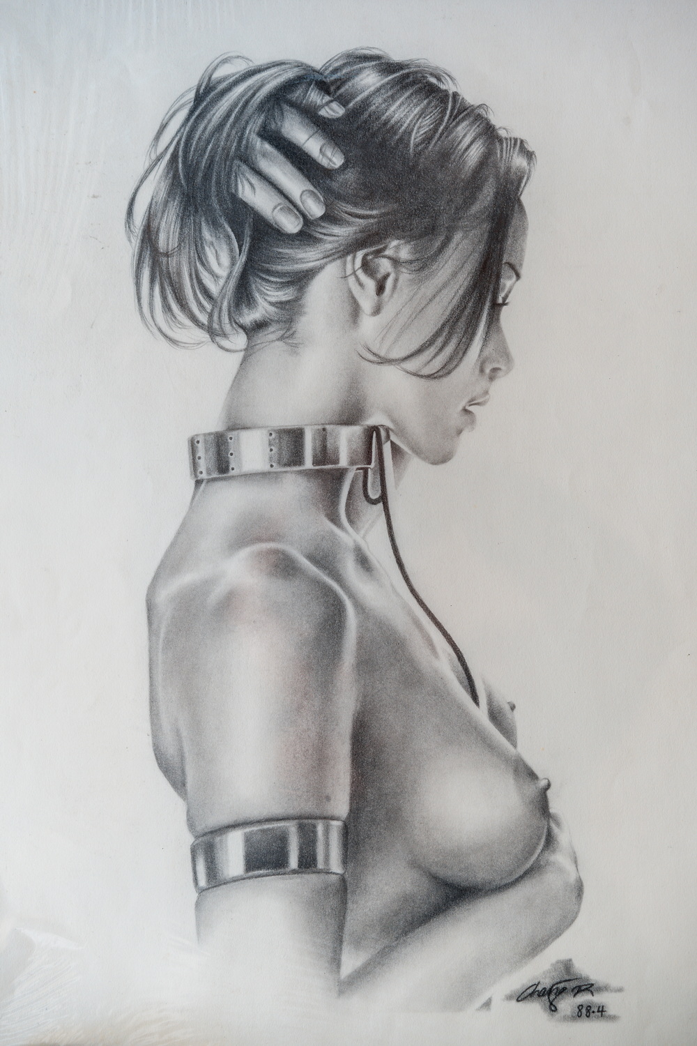
These two were when I was about 29, while working in a game studio. I created a weekly life drawing session where anyone in the company could join us after hours to do it. The company funded it, and I hired life drawing models, and each session would be around 2~3 hours. We'd do fast sketches (15~30 seconds each) for a bit, then 5~10 minute ones, then 30 minutes, and an hour. Around that time, I wanted to push myself to be more accurate and decisive, so I started to do these sessions with nothing but ballpoint pen, so I could not afford to make mistakes.


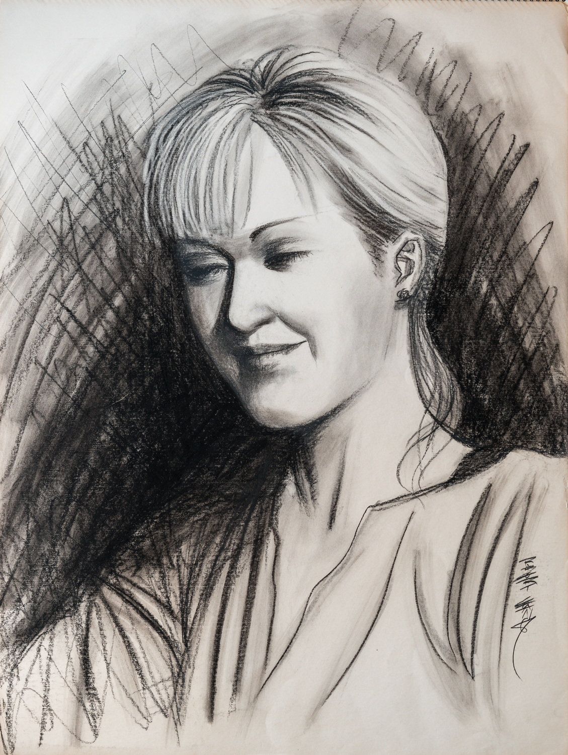
But I also did the more conventional charcoal and paint stuff too like these:

Fun fact: This model wanted to smile for the portrait, and I asked her if she was sure because her face would get really stiff after a while, and she said as long as we didn't take forever, she could do it.


When I was short on time, I'd do a much simpler sketch like this of the model.

A few more years later, I was in my early 30 and married, and I did some portraits of my wife, Elena, ranging from quickie sketches to fully finished paintings.
From reference.


From reference.
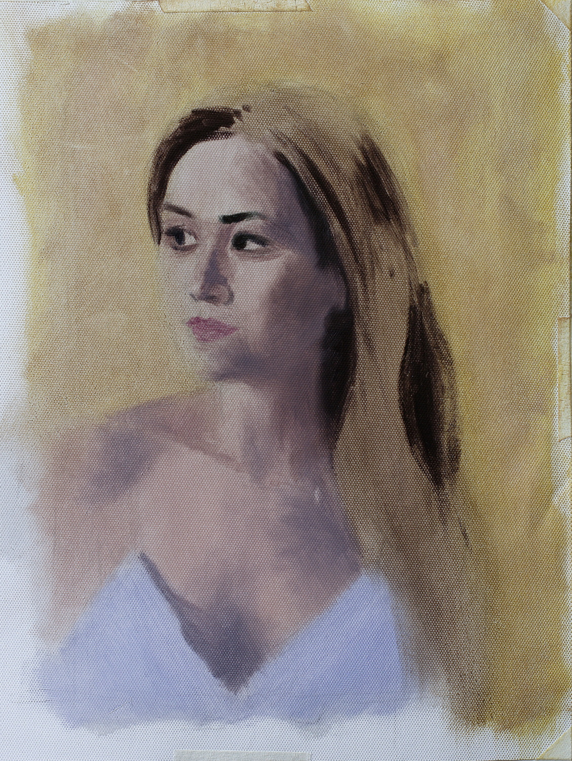
It was also around this time when I started to get comfortable with digital. I started digital in 1998 but hated it for years until I saw what digital artists like Craig Mullins could do with the same set of digital tools that frustrated me. I decided to put in the time and effort to get better at digital (and I didn't have a choice because everything in the commercial art world had turned digital, so I had to sink or swim).
From reference

This one was actually half from life and half from reference. She sat for the painting session broken up into multiple days, and I also took photo reference of her sitting there, with the same lighting. When I was done with the life painting (and her being too tired to continue), I checked it against the reference photos to see if anything needed some touching up.

From reference.

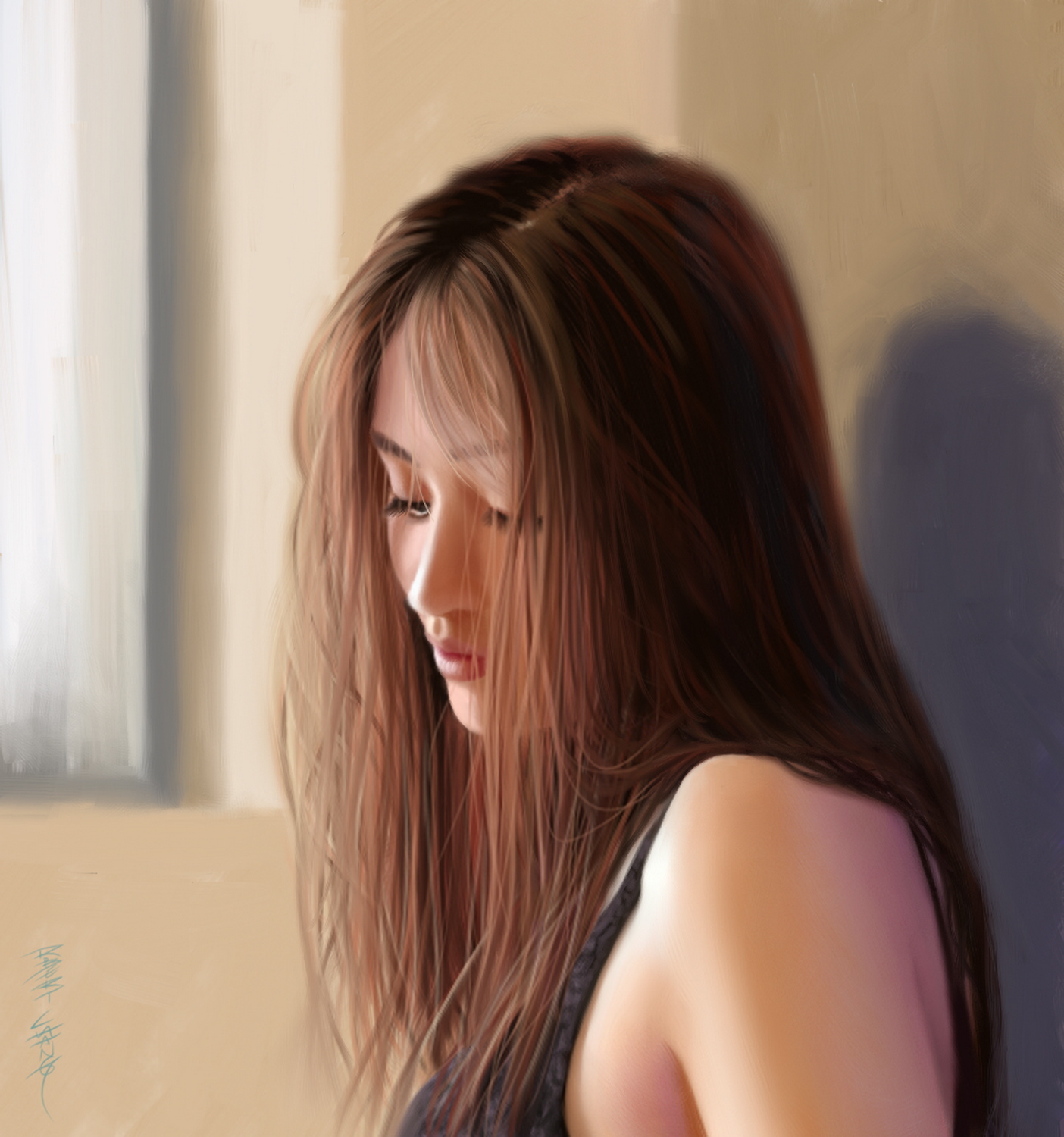
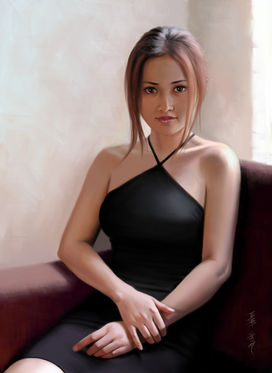
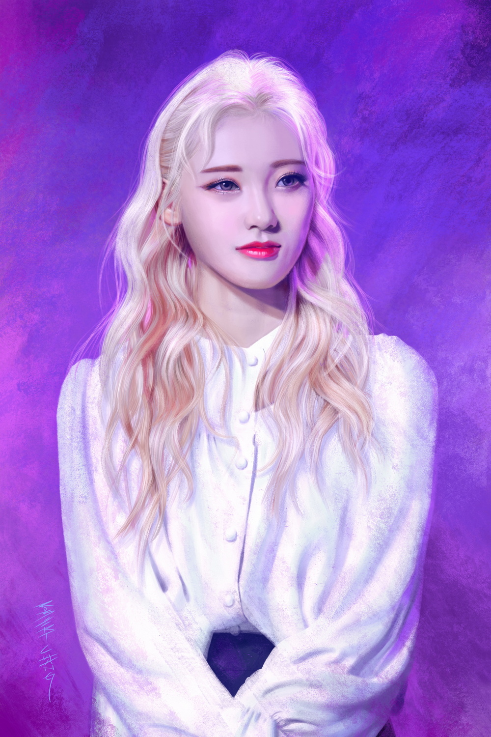
And then I started doing less and less art outside of my day job (art director for video games) because my focus had shifted to composing music and writing novels. I did a ton of teaching of art, but the only art I did was paintover critiques for students or class demonstrations. It wasn't until 13 years later did I finally start to feel the pull towards painting for myself again, and it started when one of my art students wanted to do a portrait painting of JinSoul, a member of Loona, a K-pop group we both loved. This was the portrait I did of JinSoul for class live demonstration (this was in 2019):

After doing that class demonstration, something clicked. I felt the same sense of immersion and flow I used to when I was younger, and my desire to push myself to get better at portraits slammed back into me. I think it was a few different factors that converged at the same time that got be back into it.
1) I have always lamented that I never got as good at painting portraits as I wished, despite having done quite a bit of it over the decades. I loved portraits by masters like Richard Schmid, Sargent, Zorn, and others who painted in alla prima, although I don't necessarily feel the need to also paint alla prima--I just love the look of that style.
2) I was really inspired by the digital portraits of Yizheng Ke and Wangjie Le that looked very traditional and expressive.
3) Doing fan art of K-pop artists is common in the fandom, and when I was a teenager, I did tons of portraits of J-pop idols, J-rock bands, Japanese actresses, etc. The part me that wanted to capture the essence of accomplished, talented, and photogenic people is still alive in my middle-age, and I've seen some excellent portraits of K-pop idols done by their fans that made me want to throw my hat into the ring and see what I can do.
And that's how I got back into doing portraits again. All the portraits you have seen posted in this thread before this post, were done after that JinSoul portrait, in the last 4+ years. In all of them, I've been searching for a balance of fidelity and expressiveness that represents my artistic fingerprint. And the search continues.
So, after having shown you all that, I don't know if you have noticed something--the only thing that really separates the portraits I did as a young teenager from the ones I do now, is everything else other than accuracy in likeness. This is a critical point, and I'll explain.
See, I don't think my technical skill has improved all that much since my teenage years. You might think that's weird, but the thing is, I didn't have much trouble with accuracy of likeness by the time I was around 15~16. Sure, I've had my share of stinkers too, but those were few and far between once that earliest phase of the beginner was over. Perhaps I was precocious in the development of my technical skills early on. But you might have also noticed, back then, I was lacking in all other aspects, and the most obvious was a compelling presentation. And that is the critical point. Portraits are about more than just technical accuracy or likeness.
My approach back then was too utilitarian. I sketched, I drew, and I painted, without giving enough thought to how the overall image was presented as a coherent and complete composition that utilized interesting textures and variety of edges, with selective detailing and purposeful abstraction. The way I rendered was also pretty clunky, without much finesse, expressiveness, and artistic intrigue. And those are the qualities I've been working on in the last few years.
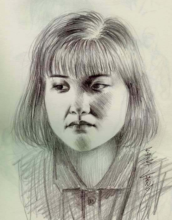
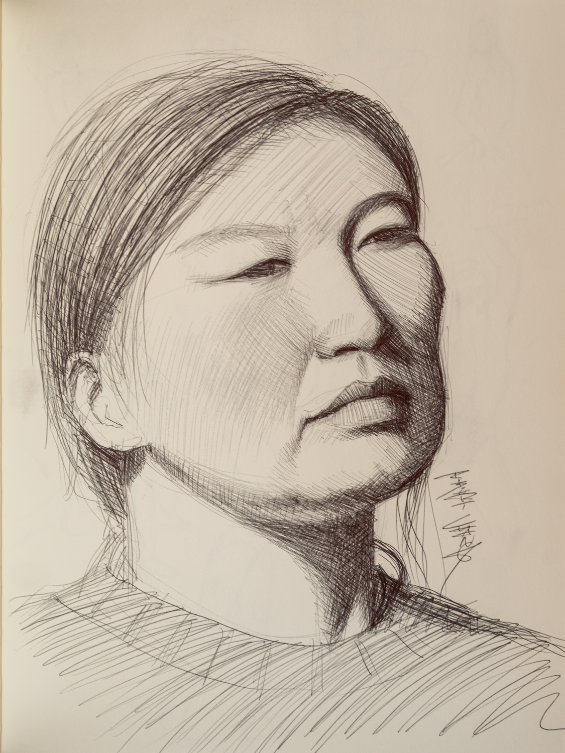
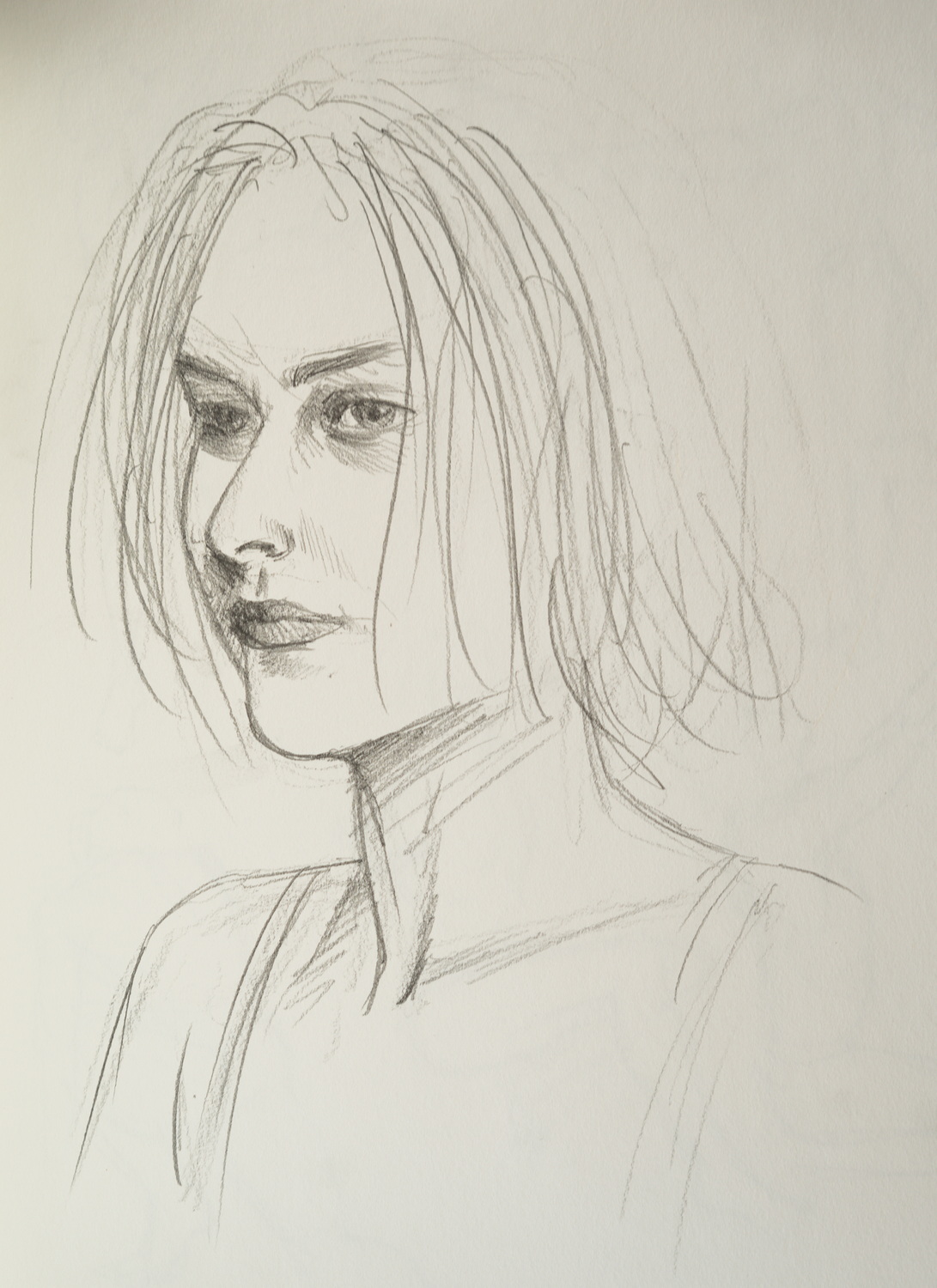
Now, I want to show you something that kinda proves my point. See this bare-boned, utilitarian, sterile, and uninteresting portrait sketch?

Wanna guess when I did that one? 30 years ago? 20? 10? How about just a couple of days ago? Yes, it was from a couple of days ago. "Why does it look so...meh?" you might ask. You see, it was done for a class live demonstration for a student who had never done a time-restricted portrait sketch before and wanted me to show him how and guide him while he did his, and he had also never drawn much on paper so this was also kinda fun for him. He's at the stage where he still struggles with technical skill, so even just the bare-boned line sketch to get the accuracy of likeness is very difficult for him. If I had approached that sketch with the intention of imparting all the artistic flare I would have aimed for if I was doing it for myself and not for a class demonstration, it would have contained too many layers of artistic intent that would be difficult for him to decode and absorb. So I kept it totally plain and just captured the likeness with as little other qualities as I could. Until he gets his technical chops up to speed and is able to capture likeness in a short amount of time, he's not ready for anything else.
Notice that this latest sketch is not that much different compared to the portrait sketches I did as a teenager. In fact, I would say those early sketches are better because they have more artistic intent to them, with more interesting presentation. And this is the point I'm getting at. Now, with at least 36 more years of experience as a professional artist, I did a sketch that's not as good as what I did as a young teenager, and the main reason is because of artistic intent--or the lack of it. Because I already had technical chops at a young age, the main development I needed was honing my artistic voice--the intent that creates my individual artistic fingerprint. If I had done that 30-minute sketch with the intent of conveying a more compelling artistic vision than just a simple line drawing without much interesting creative flourishes, it would have looked a lot more interesting than what I actually did. (And a fun exercise would be to do more portrait sketching with that student, also with 30-minute limits, but experiment with different artistic intentions that are much more interesting, and then compare them.)
So my advice is to get your technical skill up to speed first and foremost, because portraits are about capturing the essence of the subject, and for most people that means likeness (unless you want to go in the modern art direction). But once you get your technical chops to speed, focus on everything else that matters--the qualities that separate utilitarian and uninteresting portraits from expressive ones full of artistic flare. If you can capture likeness quickly, then the rest of the time you can spend on the artistic presentation of expressive line quality, brushwork, selective detailing, the balance of fidelity vs simplification and abstraction, and overall composition.
Another thing I find helpful, and I think some artists understand it intuitively, while some need it pointed out to them, is that you really shouldn't separate sketching and drawing from painting as if they are distinctively different phases. There are some portrait painters who don't even sketch in the basic features and shape of the head and just start painting. The key is to remember that you never actually stop drawing when you're painting. Drawing is about making shapes, and when you're painting, you're still making shapes, except with a brush. But the advantage a brush has over a line-making tool like pencils and pens, is you can also convey values/colors very quickly, unlike how you'd have to do a lot of hatching with pencil and pen. So if you are proficient with a brush, you can draw and paint at the same time without needing to do a line sketch first, and that will speed things up dramatically. I have done portraits with different approaches--from doing an accurate line drawing before applying the values and/or colors, to a very quick and simple sketch that just indicate roughly where the features are and the general shape of the head, to no sketching at all and just start painting on a blank canvas, letting the brushstrokes do the drawing while I build up the shapes with values and colors. I recommend you try all these approaches and get comfortable with them, and then you can favor one that you prefer the most, or continue to try different approaches to keep things fresh and fun.
So to wrap up, I think good portraits are more than just about capturing likeness, because as I demonstrated, I could do that already as a young teenager, and it would be pretty sad to think I had peaked at age 16. Technical skills are not hard to attain--it just takes some practice. It's everything else that actually makes portraits compelling that requires many years of experimenting and trial and error to achieve. I wish I had known that when I was younger, and that's the advice I would give young artists who have the desire to get better at portraits (and I would say this applies to just about any subject matter artists would be interested in, not just portraits).
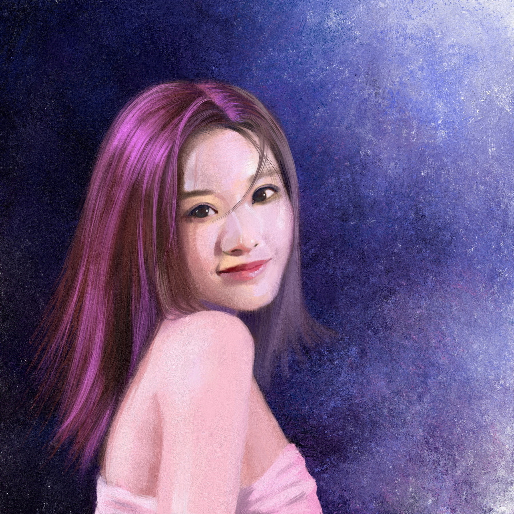
With all that out of the way, here are a couple of WIP portraits:




![[Image: DylvVCM.jpeg]](https://i.imgur.com/DylvVCM.jpeg)
![[Image: bBI79nY.jpeg]](https://i.imgur.com/bBI79nY.jpeg)
![[Image: ZUok4nj.jpeg]](https://i.imgur.com/ZUok4nj.jpeg)
