03-04-2013, 02:50 AM
|
Sickbrush "Fantastic Daggers" class
|
|
03-05-2013, 12:44 AM
Xia's environment.
The Death Goddess temple Sketches for the temple 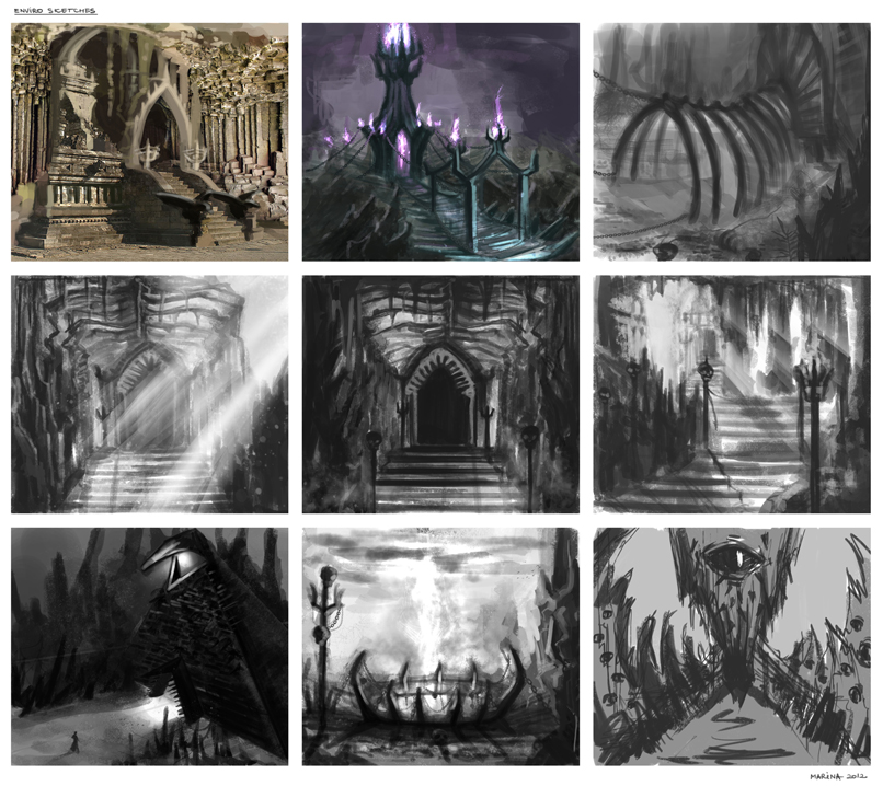 Temple thumbnails 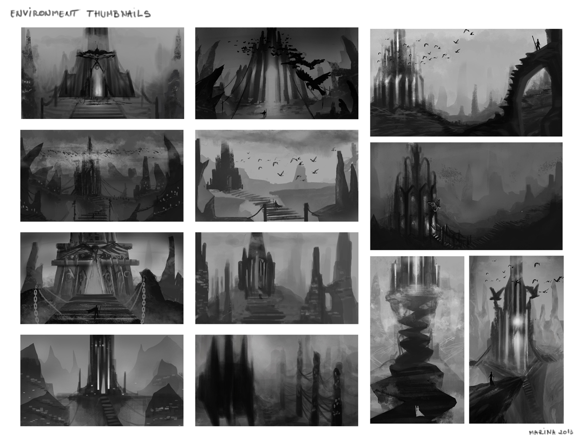 And the B&W environment  Creature design thumbnails 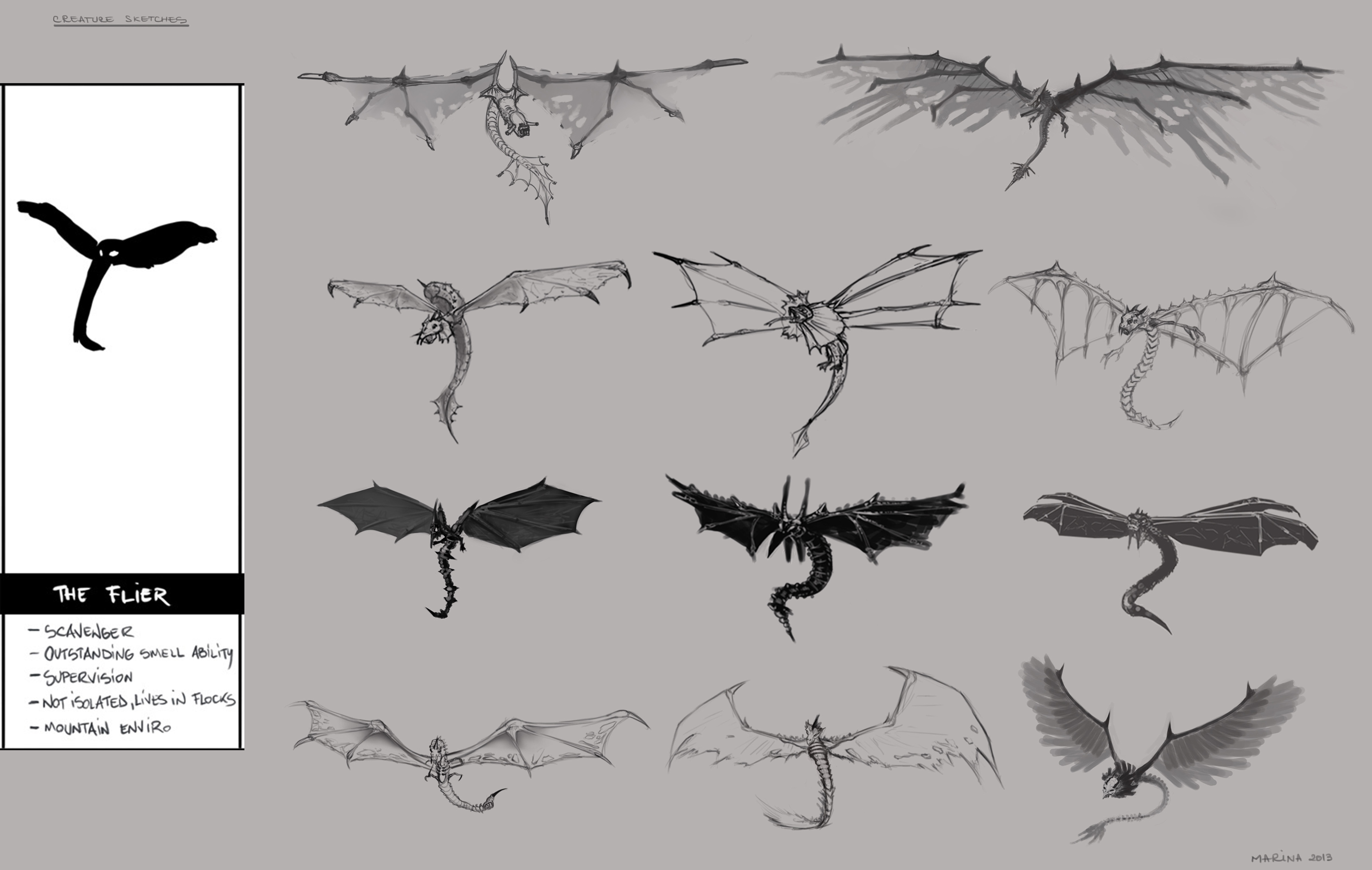 Some sketches for the head  And the final sketch. 
03-08-2013, 07:03 AM
Hey sickbrush, are you still willing to mentor individuals that AREN'T part of your selected study group? I know all people are willing to follow the class and the assignments, but, are you going to undertake any other students now or in the future?
Right now, I am working on the first assignment, trying my hardest to catch up, but I would love to be a part of the critiques and other exclusive content as well. -Mannyhaatz
03-09-2013, 06:09 AM
On to the next step:
Color variations (#6 was picked) & the composition, sketchy concept. Enjoy! (moving on...) 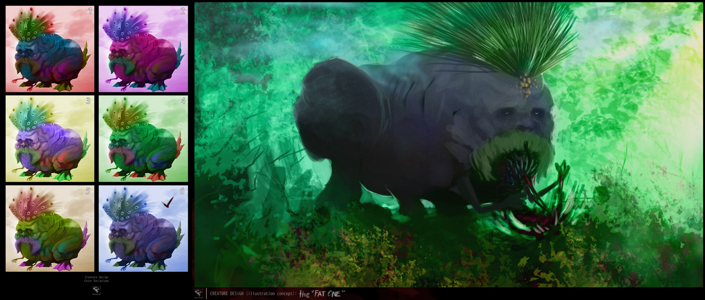
03-09-2013, 07:53 AM
Color variations for the creature assignment.
 Color WIP for the creature. 
03-09-2013, 10:19 AM
03-11-2013, 10:55 PM
Hey Mannyhaatz, at this point i'm not sure i will have another mentoring class.
Thanks for the interest, C
03-12-2013, 02:22 PM
OH GOD I STARTED THIS CLASS LATE...Oh well, I am doing this for me and me only.
Head Assignment-Completed Since this class is over and nobody is realllly critiquing intensely (or critiquing AT ALL for that matter), I'll be posting this assignment in the CRITIQUES thread for someone to tear it up an lend some fresh eyes as well as some advice on what to improve on.
03-13-2013, 12:07 AM
Assignment 1b, Selection/Elliptical and Gradient Study
Traumatized.
03-13-2013, 04:30 AM
Refining, refining...:

03-13-2013, 05:07 AM
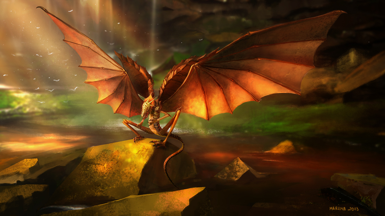
Final color for the Creature assignment.
It was great fun and great pain to work on it. Learnt alot! Tnx for the mentoring Sickbrush! :D Cheers guys! 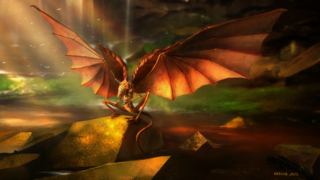
03-19-2013, 10:18 AM
Assignment #3..Just the sickle thing and the background is just basic. But this being a texture study, I thought it would be fine.
03-19-2013, 08:05 PM
Hey Manny!
Being a texture study we painted the background also. It will help pop out the sickle more and will look more natural as it reflects the light and borrows some hues from the background.
03-20-2013, 01:57 AM
(03-19-2013, 08:05 PM)Marina Wrote: Hey Manny! Hmmmm...a very unforgiving task hahaha. I attempted it, however, it made my knife look REALLY UNREALISTIC because it didn't match the same amount of quality as the knife. I didn't want to stamp the background with some sort of cloned texture nor spend 2-4 hours designing it...so I said "what the hay, let us paint this puppy white" A very elaborate excuse...indeed; I'm proud of it. oH, the shadow needs to die as well.
03-20-2013, 09:35 PM
Hey guys,
I'm going to be following this class as well. I know its over but the material's great and I'm really looking to improve my digital work. Thanks Sickbrush, for the great material! Here are the Caucasian Heads I did, more to come. 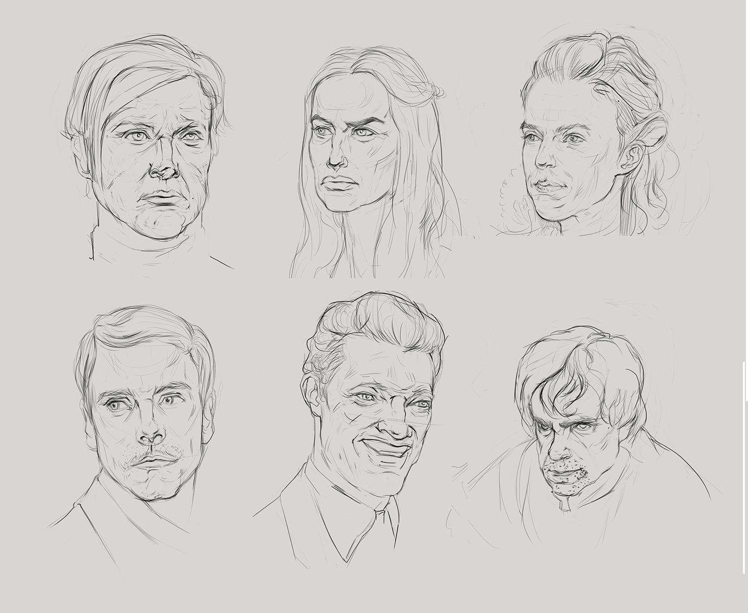
03-21-2013, 08:57 PM
Heya,
Asian heads, the soft curves are really challenging, learned lots doing these right after the caucasian ones :) 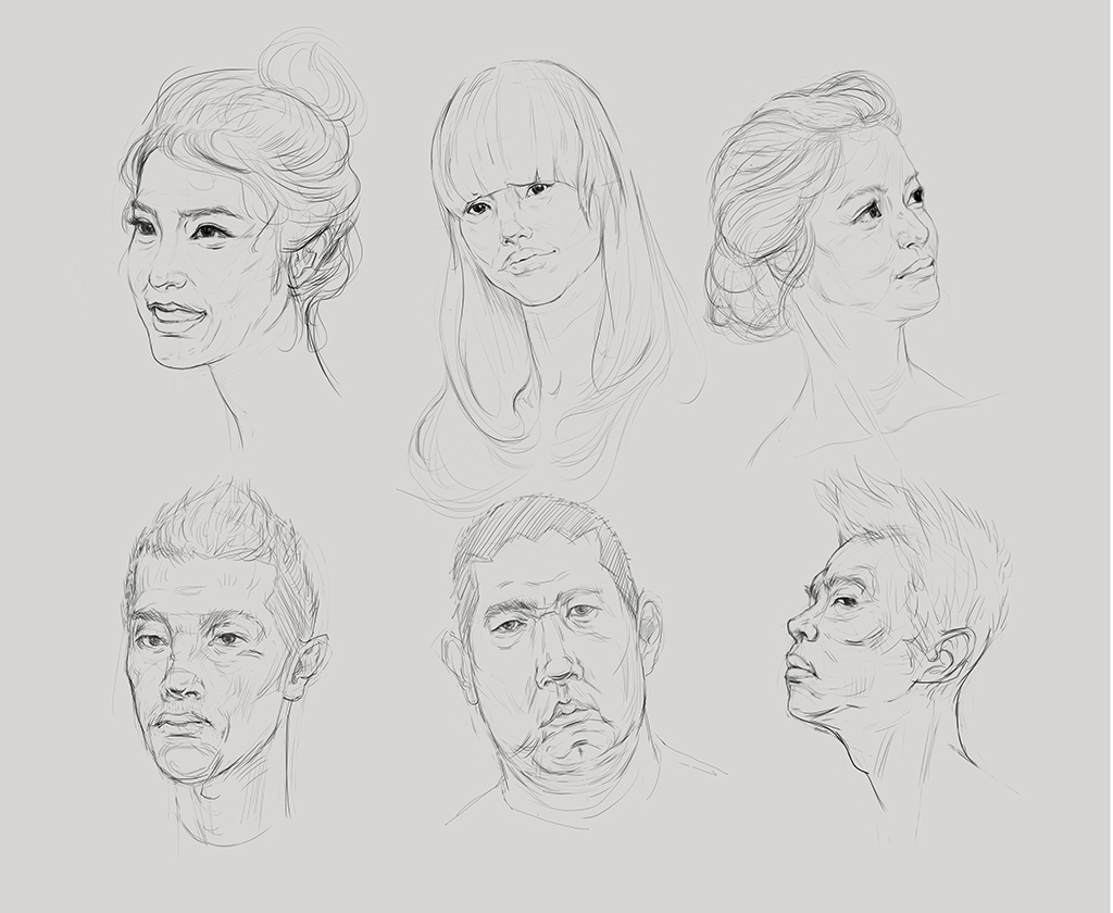 |
|
« Next Oldest | Next Newest »
|
Users browsing this thread: 11 Guest(s)


