Neopatogen CC2 WIPs
#21
Thank you @Lodratio!  I'm not going to do a leech-Great One, a leech is too simple for that in my opinion. I want leeches to be small bots crawling out of the pool, trying to prevent the player from attacking the boss. As the pool is very deep, I also imagine that the leeches instinctively push the Great One out from the depth of the pool with hundreds of their bodies. Because my Great One is not a water monster and it's not good at swimming. But it all happens under water and won't be seen in the pic. I just have to imagine the physics a bit to feel okabout my work :)

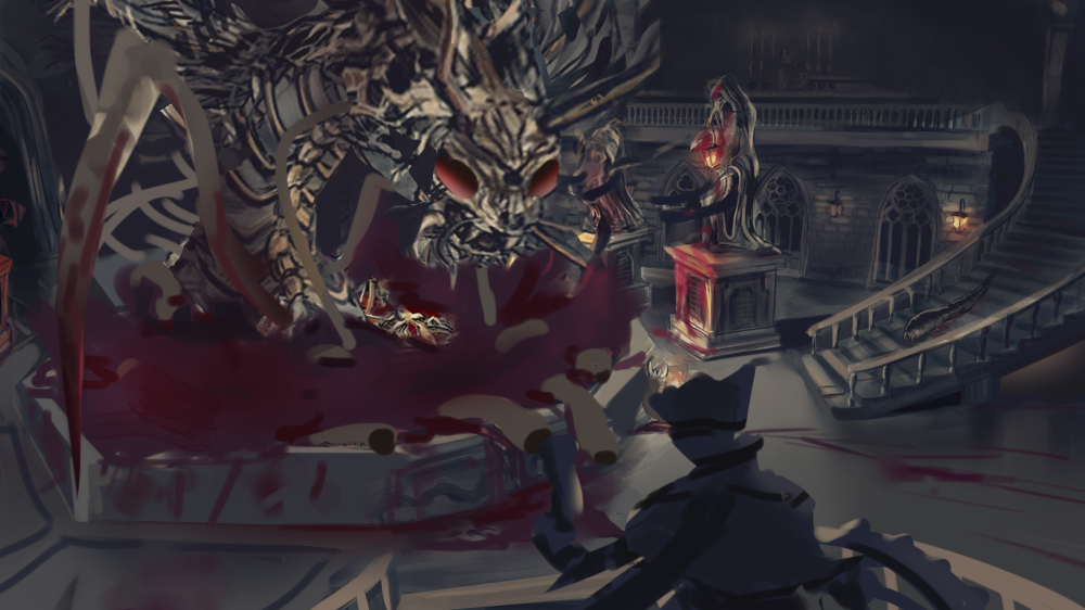
I thought designing a monster would be easier. But I realized thet I've never drawn anything scary, even as a kid. So I had to look through lots of images and do studies (I forgot to attach cat skull refs, used them for the head). Hope that I managed to show the Bloodborne mood with my monster (last sketch). I might test other ideas if I have time, but most likely I will proceed with the hunter fighting leeches and incorporate the monster in my environment.


Attached Files Image(s)


Reply
#22
The last of one is a cool design,but maybe play around with the leech idea it feels lovecraftian maybe incorporate it into the creature design, looking forward to the final image!

Reply
#23
Nice monster! It's going the right way :D

Reply
#24
My painting time for today is out, but anyway my piece wasn’t improving during the last hours. I think I ruined the comp by coloring (I haven’t done any color studies and was wrong about it) and I still got no edge control. There’s also no focus on the Hunter, instead it’s on the statue in the front.  What I’m happy with is having explored 3d software, but I must admit it was easier than painting.

 Some of the stuff that I have to improve:
- Try to complete work in advance! Otherwise I get too stressed and work inefficiently.
-Color and values. After a value study, do it in color. My coloring is even worse than values if I don’t have a very similar reference.  Do master studies, observe the lighting, objects popping from the background, how colors and values work composition wise. Then apply to personal work.
- Brush and edges control. Simplifying colors and values. Trying painterly style. Do master studies. Apply after a study by all means.
- Folds and drapery. I did some  studies but I haven’t applied them here at all. Doing more studies in value>color and applying immediately to stuff from imagination must help.
- Train concentration and focus, dive into the process, listen to less distracting stuff while painting and drawing.


Attached Files Image(s)


Reply
#25
This turned out awesome I think! definitely feels like Bloodborne, has that mood going. That bone monster works really well too. I tend to focus on the monster and the blood since its a color contrast, not really the statue, but maybe that's just me.
Reply
#26
I think it looks great Neo! I love the composition and everything that is going on. The story reads well.

If you can get your hands on some acrylics it might help your colours. Just the primary colours and black and white and do some master studies with that. You lurn a lot of colour theory really quick since you have to mix everything yourself.

Reply
#27
Thank you @LegionBrewer!
@Eyliana great idea, I really love acrylics but have little experience. Btw I accidentially burned my brushes lately, and on the next day I felt an urgent need to use my acrylics :) Got to buy new ones...
I suppose I haven't worked on this piece hard enough to hate looking at it, so I must try to fix it after the crits.

Reply
#28
Alrighty neo, first thing's first, you're amazeballs! The fact that you went into CC2 a completely different route to your first CC -- using a 3D app to amplify your idea -- brilliant! 
I really liked your idea, crazy stuff man! Really fit with the Bloodborne feel

I did a thing, I hope you don't mind:


I tend to find it easier to pick apart a piece by doing a paintover, so... yeah haha

So first thing: 

*I adjusted levels to make all the values similar so that I could go over and put in darks/lights if needed
*hue/saturation to de-sat your colours to fit the mood a bit better + make it easier for 
*colour balance to work to do its magic. 
After doing this, the blood pool's colour was basically handed to me on a platter and fit the mood rather well.
 *The foremost statue was almost as prominent as the Hunter dude so I gave him more of a good view ;)
*Awesome beast needed a bit more of a menacing showcasing imo. Needed to get him front and centre. Keyframe illustrations = all about that selling point!
*For a more readable compo check out The Windmill Principle by Gurney (I'm gonna tell everyone this cause it blew my mind when I understood it)
*blood trails on the ground to lead to beast
*blood pool overflowing as beast arises to create dynamism
*leg comin' out 'cause action o_o
*soft brushed the mezzanine in shadow because it's all eyes on the beast arising from the pool o' blood
 
*Blending! 
Simpler, larger brush strokes first and foremost. There's a few things that tend to trip people up when attempting to follow through with this idea; colour and how colours react under different lighting (observation studies are the bomb for understanding this -- I noted how you plan on doing master studies, but I reckon a daily still life study under diff lighting scenarios for even a week will help you a lot. Up to you <:)
I used a simple hard round brush to work this out

I ran out of time and I still suck at explaining things


But I hope this has helped you in at least some way, neo

I appreciate the hardwork you put into everything you do. Great job on the piece in the end and dat juicy self-reflection  Thumbs_up  Thumbs_up

sketchbook | pg 52
"Not a single thing in this world isn't in the process of becoming something else."
I'll be back - it's an odyssey, after all
Reply
#29
Smrr thank you so much for the PO and the crits! Everything's perfectly understandable, don't worry! I had no idea how to improve the comp, your ideas are very helpful. I'll do them still still live studies. I noticed how much better @Brushnoir 's work became after those. But as I absolutely don't understand how to paint with large strokes, Sargent first.

Reply


Forum Jump:


Users browsing this thread: 21 Guest(s)