Posts: 1,424
Threads: 12
Joined: Dec 2015
Reputation:
139
@JyonnyNovice: Thanks for stopping by again man! Yeah what you say about the camera lens stuff is starting to make sense to me now - close up shots have different perspective to far away shots. Gestures, yeah definitely - I was just thinking the other day that I'd neglected my gestures and needed to get back to them - thanks for the nudge :).
@OtherMuzz: Yep - you only get out what you put in - so I figured I might as well put my own effort into understanding this stuff.
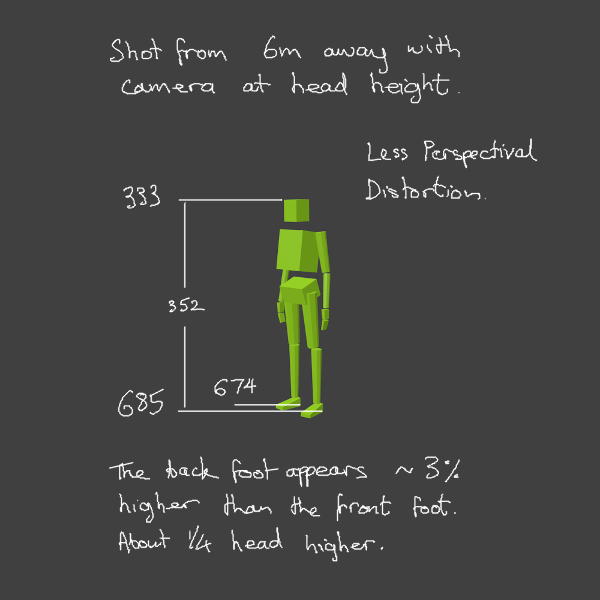
OK I've done another experiment with perspectival distortion tonight in Blender.
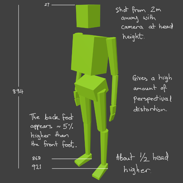
I modeled a quick mannequin and then took two camera shots of him. One at 2m and another a 6m. Then I analysed the amount of perspectival distortion that was happening. The 6m shot was definitely less distorted and looked a bit better to me.
My reading on this matter suggests that most portrait photographers use distances of between 2m and 6m. So I think maybe if I get used to drawing figures at 4m away the perspectival distortion might look most natural.
“Today, give a stranger one of your smiles. It might be the only sunshine he sees all day.” -- H. Jackson Brown Jr.
CD Sketchbook
Posts: 155
Threads: 9
Joined: Mar 2015
Reputation:
5
Hey Artloader, thanks for dropping by my SB! :) Keep up with that anatomy stuff, looking good. Maybe you should try drawing with a pen or pencil some of the time, too? I know digital is super convenient, but I find that I learn a lot from using traditional materials.
What is the green block guy for? Is the idea to figure out how much perspective distortion to have? Never seen this kind of thing before.
"Drawing is a skill like hammering a nail. You might not be great at it yet, but there is nothing stopping you from gettin' down and hammering away." -Irshad Karim
Sketchbook!
Posts: 1,424
Threads: 12
Joined: Dec 2015
Reputation:
139
Hey there Mech - pleasure :) and thank you for dropping by my humble abode here :).
Thanks also for the push - sounds like a smart move with the traditional materials - I will give it a go.
Yeah the green block guy is just me attempting to get my head around perspective distortion and what it depends on.
Have you ever noticed that if you're drawing a cube with 2 point perspective and you have your vanishing points close together, the cube appears more distorted? Well I'm trying to work out a rule of thumb for how far apart to have my vanishing points so that things appear natural.
“Today, give a stranger one of your smiles. It might be the only sunshine he sees all day.” -- H. Jackson Brown Jr.
CD Sketchbook
Posts: 1,109
Threads: 18
Joined: Apr 2014
Reputation:
68
Great to investigate this stuff like you are, makes me wanna try out my own experiments like that.
Quote:the green block guy is just me attempting to get my head around perspective distortion and what it depends on.
Didn't realise this was your goal, there is a specific terminology and theory around this stuff, it's called the 'Cone of Vision' - if you're really interested in this stuff I really recommend Scott Robertson's 'How to Draw', it will clear up so many of your perspective questions. Here's a few pages from it going over the cone of vision theory:
![[Image: fd70dTt.jpg]](http://i.imgur.com/fd70dTt.jpg)
^ This stuff might be really confusing without reading the previous pages in the chapter, just to show that there is a technique to planning out this stuff (although it becomes hard / unnecessary to apply by plotting it all out, eventually you just get a 'feeling' over what feels right)
And here's those pages from Framed Ink I mentioned - adding background objects to your 3D scenes might be something worth investigating, since how much of those objects are seen along with the figure is also affected by the camera lens:
![[Image: kGNGay2.jpg]](http://i.imgur.com/kGNGay2.jpg)
(The Framed Ink book is more about composition and visual storytelling than this technical stuff, Scott Robertson's book is definitely the one to go for to educate yourself on this stuff thoroughly)
Posts: 1,424
Threads: 12
Joined: Dec 2015
Reputation:
139
Dude this stuff is dynamite! Just added it to my Deathline task list to study. Really appreciate it man - thanks - it's guys like you sharing knowledge like this that makes this place so freakin' awesome!
“Today, give a stranger one of your smiles. It might be the only sunshine he sees all day.” -- H. Jackson Brown Jr.
CD Sketchbook
Posts: 1,424
Threads: 12
Joined: Dec 2015
Reputation:
139
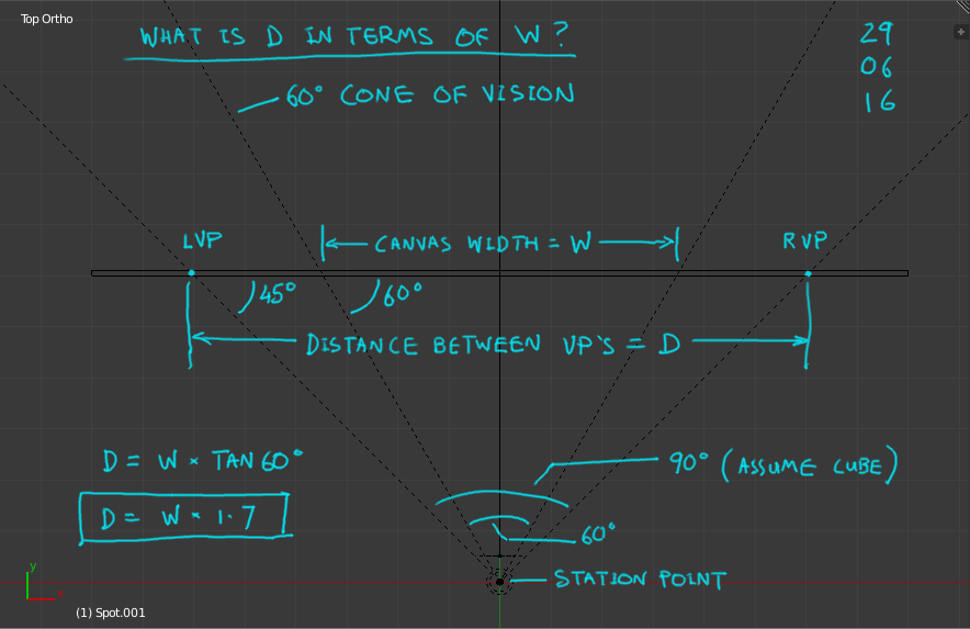
OK so I've been studying this stuff today and sat down tonight to work out a Rule Of Thumb for setting the distance between vanishing points in 2 point perspective.
Assumptions:
1. The 60 degree Cone Of Vision is the ideal.
2. The object in the scene is a cube.
3. The cube is vertical but rotated at 45 degrees to the viewer.
4. The canvas width is equal to the diameter of the 60 degree cone at that point.
Objective:
Specify the distance between the vanishing points in terms of the canvas width.

Rule Of Thumb:
The distance between the vanishing points should be around 1.7 x the width of your canvas.
Cool! I will try this out on my next perspective grids and see how it looks.
Thanks again Jyonny!
“Today, give a stranger one of your smiles. It might be the only sunshine he sees all day.” -- H. Jackson Brown Jr.
CD Sketchbook
Posts: 1,424
Threads: 12
Joined: Dec 2015
Reputation:
139
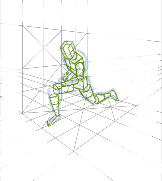
OK so using my 1.7 Width Vanishing Points Rule Of Thumb for a 60 degree Cone Of Vision (I didn't measure this - just guessed it), I've started my second perspective grid imagination sketch. Got as far as the mannequin stage and then allowed my self to stop and get to bed before 11:30pm. Got to look after my health otherwise everything goes out the window.

“Today, give a stranger one of your smiles. It might be the only sunshine he sees all day.” -- H. Jackson Brown Jr.
CD Sketchbook
Posts: 1,424
Threads: 12
Joined: Dec 2015
Reputation:
139
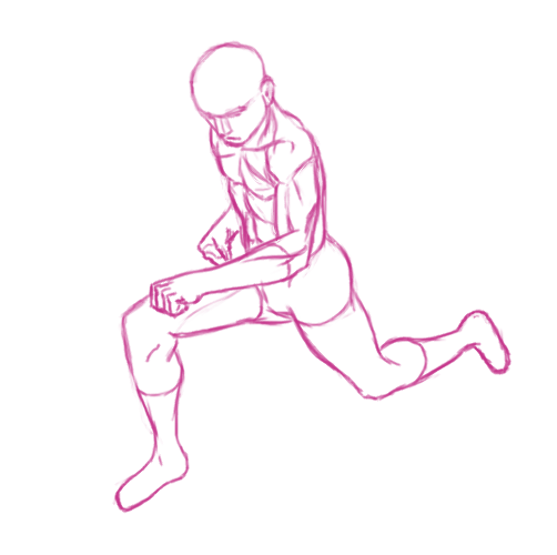
Finished off the line drawing for my second perspective grid imagination sketch.
The pose doesn't feel too natural to me. I think I can address that by doing more gesture sketches from reference.
My leg anatomy knowledge is a bit lacking - I will add some leg studies to my Task Bucket.
The perspective distortion on this one doesn't feel as strong as in post 112.

“Today, give a stranger one of your smiles. It might be the only sunshine he sees all day.” -- H. Jackson Brown Jr.
CD Sketchbook
Posts: 472
Threads: 7
Joined: Jun 2012
Reputation:
15
People here are already givin out the good advice! So I kinda feel bad for not adding anything worthwhile but I think you already know where you want to go or at least want you try out, so I guess we'll see where your journey goes!
I'm just here to leave some encouragment. You've been afterall very kind to my sketchbook haha
Cheers!
Posts: 1,424
Threads: 12
Joined: Dec 2015
Reputation:
139
@Zipfelzeus: Hey thanks for stopping by - encouragement is always very much appreciated - thank you :).
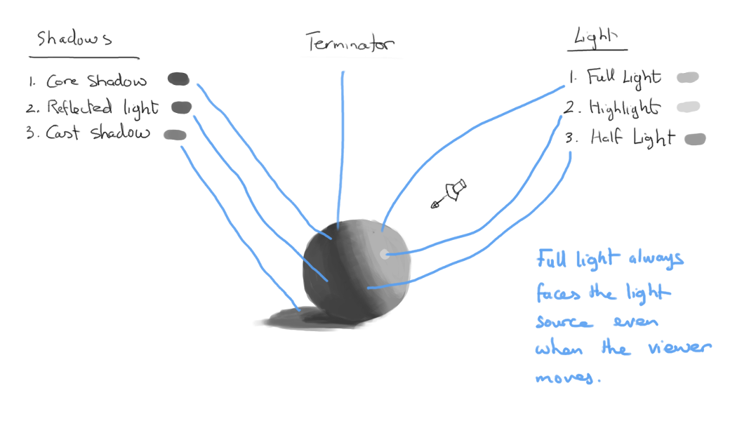
Starting out in the big scary world of values now. The following notes came from a combination of the following two links:
https://www.youtube.com/watch?v=V3WmrWUEIJo
http://design.tutsplus.com/articles/impr...-cms-20282
Here's what I've learned:

“Today, give a stranger one of your smiles. It might be the only sunshine he sees all day.” -- H. Jackson Brown Jr.
CD Sketchbook
Posts: 1,424
Threads: 12
Joined: Dec 2015
Reputation:
139
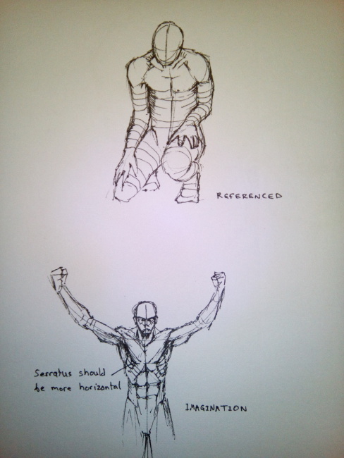
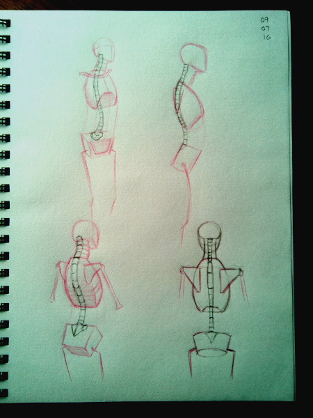
Started doing some traditional pen and paper sketches after some advice from Mr. Mechanizoid:

“Today, give a stranger one of your smiles. It might be the only sunshine he sees all day.” -- H. Jackson Brown Jr.
CD Sketchbook
Posts: 1,424
Threads: 12
Joined: Dec 2015
Reputation:
139
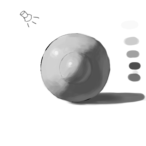
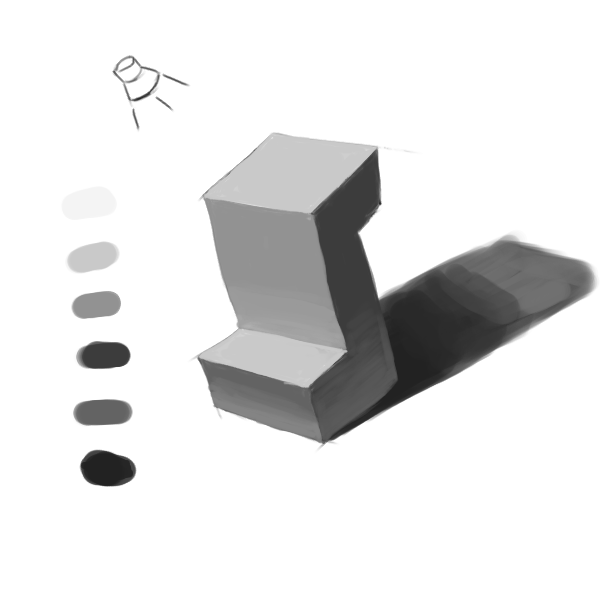
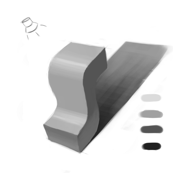
Practicing lighting values using the CGCookie Exercise 29 stuff ( https://cgcookie.com/exercise/exercise-2.../#exercise):

Edit: Looking back at this I can see a few issues:
1. The cast shadow is not aligned with the light source.
2. My blending is a bit messy.
3. I didn't have a clear grasp of the 3D shape in my head before I started - I had to change things mid-way through.
“Today, give a stranger one of your smiles. It might be the only sunshine he sees all day.” -- H. Jackson Brown Jr.
CD Sketchbook
Posts: 1,424
Threads: 12
Joined: Dec 2015
Reputation:
139
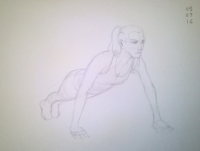
Persevering with traditional pencil and paper warmup sketch and another CGCookie value exercise. Broke my 11:30pm curfew by 15 minutes (damn):


“Today, give a stranger one of your smiles. It might be the only sunshine he sees all day.” -- H. Jackson Brown Jr.
CD Sketchbook
Posts: 671
Threads: 8
Joined: Feb 2016
Reputation:
113
Hello! Thought this might be of help?

If you are reading this, I most likely just gave you a crappy crit! What I'm basically trying to say is, don't give up!
----
IG: @thatpuddinhead
Posts: 1,424
Threads: 12
Joined: Dec 2015
Reputation:
139
John! Thanks for stopping by my friend!
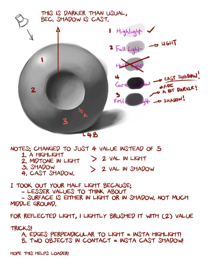
I really appreciate the notes on shading - thanks. I think you were saying that I should simplify the number of values I start off with? I will give that a go.
Also, I Googled insta highlight and got some information on a hair product? What do you mean by insta highlight and insta shadow?
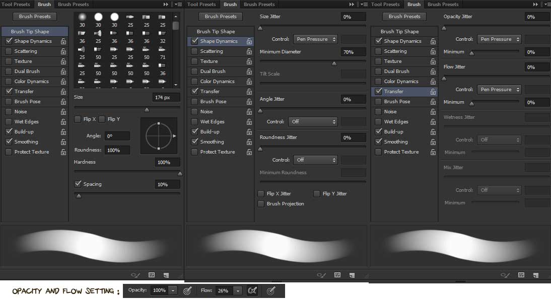
Great blending by the way - what kind of brush did you use? I was just using a hard round.
Anyway I did another values exercise last night before I got your crit so it still has the 5 values in it - I will give your method a try another night.

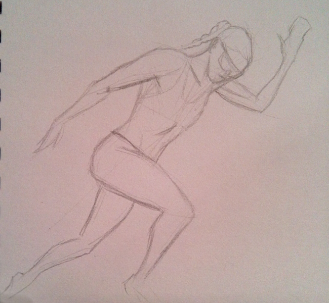
And a pencil sketch as a warm-up but I think I'm just gonna go straight to bed now after the warm-up! Been getting steadily more and more worn out as this week goes by.

“Today, give a stranger one of your smiles. It might be the only sunshine he sees all day.” -- H. Jackson Brown Jr.
CD Sketchbook
Posts: 671
Threads: 8
Joined: Feb 2016
Reputation:
113
Quote: I think you were saying that I should simplify the number of values I start off with?
Yes! I got that idea from Loomis, 2 values in light, 2 values in shadow (or Lightest value, 2 mid tones, and darkest value). I used to have a broad spectrum of values going in, but that process just overwhelmed me.
Quote:Also, I Googled insta highlight and got some information on a hair product? What do you mean by insta highlight and insta shadow?
That's was just me making words up to sound cool (Yuck!).
Hmm.. what I meant to say was, if there's an edge that's perpendicular to the light source, I instantly paint it with my lightest value (highlight). If there are two objects in contact, the point of contact I usually give it the darkest value. Reason behind that is, light would have a hard time reaching that place.
Quote:Great blending by the way - what kind of brush did you use? I was just using a hard round.
Hard round, but with settings:

I have a couple more, but it's the same hard round brush with a different flow, spacing, taper, etc... settings.. But that's basically what I use for "painting". It's better to experiment with the settings. What's comfortable with me might not ring true to you!
If you are reading this, I most likely just gave you a crappy crit! What I'm basically trying to say is, don't give up!
----
IG: @thatpuddinhead
Posts: 205
Threads: 4
Joined: Oct 2015
Reputation:
7
Your experiments with perspective distortion are fascinating. I wasn't even really aware of its effect on the human figure, I always assumed the subject to be more relevant to architecture and landscapes. Good stuff man.
Posts: 1,424
Threads: 12
Joined: Dec 2015
Reputation:
139
@John: Tweaked hard round? Cool - thanks - I will have a play around in Gimp.
@DQ_Nick: Hey thanks for stopping by dude! Yeah that perspective distortion stuff is interesting - I was just trying to work out how far apart to have my vanishing points really.
Trying to add to my pencil mileage with some more Hampton studies - I'm hoping that the simple act of sitting down and copying some master sketches will teach me something.
Pencil and crayon:

“Today, give a stranger one of your smiles. It might be the only sunshine he sees all day.” -- H. Jackson Brown Jr.
CD Sketchbook
Posts: 1,424
Threads: 12
Joined: Dec 2015
Reputation:
139
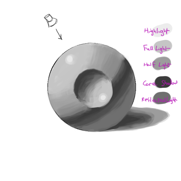
Another CGCookie 29 Values exercise - tried to simplify the number of values I started out with to 4 as advised by John:

“Today, give a stranger one of your smiles. It might be the only sunshine he sees all day.” -- H. Jackson Brown Jr.
CD Sketchbook
Posts: 1,424
Threads: 12
Joined: Dec 2015
Reputation:
139
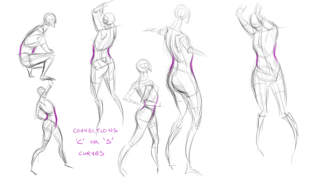
More Hampton study - Connections:

“Today, give a stranger one of your smiles. It might be the only sunshine he sees all day.” -- H. Jackson Brown Jr.
CD Sketchbook
|


![[Image: fd70dTt.jpg]](http://i.imgur.com/fd70dTt.jpg)
![[Image: kGNGay2.jpg]](http://i.imgur.com/kGNGay2.jpg)
