Posts: 3,357
Threads: 37
Joined: Aug 2013
Reputation:
234
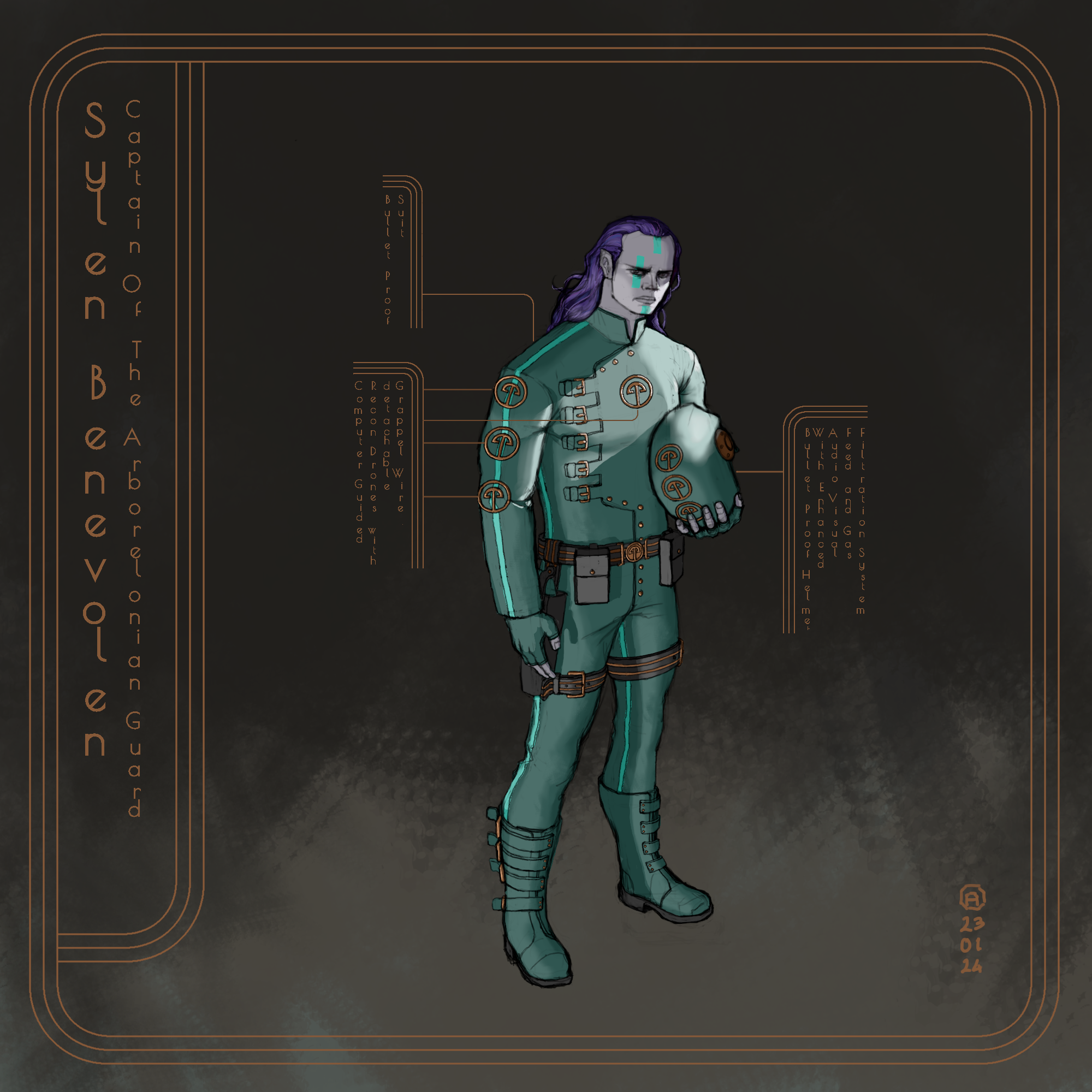
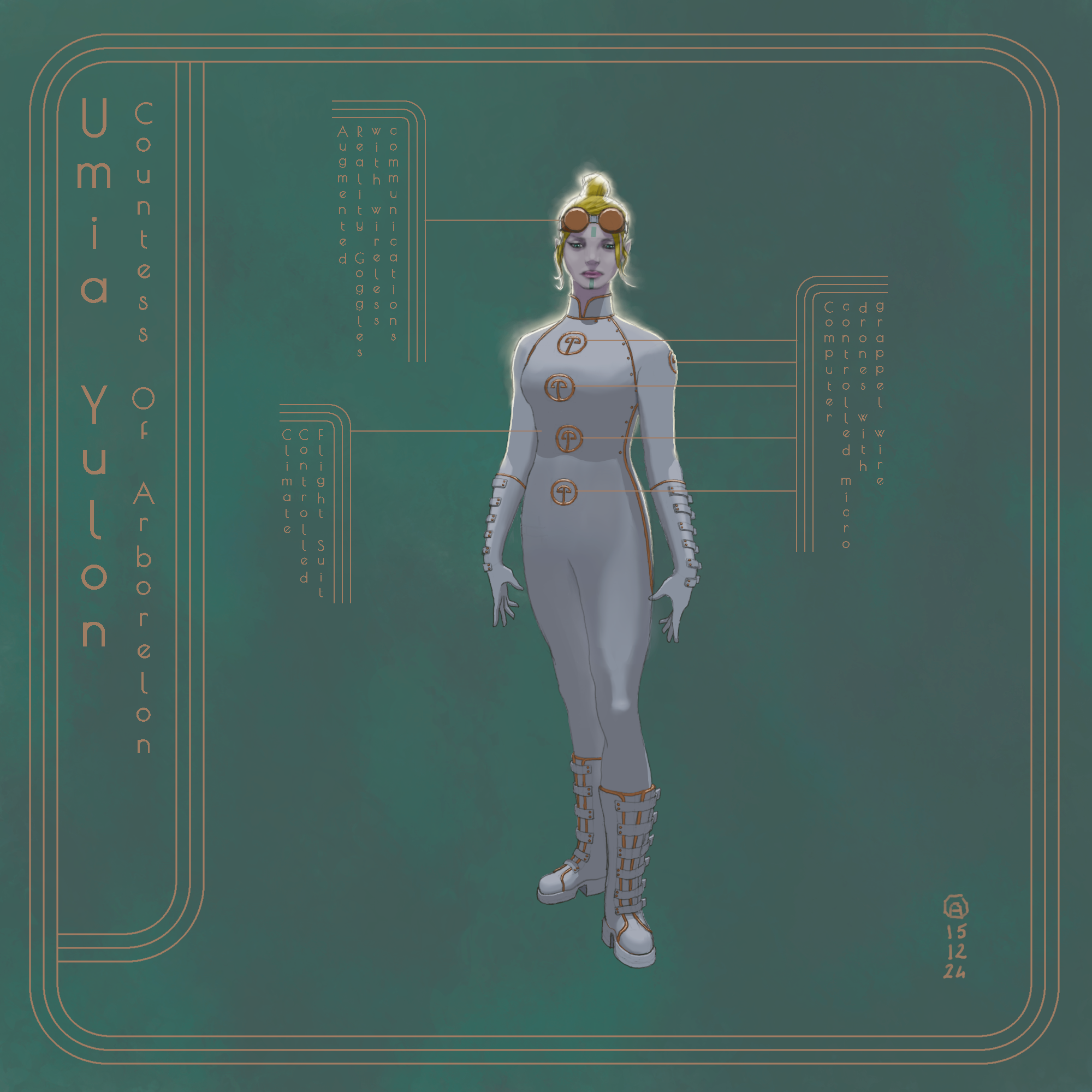
If the idea of a layout is to explain something i would expect that you explain those thing in a clear and readable fashion rather than experimenting with the orientation of the lettering atleast in the ''explanation box'' since those type of drawing are often drawing done to give information about the subject which mean the design clarity is essential atleast if you have to refer back to those drawing later on
I think it always best to prioritize clarity over design atleast in that case the environnement and subject matter are familiar to the viewer and they can relate to it.Sometime it can be hard to read the shape of an object and understand it function that why i commented earlier on the helmet shape being hard to read as such.Remember that your complementary drawing help give context to how you want the character to be perceive and that the perfect excuse to draw object in a different point of view to give more information as to what those object function are. Let just take the belt for example you could indicate that it lock onto itself or that the sachel can be open or close.Those object are already pretty clear but some element can be confusing like for example the button on the jacket could be perceive as rivet on an armor so you gotta getting secondar opinion during the design process to see how people interpret what they see and see if it match what you want them to perceive. I personally believe choosing the right color that sit next to each other help clear any confusion. In the case here i would argue that the jacket color is somewhat confusing. To much element have the same color that the issue from the helmet to the boot they seem almost made of the same material the idea of introducing a bit of color difference is to separate those texture and to create interest.
Nothing against monochromatic artwork but will doing monochromatic work it would pay off to pay special attention to this kind of ''how do i make my material read as intended''.
If you are going to use a textured brush at a large size be aware that it might give part of your work a digital look as the texture would repeat. I am talking about what you did with the floor. There is brush for smoke i think that what you were going for but that brush doesn't seem to have the quality you are looking for.
Posts: 1,076
Threads: 4
Joined: Jan 2016
Reputation:
43
Looking good, the lighting in particular is very well done, very dynamic. Nice design elements as well, the typography helps give the image a futuristic look which compliments the character design quite well!
Posts: 1,527
Threads: 24
Joined: Dec 2012
Reputation:
70
Ohhh hey you! I see that Intro to Digital Painting w Craig Mullins homework
That is a really great course and I can see you pushed yourself with applying what was taught - great job!
Looking forward to when you update
sketchbook | pg 52
"Not a single thing in this world isn't in the process of becoming something else."
I'll be back - it's an odyssey, after all
Posts: 31
Threads: 2
Joined: Jul 2024
Reputation:
5
I really like how the circular elements of design like top of the boots, belt... Are drawn to give a very understandable view of the perspective of the body. I feel like there is a little bit too much empty space around the character, we would appreciate the design better if it was larger with less dead space (while still keeping the cool "interface" elements that are giving more info about the setting with their style.
Very near design!
Posts: 1,076
Threads: 4
Joined: Jan 2016
Reputation:
43
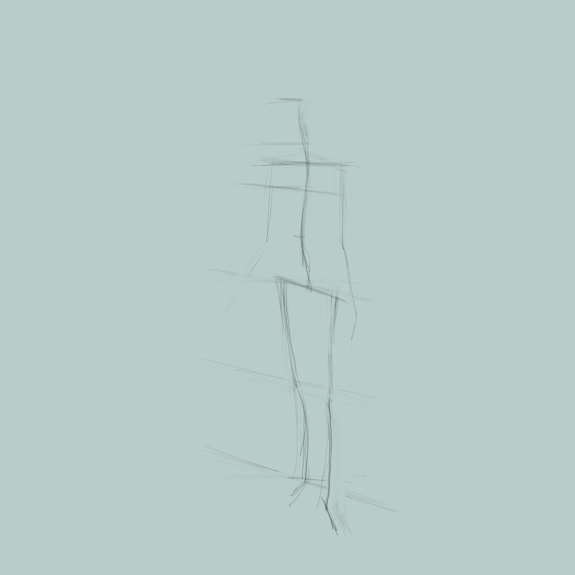
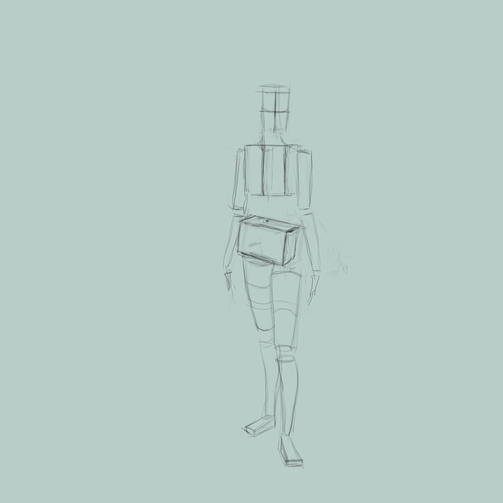
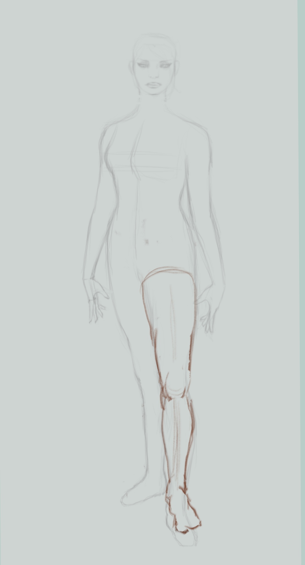
Great work! Love how you constructed the figure, your technique is aces for this sort of figure drawing. The lighting is very well done, dynamic but feeling very natural as well. Keep it up!
Posts: 316
Threads: 3
Joined: Sep 2019
Reputation:
23
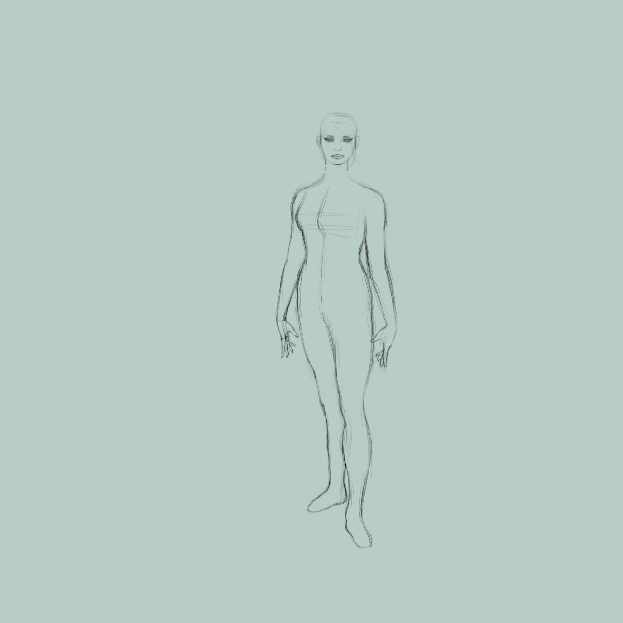
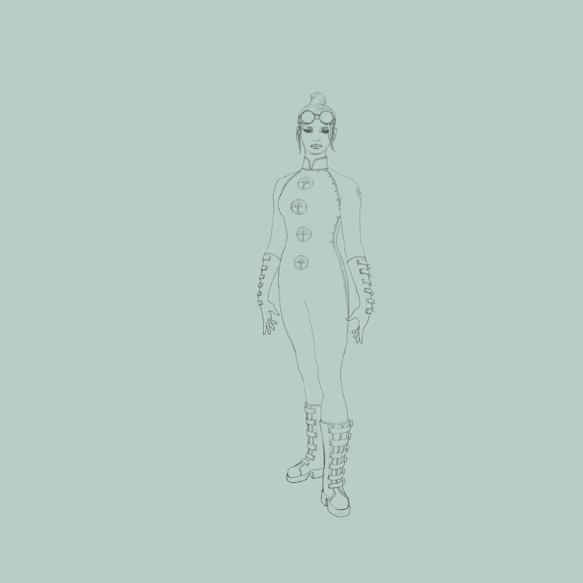
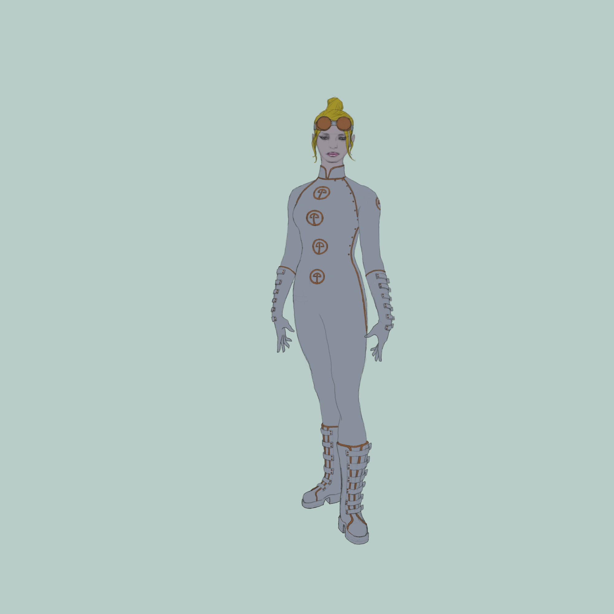
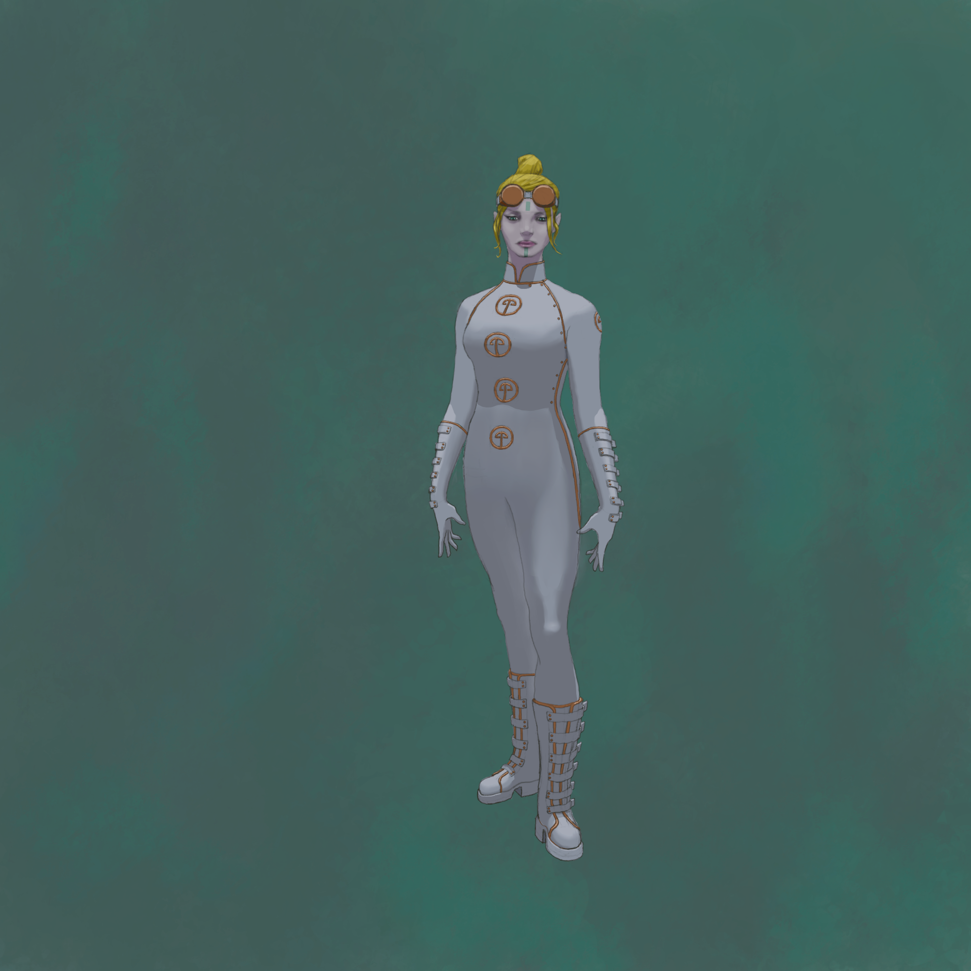
Long time no see. That UmiaYulonFinal peice is very cool. Nice pose, costume, and expression. I dig the minimalist background too.
Don't be a stranger......
Posts: 1,424
Threads: 12
Joined: Dec 2015
Reputation:
139
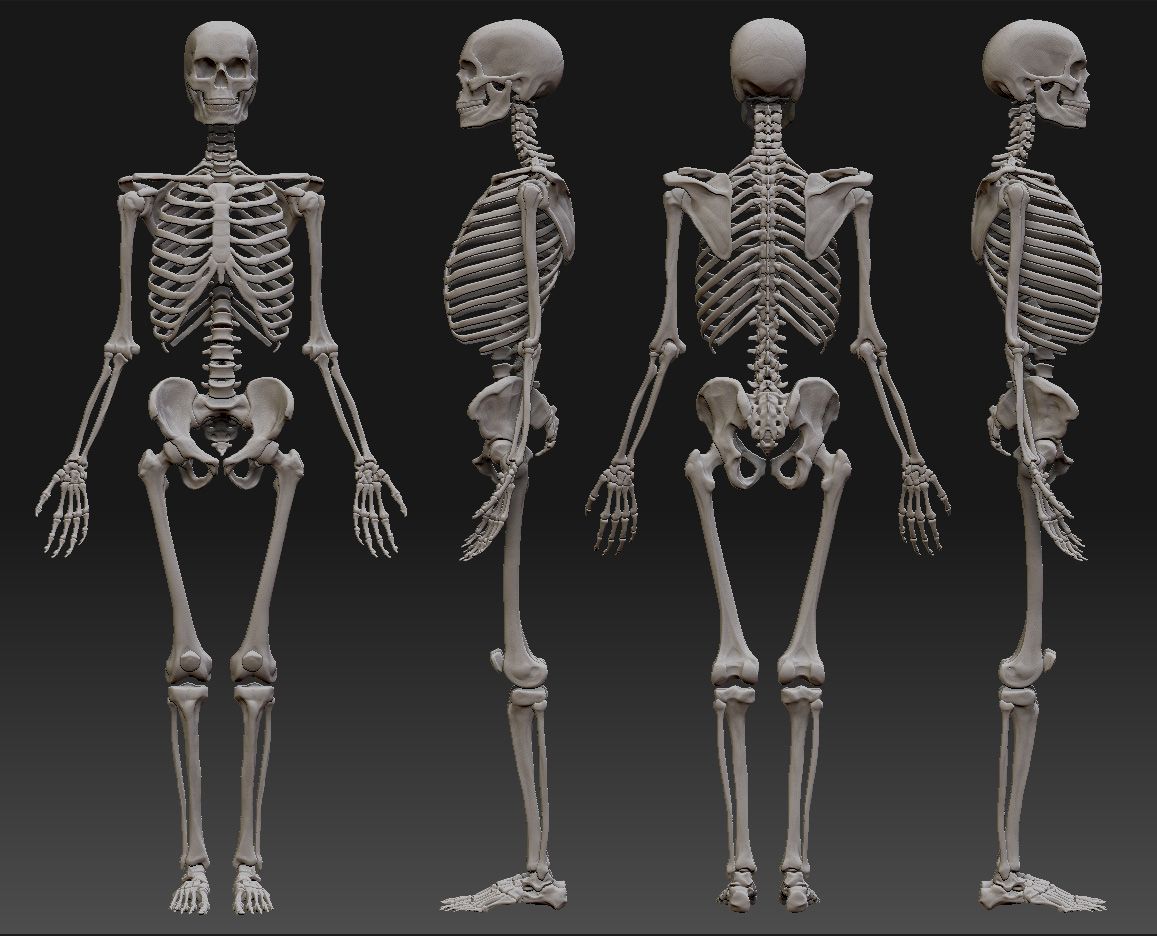
Hey Amit :) - thanks for the crit dude - yeah I've got a bad habit of bending the shin bones - picked it up from some of the comic book artists I read. How's things with you man?
Hey Cgmythology, thanks for the kind words :)
Hey Jephyr, yeah been a while - thanks for the kind words dude :)
“Today, give a stranger one of your smiles. It might be the only sunshine he sees all day.” -- H. Jackson Brown Jr.
CD Sketchbook


.jpg)
