02-11-2017, 11:42 PM
I love the facial expressions you put on your characters, it really makes them look... not fake. What do you want to become when you finally become a professional?
|
Sketchbook
|
|
02-11-2017, 11:42 PM
I love the facial expressions you put on your characters, it really makes them look... not fake. What do you want to become when you finally become a professional?
02-13-2017, 02:06 AM
hey, thanks
To be honest i dont really know... i have a job which is non art related and i havent really tought about becoming a professional for some time now, i like doing art more as a hobby i guess, il see where i am in a few years maybe if il be good enough il change my mind... but if i had to pick id go for character concepts or something character related thanks again for droping by
02-20-2017, 08:23 AM
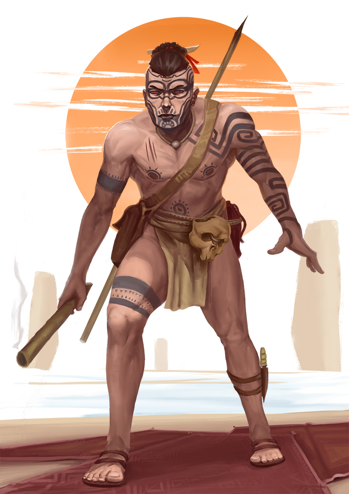
Maoii/amerindian combo for the facebook group character design chalenge

03-03-2017, 06:42 AM
didnt come out that great, was a fun study to do doe

03-08-2017, 06:30 AM
listened to some stand up, figured i should do a stylized portrait of dave chappelle

03-09-2017, 09:25 AM
wanted to paint something for the grave of the firelfies for some time now

03-11-2017, 07:42 AM
failed at this one, couldnt get her eyes to match

03-13-2017, 04:16 AM
made some gesture studies from lol splash art, i didnt make them as bad as i tought i would
  
03-14-2017, 06:39 PM
Nice gesture studies! I admire that you included expressive hands in them. And I love the light and shadow of that soldier sketch! The shadow across his nose reveals the form so well.
I accidentally clicked the pintrest button (I have the browser extension) on your study of the lady with the bangs, and pintrest matched it with your reference haha! While it is looking quite nice, I see that your version has eyes (and a nose) that are slightly lopsided, as you mentioned. One thing that helps me keep them aligned, is drawing a horizontal or angled line (depending on the tilt of the head) where the bottom of the eyes are, and also along the bottom of the nose, on a separate layer, like Bargue does here: https://images.duckduckgo.com/iu/?u=http...-9.jpg&f=1
03-19-2017, 10:15 PM
hey thanks, yeah the lady is from a movie called raising the red lantern
i probably should have done the bargue thing, maybe i wouldnthave squished her face that much two characters i did, they are basically the same but i didnt like the first one so i tried to do it diferent a second time  
03-28-2017, 04:55 AM
The second lady looks more self-assured. And the face/hair contrast makes her face stand out better than the first one. I really like the way you stylized her face--the pointed, sharp features--looks awesome! And that dress is really cool.
My Sketchbook: learning illustration from the beginning
03-29-2017, 12:18 AM
The second is way better, the gesture is stronger and the silhouette is better, great job!
Sketchbook : http://crimsondaggers.com/forum/thread-7501.html
|
|
« Next Oldest | Next Newest »
|