09-17-2017, 06:16 AM
|
Sketchbook
|
|
09-21-2017, 07:33 AM
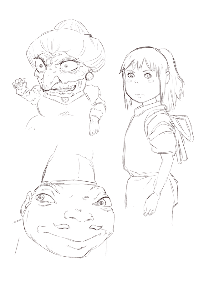
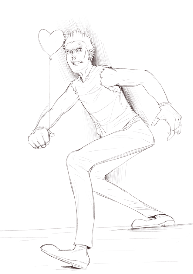
hey man, thanks il probably sketch until i burn out and probably take another brake haha
09-27-2017, 07:27 AM
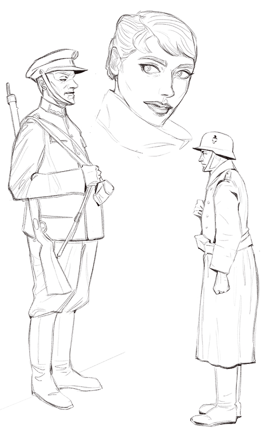
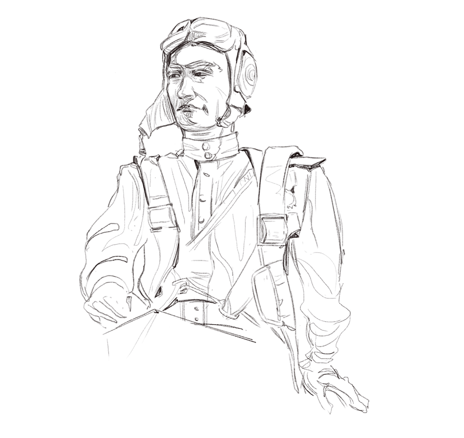
im trying to get better at sketching so i can better plan ahead so i dont have to keep constatly tweak stuff while rendering but i probably also need to find a diferent way to render idk il keep trying til something comes out D:
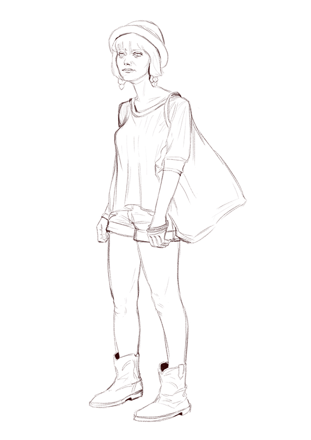 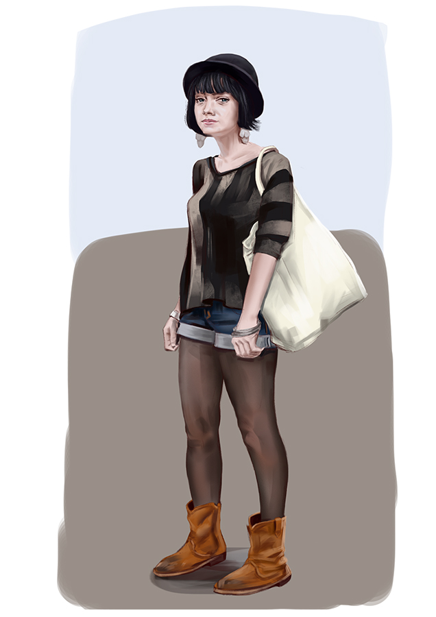
09-28-2017, 06:35 AM
did not like doing this one, not focused
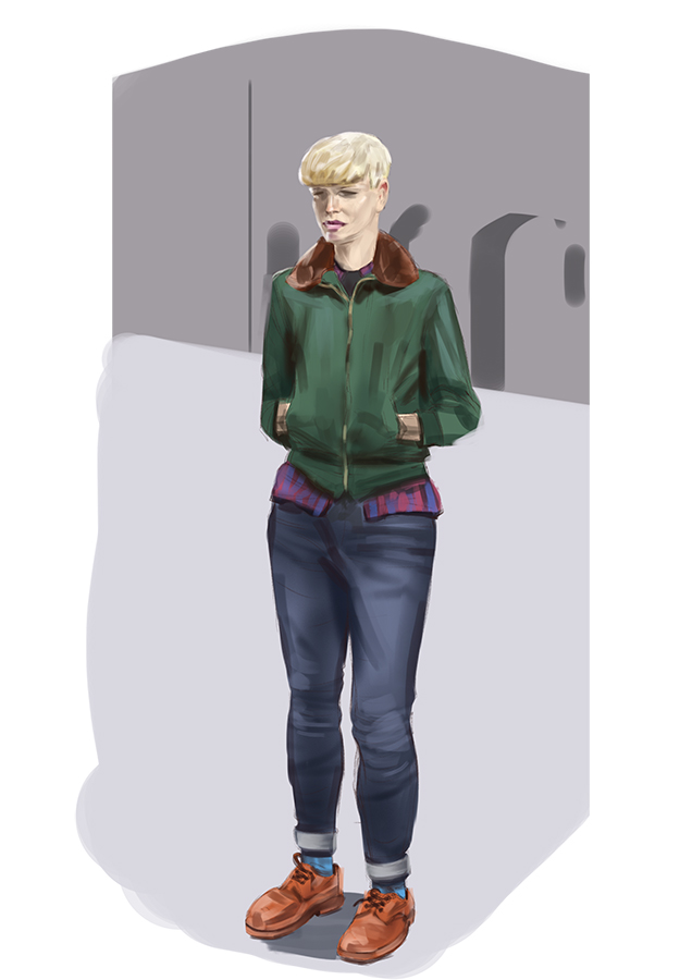
12-23-2017, 06:16 AM
havent been up to much but felt like doing stuff these past days
 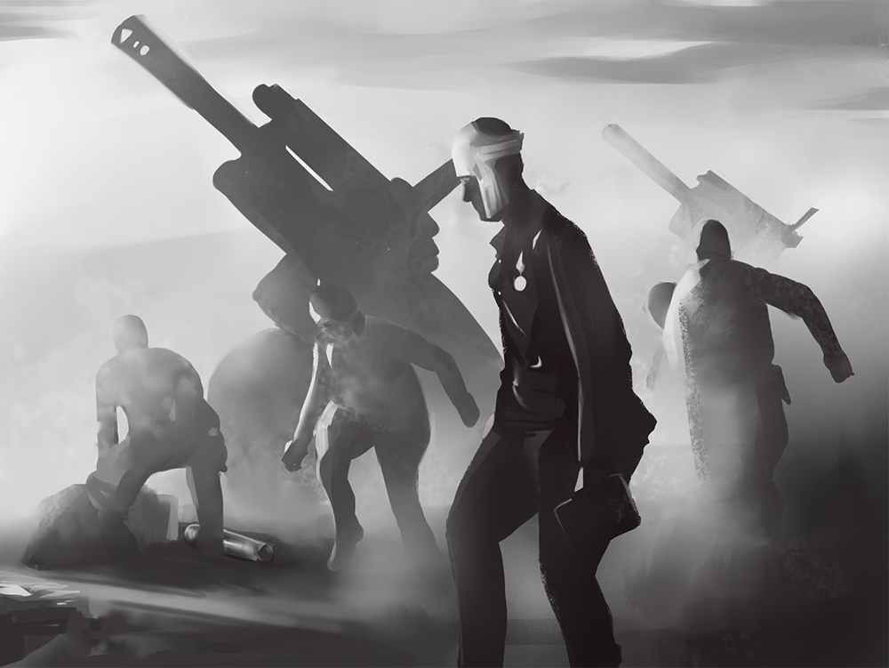 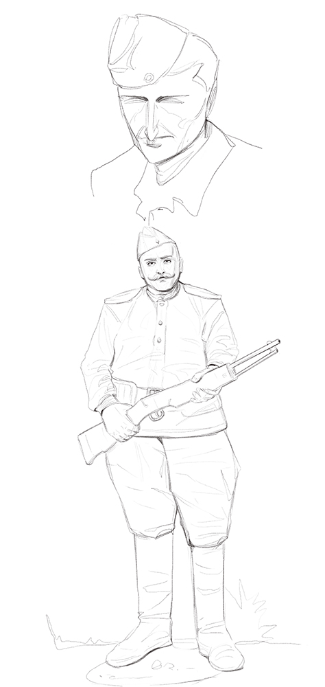  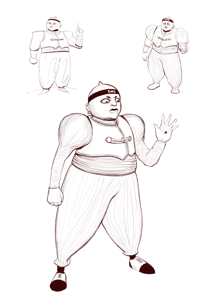
01-11-2018, 02:37 AM
Great stuff man, you've done so much work!
My criticisms would be: -It feels like there's something not quite right with your body (but mostly face) proportions/Construction. Like, the eyes and nose don't actually belong to the face- You drew the head, but didn't think quite enough about how the facial features go around the different planes of the face, like the face was just pasted in (this isn't the case in all of your drawings, but in some -one eye is too high or both are too close together, the nose placed wrongly, etc.) - Your figures often lack gesture and appear quite stiff, you could check out Proko's video on youtube about gesture Hope I made sense.
01-11-2018, 03:56 AM
I love your use of color! Very vibrant and eye catching.
I agree with Hirvios here. I hadn't noticed the eye and nose problem until it was pointed out. You can avoid the eye level by using an eye level line that wraps around the head. If you check out head contruction its usually the horizontal line thats about ear level in drawings. And if I might add something else, there's a few drawings where the perspective gets a tad wonky. Its most noticable with the feet positions (I have this same problem as well haha). I see that you understand foreshadowing so its just a case of nailing perpective on that front. Keep drawing man!
09-26-2018, 02:34 AM
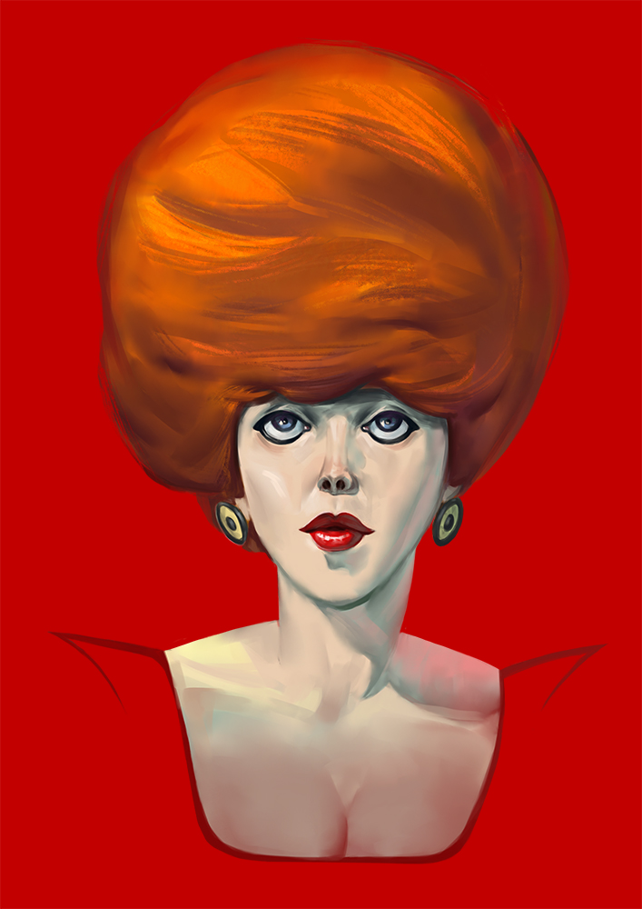
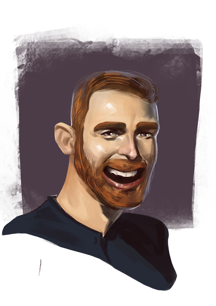
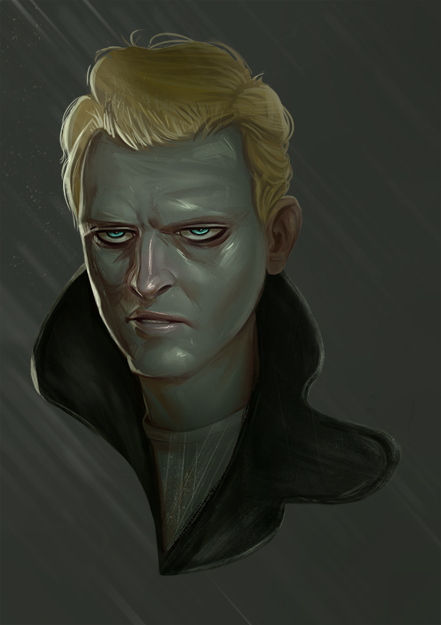
Thanks for the crits my dudes, i was away for a while here's a portrait
10-02-2018, 08:00 PM
Welcome back mate.
Nice bit of rim lighting, I like the pale skin tone with the hints of warmth here and there, nice work. The eye shape looks quite stylised, if that's what you're going for then fine, otherwise maybe study the eye shape more closely. Keep it going mate!
“Today, give a stranger one of your smiles. It might be the only sunshine he sees all day.” -- H. Jackson Brown Jr.
CD Sketchbook
10-03-2018, 03:01 AM
Thank's
I went with wherever my hand took me beacause i turn the reference layer on and off and cant find a way to keep it pined so i can have it in my sight so i know what im following so it turns into 50/50 thing of what it is i did the same thing with the next one that's atached but cheated a bit on the male portrait 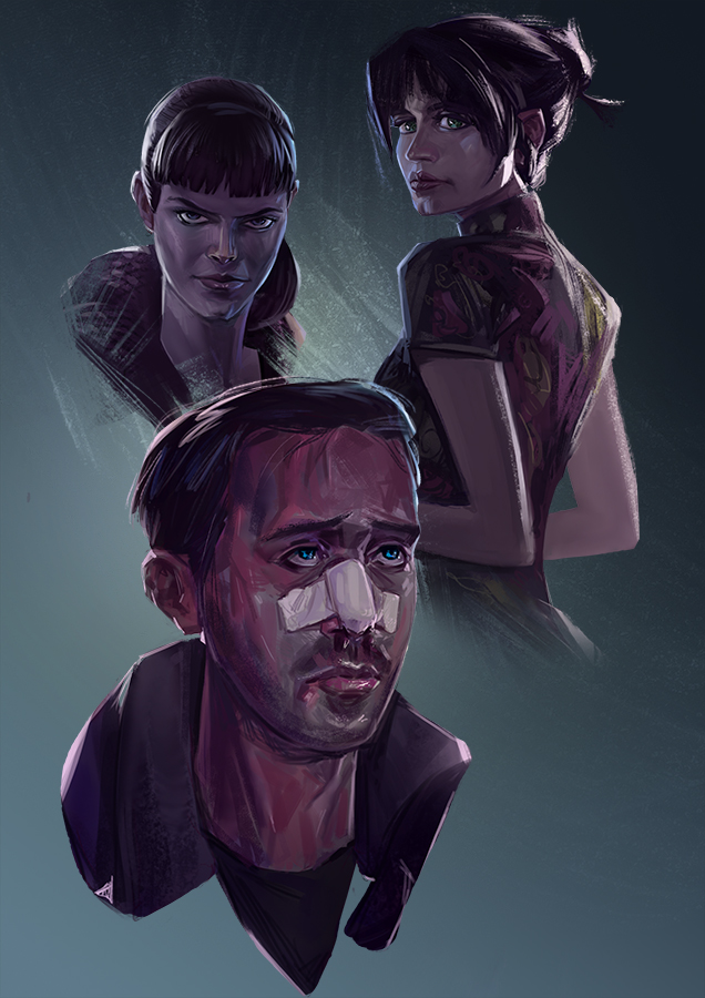 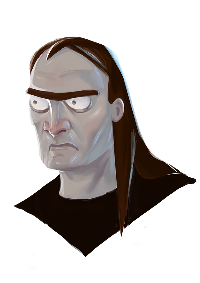 i also think that maybe i should just stylize if that is what feels more natural to me |
|
« Next Oldest | Next Newest »
|