04-15-2017, 10:16 PM
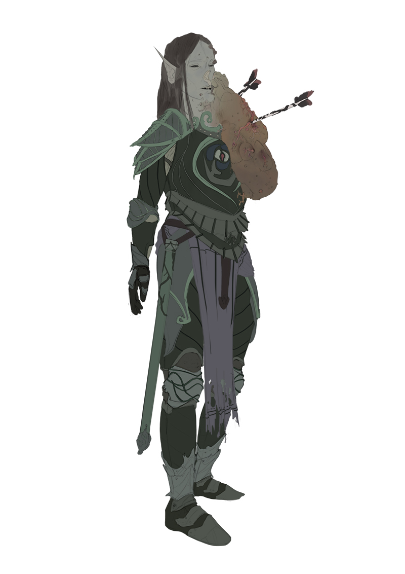
Just some quick studies and working on that elf in background. Not much.
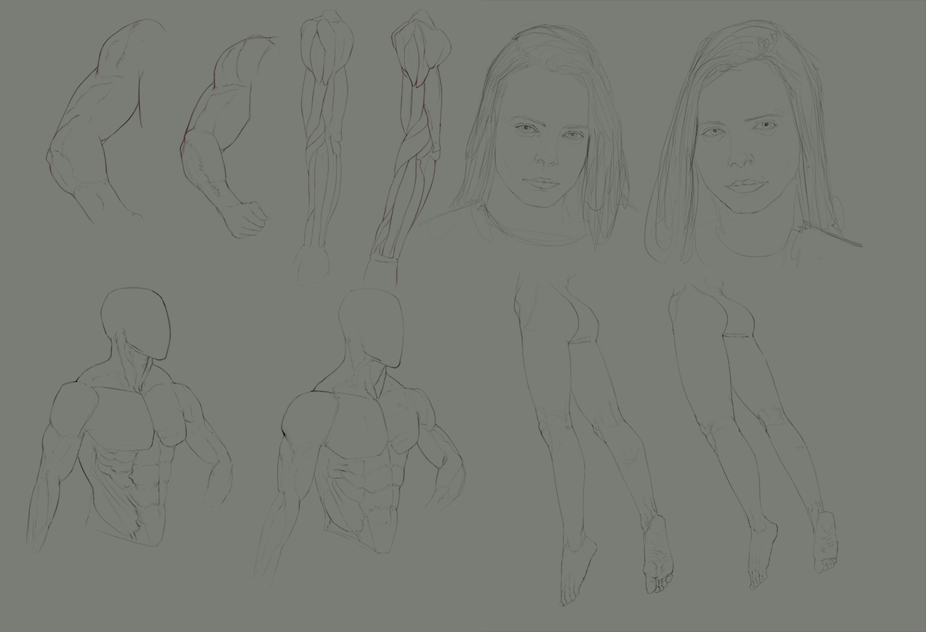
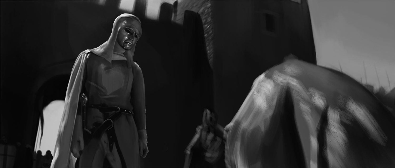
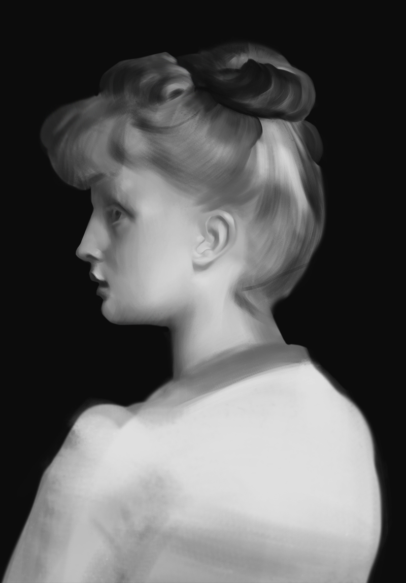
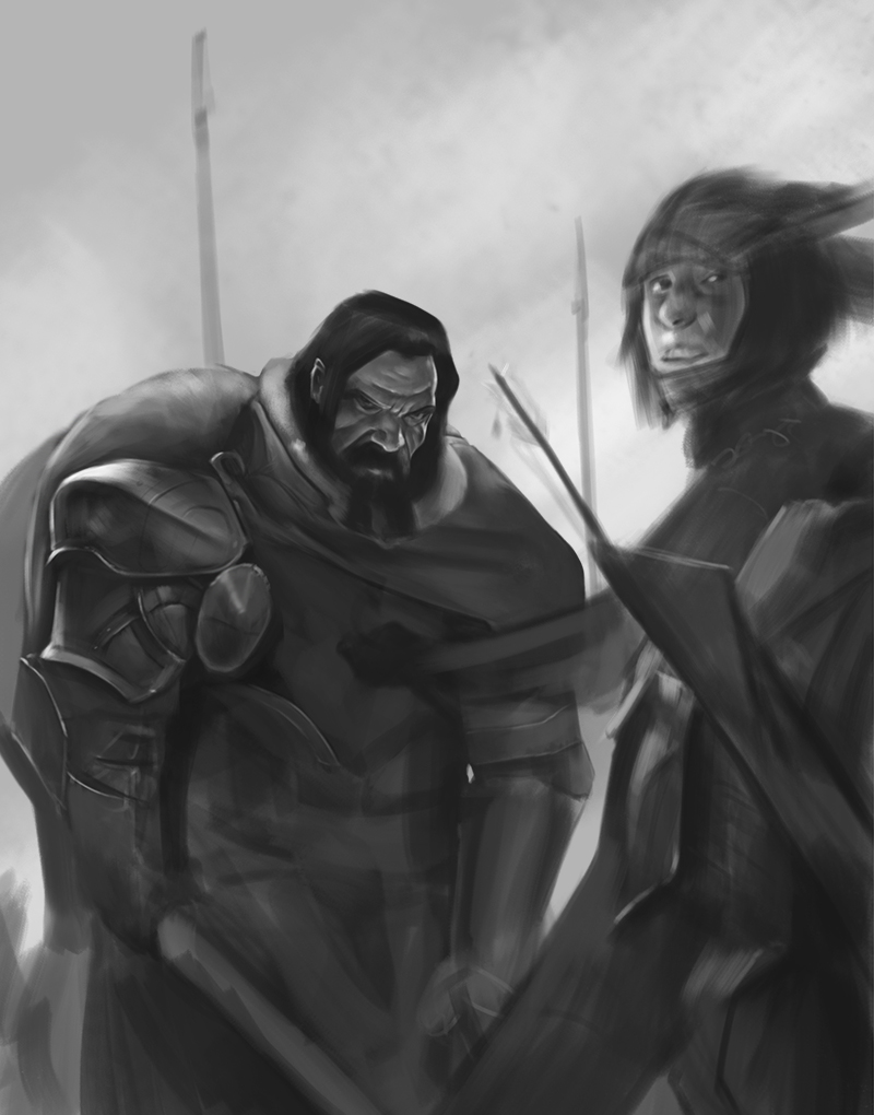



my sketchbook, meh - http://crimsondaggers.com/forum/thread-7549.html
|
varbas is a noob
|
|
04-15-2017, 10:16 PM
Just some quick studies and working on that elf in background. Not much.
    
my sketchbook, meh - http://crimsondaggers.com/forum/thread-7549.html
04-20-2017, 04:51 AM
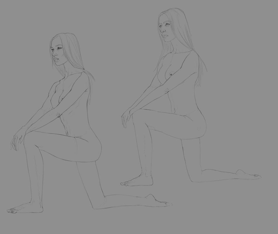
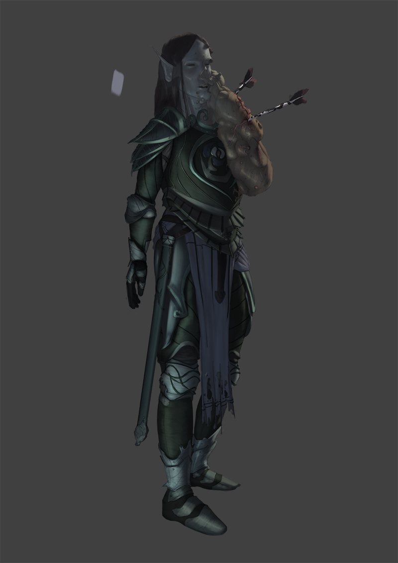
Some stuff.. Took a day off and now I dont know how to do stuff ...
my sketchbook, meh - http://crimsondaggers.com/forum/thread-7549.html
04-22-2017, 07:28 PM
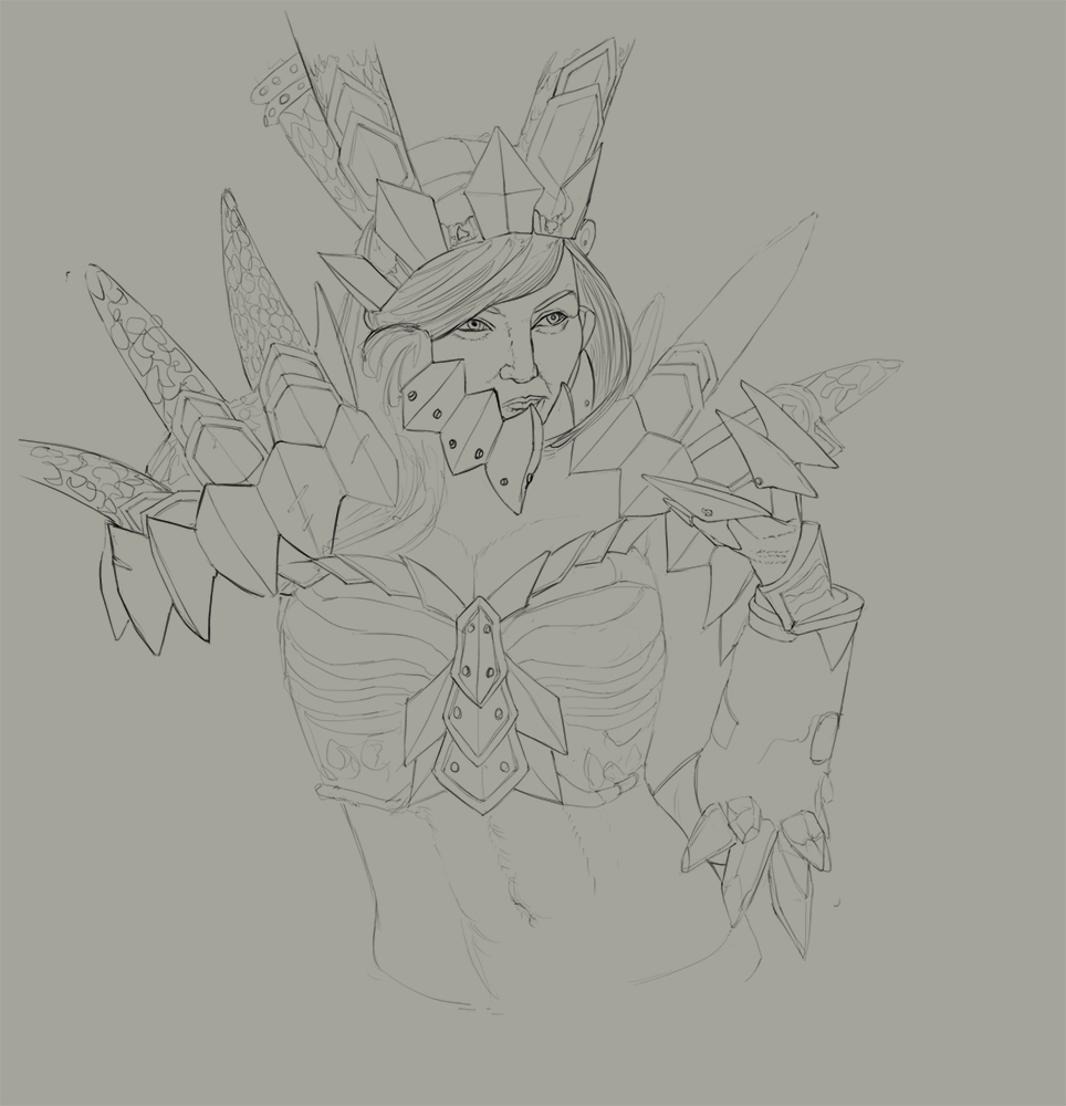
Dont know what I am doing so just some more stuff...
my sketchbook, meh - http://crimsondaggers.com/forum/thread-7549.html
04-25-2017, 05:35 AM
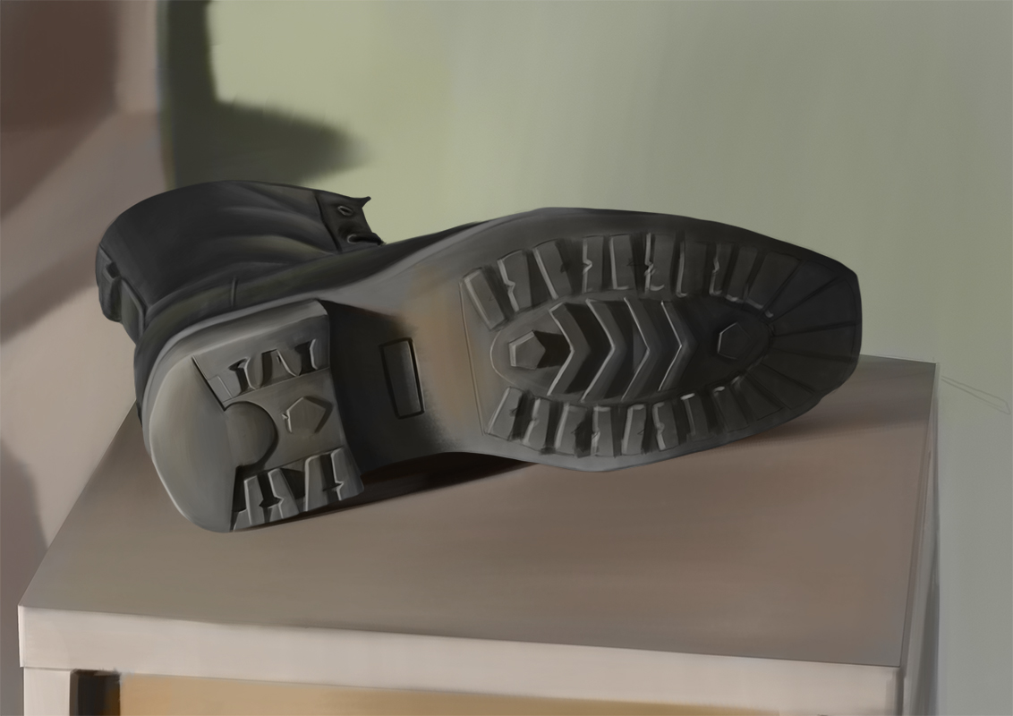
Worked a bit on that character.. and did some observation exercises but nothing special so I just piled them up together...
my sketchbook, meh - http://crimsondaggers.com/forum/thread-7549.html
04-27-2017, 05:17 AM
Working more on that character... didnt do much studying
   
my sketchbook, meh - http://crimsondaggers.com/forum/thread-7549.html
05-01-2017, 05:33 AM
Took a day of so not alot of stuff. DOnt know what to do next so just some random sketches..
my sketchbook, meh - http://crimsondaggers.com/forum/thread-7549.html
05-06-2017, 06:13 PM
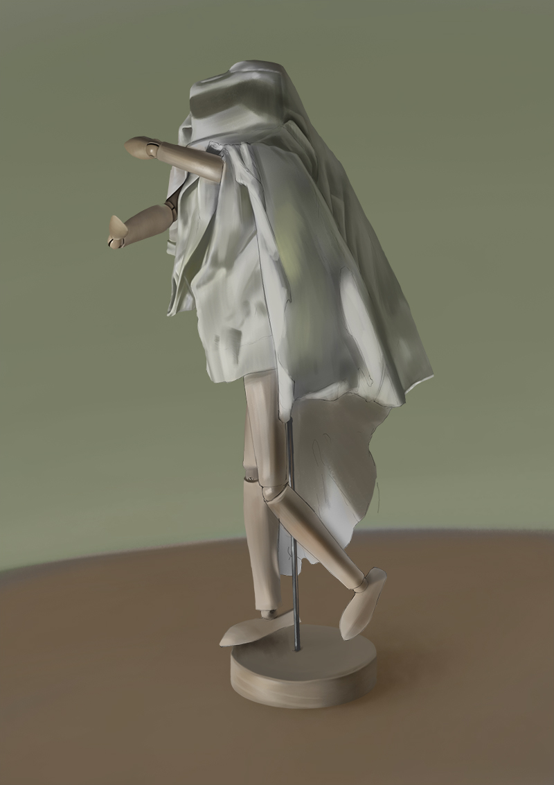
Not a good place.. just some shitty stuff
my sketchbook, meh - http://crimsondaggers.com/forum/thread-7549.html
05-10-2017, 04:30 AM
Did not draw for 3 days like a retard so did bit more stuff today....
my sketchbook, meh - http://crimsondaggers.com/forum/thread-7549.html
05-10-2017, 05:50 AM
Im a total noob but still im going to say it because I think you need it.
You copy and observational skills are superb. Your render of value/form is superb. But maybe you shoudnt render everything as crisp and sharp. If you could leave some stuff in the midway, showing the brush strokes. Think of Richard Schimd or Craig Mullins. You render the focus points crisp and leave some secondary parts less developed. That will give so much character to your paintings. Wich leads me to my second point. Composition and Shape Design. It seems to me that you arent giving any love to those. Brom, Anthony Jones, Ihor Pasternak. Look at those guys and see how they design first the Shapes and then conform the rest of the character to it. As a minor point some of your proportions on anatomy seems off. I notice your mens shoulder-neck area to be a bit weird on many of your pictures. Maybe try to do some other body types. Ordinary mens. I wouldnt worry to much about this thought. If I were you. I would be working a lot on composition and design. Stop rendering everything as detailed. Its time consuming. Spend that time on notans, and shape laguage. With your render skills you will soon be doing crazy stuff. Look at anthony jones Tutorials or Brainstorm mentorship or even better for free on this forum Environment Design Rocks. Amit talks alot on shape design and gives some exercises to work on it. Also Framed Ink, Eytan Zana. Stop spinning the wheel, get out of your confort zones. I know Im a total noob and you may just give a crap about what I say, but give it some thought. Also If you arent already working on art. I will finish some portraits from reference and imagination(final pieces not studies) and start looking for commisioned work. You are already really good and can work on art if you arent yet.
05-11-2017, 04:29 AM
AlfonsoX- Thanks but I would definitely not use word superb :D but thanks.
Yea I kinda forgot to do the edges play and the more "artistic" stuff. I am probably focusing too much on producing some portfolio so I can send something to potential clients so was focusing more on stuff like design and looking whats popular... But that said I always liked the stuff of Brad rigney soo the rendering style maybe kinda reflects :D But yea know what you mean, should probably find some middle point. Yea thats kinda what I said with focusing on design. Thinking more of what and why character are wearing stuff more then how the shapes of it looks. Did not even think of that the last few monts. I´ll look into it ,thanks. I struggle alot with anatomy but theres no other way as just studying it. Also will probably use more references to get things right. Yea sounds reasonable. I actually own some of Anthony Jones tutorials but never got to actually study from them :D Nice reminder though. Will look into those stuff ,maybe not right away :D but will keep them in back of my mind. Thanks. Thats the plan but I dont know alot about freelance like where to look for jobs and stuff like that but I did write few people on DA and they did not get back to me so that kinda tells me how my skills are doing :D Dont know if I am ready for jobs yet. But yea thanks for comment. You probably took some time for that comment, which I dont think is worth on this shit sketchbook :D but yea still appreciate it. Not much stuff today.
my sketchbook, meh - http://crimsondaggers.com/forum/thread-7549.html
05-12-2017, 06:30 AM
Just some stuff... will work more on the color/values on that piece and it should be probably finally finished...

my sketchbook, meh - http://crimsondaggers.com/forum/thread-7549.html
05-12-2017, 07:07 AM
It was already some posts ago, but that creature with an armor and without a nose is amazing. Most of the time I like plain colours more than a lot of rendering, so when I saw the first draft I thought "cool!" but then it got cooler with the rendering. Makes me really motivated to finally learn some rendering, too.
05-16-2017, 06:05 AM
tinDeer- Thanks. Yea I am not really confortable with the straight to color approach so glad to hear it ended up decent enough. Still alot to learn. Yea I would say studying rendering is pretty important but with just drawing and understanding form you could get better in rendering. Just need to find balance there.
Took few days off(again) and did some useless studies but will be back. Also "finished" that thing finaly. Far from perfect but yea should do some new stuff. 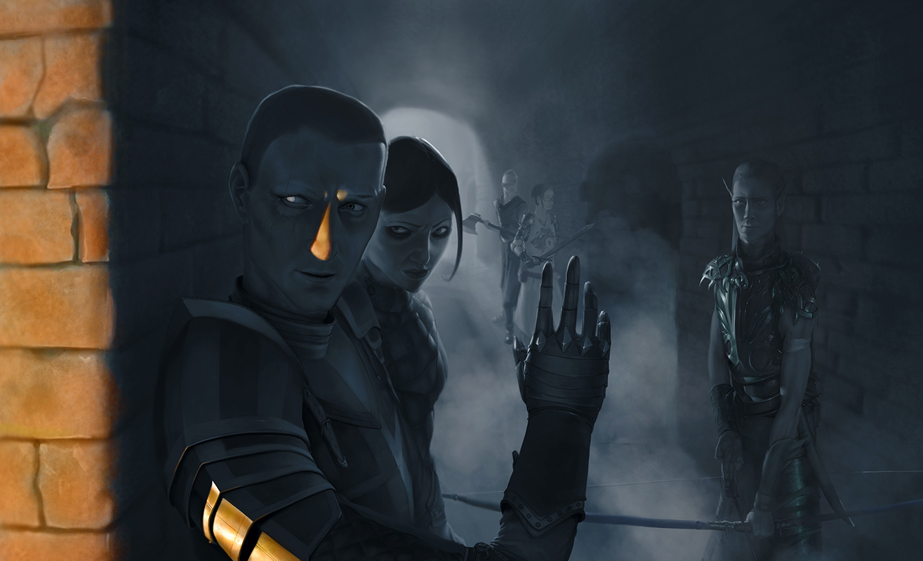
my sketchbook, meh - http://crimsondaggers.com/forum/thread-7549.html
05-16-2017, 07:24 AM
Dude the way you render light is pretty awesome.
Just be careful with some of your poses - the guy at the front - his shoulder and upper arm look like they join his body too low down and it is bent in an odd way - like it is a rubber arm. Maybe search up some more references to help you next time you're putting together a piece like this? Keep it going though!
“Today, give a stranger one of your smiles. It might be the only sunshine he sees all day.” -- H. Jackson Brown Jr.
CD Sketchbook
05-19-2017, 05:02 AM
Artloader- Thanks. Yea gonna need to be carefull but with that was focusing more on design and some shitty composition but yea no excuse :D Yea thanks.
Some stuff.... Had new idea for character.. well kinda cheated and used random generator for dnd but using it as exercise to get idea just by some set characteristics. 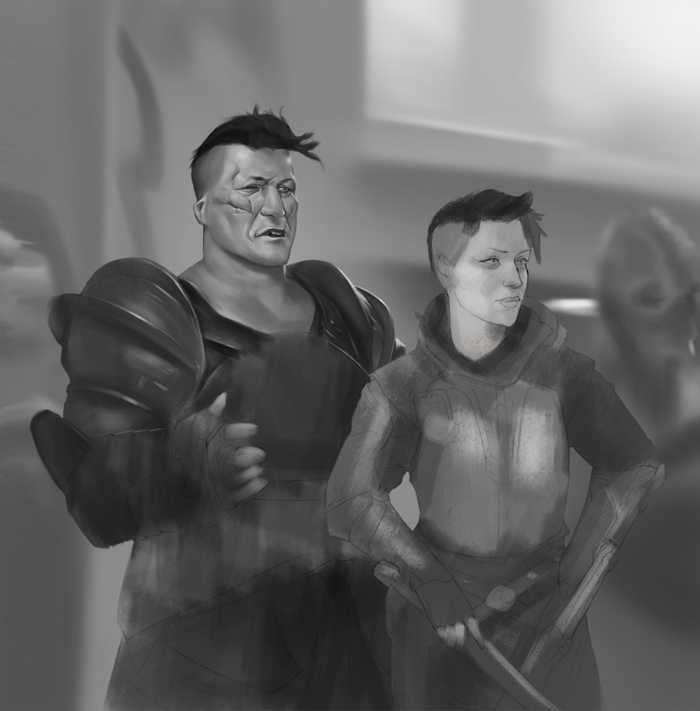 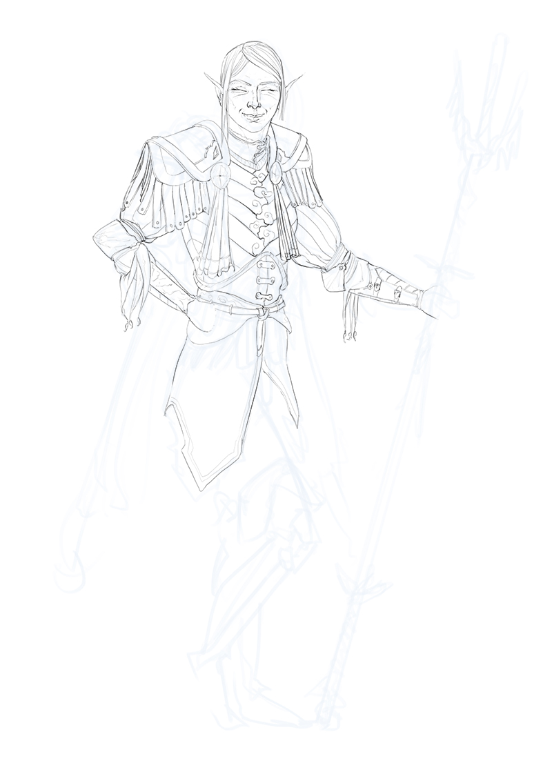
my sketchbook, meh - http://crimsondaggers.com/forum/thread-7549.html
05-22-2017, 06:14 AM
Took few days off soo just some quick sketches and some studies... Kinda forgot or did not realized how drawing something and then trying to draw it from imagination helps. Like I dont really remember the whole thing but just the little stuff so you can combine them in your own designes.
my sketchbook, meh - http://crimsondaggers.com/forum/thread-7549.html
05-22-2017, 11:47 AM
First, it's amazing the number of paintings you've done, keep going, it's already clear how much you've improved... That's beautiful.
You use well the colors and values, but I would pay a little attention to the composition of your paintings, as well as the anatomy (it's a little weird you having problems with anatomy, because in your studies the anatomy is ok, but when you produce a "final" painting it has some proportion problems, so I think you should be a little more careful with that, try flipping the image during the sketch, so you can see better what you're doing - cause changing proportion and anatomy problems after you've painted it's a loooot harder, so do it and be a lot more careful while you're sketching); Keep studying!
05-24-2017, 12:27 AM
Hey varbas I saw your comment in the shoutbox...
My advice to you is that, you may feel ready to freelance, but I mean, who doesn't feel that? I think I remember Will Terry saying, "If you're not getting job offers, you're probably not as good as you think you are." As time goes on, I receive steadily a few smaller commissions, but I know I'm not good enough or have a good enough body of work to get pro jobs. I think your stuff is really great and tight in the rendering side and your costume designs aren't bad but your anatomy and proportions are unreliable and strange. I'll give some examples http://crimsondaggers.com/forum/attachme...study2.JPG The girls arm is snapped in half over her head at the forearm. The male figure's head is mutant and the forearms are strangely thin http://crimsondaggers.com/forum/attachme...ketch3.JPG This guy in general isn't a very appealing character, but his stomach is slurred to the side http://crimsondaggers.com/forum/attachme...ketch2.JPG This guy has half a cranium http://crimsondaggers.com/forum/attachme...ketch1.JPG The back torso has so many problems its funny. The bicep looks crunched in half (because the lineweight,) the forearm foreshortens wrong the belt around the waist isn't wrapping the form properly. The guy on the right's arms and hands are just a mess, I'm not sure if they're facing the viewer, or how they're connected to the torso. http://crimsondaggers.com/forum/attachme...study1.JPG Guys hands are too small, arms are not long enough http://crimsondaggers.com/forum/attachme...ketch2.jpg This guys arms are wildly different sizes http://crimsondaggers.com/forum/attachme...ketch1.JPG This guy has no deltoids, I like the design though http://crimsondaggers.com/forum/attachme...ketch1.jpg The bowmans arms are ridiculously long, it's kind of disturbing to look at the right one. The front guys arm is foreshortened in a weird way, also not sure how his bicep bends that far. I can tell the better ones are studies of Marko, and those look much better, mainly because the proportions. That's something you need to fix is your sense of proportion. They're just either close or way off. Sit down and learn specifically the limitations of each limb, also how to represent it with basic shapes like cylinders. Do Drawabox stuff if you haven't. I had similar issues to you before I did that. It seems you understand limbs in their complex anatomical sense but not at their core of how they are represented as three dimensional illusions in an illustration. These things REALLY hinder your work and will keep people from being interested. Even if the rendering is impressive, your average person will not understand why something doesn't appeal much to them. A good thing you could try is (After doing some basic shape drills from drawabox, spend a good week on that or as long as you can really.) Try just drawing a nude figure in the most basic pose and try to get all the proportions right, ignoring the complex anatomical details. Just boxes and simple shapes for the body, then try and rotate it and maintain those proportions. If you struggle with that, that's where your problem is. You've developed a visual library but the foundations are shaky... I feel like I'm talking to myself... We all gotta do it, give it a shot. If you put all the effort you put into rendering into good solid drawing for a few months, you'll be flying dude, promise.
70+Page Koala Sketchbook: http://crimsondaggers.com/forum/thread-3465.html SB
Paintover thread, submit for crits! http://crimsondaggers.com/forum/thread-7879.html [color=rgba(255, 255, 255, 0.882)]e owl sat on an oak. The more he saw, the less he spoke.[/color]
05-24-2017, 04:58 AM
That is some really nice rendering going on here! I can also just say what everyone else probably did: your rendering is really good, try to work more on the structural side of things and design for a couple of months and then you'll have unlocked the beast mode! Keep it up!
|
|
« Next Oldest | Next Newest »
|