Posts: 191
Threads: 1
Joined: Oct 2012
Reputation:
15
I run into weird line problems when photoshop is zoomed to weird numbers, though it might be a different issue. Weird numbers being like 33% or something besides 25, 50, 100. If there's some solution to this make a note of what you change to fix it. I've just gotten used to it.
Posts: 200
Threads: 1
Joined: Dec 2014
Reputation:
7
@ThereIsNoJustice - I will let you know if I find out 
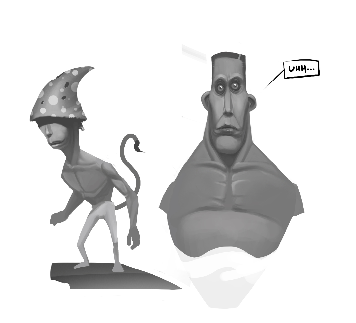
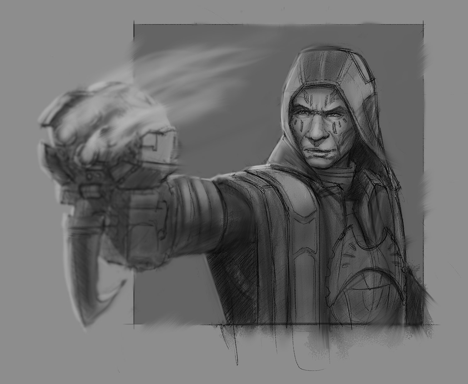
Sketches and trying new techniques...
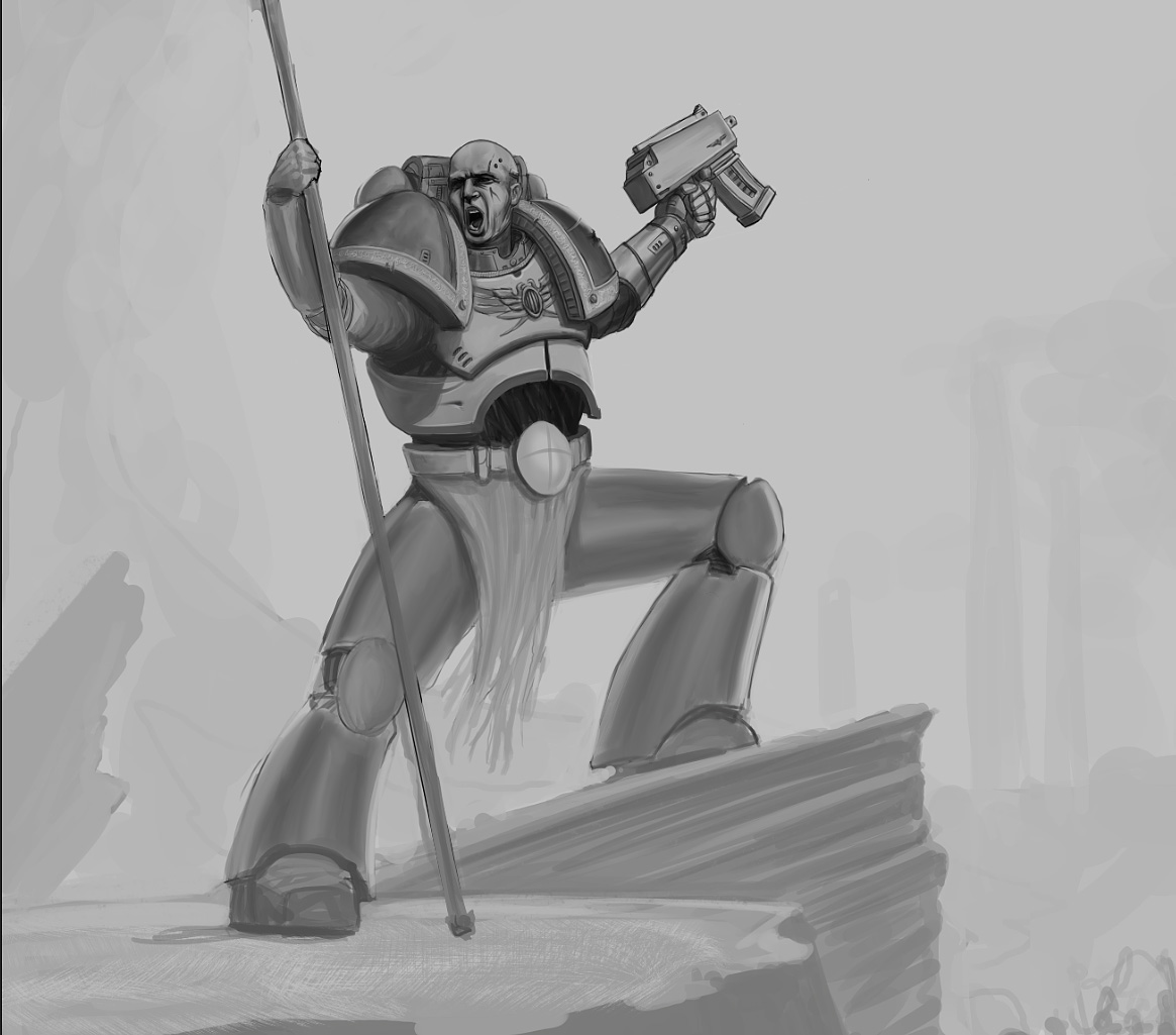
I continued on the space marine, banner dude for a bit. Close up:

Sketching with round hard brush+opacity:

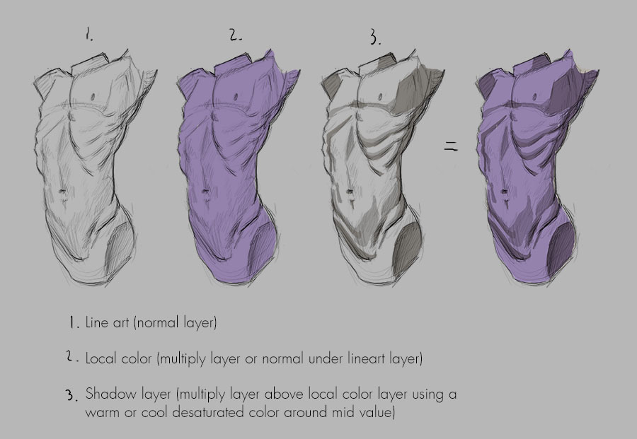
Did a very quick render study, using a technique that i saw that Mauro Belfior used on a few of his instagram-posts (check him out, he is great):

Posts: 200
Threads: 1
Joined: Dec 2014
Reputation:
7
I finally fixed the wobbly-line problem! I searched Google for a long time yesterday, and I found out that it is a pretty common problem. But not many solutions...
But one solution that seemed to work for alot of people (not me) is found here: https://sweetmonia.com/Sweet-Drawing-Blo...photoshop/ (Maybe it will work for someone else)
But like I said, I tried that solution, and it still did not work. Almost gave up until I found this app: https://lazynezumi.com/ ...and it worked! Now I finally got smooth lines again. Tough it costs 35$ to buy, but it's free for 15 days trial if anyone wants to try it out before buying.
----
Some progress on this one:

Posts: 200
Threads: 1
Joined: Dec 2014
Reputation:
7
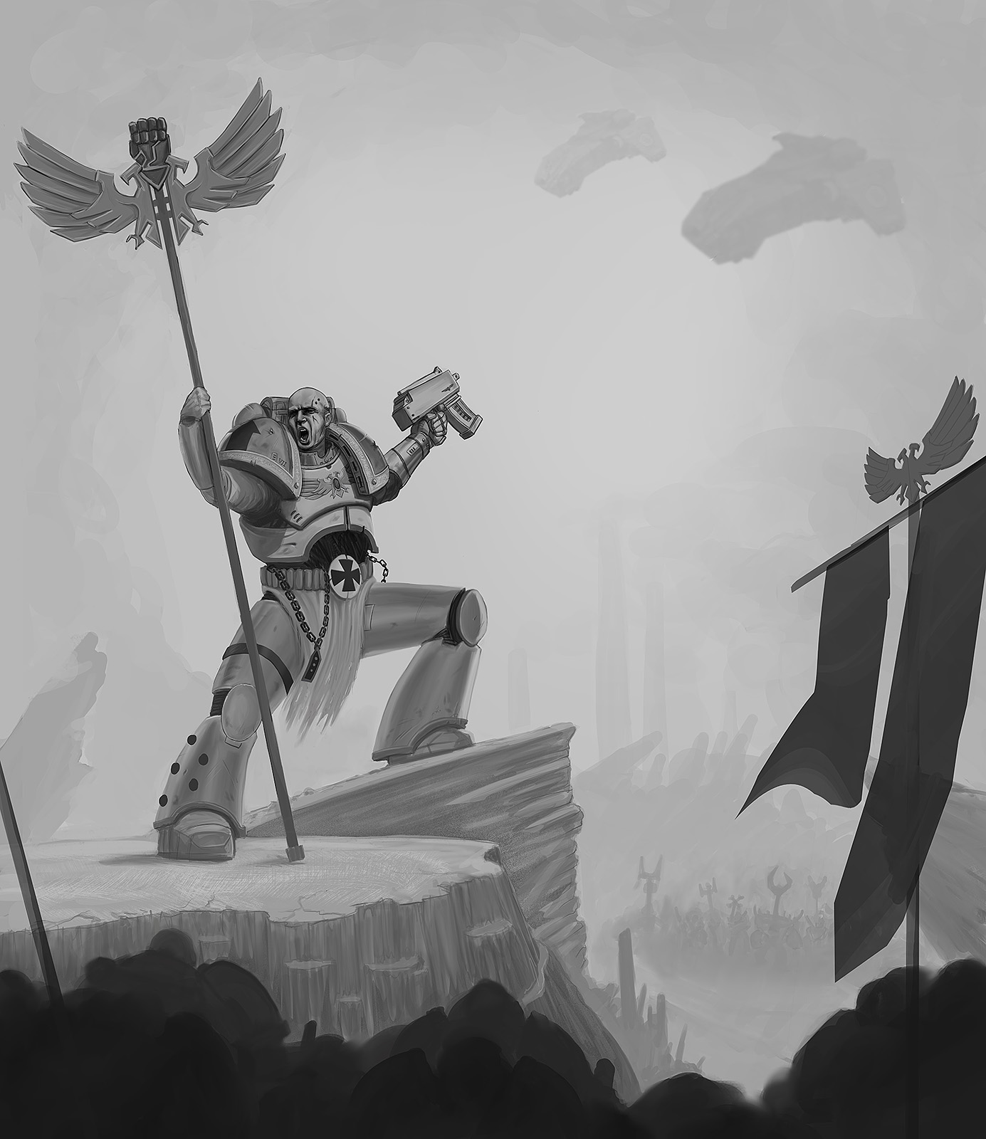
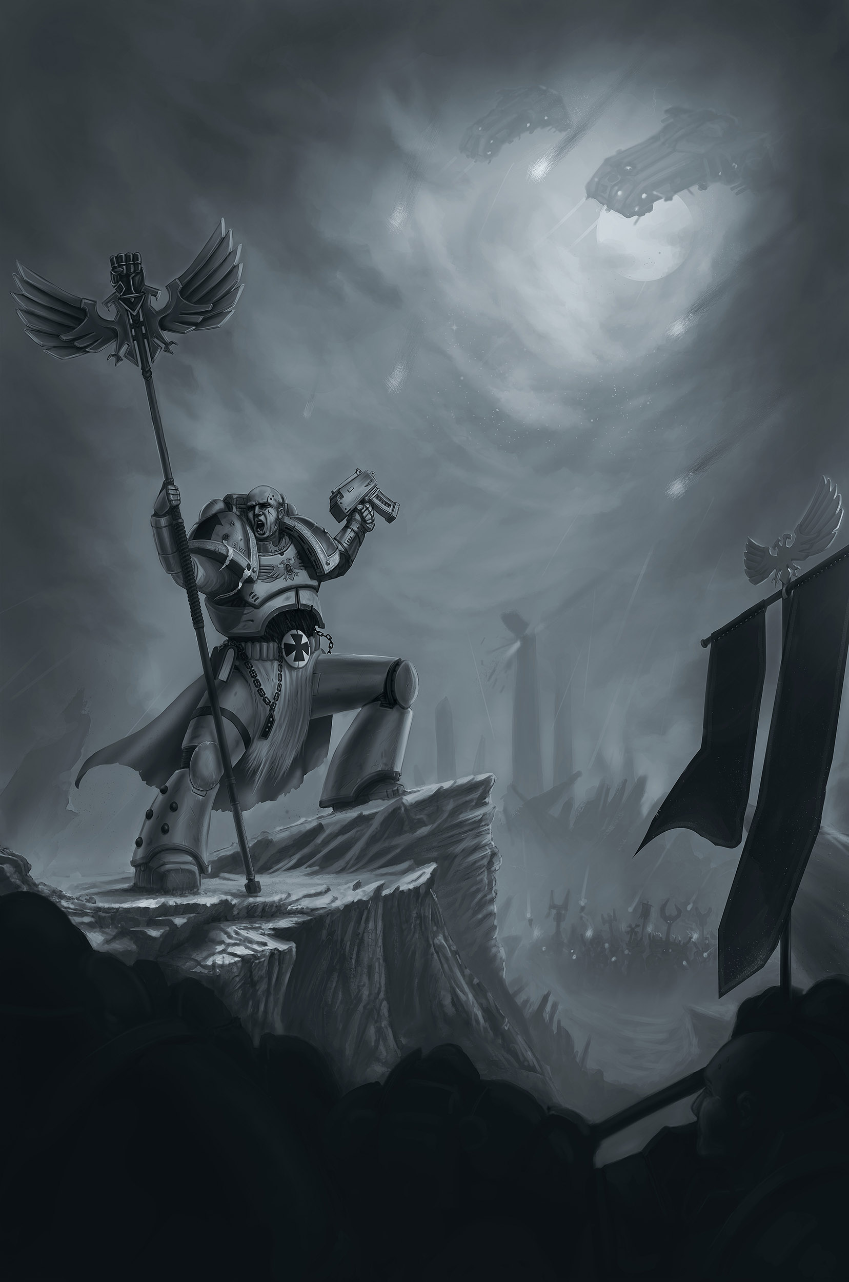
Wasn't supposed to paint this, but having too much fun. Decided it to be Imperial fist. Almost entirely done with round hard brush with various opacity.

Posts: 3,361
Threads: 37
Joined: Aug 2013
Reputation:
234
Don't leave so much space empty if there nothing to guide the eye where he point at with the gun.
Posts: 200
Threads: 1
Joined: Dec 2014
Reputation:
7
@darktiste - Yes, I dont know if you saw the sketch on last page (?) but i'm planning to add some ships there in a later stage. Thanks for stopping by! :-)
Posts: 200
Threads: 1
Joined: Dec 2014
Reputation:
7
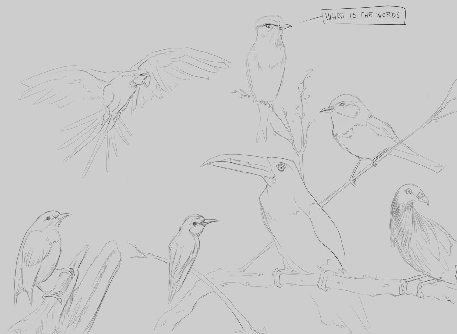
Birds for warmup, then continued on the space marine a bit more. Now off to bed :-)


Posts: 200
Threads: 1
Joined: Dec 2014
Reputation:
7
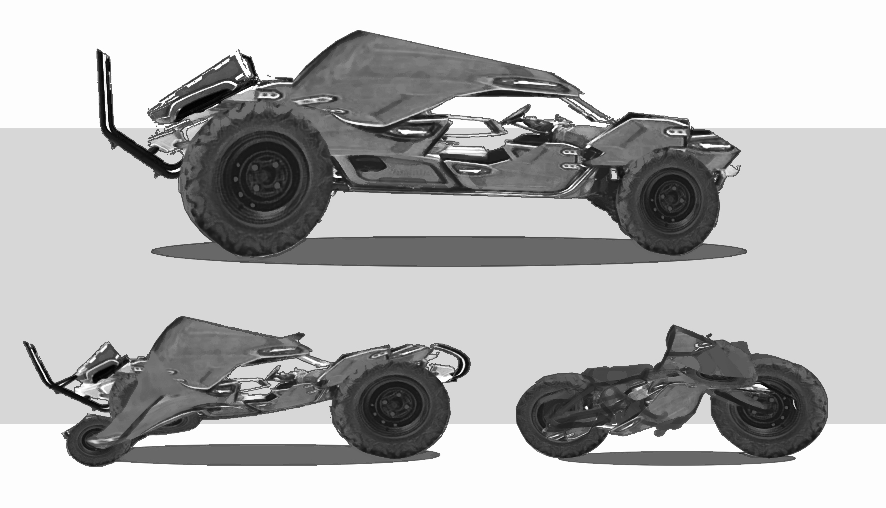
Very quick sketch during lunch, photobashing and trying to find shapes/silhouettes. Used this one as base: https://cdn.blocket.com/static/2/images_...330941.jpg

Posts: 28
Threads: 3
Joined: Jan 2016
Reputation:
2
Hey there -echo- ! I'm happy to see you're doing stuff with a simple round brush, it can achieve so much with proper use and I feel it's a bit underestimated these days. Regarding the Dorn's angr...Imperial fist I think his right arm holding the banner is a bit misplaced along with the shoulderpads on both arms, they should be at a different angle relative to the angle of the arm ( you can look up minis with similar posture on GW website). Also the forearm holding the bolter might need a bit more foreshortening.
That photobash is pretty good, nice way to generate unexpected ideas.
Please do finish this illustration.. For the Emperor !
I'm not the best with social media.
I attach a scribble/sketch to every post/reply I make in my threads. It might not be very sane.
Posts: 200
Threads: 1
Joined: Dec 2014
Reputation:
7
Hey Narog! Yeah I thought I should go back to the basics with just a simple round brush for a while
You are right about the Imperial Fists piece, I checked some figures with similar poses and the shoulder pads should move differently. I'll dont think I will fix that particular problem with this one tough, but I will keep it in mind for the next one i do! However I changed the forearm, after you pointed it out it was so obvious. Big thanks for the heads up, and don't worry, I'll will finish it... For the Emperor!
Thanks for stopping by and constructive critique, I really appreciate it!

Posts: 158
Threads: 4
Joined: Feb 2015
Reputation:
12
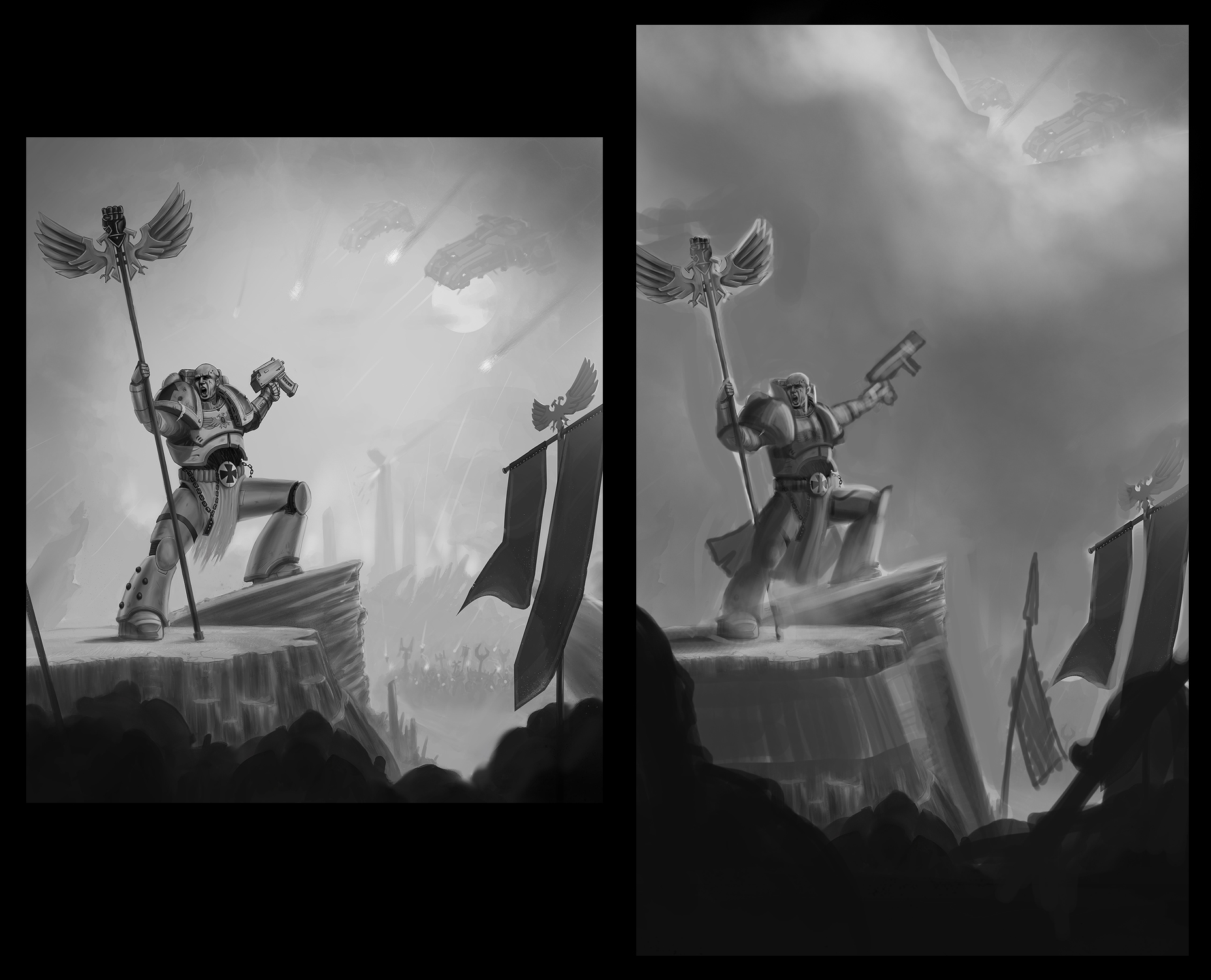
Hey Echo! I really dig the warhammer piece, and you´ve seized the storytelling. I´m not too familiar with the warhammer universe but from the vibe of the piece, i sense that the guy is the leader, and there´s an air invasion ready to occur.
I think the piece has lots of room to grow and has portfolio potential.You have 70% of the picture solved but those 30% need to be tackled haha.
Hope that you don´t mind my paintover, to better illustrate my point.

1. Composition; Yours already works but needs some room to breathe, so, i´ve opted for a vertical composition since it´s a vertical storytelling; the army, the leader, the air invaders and the air event, probably a battle.
You´ve made a clear differentiation between the leader and the army, it reads, and you left the invasion quite ambiguous, which is fantastic, allows room for interpretation and wonder.
2. Shape; Regarding shape, once again, you´re almost there, i would refine the leader´s shape, specially the legs, the armour is too blocky, push that arm pointing at the sky a bit more to have more readability ( think fighting game; exagerate the pose so the movement reads well, not breaking realism, just using pose for your advantage).
Work one or two standard sillouettes but do not allow those shapes to take attention from the main source of attention, the leader, that points to the heavens.
Refine also those rock shapes in a more appealing way, creating a separation from the army.
3. Value; That one i think needs the most work. Think about ambience, mood. You created an almost 1-10 (black-white) value range, work within the nuances; grays, it´s rare to use the full spectrum of value. Pick mid tones and add shadows and highlights where needed.
In that image value should; A) Provide ambience but background is not the focus B) The leader and part of the rock should be the highlight and by looking at him the readers eyes should be directed to the skies C) Skies should have some kind of ambiguous value but having more importance than the leader. D) The army should be the darkest part of the image but not black.
You can also pick darkest darks in some spots of the leader´s armour that are in shadow, but specs at the most.
A special consideration. Avoid the easy value strategy;
Nathan Fowkes makes a fantastic free video detailing that bad option. The dark to light value scheme works well but should not be overused in all pieces, in this one i think it works.
https://www.youtube.com/watch?v=fvJQ0aHp-eQ
Cheers!!
Posts: 200
Threads: 1
Joined: Dec 2014
Reputation:
7
Whoa man, that is some great notes and paintover, thank you!
I was a bit uncertain about the background and atmosphere of the painting but I couldn't set my finger on it and then you come in and just nails it. BIG thank you, I will follow up on your notes. Much appreciated!
Posts: 158
Threads: 4
Joined: Feb 2015
Reputation:
12
Awesome Echo, just want to see my fellow daggers bringing forward the best works they can do!!
Posts: 200
Threads: 1
Joined: Dec 2014
Reputation:
7
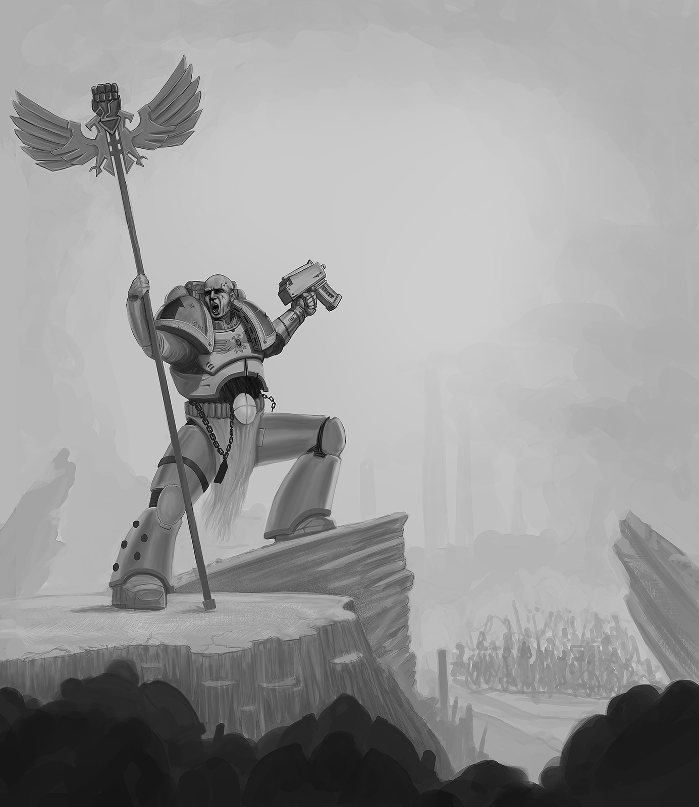
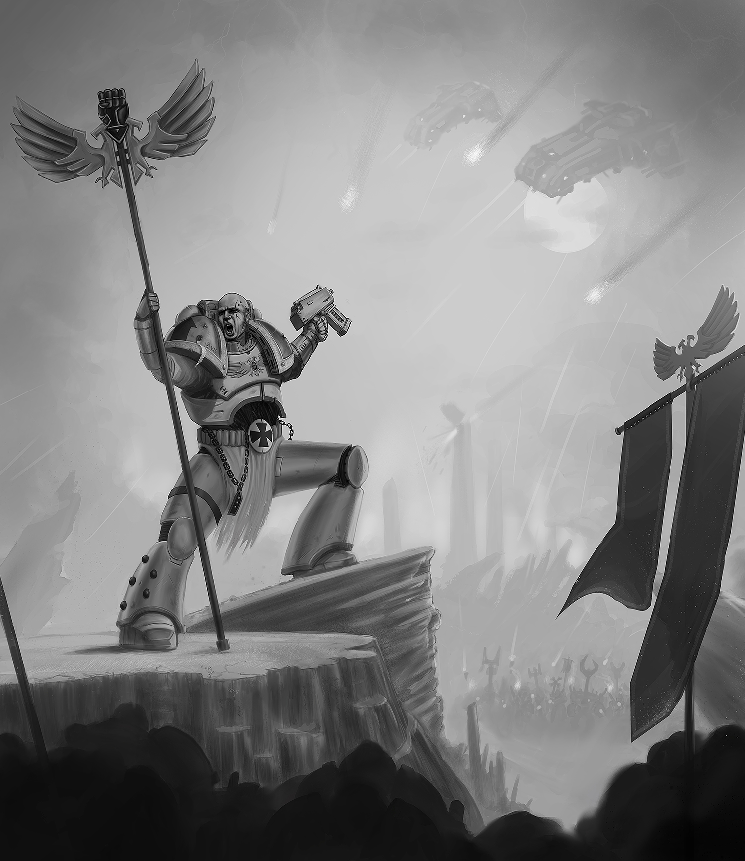
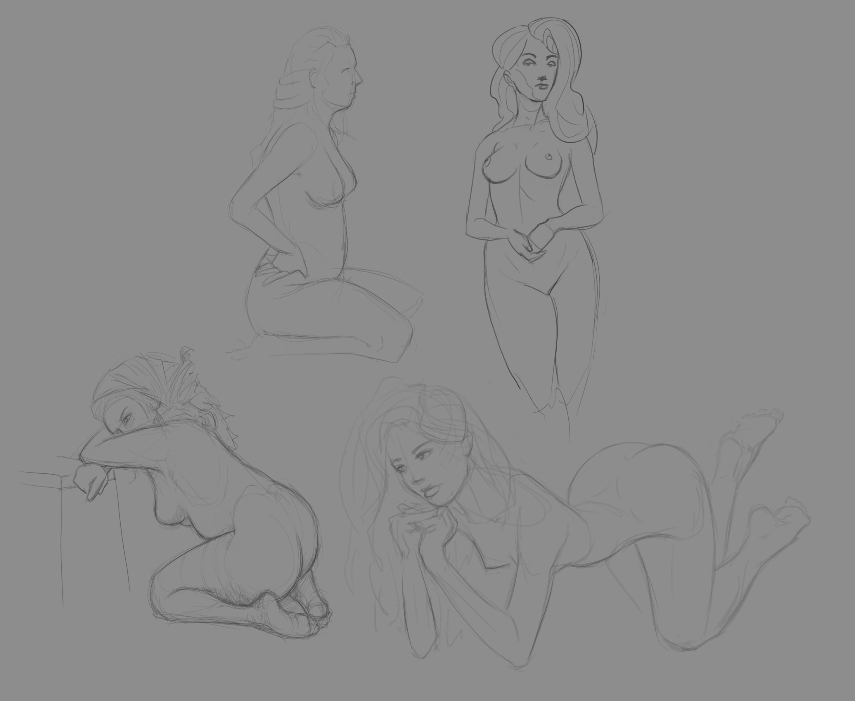
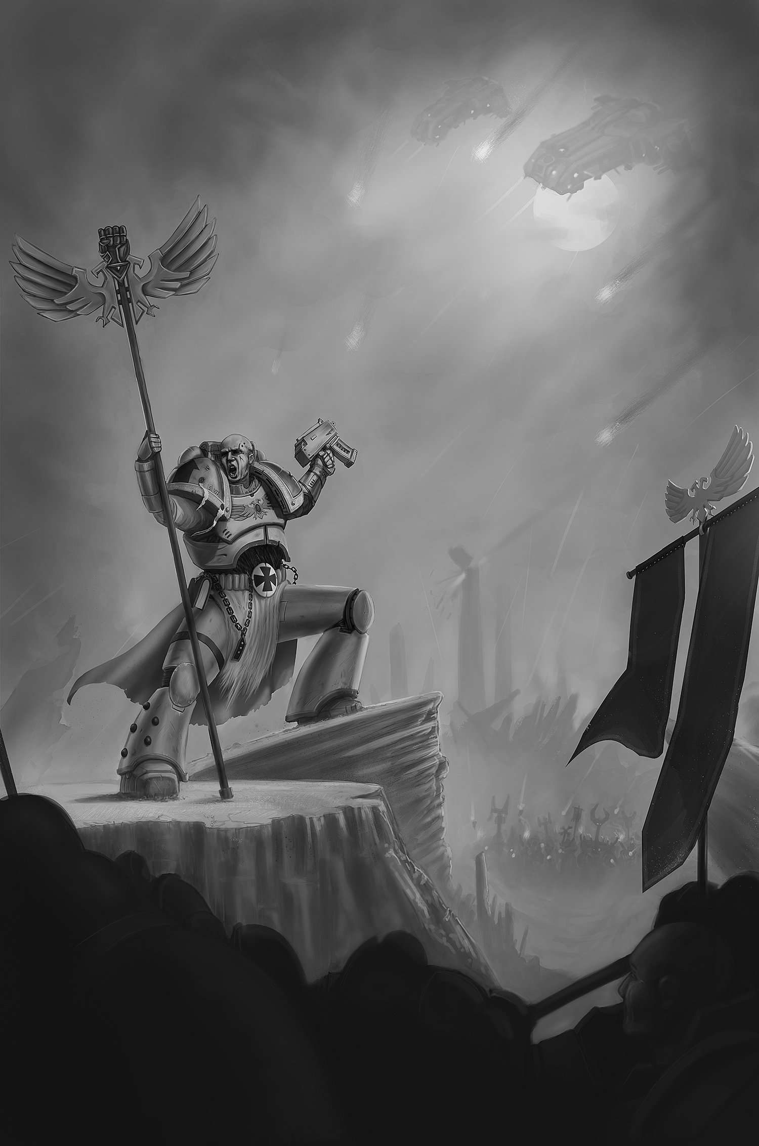
Female warmups and some progress on the warhammer piece, still gotta paint in the foreground a bit better, adjust a few things and add/refine details. But I think it got a bit more atmosphere now after your points, thanks again! :)


Posts: 2,817
Threads: 15
Joined: Jun 2013
Reputation:
109
Its good you have a seperation of values in the for middle and background. I think the painting is more about the sky than the character, theres just too much of it. The rocks arent very rock like, they seem a little too perfect, almost like toys and the contour of both the ones hes standing on are almost perfectly straight lines. Like the only diagonal lines in the whole image are the flag, and the figure closest to the background on the left side. even the soldiers down below are vertical, and the spiraling rocks above them.
in fact this crop here fixes a lot of the issues
http://crimsondaggers.com/forum/attachme...e_crop.jpg
Mainly just think more about sexy shapes and compositional motiffs, like radiating lines and what not, id highly reccomend reading andrew loomis Creative Illustration, its fantastic for learning those things. And always thumbnail your ass off before making that first mark on the final image!
Posts: 200
Threads: 1
Joined: Dec 2014
Reputation:
7
Yeah, I haven't really got to the point to refine the rocks yet. I took a little detour with a more vertical composition after RickRichards notes and just kinda quickly painted em in. The clouds, rocks, soldiers below etc. still got some work to be done.
...And about the thumbnail, I wasn't really supposed to paint this, I just went along and had too much fun to stop :)
Posts: 1,424
Threads: 12
Joined: Dec 2015
Reputation:
139
Those female warm-up sketches look good Echo and the Warhammer piece is coming along nicely too. Let me try to read the story here, there's a battle going on and it's between the big guy and the guys in the foreground vs the guys in the background and the ships?
Keep at it Echo!
“Today, give a stranger one of your smiles. It might be the only sunshine he sees all day.” -- H. Jackson Brown Jr.
CD Sketchbook
Posts: 200
Threads: 1
Joined: Dec 2014
Reputation:
7
Hey Artloader, thank you. That is pretty much it, In the end It is up for interpretation, in my mind the battle is just about to strike and the marine with the banner is shouting a battlecry to encourage his men.
Thanks for stopping by! :-)
Posts: 200
Threads: 1
Joined: Dec 2014
Reputation:
7
Posts: 28
Threads: 3
Joined: Jan 2016
Reputation:
2
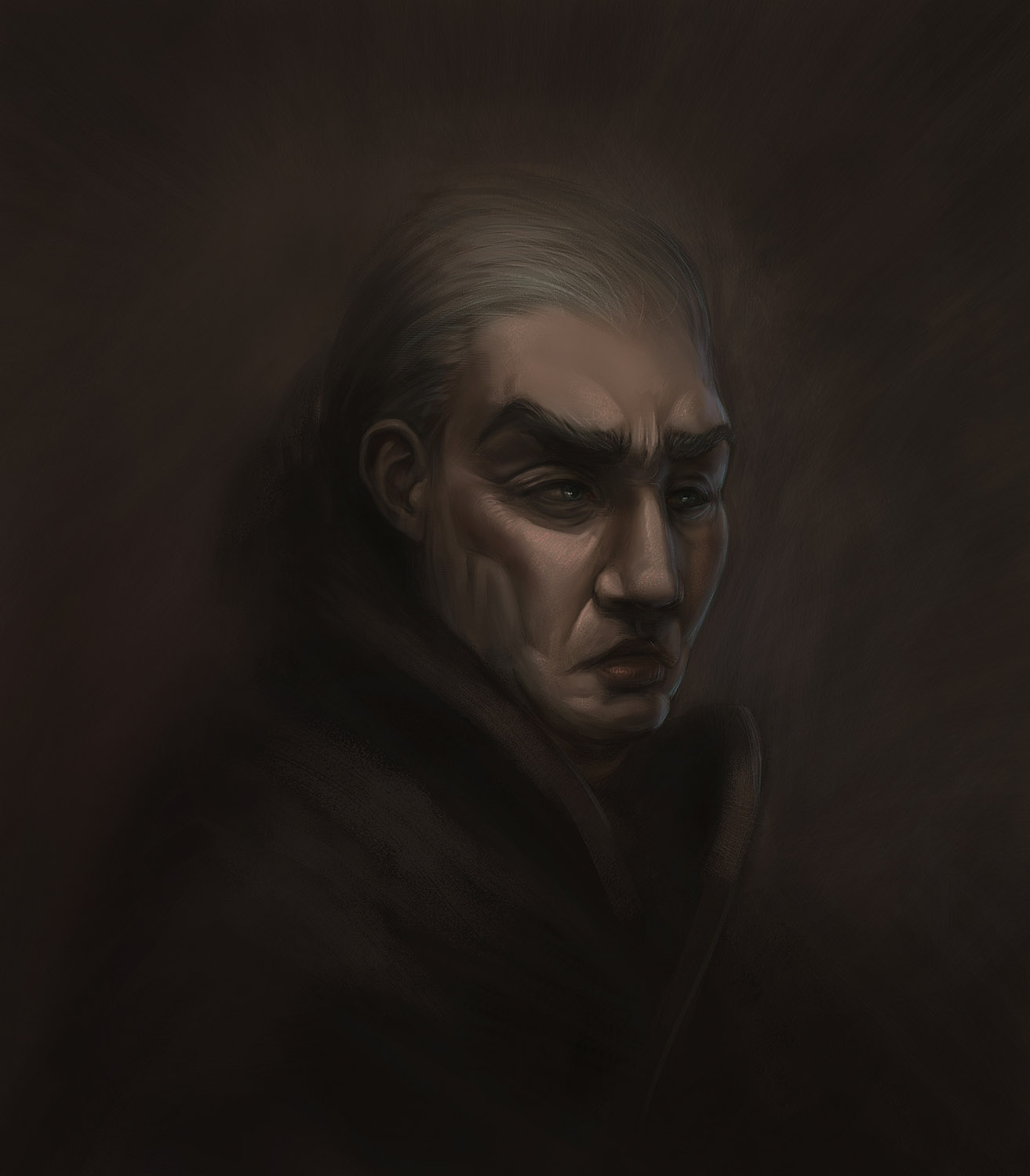
(08-31-2018, 06:07 AM)-echo- Wrote: Felt a bit down for a couple of days, but feeling better now. Experimenting with colors from older b&w sketch, sketching, and some progress on the Imperial fist. Getting tired of it so I might take a break, doing some other stuff and come back to it later. hopefully with fresh eyes.
Leaving a piece for a couple days sometimes does wonders, I recall so many times it helped me shift a piece from meh to good or "something is wrong here and I dont know what" to "holy hell it's so obvious now !" it's not even funny ;).
The detail on the rocks below the Imperial Fist is starting to look great ! The composition has a great potential.
On the portrait piece you did an excellent job with blurring everything around the face, really gives that old portrait vibe.
I'm not the best with social media.
I attach a scribble/sketch to every post/reply I make in my threads. It might not be very sane.
|


