Posts: 374
Threads: 16
Joined: May 2013
Reputation:
59
Why use umber if you don't want your painting to dry quickly? It's like adding a dryer to your medium and then complaining that it dries too quickly. Use another pigment if it's an issue.
There are other contributing factors you should be aware of. What kind of ground did you put on the panel or did you get it pre-made? If you got it pre-made you should know what type of ground is on there because that completely changes how the painting will act. My guess is that the paint isn't drying, rather you've gotten yourself an acrylic or absorbent ground and it's just absorbing the oil rather than drying it. If it was actually dry, adding turpentine wouldn't do anything. If you want to fix this, use a non absorbent oil ground and it should extend the drying time by a lot.
Speaking of turpentine. Why does the paint look so oily? Did you add oil to it? Or are you using oily paint from tubes? Generally an underpainting is just done with a handful of colors and a bunch of turpentine, it leaves it nice and matte, somewhat absorbent and very easy to paint over. It can be a good idea to get in the habit of spreading your paint out on blotting paper before using it because manufacturers pre-load paint with medium rather than have it be properly stiff. Only company I know of that doesn't add medium to their paints is Old Holland.
They should teach you this stuff.
Discord - JetJaguar#8954
Posts: 483
Threads: 2
Joined: Feb 2017
Reputation:
5
(06-24-2019, 02:17 AM)Fedodika Wrote: 3d is like using a model thats free in many ways, you just have to have the fundamental knowledge to use gesture and anatomy to make it not look like a 3d model and like it fits in an illustration
Maybe I'm wprrying too much asbout things and doing things correctly, I know professionals use 3d but I though that was more for getting a quick idea across and not a finished product. I think I'd be ok with the gesture but my anatomy knowledge would definitely let me down big time.
Posts: 483
Threads: 2
Joined: Feb 2017
Reputation:
5
(06-24-2019, 02:43 AM)Tristan Berndt Wrote: Why use umber if you don't want your painting to dry quickly? It's like adding a dryer to your medium and then complaining that it dries too quickly. Use another pigment if it's an issue.
There are other contributing factors you should be aware of. What kind of ground did you put on the panel or did you get it pre-made? If you got it pre-made you should know what type of ground is on there because that completely changes how the painting will act. My guess is that the paint isn't drying, rather you've gotten yourself an acrylic or absorbent ground and it's just absorbing the oil rather than drying it. If it was actually dry, adding turpentine wouldn't do anything. If you want to fix this, use a non absorbent oil ground and it should extend the drying time by a lot.
Speaking of turpentine. Why does the paint look so oily? Did you add oil to it? Or are you using oily paint from tubes? Generally an underpainting is just done with a handful of colors and a bunch of turpentine, it leaves it nice and matte, somewhat absorbent and very easy to paint over. It can be a good idea to get in the habit of spreading your paint out on blotting paper before using it because manufacturers pre-load paint with medium rather than have it be properly stiff. Only company I know of that doesn't add medium to their paints is Old Holland.
They should teach you this stuff.
Apologies Tristan I forgot to mention what surface I was using and so on. I know umber dries quickly but this seemed to be drying in a 3 hour session which seems crazy to me. I know it dries quick but should it really be that quick?
This was done on a hardwood panel that I prepped myself with 3 coats of gesso (pip seymour to be precise).
Regarding the oily look I think that might be due to how I took the pic, in hand it looks matte (apart from some areas that are abit shiny but I think that's due to how the light is hitting the brush strokes, could be wrong though). I posiitoned a light above it to light the painting as best as I could. I normally use freezer paper over my palette. Not sure if it's the same as blotting paper though.
Not sure how the painting classes at Watts work in person but from the online videos that I've watched so far in their oil painting section they don't really go over tools and mediums etc in great depth. They tell you what brushes to get and medium, and suggestions for work surfaces but that's about it.
Posts: 483
Threads: 2
Joined: Feb 2017
Reputation:
5
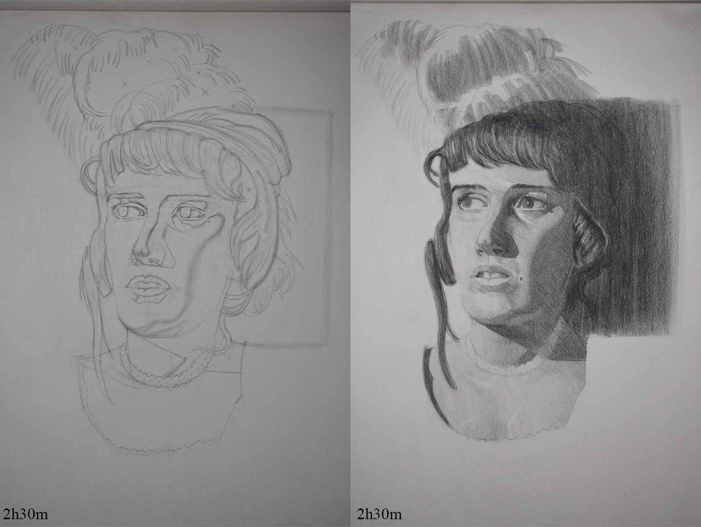
Been working on my live streaming h/w tonight which is almost complete, gonna spend another 30 mins on it as I'm trying to stick to 2h30m this week to work on my speed.
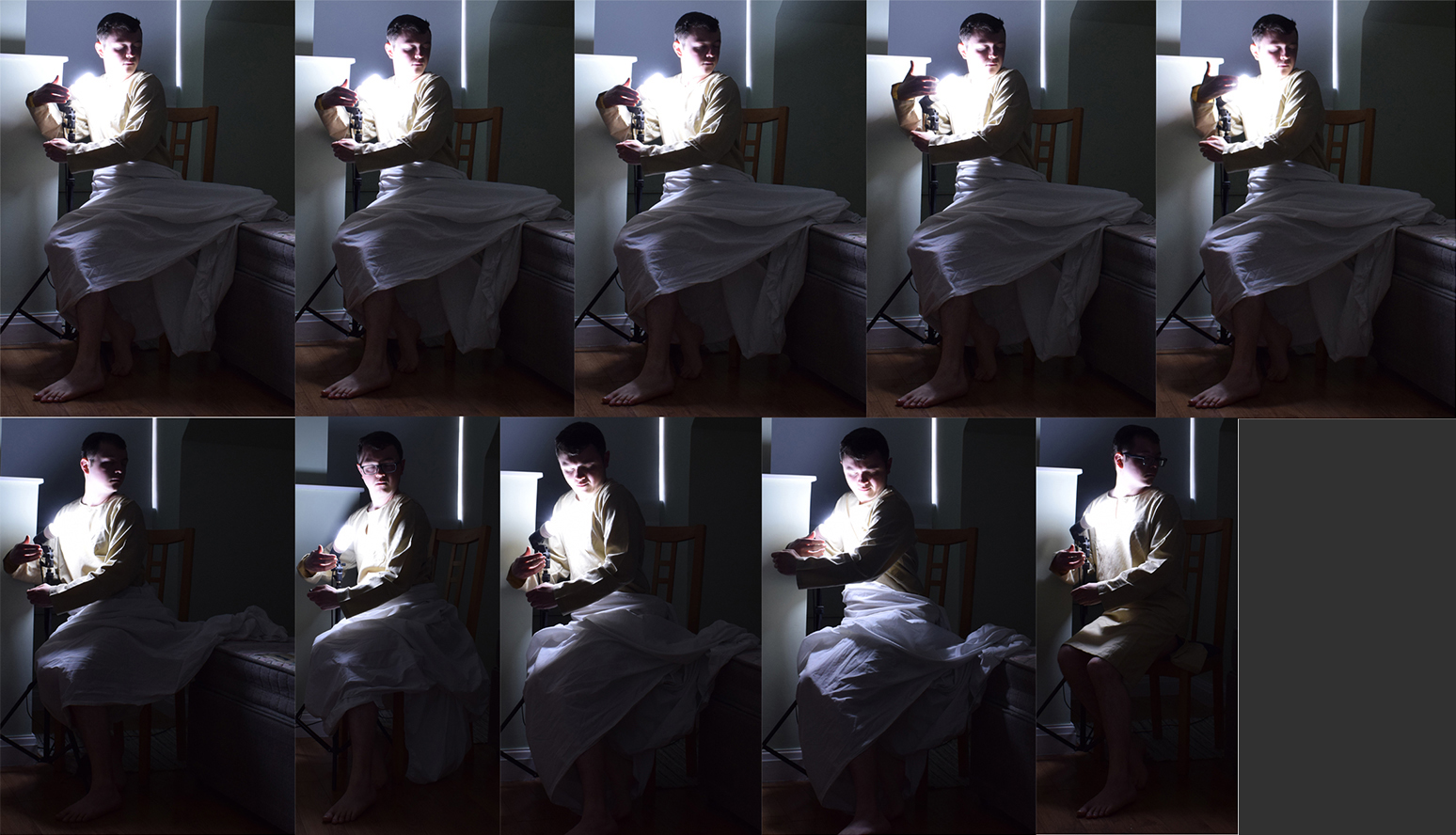
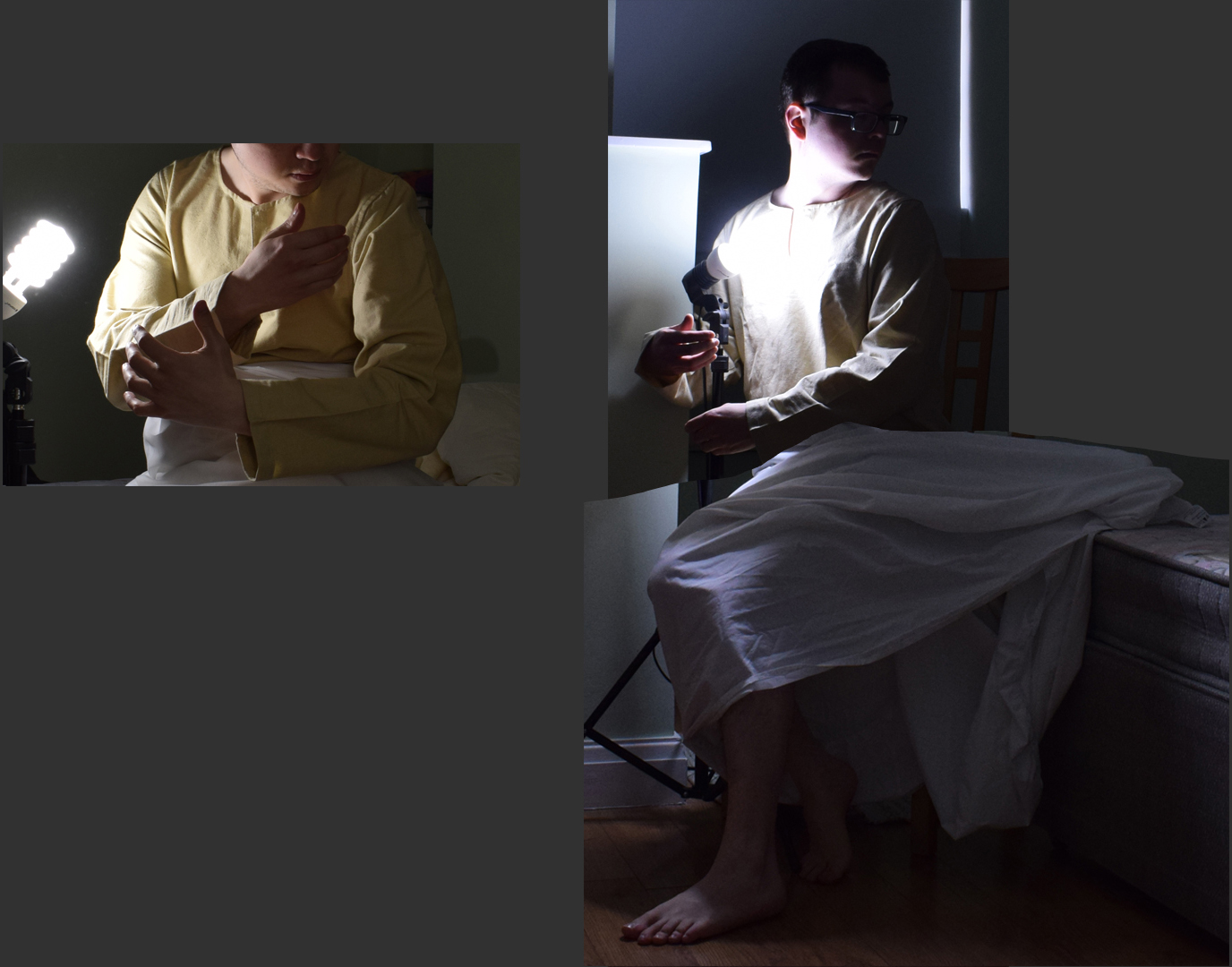
Spent the last hour or 2 taking some more photos of myself to use as reference and then doing a little bash up of a few photos that I liked the look of. Going to use a mix of the pics I took along with some photos that a user kind enough of to provide on another forum and refer back to my original sketch. Tried getting the eye level as close as possible to my sketch aswell as the pose but I'm no model haha. Definitely need to work on my photo skills as it will be invaluable in the the future.


Got life classes the next 3 days, might have an hour or 2 in between where I can work on the poster but Friday will be the next day I can dedicate alot of time to it.
Posts: 483
Threads: 2
Joined: Feb 2017
Reputation:
5
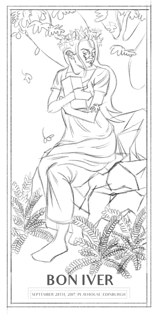
Update on the poster design.
Had my usual life classes this week (prob post them this week) so not a whole lot of time to work on the poster. I was planning on spending all weekend working on it and hopefully start inking but had some things come up last minute so haven't had as much time as I would of liked.
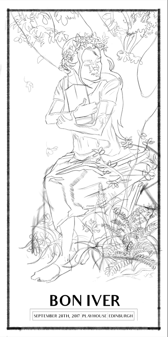
Got the final design complete, used the ref of myself that I shot to help me with designing the woman but tried sticking to my original design as much as possible and not just blindy copy the ref, basically using is as an aid. Shot some addiitonal ref in my garden to help with the plants aswell.

I'm still not completely happy with the design, see a few areas that could be improved upon such as her hands/feet, face, and the tree in the background doens't fit right with me (I wasn't sure if I should be using a perpective grid or not to stage the scene or not, since posters like Mucha's don't but I could be wrong). I've tried re-doing the sketch a few times now to fix these issues to no luck so i think this is just the best I can do skill wise right now so rather than just leaving it as this I want to take it to a finish regardless.
Got some plans tomorrow so I'll only have a few hours to get work done but I'll start inking this out in illustrator, hopefully get this done by next weekend.
Posts: 2,817
Threads: 15
Joined: Jun 2013
Reputation:
109
your presentation and line weight are really nice, its just the drawing its presenting is super stiff and lacks a lot of natural feel to it. Like take that pose yourself, try to be as literal as you can, even for the object shes holding, why would her arms be so wide apart? if you were clutching like a book to your chest, your arms would come in closer so it doesnt fall through.
Her (her) left forearm (which is half the size of the other arm,) is just barely touching her other arm, not adding any strength to the grip at all. her face is better, but the way its positioned is strange and unnatural feeling. Like the way her back is straight up and down looks uncomfortable and it lacks the natural curve of a spine
here i googled up some references of a similar pose for the arms
https://previews.123rf.com/images/gbh007...ground.jpg
https://d2gg9evh47fn9z.cloudfront.net/80...959249.jpg
https://fscomps.fotosearch.com/compc/CSP...178352.jpg
The weight of the book(?) is cradled in the arms, it feels like its there. Why is her dress pooled out so far back? I see youre going for like a bougeureau thing with the plants and the seated girl but bougeureau had a good eye for shape seperation in composition. With yours i cant tell what shes sitting on since the busy plants obscure the seat and clutter the scene
Notice boug has a clear seperation for the purpose of the read of the image and the plants are a detail and not a focal point
https://cdn.topofart.com/images/artists/...eau095.jpg
https://ae01.alicdn.com/kf/HTB1T5rQKXXXX...40x640.jpg
https://upload.wikimedia.org/wikipedia/c...886%29.jpg
https://imgc.artprintimages.com/img/prin...und=fbfbfb
Its usually a big stone block with a clear silhouette.
I dont think this is the best you can do, keep pushing yourself and exploring, this will be a weak image no matter how much you paint or finish it, you have to keep striving for a good pose that works and has energy and subtelty and a composition that reads well from afar.
A good challenge is draw the pose say 100 different ways, but quick like 30 second stick figures with varied camera angles and loose lines with big sweeping gesture, then hone in on the few of those 100 that work and refine them, dont just finish the first thing you sketch, explore more dont paint this stinker luv you no offense
Posts: 483
Threads: 2
Joined: Feb 2017
Reputation:
5
(07-01-2019, 12:38 PM)Fedodika Wrote: your presentation and line weight are really nice, its just the drawing its presenting is super stiff and lacks a lot of natural feel to it. Like take that pose yourself, try to be as literal as you can, even for the object shes holding, why would her arms be so wide apart? if you were clutching like a book to your chest, your arms would come in closer so it doesnt fall through.
Her (her) left forearm (which is half the size of the other arm,) is just barely touching her other arm, not adding any strength to the grip at all. her face is better, but the way its positioned is strange and unnatural feeling. Like the way her back is straight up and down looks uncomfortable and it lacks the natural curve of a spine
here i googled up some references of a similar pose for the arms
https://previews.123rf.com/images/gbh007...ground.jpg
https://d2gg9evh47fn9z.cloudfront.net/80...959249.jpg
https://fscomps.fotosearch.com/compc/CSP...178352.jpg
The weight of the book(?) is cradled in the arms, it feels like its there. Why is her dress pooled out so far back? I see youre going for like a bougeureau thing with the plants and the seated girl but bougeureau had a good eye for shape seperation in composition. With yours i cant tell what shes sitting on since the busy plants obscure the seat and clutter the scene
Notice boug has a clear seperation for the purpose of the read of the image and the plants are a detail and not a focal point
https://cdn.topofart.com/images/artists/...eau095.jpg
https://ae01.alicdn.com/kf/HTB1T5rQKXXXX...40x640.jpg
https://upload.wikimedia.org/wikipedia/c...886%29.jpg
https://imgc.artprintimages.com/img/prin...und=fbfbfb
Its usually a big stone block with a clear silhouette.
I dont think this is the best you can do, keep pushing yourself and exploring, this will be a weak image no matter how much you paint or finish it, you have to keep striving for a good pose that works and has energy and subtelty and a composition that reads well from afar.
A good challenge is draw the pose say 100 different ways, but quick like 30 second stick figures with varied camera angles and loose lines with big sweeping gesture, then hone in on the few of those 100 that work and refine them, dont just finish the first thing you sketch, explore more dont paint this stinker luv you no offense
Thanks for your feedback it's much appreciated, no need to worry about offending me haha.
The reason I put her arms that far out is becuase she's meant to be cradiling a lantern, I thought if I put her arms closer like you showed with the book it wouldn't be realistic since a lantern is much wider than a book she'd be crushinmg it.
At this point I wish I didn't include those bloody plants! Can't draw plants for shit, especially when they are meant to be detailed and well designed. Might just tone down on the amount of plants.
I'll see if I can fix this again or not, I think I'm just gonna spend less time on this and work on it over a couple of weeks so that I can still study/learn during the week rather than taking another 2 week break from studying just to work on this. Can't work on my art full time due to my day job and I don't want to keep on altering a piece thinking i can do better when the smart thing would be to take notes on where I'm currently going wrong and actively work on those areas for next time.
Forgot to add, I had her dress pooling to the side as I wanted it draped over the rock she is sitting on, again I'll probably change this.
Posts: 483
Threads: 2
Joined: Feb 2017
Reputation:
5
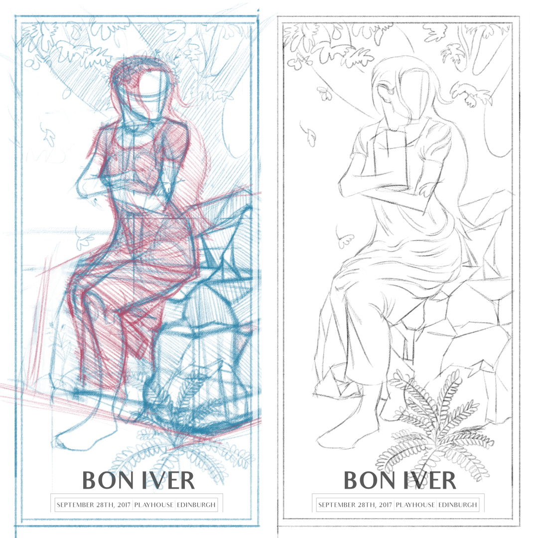
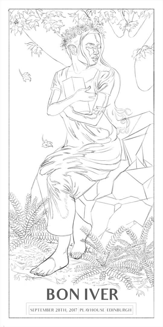
Tried improving upon the design.
Cut back on the plants altough I might add 1 or 2 more and included more of the rock she is sitting on. Started with a cube and tried cutting away at it and adding bits but I think I went over board.
Got rid of the extra bit of her dress and made it conform more to her body and tried making her look less stiff. Gonna work more on it tomorrow night, still need to fix her arms/hands and redo the face.
Hopefully this is an improvement?

Posts: 2,817
Threads: 15
Joined: Jun 2013
Reputation:
109
yea thats a lot better :)
Posts: 483
Threads: 2
Joined: Feb 2017
Reputation:
5
Worked on the poster design some more. Refined the last sketch some more and used a mix of that and the previous sketch to complete a final drawing. It definitely loks alot better than my first attempt (thanks Fedodika for pushing me).
I've played around with the head size as I still thought it looked just a little too big but every change I did made the head look way too small so for now I've left it as the same size as my first redo sketch.

Final Sketch

Final week for my live streaming class so I'll be working on that tomorrow aswell as getting back into study mode with some hand drawings, wanted to work on those 2 things this weekend but I've just been knackered the past 2 days for some reason. Hopefully some rest is all I needed and I can dive back in tomorrow.
Still need to take some photos of work from this week and last week I believe so I'll force myself tomorrow before doing any work so I can post it all.
Posts: 181
Threads: 0
Joined: Oct 2017
Reputation:
41
I think a lot of the reason why the head feels off is actually due to the size of the neck. It's too thick and we shouldn't be seeing so much of it behind the ear. The top of her skull is also missing - if you follow the lines from her forehead to neck, you'll notice you should be seeing some hair above the flower crown.
Posts: 483
Threads: 2
Joined: Feb 2017
Reputation:
5
(07-08-2019, 04:07 PM)chubby_cat Wrote: I think a lot of the reason why the head feels off is actually due to the size of the neck. It's too thick and we shouldn't be seeing so much of it behind the ear. The top of her skull is also missing - if you follow the lines from her forehead to neck, you'll notice you should be seeing some hair above the flower crown.
Thanks for the input chubby_cat :) I've thinned her neck down abit, just need to add more mass to the top of her head now. Hopefully it looks right now.
Posts: 483
Threads: 2
Joined: Feb 2017
Reputation:
5
I was working on the hand bones on Monday and it's taking me alot longer than I thought to finish my studies so didn't get enough time to post in the end, still haven't finished those studies actually........... Gonna finish them next week and post them then.
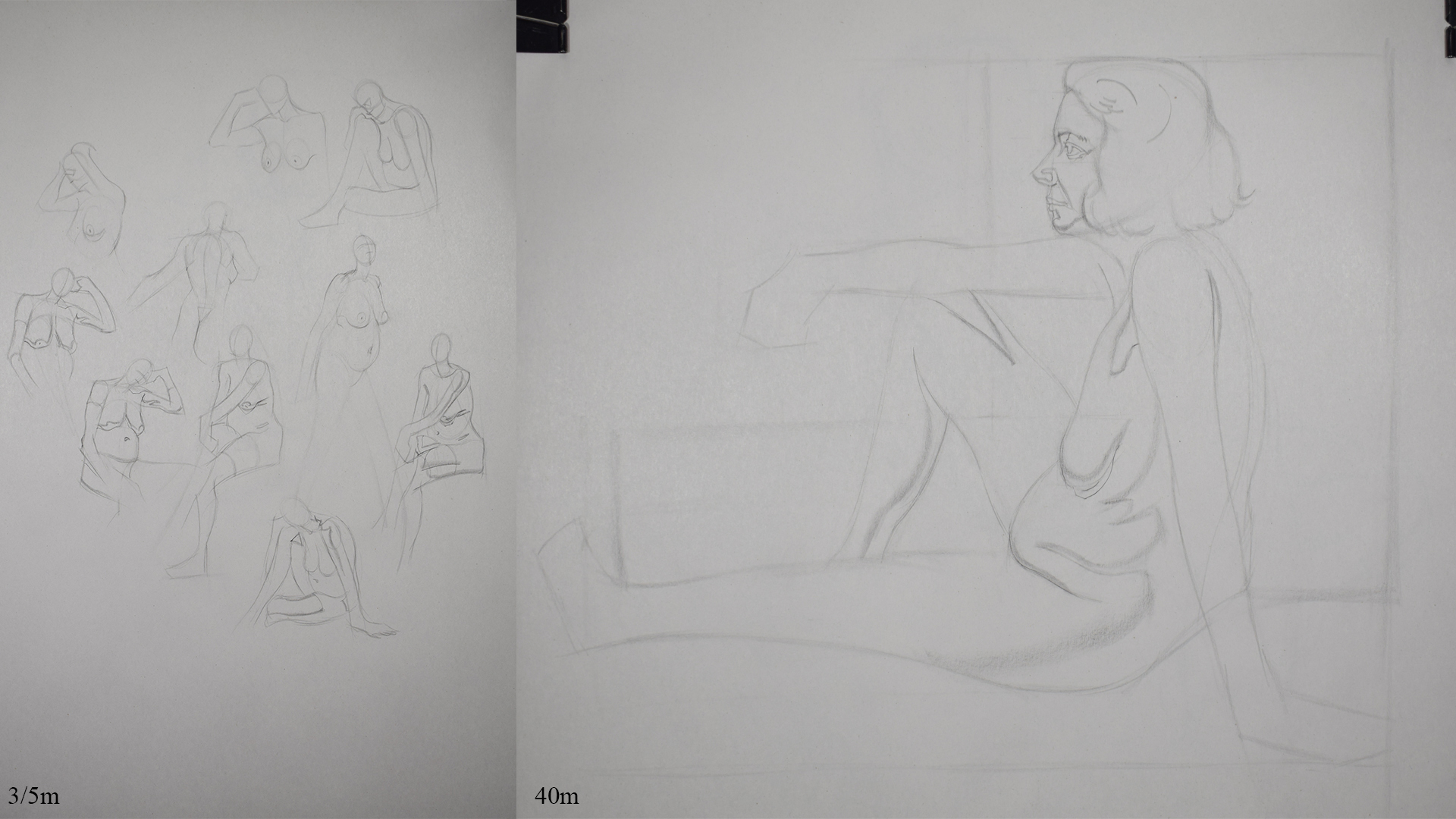
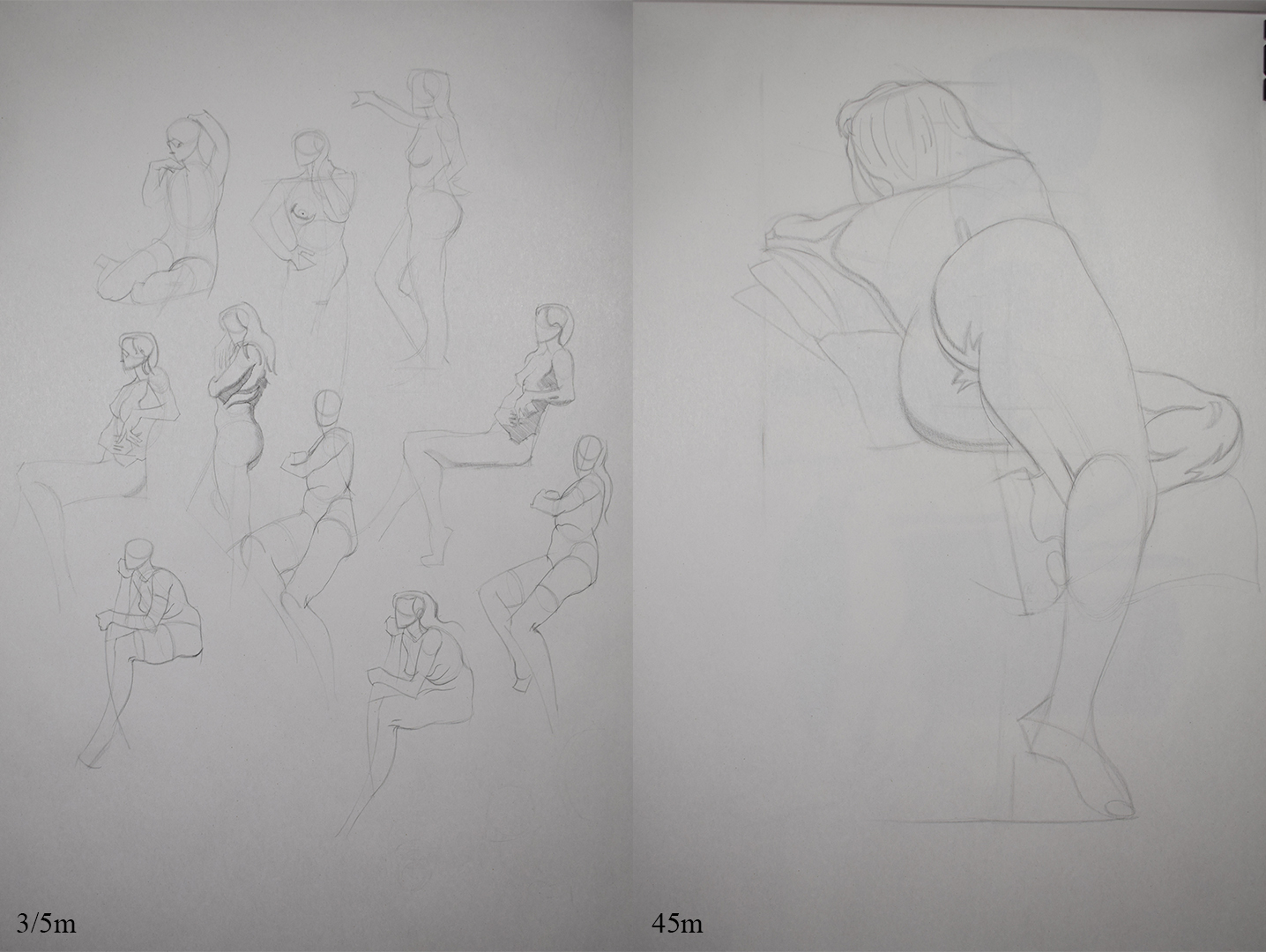
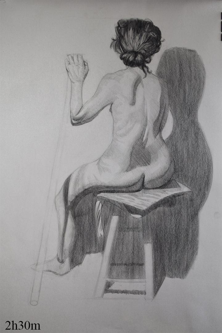
Anyway here's some stuff from my life classes the past couple of weeks.
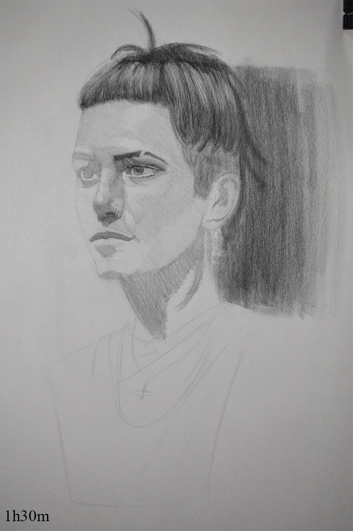
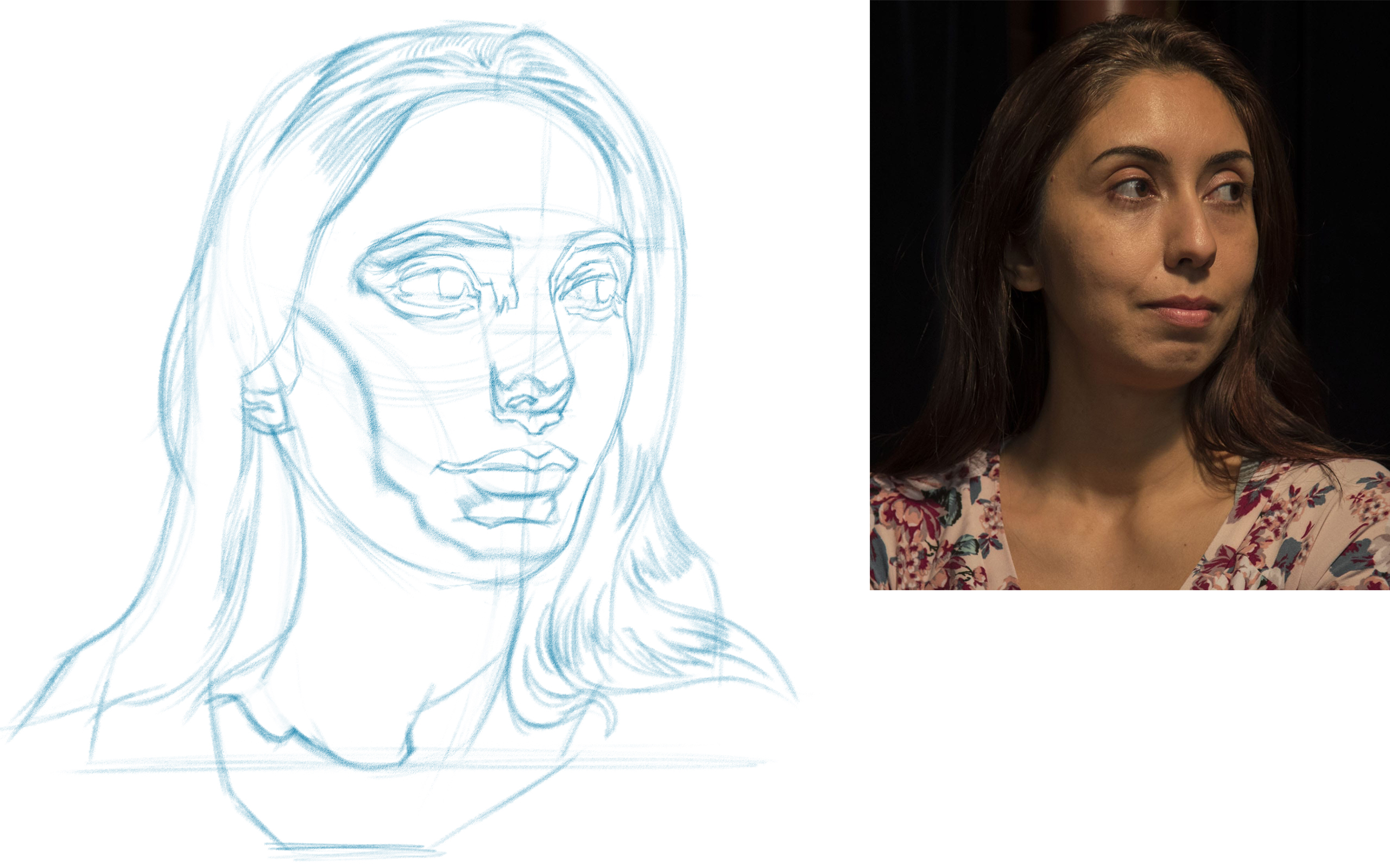
Portrait Class
Still struggle with drawing a head fairly big on the page, I find I get a better likeness/indication on my figure drawings since the head is much smaller than the ones I'm doing here. Once this poster I'm wokring on is finished I want to go back and work on my head construction and start working on some master studies to help with my idealization and shape design.

This portrait is from the Wednesday classes I mentioned. completely dropped the ball on it, again it's my construction that's letting me down here. For the final week I did a monchromatic painting and had a go at drawing with my paintbrush rather than relying on a transfer of my original lay-in. Left the painting in my class to dry so I'll post that this
week.

Life Class
Usual life work, gonna go back to studying anatomy soon so hopefully working on my anatomy knowledge and working on master studies should help take my drawings to the next step.


Quick Sketch
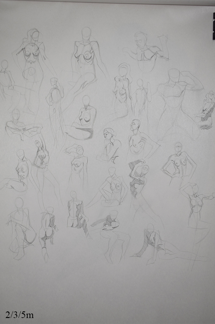
Some quicksketch from photo ref.

Poster

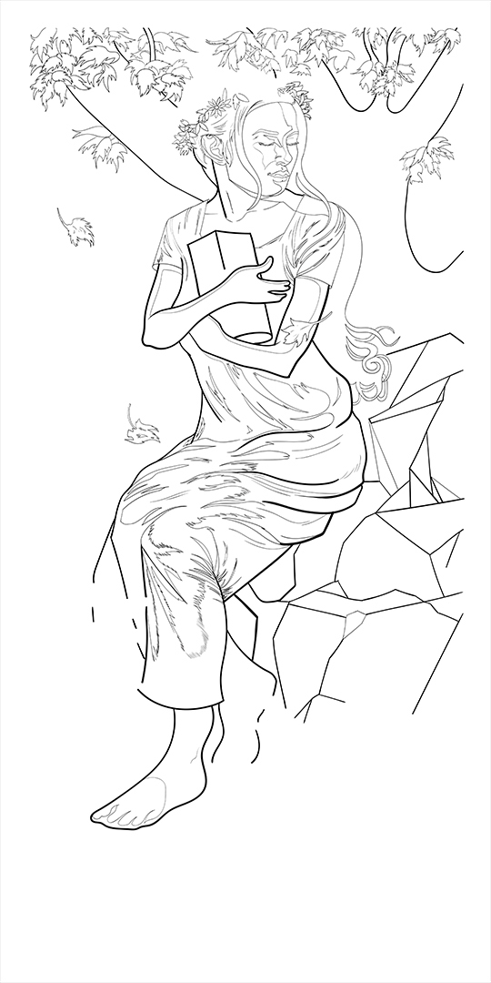
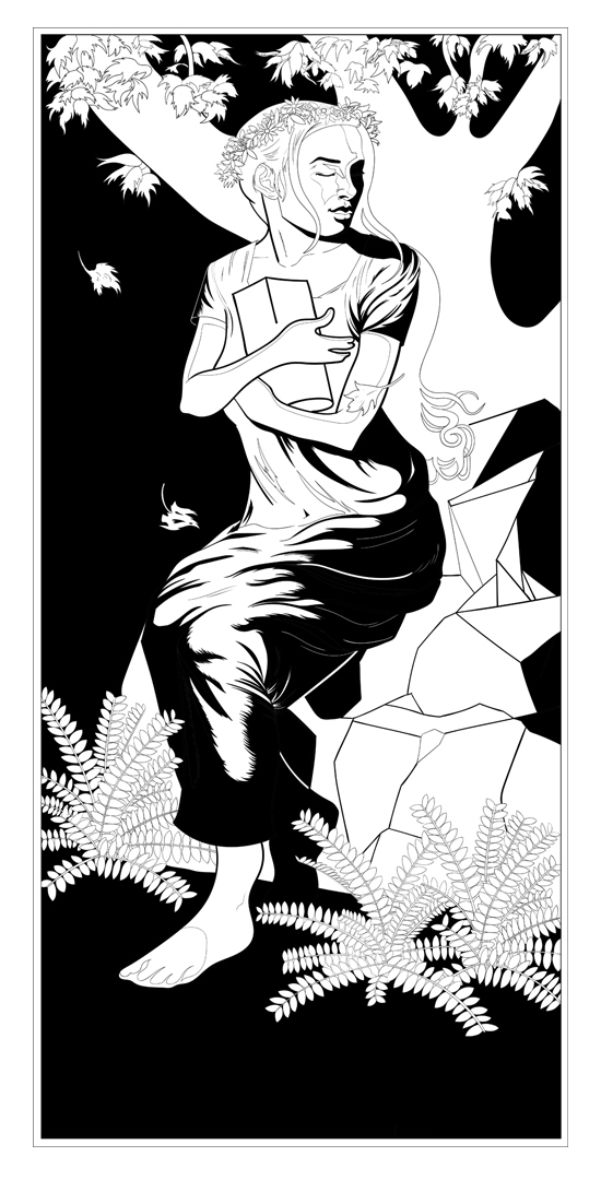
Finally started to ink this damn piece, spent all day on it today working in illustrator and will spend time tomorrow on it and hopefully get the inking stage done. Not sure about all of the lines I've drawn since some are used to indicate shadow, might be a case of just removing some of these lines when it's time to colour as they may end up being unnecessary. Using an artcile about digital screen printing to help me here since this is all new to me.
Posts: 483
Threads: 2
Joined: Feb 2017
Reputation:
5
Just a quick update.
Still chugging away at this damn poster, taking me so much longer than I thought but I've finally finished the linework!
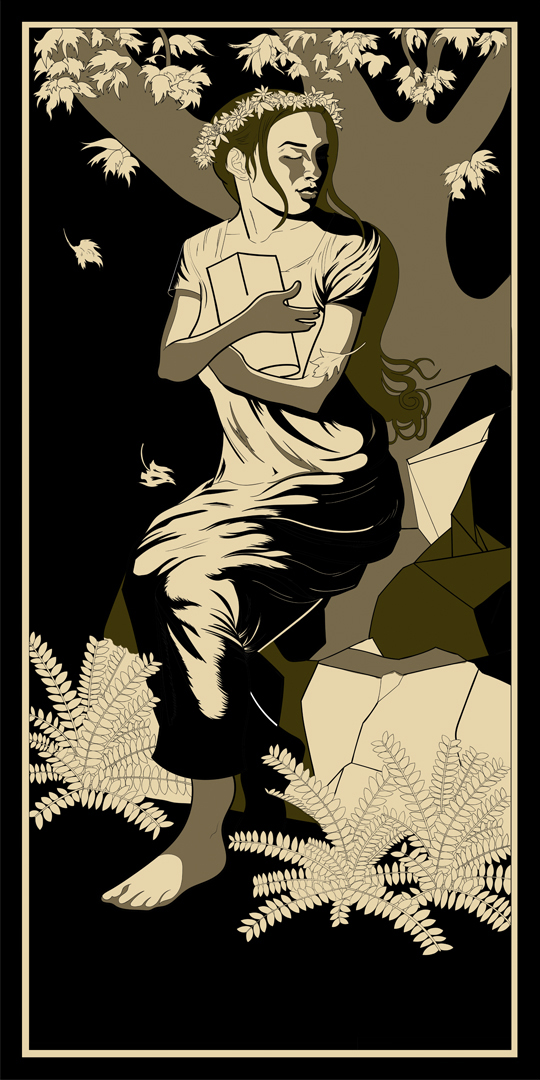
Now I just need to decide on a colour scheme. I've been experimenting with different colours, tried the colours from my original comp but they looked horrible so I'm looking at other posters for inspiration. Once I had my colours selected I wanted to mess around with halftones but I'll see how I get on with time, wanted to get this done by Sunday but I'm out all day Saturday so I might have to abandon the half tones.

Posts: 483
Threads: 2
Joined: Feb 2017
Reputation:
5
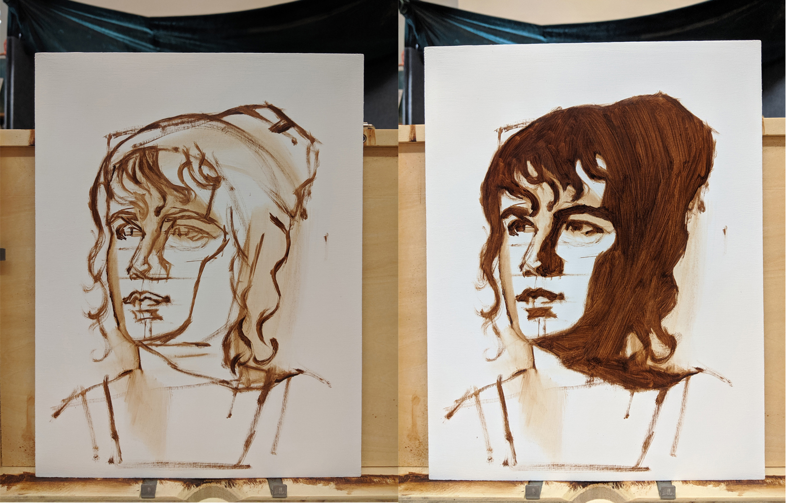
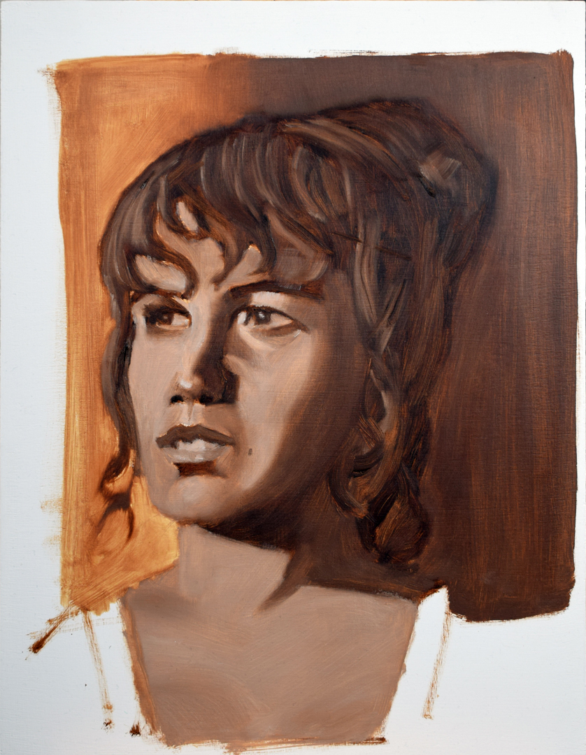
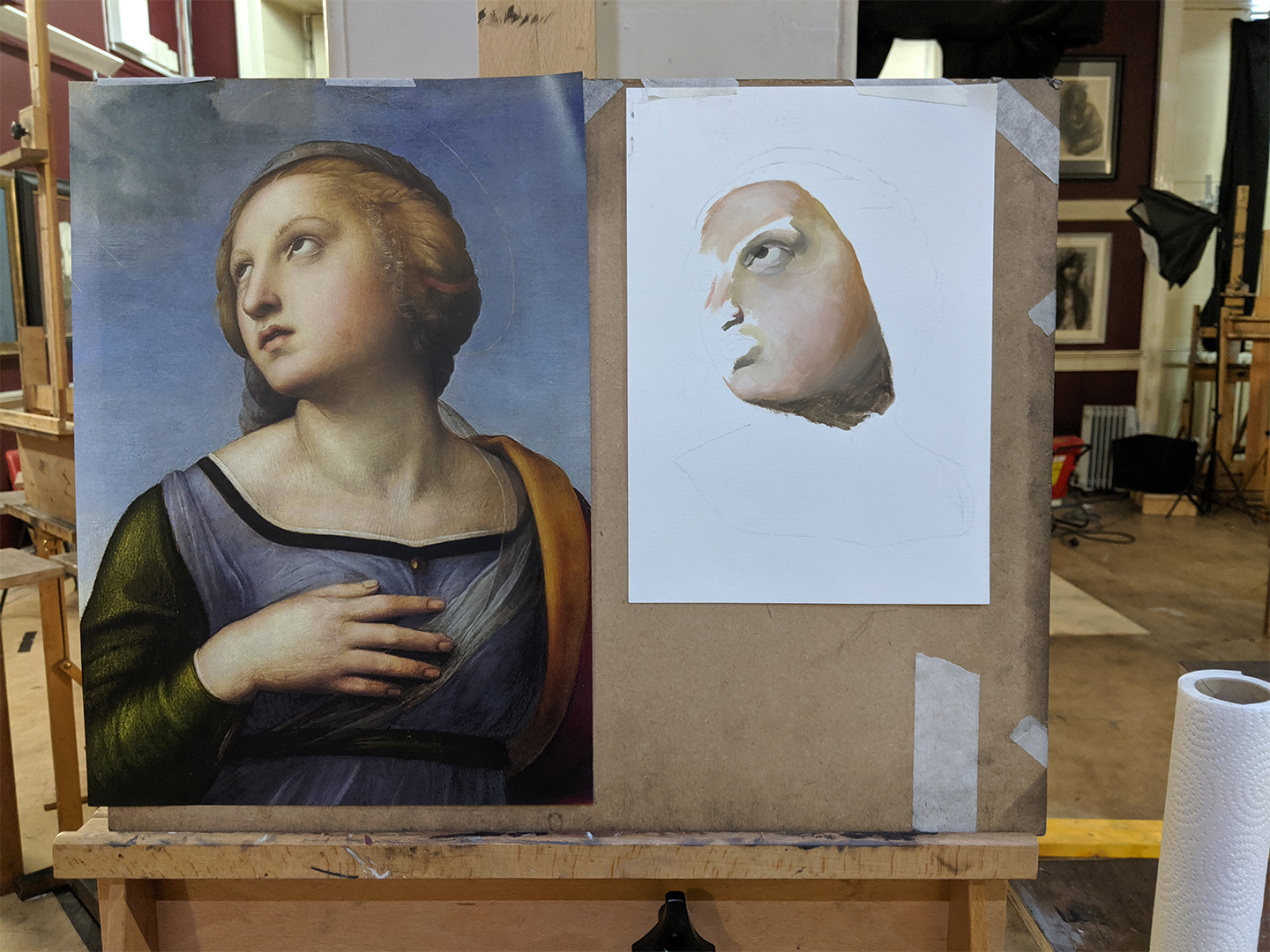
Here's the painting from life that I did last week from the Wednesday classes. Decided not to transfer my lay-in from the first week onto the surface like I did last time and instead decided to do my lay-in with my brush from the live model which was alot harder than I thought. Took me about just over an hour to get my lay-in done and block in my middle value.
Mostly used my bristle brushes for the majority of the painting and just used a sable brush to soften some edges like on the cheek. My original plan was to use phaloe blue with ivory black and titanium white but I wasn't sure how to mix my values. Do I mix the blue and black to make a chromatic black and then mix that with white to get my different values or is the blue by itself one of your values? Gonna ask on the Watts forum and see if someone can explain it to me, anyway went with burnt umber and titanium white.


Poster
I'm officially done with this poster, still haven't finished it, prob around 80% there but I'm just running into so many issues with the colour seperations and Illustrator. Basically I inked it in illustrator, took it into photoshop to colour it and then I tried taking it back into illustrator to fill oclour some areas like the leaves since it would be much quicker but it's not working for me. Been watching a video to help me with it and tried following along with it but what he did in the video was not working for me at all even though we did the exact same things.

I'm going to go back to studying this week since it's been about a month and do some reading up (or watch some videos) on how to use illustrator for what I want to do and next time I try something i'll do something small scale like only doing a screen printed head and build up from there.
Posts: 483
Threads: 2
Joined: Feb 2017
Reputation:
5
Haven't got time tonight to take photos of my traditional stuff, gonna post that on Wednesday.
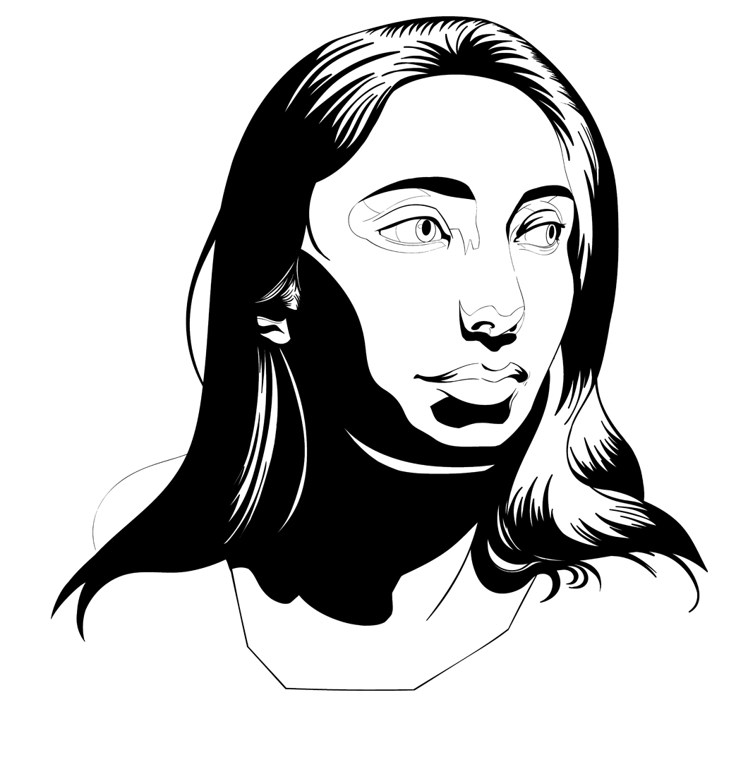
I'm still pissed at not finishing my poster due to all the complications I had and wanted to try again but rather than doing something rather big I'd do a smaller piece to try and wrap my head around illustrator so i thought trying to do a screen print of a portrait from ref would be a good idea as it wouldn't be as time consuming.
like last time I drew my image in photoshop first and then took it into illustrator to ink. Again I've been following along with a video on youtube and that's where I've fucked up. I've been filling in my black areas while doing the inking as that is what the guy in the vid did but wasn't aware that that isn't creating a fill so to speak, it's still individual strokes eith paths etc and I think due to the amount of strokes I can't convert my image to fill shapes (illustrator either freezes or takes a shit ton of time when trying). So basically I should of inked the outlines and afterwards used the fill tool...I fucking hate illustrator.
I could start inking again but another tutorial I'm referencing is using photoshop for the entire process (with the intention to screen print) so I think rather than starting over I'll just continue it all in photoshop. I'm gonna get in touch with some poster artists I like and see if they can hopefully point me in the right direction for learning to screen print digitally.
Sketch

Inking which I've rasterized in photoshop

Posts: 483
Threads: 2
Joined: Feb 2017
Reputation:
5
Had to take care of some things on Wednesday so didn't get the time to post, really gotta stop saying i'm going to post on a certain day and never do...
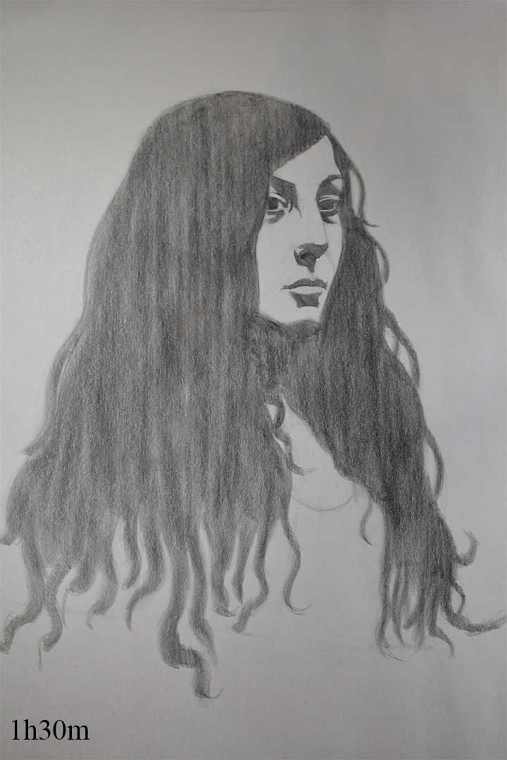
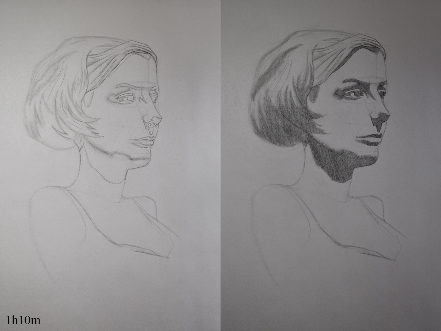
Portrait Class
Portrait from life last week. It looked ok in the lay-in stage but once I added tone it looked kinda Blair witchey, definitely went too dark on my middle value and my shape design needs alot of work.

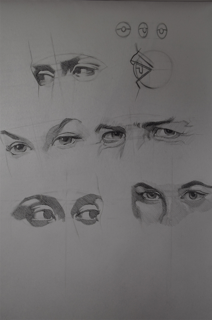
This is from this week. I did some master studies of eyes and did a general refresher on eyes aswell which I believe shows.

Life Class
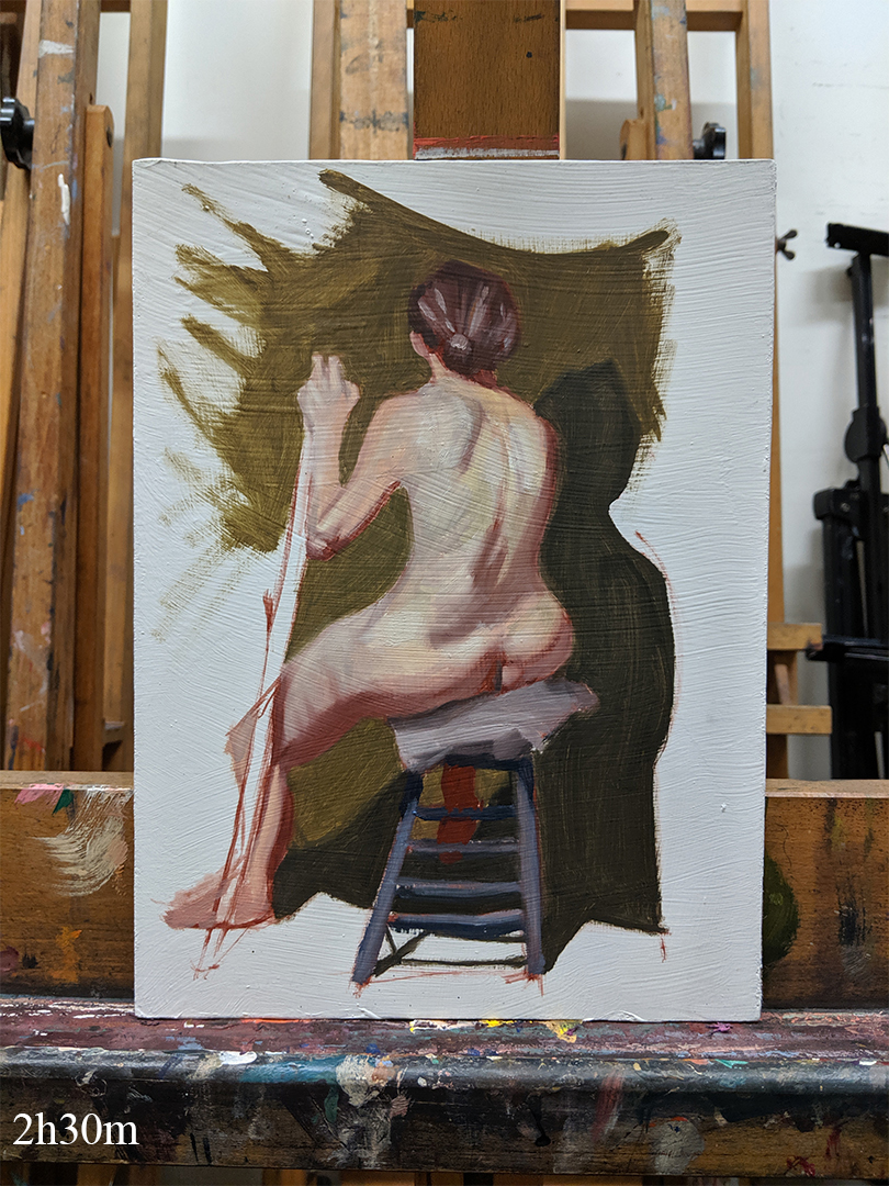
Drawing is from the first week of the 3 week sessions. Can't make it this Wednesday so mixed it up and completed a finished drawing in the 1st week and a painting in the 2nd using the zorn pallette which went better than I thought although I got the wrong colour for the shadow on her back.


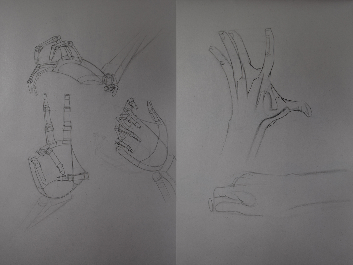
Hand Studies
Some simplification of the hand bones and some hand drawings from Proko.

Master Studies
Some master studies of eyes, the top of the page are some studies from Brian Knox and the middle 3 are studies of Norman Rockwell and Gil Elvgren. Bottom left is my attempt at drawing eyes from ref trying to incorporate what I was studying. For the time being i'm gonna do my master studies like this and just focus on individual aspects of figure drawing (e.g. studies of features, studiues of just arms and legs and so on) as I can get alot more done rather than focusing on one long master study.

Anatomy
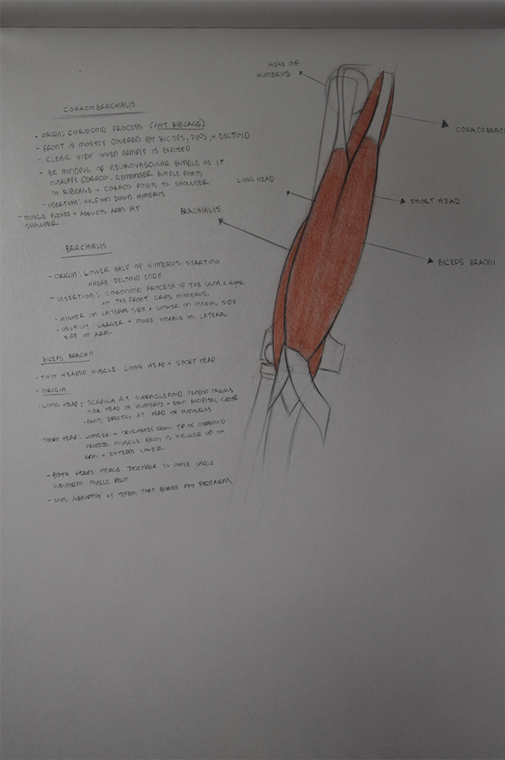
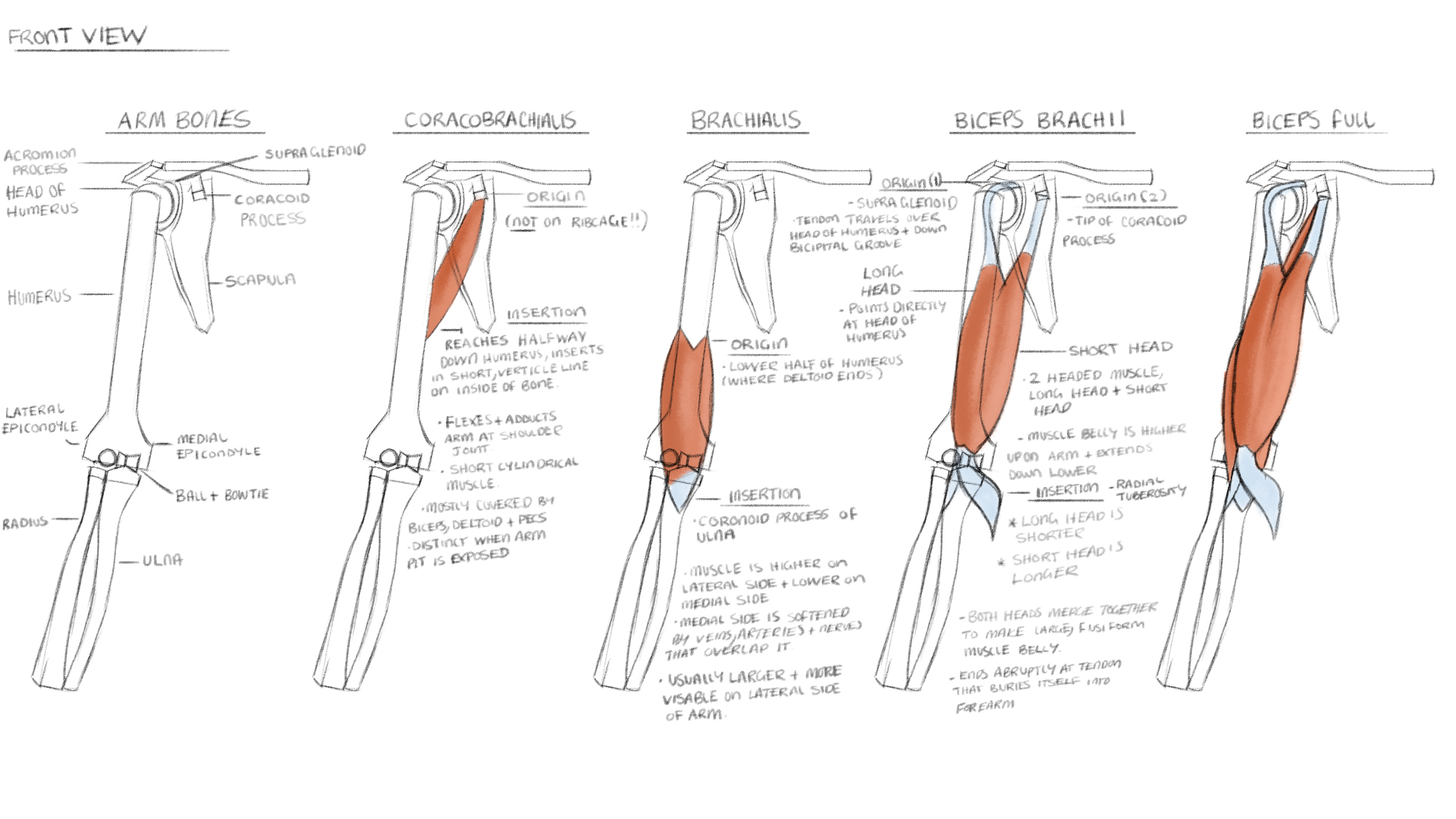
Focusing on arm anatomy atm as I'm not really good with it. Started tradionally but switched to digital since it works alot better for me as I can do break downs of each muscles quicker.


I go away this Wednesday up to Edinburgh for the short courses at their atelier. Most likely will not get time to post before then so I'll be gone from the forums for just under 2 weeks.
Going to take lots of photos and notes while I'm their so I might see if I cna post daily like a blog or something or just wait till I get home as I'm noit sure if I'll have the time or not, we'll see.
I plan on taking my sketchbook so I can continue with anatomy studies in the evening, hopefully I have the time to squeeze it in.
See you all in 2 weeks!
Posts: 849
Threads: 6
Joined: May 2018
Reputation:
116
I've heard good things about the Atelier in Edinburgh! Good luck! Hope to hear about it.
Posts: 483
Threads: 2
Joined: Feb 2017
Reputation:
5
(08-04-2019, 04:27 PM)JosephCow Wrote: I've heard good things about the Atelier in Edinburgh! Good luck! Hope to hear about it.
If you have any questions feel free to pm me as I can go onto more detail. :)
Posts: 483
Threads: 2
Joined: Feb 2017
Reputation:
5
So yh...daily updates did not happen. I was staying with family while I was there so my everyday scehdule was coming home from class, entertaining my little cousins, tea and then pretty much sleep, same with the first weekend I was there except I didn't have classes and I was looking after my cousins so any free time I had I was far too tired. I was hoping to continue with anatomy or read some art books which did not happen. :(
I was planning on posting earlier but I came back with a cold and have been pretty much bed bound since Monday, still not 100% but I'd like to atleast get some work done tomorrow.
Anyway I took lots of notes and pictures but I'll just post the main things. Thinking of compiling all of my notes and pictures and do a step by step guide of what I did so I'll have something to refer back to.
Colour Mixing
First short course was a 2 day colour mixing course which was different than I thought it would be. I thought there might of been more theory involved but there wasn't a whole lot apart from the instructor quickly discussing some colour properties.
Day 1
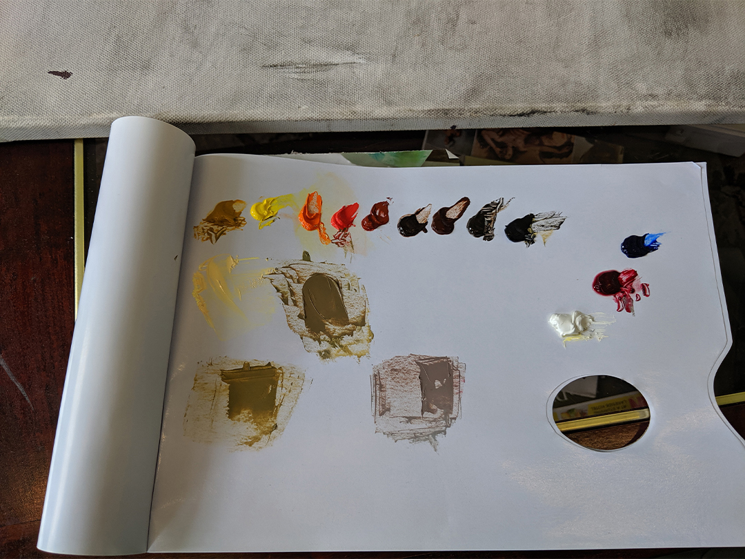
Each day normally started with them discussing the days plan/art discussion for the first 30-45 mins. The first morning they went over their palete and how they lay it out. Colours are as followed:

.Y Ochre
.Cad Y Light
.Cad Orange
.Cad Red Light
.Venitian Red
.Burnt Umber
.Red Umber
.Raw Umber
.Ivory Black
.Titanium White
.Alizarin Crimson
.Ultramarine Blue
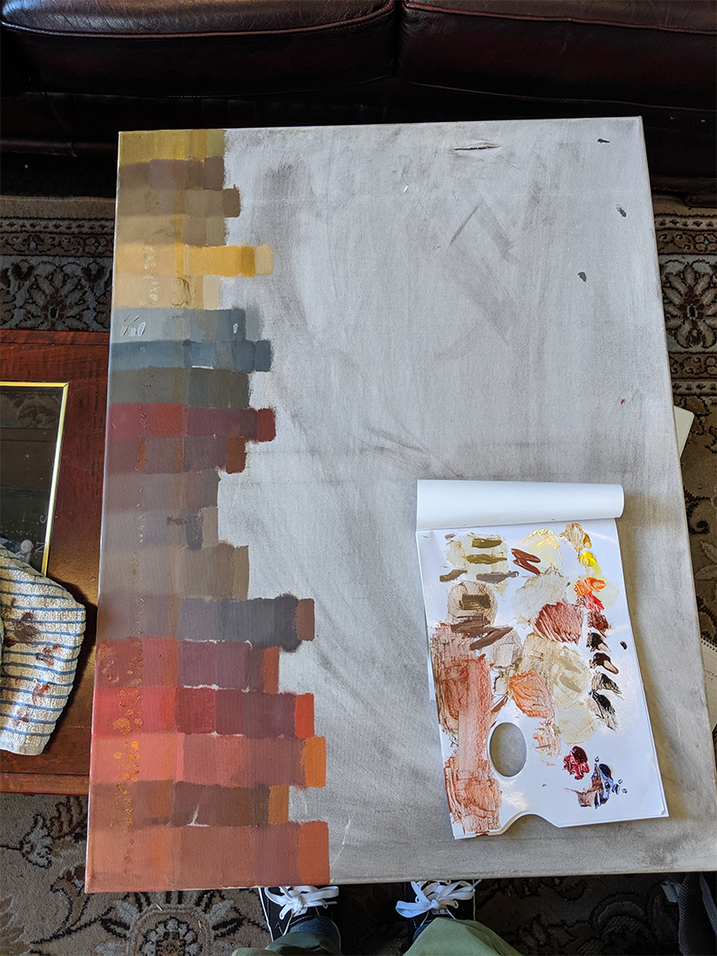
After that they showed me their process of colour matching/mixing using a caravaggio piece (I believe) which I then attempted myself as they wanted a rough idea of how good I was at it. For the rest of the day I worked on a big canvas with different colour swatches which I then had to match myself as best as I could. The swatches on the edge are the originals and every vertcle swatch is a different students attempt with mine being the very last ones. Usually they would come round every so often to see how I was doing. If I was having any difficulties they would sit down with me and explain abit more or give me a hint.

Day 2
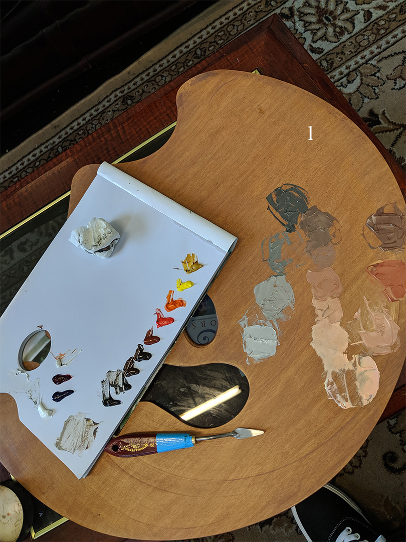
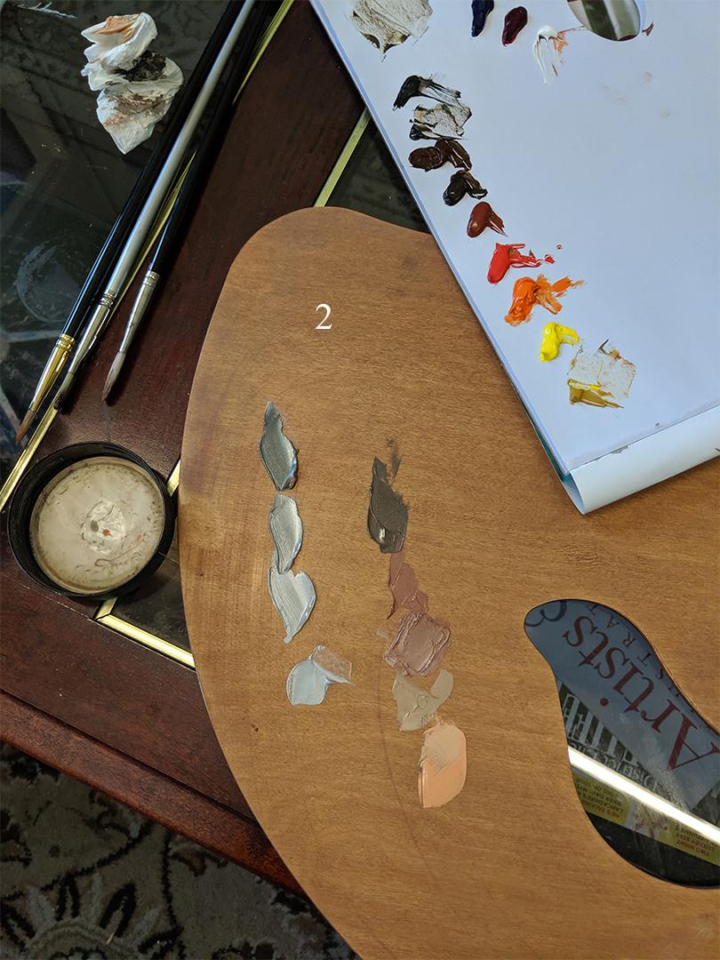
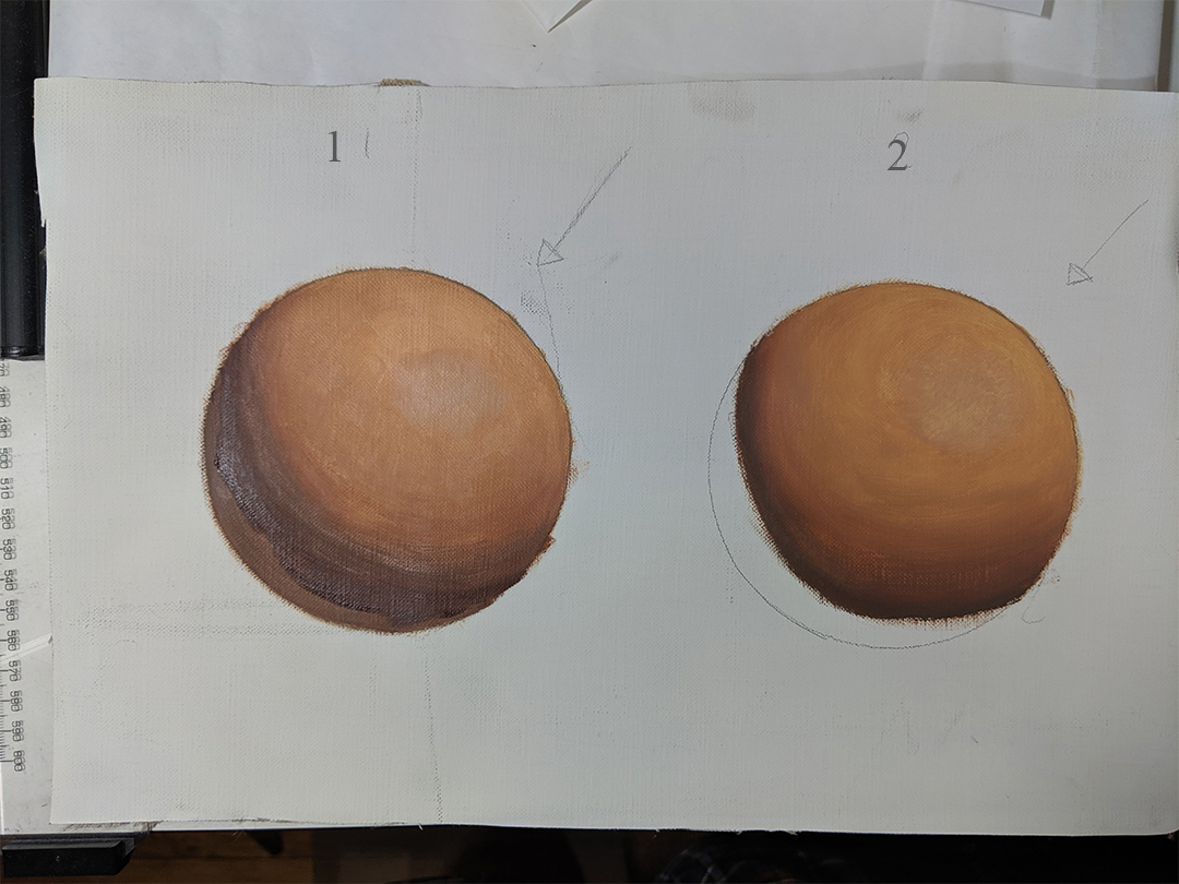
They showed me how they mix their flesh tones. They mixed 4 flesh tones going from light to dark and then created corresponding grey values, with the 2 being mixed together to create a line of tone inbetween the 2 which would be my flesh tones for creating a flesh ball. The same was done again but this time using a warm cool palette.
Normal flesh tones = 1
Warm/Cool flesh tones = 2


They went over the properties of light and how it affects the form etc and ym task was to create a flesh sphere ending at the terminator line as they said the shadow colours would be different depending on the surface the sphere was on but they didn't go into more detail.

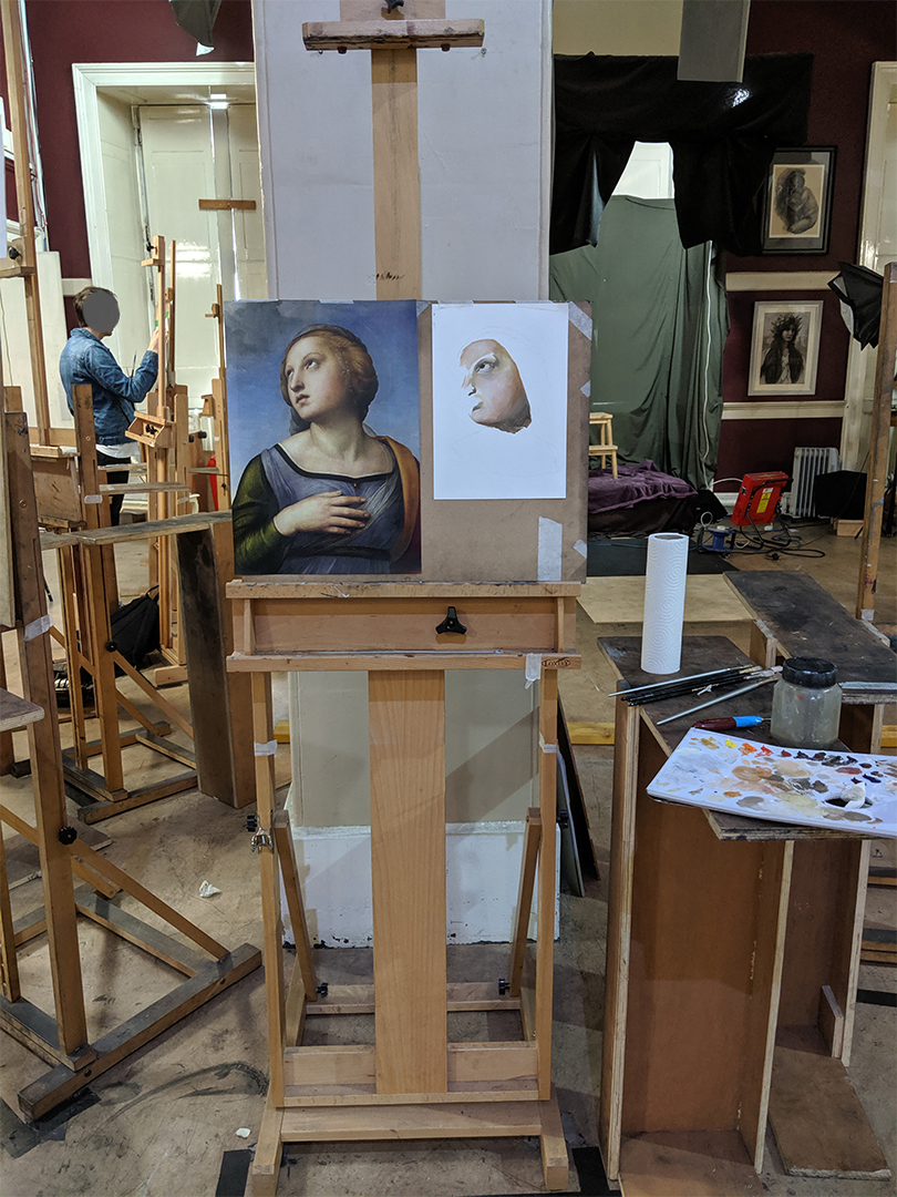
In the afternoon I was working on a master study trying to match the colours as best I could and they would come round and check up on me every so often and again give suggestions or help if needed.


|


