03-13-2021, 04:24 AM
Looking good! Composition is very dynamic, feel like a scene straight out of a movie. Hope to see more progress!
|
Zorrentos Sketchbook
|
|
03-13-2021, 04:24 AM
Looking good! Composition is very dynamic, feel like a scene straight out of a movie. Hope to see more progress!
03-26-2021, 12:08 AM
Hey guys! It's been a while since I've updated this sketchbook. I have a lot of stuff in the works, so I will be dropping it little-by-little over the near future.
So what have I been up to? Well, I am really happy to say that I got a job! Starting early in April, I will once again be working as a game artist for the company IGT in Växjö. Of course, I will still be visiting and updating this forum and my sketchbook! I am really motivated to continue to study, learn and get better! I hope that you all continue to join me on this journey as we try to improve our art more and more! Here is a piece that I'm close to calling finished. I want to post it this weekend, so please share any feedback and such on what I can improve and change before that: 
03-26-2021, 12:58 AM
A couple of more pieces that I'm also hoping to post this weekend. Crits very much wanted!
03-26-2021, 06:29 AM
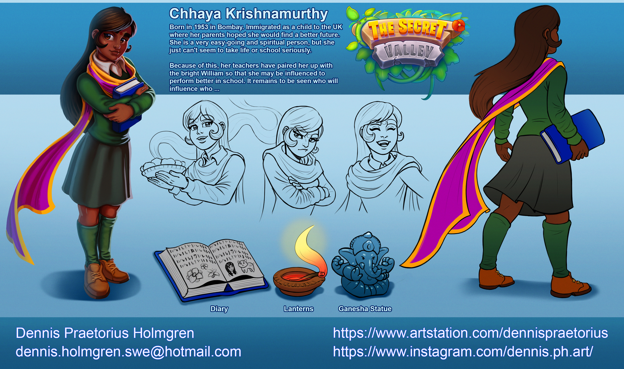
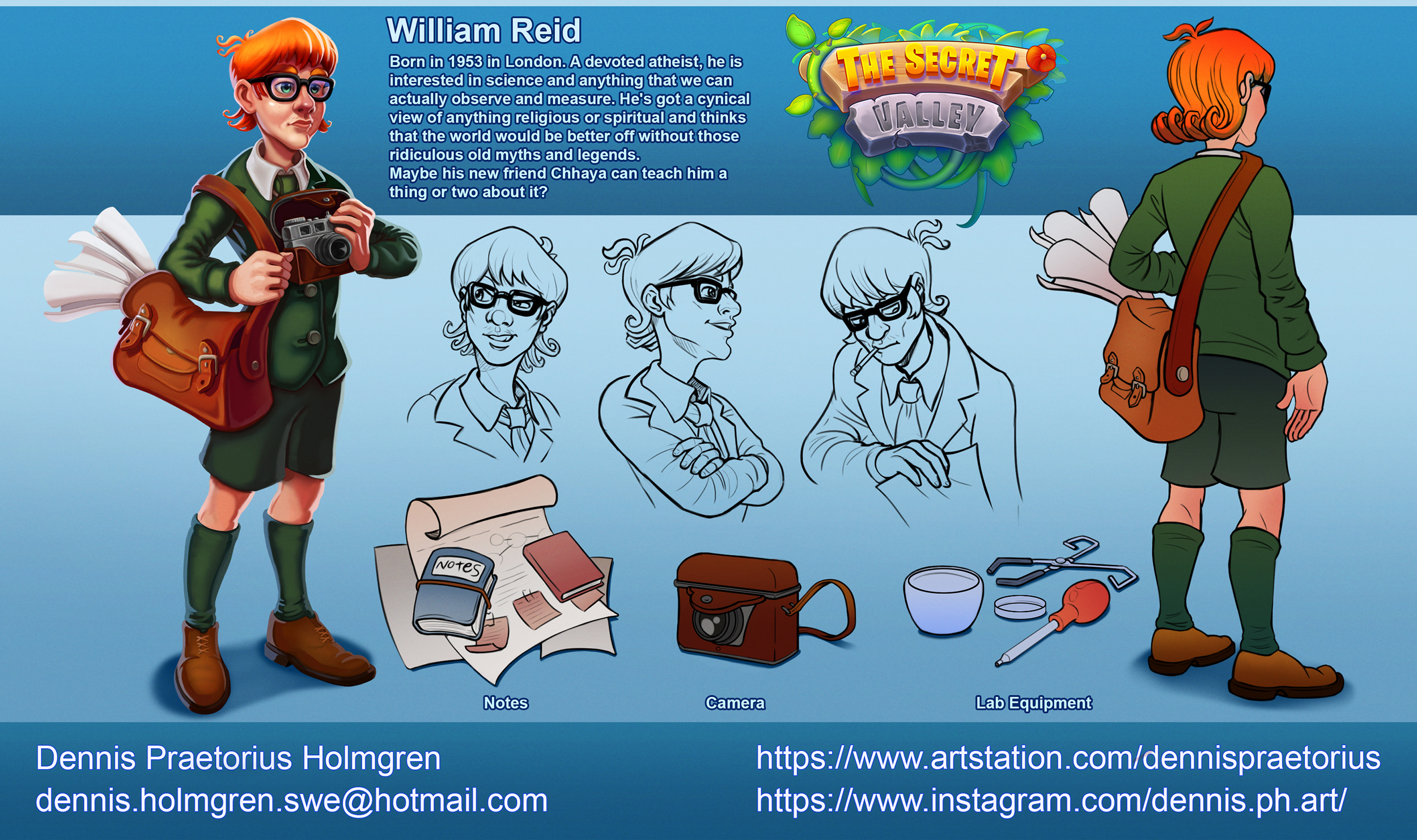
Hi Zorrentos personally if i had any comment it probably about the lettering in the secret valley piece i don't know exactly how big it really going to be but i think people shouldn't have to click on a image to read anything but that my personal opinion.I find the descriptive to small but kinda i feel like you had reason here since there so much stuff on the page.But i than read that this a personal project so you can do pretty much whatever you want which for me would probably mean splitting up some element and grouping some for example i would take the 2 big character and put them as a turn around with the text and the props would be on there own as well as the expression sheet.I would probably also move the logo more toward the extreme left if in every piece since i think it as alot of important to let the viewer know about what the name of the project.
One other advise i might have is don't over use rim light choose where you want the attention to be let place for the eye to rest that what create flow toward your focal point.
03-26-2021, 11:15 AM
So the rim light looks a bit out of place in the military scene as one , where is it coming from ? And two, it's only on the characters and not the rocks on the ground near them . I think machine gun fire can cause some orangey rimlight unless that's something I'm making up due to videogames ? So if you draw some of that happening in the mid ground then you can also get some coloured lighting going for extra visual interest. If it looks better with the rim light just on those characters then fair enough
Also it seems like they're in a sandy , dusty place so you could make parts of the smog be more yellow and heavier to create a sense of depth and add colour variation. And I second what hristov said about edge control , although I'd add that if you have time you could also vary the edges within each main character too. Last thing to add would be more colour hue variation (and possibly saturation and value variation as well )within each "element". Take the background wall in the right. Leaving out texture , it's all the same base colour. Some very subtle colour gradient manually painted in on a diagonal helps make it seem less "digital " . Same could also apply to the characters , the foreground wall, the ground , the rocks etc. I think this is less important for character art though. I do tend to do more painterly stuff though so some of this might not be revelant for the style you're going for. It's a great piece , very dynamic with the sense that there's a lot of stuff going on around them. And congrats on the job!
03-29-2021, 03:15 PM
Thanks a lot for the input guys! I uploaded the finished works to my artstation if you want to see them.
So today I'm having a big moving day to Växjö. I'm also going away to visit family for a few days before my new job starts, so it's gonna be a while until I post here again. I thought I'd make a small update before I go off-grid for a while. Here are some W.I.P designs for my personal project and some studies. I'm hoping to return here again soon and keep the momentum going! I really credit CD and its community for helping me to push my skills and secure this job! 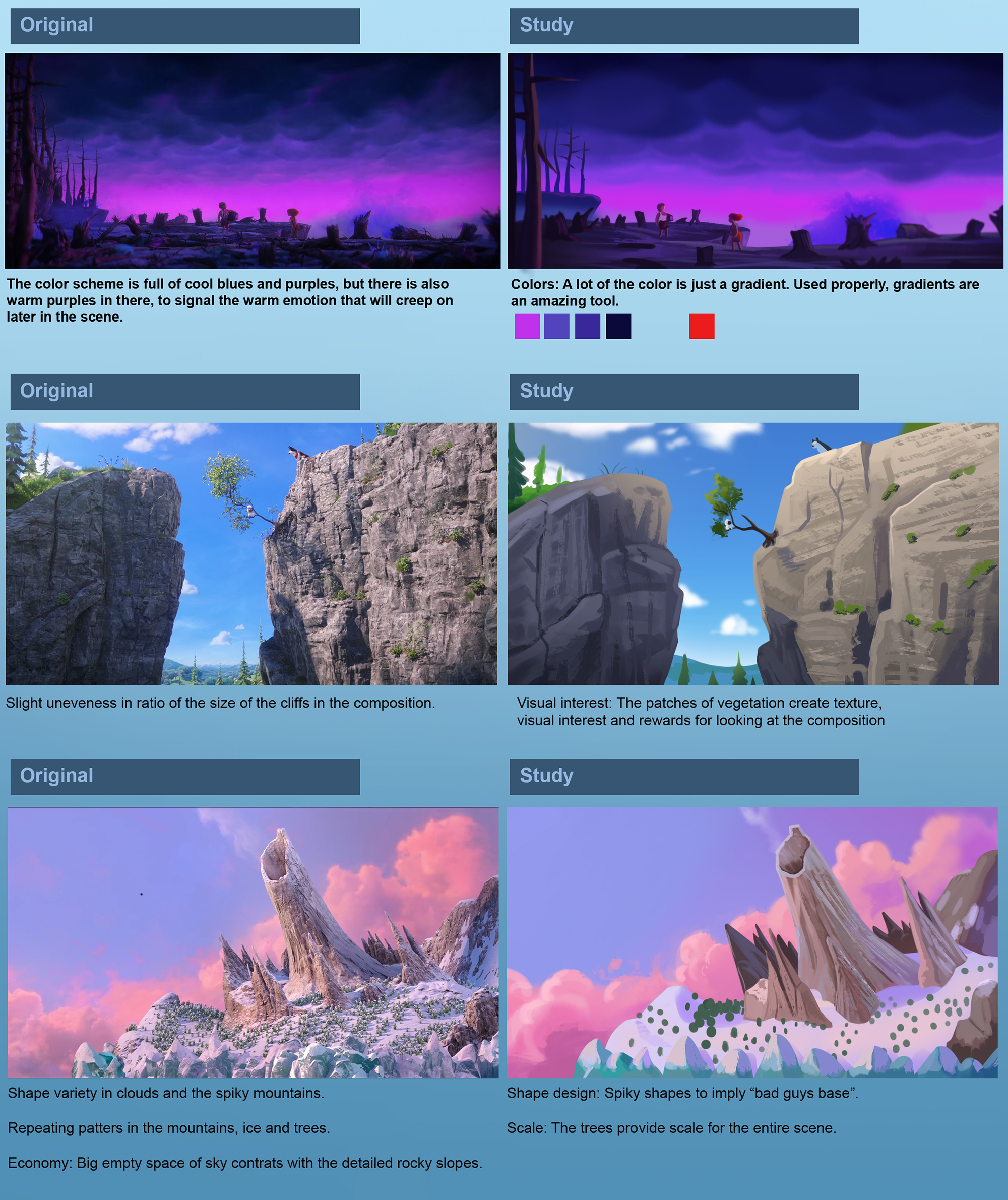 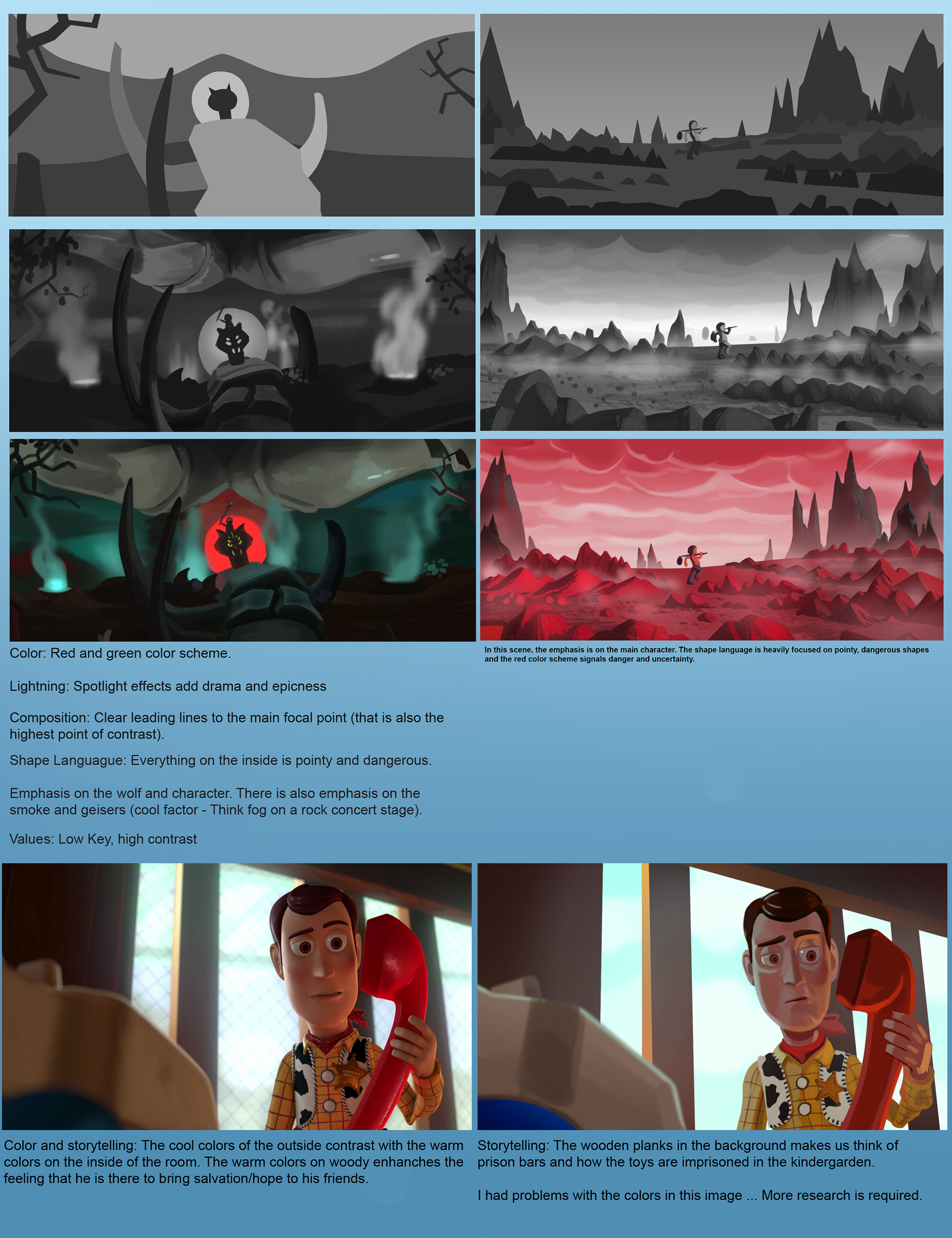 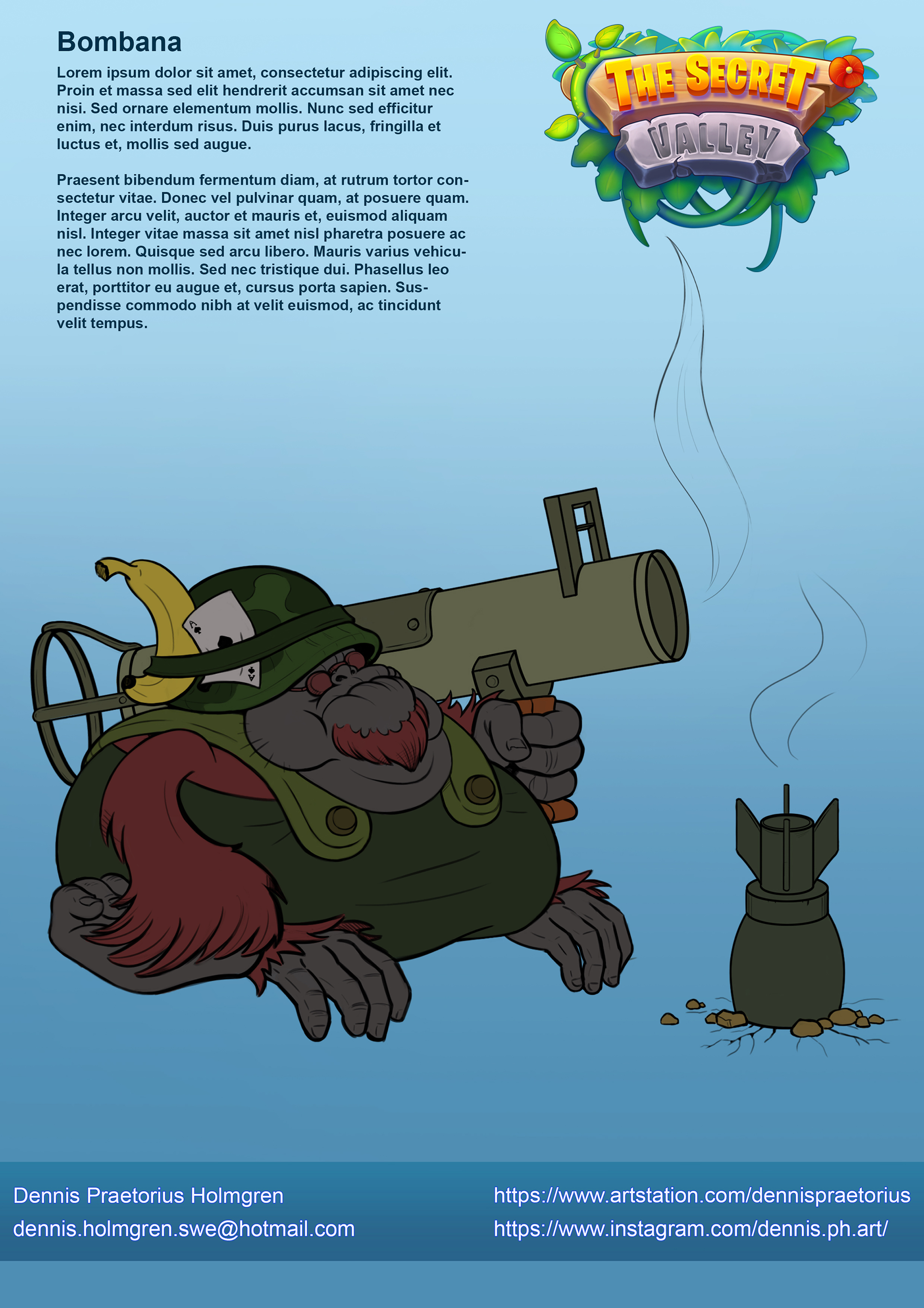 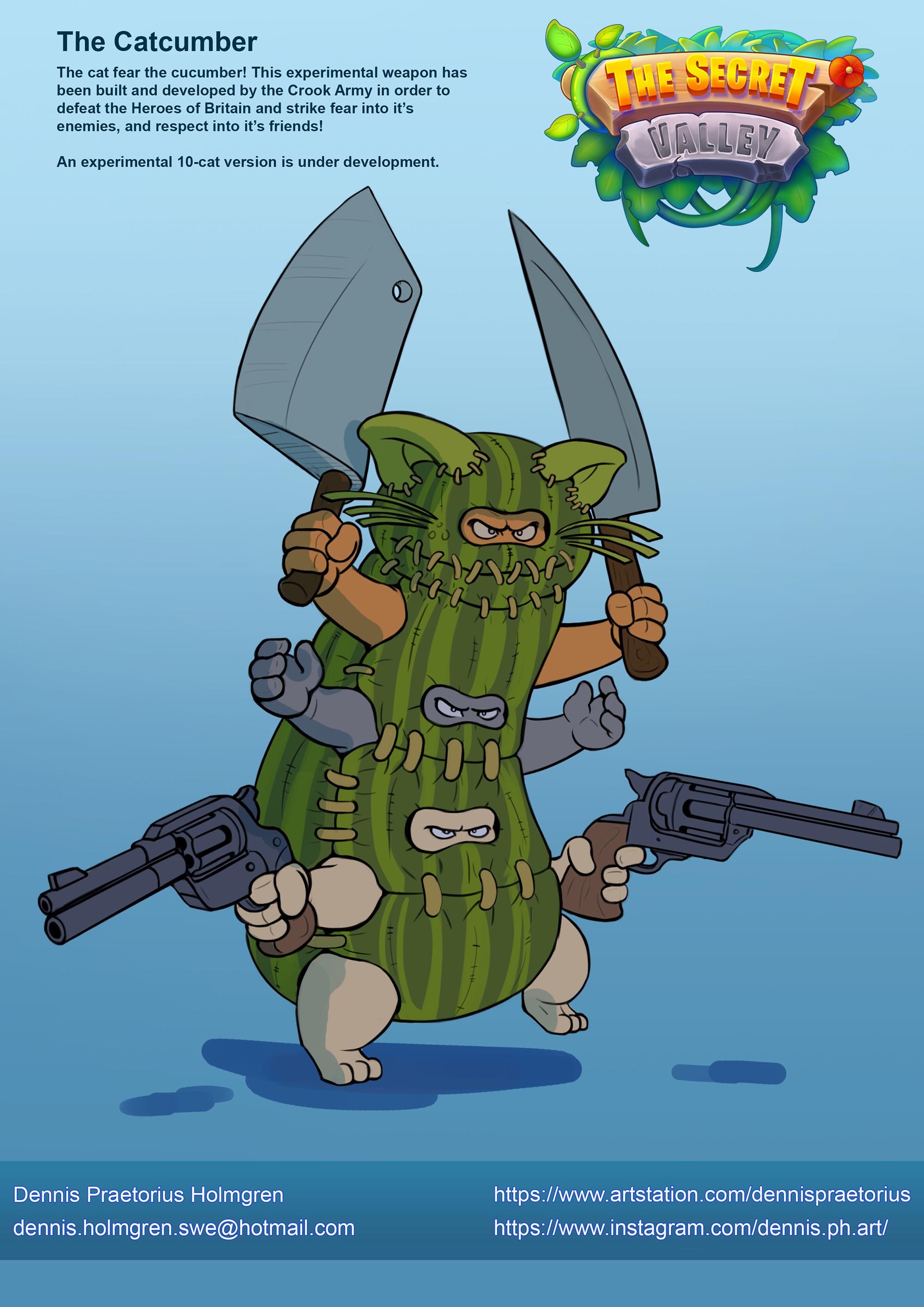 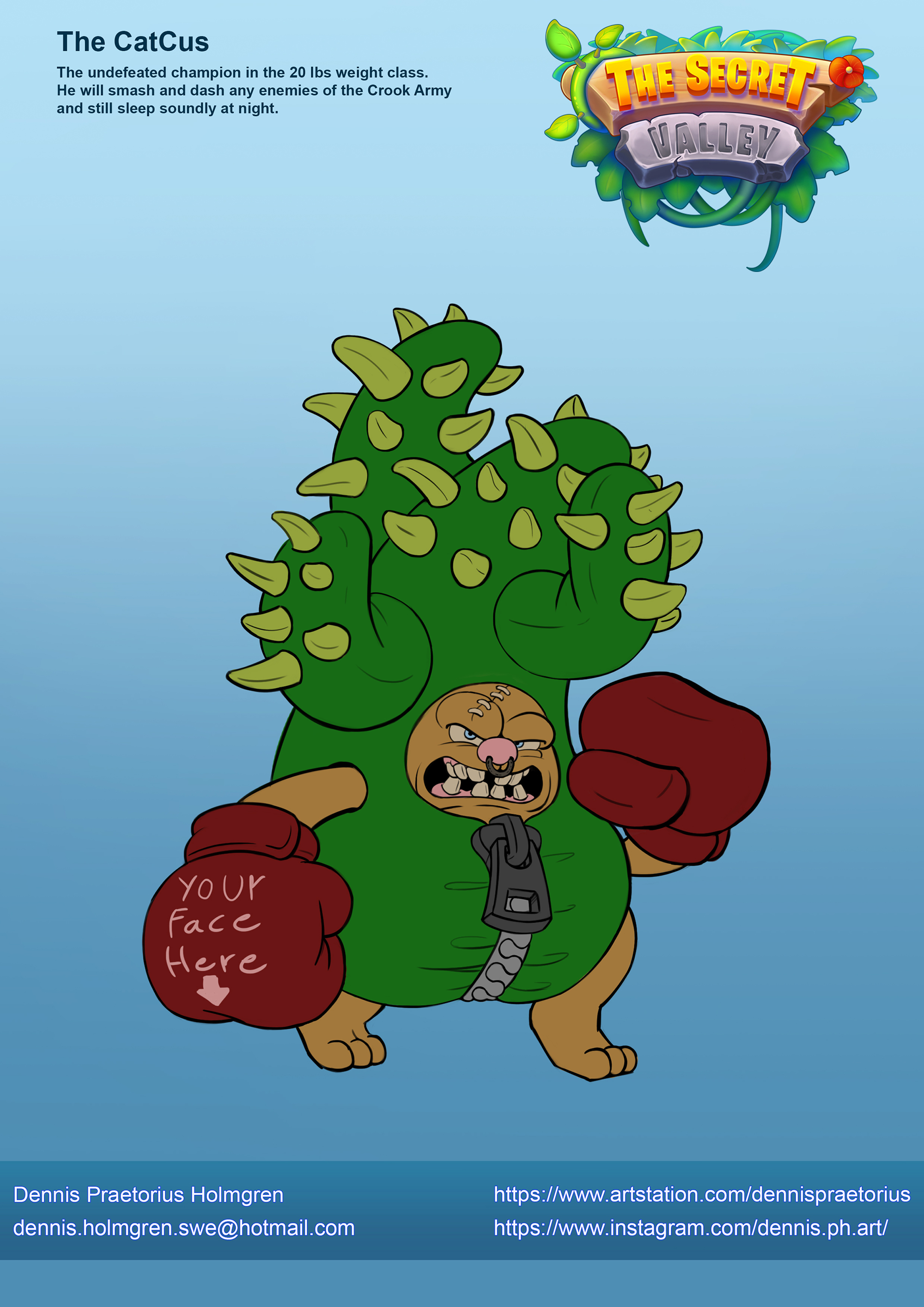 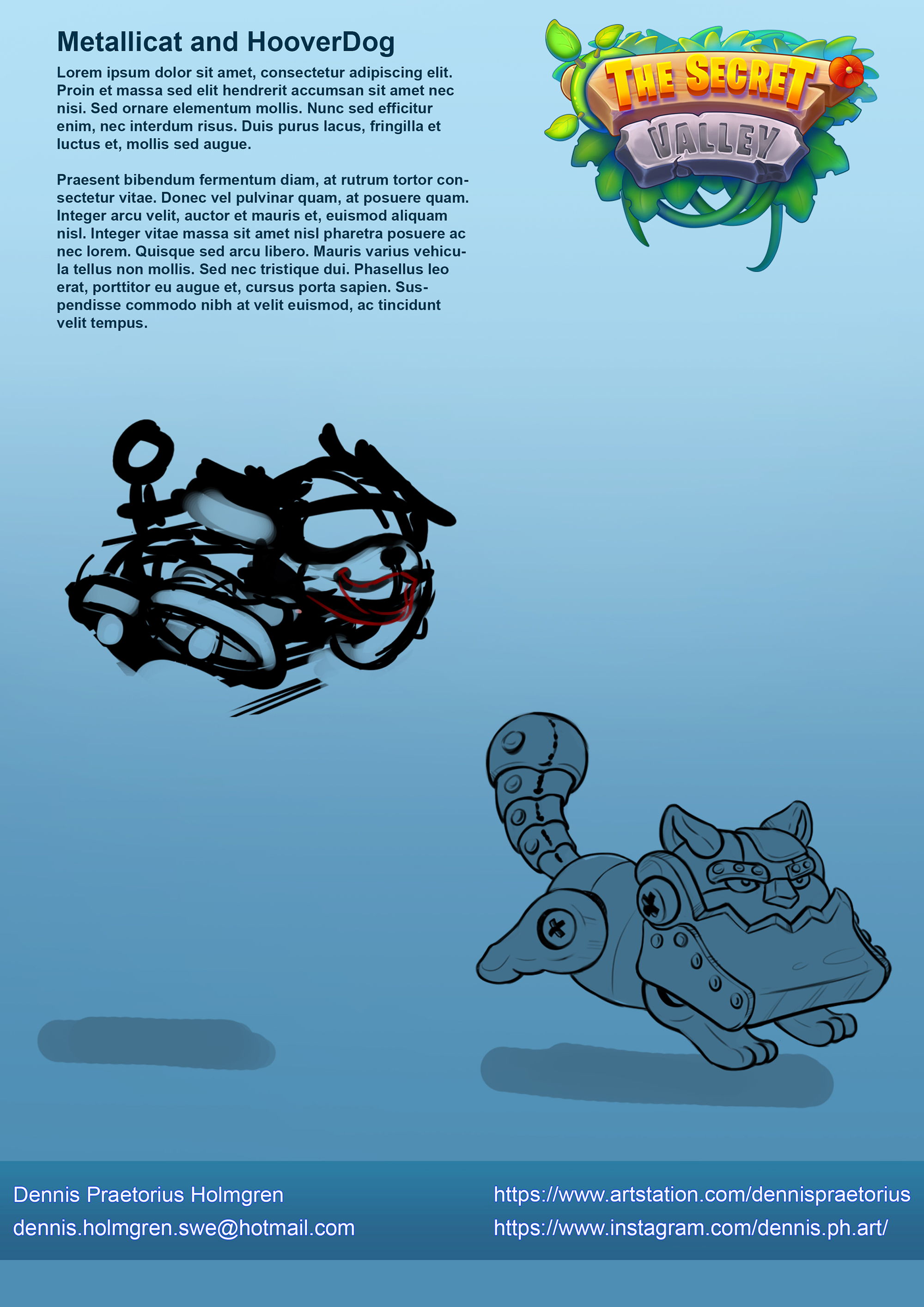
04-01-2021, 06:20 PM
man as always your analyses under your studies are really well thought ! now i wanna see you applying them into tons of illustration/ designs/ whatever from mind !
04-16-2021, 03:01 AM
Hi, It's been ages since I stopped by the forum — sidetracked by too many other things. Anywho — thanks for your suggestion about my image.
Loving your new 'cat' designs — clever stuff! Keep 'em coming!
04-16-2021, 04:26 AM
Kul med en svensk!
How long have you been working in the industry? Looking good!
04-16-2021, 05:10 PM
I love your character designs for the Secret Valley project!
08-14-2021, 06:33 PM
Your character designs have alotta personality and it looks like you really enjoy what you do. I love the character sheets you did for Chhaya and William by the way.
08-15-2021, 06:18 AM
Hey there Zorrentos! Dig the style and I really like your studies. :) Looking forward to more!
08-30-2021, 01:28 AM
Hey guys! Thank you so much for your kind words! I really appreciate each and every single one of you who have taken the time to visit my sketchbook.
@ wld.89 Thanks! I'm happy you like the way I study. I'm definitely trying to apply them to the best of my abilities. @ Jephyr Thanks for visiting! @ Bark Tack så mycket! I studied at The Game Assembly from 2017 - 2020 and since then I've worked in the industry. @ Olooriel Thanks for the kind words! @ Tank Rat Thanks a lot! Happy you like them! @ Midnight Rambler Thanks for dropping by! It's been a while, and the time has come for me to begin posting and updating my sketchbook here again. I'm a bit ashamed that I took such a long break from updating, but sometimes life just becomes way too busy to keep up with all the social media. Also, this summer I actually took some time to just live and go on adventures. In my opinion, it's important to take a bit of time to actually experience and enjoy life as well. So what have I been up to? As you may remember, I started a new job at IGT last April and begun working on creating art and graphics for Casino Games. I moved away from Malmö to Växjö, and after that, I have just been really busy working in the studio and learning stuff for work. I can't show any work I'm doing for the studio, but I have tried to do some work on my personal project in what little spare time I've had: Here are some character designs I'm working on. This is not how I will present them for my portfolio, but at least it shows the designs quite well:  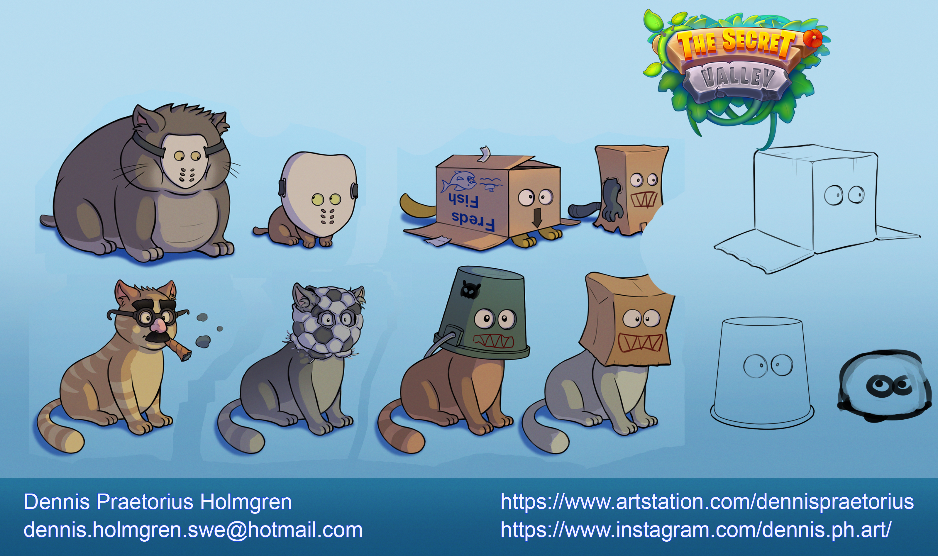 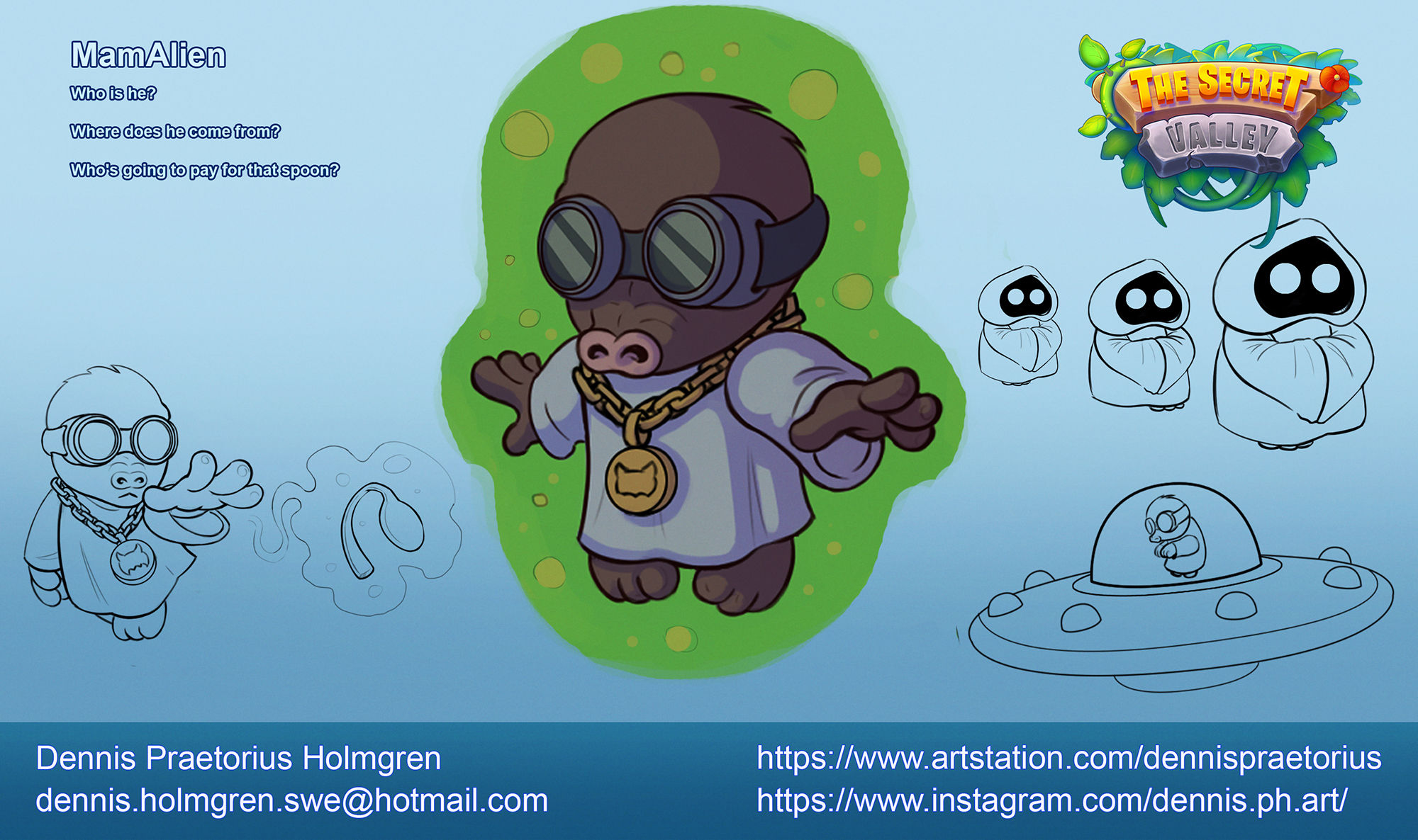 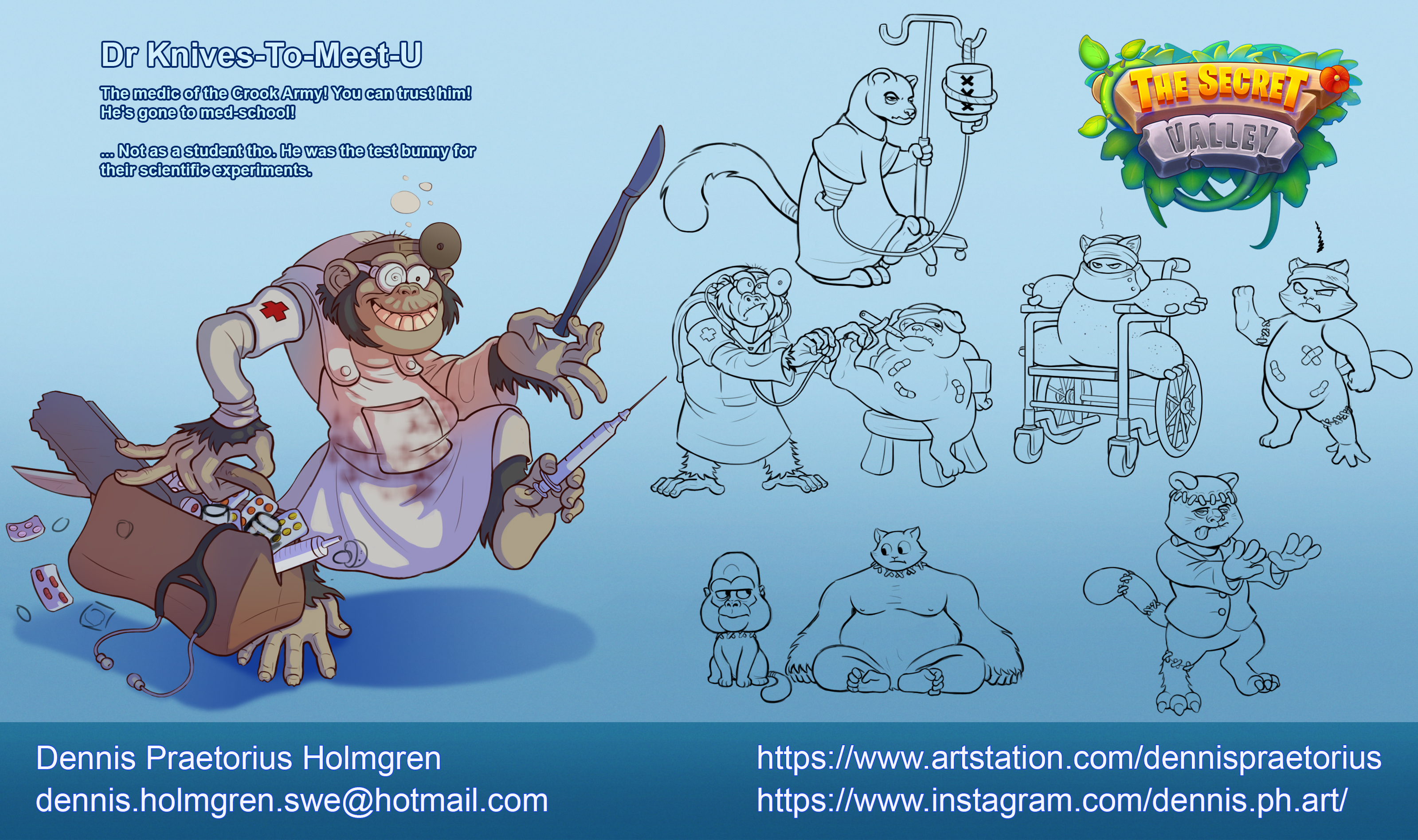 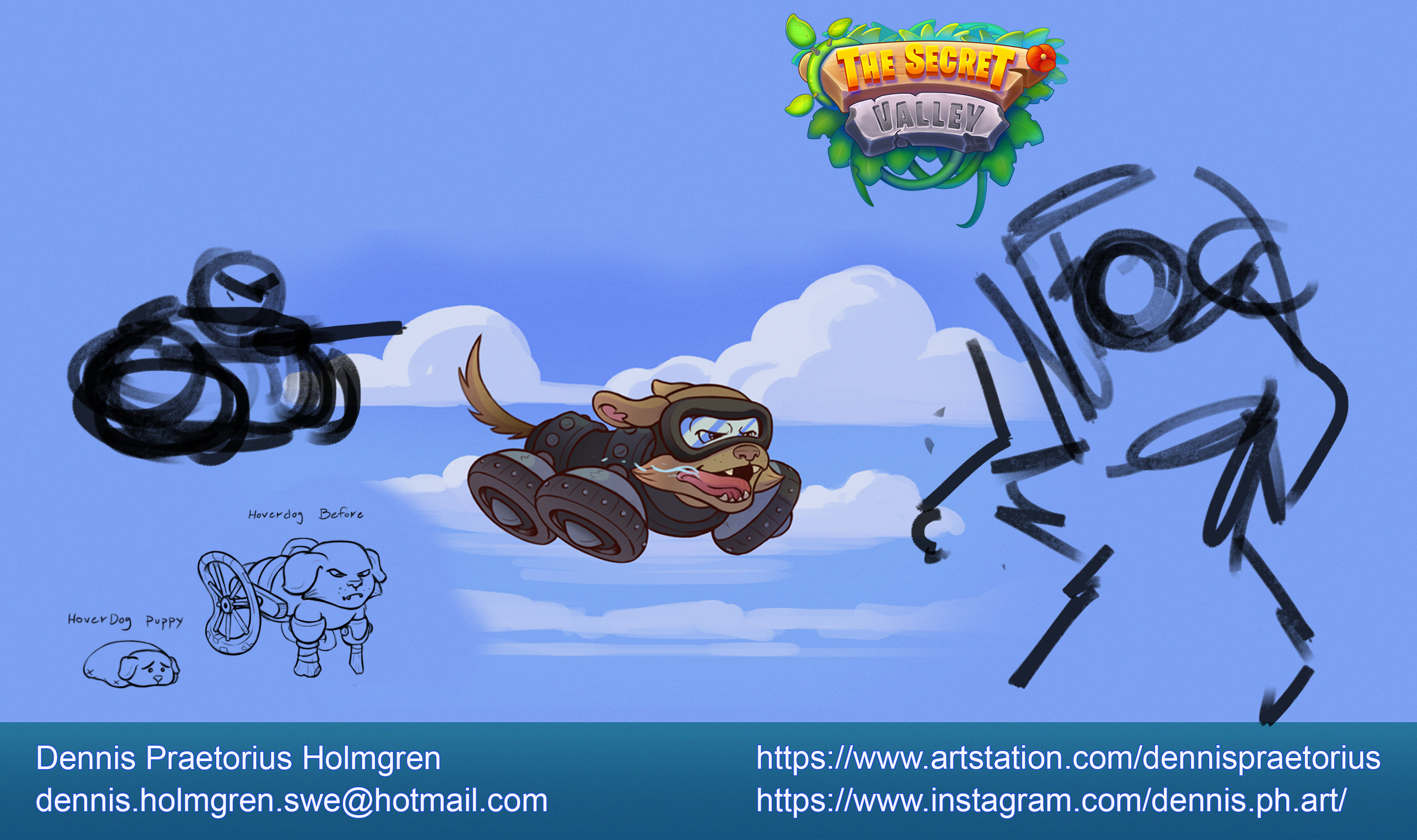 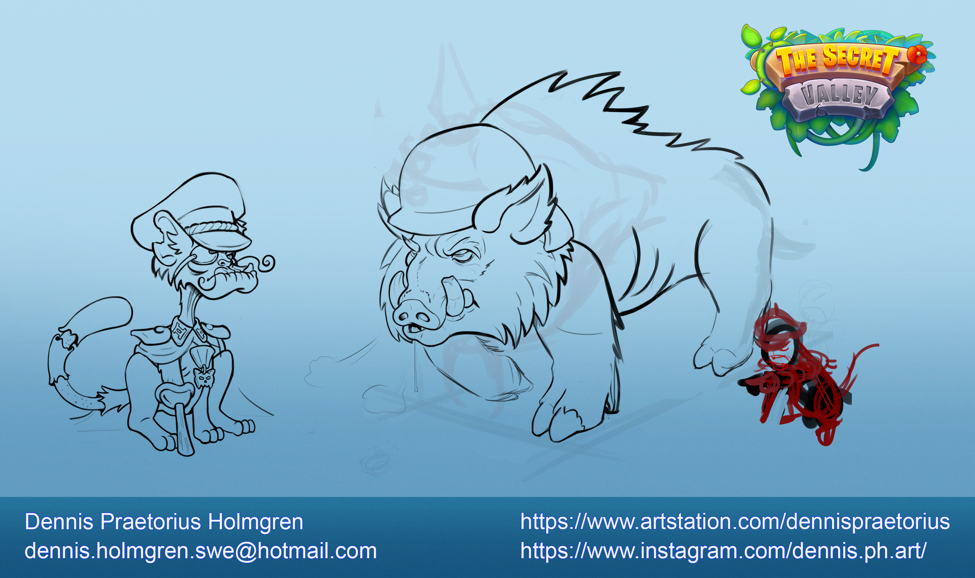 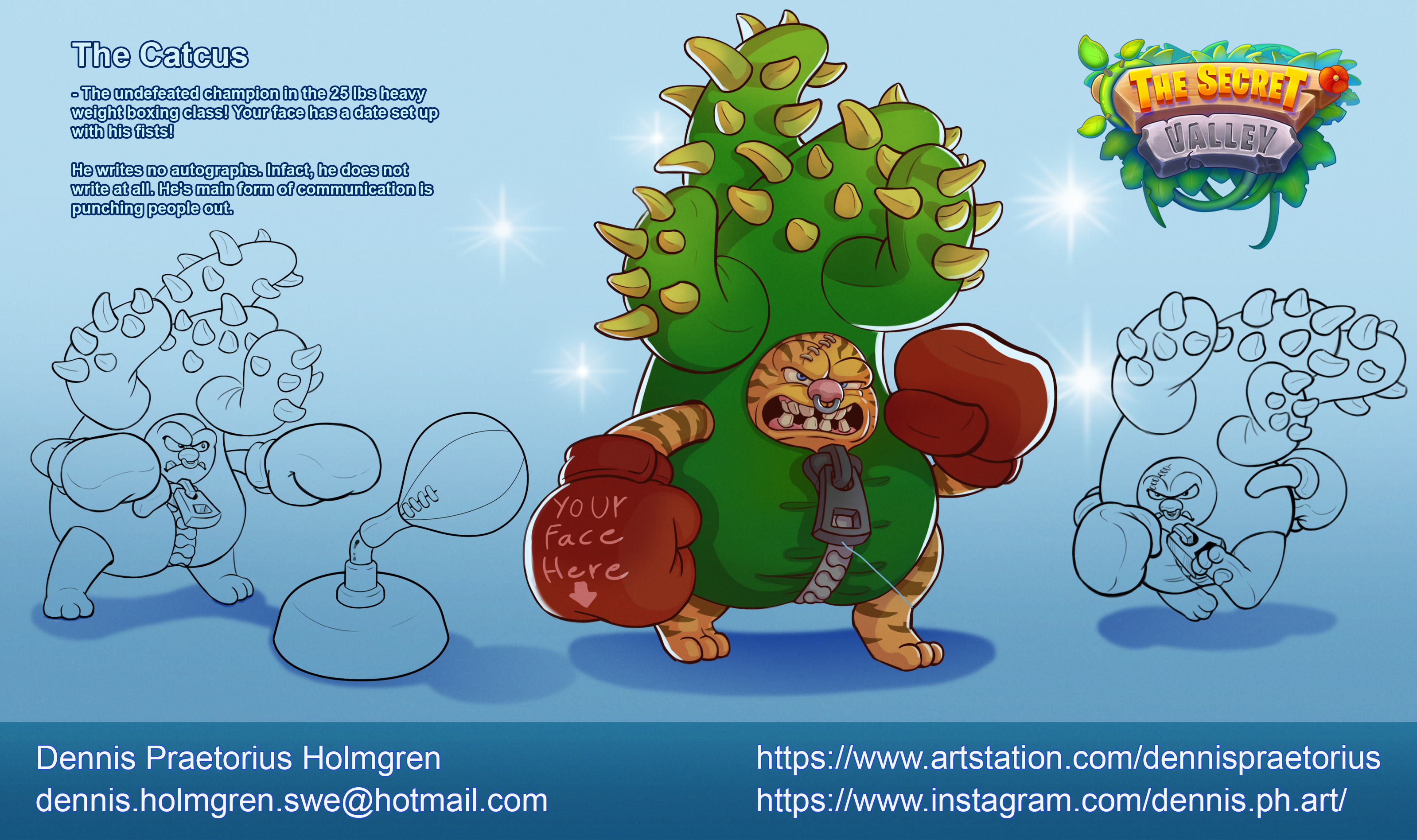  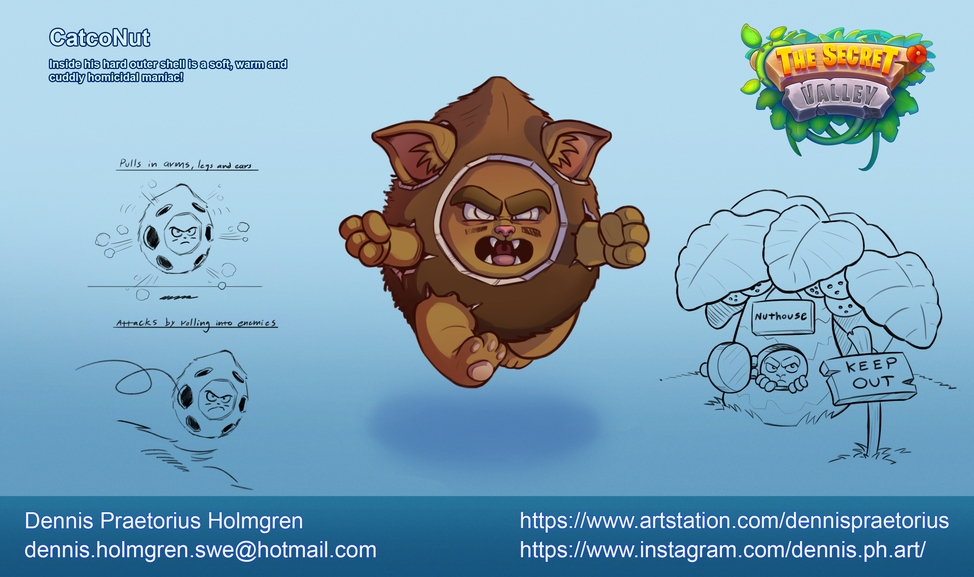 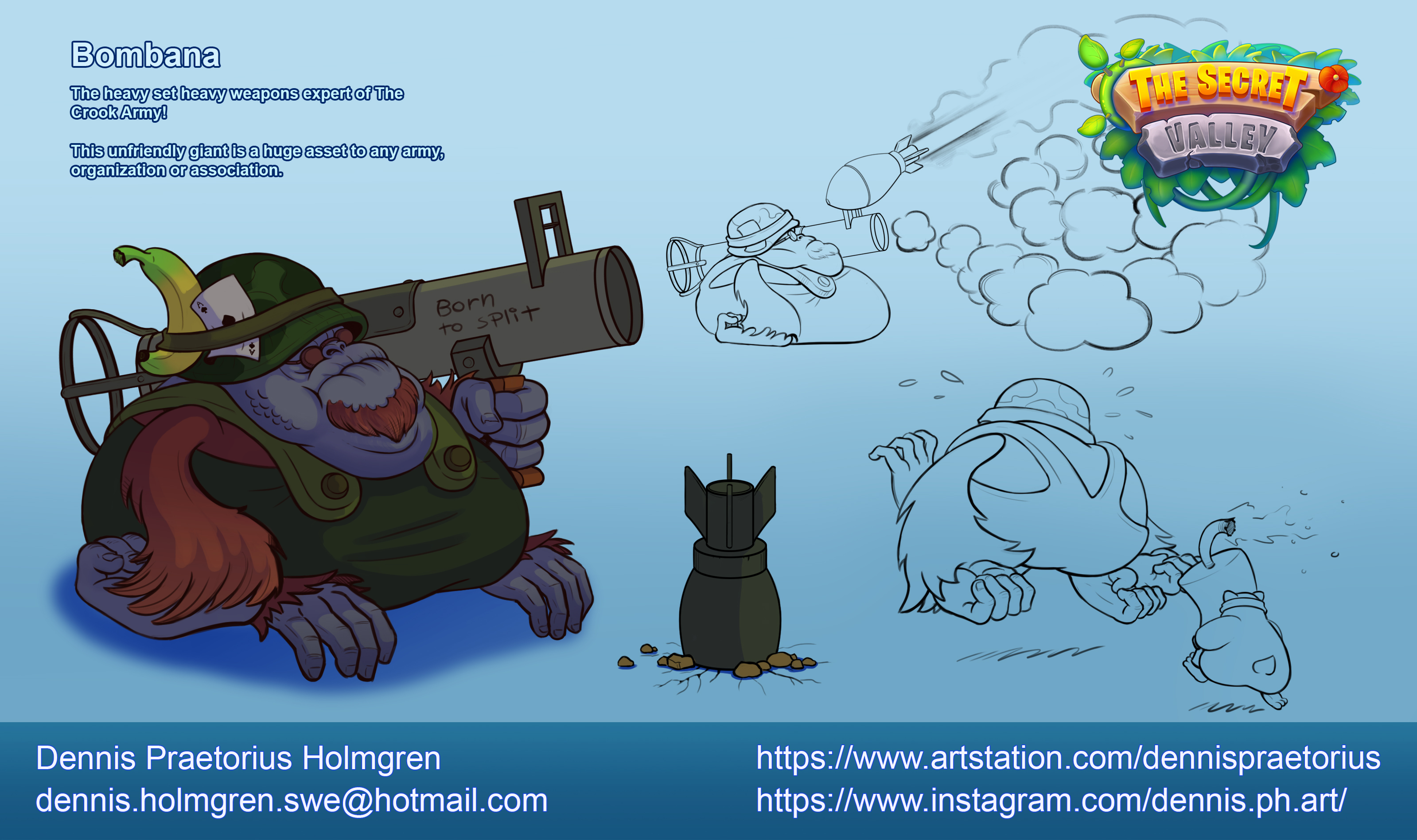
08-30-2021, 01:30 AM
The last image wasn't included in the main post:
09-04-2021, 01:42 AM
A fun little project I made today to showcase how to create cartoon shaders in Blender at my job. I hope you all like tasty fruits! Especially the kind made in Blender
 
09-04-2021, 12:34 PM
The black background clash against the lineart be careful unless you want the thing to read extremely flat .I would say you could give the outline a color similar to your object but less saturated.
09-04-2021, 01:41 PM
So these are 3D models that are cartoonified? That's dope
09-05-2021, 12:54 PM
woow you got a job woooah thats amazing and this project looks really clean and profesional O.O keep it up!! :3
'The best way to have a good ideas is to have a lot of ideas ' Linus Paulingth
09-12-2021, 08:59 PM
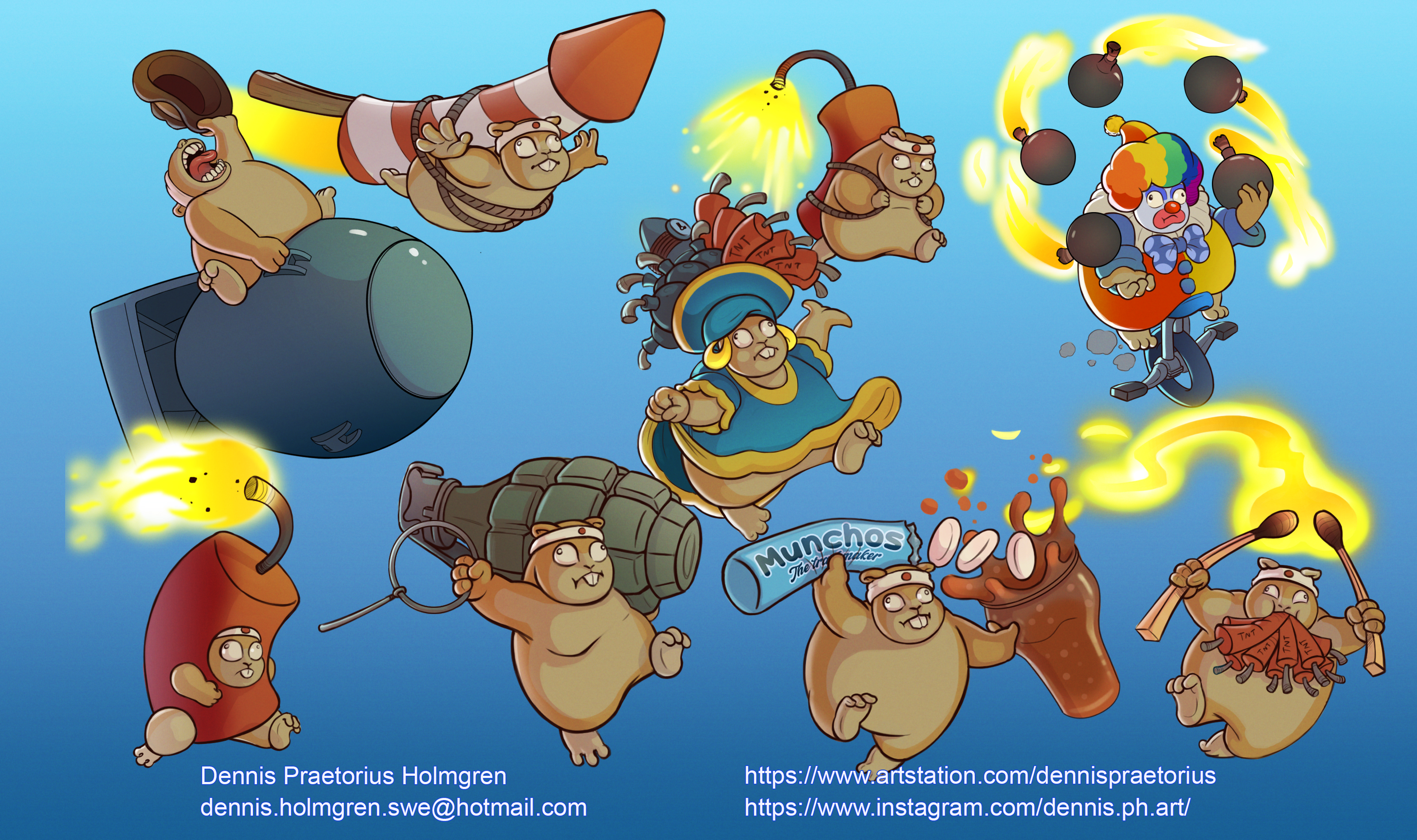
Haha Dr. Knives to meet you, love it! Great designs over all, great expressions on the ginea pigs too! (Is it ginuea pigs?)
10-28-2021, 01:22 AM
Love the vibrant and stylized characters. Your more comic stuff (like with the simple flat colors & one shadow color) work very well for the style you work in. Nice clear lines and shapes. Can't wait to see more!
|
|
« Next Oldest | Next Newest »
|