08-03-2013, 09:51 PM
Loads of hard work going on in here (lol at the t-rex arm on the armour btw) your brush work and finishing is improving, good job, keep it up!
|
Eddy´s Sketchbook
|
|
08-03-2013, 09:51 PM
Loads of hard work going on in here (lol at the t-rex arm on the armour btw) your brush work and finishing is improving, good job, keep it up!
08-04-2013, 06:13 AM
Bjulvar: Thanks man! yeah stroke economy doesnt sound good haha. Also, thanks for the feedback, the part you mention is going to be in shadows, and less defined than the rest of the character.
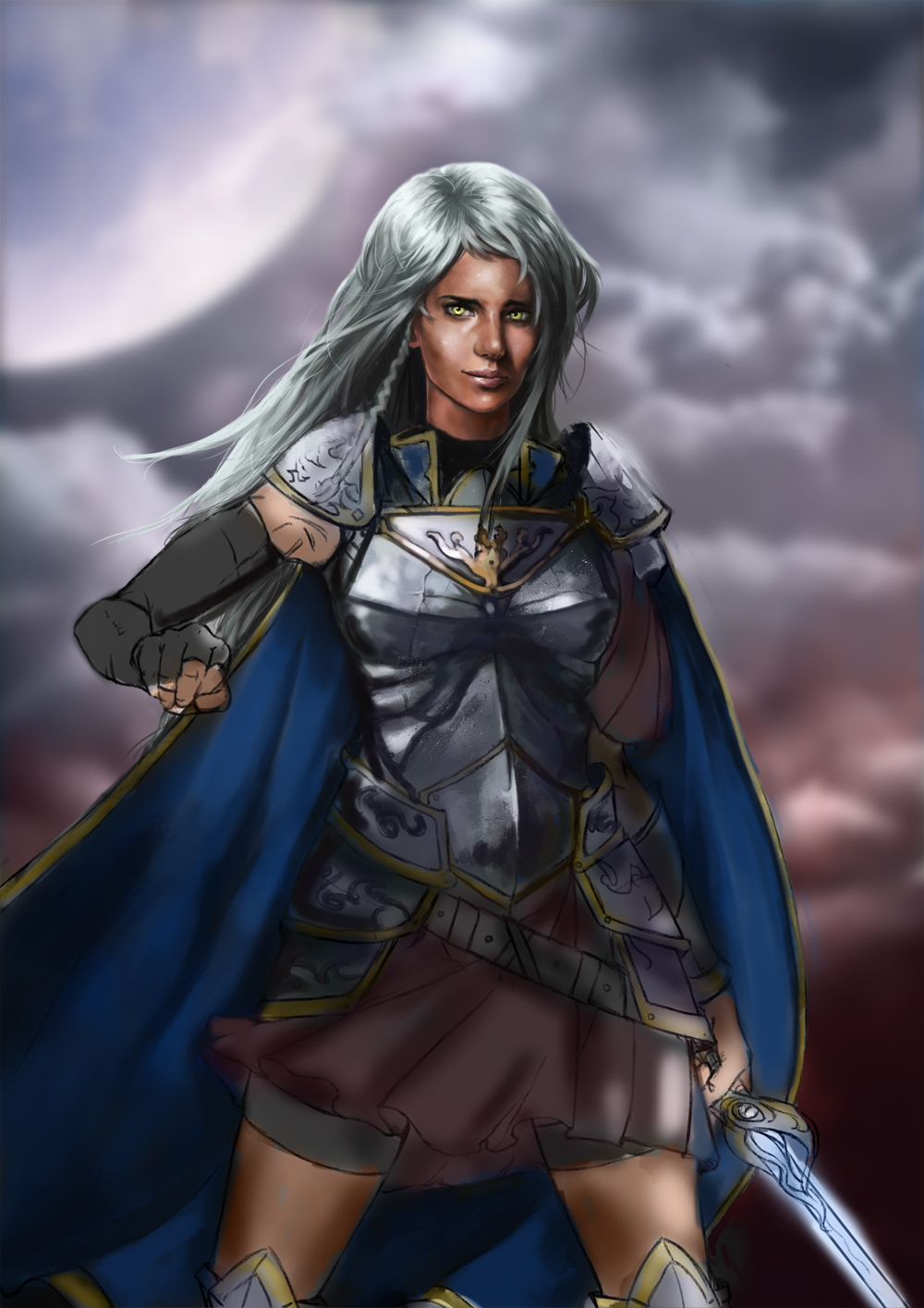
I know i said this was going to be an advanced version of the old illustration, but because i wanted to do something different, i finally make it a independent illustration. :P JonHop: thanks mate! haha yeah tiny t-rex arms for the win. xD WIP of the current illustration, now renamed to True Sky. And not an advanced version of the redhead lady anymore.  There are probably like a million mistakes to correct on what is already semi-finished but i´m too tired to see them. I will let it rest for today and start tomorrow with fresh eyes and mind. Also, photoshop crashed when painting that damn difficult white hair, so i already spent all my savings on a new computer lol.
"Stand tall, and shake the Heavens!"
Tumblr for my comic!: http://rainfallcomic.tumblr.com/ Sketchbook: http://crimsondaggers.com/forum/thread-1227.html Facebook: http://www.facebook.com/eduardogarayart Deviantart: http://eduardogaray.deviantart.com/
08-04-2013, 02:27 PM
Nice work on the last piece so far man, the hair and armor are coming out great, I think the foreshortened hand looks a bit weird though.
08-05-2013, 12:04 AM
Very cool sketchbook. So inspiring man, keep it up!
08-06-2013, 11:18 AM
Man...too good, got to teach me how to paint like that!
Sketchbook:
http://crimsondaggers.com/forum/thread-7058.html
08-07-2013, 04:14 AM
Triggerpigking: Weird arm... removed, thank you! haha
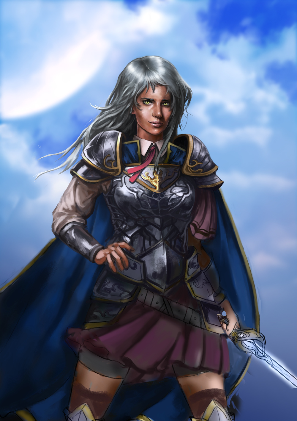
ruffledo: whoa, thanks mate! ^^ TonariNoPunpun: thank you! i've seen you SB already (only i forgot to drop a comment, my bad!)And you have a nice way of render things, faces specially! i do not think I have enough level to teach anyone, but if i can help you with anything, just ask! :) Here is another wip of the illustration. I´m currently trying a different approach, what do you think? But sadly, i think i will have to stop, or atleast work less on this one until the hardware of my new computer arrives, because photoshop already crashed a few times and its getting slower and slower to the point that painting isnt enjoyable anymore. But hopefully, it will only take a few days. 
"Stand tall, and shake the Heavens!"
Tumblr for my comic!: http://rainfallcomic.tumblr.com/ Sketchbook: http://crimsondaggers.com/forum/thread-1227.html Facebook: http://www.facebook.com/eduardogarayart Deviantart: http://eduardogaray.deviantart.com/
08-12-2013, 12:29 AM
Very nice dude, this latest version is a lot better. Great to see your addressing the hands too, already looking 1000 times better then those from a couple of pages ago. Not much to crit from me dude, just keep pressing and I look forward to seeing more!
P.s, my last computer did a similar thing with photoshop. I would paint for about 20-30 mins then it would lag like crazy, so frustrating. In the mean time while your waiting, perhaps brush up on those pencils and line work and scan them in maybe? :D Would love to see some traditional stuff from you.
08-12-2013, 08:41 AM
thanks a lot man! yeah hands are tough, i never got them right, thats why i started to focus on that.
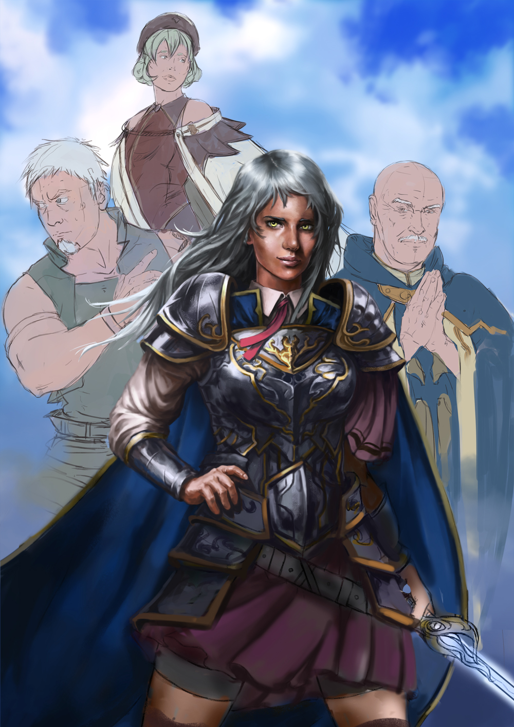
We need to face our weaknesses to overcome them, thats the only way!. :P I havent touched a real pencil in ages! today i was sketching in photoshop and i wasnt comfortable at all, so maybe returning to real pencils would be a good idea. Also for the computer,yeah, i've been trying to keep working on it these days, but photoshop its painfully slow. Worst part is, i already have all the new hardware ready to install but i will have to wait until a friend decides to take a break from his incredibly busy schedule (sarcasm) to help me install them. Oh well, in the end i will have to learn how to do it myself, but i´m not really good with delicate pieces of hardware lol. Thats why i absolutely hate to rely on other people. Anyways, lets be positive! here is a new wip. Since the girl alone in the sky looked boring, i decided to try something more complicate/interesting. I added the other 3 heroes from the war against Maou Satan. (From the Hatarakou Maou Sama! series) What do you think about this new composition? :S 
"Stand tall, and shake the Heavens!"
Tumblr for my comic!: http://rainfallcomic.tumblr.com/ Sketchbook: http://crimsondaggers.com/forum/thread-1227.html Facebook: http://www.facebook.com/eduardogarayart Deviantart: http://eduardogaray.deviantart.com/
08-12-2013, 08:52 AM
Hi Eduardo. Not sure about having the second girl hovering over the main character like that. It seems unbalanced and you lose the silhouette of the main girl. How about cutting the second girl out and just having the two male characters flanking her. Then raise her up a little so you have a classic triangle composition?
08-12-2013, 09:07 AM
Its going to be epic!(and thanks for the reply, I'm sure I can learn a lot from you)
Sketchbook:
http://crimsondaggers.com/forum/thread-7058.html
08-12-2013, 09:56 AM
Liking the new composition man although I defineitly agree about the top girl makes it look a bit too crowded.
still planning on watching the show, just about finished watching all the attack on titan eps so far and i'm gonna go straight to watching it.
08-12-2013, 01:22 PM
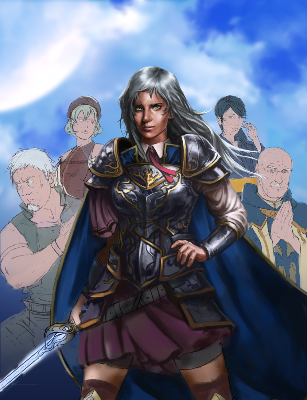
Ignatz: Thanks for the feedback! yeah, i can see that now but i really want to have all those characters there, so i need to find a composition with all five characters (i forgot one in the last update) also, maybe this fifth character is helping with that triangular composition?
TonariNoPunpun: Yeah! and thanks! :) Triggerpigking: Awesome! i think you will like the series, its a mix of everything, action, drama, comedy, romance... but really well mixed! i cant wait for a second season. Also, thanks mate! 6:00 AM now, i better go to bed. New comp! better now? 
"Stand tall, and shake the Heavens!"
Tumblr for my comic!: http://rainfallcomic.tumblr.com/ Sketchbook: http://crimsondaggers.com/forum/thread-1227.html Facebook: http://www.facebook.com/eduardogarayart Deviantart: http://eduardogaray.deviantart.com/
08-12-2013, 03:10 PM
This is a frikken awesome sketchbook man :D Really liking the anatomy drawings and it's great to see an SB containing the animes. haven't seen the show in your latest illustration but now I may have to give it a chance! I admire how willing you are to keep going back and fixing things in your images, I can be really lazy about that DX
Latest composition is much improved, I really like how she's at the top of an arc of all the characters. I must ask why you've decided to crop her off at the thigh like that, it seems awkward to me that they're partially shown if we can't see all of them. Not really a critique, just wondering out loud XD I only came up with one thing I can really call a critique, I definitely think you should make the guy on the looking inward, people like to follow character's gazes and his is shooting us right out of the image. I think it might look cool if there was some really bright value next to the hero to make her stand out, did a quick paintover to show what I mean. ![[Image: 18ChlR2.jpg]](http://i.imgur.com/18ChlR2.jpg) You might find this too blatant or extreme though, just a suggestion. do what you think is best! Good luck finishing this, it's coming along great!
08-12-2013, 07:05 PM
Yep, I think this arrangement works much better. I agree with Samszym about the eye direction of the guy on the left aswell. Looking forward to seeing this finished.
08-13-2013, 12:33 AM
Sweet dude! This new piece is turning out to be pretty epic!
Someone once told, (and I couldn't understand this for ages lol) that if you want someone to do something for you, ask a busy person. Not the 'busy' type who spend most of their time procrastinating but the type who are already successful, because they understand the importance of time and how to utilise it properly, and seem to get more stuff done. That's why professionals are always more expensive, because their time is more valuable, if that makes sense lol. On a note about the new piece, the comp looks cool, I like the power triangle and the design of the new characters. One thing to watch out for though is the perspective. The way their smaller/bigger or lower/higher makes them look like midgets and not getting progressively further away. I can think of two easy ways to tackle this, is 1, make the image horizontal to give them more room or 2, make your main character way smaller, almost book a book cover comp and do it that way. That's what i'd do anyway ;) their just suggestions though, i'm still looking forward to seeing it progress regardless, that main character is looking awesome.
08-13-2013, 01:57 PM
Aw yes!! That latest piece looks great, keep pushing it as far as you can!
08-14-2013, 09:02 PM
Heeey, what a fancy progress you have here =D Love the way your neewest painting comming out. Can't wait to see it done =d
08-17-2013, 07:25 AM
Wow I love your illustrations! They look pretty amazing :)
Keep up the great work! I'm looking forward to seeing more of it!
Deviantart ~~~~~ Tumblr
|
|
« Next Oldest | Next Newest »
|