Posts: 1,098
Threads: 11
Joined: Aug 2012
Reputation:
34
hey there, wanted to post here earlier but life got in the way haha.
Anyway, those last updates are just awesome.
That Rikku cosplay study is really good.
Plus, as always you put my figure drawing to shame haha, really inspiring to see as always.
I'm also looking forward at how your skill will develop now that you are drawing from life.
Posts: 850
Threads: 4
Joined: Mar 2013
Reputation:
21
a4? Well, then I have no excuse why yours look better and more refined etc :P
Digital life drawing sounds really cool!
Posts: 812
Threads: 4
Joined: May 2012
Reputation:
35
Awesome updates Will! I really love the life drawing stuff.
Posts: 903
Threads: 54
Joined: Feb 2012
Reputation:
18
Mannn your stuff is looking great as always. And the sweet sweet pencils! Keep pushing because whatever you're doing, it's working.
Posts: 573
Threads: 17
Joined: Mar 2012
Reputation:
7
Hi Will,
to answer your question I didn't go alone. My girlfriend and I had the plan to go to South East Asia for a long time but she had a job and I had an internship so we couldn't go. But then she decided to quit her job and go to university again. So when my internship got to an end and my company still hadn't told me if they wanted to keep me, we booked tickets and hostels and made plans with our "lonely planet". We booked pretty long before the actual trip so the flight was not very expensive (relatively speaking). We had clothes for 2 weeks, some medicine, but since we didn't want to sleep in a tent, we had no tent or sleeping bags with us. so the luggage wasn't terrible heavy.
when we arrived we soon realized just how easy it is to travel around there. Most of the places are used to tourists and people speak english. so when you arrive somewhere you can without a problem make plans how to get to next place and book train or bustickets etc.
we travelled mostly at night, so we didnt loose a day. In thailand and vietnam there are quite comfortable sleeping trains. I wouldn't recommend the busses though, they are not really comfortable plus in vietnam the times we took the bus the driver was driving like a crazy person. Honking all the time and cuzzing at the other cars. But other than that it is really no problem to get around.
And like I said I drew in a sketchbook and made water color studies so I learned new stuff.
I hope this shed some light on the whole matter.
on an different note I really like the study of the laying man, especially the part where is stomach and his mons pubis meet, I think the rendering there is really good. and your monster portrait is cool, but for me the teeth look a bit to similar and parallel, I think it would gain from having those a bit more different.
Other than that I love it :)
Cheers,
Flo
Posts: 467
Threads: 2
Joined: Jan 2012
Reputation:
16
EduardoGaray - Cheers as always mate. Yeah life drawing is really cool, it's so dam hard >:o haha. We only get 2 hours a week though and no long poses but it's still really cool to draw different models each week. Your figures are pretty dam good too man lol, let's keep developing together ;)
Lyraina - Haha thanks :p Your figures have come leaps and bounds and are by no means worse than mine, just a matter of time and practice. Ive still got miles to go before I get my figures how I want them. My brain breaks a lot when it comes to foreshortening for example o_0 Thanks again Lyraina
Jonesoda - hey thanks man, I really appreciate it ;)
pnate - Glad you think so man, through my eyes it all sucks balls haha. Whenever I need motivation on how to paint I usually just drop by your sketchbook :p Thanks as always dude.
Flo - Thanks for the quick and in depth reply man, that sounds really cool. I might have to start putting some money to one side and sorting something out like that. That thing you mentioned about the bus, I can empathesis with that lol. I remember going to Greece ages ago and all the taxies drive like that lol. I was a pretty crazy experience. There was about 7 of us in the car too, the guy didn't break a sweat lol. Thanks again man!
Quick update, I'm back now and feelin pretty pumped. All these ups and downs can be pretty emotionally draining but now it's time to just shut the fuck up and get better.
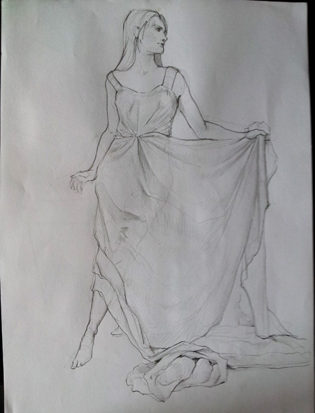
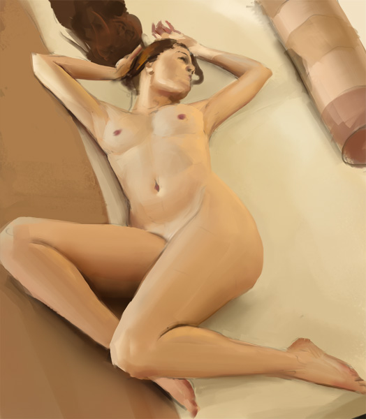
life drawings, and finally getting round to studying perspective. Plus quick drapery thing
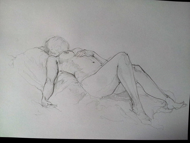
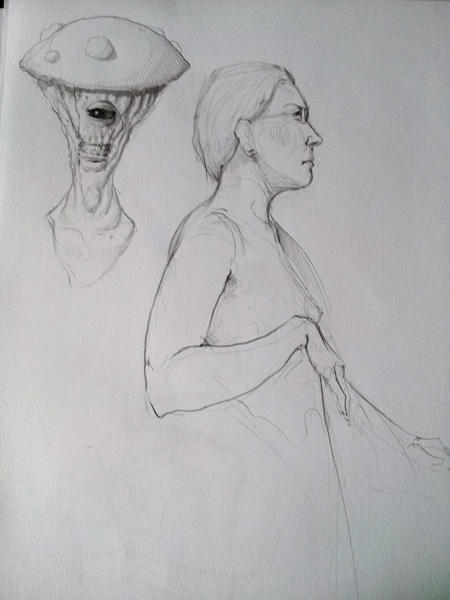
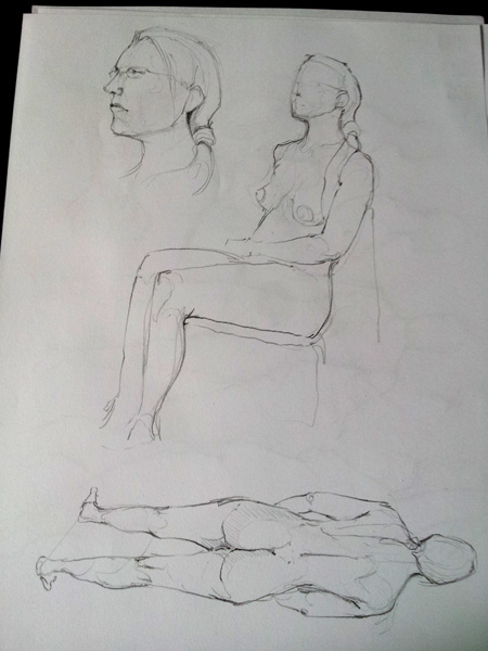

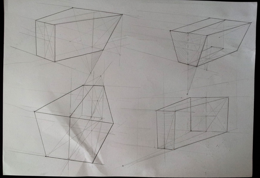
values studies
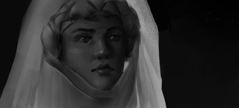
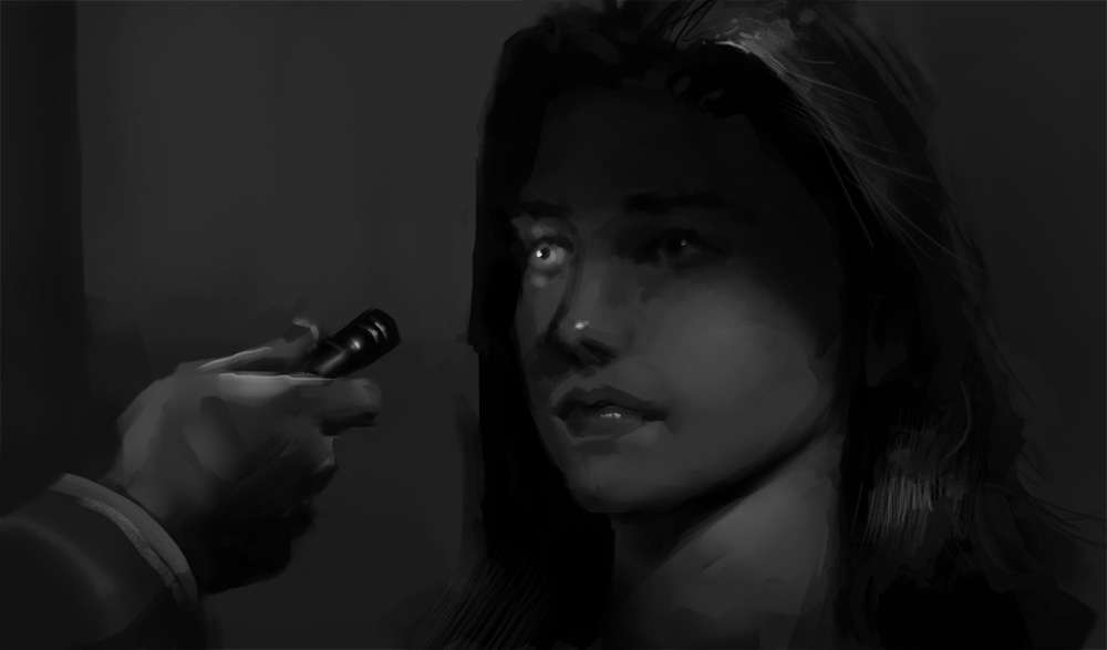
plus soft diffuse light study
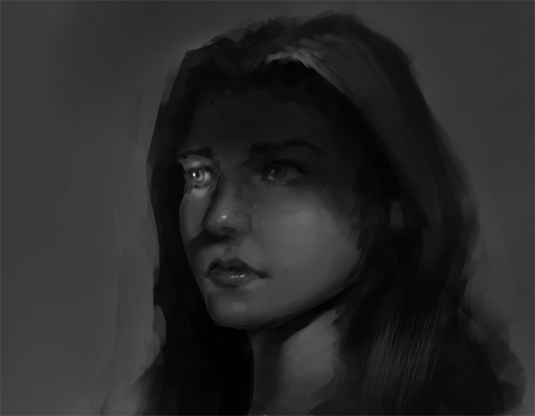
apply - fuck hair
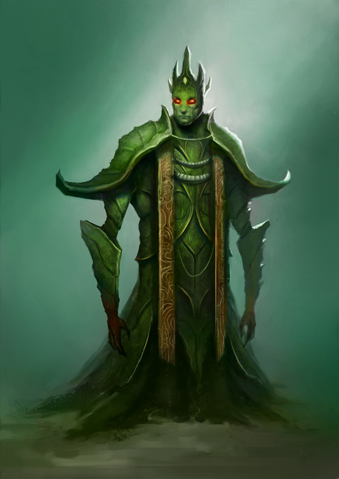
and recent character design thing, inspired by chow over at ca. Take an insect and turn it into a royal dude. Crits welcome as always :}
<3
Posts: 1,074
Threads: 9
Joined: Jan 2012
Reputation:
53
Life drawings <3 Amazing!
Posts: 1,342
Threads: 17
Joined: Jul 2013
Reputation:
45
Great updates man, love seeing your stuff.
Posts: 340
Threads: 10
Joined: May 2013
Reputation:
23
loving value studies I have to try this also!
Posts: 850
Threads: 4
Joined: Mar 2013
Reputation:
21
Lovely figures again!
The ChoW has a very nice design language, but the lower part doesn't really work for me to be hones... it is on the one hand quite humanoid, but then suddenly stops at... knee length or so. Might have worked better if the bottom part were rendered a bit more (similar to the top half), so that we could actually see what is going on and why he is so short. The design of the carapace/armor is really cool though!
Posts: 848
Threads: 20
Joined: Jan 2012
Reputation:
29
Great life drawing! so jelly..
Nice studies all up. The thing I wonder with the insect royal Chow guy is - what insect is he? I know it is only meant to be inspired by an insect, but he kind of just looks like a wacky guy with cool armor on and green skin. Don't get me wrong, it looks cool and I wouldnt have anything to say if you didn't give me that little bit of extra information of 'inspired by an insect'. Just remember the story.
Posts: 467
Threads: 2
Joined: Jan 2012
Reputation:
16
Ursula - Lol, thanks, I'm glad you think so ;) Still feels like ive got a ton to learn on them though :p
crackedskull - Thanks dude, that means a lot! Hopefully much more on it's way soon.
madzia - Yeah their super helpful, though from seeing your stuff your values seem leagues ahead of mine :0 Here's a link to the filmstills I use - http://www.cinemasquid.com/blu-ray/movies/screenshots
Lyraina - hey hey! Thanks for the crit, didn't really notice that but your totally right. I wanted the design to be more sort of robes than actually skin, and the bottom to be kinda like cloth on the floor, like royal garbs, but 1 I ran out of time and 2 my deep ignorance of painting clothes left me without the knowledge of how to achieve what I had in mind lol. Yet another thing I need to work on in the future 0_o Thanks again for the crit though, it helped a lot!
Jaik - Cheers mate! Here's the image I used for inspiration and reference for the design lol
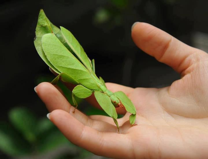
Didn't really get where i wanted with it, it was pretty tough getting 'royal/ insect/ humanoid' to read as a design. Good fun though, and a learnt some shit in the process to so its all good I guess ;P
some more shhhiiieeeeet
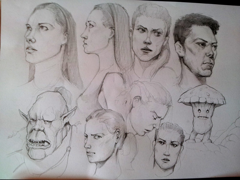
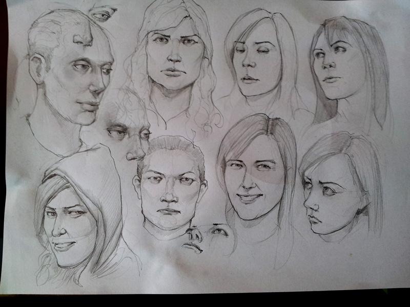
study I spent abit longer on. Was really helpful
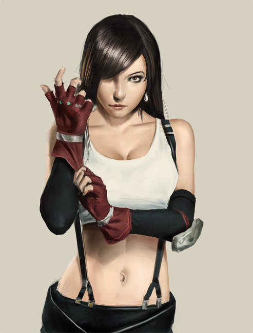
trying subtlety
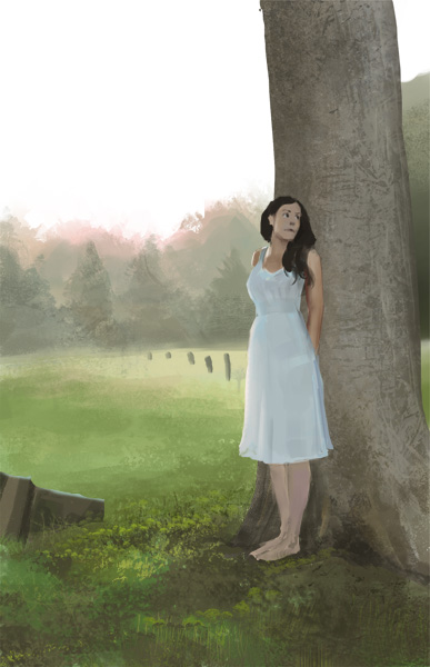
hair :s
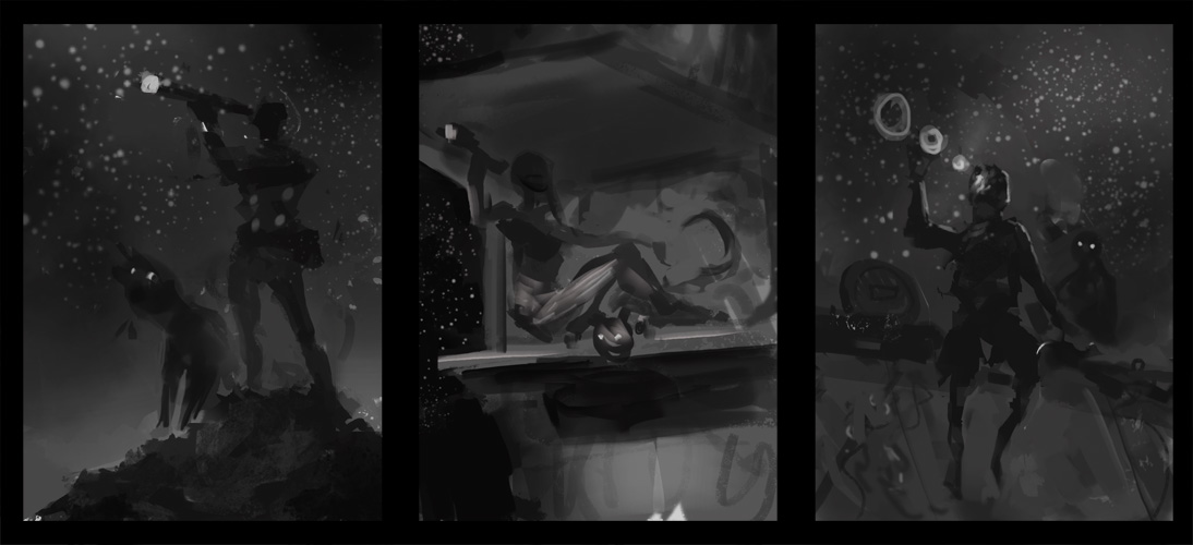
thumbs for 'new piece' another chow thing - pilot stranded on a planet with telescope
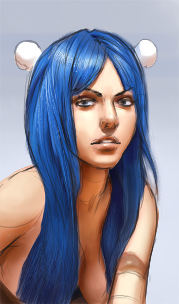
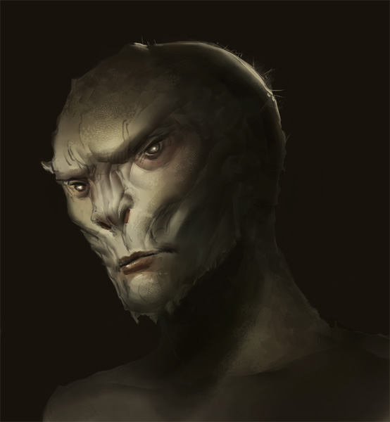
fuck face study
Posts: 235
Threads: 9
Joined: Oct 2012
Reputation:
6
Looking good! I'm seeing a good deal of improvement just on this page alone. I think the Tifa study is probably my favorite, but then again there might be a -slight- bias there.
In all seriousness, things are looking good though-- solid work ethic! I'll be looking out for more of your stuff. :)
Posts: 537
Threads: 1
Joined: May 2012
Reputation:
8
Dude, the progress is overwhelming me, aaaah!
Feels like all of those bumps in the road you've hit lately were just bringing you into a new dawn of Warburton. I hope that you can think more positive about what and how you paint. Because you're always moving forward, like a viking ship unto distant lands. Really looking up to you right now, you inspirational guy.
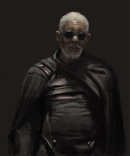
That Morgan Freeman study is looking mighty textured and rough. Looks like it could be translated quite nicely to the ChoW piece you're planning. Even though I don't know the design yet! I think that the first and third thumbnail are both really interesting. The first one is a bit more safe, but looks solid. The third one is giving me more of a story, feels like it set on a ship. An interdimensional ship, or whatever! Compositionally it might need some more work, but can't say anything until you've started painting!
Can't wait to see where it goes man! Keep it up :D
Posts: 340
Threads: 10
Joined: May 2013
Reputation:
23
thanks for link! Your last update is astonishing, Tifa looks great her hairs are almost photo realistic, but the "fuck face study" .... my god the lights are awesome, you might try to fix eyes location, looks a little odd, one much far away from nose than other in my opinion. More updates please!
Posts: 848
Threads: 20
Joined: Jan 2012
Reputation:
29
Looking great man. Bloody well speechless over this update. Love the little mushroom dude sketch thing. Looks really cool. The lighting on that face sketch is awesome, just be sure to remember the sphere underneath all of it (one cheek bone is receiving very similar light to the other and it should probably drop off a little on the furthest one) but thats just me being picky for something to say. Looks really cool!
PS that insect thing is creepy as balls.
Posts: 467
Threads: 2
Joined: Jan 2012
Reputation:
16
Einver - Thanks man! Yeah Tifa is a cool character, the original cosplay is even cooler - http://willpheonix.deviantart.com/art/Ti...-436234093
Thanks again for your kind words ;)
Bjulvar - Haha, stop it dude you'll make me blush :p In all seriousness though I'm feeling super pumped to paint again, I just get the feeling a lot is going to change this year, like an evolution in myself or something as I get older. Its pretty tough to explain but with it comes a rollercoaster of emotions. And through all this the painting has been there with me, like a loving partner sticking through till the end xD Just makes this journey all the more valuable and exiting knowing this now. And wow I just got deep with that shit lol! I hope my bullshit bomb didn't bore you too hard haha.
Thanks again for your kind words man, they mean a lot. And I totally agree with your input with the chow piece so cheers also for that. I went with your advice ;)
Madzia - Thaaaank you im glad you like. Yeah probably should have thought of a better name for that face thing, a bit disrespectful seeing as it's a study from someone else design -_- Your right about those eyes too, I didn't even realise that, thanks for the tip. I'll work harder to get this stuff right for next time, thanks again!
Jaik - Thanks mate! In fairness the mushroom dude was a study from some else's pencils :p I just really wanted to capture the awesome 'style' in which he draws stuff, heres a link to the dudes work, its amazing - http://akiman.deviantart.com/art/Ioid-St...-405797427
Thanks a lot for the tip on the face thing too dude, I completely missed that and i'll keep it in mind when I do other heads, you make a good point!
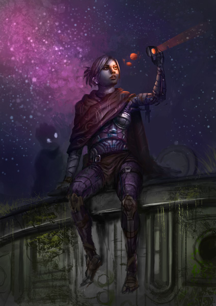
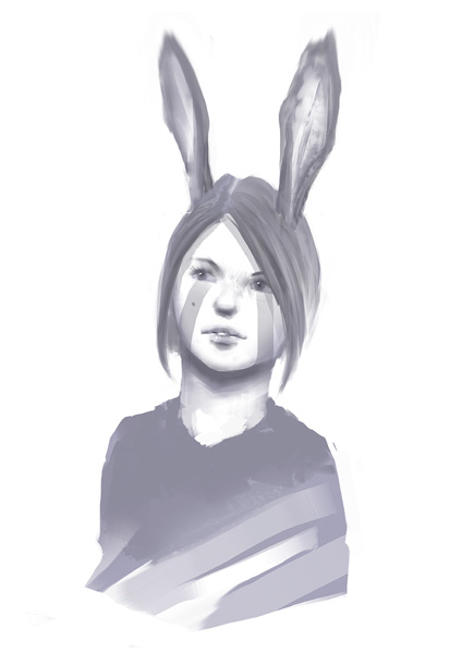
Been a pretty crazy week, here's the chow piece which I failed to finish between commission stuff. Spent too long on it and failed hard lol, so broken but I learnt some stuff so it's all cool. I keep trying to do pieces for my portfolio and they keep coming out shit haha. One day, i'll finally do a piece I can put in the folio >:o
oh and have a warm up doodle too, on me :p
Posts: 211
Threads: 4
Joined: Jan 2014
Reputation:
6
Why thank you, may I have another one?:)
Seriously, that doodle is awesome, it should be done in mezzotint in a miniature format:)
Posts: 1,098
Threads: 11
Joined: Aug 2012
Reputation:
34
damn, its been so much time since i came here, and i'm amazed by some new stuff i havent seen before. I normally see most of what you do on facebook, but maybe your publications arent showing in my timeline for some reason, and instead i get cat photos and memes, sigh. xD
But yeah, that Tifa study looks crazy, its so good, really feels like the natural evolution of your style and rendering technique.
Really good to see you getting better with each update, stay strong man!
Posts: 903
Threads: 54
Joined: Feb 2012
Reputation:
18
Great updates as always :) That feeling of one day I will do something portfolio worthy...I know those feels. Hope you don't mind, I did a paintover of that CHOW because I think this could really be something for your portfolio with some small changes:
![[Image: z9xru1X.jpg]](http://i.imgur.com/z9xru1X.jpg)
-The implied perspective is that we are looking up, so I adjusted her legs to be more of a sitting position as if we are looking up at her. I see that you angled them how someone would normally sit IRL if they were right on the very edge of the ledge, but I would recommend reference for that because it's a tricky angle
-She also looked a little short but I figure that for a character illustration like this you want her looking really heroic, so I free transformed her body just to stretch it and make it longer
-The gesture of her torso - from the pit of her neck to the center of her ribs to the crotch-is right now a straight line, which is a little static, so I moved her upper shoulders/head just slightly to the left, to make it more of a curve
-The image looked a little off center so I cropped some off the left side of the picture
-The stars behind her stop right where she is, so I extended it to keep going off to the right
-The background felt a little empty, so I added random tech bits and bobs
It's super rough cut and paste, but I hope it's helpful in some way and not too preachy or whatnot. The rendering, values, and colors are all spot on man.
|


![[Image: z9xru1X.jpg]](http://i.imgur.com/z9xru1X.jpg)