Posts: 809
Threads: 2
Joined: Mar 2012
Reputation:
16
The comic suff's looking so good man, really dig the two tone style. That rainy page came out awesome :) Keep it coming dude.
Ps, nice hands. You're getting a ton of emotion into them, love it :)
Posts: 654
Threads: 4
Joined: May 2013
Reputation:
22
Wow, Kickass work on the crimson arena submission, love your use of colour in that and it's pretty interesting seeing your drawing process for it all.
As for the comic, I still really dig the style you've been going with so far but I do think the coloured page looks pretty cool as well, maybe try doing a few more pages in that style to see how well it works for you.
Keep up the awesome work man :)
Posts: 537
Threads: 1
Joined: May 2012
Reputation:
8
Dude, I think that I said this before, but I'll do it again. I'd buy a comic of yours! The shading looks great, feels like you've been drawing these forever. As for color or black and white, I think both does the comic justice. Keeping some monochromatic palettes could be cool too. Suppose they could be use to enhance mood. Why not mix it up? :D
Sweet job on the whole Crimson arena process. Great to see you incorporating a bunch of studies into the piece, though I think you could've used more varied color into the character!
I agree with the hands, they look great :D
Posts: 1,098
Threads: 11
Joined: Aug 2012
Reputation:
34
CoreyH: thanks a lot! the introductory pages are over now, kinda slow paced but the story is starting now. I think i will stick with Black and white plus toning for most pages and switch to color in specific moments.
crackedskull: thanks mate! yeah i still have to try coloring a strong chiaroscuro scene, page 9 will be in color, so i will think about it.
JakeB: much appreciated man, thanks! :)
Triggerpigking: thank you matey! for the comic, i will keep working on black and white but i will try with color in page 9 to see how it looks. Will probably keep color just for the important scenes.
Bjulvar: whoa thanks man! if i ever make a real paper comic i will send you a copy myself haha.
I agree with you on using a specific palette to enhace the mood of the story, its something i will have to experiment a lot.
For the Crimson arena character, you are not the first who says that haha. But i had this strange idea of a white dressed albino character, i even made her more colorful than i initally planned haha. But you are right, it probably wasnt the best choice. xD
And here is page 7, as i said in the replies, the introductory pages are over, the story starts properly in the next page, full color on page 9.

Posts: 1,098
Threads: 11
Joined: Aug 2012
Reputation:
34
Page 8 i like to think that my backgrounds are slowly starting to look like backgrounds. xD Also, a new character?
Next page will be in full color, lots of experimenting on the horizon.

Posts: 812
Threads: 4
Joined: May 2012
Reputation:
35
Dayum looking good Ed! Sweet job on the crimson arena illustration, and I gave your comic a full read today. Really enjoying it! Looking forward to the next page! :D
Posts: 1,098
Threads: 11
Joined: Aug 2012
Reputation:
34
Jonesoda: Hey there! :D thanks a lot man, i'm really glad that you gave the comic a full read. Seriously, it means a lot dude.!
Page 9 is here (finally!), in color!
In case you havent noticed, i dont really know what i'm doing so, any feedback on this one would be REALLY appreciated. Everything done in Mangastudio 5.
I was trying to something similar to the earlier colorings of Tsutomu Nihei and the stuff Yoshitoshi Abe does. Of course, i cant replicate something like that haha, but i was a fun experiment nonetheless. And i learned quit a lot of things about Manga Studio! That program has an amazing potential.

Posts: 556
Threads: 5
Joined: Dec 2012
Reputation:
8
Holy hell man, that last painting really came through strong. The composition is really great, too.
Attack on Titan inspired? ;D
Your backgrounds are definitely coming together a lot better now. They're not completely clean, however it fits with the sort of atmosphere you're creating. The panels feel cohesive, and read well. One quick thing, keep an eye on some of the perspective and scale. In a couple of these, like the panel where he's standing in front of the girl, he's much larger than he should be.
Really looking forward to seeing where this is going. Keep going strong, man. :]]
Posts: 1,098
Threads: 11
Joined: Aug 2012
Reputation:
34
Archreux: thanks! :) glad you like that illustration, i had to rush the character but i'm still more or less satisfied with the result. xD I really need to plan things better next time.
For the comic, thanks for the feedback, indeed i suck at that. I will have to start studying seriously that stuff in the near future, how are you going to make a comic if you suck at perspective? haha.
Well this past weekend was my 24 birthday (wohoooo!) so i'm still recovering from it.
So, today i just started fooling around in mangastudio to get back into the mood.
I tried to paint with manga studio for the first time.
Its completely different from Photoshop, it feels more natural and closer (a bit) to painting with a traditional medium.
For a first experiment i'm more or less satisfied.
No refs used this time.

Also, Kill la Kill has ended :( goodbye, you will always be in my heart.
This one with mangastudio too.
Refs only used for the costumes, all else from imagination, hence all the funny proportions and others mistakes all over the place.

Posts: 227
Threads: 1
Joined: Jan 2014
Reputation:
5
First of all: HAPPY BELATED BIRTHDAY! (:
Ah, you posted some comic pages since I last visited here! I really like the atmosphere in them so far. I think that a comic is really a good training as you really have to draw certain things as you need to draw them to progress the story. I was working on a comic off and on the last months as well and I really enjoyed it, somehow. It made me draw so many different actions, some other angles and stuff, and most of all, it made me think of a lot of things as well. I'm really curious about your new pages. Gonna watch the tumblr as well (:
I really dig the hair in the Mangastudio picture, especially the red side...!
Posts: 654
Threads: 4
Joined: May 2013
Reputation:
22
Hope you had a good birthday man.
Nice Kill la kill sketches, I finished it two days ago(that ending was awesome :D) the show is'nt completely over yet though, we still got an ova coming up in september I believe.
The last coloring in the comic's come out pretty cool, I think you should continue with messing around with it but I think it fits the tone of the comic so far.
Posts: 1,098
Threads: 11
Joined: Aug 2012
Reputation:
34
Cyprinus: thank you kindly :) indeed, the whole reason to start a comic was that, the training.
It really makes you leave your comfort zone and make you draw a lot of things you would have never draw otherwise. Its also an awesome way to let off all the weird shit in my head haha.
I'm glad you are liking it so far. :D
Triggerpigking: mann KLK ending was too awesome indeed, quite a bittersweet ending, you know what i'm talking about. :( I hope certain character will come back in that ova...
Also, thanks! i'm glad you like that color experiment, so far i have mixed reactions for that page.
Some people felt like even if the color looked good, it was a sudden change in mood and athmosphere and didnt felt right. I have though about redoing the first two pages in color, so you can expect that a change in technique.
Time for an update, i will post here some conceptart stuff i did this last week and two new pages for Rainfall:


funny perspective here ^
and Rainfall pages 10 and 11


Posts: 465
Threads: 2
Joined: Mar 2013
Reputation:
18
Hey dude, cool stuff recently!!! Really digging that inn design, it's got this run-down poor side of ye-olde-town feeling working for it really well!
minor crit on page 10, you've got the guy character looking to the right on the first panel and then to the left on the second panel, even though he's looking at the same thing in both of them. That sort of confuses me directionally, not really sure where anything is. Just something I think you might want top watch out for when you're doing layouts for these Xd
keep rocking! and late happy 24th bday!!!
Posts: 133
Threads: 2
Joined: Jan 2013
Reputation:
2
Man I dont know alot about comic but your rainfall thing looks awesome I like the mood in it pretty solid stuff, keep killing it!
Posts: 1,098
Threads: 11
Joined: Aug 2012
Reputation:
34
Samszym: thanks a lot dude! for that inn, i was thinking about your usual JRPG inn haha like in the early final fantasy games or dragon quests. Oh and thanks for pointing that too, its the sort of thing i never notice, sigh... xD will try to make less mistakes like that in the next pages.
Blewzen: thanks a lot dude, it means a lot that you like this silly litte project of mine. xD There is still too much to be learned and practiced but i will keep doing my best. :)
Rainfall 1, page 12.
Took me longer than usual this page.
Trying to get better with that inking, maybe the hair looks better now? just give me 200 more pages you will see haha.

Posts: 850
Threads: 4
Joined: Mar 2013
Reputation:
21
I like the concepts in post #652! Depending on the style you are going for, I think the armor (in the illustration) should pick up a few more colors from the surroundings, blue from the sky and shirt, red from the hair, grass color etc... right now the foreground looks like you just colored the skin, armor, hair and shirts as completely separate areas.
Comic: The hair looks great! Looking forward to your next updates :)
Posts: 1,098
Threads: 11
Joined: Aug 2012
Reputation:
34
Lyraina: thanks! yeah i think the same about that picture, though i was told to emulate a certain style so... but yeah, the lady knight feels like pasted onto the picture. xD
Oh and also thanks about the comic, i'm glad you like it. :D
So you probably have noticed my lack of activity on the forums and this sb lately, but these days i feel really disconnected from illustration and concept art in general :P Kinda, this comic is the only thing that feels fun. :S I guess i should keep doing portfolio stuff anyways so i dont forgot how to paint haha. Still, i dont want to abandon you guys! i want to keep posting here even if its mostly comic for the time being.
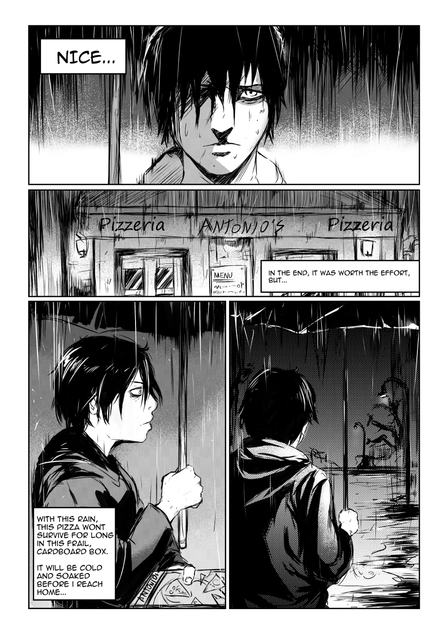
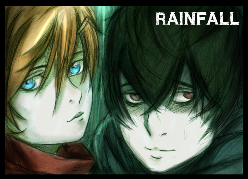
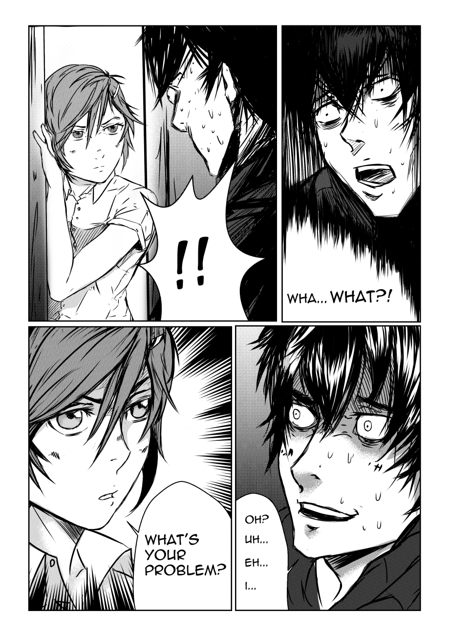
So here is a banner i did for Rainfall along with a remake of page 1 and page 13.

The redone page one:

And page 13:

Also, i uploaded the comic to this site: http://tapastic.com/episode/36811
For easier reading. :)
Posts: 7
Threads: 1
Joined: Apr 2014
Reputation:
0
Im read last pages. Man it's cool! Omg. I'm wondered, but its really interesting to read. Maybe because i like some depressive things. Have you read Scott McCloud's Comic books? If not, be sure to check :3
Posts: 19
Threads: 0
Joined: Apr 2014
Reputation:
1
I'm just blown away by your work. No crits from me, just keep going!
Posts: 654
Threads: 4
Joined: May 2013
Reputation:
22
Haha, I think you nailed his expressions in the last page man,
The redone page one looks alot better, Stylistically I think the guy fits much better with the tone of the whole story, and the rough backgrounds look a hell of alot better then the photoshopped ones.
That medieval conceptart stuff looks pretty cool as well.
|


