04-01-2014, 08:25 PM
Hey Phil, thx a bunch! :) Yep, struggling with that.. I'm very slow (or rather very anal) about my own stuff.. but I'll keep posting whatever I come up with..
|
Kaffer's sketches & doodles
|
|
04-01-2014, 08:25 PM
Hey Phil, thx a bunch! :) Yep, struggling with that.. I'm very slow (or rather very anal) about my own stuff.. but I'll keep posting whatever I come up with..
04-06-2014, 08:44 AM
Loving the sci fi direction you have been taking lately. Looks really cool. That tank looks pretty awesome. Did it really have such a flat side plane though?
That lord of the flies D: looks so cool! The colours are really great. Looking forward to more posts from you since the whole of the last page was great!
04-09-2014, 05:42 AM
Hey Jaik! Thx a lot! Yeah, it was actually that flat, thats what caught my eye too.. trying to push myself toward manmade objects, because until this point I was more immersed in natural/organic stuff. Can't say it's easy :) Thanks for the kind words, I'm really glad you like 'em!
Some recent stuff quick study after Augustus O. Lamplough - Temple of Kom Ombo original:https://p.gr-assets.com/540x540/fit/hostedimages/1396610030/9159473.jpg 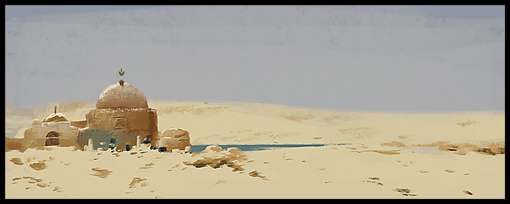 Spitpaints to the FB group Deep dark cave monster  Double-axe dwarf  Super Speedpainting Funtimes ones Dragon Hunting 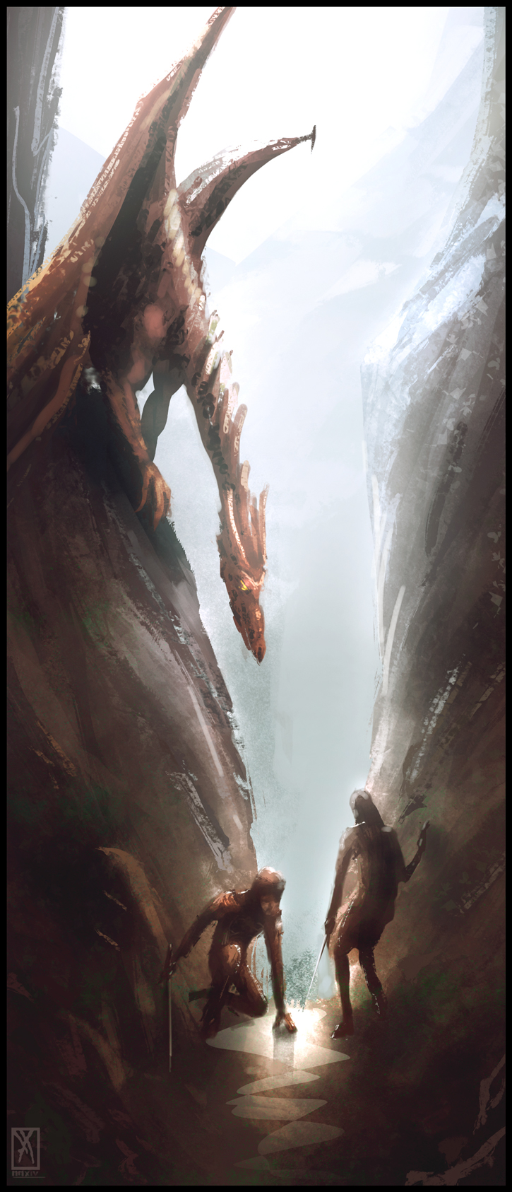 Death Yard 
04-10-2014, 04:22 PM
I like that warm orange hues you're using in those last post, especially combined with the green in the death yard. Very moody.
04-11-2014, 07:05 PM
Thx Lyraina! :) Yeah, color adjustments in the end of the painting can work wonders IMO :)
04-13-2014, 12:08 PM
Thanks for the paint over in my sketchbook, it helps to illustrate what you were saying.
I agree with Lyraina, the colours are nice. However, green and orange are your go to colours (your dp, the swamp elder bloodsports, dark cave monster, even the dragon on in the last post is just desaturated green and red with some grey for the sky) so maybe keep that in mind for future pieces. Kind of cool if this is intentional, but it may not be so just pointing it out. *Just went and looked at the last 2-3 pages and there is a lot of green and orange in your sketchbook.* But, I still enjoy what you are putting out, so keep on keeping on and give me more updates soooon! >:D
04-14-2014, 02:01 AM
No problem :) Yeah, true that - but it's not really intentional, they just kind of end up this way. I'll keep it in mind, wouldn't want my portfolio to end up showing only these colors - thanks for pointing that out bro! :)
04-23-2014, 03:52 PM
The little cave monster is cool. Very fierce face, but gives the impression that it's about 3 inches tall.
Dragon hunters has some good story telling--those guys are out of their league, I think. The death yard colors are beautiful. Also, the lord of the flies guy is really cool--I like how he's sort of in pieces.
_________________________________________________________________________
The best time to plant a tree was 20 years ago. The second best time is now. -Chinese proverb Sketchbook
04-23-2014, 05:31 PM
Temple study came out very well!
04-23-2014, 07:26 PM
Tygerson - Yep, that was the goal :) I'm glad because those were the actual things I wanted to represent in these pieces, shows I was on the right track :) (- not be boasting or anything)
Denikina - Thank you! :)
04-23-2014, 11:35 PM
Sweet storytelling going on man! Feels like you're pretty fearless when it comes to subject matter. I really like that, it's so varied!
As a little critique, I think that you can introduce some more depth in your layers. Painting in more clear foregrounds, middlegrounds and backgrounds. You did it great in the dwarf holding two axes sketch, there you can really feel the room. Keep kicking butt dude! And because Jaik pointed out that you use similar colors, why not try this challenge! 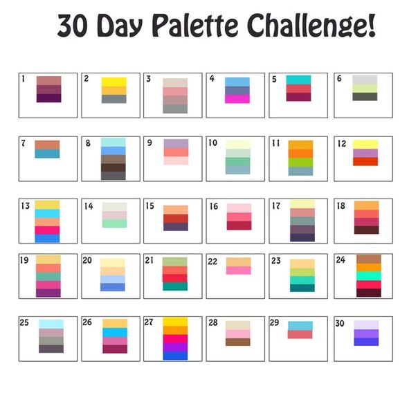
04-24-2014, 11:39 PM
Hey man, thanks a lot! Feels good to be called fearless! :P
I like to think more in terms of focal areas & less important areas, but I get what you mean, introducing depth levels some more could definitely help with the feeling of space in my stuff. That palette-challenge is a nice idea - though it has some pretty wild stuff going on :) I just might give it a try.. Thanks for the critique man! :)
06-14-2014, 12:07 AM
Hey man! Nice stuff you've got there! Looks like you're posting very regularly, that's good! I see you're gettig better at composition, color schemes and portraits. Keep it up!!
06-14-2014, 01:17 AM
Thank you very much! I'm really glad if that's the case :P Nowadays I'm trying to reach a more loose & painterly feeling in my stuff (also wanna get faster), so I'm kinda pushing myself
in that direction.. aside from building a portfolio :) Todays speedpaint: The white wolf! (Meh...Not too satisfied)
06-14-2014, 05:48 AM
Nice. Good progress.
Your environment work really is a major strength of yours.
06-14-2014, 06:47 AM
Great sketchbook, really like how you challenge yourself with different subjects and keep trying to weld more tools onto your arsenal of skills - I can see you are thinking more about depth and mixing up the colour scheme with the wolf picture for instance, even if you don't regard it as a success. (Honestly I find full body speedpaints tricky myself, I think a full body is a complex shape to get down and gel with the rest of the picture, so just keep practising!) Keep it up!
06-15-2014, 05:12 PM
Thanks a lot man, I agree, full postures are a difficult task to manage in something thats supposed to be quick and fresh.. gotta keep at it though :)
A couple of Spitpaints from yesterday Bone Garden 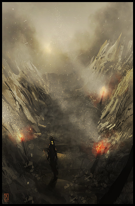 Room with the White Orb 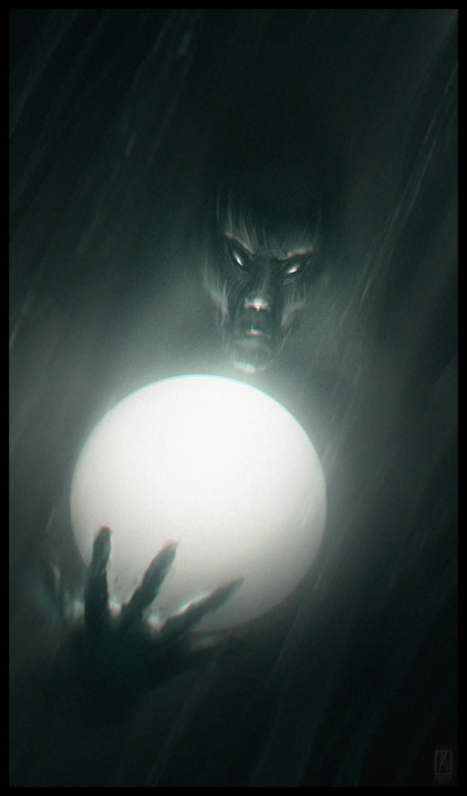
06-18-2014, 06:29 PM
A couple of Spitpaints..
Crow God (more like Penguin God..)  Volcano City 
06-20-2014, 10:06 PM
Thx a lot! Trying my best.. :)
Some hand sketches for anatomy practice 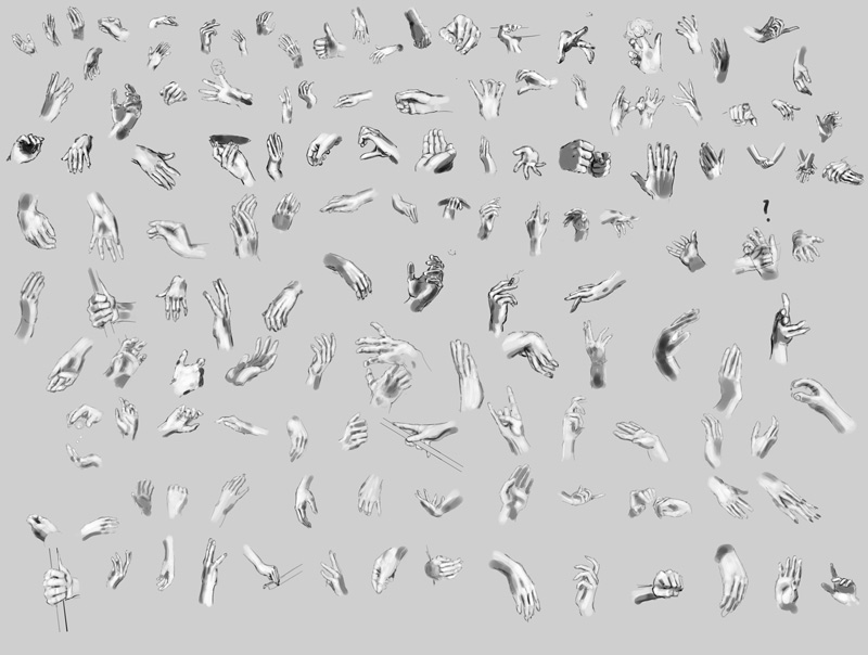 and a Spitpaint for today, Mushroom Warrior - these are pretty addictive :) 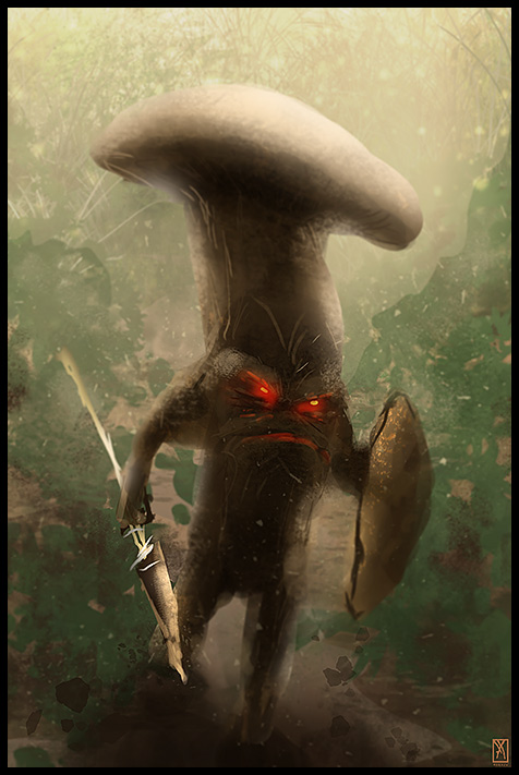
06-21-2014, 12:05 AM
Great lighting on these speedpaints, it is really dramatic and eyecatching.
|
|
« Next Oldest | Next Newest »
|