07-15-2014, 09:10 AM
|
Shin's Sketchbook
|
|
07-20-2014, 07:05 AM
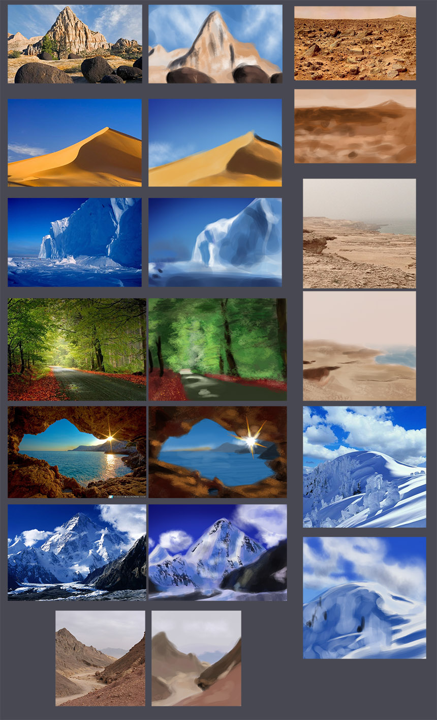
Little update of my study stuff, gonna focus on skin coloring next week and some more values..
   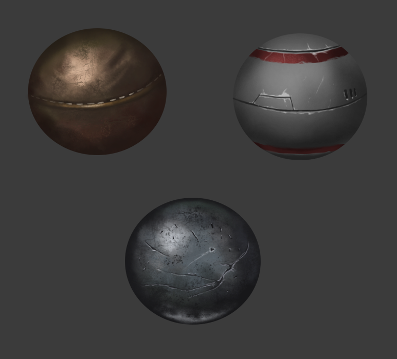 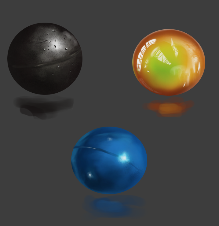 
07-20-2014, 08:26 AM
Great work Shin, you keep getting better and better too : )
Love your material studies, so much information in them - make sure to use them all in paintings though else you'll forget what you learned! Of course you have them as reference but nice to be able to do from your mind : ) Keep it up bruddah : )
07-25-2014, 07:49 PM
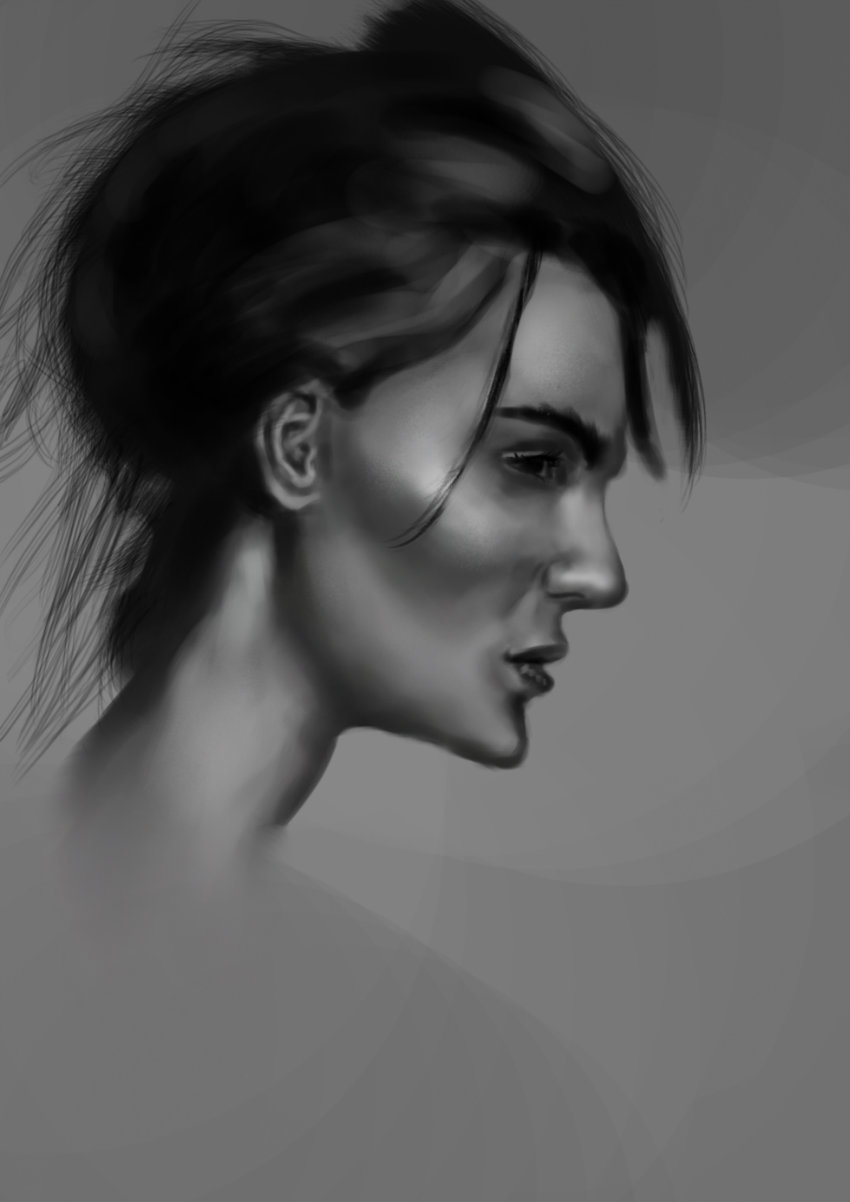
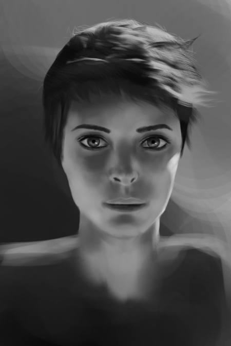
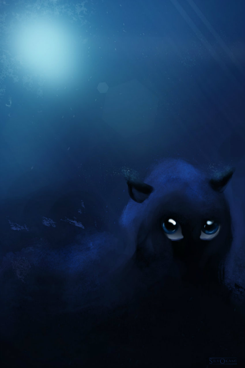
Don't know how to feel about this one but i like her hair..
07-26-2014, 09:06 PM
Applying some color values into painting, any criticues are welcome.. the pic is very cropped so sorry if it's blurry..
07-27-2014, 12:33 AM
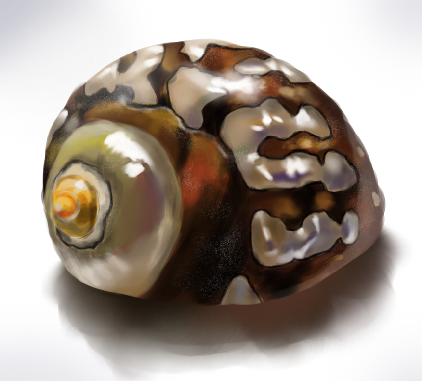
And some more studies..
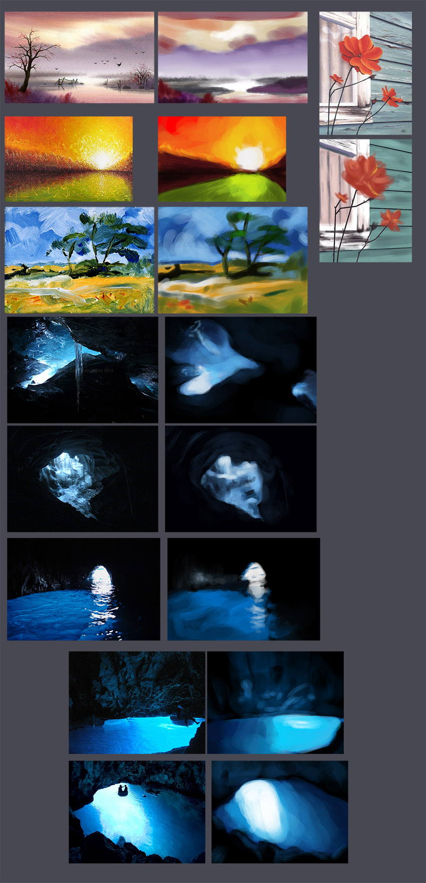   -skin study 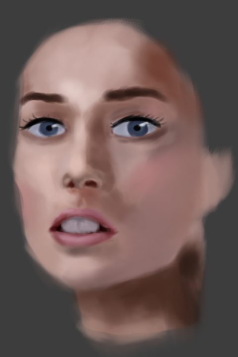 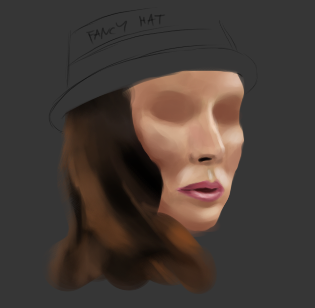 -still life 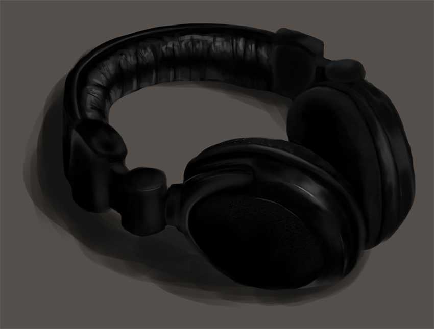
07-27-2014, 10:26 PM
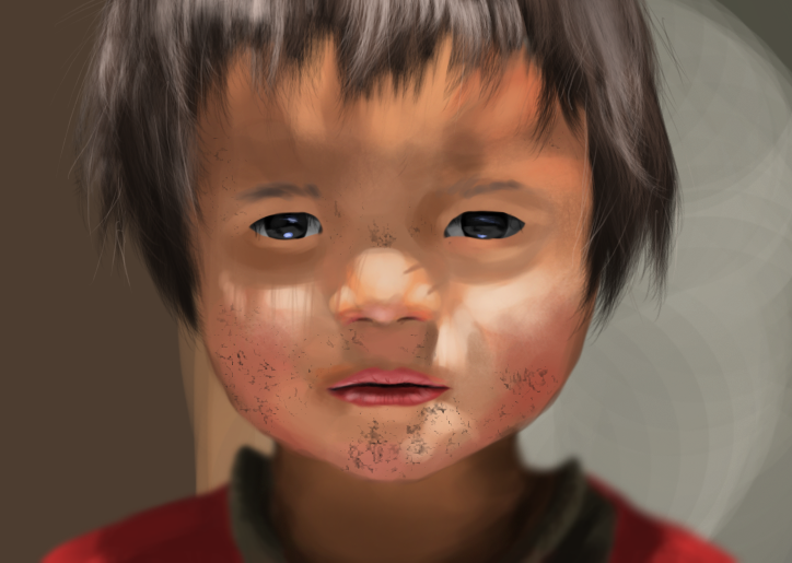
Photo study.. tried to apply some image adjustments since i rarely ever use those >.<
07-28-2014, 09:01 AM
Looking great! I love the focus pulled to his face with the blurry neck, the cast shadows from the hair on his cheeks and nose give it a real lifelike feeling too. The hair itself looks a little too fuzzy and blurry though - I can see you put in some hard strands too but I think it's not enough. Don't know what to suggest since I'm not great with hair, but just my observations. Looking great though still, your portraits are really kicking ass these days! I really liked that blue sea creature painting before as well - its cute, with the eyes, but overall has this kind of melancholy feeling too, really nice ^^
08-02-2014, 07:47 AM
(07-28-2014, 09:01 AM)JyonnyNovice Wrote: Looking great! I love the focus pulled to his face with the blurry neck, the cast shadows from the hair on his cheeks and nose give it a real lifelike feeling too. The hair itself looks a little too fuzzy and blurry though - I can see you put in some hard strands too but I think it's not enough. Don't know what to suggest since I'm not great with hair, but just my observations. Looking great though still, your portraits are really kicking ass these days! I really liked that blue sea creature painting before as well - its cute, with the eyes, but overall has this kind of melancholy feeling too, really nice ^^ Hh, thanx man, always nice to see a reply like this.. : ) And as for the blue one, i tried to put an calm feeling to it as i applied some of the color study i did, don't know if i should make more.. :s 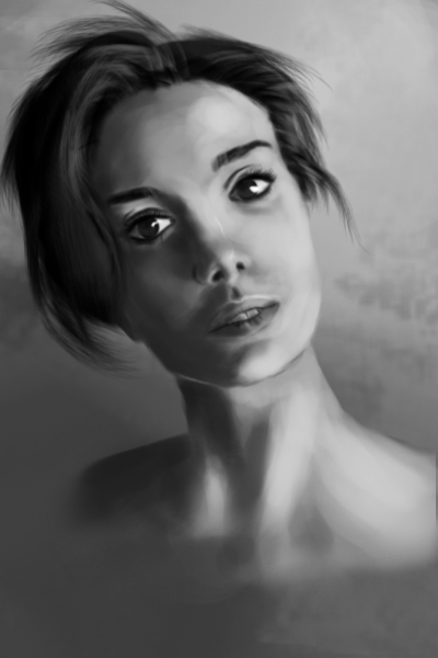
08-03-2014, 09:03 AM
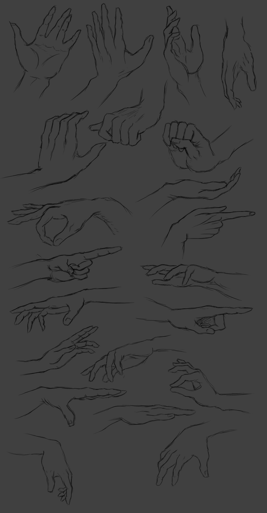
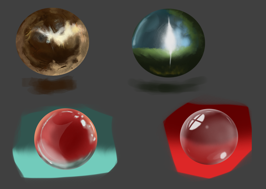
More stuff, this week focused on color and practicing values on the landscape..
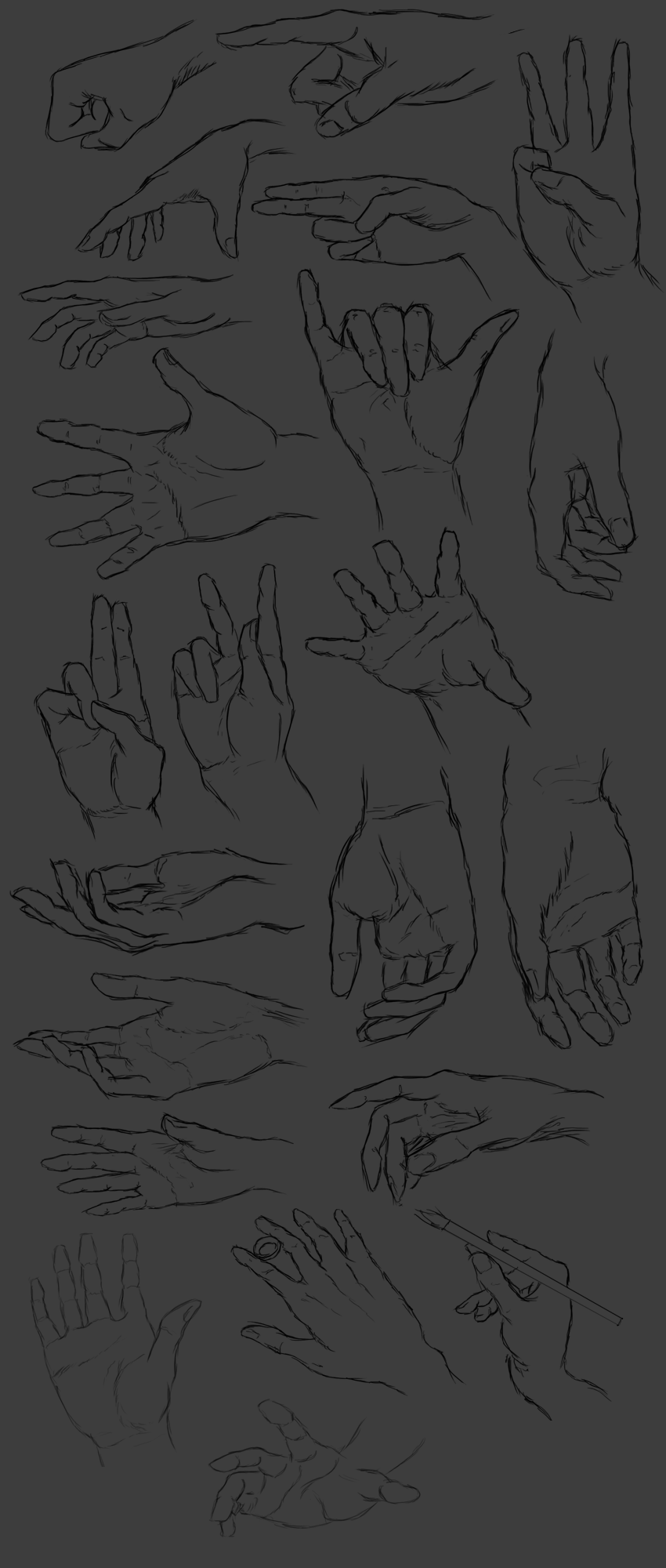
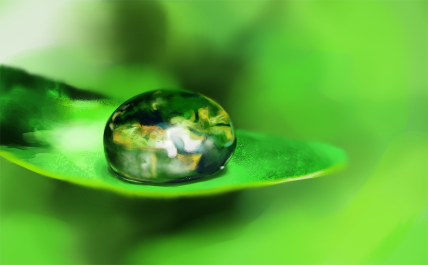
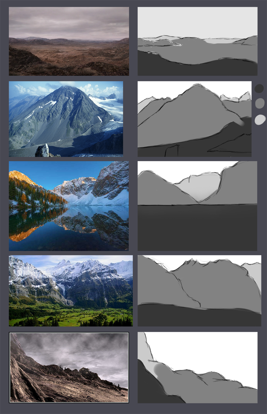 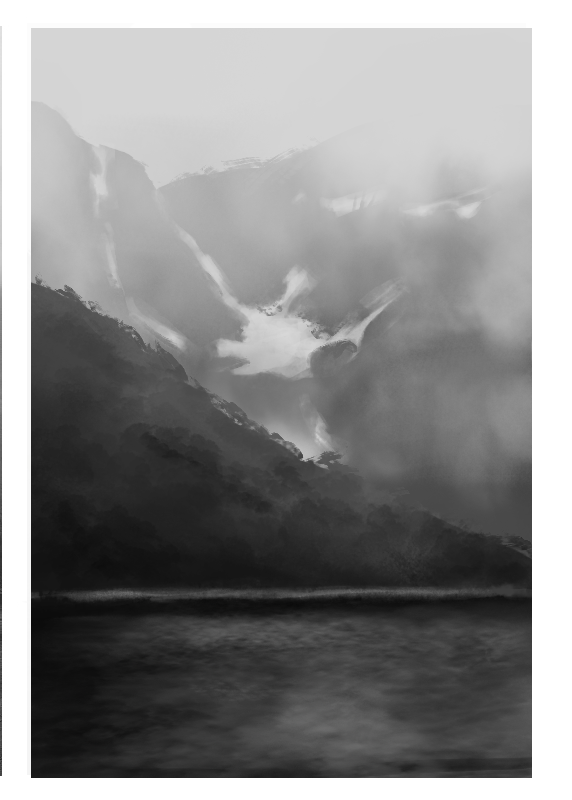 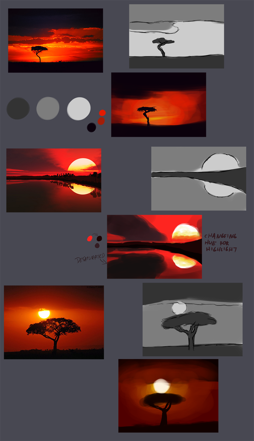  -some hands 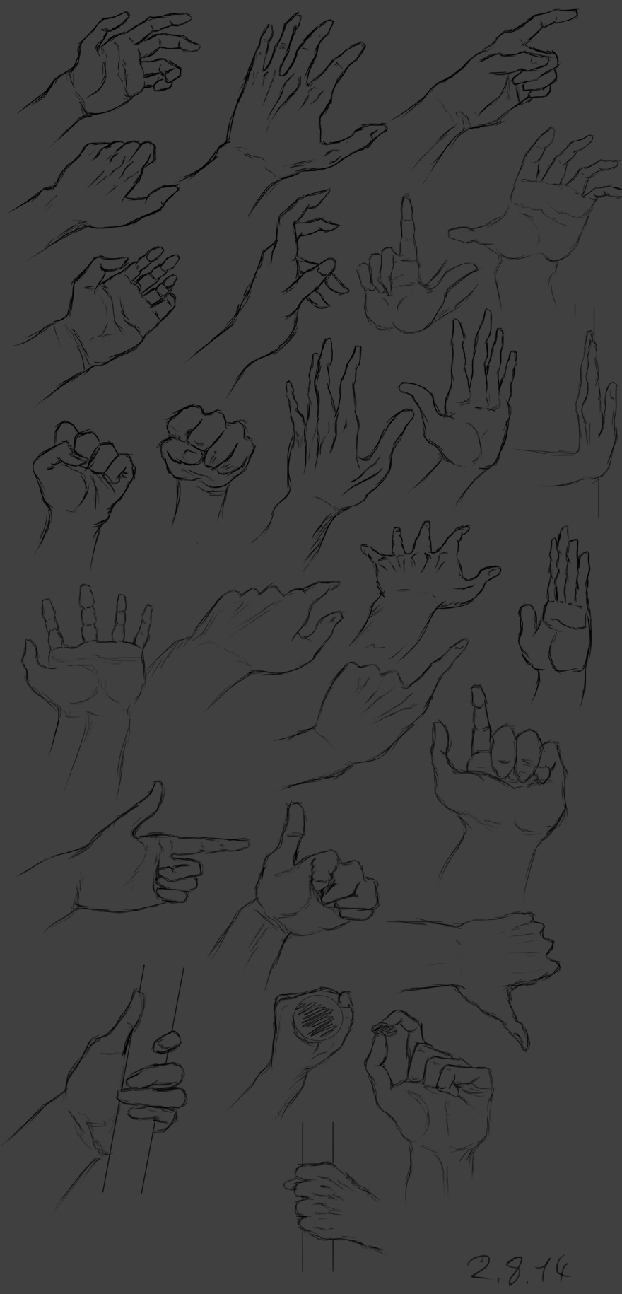 -materials 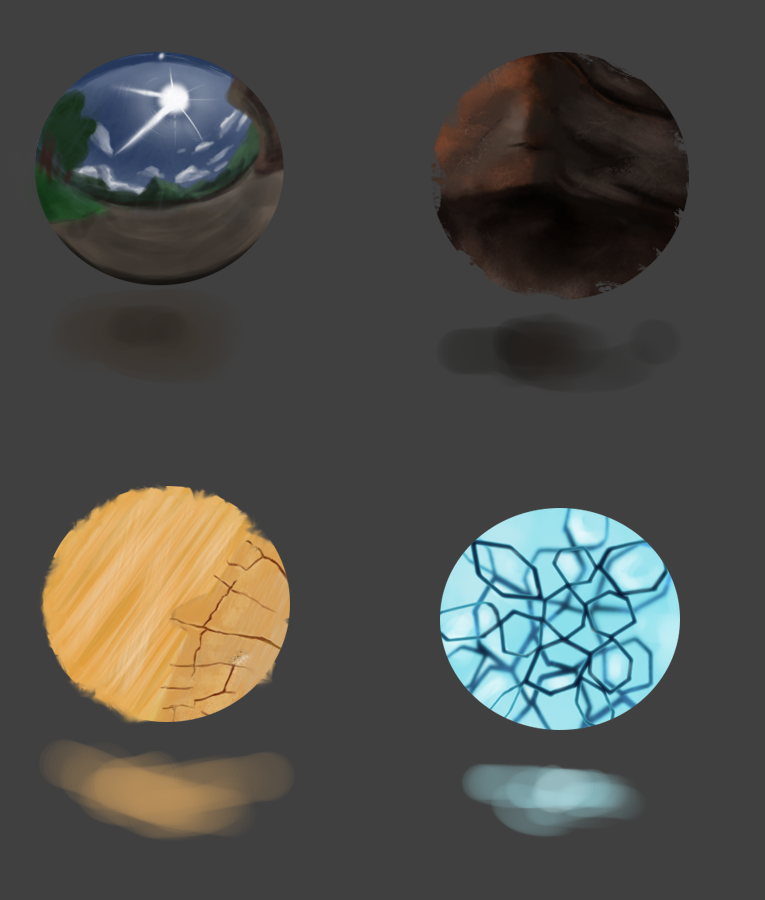 -master study 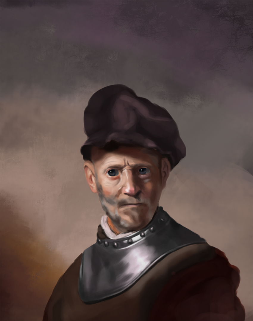 -and one of my first ilustrations based on the material studies.. still have so much to learn.. http://s27.postimg.org/a7uq42qpd/Untitled_1.png
08-06-2014, 02:08 AM
-Master study
Learned some stuff but started to question my painting style.. I was thinking that my brush strokes need more sharpness in them so i'll try to work on that in the other works.. 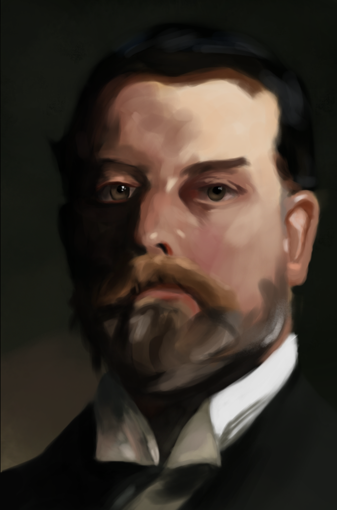
08-10-2014, 05:55 AM
Update time !
Really don't know if i'm doing enough work recently.. -something quick 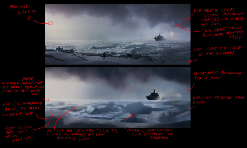 -still life 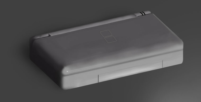 -study of an illustration from Anthony Jones 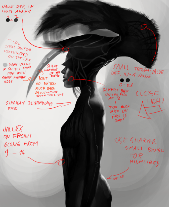 and apply 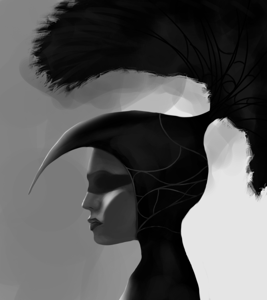 -materials.. picking up older ones to see how much i improved 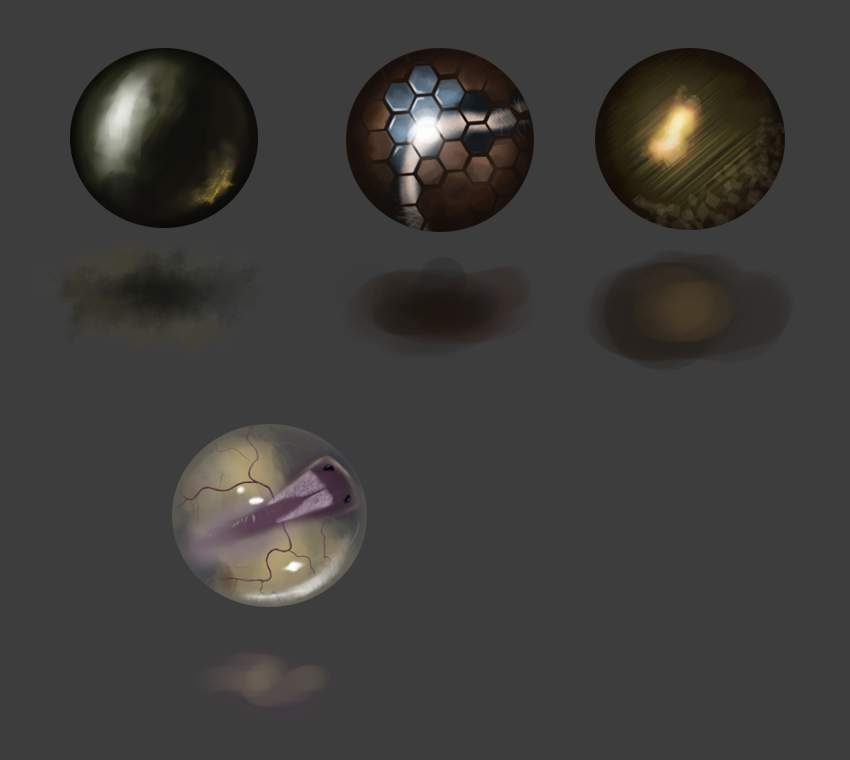 -mostly skin studies and failures 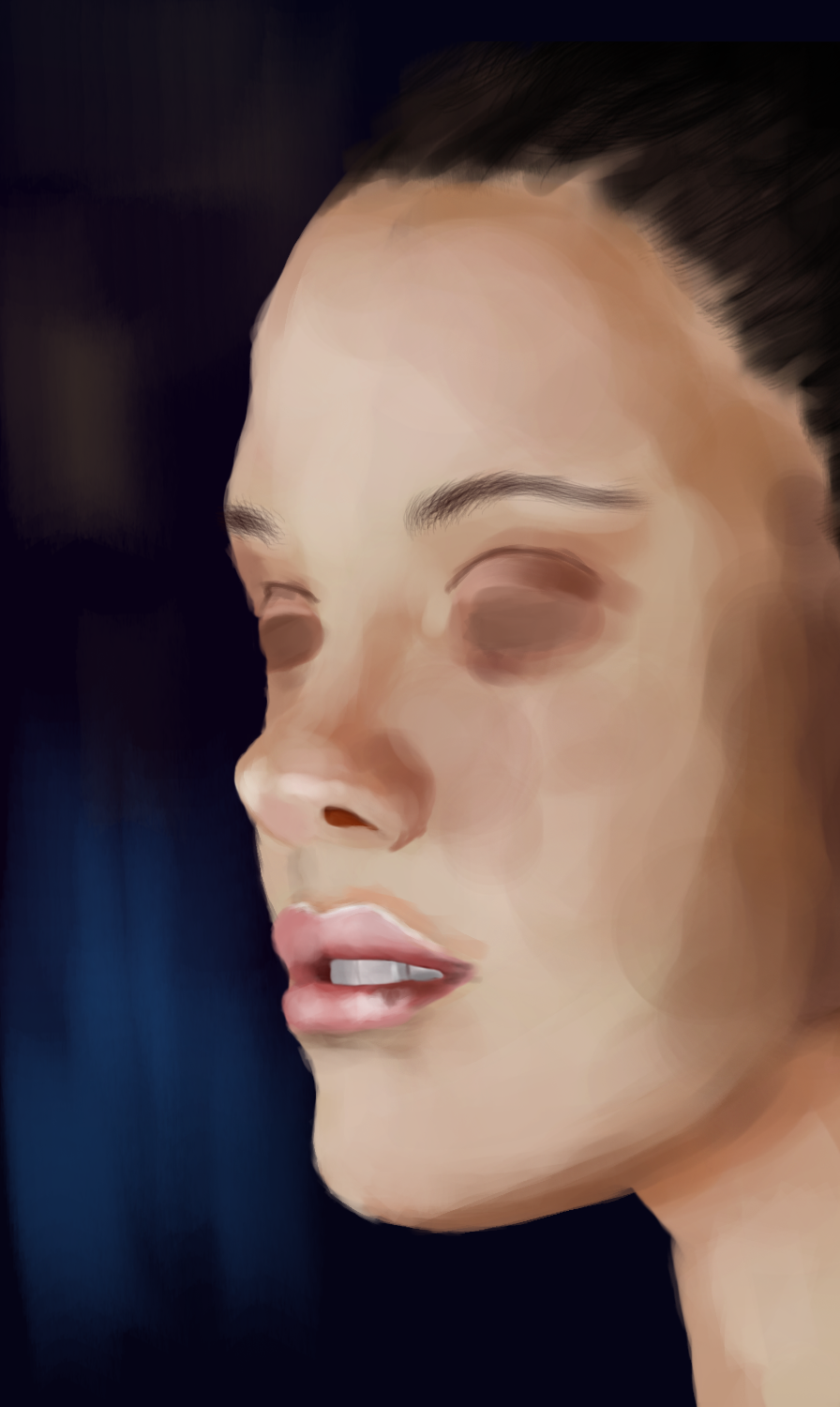 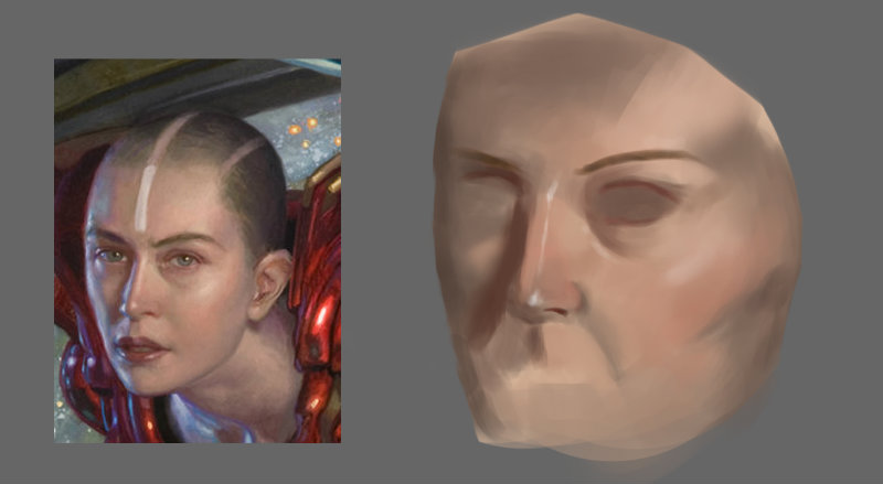 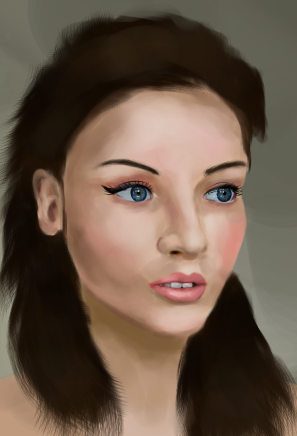 -something very handy~ 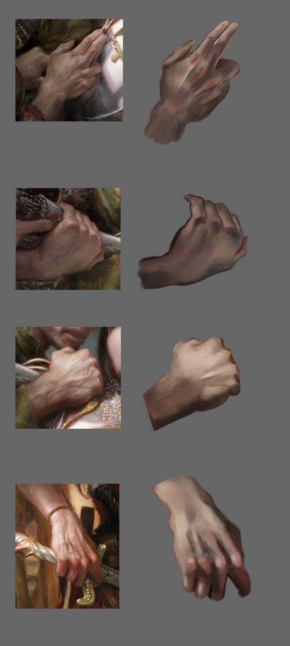 -something bleh 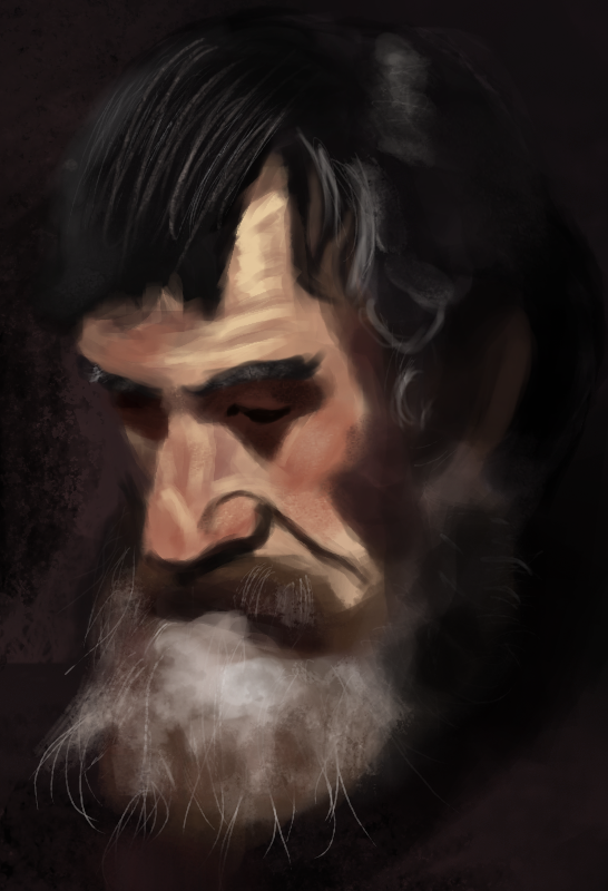
08-10-2014, 06:38 AM
Hey there. Nice amount of studies going on here.
I've looked over your sketchbook I feel like I can lend you some advice from what I've seen. I hope you take this as constructive feedback and I hope you take something away from this. So my main observation of your work is that you lack a solid construction drawing behind your drawings and paintings. It isn't "built" as 3D objects in space so any painting you add over will look off because the initial drawing is off. It does look like you're jumping into digital (studies) paintings without previously getting a good understanding of constructive drawing. This is something that most people have problems with starting out and it is something that if it's not addressed can make you study and study and not really improve at a steady rate. Constructive drawing is at the core of representational art because it is what we're looking at. It is the exterior shapes that make up objects. Artists like Loomis, Bridgman and Vanderpoel have often stressed the importance of the constructive approach to figure drawing (it also applies to everything else, not just figure drawings) and I saw some Loomis looking stuff a bit back in your sketchbook however it didn't appear like you where constructing these 3D objects that Loomis teaches by. So I'd advice you to go back to that and really focus on learning these forms because it is essential for studies like the one of the old man you just posted above. If you have the financial resources I highly recommend the Dynamic Drawing workshop CGMA has. It has a simple breakdown of the constructive process and how to apply that to your studies and drawings. There are other resources to learn this. I believe the Loomis books go through this, The Human Figure by Vanderpoel has a very elegant way of explaining the importance of construction however it is more a book that compliments anatomy books like those that Bridgman made. Anyway, I hope you consider what I said and I hope we'll be seeing some constructive drawings form you, in the future. :)
Discord - JetJaguar#8954
08-10-2014, 11:38 PM
(08-10-2014, 06:38 AM)Tristan Berndt Wrote: Hey there. Nice amount of studies going on here. Yes, this is exactly a type of reply i really needed, thank you for honestly ! : D Ok, this week i'll focus on construction, the Loomis stuff i did that time was really something i just dtarted from scratch, i didn't have any knowledge of what to think about while drawing heads, i was just focused on geting better at them, not realising other important stuff.. So yea, thanks again, really appreciate it ! And a painting with applyed knowledge of color theory from James Gurney 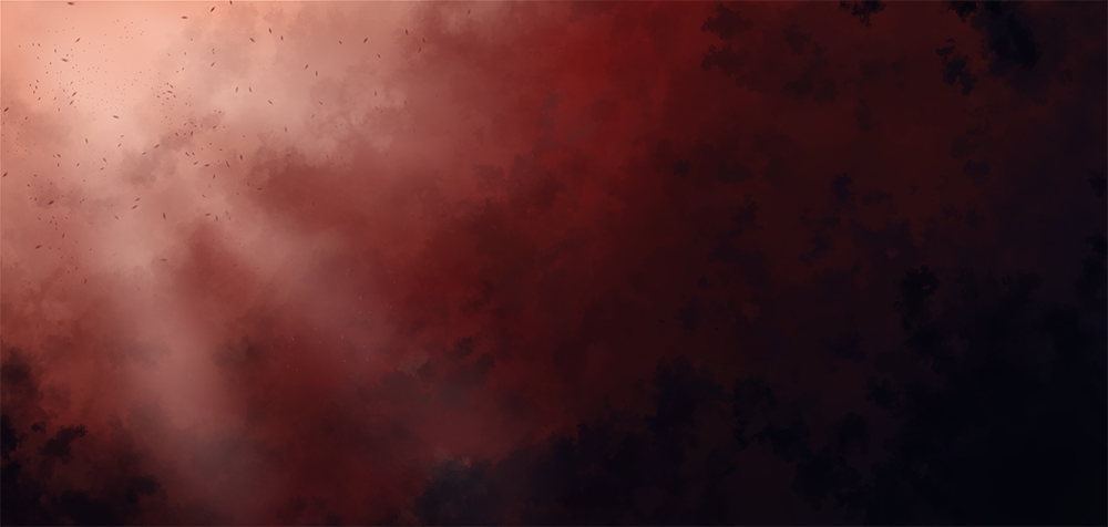
08-16-2014, 09:27 PM
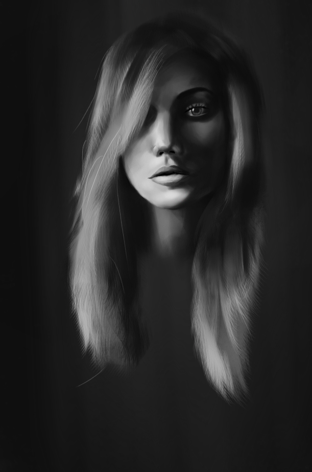
Trying out different approaches..
08-17-2014, 06:18 AM
Well since Tristan told me i lacked in construction, most of the time i was looking through Loomis and Bridgmans books so i don't have much to show now but going through the basics again really showed me what i missed so i'm gonna try to work on it more and hope that it will be seen in my works..
-construction result 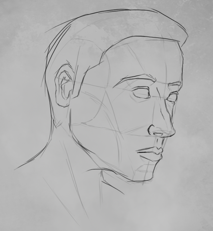 -materials 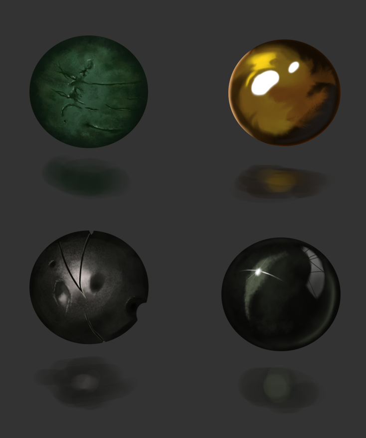 -something quick, trying out lighting theory 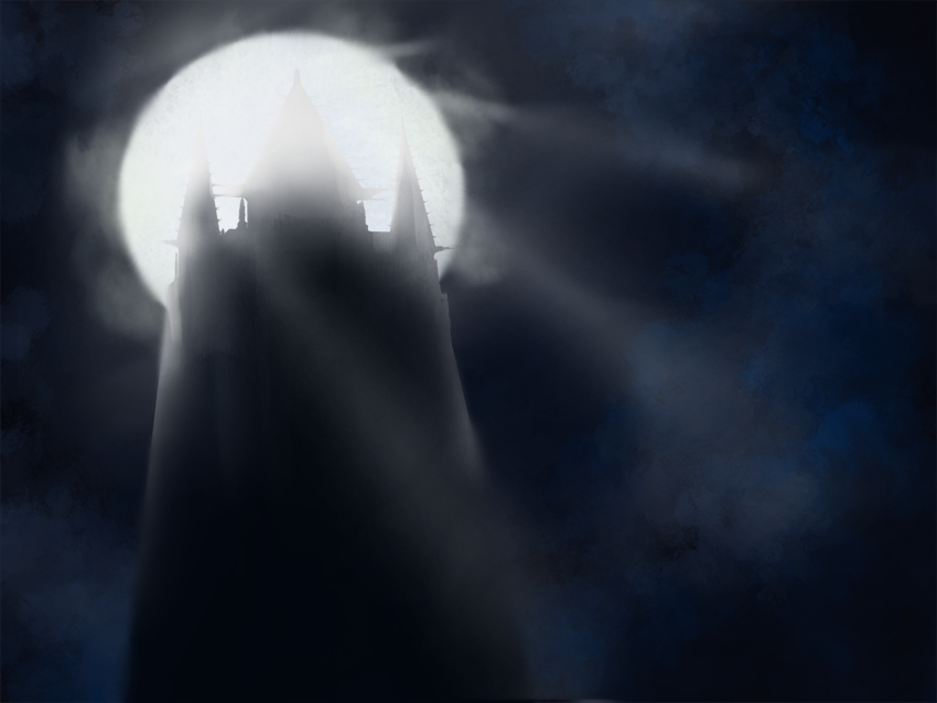 -still life, strong lighting and colours~ 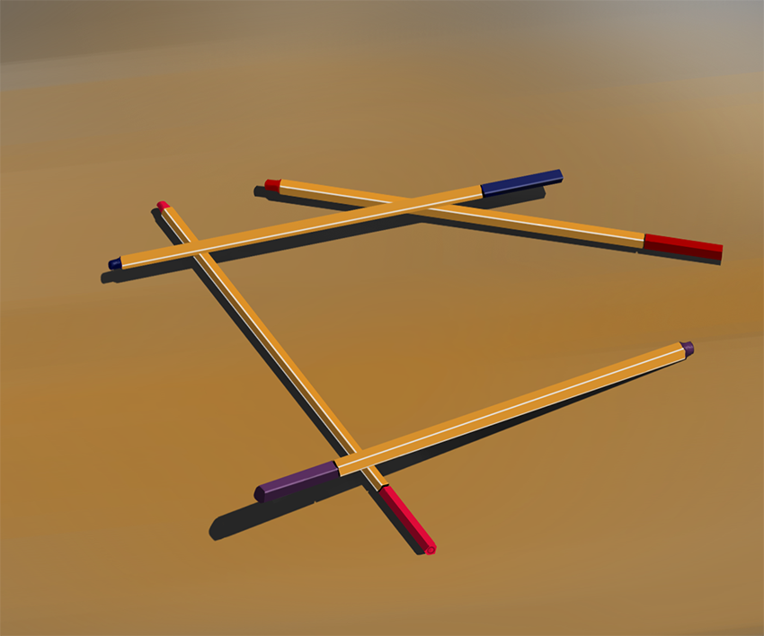 -value stuff 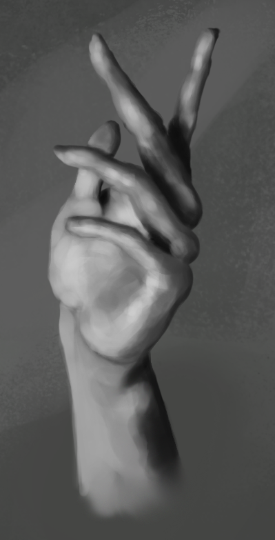 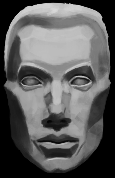 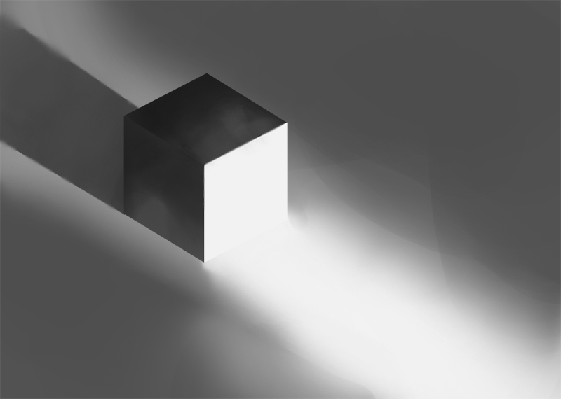 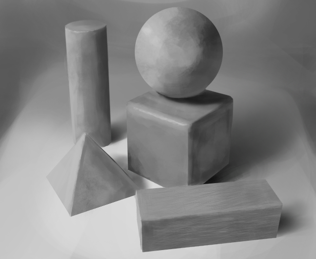
08-19-2014, 07:07 PM
Something inspired by works of Anthony Jones, overall it's flat, bad value control but it was fun and a really good grayscale practice
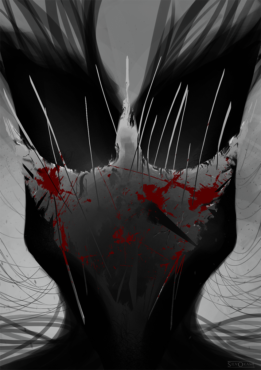
08-22-2014, 10:06 PM
More shenanigans !
-screwing with movie screeshots for warm up 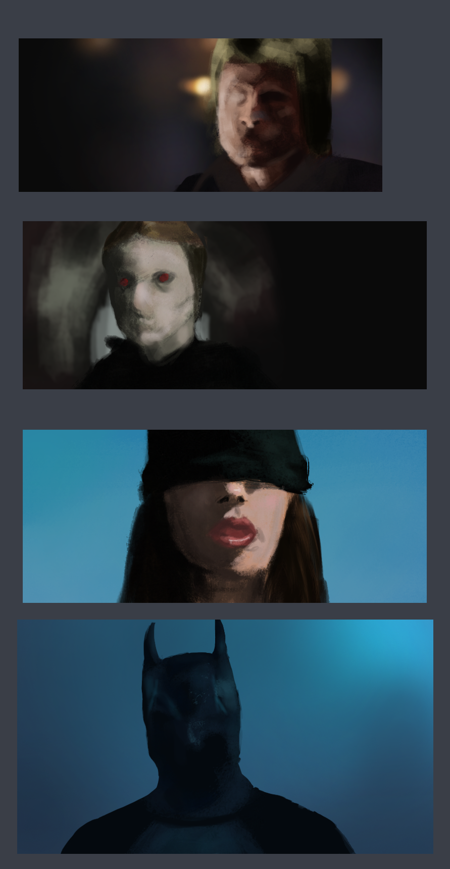 -some more values 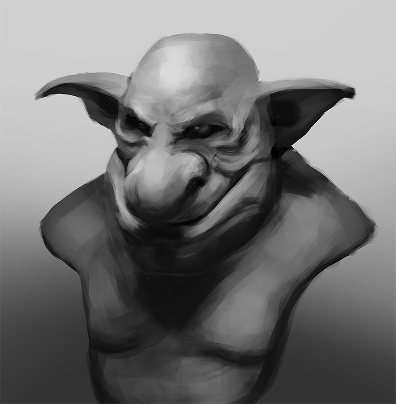 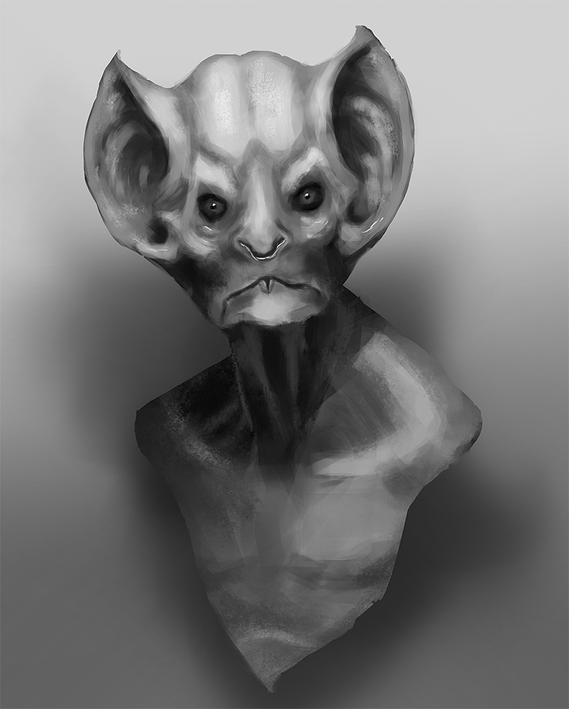 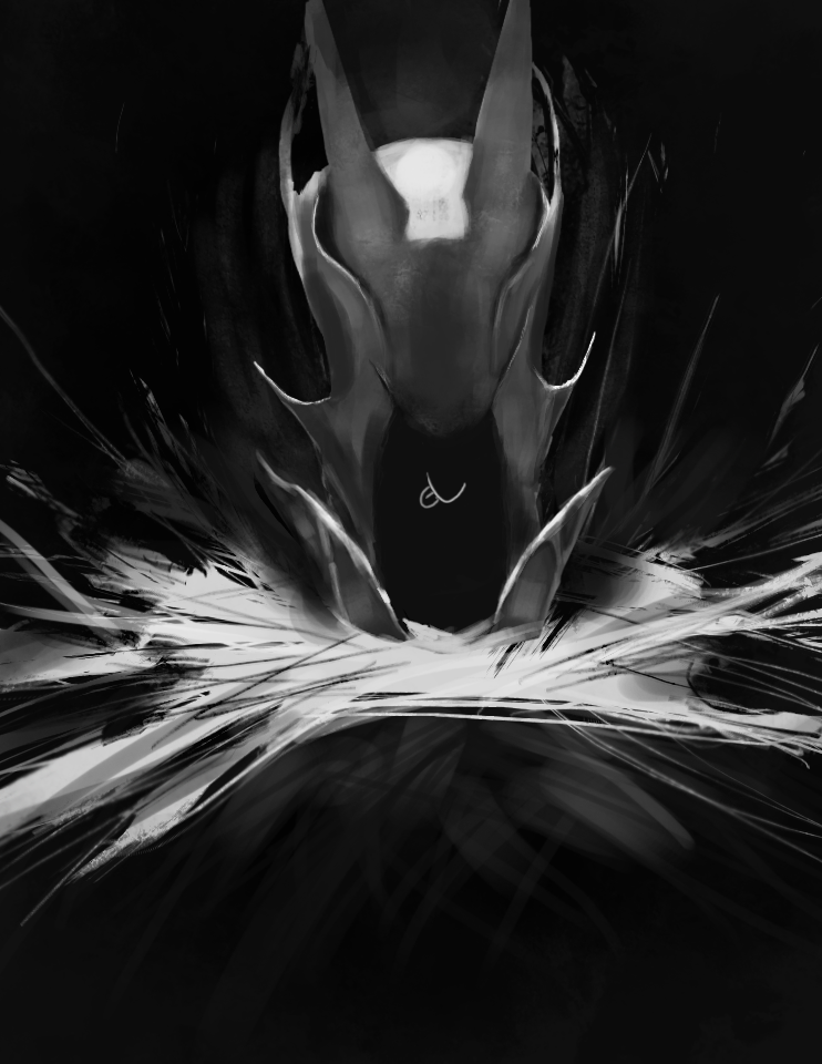 -colorish end~ 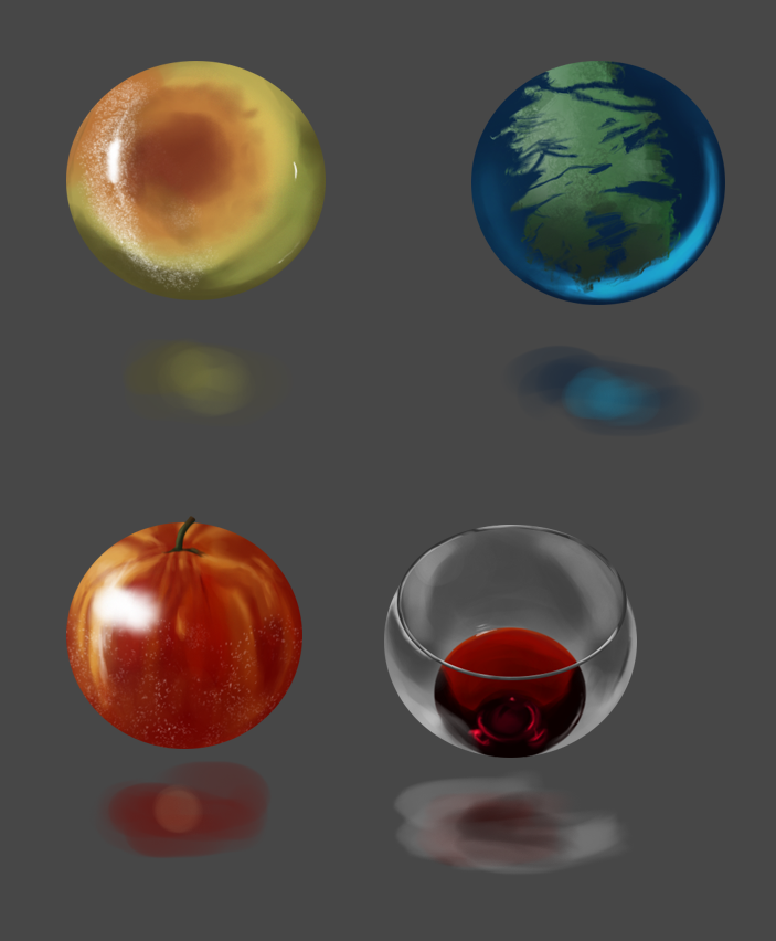 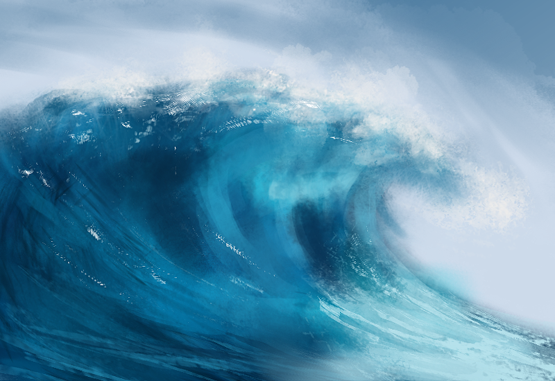 |
|
« Next Oldest | Next Newest »
|