03-23-2015, 07:21 AM
Damn good work since the last time I dropped by :D Really dig that image of the broken down freeway, it has a nice graphic look to it .
|
Ramalooke's Sketchbook
|
|
03-23-2015, 07:21 AM
Damn good work since the last time I dropped by :D Really dig that image of the broken down freeway, it has a nice graphic look to it .
03-25-2015, 03:27 PM
More often. Yes. This post-apoc / zombie(?) apoc stuff is all killer. What is that for? Also, I went back a page and saw your post about missing this place from this past November... I feel like I'm in the same place too. Really hoping for a unified forum to come back to life. In the meantime, I'll be here as well.
Keep on killing it dude!
03-25-2015, 07:13 PM
Daaaaamn love those line work pieces you did there! Great to see you have made a comeback again :)
04-04-2015, 07:09 PM
You have some very nice way of doing lines/lineart… already thought so when I saw those latest characters on facebook (or somewhere..). Combined with that somewhat-texured way of rendering it makes for a very interesting and nice looking result. Although I like the last guy in #278 better than the rendered version of the girl - with her, you went a bit soft, missing out on some energy. Just my opinion though, of course it depends on what you intend it to look :) I’m not sure if that even makes sense - I guess what I am trying to say is don’t fear, be bold, you have something really nice going on here, looking pro :D
Cool enviro in #280 and those zombified char is cool too! Keep it up!
07-14-2015, 01:14 AM
Booooy it's been a while huh? =D
@BenFlores Thanks man. Don't worry, it's been a while since i droped into the forumz ;o Thanks for stopping by =D @Veneq Thanks man. Acctually I've had couple conversations with my friends about all the forumz stuff. Everyone kinda wish for some sort good old ca.org times vibe. What's wrong with this place? Honest question I'm out of the loop these days ;< @AngeliquevdMee Thaaaanks =D @Lyraina Thanks. It makes perfect sense. I kinda experimented a bit with those character renderings after watching one of AJ tutorials. Trying to get more into fancy energetic brush strokes and sexy shapes relam. Not sure how to practice that =D. Something I need to figure out this year :v. Thanks for comment =D Well. Most of my stuff is NDA these days. Sooo nothing much to show. Have something big coming this year. Soooooo big post is on the way. In the mean time I'll post examples of me failing at stuff =D ![[Image: 1_zpsbvengyk6.jpg]](http://i1150.photobucket.com/albums/o620/ramalooke/1_zpsbvengyk6.jpg) ![[Image: 2_zpsskqpftwu.jpg]](http://i1150.photobucket.com/albums/o620/ramalooke/2_zpsskqpftwu.jpg) ![[Image: 3_zpspr6owmvo.jpg]](http://i1150.photobucket.com/albums/o620/ramalooke/3_zpspr6owmvo.jpg) ![[Image: 4_zpsny23y6gf.jpg]](http://i1150.photobucket.com/albums/o620/ramalooke/4_zpsny23y6gf.jpg) ![[Image: 5_zps6jjj75ss.jpg]](http://i1150.photobucket.com/albums/o620/ramalooke/5_zps6jjj75ss.jpg) ![[Image: 6_zpslizuozim.jpg]](http://i1150.photobucket.com/albums/o620/ramalooke/6_zpslizuozim.jpg) ![[Image: 7_zpsw60f7eeh.jpg]](http://i1150.photobucket.com/albums/o620/ramalooke/7_zpsw60f7eeh.jpg)
07-14-2015, 01:26 AM
I've read enough berserk to know how those zbrush studies are gonna go
![[Image: tumblr_n0uxi2Wfft1rtuqolo1_500.gif]](https://38.media.tumblr.com/4d131dd7d4fdce2b4cbd735625a5d0bb/tumblr_n0uxi2Wfft1rtuqolo1_500.gif) Fantastic, they are gonna go fantastic. The zombie/infected dude looks amazing man.
07-14-2015, 02:25 AM
I would also like to see a behelit modeled in zbrush. Characters look high-tier, love em.
07-15-2015, 03:39 PM
![[Image: 12050291.gif]](https://d.gr-assets.com/hostedimages/1416734063ra/12050291.gif) Duuuuuuuuuuuuuuuuuuuuuuuuuuuuuuuuuuuuuuuuude! I can't even Every post = more and more jaw-dropping please continue updating you crazy ninja you
sketchbook | pg 52
"Not a single thing in this world isn't in the process of becoming something else." I'll be back - it's an odyssey, after all
07-23-2015, 06:49 AM
Whoaaa great work man!
Loving it <3 (and holysh*t great enviros man)
07-26-2015, 02:49 PM
Wow man, great improvement as always! Your character designs have gotten so good, hope to see more!
Sketchbook ~ Blog ~ Deviantart ~ Livestream
07-27-2015, 05:29 AM
Oooh nice update as always! Love the Ciri redesign.
Looking forward to that ‚something big‘. When can you show us more? :D
07-27-2015, 05:55 AM
Hey there, it's been a while! :D
Everything is looking so pro whoa :O The norse guy and chick from the last page are my favourites <3 Love the 3d practice, keep at it! But now I will try to find something I can crit.... mostly tiny tiny stuff really... but hey, I tried xD ^^'    
07-27-2015, 06:10 AM
Loving the line work and paintings. Really clean, and the fill of color is just great. Same goes for your use of texture in the drawings.
Your more concept art orientated stuff could use a bit of work, and while they're solidly constructed, there are a lot of places in the costuming that have too much texture work, which make them very noisy. The Circi redesign has a great use of texture, and doesn't have too many areas blasted with noise. It's very well balanced in that respect. Other than that, your enviro's are looking great. I like the one on the last page of the two horsemen riding down the hill. Looking forward to the next update! :D
07-31-2015, 02:33 AM
It looks like from a clean and nice line art you can go in many stylistic directions... clean line art is important!
08-05-2015, 01:12 AM
@smrr
okaaaay, i'm updating ninja style =D. thanks for stopping by you bubblegum agent =D @Ursula Dorada thaaaankkksss. i'm happy you like them =D @pnate thanks man! most of my stuff is nda, but i hope to get some cool stuff out soooon ;3 @Lyraina i need to couple more weeks, to get stuff out. but it's coming =D @Nowio hey man. big thanks for all the critz. i really appreciate it ;3 your a man made of gold =D @Archreux thanks man. i'll try to keep my eye on this. i tend to get too carry away with textures and shit. gonna practice that more in the future. @meat yeah. lineart is key in my opinion. most of my character stuff are lineartish these days, and i noticed a huge improvement in my paintings just by doing lineart. but to be fair, even though i paint environmets i didn't tackled good old painted illustration for a while now and i'm bet i'm rusty as fuck when it goes for painting something from scratch. heeeey. i've noticed that my environment stuff sucks balls sooo decided to do some jaime jones studies to help me not suck that much. we'll see how it goes once i get my new environment image out. =D ![[Image: 1_zps9dckrclr.jpg]](http://i1150.photobucket.com/albums/o620/ramalooke/1_zps9dckrclr.jpg) ![[Image: 2_zpswedvdpge.jpg]](http://i1150.photobucket.com/albums/o620/ramalooke/2_zpswedvdpge.jpg) ![[Image: 3_zpsijhbklrk.jpg]](http://i1150.photobucket.com/albums/o620/ramalooke/3_zpsijhbklrk.jpg) ![[Image: 3a_zpsudsauik8.jpg]](http://i1150.photobucket.com/albums/o620/ramalooke/3a_zpsudsauik8.jpg) ![[Image: 4_zps13ybepnn.jpg]](http://i1150.photobucket.com/albums/o620/ramalooke/4_zps13ybepnn.jpg)
08-05-2015, 03:38 AM
Ooooh nice studies!! ....Now I want to do some too, haha :D So inspiring.
Only crit I can find is "watch your edges" - mostly, they are nicely controlled, but in some parts the lasso/transparency lock is a bit too obvious, drawing attention to parts where you don't want any attention. (I.e. in that pink-ish rider piece - look at horse's tail in your vs. Jaime's version). Unless you were focused more on something like color, then just ignore my comment please :P
08-05-2015, 04:03 PM
Damn, those are some sexy Jamie studies. I agree with Lyraina when I say I feel like doing some of those, too!
The edges in a few of these are a bit sharp, yes. Considering finessing a few of them the next time you go through a study with the lasso and whatnot. I'm really fond of the implementation of it. Do you make a lasso selection with an opaque fill, and then just paint over/around that? I'd be very interested to know your process because these results are real pretty. It will be really awesome to see what you do with all of these. :]
08-17-2015, 11:55 AM
The studies look pretty solid.On that last landscape I'd say you might want to keep detail to your focal point and kinda dffuse it radiating out from it. Since detail is spread troughout the painting its sorta hard to see what you want the viewer to see.Elegance is in simplicity.With that elf portrait drawing i think making the eyes a bit more ambiguous would look better. For refference look up eastern artists. Mostly koreans like Braveking or Evan lee to see what I mean. Regardless keep up the hard work. It's paying off big time!
08-27-2015, 07:49 AM
@Lyraina
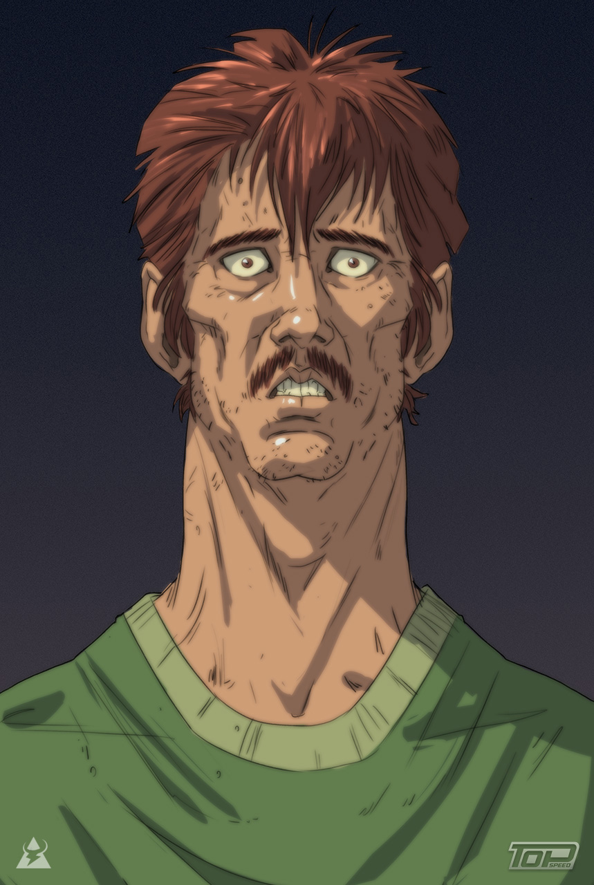
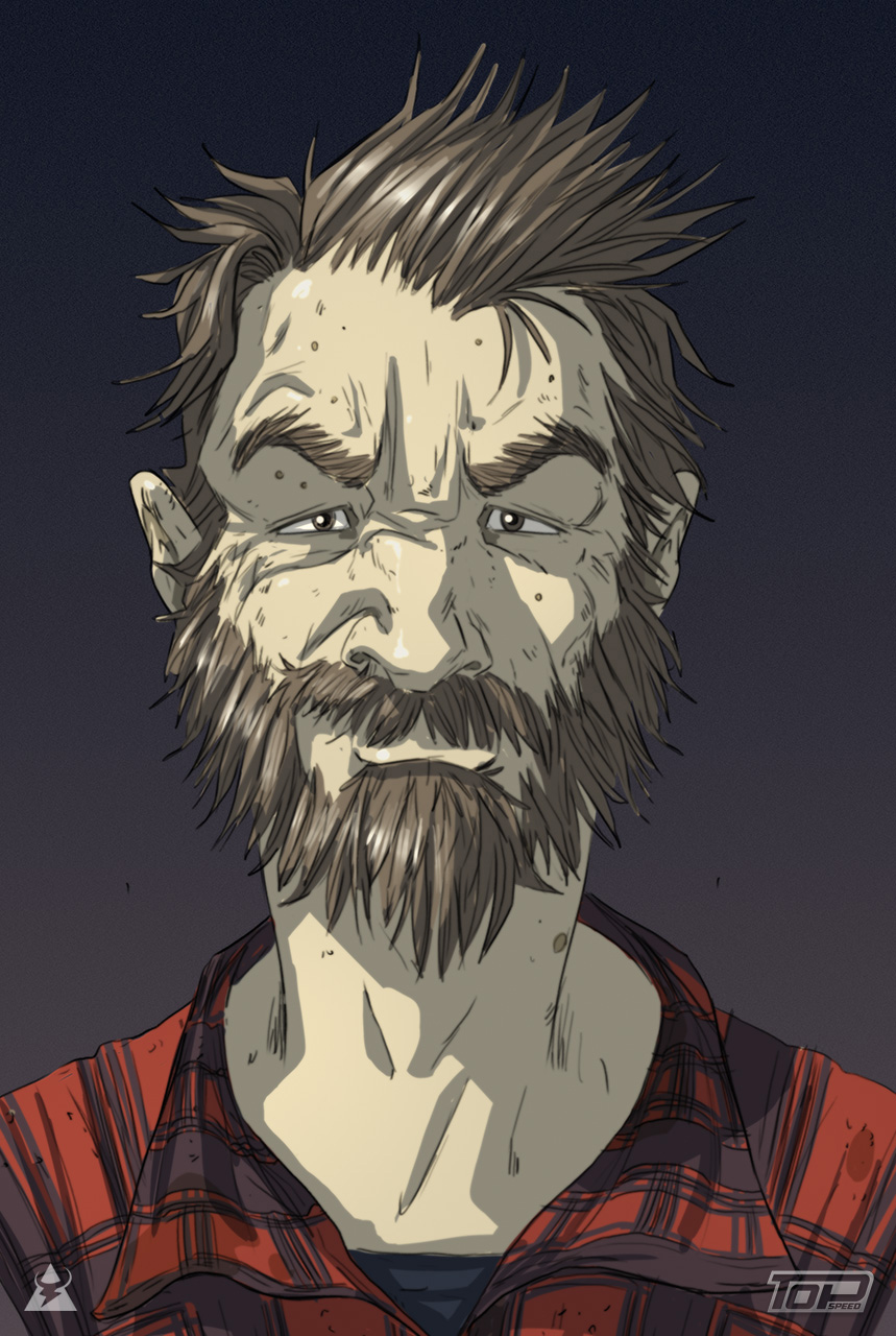
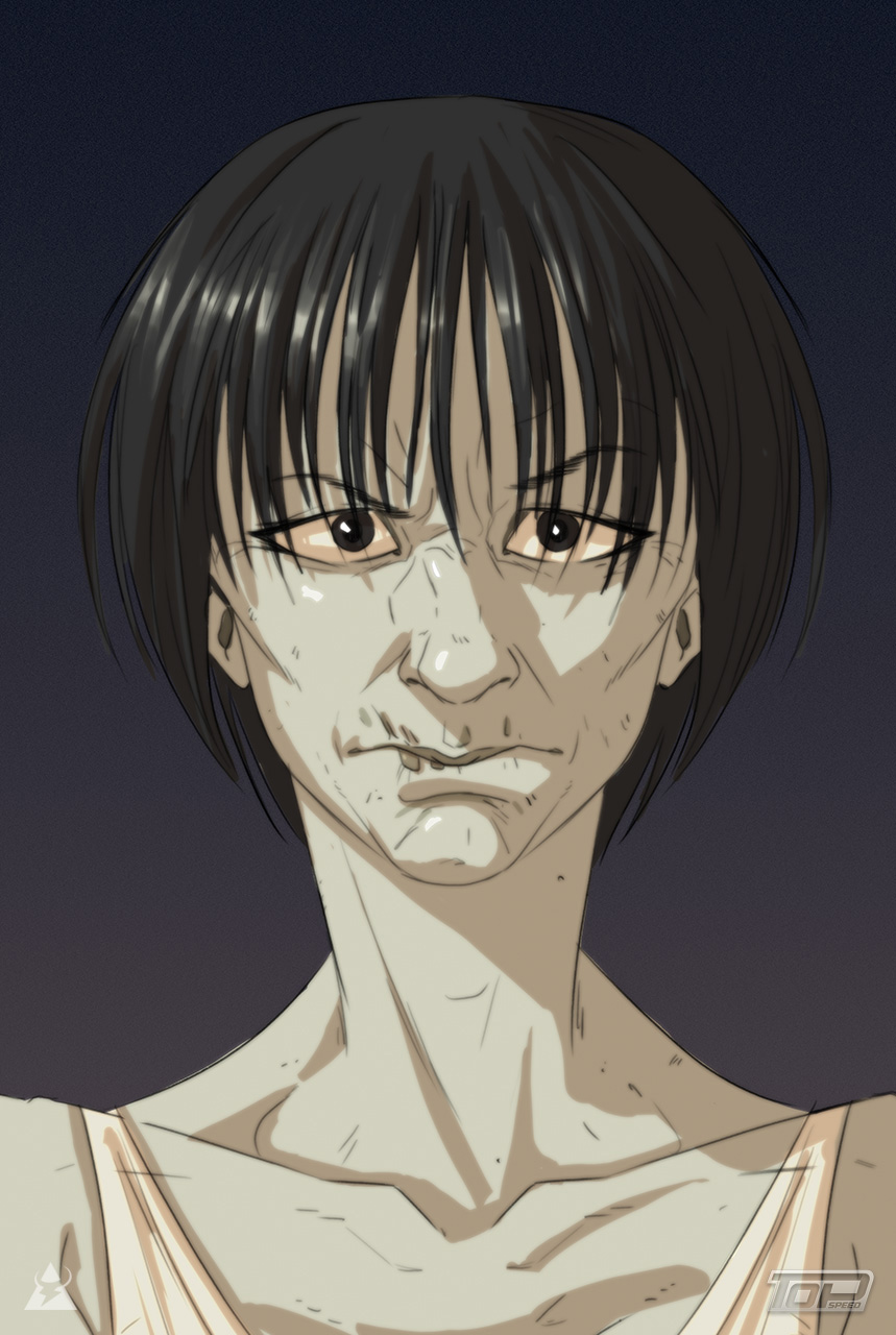
Oh yeah, you're totally right! Thanks for pointing that out. Didn't seen this till now. Big thanks once again ;3 @Archreux Hey. Thanks for stopping by. I'm using this process https://www.youtube.com/watch?v=NygkJEc3yu4 @Rindoukan Thanks man for solid advices. I'll go and study more asian artist for future references. Thank you! ;3 Here's something I can finally show. Some character work I did for a small mobile game studio.           
08-27-2015, 08:55 AM
woohoo goo rama! the cel-shading i'm diggin it man!
|
|
« Next Oldest | Next Newest »
|