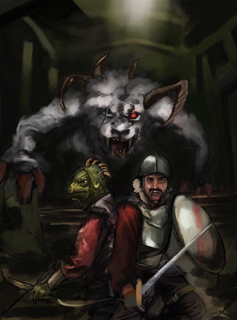
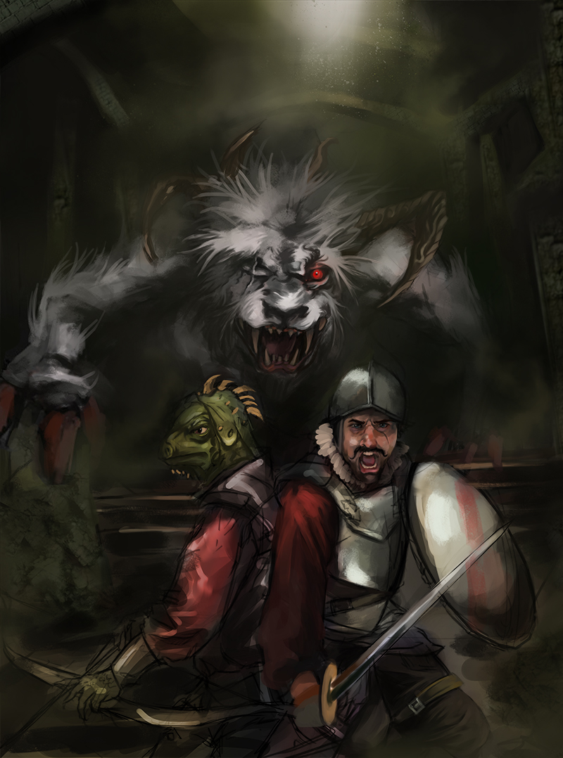
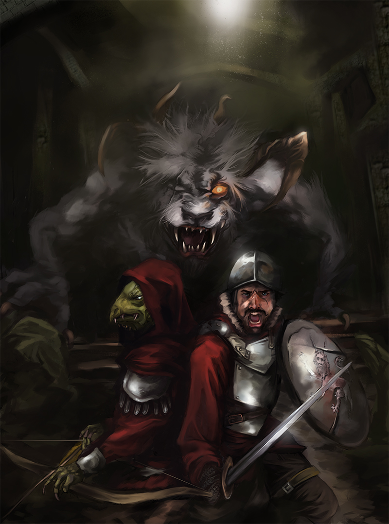
Posts: 1,098
Threads: 11
Joined: Aug 2012
Reputation:
34
I´m preparing my next portfolio piece, from now on i will replace my existent portfolio pieces with new ones. I plan this to be the first.
So, what you think about this composition?
The basic idea is, two adventurers in an old long ago forgotten ruins, and of course, the creepy beast coming to devour them.
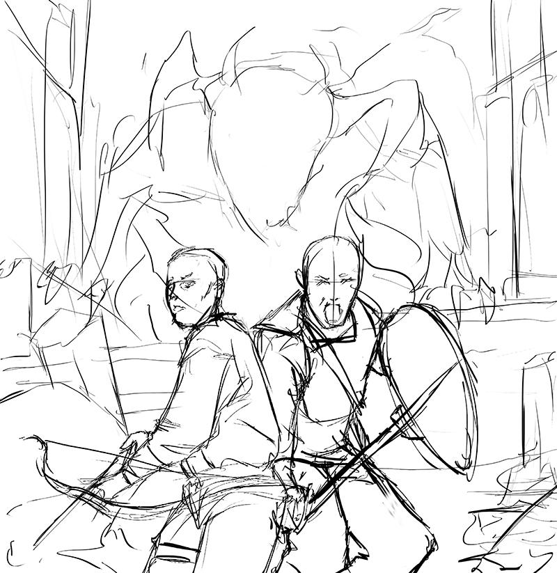
Posts: 350
Threads: 15
Joined: Jun 2012
Reputation:
18
I only have one problem so far, the size and bulk of the monster makes me feel it would be noisy. Even in a very dark room it would still give away the direction it is coming from, the adventurers don't know where it is though. You could make it work if you had a very stalky monster peeking from the dark, but right now maybe a pack of dog sized monsters weaving around them would be better?
Either way, I look forward to seeing what direction you go!
Posts: 1,098
Threads: 11
Joined: Aug 2012
Reputation:
34
yeah, good point atrenr, maybe i can design something similar to the monster of the corean movie "the host"
![[Image: images?q=tbn:ANd9GcTnde5r6gQicwn5t-n2unn...OuTw-swV0A]](https://encrypted-tbn1.gstatic.com/images?q=tbn:ANd9GcTnde5r6gQicwn5t-n2unnfwfzr2EWRPgRVqZXyC28DOuTw-swV0A)
that monster was huge, but pretty sneaky too..
Posts: 254
Threads: 7
Joined: Mar 2012
Reputation:
3
Eduardo, for your new piece i'd suggest adding more space to the top or bottom, their face are very much in the center at the moment. Looks like you are going for a pyrimid shaped compostion? So maybe some space on top.
Posts: 1,098
Threads: 11
Joined: Aug 2012
Reputation:
34
thanks for the suggestion kidult, something like this would be better?
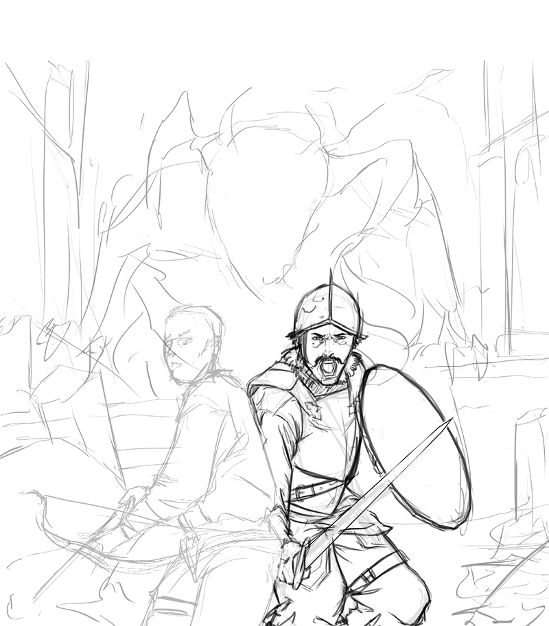
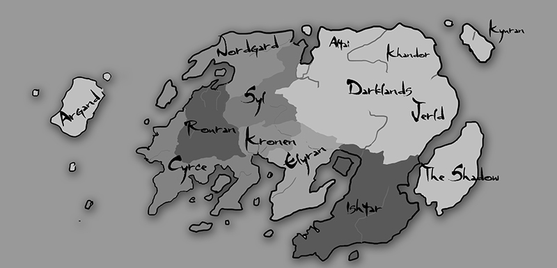
i also did a shitty map to give some background to this fantasy stuff, TES inspired!
Posts: 254
Threads: 7
Joined: Mar 2012
Reputation:
3
yeah that's looking better, the overall shape of your canvas is very squarish. Going for a particular format, like card art? Otherwise maybe try a more bookcover / poster format
Posts: 1,098
Threads: 11
Joined: Aug 2012
Reputation:
34
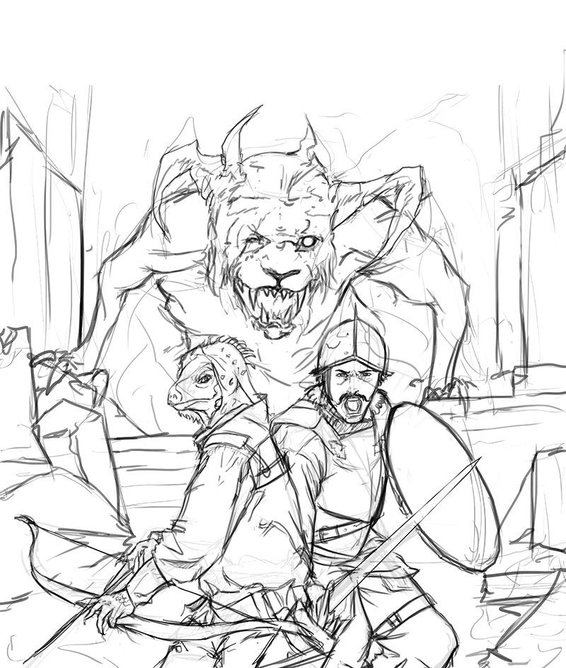
yeah, i expanded the canvas a bit more.
And the archer turned into some kind of iguana guy, also a reptilian monster in the background would be redundant so i went for a manticore/chimera thing.
Posts: 1,098
Threads: 11
Joined: Aug 2012
Reputation:
34
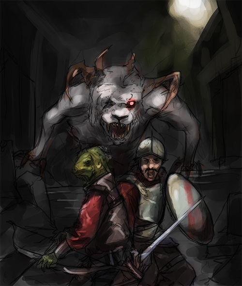
added basic values and basic coloring in an overlay mode.
I still need to try more colour schemes.
Posts: 254
Threads: 7
Joined: Mar 2012
Reputation:
3
Yeah looking cool! Try maybe get something from the 2 characters to slightly overlap the monsters face (maybe the lizard has some spikier head bits?) just to push it back a smidge. It seems a bit too much on the say depth as the character's faces.
Posts: 1,098
Threads: 11
Joined: Aug 2012
Reputation:
34
man, i´m going to put you in the credits :P
I´m already working on the depth of the picture, will update tonight (in CET time)
Posts: 467
Threads: 2
Joined: Jan 2012
Reputation:
16
hey man, love this new piece your doing, it has alot of potential. You've had some prity gold crits too and i thought i'd add mine and see if i could help :3
![[Image: paintover1.jpg]](http://i1208.photobucket.com/albums/cc376/logisticpuppet/paintover1.jpg)
I think the problem with what you've got at the moment is like Kidult said and the composition feels abit squashed. Thats partly because you main focal points are fit in a square, and squares make boring compositions generally. They feel very static and rigid which is the opposite of what you want in this piece. Plus your composition has alot of straight lines, vertical and horizontal which add to this point. The red square kinda shows this.
Secondly, it seems your going for a very central composition, like Kidult mentioned the classic triangle/ book cover/ poster type of thing. With this being the case the light source in the top right feels out of place and it pulls too much focus onto the right of the image leaving the left kinda empty.
heres a quick paintover, hope you don't mind
![[Image: paintover-1.jpg]](http://i1208.photobucket.com/albums/cc376/logisticpuppet/paintover-1.jpg)
All ive done is extended the image more and moved the light source. I also moved the warriors arm to the front because it looked weird behind the archer and gave the monster more depth and movement by pushing its claw forward. Something i didnt paintover but would like to mention also is the warriors narrative. What are they doing and why? The warrior seems to be screaming while the archer is kinda chilled and it's tough to tell why. The fact that their almost back to back suggest their being overwhelmed as does the guy shouting but theres no sign of anything attacking them, part from the monster. Though that looks like its sneaking up on them, in which case surely the archer would see him.
Despite this it looks really awesome so far, i hope you follow it through to finish because i would love to see it completed! And i hope my long ramblings helped.
Posts: 1,098
Threads: 11
Joined: Aug 2012
Reputation:
34
thats awesome warburton! thanks a lot, it looks much better in your paintover, i will go in that direction. :)
Posts: 1,098
Threads: 11
Joined: Aug 2012
Reputation:
34
Update.
I was thinking, maybe transforming the monster lion into a chimera?
or adding a bunch of little monster to represent that the warriors are surrounded?
PD: listening to Vindictus/Dark Souls ost while painting scenes like this is awesome. :)

Posts: 235
Threads: 9
Joined: Oct 2012
Reputation:
6
This is shaping up! My 2 cents is be careful as to how you're lighting your characters vs. how you're lighting the creature. the characters have a decent amount of depth right now, as opposed to the monster which looks like it's head and torso are melded. It might be a good idea to push the limbs that aren't being hit by light back further down the value chain, and define key parts of them with bounced or rim light.
on an a non-critique note, your human guy reminds me of Mario, haha! Lizard man is my favorite though.
keep it up.
Posts: 1,098
Threads: 11
Joined: Aug 2012
Reputation:
34
Thanks Einver, im trying to solve that issue too, and btw the moustache guy is designed like a fearsome spanish tercio! xD
and this is getting difficult! and because of that, im leearning. :D
working right now on the depth of the picture. I also want to redo the values, pushing much more lights/shadows.
PD: next time i will open a thread on the wip section, this is for sketches after all!

Posts: 350
Threads: 15
Joined: Jun 2012
Reputation:
18
I really like the direction the monster went in, it looks very hungry! I feel like the problem I mentioned is still present though, you have it so well lit how could they be looking elsewhere, ya'know? I like the chimera cubs idea but I think doing it without breaking your comp could be tricky. Keep pushing, it's looking better and better!
Posts: 1,098
Threads: 11
Joined: Aug 2012
Reputation:
34
thanks atrenr!
i would call it finished, the problem you mentioned is still present, i tried to add a pack of little monsters like kobolds to the picture, but that broke the composition everytime, i´m going to plan my next illustration much more carefully.
What do you think guys and gals? I gave the lizard guy a more draconian look, and if you look closely, the moustache soldier have a heraldic manticore in his shield, and a real one behind. :)

Posts: 350
Threads: 15
Joined: Jun 2012
Reputation:
18
Looks great man! I like the shield crest and the new look for archer.
The only thing I would suggest at this point is maybe working a 2nd chimeras reflection into their armor, implying you are the 2nd chimera staring them down! It would explain why they are looking at you instead of the monster, too. I don't know how complicated that could get in the armor though, haha. Great job man!
Posts: 1,098
Threads: 11
Joined: Aug 2012
Reputation:
34
thats a great idea! it could be difficult though, but maybe...
Thanks mate for all the feedback! :)
I already have some ideas for my next illustration, it will be about my speciality, chicks in armor! lol
Posts: 235
Threads: 9
Joined: Oct 2012
Reputation:
6
All things considered, I'd say it shaped up pretty well! A couple anatomical and proportional issues with the spanish soldier, but those will be remedied down the line with studies. Your materials aren't bad either, though maybe some cloth studies would help you push those.
Just keep it up though man, looks like you've got a good idea about what you're doing.
|


![[Image: paintover1.jpg]](http://i1208.photobucket.com/albums/cc376/logisticpuppet/paintover1.jpg)
![[Image: paintover-1.jpg]](http://i1208.photobucket.com/albums/cc376/logisticpuppet/paintover-1.jpg)
