Posts: 184
Threads: 4
Joined: May 2013
Reputation:
11
great work on her face!
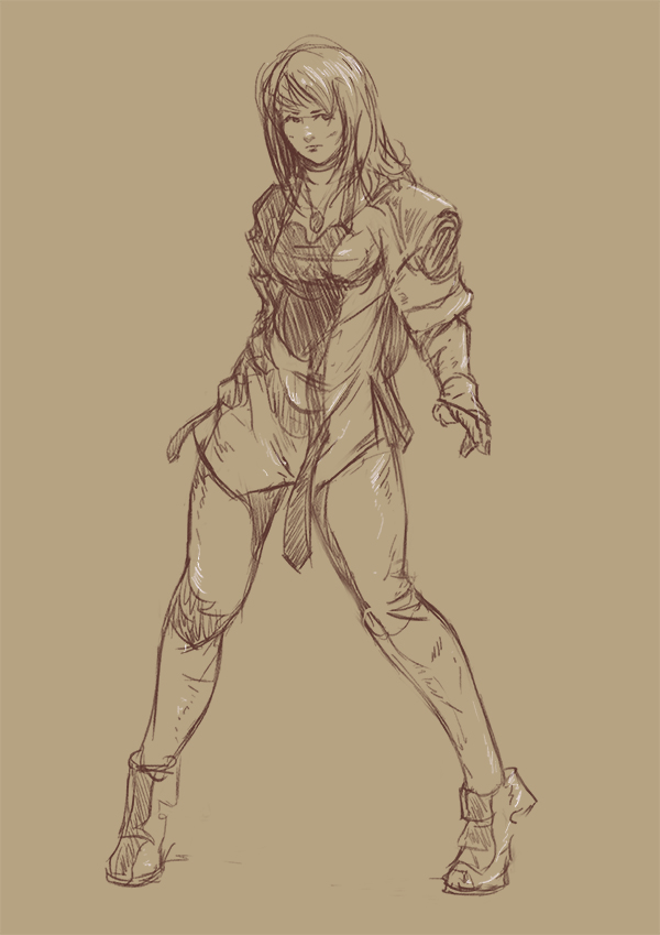
i certainly agree about the thumb position. also it looks as if she doesn't have a breast under her hand, as if she's clasping at the area where it's missing, i guess it's a shadow issue.
really nice vibrant work on the sword girl from earlier. good decision to change where she's looking at. keep it up yo!
"If you want liberation in this life, there is no area that you do not watch. Watch the breathing, watch the posture, watch the flow of energy, watch the texture of the mind, watch the response to objects." - Namgyal Rinpoche
Posts: 809
Threads: 2
Joined: Mar 2012
Reputation:
16
Dude, you're crushing it. That last piece came out great, especially with the final tweaks you made, and this new piece looks awesome so far. I feel your paint with hands as well lol. theres so much perspective and stuff going on, it gets a little crazy. Definitely worth shooting some rough ref if you're struggling with a particular position. As long as you learn from it, who cares, and hands are one of those things that its really easy to spot when they're broken lol.
With the hand on this last piece, I can see what you're going for, but I think the thumb joint is too close to the finger knuckles. The thumb connects to the hand way closer to the wrist. But play around with it, you'll nail it I'm sure.
Keep it coming dude :)
Posts: 367
Threads: 4
Joined: Oct 2012
Reputation:
25
Your last few works are so good. I just love that girl with armor-and how you did the shadings and made it all clear. I really like your style,and I can just imagine how good you are going to be after just another few more works.
I'm working on little project now,but its just a start. I would really love you to be part of it :)
I'll message you about it when we work more on it.
Posts: 429
Threads: 0
Joined: May 2012
Reputation:
7
i love seeing how much youve improved since page one, keep on working hard man!
Posts: 656
Threads: 6
Joined: May 2013
Reputation:
12
Soldier lady turned out awesome! Love the armor, love the eye on the sword--hints at some really crazy supernatural power. Background looks good to me.
Surprised lady looks like she maybe just leveled the place with powers she didn't know she had? I imagine there will be more clues as you keep working. Her face looks great.
_________________________________________________________________________
The best time to plant a tree was 20 years ago. The second best time is now.
-Chinese proverb
Sketchbook
Posts: 1,098
Threads: 11
Joined: Aug 2012
Reputation:
34
Hey people! :)
I think i never had to reply to so many comments, thank you so much!
Vansty: it should be a bit more clear now (but i´m still working on getting exactly the expression i want) and thanks!
matt_radway: thanks! yeah there is so much stuff to do, and redo. I think i forgot about the thumb on this update, but i will try to fix that hand right away!
Trevor S.: Thanks Trevor! yeah, you should definitely try doing something like that, its incredibly fun and also a great way to break out from routine and learn something different.
aks9: thanks mate! yeah, i need to fix that rebellious hand haha, for the breast... you are probably right. This picture is a fanart of a certain anime series (and novel) and this character always looked pretty flat-chested, but maybe it was because the particular art style of the show. I certainly will think about it.
JakeB: thanks a lot man! yeah, i will definitely return to the hands in the next update. I certainly had to shoot reference for the (now) right hand with the crappy camera of my phone. It would be impossible for myself to paint something like that from imagination right now, but as you say, as long as you are learning something, who cares? cheers mate!
Toxicpanda: thaanks! glad you like it! also, for the project, yeah just send me a message whenever you want! now i´m curious haha.
Benflores: thanks a lot mate! :)
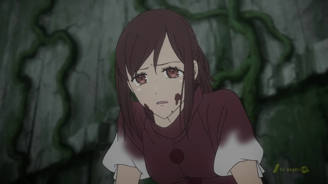
Tygerson: thanks! yeah, i just though that the lady in armor picture needed something more supernatural, and i always wanted to experiment with something like those crazy weapon designs you always see in korean online games. For the last piece, well, its a fanart of a japanese novel/anime called "From the new world" Which is about how in 1000 years from now on, every human has almost godly mental powers, so you can start guessing what happened here. xD
And now the update, i never though this would be so time consuming, its getting difficult, way more difficult than my previous illustration. But thats a good thing of course, because i feel like i´m actually learning things with every painting session. So the only advice i could give you if you are feeling like your art is stagnant is: think about something you love, visualize the idea on your mind, then fight with tooth and nails to make it real, no matter what! 

Oh and here is a screencap of the anime this is based, in case anyone was curious.
Posts: 654
Threads: 4
Joined: May 2013
Reputation:
22
Nice, that last piece is beautiful man, you nailed the expression on the face.
out of curiosity whats the anime?
Posts: 220
Threads: 5
Joined: Jun 2013
Reputation:
8
Nice stuff :D Can't wait to see more! keep up the good work
Posts: 1,098
Threads: 11
Joined: Aug 2012
Reputation:
34
Triggerpigking: thanks man! i hope you already started to see the show haha
BjorkJT: thank you! :)
I would call it finished, or at least, abandoned haha.
I have mixed feelings with the result, but i still learned a ton doing this.
Seriously, i need to start hammering those master/life studies right now!
As always, your feedback is most welcome!
So, feel free to critique and ravage it!

Posts: 429
Threads: 0
Joined: May 2012
Reputation:
7
the last piece is looking great! i did a quick paintover of it
![[Image: crit_zps4390f232.jpg]](http://i1057.photobucket.com/albums/t398/eyedias/Photobucket%20Desktop%20-%20BENFLORES-PC/work/studies%20and%20wips/crit_zps4390f232.jpg)
that arm was too short on the left and it looked very uncomfortable so i gave it some space between the body. lower leg could use a bit more curvature. i also swayed her to the right a bit more, it does give a feeling that shes gone through enough and shes so weak that shes about to topple over. but anyways its a really nice piece :) you captured the feeling from the screencap it was based off of , its really well painted, and also that face on the left corner is golden haha. keep at it!
Posts: 1,098
Threads: 11
Joined: Aug 2012
Reputation:
34
Thanks a lot Ben! :) yeah this last illustration made me realize a lot of things.
One of them is that i really need to get better at anatomy and figure drawing before attempting a new illustration. So, i will be studying at least until i came with a new idea for my next illustration, because right now i cant think of anything.
Well, i wanted to do a Xenogears illustration but, i think i will leave that for the future.
But i still did a sketch of Elly! (character from that game)


Posts: 1,098
Threads: 11
Joined: Aug 2012
Reputation:
34
Today's update.
Sundays are always slow days.
I recently changed my diet and started doing some excersice to compensate for this dangerous sedentary lifestyle so i´m feeling tired all the time. But i suppose this is just some kind of period of adaptation.
Still going with anatomy, and a sketch from imagination that turned into a fanart (as always)


Posts: 1,098
Threads: 11
Joined: Aug 2012
Reputation:
34
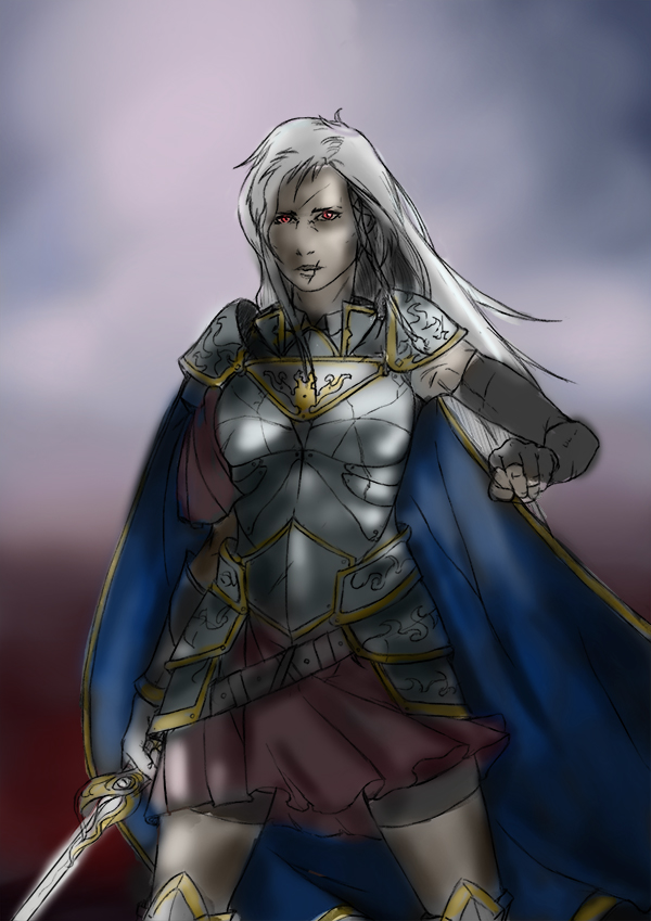
I finally started a new illustration.
Its going to be the "advanced/powered/super saiyan" version of the redheaded lady knight i uploaded some weeks ago.
Cant wait to start painting her, armor design and hairstyle kinda inspired by Emilia "The Hero" of: The devil is a part timer! series.
My idea is to make her wield a blade made of flames in that empty hand.
Also, for the background i´m thinking about putting the same battlefield, but completely burned down, everything reduced to ashes.

Posts: 123
Threads: 7
Joined: Jul 2013
Reputation:
0
Awesome art as always, that last sketch is gorgeous!
Posts: 172
Threads: 5
Joined: Feb 2012
Reputation:
3
Posts: 1,098
Threads: 11
Joined: Aug 2012
Reputation:
34
TonariNoPunpun: glad you like it Tonari! :) i certainly will try to go a step further with this illustration, so i needed a proper, clean lineart.
Cricketts: thanks a lot! :D
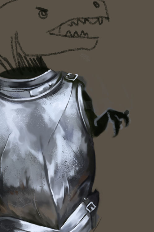
Here are some preliminar material studies for the illustration, pieces of armor, a skirt and a braid.
You know, the traditional hero stuff.

Posts: 340
Threads: 10
Joined: May 2013
Reputation:
23
Can't wait for your new illustration!
haha hey the armor have small T-rex arm xDD

Posts: 1,098
Threads: 11
Joined: Aug 2012
Reputation:
34
haha yeah, when doing that i was thinking about a poor T-rex with his tiny arms inside that armor. xD
Also thanks! i´m currently trying to decide what colors i´m going to use.
After trying a few combinations i went for a purple/red background to make contrast with the white/yellow/blue character.
As opposed to the regular version with a blue background and blue/red character and want this character to pop-up much more.
But still, im not sure.
If anyone have any suggestions, i´m all ears!

Posts: 360
Threads: 10
Joined: May 2013
Reputation:
5
You changed her haircolor! But... she was so hot!
Just kidding, it's looking awesome.
Posts: 537
Threads: 1
Joined: May 2012
Reputation:
8
Damn man, a bunch of great new stuff. Digging the latest metal and cloth studies. They showcase a good sense of where to put the brushstrokes. It's called brush-economy right? Stroke economy sounds so medical :P
I'd suggest trying to restrict the complementary colors to the focal point. I know that hue is going to change though, but an example is the lower part of her cloaks and knee-piece. They get a bit of attention right now because they're next to eachother. Or you could try avoiding having detailed stuff near the edges of the canvas. I suppose atleast! But I like it and I feel the connection with the woman on the battlefield.
Also, I laughed at the T-rex arms :D
|


![[Image: crit_zps4390f232.jpg]](http://i1057.photobucket.com/albums/t398/eyedias/Photobucket%20Desktop%20-%20BENFLORES-PC/work/studies%20and%20wips/crit_zps4390f232.jpg)


