12-26-2012, 11:12 AM
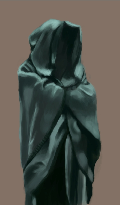
Did a drapery study as suggested

|
Bjulvar's Sketchbook
|
|
12-27-2012, 02:21 PM
No, you didn't fail! It's miles ahead of what you had before! Its almost there.
The best advice someone gave me was: "You can't draw what you don't know". Once you realize this there is a lot less depression and a lot more motivation; at least for me it was like that ahaha.
12-28-2012, 06:39 AM
Thanks again! I hope so, feels like it's not sticking though, but I'll continue to observe it!
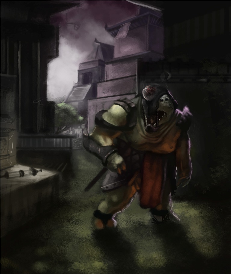
Yeah that is very true. I'm probably guessing too much! Haha yeah it is a bit motivating though so thank you! Turtlestudy with mandatory turtlemen designs! 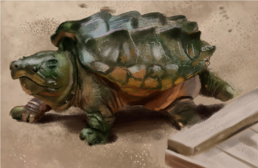 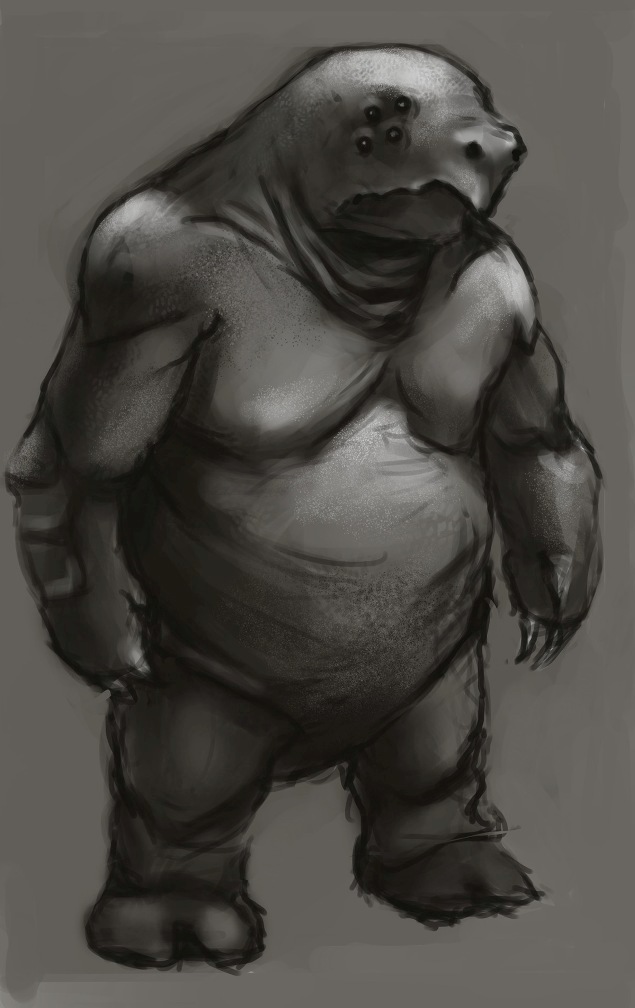 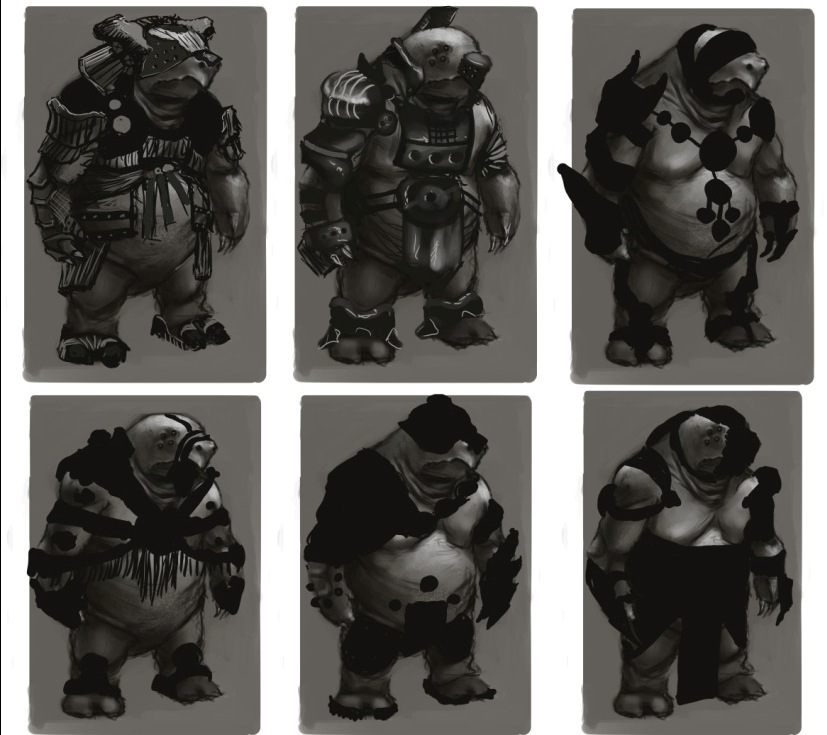
12-29-2012, 11:19 AM
Spent the day with this and had a lot of fun. Learned some new things! Will probably continue with if I have time.
12-31-2012, 10:53 PM
Made a really quick architecture sketch, I guess I'm trying to get more visual cues on how to draw buildings.
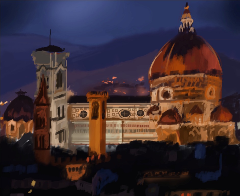 And here's my entry for conceptarts ChoW and some WiPs for it.  
12-31-2012, 11:35 PM
the hands and face of this guy looks great, however the rest of the body needs more work.
Watch closely the position and size of the legs and the waist. For the colors, the background looks too green at the moment, maybe you can go for a blueish color on the sky and moon? i dont know, but i suggest you to experiment a little. The general light scheme is nice thougt. :) And happy new year!
"Stand tall, and shake the Heavens!"
Tumblr for my comic!: http://rainfallcomic.tumblr.com/ Sketchbook: http://crimsondaggers.com/forum/thread-1227.html Facebook: http://www.facebook.com/eduardogarayart Deviantart: http://eduardogaray.deviantart.com/
01-01-2013, 01:31 AM
Yeah I totally feel what you're saying mate. I guess what I learned during this is that with a deadline you have make some decisions and stick with them just to get it done in time. But I regret some now, especially what you just mentioned. Threw in some blue color in the sky now and it looks much more calm, so thanks for that suggestion! Might work on it some more to fix up his body, but I'm quite tired of it to be honest :D I'll try to remember this for future projects though!
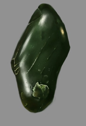
Thank you mate, and a happy new year to you as well! Tried doing one of those texturespheres, this is Jade! 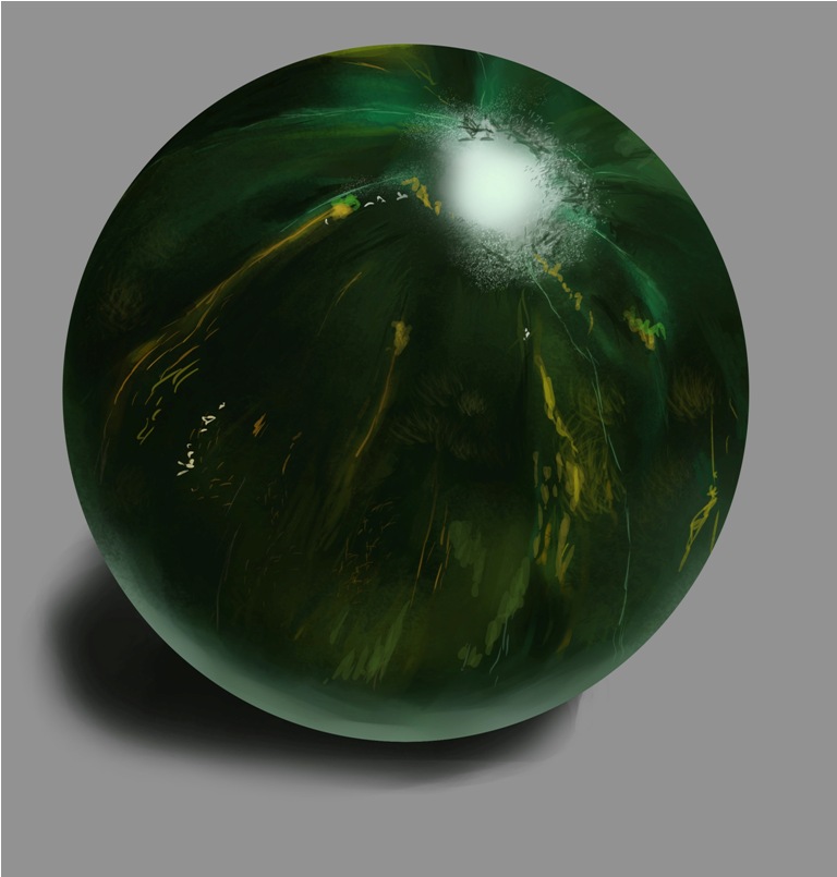
01-03-2013, 03:49 AM
Just some thumbnails, nothing fancy. Thought about doing some kind of fanart illustration for WoW as a portfolio piece. It would rock so hard to do a card for Blizzard some day in a distant dystopian future.
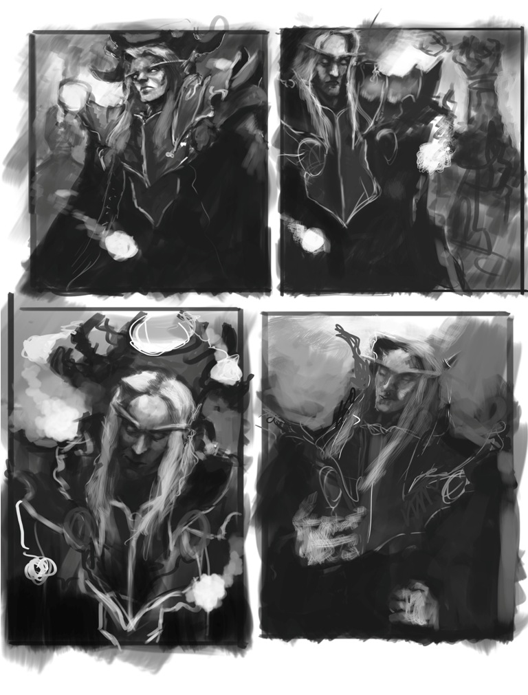 Throwing in a study 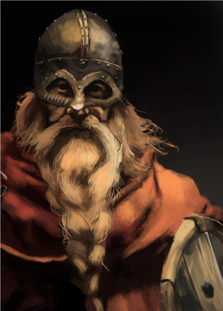
01-05-2013, 02:49 AM
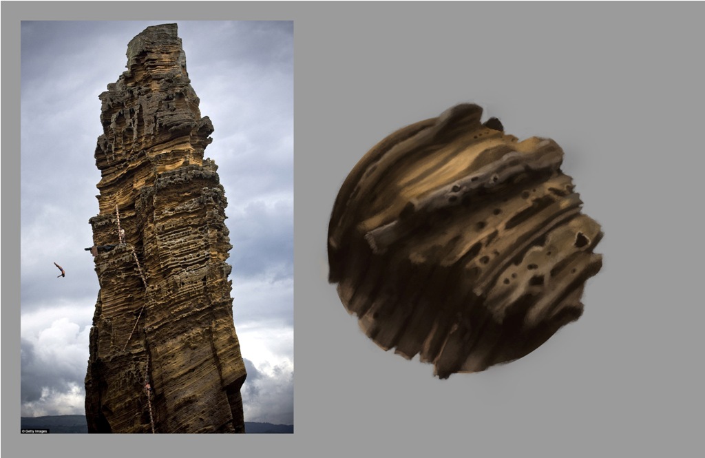
Trying more texture spheres. I found this a lot more harder. Included the reference picture.
01-05-2013, 06:13 AM
(01-01-2013, 01:31 AM)Bjulvar Wrote: I'm sorry to be the first one to point it out but that is not jade. That's a watermelon.
01-05-2013, 11:32 PM
Haha, I think I might've noticed that while painting it. I had to spend the day at the grocery store staring at melons (interpret that however you like) to redeem myself.
This could be a melon, or it could be Jade, I'm not sure anymore :( 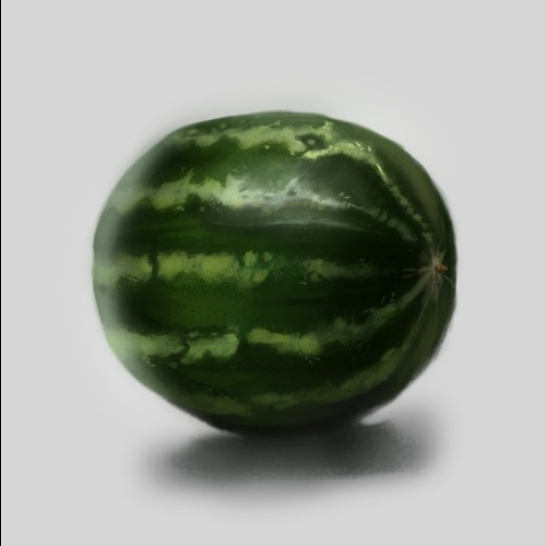 Thanks for being honest man! I laughed at my incompetence D:
01-05-2013, 11:39 PM
I'm sorry, that is not a melon. That's a fruit.
01-06-2013, 07:07 AM
A horse is a fruit that doesn't exist. Just like this Jade.
01-06-2013, 07:34 AM
No matter how much fruity they are, they aren't existing. It's a sad world.
|
|
« Next Oldest | Next Newest »
|