Posts: 1,098
Threads: 11
Joined: Aug 2012
Reputation:
34
^i agree, also this last practice has a lovely 80's feel haha, i like the second one is kinda funky
Posts: 467
Threads: 2
Joined: Jan 2012
Reputation:
16
Great sketchbook dude, you'e imroved insane amounts since page 1 which i was shoked to see was only about 1 year ago :0
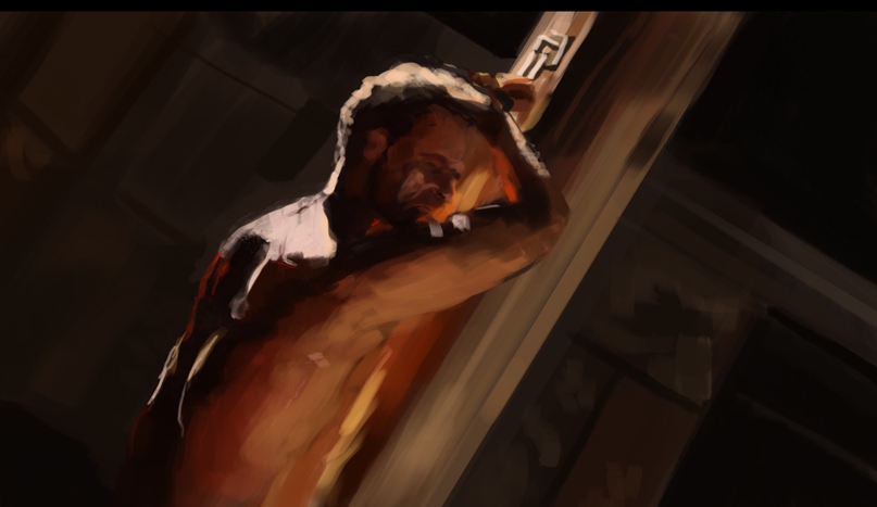
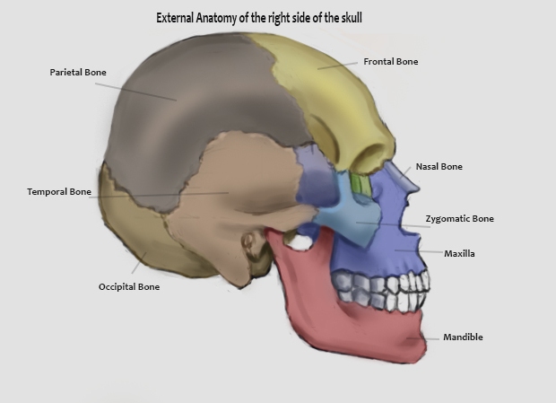
Always makes me happy to see someone like yourself busting their ass to get better and achieveing great results. Your obviously doing it right but if i were to offer and help or suggestions i would recommend spending abit of time on your edges as well as your values. In your latest screen cap studies they can look abit muddy because you use only 1 type of mark and theres little contrast between the hards and the softs. That being said this latest skull piece has beautiful edges so your defiantly heading in the right direction ;)
keep killin it dude, i look forward to seeing more updates and improvements from you.
Posts: 140
Threads: 2
Joined: Apr 2012
Reputation:
2
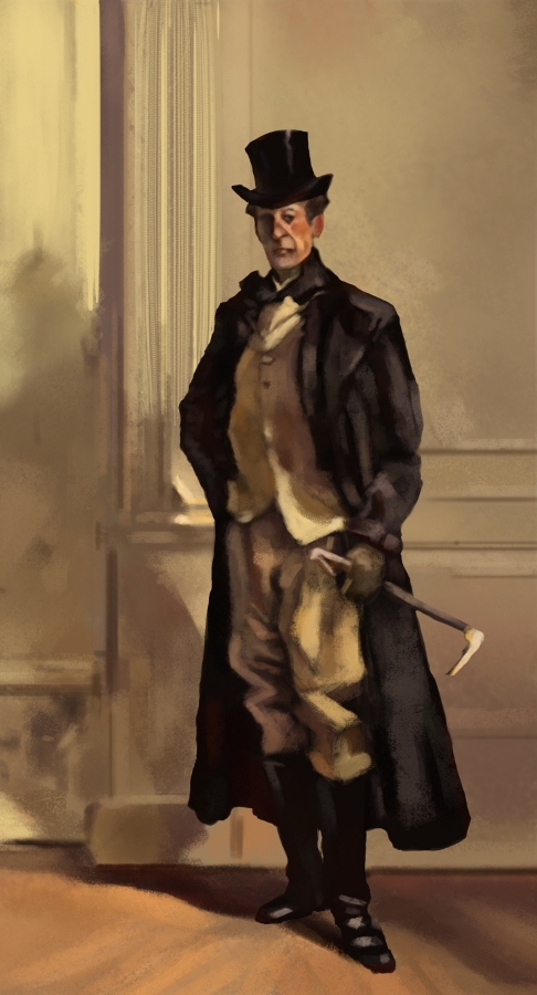
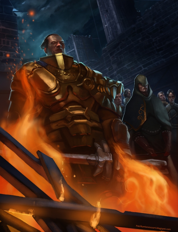
Hey cool color studies here ! :D Keep doing those ! Your last illustration is looking to be great I like the cool VS warm colors effect ! can't wait to see it finished ;)
Keep working that hard and improving like that mate ! :)
Posts: 903
Threads: 54
Joined: Feb 2012
Reputation:
18
Wow Bjulvar, love how you're pumping out this work consistently! Not much I can offer crits-wise except what you probably know: keep going! :) Hope to see you takin part in the next bloodsports dude, (supposedly) going to be announced this week. Rawr I'm all pumped up just thinkin about it
Posts: 1,098
Threads: 11
Joined: Aug 2012
Reputation:
34
i´m loving the warm versus cold in your last illustrations. Also, cool perspectives. :)
Posts: 53
Threads: 3
Joined: Jun 2013
Reputation:
0
Nice Gestures! Where do you get the references for those?
Keep it up :)
Posts: 63
Threads: 1
Joined: Jun 2012
Reputation:
0
Great sketchbook man. I have to agree with arden and others that in some of your works the forms do seem lost and undefined. Another thing that is getting my attention is the use of edges around the silhouette. They seem too sharp compared to edges inside your figures. I also want to complement you on the skull studies. They turned out great. Good luck!


