Posts: 690
Threads: 7
Joined: Jan 2012
Reputation:
12
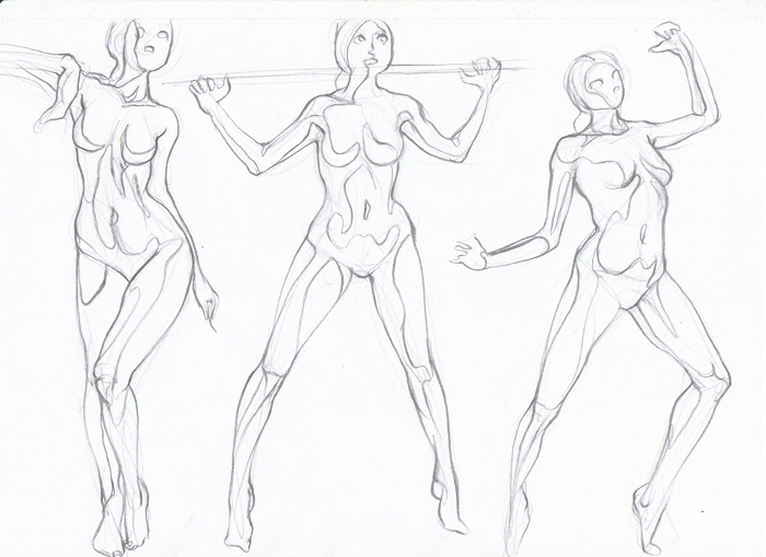
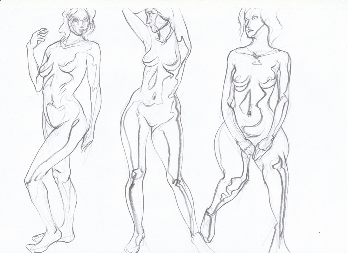
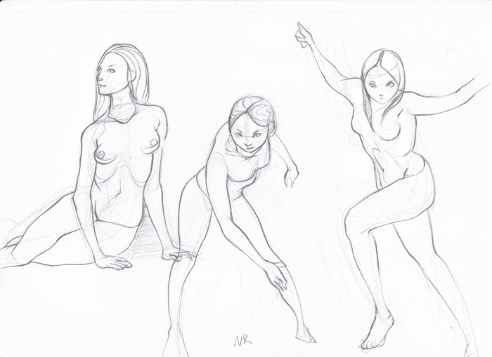
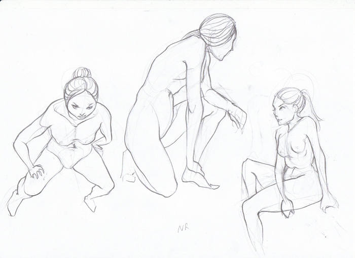
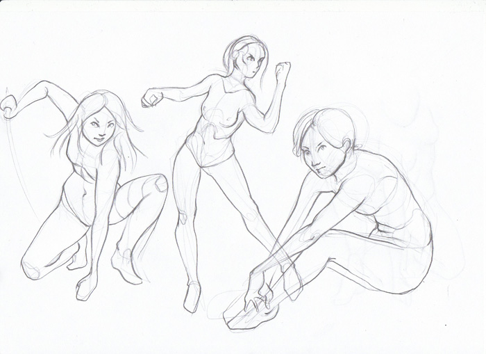
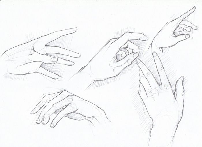
Sooo much quality stuff here. Love your figure drawings, they'll getting stronger every post. However I have the feeling you are avioding feets and hands, dunno if it's true. Maybe give them more love, they're pretty important and fun to draw once you get good grasp over them ;) Keep up awesome work!
Posts: 1,118
Threads: 12
Joined: Nov 2013
Reputation:
63
Do you establish a horizon line for your figures? The figures you drew with boxes and cylinders seem like they dont have a consistent horizon line. The best thing I found for understanding form is to draw the figure as boxes or cylinders a lot. It forces you to figure out how much of the top or bottom plain is facing the viewer. It will also help you with foreshortening issues if you have a clearer idea of which part of the body is closer. Some times the figures arm or leg will be only slightly closer to you than the rest of the body. Figuring out how to draw the top or bottom plain for hard poses like that will strengthen your foreshortening for sure. Moar boxes! :D
Posts: 850
Threads: 4
Joined: Mar 2013
Reputation:
21
ImSkeptical: Thank you for the links. Maybe it really is time to study from other people's drawings again instead of photographs. I'll look up the watt's method, too.
ramalooke: Thank you :) Uhm...yes. I have been avoiding hands and feet lately.. will have to stop doing that!
Hypnagogic_Haze: Sometimes I do, but not very clean, more like... estimating it. Will have to do that more. Thank you :)
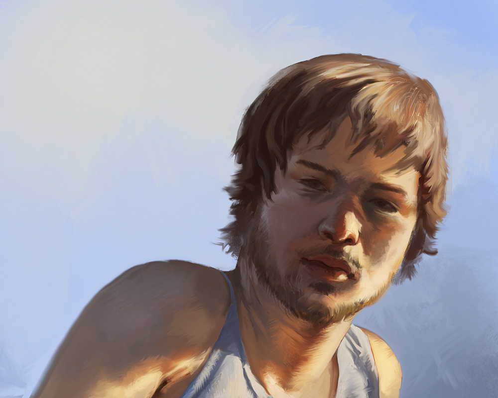
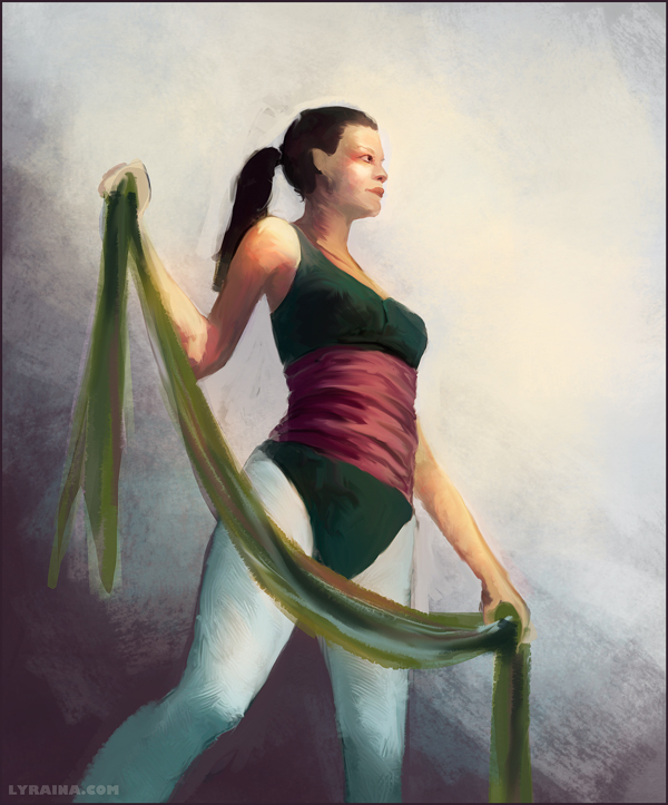
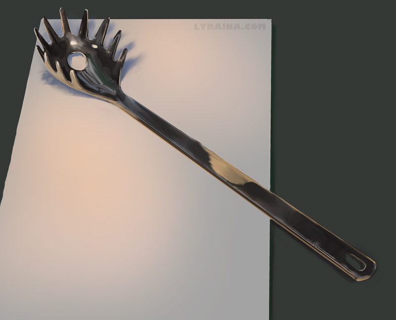
Some digitals from last week:
Trying out something (photo ref)

Trying out more (no ref...perspective is very off..i know >_>)

this thing beat me... from life.

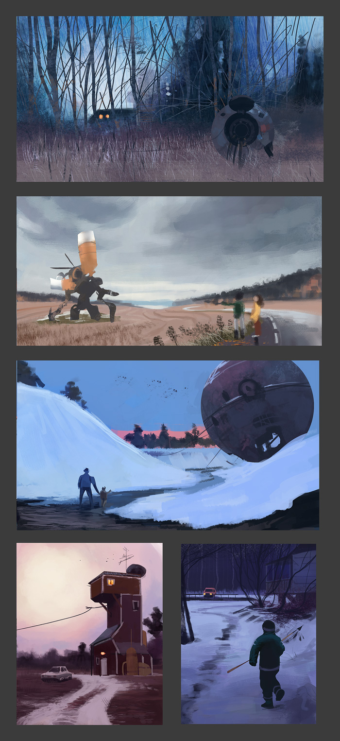
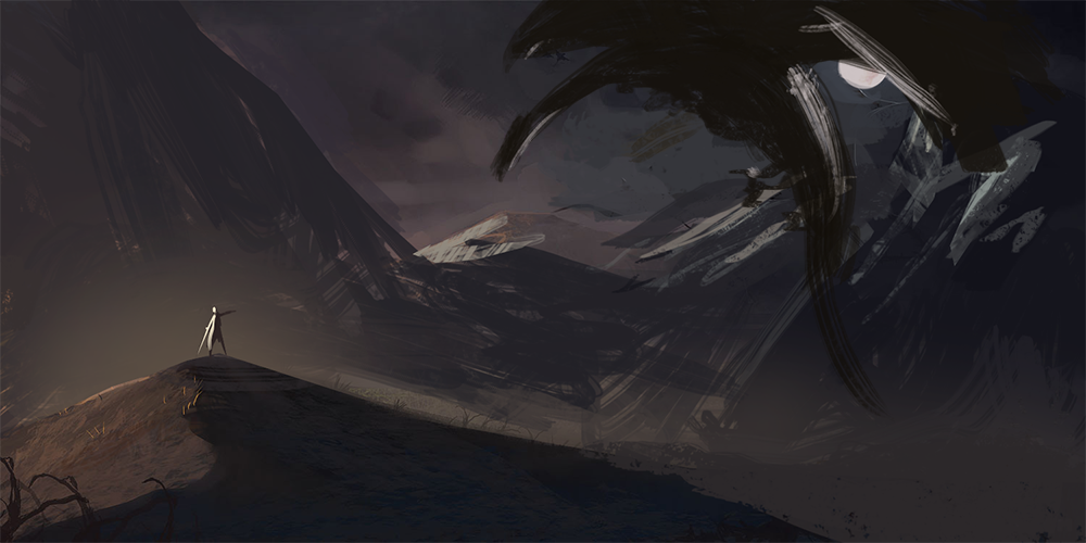
Simon Stalenhag studies, one a day. He has a very unique style, almost photrealistic colors but applied painterly. Love it.

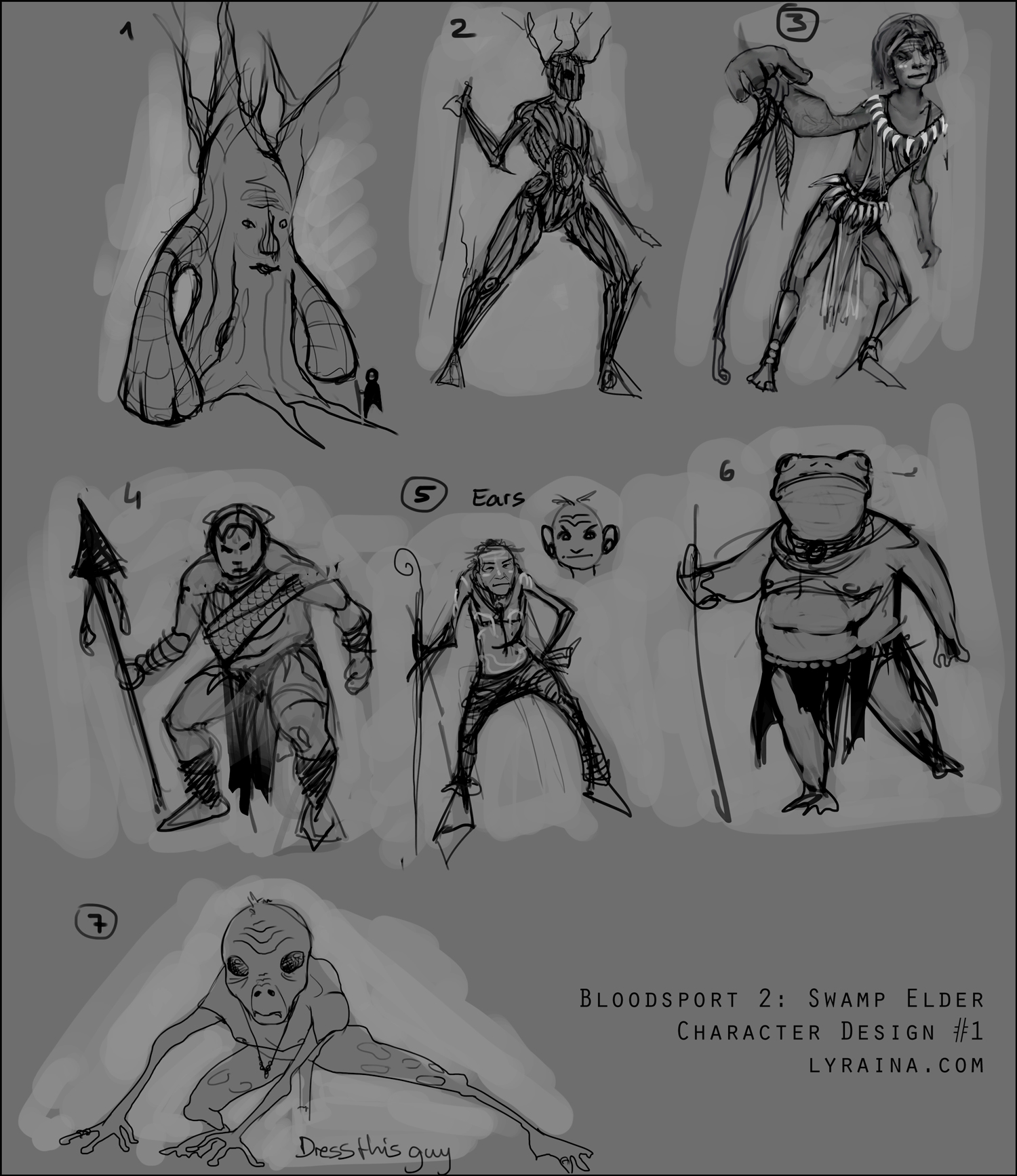
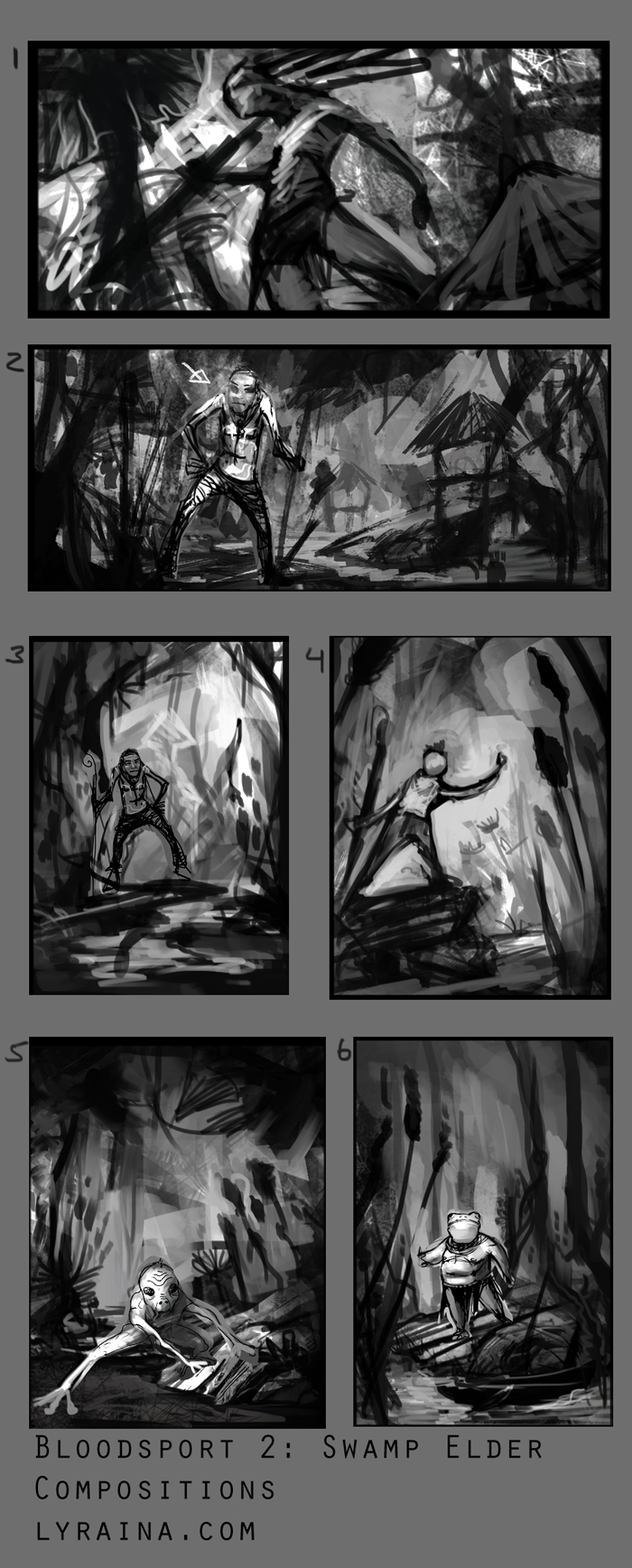
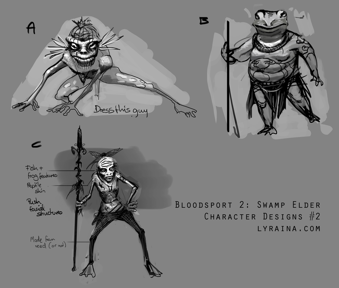
starting the new bloodsport. come join us in the community challenge forum!

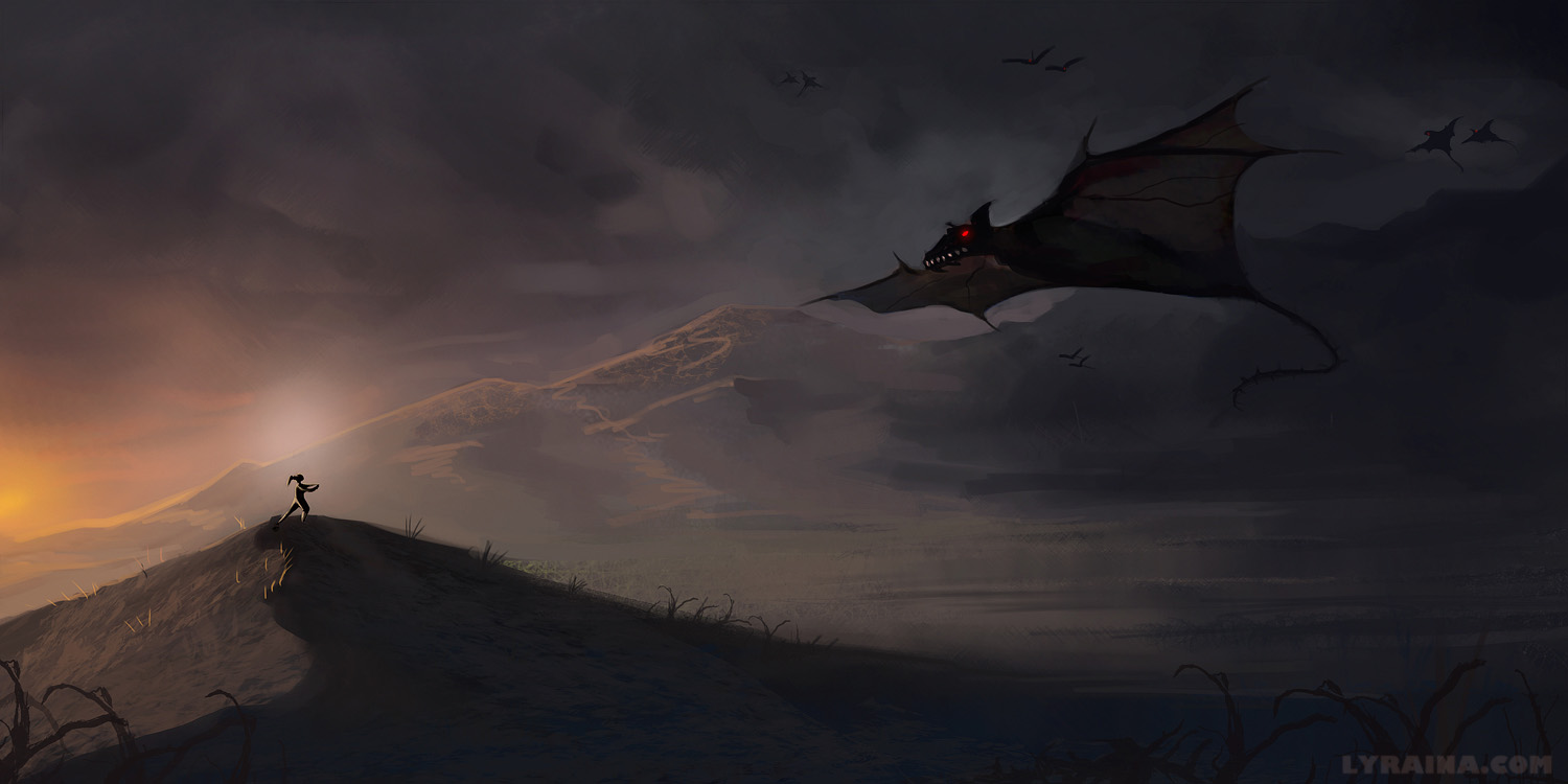
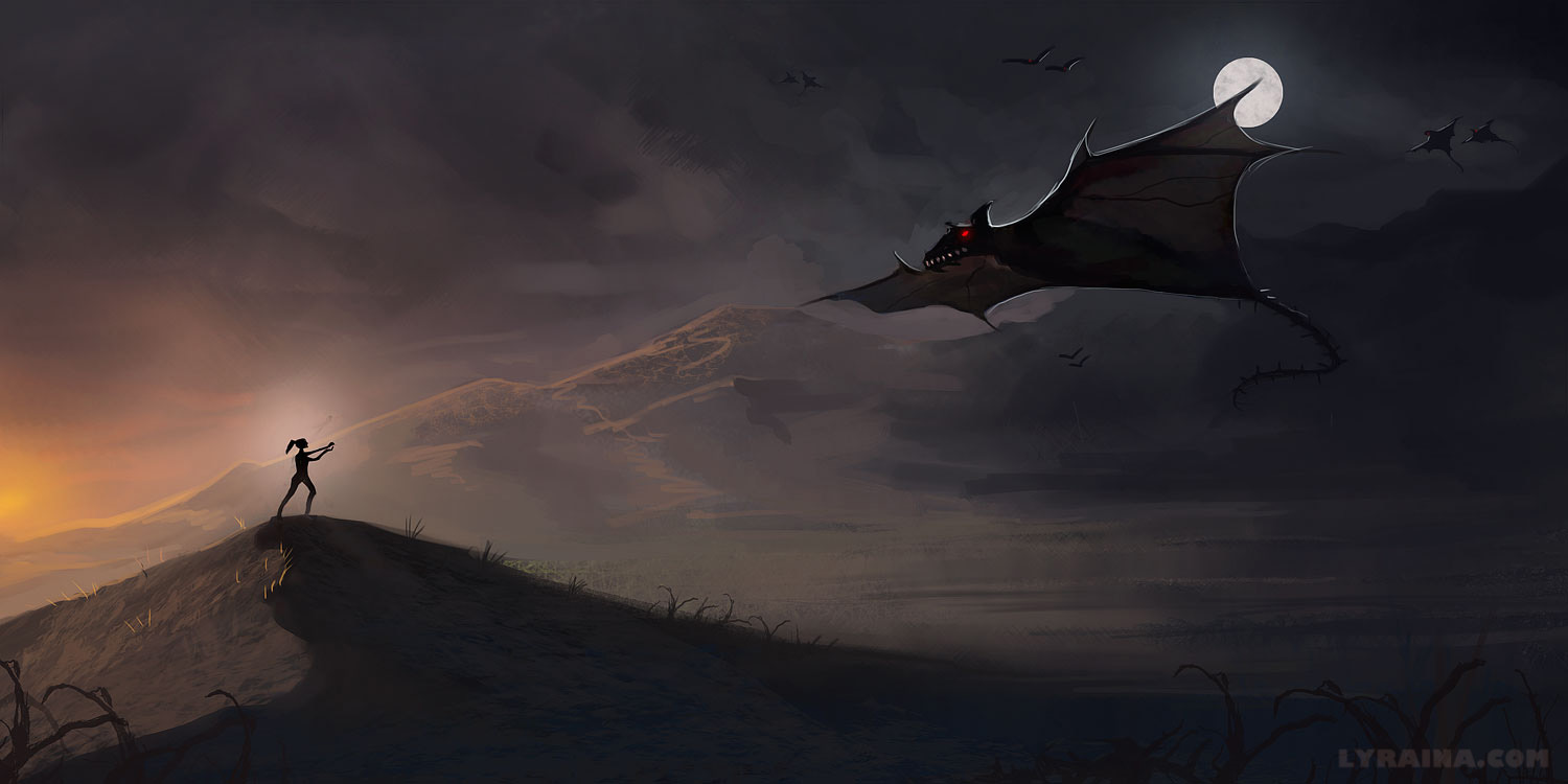
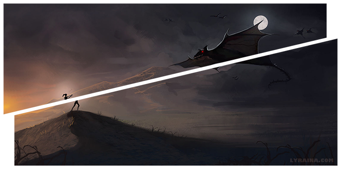
here's something I did for my mother, two versions with different focus.


Posts: 1,074
Threads: 9
Joined: Jan 2012
Reputation:
53
Posts: 1,527
Threads: 24
Joined: Dec 2012
Reputation:
70
Lovely update ~!
I'm looking forward to how your BLOODSPORTS piece is going to turn out... looking great so far, cool ideas and whatnot ^ ^
Oh and (if I hadn't already mentioned :x ) thank you guys for restarting the BLOODSPORTS challenges. I'll attempt to join in on this one ;D community challenges are the bomb!
sketchbook | pg 52
"Not a single thing in this world isn't in the process of becoming something else."
I'll be back - it's an odyssey, after all
Posts: 118
Threads: 4
Joined: Mar 2013
Reputation:
4
I'm seeing a lot of great progress from this thread, Lyraina!
Your last painting has a few compositional issues, the most noticeable of which is the line of mountains that splits the piece in half.

I hope you don't mind, but I did a quick paintover-

Keep bein' awesome!
p.s. Simon Stalenhag is a boss
Posts: 1,342
Threads: 17
Joined: Jul 2013
Reputation:
45
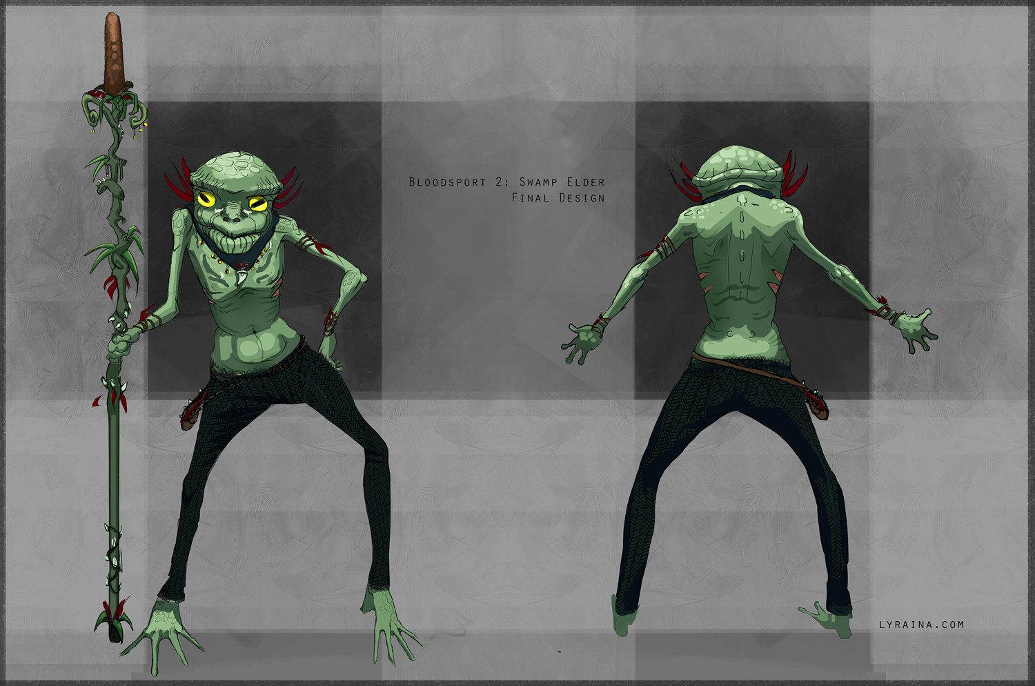
You're turning up some great pieces, cant wait to see the swamp elder finished, keep it up.
Posts: 850
Threads: 4
Joined: Mar 2013
Reputation:
21
Posts: 101
Threads: 3
Joined: Jan 2013
Reputation:
0
Haha I just watched a proko critique video today and you were in it. Made your name sound familiar when I saw it in the forums today. Such a change now, from the ones in the critique.
Your work stood out in the critique as much and it still does now.
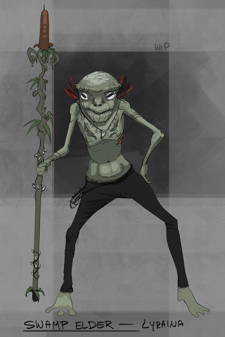
The swamp elder's pose seems a bit odd. It's as if you just rotated him to the side without thinking about how that would affect him. Considering he seems to put his weight on the left leg, there should be a tilt change in the pelvis and shoulders. Right now they look almost parallel. Accentuating the squish and stretch might help
Keep it up :)
Posts: 848
Threads: 20
Joined: Jan 2012
Reputation:
29
Those hands are looking good. Nice clean lines. I won't bother commenting on the bloodsports stuff. But your figures are coming along nicely :) I like the light and dark divisions on some of them, you should colour those in sometimes :)
I think its great that you are really focusing on your foreshortening skills. Keep it up :)
Posts: 107
Threads: 6
Joined: May 2012
Reputation:
7
Good stuff, I like the ideas for the swamp elder. Curious how you'll push the old man.
Good luck.
Posts: 850
Threads: 4
Joined: Mar 2013
Reputation:
21
Tom Seas: Haha, that's cool :D Yes, my figure work changes all the time.. depending on what area I focus on (lines, construction, proportion, gesture). Thank you for the kind words :) Also for the feedback. I tried to shift his pose a bit, not sure if it's better now...
Jaik: Thanks as always :) Colour those... yess.. I'd like that :D Trying to stick to my weakest areas (=the least fun ones) right now though.
dracken: Thank you!
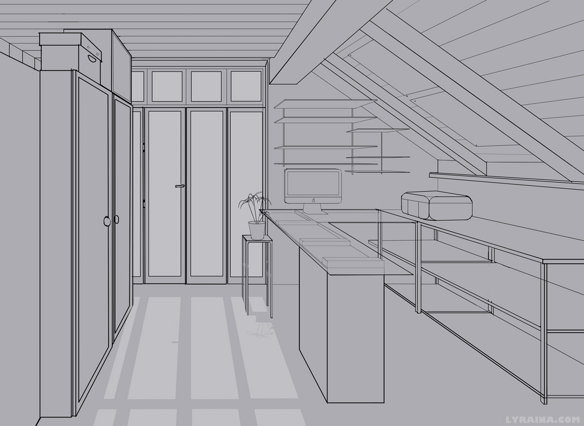
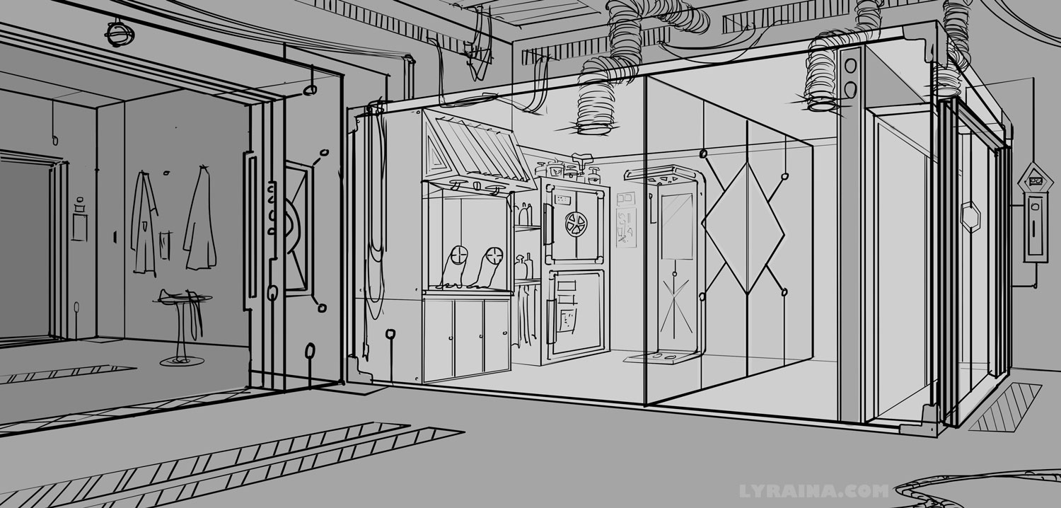
Here is a very meager update for the time that has passed since my last post. I spend a lot of time trying hard and failing harder lately, so I don't have much to show. Here's homework for Matt Laskowski's perspective class:


Bloodsport update


Posts: 56
Threads: 2
Joined: Jun 2013
Reputation:
0
Hey really cool stuff in here, tons of hard work, I can see a lot of improvement since the first post not even a year ago. Looking forward to see how that bloodsports piece turns out.
Posts: 848
Threads: 20
Joined: Jan 2012
Reputation:
29
Nice perspective work :) Failing hard is good, it means you are getting all the bad stuff out of your head to make room for all the good to fill it up!
Keep on working hard. And never give up. Also you can always upload your failures so we can laugh at you (just kidding, so that we can HELP you, don't hide your failures, shine a light on them so they get scared and run away)
Posts: 850
Threads: 4
Joined: Mar 2013
Reputation:
21
Wils: Thanks! Glad you see improvement <3
Jaik: Yeah failing is okay, as long as there are a few successes inbetween as well :P And yeah, I'll keep at it. I'm very determined to take that monster called perspective head on this time. Oh and I'm fine with you laughing at my failures as long as you point out how to improve at the same time :P
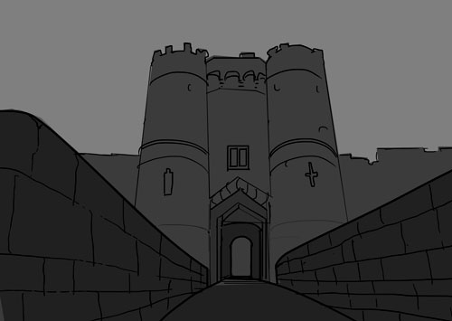
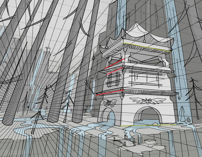
Alright. So. Two point homework from mind.

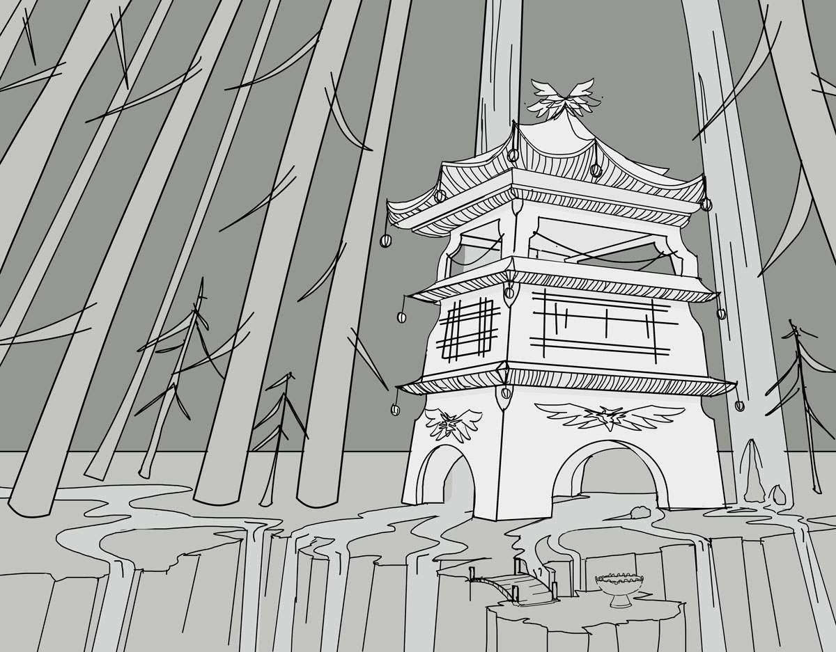
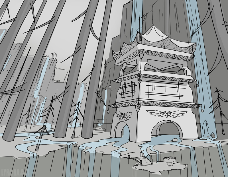
Tried to fix the upper parts of the shrine that were wrong last time.

Rnd from photo. This is not very helpful a exercise I think.

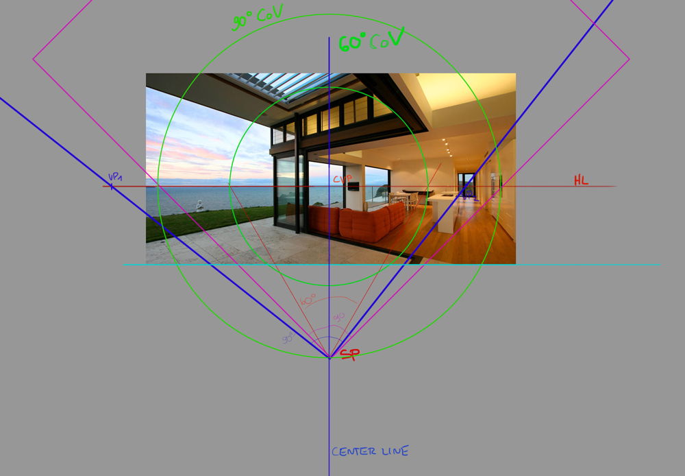
Here I have tried to reverse engineer all those concepts I am learning like cone of vision, station point etc from photos. Sometimes I feel like I'm just about to understand it but I am missing one part of the puzzle so nothing can fall in place... so I'm just writing this down because it helps me think... not sure if it makes sense, but if anyone can say something about it I'm grateful, too. In this case, I don't know how to place the center line (of vision) on the picture plane. As I understand it the line of vision will always be parallel to the ground as long as I look straight ahead, and defines the direction where I look at (so it is middle of the cone of vision). The point where it crosses the horizon line is the center of vision (the exact point where I am looking at).
I read somewhere that in a photograph that is not cropped, the line of vision will always be in the middle of the picture plane (makes sense for me). But what if a photo is cropped, or if I am doing a drawing which is not placed exactly in the middle of my constructed cone of vision but placed a bit more to the right or left? While I could try to do this with just following the rules of establishing the i.e. 60° cone of vision, I don't know how to do it the other way around using a reference as basis. So clearly I'm not fully understanding it yet. I'm also not sure how this relates to one or two vanishing points.
In the image below I just decided that the line of vision probably is in the middle of the image (as I didn't know to determine it), then placed a square on top of it, thus determining the station point. The square is placed so that it hits the vanishing points, because I read something about VPs being placed 90°s apart (a new concept for me as well...)
I'm also grateful for any advice as to how I should practice/apply that, atm I try to just understand all those principles with various books and videos. The reverse engineering from photos didn't work too well, so next I will try to do my own drawings using this cone and station point stuff. I feel very stupid for not grasping those concepts more easily, one would think someone with a scientist brain should be able to understand this.

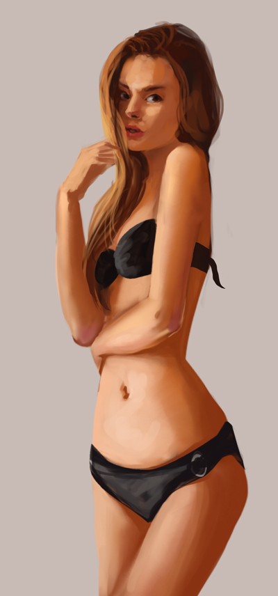
Quick chick when too tired to do other stuff. From ref

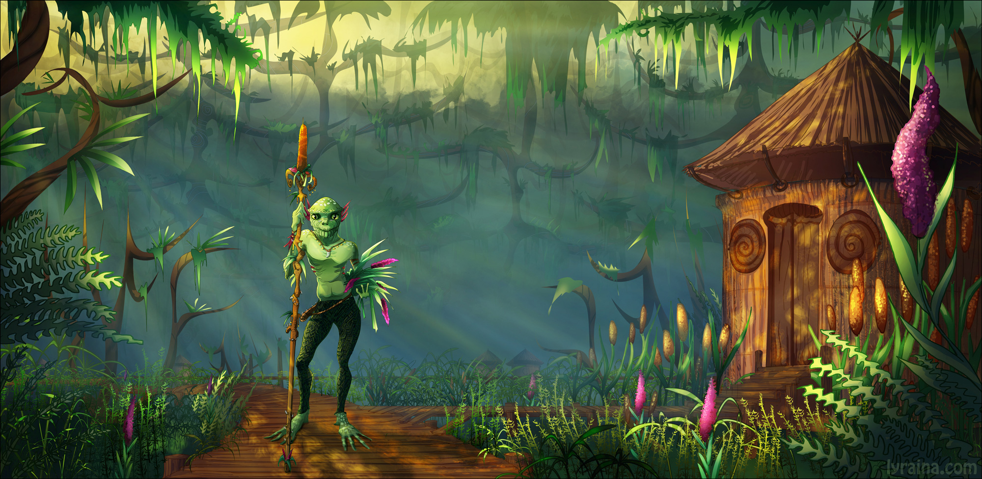
BS final!

Posts: 465
Threads: 2
Joined: Mar 2013
Reputation:
18
Yo, you're getting a lot of work and thinking in, great job! Good luck figuring out your perspective stuff, wish I could offer some help but you've already gone over my head pretty far XD
Posts: 656
Threads: 6
Joined: May 2013
Reputation:
12
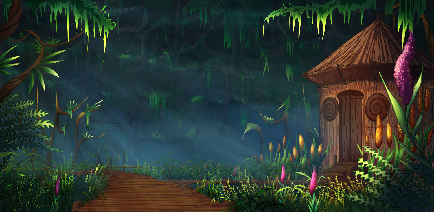
The swamp guy looks awesome, and his home looks so fitting to the environment. I like that you created a friendly swamp creature--such a different take than the usual evil denizens of the murky waters.
_________________________________________________________________________
The best time to plant a tree was 20 years ago. The second best time is now.
-Chinese proverb
Sketchbook
Posts: 161
Threads: 0
Joined: Aug 2013
Reputation:
9
Those perspective studies are sweet. How do you get the straight lines? are you using painter or something?... I know that Painter has a ghost feature when your making straight lines, something Photoshop should have.
The swamp elder looks a little off to me. the composition is a little strange (splitting the canvas half) and the creature doesn't look like part of the environment. I think this is because he is sort of just standing there, looking at the camera... like he is getting his picture taken. It would help if he was somehow interacting with the environment a little more. Also, don't be afraid to lose some edges... because everything is basically the same sharpness, which flattens things a lot.
Keep going at it, thanks for the reply on my sketchbook btw :)
Posts: 101
Threads: 3
Joined: Jan 2013
Reputation:
0
The more you fail, the more you learn!
I like your bloodsport piece. I was expecting a frog like silhouette, but you went for a frog design but human proportioned character, which is refreshing.
It4s interesting to see you work on perspective. Some parts could use some more solid construction, some of the vanishing lines don't follow the grid
I quickly went over one piece to show you where's it's off a bit.
Problem is it adds up so ends up being quite big.
You should try out this tool, very simple to use: http://www.youtube.com/watch?v=4Mtrrbz-1Co

Posts: 345
Threads: 4
Joined: Jun 2013
Reputation:
2
Awesome perspective studies!
|


