Lyraina's sketchbook
meat: Ah well, what I didn't mention was the hours of procrastination that came before I finally started doing a bit of painting :P Looking forward to whatever you'll be posting in your SB next <3

Jaik: I did procrastinate, until the guilt was worse than the tiredness :p And yes! Males! Need to conquer them eventually. Drawing wise, I mean.. And I totally know that "want to fast forward my ability", especially since last weeks model was so gorgeous!
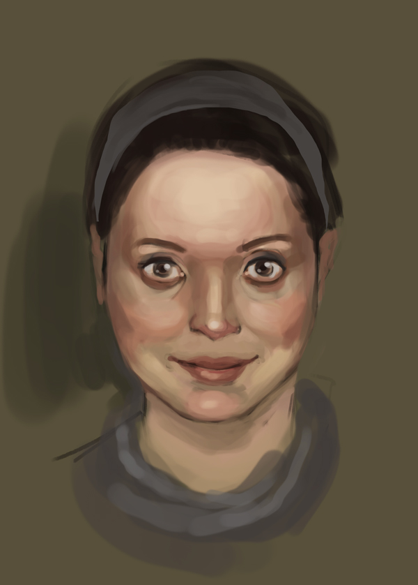
And no, I did not actually blend with those color patches. They are just for checking how good I did afterwards. So first I picked some flat color patches, without taking into account surrounding colors etc, just trying to choose anything from the color wheel which I think looks like i.e. the cheek, shadow, nose etc hue (that's "picked" or in some cases F). Then I picked colors from the same spots on the photo (thats O). Then I actually put the flat colors down on my drawing of the face, and corrected where I was off - now it is easier because the colors are in relationship to each other (that is still F, didn't save the previous step in most images). Then I rendered the faces with blending, introducing new colors etc, basically as I normally paint. Only after being done with it, I picked R. So R is not what I actually used to paint, but the end result. I used it only to compare it to the original photograph, to see where I was off. (I look at the saturation, brightness, hue sliders / color wheel)
Probably a useless approach, but I didn't really plan this out beforehand :p What does feel very useful though is just comparing the end-result-colors of my image with the colors on the original (whatever the source might be - photo, master painting...), because it helps to understand where my perception is off. Like, in my case, I tend to go over the top with saturation and contrasts.

Todays update is a bit random because I am working on too much at once... but anyway. I started to do studies with Gurney's "Color and Light". Taking notes on every chapter and doing master/photo/life studies and/or application as I find useful.

direct sunlight (master copy and plein air, which looks horrible because I didn't see anything on my screen *excuses*)
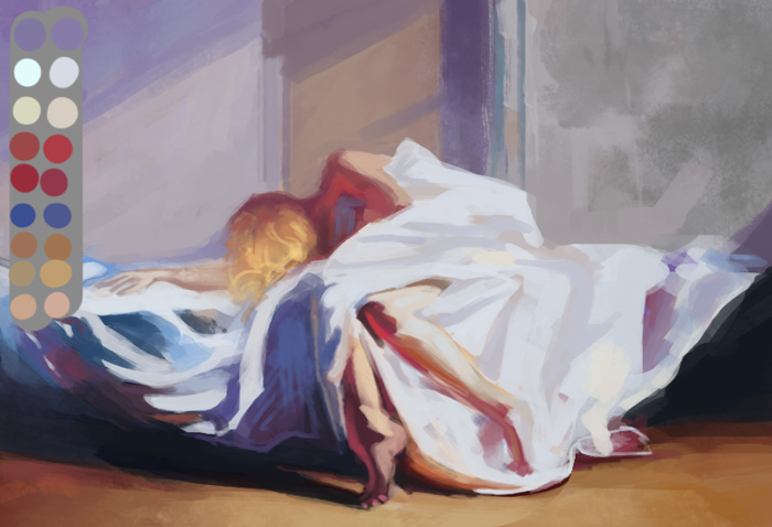
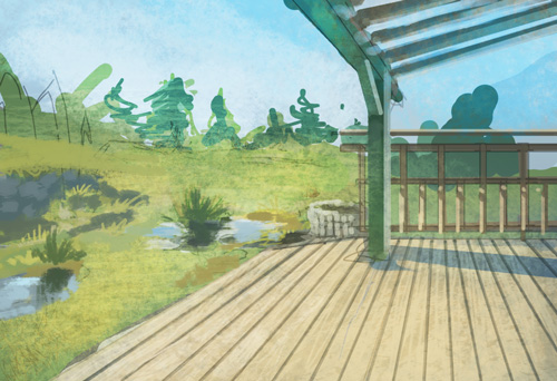


window light (master copy/still life)
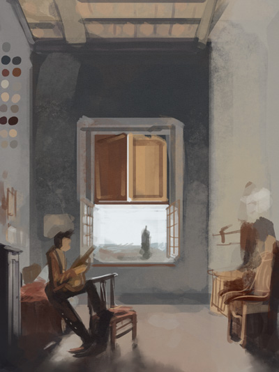


candle light/fire (master)
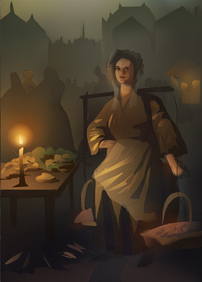


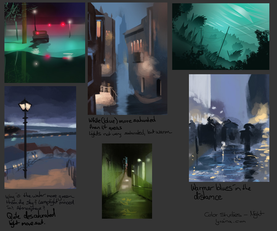
night scenes (master/photo copy)


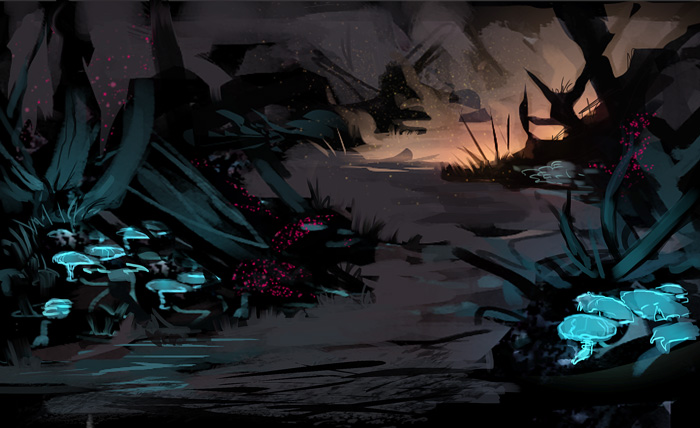
luminescence and hidden light source (application)


and this is me getting sidetracked :P


and studies for bloodsport 4 (you can join in the challenge area!)


anyone interested in the notes I take from Gurney's book while I do my studies? Just don't want this post to get any longer than it already is :[

SketchbookDeviantartArtblog | Portfolio
Every feedback is appreciated!
Reply
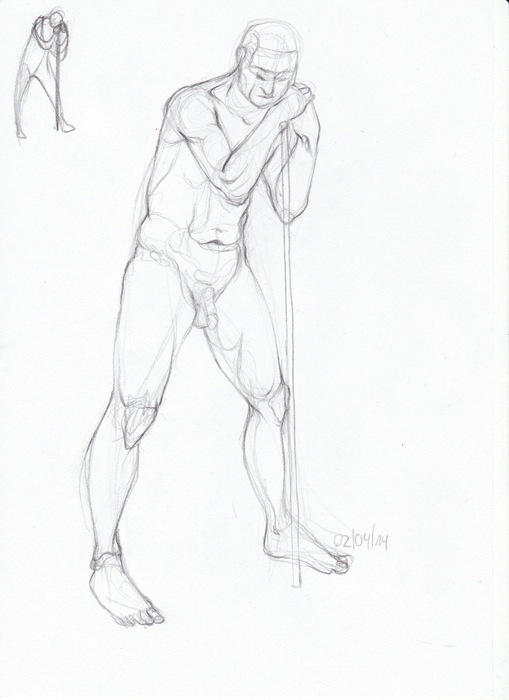
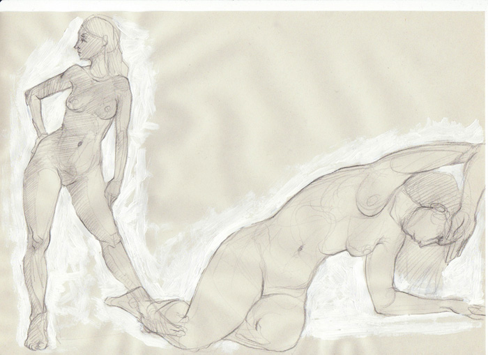
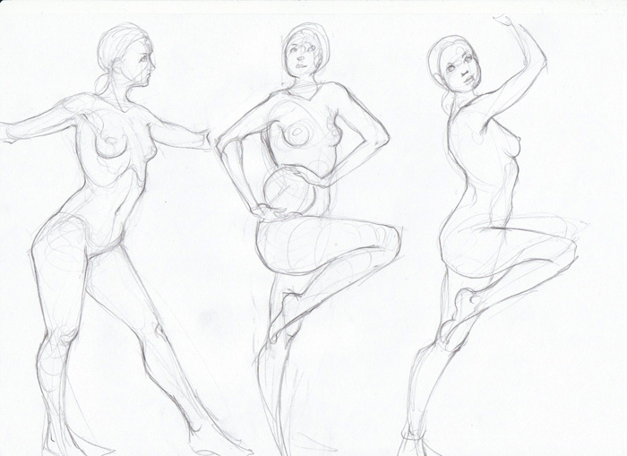
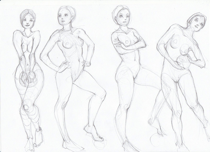
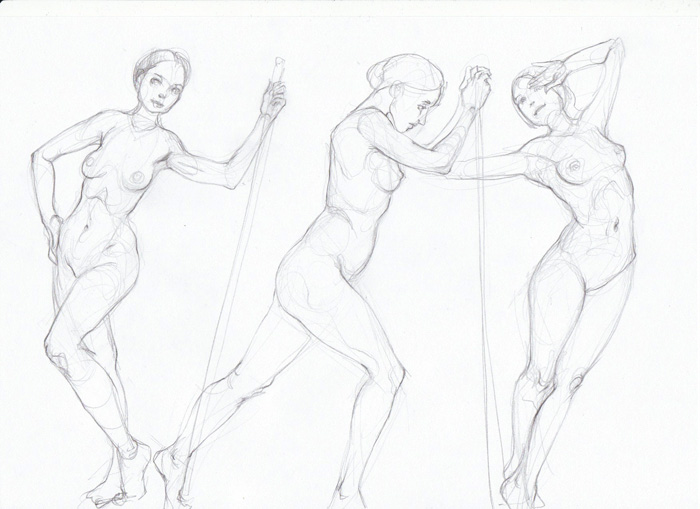
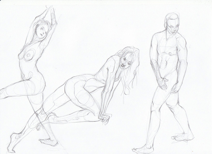
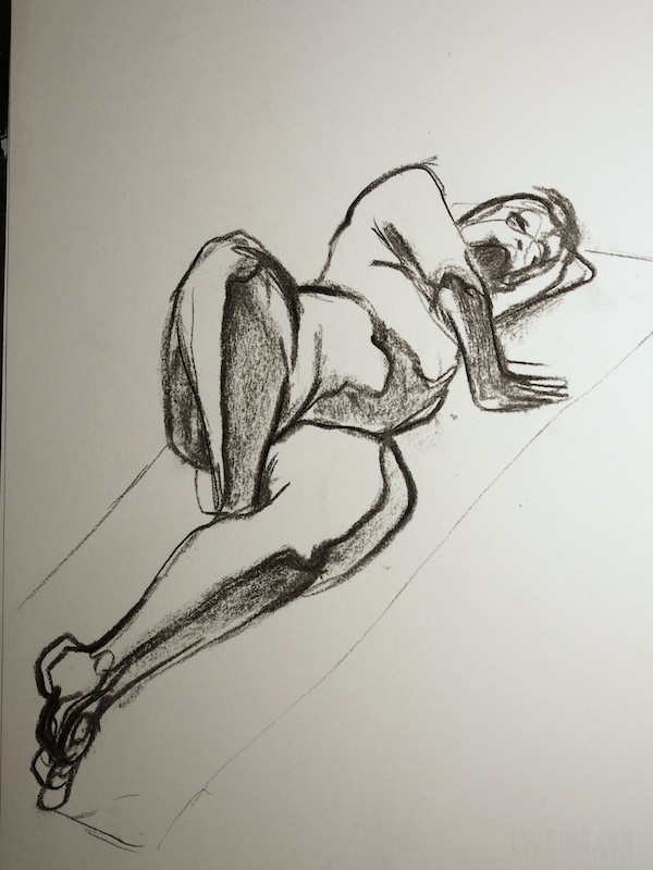
Also, life drawing:


pose studies for BS4


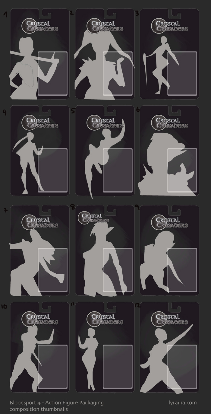
composition


SketchbookDeviantartArtblog | Portfolio
Every feedback is appreciated!
Reply
Always nice to see you diligently preparing your process.. thumbs up! :)

Reply
Thank you very much, Kaffer :)


Low self-esteem is a bitch :( One day I'm trying to be all like "work harder! you want to improve!" and feel good, but the next evening/day I find myself in a downward spiral of self loathing and doubts and "why even bother" and "at this rate you'll never get anywhere" all over again. And even if I pull myself out of that state of beating myself up/self pity, it is just a matter of time until the nasty voices telling me to just lie down and never touch a pen again are back again. It is just so very draining, and I feel like I could work so much better and be more concentrated, if I didn't need to spend 50% of my mental energy on silenceing those negative thoughts :(
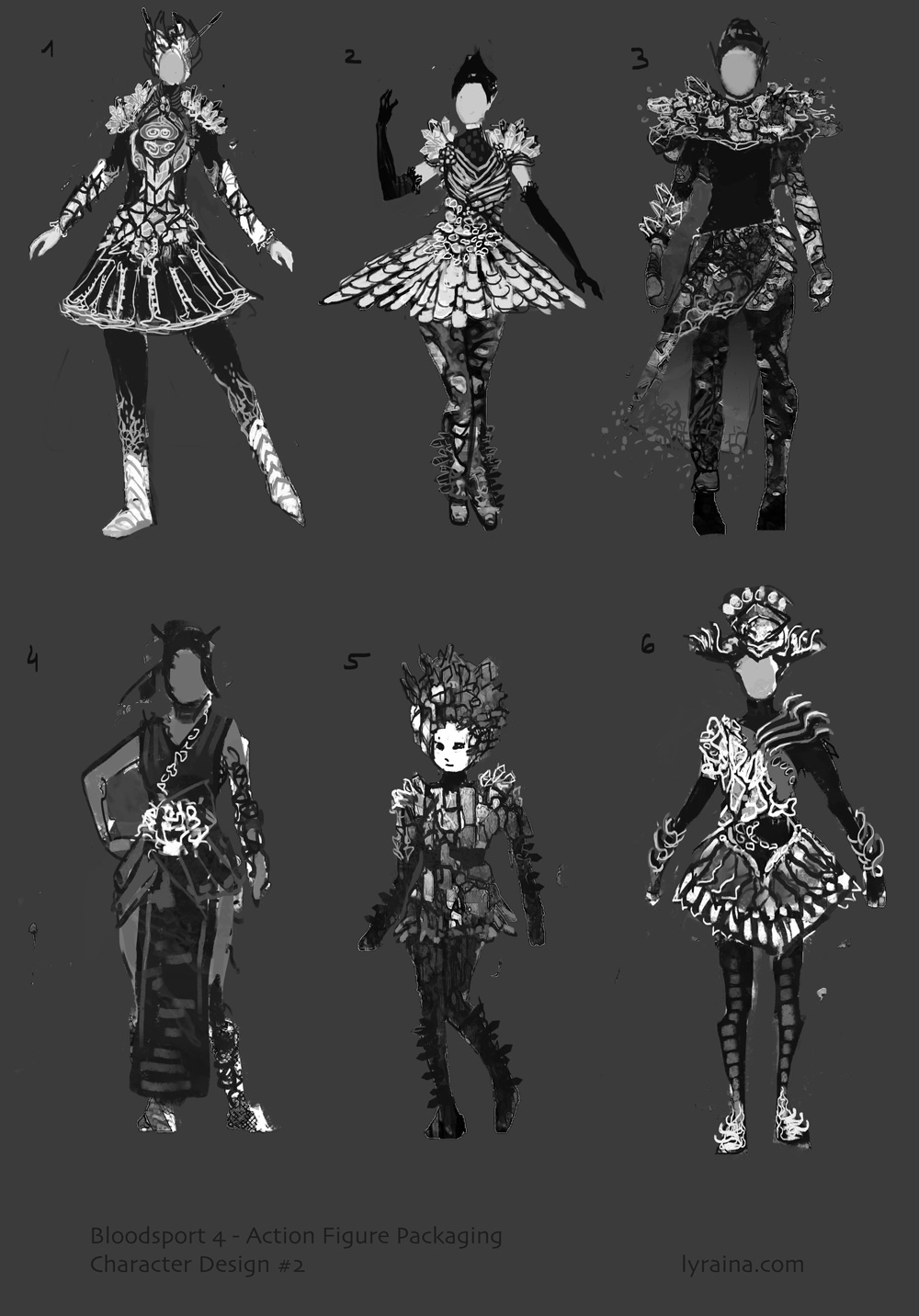
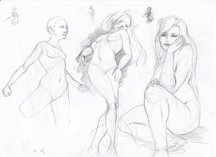
Anyway, some more drawings from ref and without, and character update for bloodsport4.
Have a nice weekend guys, I'm off for a family gathering...


SketchbookDeviantartArtblog | Portfolio
Every feedback is appreciated!
Reply
awesome update - have a great time with your family.
And self consciousness is normal. It is good for the motivation to get better it is not good when it paralyzes you. You are so good already. And you have great work ethics as your regulary updates show. Be proud and try to enjoy what you do and you will get everwhere you want to be!

*and of course i am interested in your gurney-study-notes. such notes are golden!

Reply
The worst thing is the low esteem periods comes back from time to time like boomerang. I'm also in that state now and I'm sure even badass artist struggle with it. I think most important is to remember that no matter what you do, you are getting better, believe in future and just keep doing what you are doing. My brain is trying to convince me that there's no point in it and I feel horribly depressed but other part of me know it will calm down soon and my inside voice will stop arguing about every brushstroke. :) Keep going, crossing fingers for you!

Reply
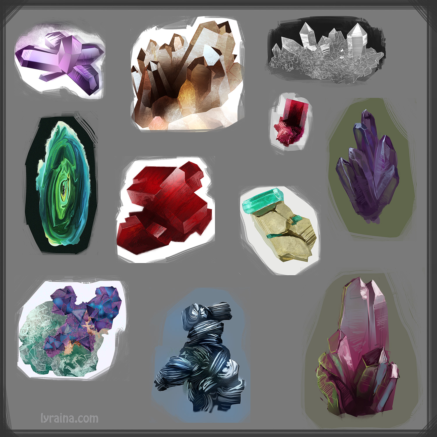
Wow, that bloodsport prep looks great! Inner 7 year old me is just drooling over all the lovely crystals. Those costumes are going to be awesome all rendered out. I love the life drawings with little thumbnails. Gotta try that.

_________________________________________________________________________
The best time to plant a tree was 20 years ago.  The second best time is now.  
-Chinese proverb

Sketchbook

Reply
Wolkenfels: Thank you for the encouragement, I appreciate it :) And yes, I always try to channel the self consciousness into motivation, as much as possible.

Madzia: Yeah, you're right, at least it is somewhat predictable. There will always be another down-phase, but when it will also (probably) get better eventually :)

Tygerson: Thank you! Yes, my inner 7 year old had lots of fun with those crystals. Ok ok, the older me enjoyed it as well... The thumbnails help me figuring out the biggest shapes and relationships and angles in about 30 seconds, which then helps me getting the pose right. So that's really helpful :)

---
Gurney Notes

Direct Sunlight:
- Three light sources: Sun, blue sky, reflected light (2 and 3 are subordinate to 1)
- High altitudes, clear sky: Shadwos darker and more blue
- Cloudy: Shadows become greyer
- Haze, smog: Shadow tone nearer to sunlight
- Color of the ground reflects into shadow areas

Window Light:
- Cool and bluish
- Contrast to warm light sources inside
- Bounce light from ground outside, depending on ground color (visible on ceiling)
- Soft warm shadows

Candlelight and firelight
- yellow-orange, weak, drops of rapidly
- lit at dusk (not night)
- smoke scatters like: softness, no black shadows (as opposed to photography)
- fall off: inverse square law (twice the distance = 1/4th as bright)

Indoor Electric Light:
- most common: incandescent, fluorescent
- (Relative) Brightness: depends on distance of subject to light, wattage, lamp type...
- Hard Light: harder = more dramatic, crisper shadows, more texture and highlights (i.e. sun or spotlight)
- Soft Light: Wider area, more flattering -> diffuser panel, lampshade etc
- Color Cast: Dominant wavelength of light source (i.e. regular incandescent favour red/orange colors)

Streetlights, Night Conditions:
- moonlight (blue/gray), flame-based light (orange), electric lighting
- pay attention to different kinds of modern lights (neon, LED, metal halide etc)

Luminescence:
- Incandescence = light of hot/flaming objects (=glut/glühen)
- Luminescence = Cool temperature glow
i.e. Bioluminescence, fluorescence
- gradation from one hue to another
- blue/ green travels farthest through water

Hidden Light Sources:
- Ways to light a scene:
1. outside the picture
2. inside picture (visible)
3. inside picture (concealed) --> mystery

Overcast Light:
- clouds eliminate extreme contrasts
- good for complicated outdoor scenes
- shows true colors, brighter than in direct sunlight

Cast Shadows:
- flooded with various sources (on earth because of atmosphere)
- blue sky -> blue cast shadow
- depends on light source: soft light = blurry edge, two lights = two shadows (i.e. car lights)...
- edge gets softer with distance
- bands of light and shade create depth

Half shadow
- creates drama
- i.e. setting sun, lighting only upper part of something, "end of day" feeling

Occlusion Shadows (crevice shadows)
= small, dense area of shadow, when forms come close to each other
- i.e. folds, contact of object with ground

cast shadow


overcast (master study)


half shadow (master study)


realized that I have trouble coming up with new ways and shapes to cover the torso, legs etc, basically design, so I thought I should do some more visual library things (and practice my digital lines)


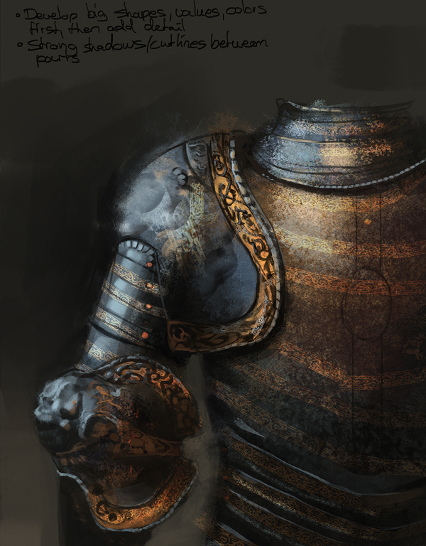
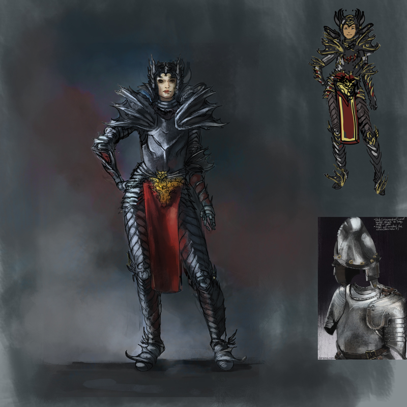
and armor! for the crimson arena, and because I think I never did a proper armor study.


bloodsport update. please ignore the creepy face for now


SketchbookDeviantartArtblog | Portfolio
Every feedback is appreciated!
Reply
Whoa! So much learning going on 0_0 Keep pushing Lyraina and beating down those negative thoughts, you are doing great. Crystal Crusaders piece is lookin good, although to be honest, I prefer thumbnails 3, 5, 8 and 12.

Reply
Great amount of work going on, as for getting frustrated, just accept it as a natural thing and move on with the drawing. Good to see that you are doing in depth studies and analysis.

Reply
pnate: Thank you. I agree, my choisce of thumbnail wasn't the best, figured that out a bit late :/

crackedskull: Thanks, and yes, I'll move on :)

referenced


not referenced


armor


dunno what


life drawing


bloodsport update, getting a bit crowded


SketchbookDeviantartArtblog | Portfolio
Every feedback is appreciated!
Reply
really nice poses so far! and the costume for the crystal crusader looks great, nice colors, reminds me of some algenpfleger style, keep up!

Reply
Blewzen: Thank you! Algenpfleger style, that was not what I was aiming for, but I can't say I'm unhappy with the association ;)

Gurney Notes

Three-quarter lighting
- light source 45° from model, both eyes illuminated -> most portraits are like this
- key light (main light) vs. weaker fill light (reflected or secondary light source)
- short lighting = foreshortened are of face (farther away) is lit, makes face thinner

Frontal Lighting
- can be hard or soft
- very little shadow
- planes get darker as they turn away -> creates outline IRL

Edge Lighting (rim light, kicker)
= a form of backlighting
- separates form from background
- requires strong light source
- i.e. low sun shining towards viewer
- hard, reflective surface can create flaring highlight
- width of rim light depends on size of planes facing backward (NOT only a white outline!)

Contre Jour
= a form of backlighting
= subject blocks the light
- shape emphasized
- colors lose saturation

For those I took a template from a photographer, I hope he does not mind, and tried to shade the Reilly head accordingly. Then checked with the original sheet to see where I was off. I still don't really understand when and how the light hits the forehead instead of the temple area, I think I need to do some more experimenting with a dummy, or my skull, or my father's head or something...


I call those "100%-opacity-brush is not on friendly terms with me"-exercise. I hope we will get along eventually. Any advice how to make the lines do what I want them is appreciated.


SketchbookDeviantartArtblog | Portfolio
Every feedback is appreciated!
Reply
Gurney

Light from below
- firelight, theater
- unusal and therefore attention grabbing
- magical, sinister, dramatic
- can also come from a reflector (i.e. a person reading in the sun)
- good to make objects look large at night by only partly lighting them
- experiment with small models


lines/fashion


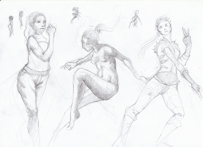
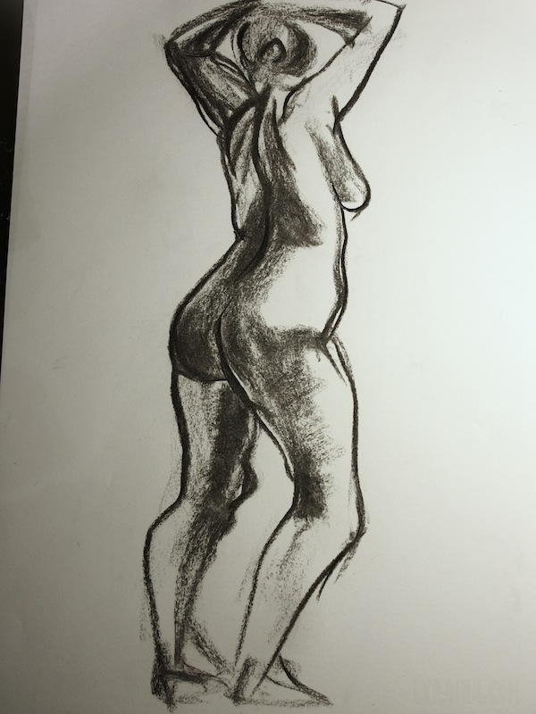
last life drawing for a couple of weeks. I was told to draw more .. "wild"


SketchbookDeviantartArtblog | Portfolio
Every feedback is appreciated!
Reply
man, you do so much work! Look at all these beautiful figure drawings and studies from Gurney.

You started using charcoal at life drawing by the looks of things? Thats nice, love charcoal stuff, but now I just have to find some nice paper to draw on. The newsprint I have isnt exactly the best quality and I think it is hurting my drawings.
That lighting guide looks handy, the more detailed you can do that, the better it will be as a ref in the future, but maybe you should set up a light and do it from life xP

Bloodsports is looking good as always. I love the colours and all that.

For the solid lines, try turning on shape dynamics so you have some fall off at the tail of the line, I find that changing the line weights can really help with making the line more friendly :)

Other than that I can't comment on anything, but you are really working hard and thats inspiring in itself :D I always benefit from looking at your sketchbook, makes me want to work harder.

Reply
Jaik: Yes, I was told do be more "wild" so I thought charcoal might be a good choice :P Don't really know how to work with that medium though... I have a bunch of different papers but didn't really figure out which one to use for what. And yes! I'd love to do some life portrait painting again. Shape dynamics is turned on but not much use if I press down the wacom like a maniac D: Thanks Jaik!

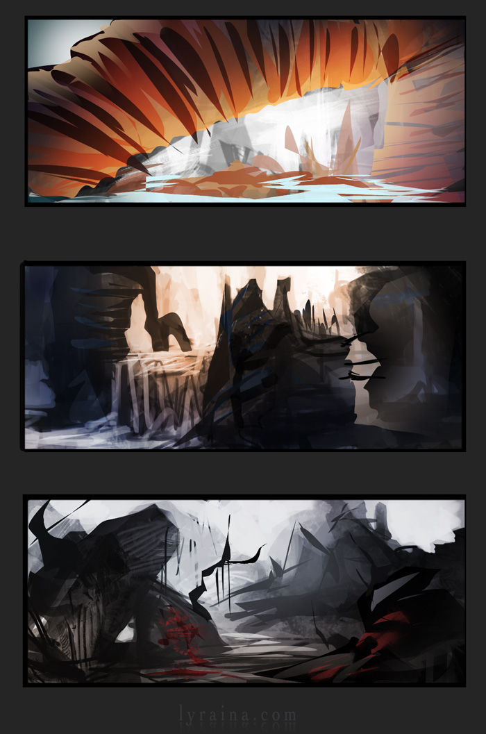
Bloodsport - final


screenshot-overpainting. Tough one because I don't really know how to give form to something this stylized.


crimson arena thumbnails. I hope I don't run out of time, drawing armor is kind of new territory for me O_O


SketchbookDeviantartArtblog | Portfolio
Every feedback is appreciated!
Reply
Really nice to see how the your Queen of Stormhaven is developing. Neat idea to bring some of your gestures into the design for help. I was struggling myself to get something that suited, now I might go for some gestures :P

Digging the bloodsports final, I think you handled everything from the fabric to the crystals really well. So those studies helped you out. Though I would say tha you did have some more dynamic and "open" compositions as thumbnails. By open I mean with more air and space! The final feels a bit more crammed. Something to keep in mind for the leading ladies!

Great that you're pushing forward so quickly. Feels very inspiring. You're doing awesome Lyraina! :D

Reply
ooh a zhaoming wu study, nice! :)

Also the sheer amount of hard work here is inspiring.
Redrawing stylized stuff in a realistic way is really, really hard because its really easy to cross the line and enter the uncanny valley. I've seen people turning anime screenshots into nightmare fuel but you managed to do a really good job on that one, specially the hair.

Good job too on the challenge, if i have to pick a favourite it would be 7 or 2. 1 and 6 have too much spikes of evil for my taste. xD

Reply
Crystal crusaders Zoisite turned out just gorgeous! I love the layering of the dress and seemingly effortless spray of gems to decorate it. The colors are so bold and feminine, too!

Really great variety on the new armor designs! Good luck picking a favorite.

_________________________________________________________________________
The best time to plant a tree was 20 years ago.  The second best time is now.  
-Chinese proverb

Sketchbook

Reply
Bjulvar: Thanks! And yeah... it is probably lazy, but I though why not recycle the gestures (those I did from mind) ;) I agree about the thumbnail not being the best choice... it looked better in my head :/

Eduardo: Yeah.. I think I originally got to know him from your Sketchbook :P For the Queen of Stormhaven, I do like 7 a lot design wise, but I also think it's kind of boring. More fitting for a city guard or something. So I am going for evil spikes of doom design :P Not sure if I am going too much cliché, but I find it really hard to think of something "fantasy" with all those gorgeous real world medieval armor designs out there...

Tygerson: Thanks a lot! I am glad if rendering all those crsytals was worth it :D

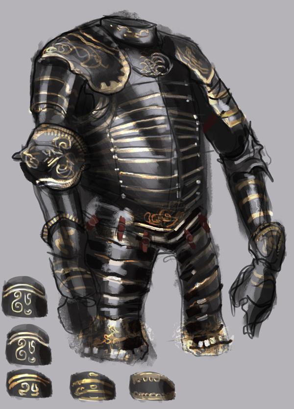
more armor studies, more specific this time, looking how to do dark armor with gold ornaments


girl from expression drawing tool


WIP


SketchbookDeviantartArtblog | Portfolio
Every feedback is appreciated!
Reply


Forum Jump:


Users browsing this thread: 251 Guest(s)