Lyraina's sketchbook
"Embarassingly small update." <---

Brace yourselves people... This means she's going to slam us with something big she's been secretly working on.


Focus.
Reply
It's always good to drop by here and see your updates getting better and better. The environments on the previous page are really sweet and I cant wait to see more!

Reply
Lovin how those final CGMA pieces came out! Looking forward to the next update <3 Got any super secret cool projects planned?

Reply
StardustLarva: Thank you!
meat: Something big? Do you know things I don't know? :D
Warburton: Thank you :)
pnate: Thanks, mostly not-so-secret efforts to learn perspective and drawing is planned :p

Trying to work on that death grip and stylus-wristlock


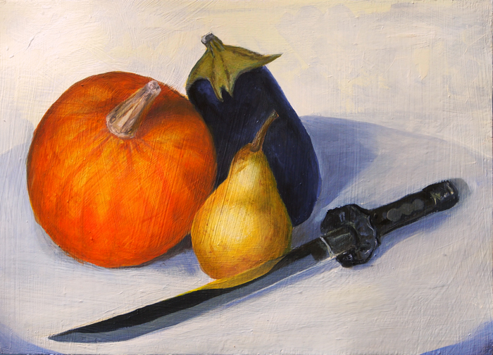
Got inspired by meat's oil awesomeness and also coulnd't stand only drawing those pretty and colorful fruit sitting on my desk! So I got out the oils again and made this. I made a lot of mistakes, but also feel like I learnt a ton.
1) I wanted to go for warm light - cool shadows, but didn't find a good way to block out cool light ruining my warm light source at daytime; while painting at night makes me swarmed by insects. Bad planning. I had a lot of trouble determining colors and temperature in the shadows, up to a point where I couldn't even 'see' if it is warm, cold, brown, grey or whatever anymore. I spent a lot of time just staring and thinking; which is something I probably should do more often to develop a better eye for these things.
2) Lack of planning - spoiled by the digital age I didn't really figure out what to do with background and framing beforehand, thus running into trouble later.
3) I also lost my construction drawing during the process, which killed the perspective in several parts (most obvious in the dagger). Not sure how to fix this, other than paint more carefully to preserve the planning/drawing from earlier stages? Kind of counterintuitive for me, since I like just blocking in rough shapes when starting out
4) The underground was a really bad choice, as it kept me from seeing shadows and bounce shadows. Choose more wisely next time.
5) The texture is more obvious than I thought, plus the surface was quite absorbant (3 layers of house paint on heavy paper), unfortunately I don't remember if that was the case with different painting ground as well, or if it's maybe because I started out with a lot of thinning medium. Or too small brushes. Needs more experimentation.
Had lots of fun though!


ChoW. Not super happy, but glad that I managed myself to push to a (rushed) finish despite overthinking this whole thing. Cannot let the brain keep me from producing! Glad to have tolerant enough family/friends that nobody gets me institutionalized despite me rambling about cyborg sexuality and modesty and similar topics...


Also, THIS

SketchbookDeviantartArtblog | Portfolio
Every feedback is appreciated!
Reply
Maaan, this is exactly why I love looking at sketchbooks. You've developed in all fields so much, and hell I've already said on dA, but I need to do it once more. Awesome progress over last months - this is how great artists are made. :)

Reply
Thanks so much for the kind words, denikina :)

state of the sketch, or something


SketchbookDeviantartArtblog | Portfolio
Every feedback is appreciated!
Reply
Woohoo poses all day errdayyyy

Reply
Dayum! Hot lines and ladies.
Improvement over 8000 on that page!

Reply
Serious art business going on here. Really like the latest studies, those figures are impressive.

I see you've been doing some still life studies, I've been getting into that a bit more recently too. Maybe we should start a still-life study group or something? :)

Reply
pnate: Yesssss! Could do those aaaall day...
rafa: Thank you <3
Craig Paton: Thanks! Those still lifes were an attempt to improve on drawing and perspective, but didn't really work out in that regard... so future still lifes will have to wait a bit longer I fear D:

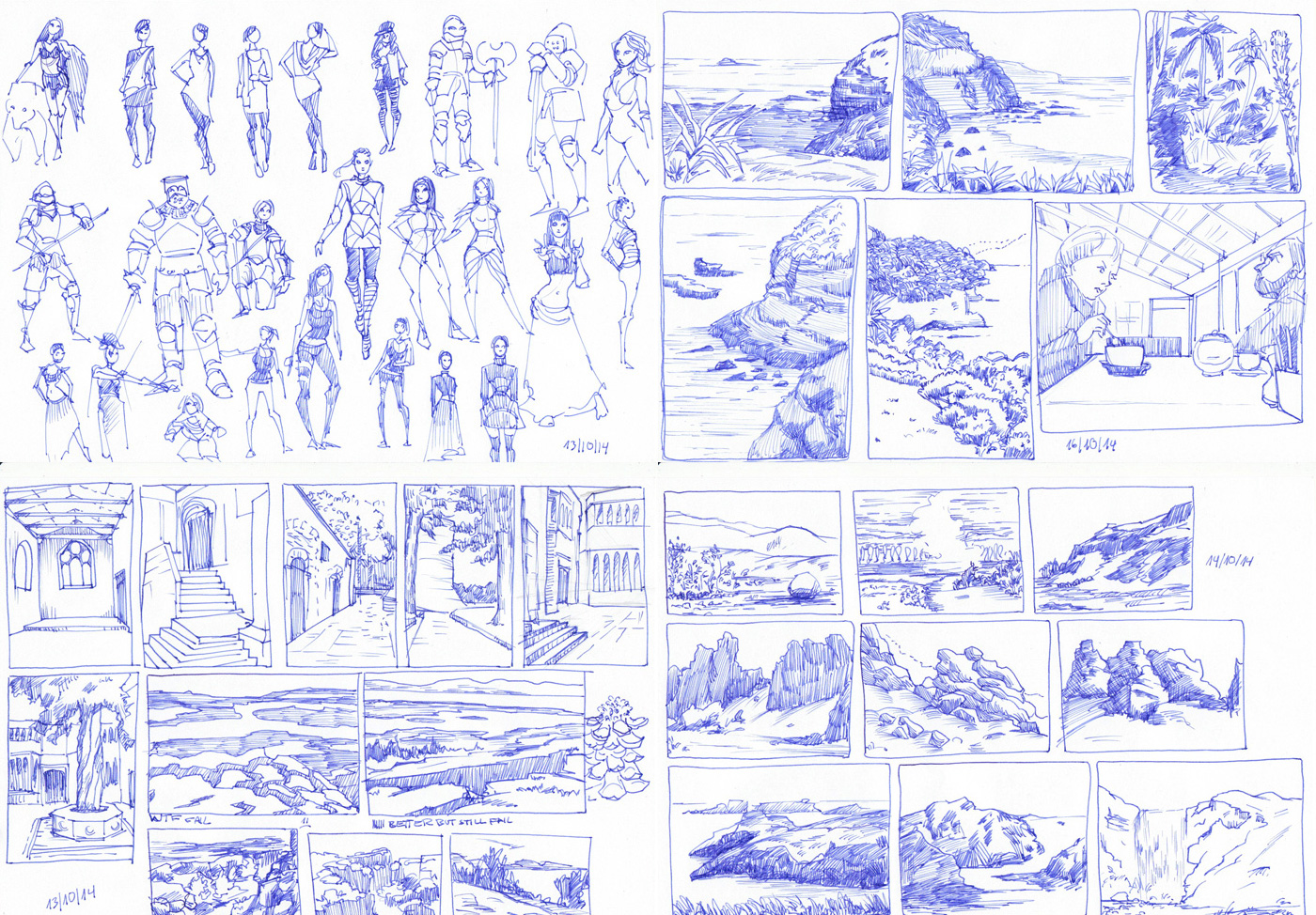
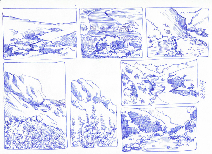
wild mix of ref and non ref. readabilty of my pen-enviros is still terrible, sorry for that!


SketchbookDeviantartArtblog | Portfolio
Every feedback is appreciated!
Reply
Welp. You're now over where nate and rafa's at where I can't really think of anything to say besides "...!!!"


Focus.
Reply
meat: Haha, thank you! you are putting me in good company there! ;)

study/apply... I want a donut now


SketchbookDeviantartArtblog | Portfolio
Every feedback is appreciated!
Reply
Nice amount of work youre doing.
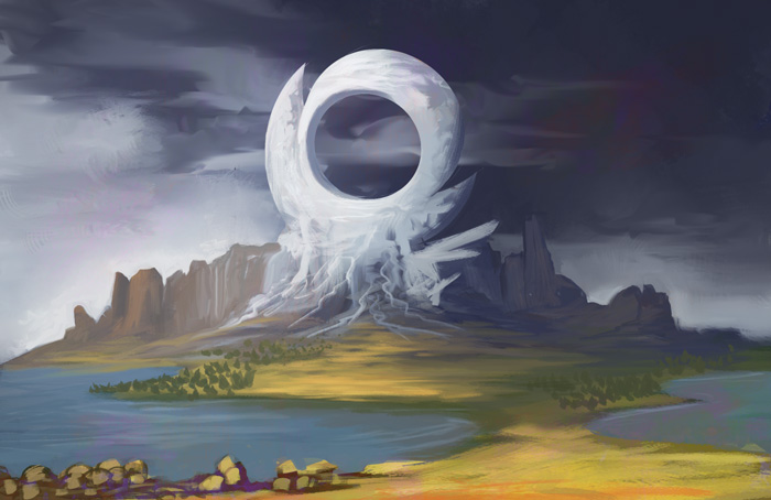
On that last image the left edge of the landmass is too sharp and creates a tangent with the water and the left border of the image. Also might be a good idea to use some stronger more saturated colors in your application.
Dont have much else to crit, youre doing good. I quess as a general rule of thumb always observe, even when not painting. Observe the interesting patterns in nature, when you see something really appealing then think why is is that way, analyse.

Reply
crackedskull: Thank you for the crit! Spot on with the saturation. Showed me that I need to look/observe closer at what I'm doing when doing a (photo) study.

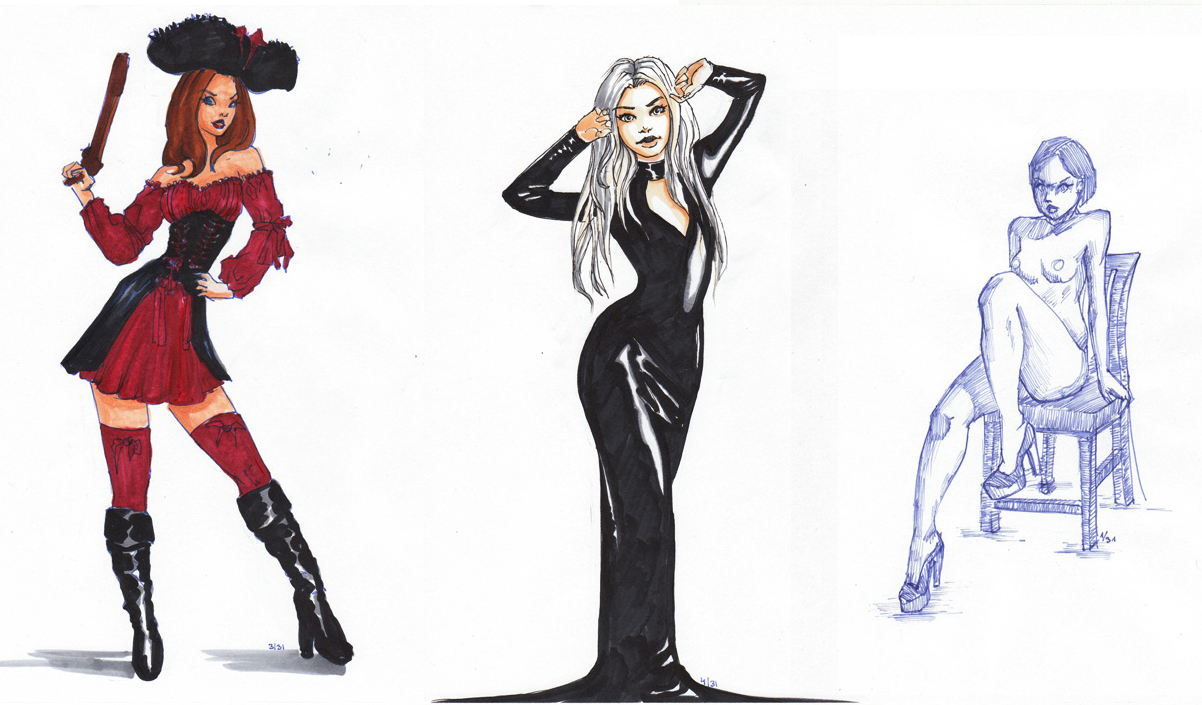
more morning pen gesture/drawing. might switch to pencil soon. some of the girls even found some clothes by now...


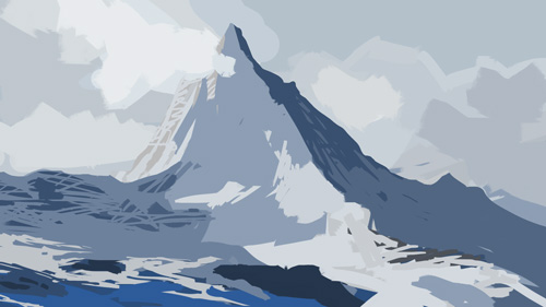
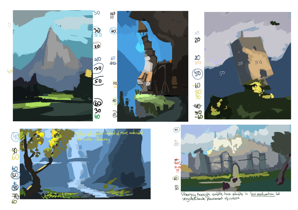
saturation guessing game


Will be at Schoolism Live Workshop this weekend, so see you next week!

SketchbookDeviantartArtblog | Portfolio
Every feedback is appreciated!
Reply
hatchinnnn!!!! Love!! the enviros are getting KILLER!! I also love your very studied approach to things :). One thing i wanna point out as a crit in the copious amounts of figure work you've been doing :D!

I've noticed this even when checking out your first page you still make this mistake but far less often now. It's something around the pelvic area of your female figures, like sometimes it's too long or, well just too long in some parts. Like most of them could be fixed if you just bring the hips up slightly. I like to think of where the top of the hip bones are and where the bottom of the ribs are, there isn't really a ton of space between that in reality. You seem to get it right most of the time though, especially now keep POSTIIN!!!!!

70+Page Koala Sketchbook: http://crimsondaggers.com/forum/thread-3465.html SB

Paintover thread, submit for crits! http://crimsondaggers.com/forum/thread-7879.html
[color=rgba(255, 255, 255, 0.882)]e owl sat on an oak. The more he saw, the less he spoke.[/color]
Reply
you are my personalized bad conscience for not painting more...
your work ethics are incredible!
and it shows in your stuff.

Reply
Damn these gesture and thumbnail studies are drop dead gorgeous!
The landscapes are coming along too, I know you're doing the full opacity brush on these last ones but you should keep doing them, I've started doing it couple of weeks ago and it helped me alot.
Keep it up Lyra!

Reply
Fedodika: Thank you! Haha, I love studies, analyzing, thinking stuff through - so much that I have to be careful to also apply it afterwards :P Thanks for the crit on anatomy - I'll need to so some more slower studies again I guess, and figure that out. Thanks!

Wolkenfels: Hahaha! Thank you. :) Yep, you should definitely paint more! *evil maniac laughter*
...and next time we should totally meet at Schoolism Live or similar!!

rafa: Thanks - yeah, the full opacity brush is tough but very useful as it forces me to ...actually think what I want to lay down and not just blend random colors together until it looks about right :p

mini update - more saturation guessing game... scanned update to follow a bit later when I'm less lazy >_> first batch from paintings, second from photographs.


SketchbookDeviantartArtblog | Portfolio
Every feedback is appreciated!
Reply
Sooo many studies.. Jesus Christ :D These environment thumbnails look sweet. I like that full opacity tryouts. It's a good exercise and for sure usefull but so hard to make the image look like something other than mess :( Great job :)

Reply
Mike: Haha, thanks! Yeah full opacity is useful. Thankfully I'm not trying to make those look good, it's really just lying down colors in the right place/order so that I can see them in their relationship. So I don't really mind if it looks like a mess :)

Me being super proud of using a real sketchbook, being outside, amongst real people. Sketching real people, even! While some sect member tried to recruit me (in vain), and others talked me into giving away my lunch (successfully). Next time I'll definitely bring earphones. Faces are partly from imagination, but also inspired by people around me. No likenesses though 'cause I didn't dare to stare at them for the most part, especially other people's kids!


Trying out... things. Which I learnt at the schoolism workhop (gesture drawing lecture) - let me know if anyone wants notes.


warmup etc


more saturation guessing game. this time from (travel!) photographs that looked a bit more muted or overcast to me, to see the difference to the bright ones above.


Edit: Lol, my updates are so figure/study heavy! I swear, I'm also doing imagination stuff, just nothing worth showing comes from that yet ;_;

SketchbookDeviantartArtblog | Portfolio
Every feedback is appreciated!
Reply


Forum Jump:


Users browsing this thread: 146 Guest(s)