08-08-2013, 11:13 AM
Nice studies in here! The progress shows for sure.
|
Julius Ebert Sketchbook
|
|
08-22-2013, 03:15 AM
Thanks dude!
Here's some new stuff. Started as drawing. Then this: 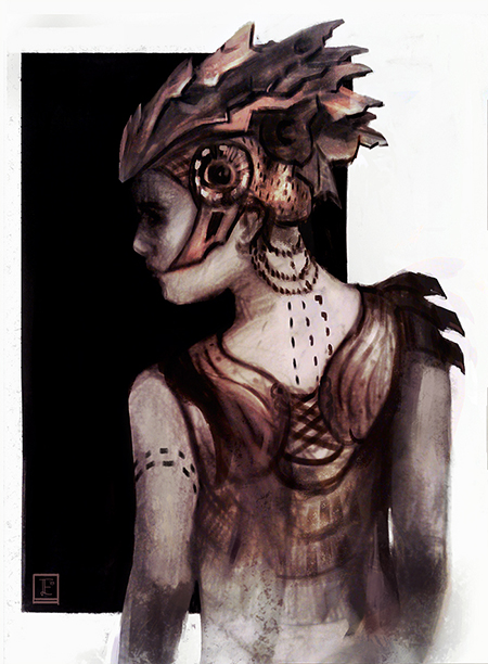 Now it became this. Still wip though:  Aaaaand I gotta admit that I failed my CHoW horribly.  Would love to hear some crits from you guys! Cheers!
08-22-2013, 04:40 AM
Some critics of a friend just made me realise how fucked up those proportions are. I'm getting so blind when working.
Is this any better? I figured that her shoulders were far too wide and her hip far too low. I used the liquify tool, so don't look at the background, haha. 
08-22-2013, 09:32 AM
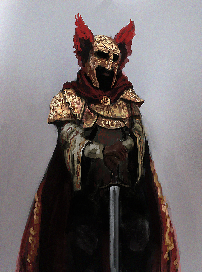
I just sqeeze this one in. Did it after watching some older lifestream of Dave Rapoza.
08-24-2013, 01:52 AM
Kept on workin on it. Tried to organize those values a bit and fix her anatomy and proportions. Still considering it wip though, haha.
 Any thoughts about it? They're all more than welcome <3
08-24-2013, 05:02 AM
I like it a lot! As for organizing the values, I heard this rule that may help: the darkest object in the light should be lighter than the lightest object in the dark. Parts of the church that are away form the torches still have highlights that are just as bright as near the torches. Also the girl seems to have some warm light on her clothes while the light everywhere else looks cool. I love her headdress thing and the way the highlighted knife stands out against her pants.
08-24-2013, 07:19 AM
You have very interesting designs there.
For your last compo , I may increase the size of the girl because right now you have an empty space in the bottom left area. The reading is cut in this part. You may use your helmet and change slightly the gesture of the girl to create more curves and more interests in the overall composition. I wouldn't put the main light against the wall but below the door or behind just to make a call for the audience -" Hey what s going on behind"? and let us imagine what's behind. Instead of closing the door and "closing" this mental conversation. You could play also between the design balance of your helmet/clothes and what is happening with this architecture. Using interesting vocabulary related shapes to connect the character and his environment. I can comment more about your picture :p but the main things are here for me. I'm not a pro though, hope it helps you. :) godo job!
08-25-2013, 02:02 AM
Thanks alot for your crits!
You're definetely right that those background values are still off, deerheadlights. I wanted to render the cathedral thingy anyway, I will remember your crit when I do so! florentK, thanks for your crit too. The composition is a bit off, I had that thought too, but I won't change the gesture of the girl now. I will try out some other stuff to fill the bottom left corner. Maybe I can figure something out. The light behind the door and/ or the door half open is a bit too easy imo. Thats the stereotype "mysterious door - whats behind it". But your point on the architecture to use design elements of the headdress is a sweet idea! :) Here's a portrait of today to not only post text. 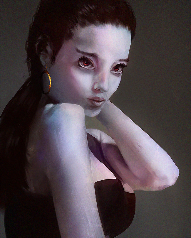 Cheerio!
08-28-2013, 08:44 AM
Quick speedy:
 And the next and probably (or hopefully) last wip step. That front took longer that I wanted it to.  Cheers!
08-30-2013, 08:00 AM
I kept on working on this one. I'd say it's final, but if you guys give me some nice critics, I sure will keep on pushing. :)
It's not a 100% what I had in mind, but I still like the outcome of this painting. I've definetely improved alot working on it. 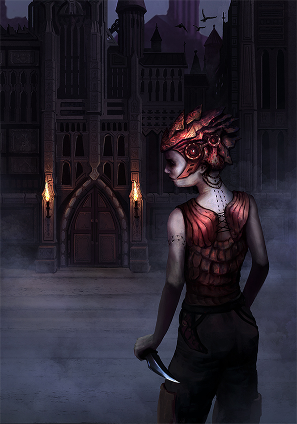 All kinds of critic are more than welcome. You would really help me out by saying what you like and don't like about it! Cheers and good night!
08-30-2013, 02:54 PM
This is a beautiful sketchbook man! Your study vs application is equally balanced; improvement is noticeable.
For the knight girl, ummm have you tried taking a picture of yourself in a similar pose? I'm sure that will help you spot mistakes and correct them. Time to study! hahaha
08-31-2013, 10:04 AM
Thanks dude!
You're right, it's study time. But I need some distance to that bigger piece before I try to apply all the crits! So here they come. 3 hours for both. Daang, painting without the left hand is annoying.  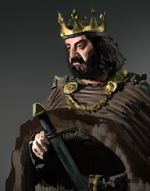 Cheerio!
09-04-2013, 09:11 AM
Really like that last illustration, and the studies are wicked too. the lighting on the hand must have been a bitch! turned out really well though, nice one :)
09-04-2013, 10:02 AM
Really great sketchbook, Julius!
What I love most I think is the coloured sketch of the knight chic. There's so much to look at, the textures are working well.. It's awesome! Something about the finished piece that doesn't have that same vitality to it, however, you still did a great job! I can't wait for more finished pieces because you're already killing it! ^ ^' Also, dayum, nice hand study :o Keep it up maaaan :D
sketchbook | pg 52
"Not a single thing in this world isn't in the process of becoming something else." I'll be back - it's an odyssey, after all
09-18-2013, 08:14 AM
Woa, thanks you two! Just came home from my holidays and bam - you gave me all the motivation I need!
I tried out some new brushes of Sergey Kolesov and fell in deep deep love with one of them. This is a quick test: 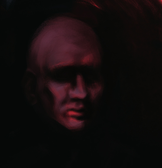 Here's a portrait study with that brush:  And I reworked the composition of this one and rendered around her face for a bit. Guess it really is done now. 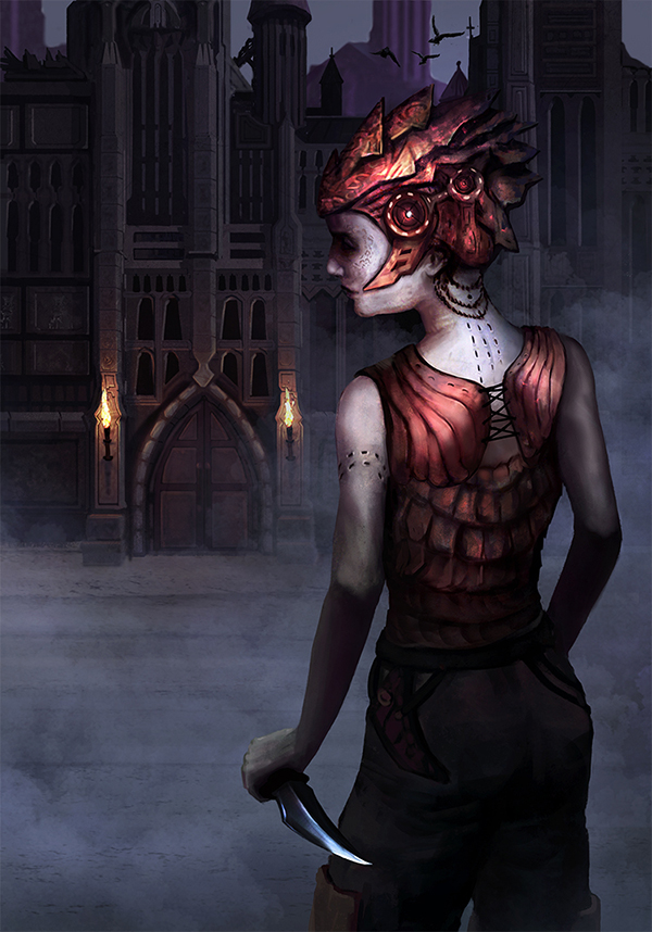 Aaaaand my Hampton finally arrived. I've waited frickin' 4 month for it because amazon screwed up. Or the delivery company. Whatever. I got it now, and Gurneys Guide for the Realist Painter aswell. Shit is about to go DOOOWN. I'll try to get my lazy ass up atleast once a week and scan my drawings. Toodle-oo, toodle-pip and Tata!
09-27-2013, 03:13 AM
Today's painting. Just wanted to get warm for a study, but this was too much fun!

10-02-2013, 03:26 AM
New stuff:
As promised, some figure drawings. 45-120 secs. 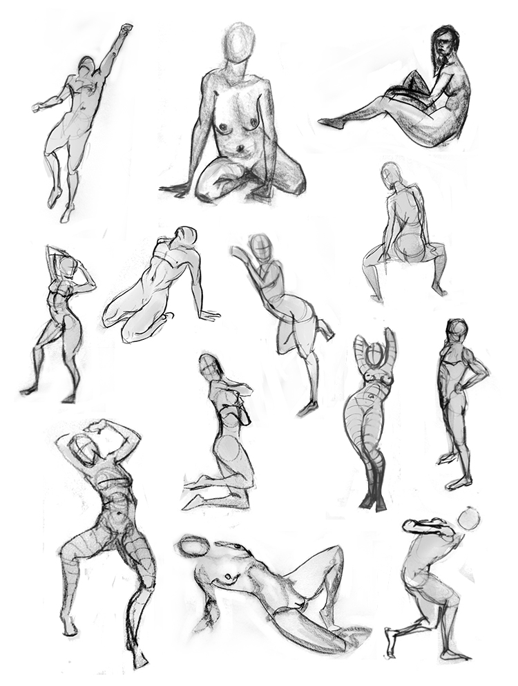 A quick try for a self portrait without mirror or photo. Quiet tough to remember how you look like. 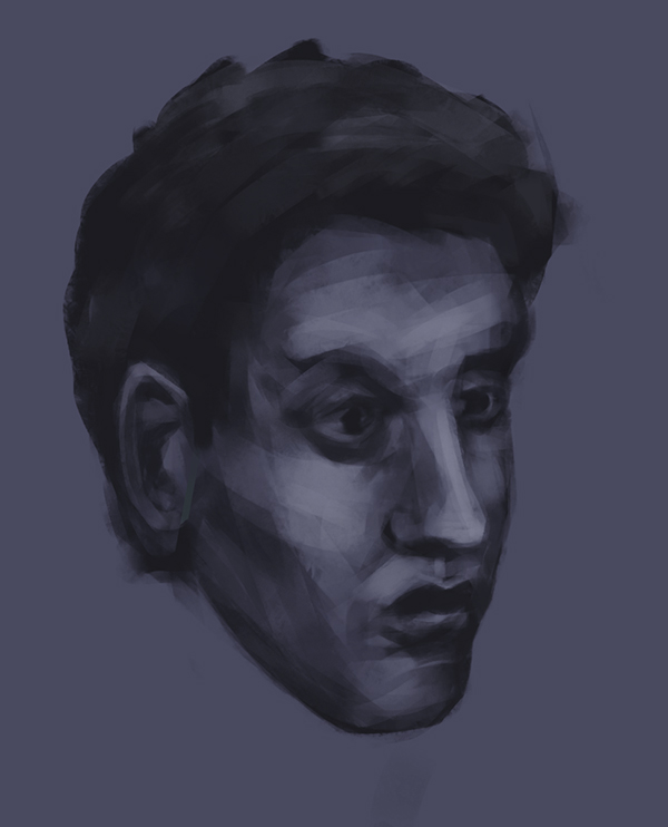 A longer figure study: 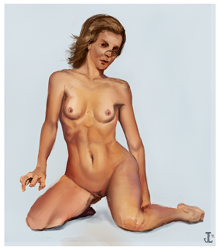 Tell me what you think! :)
10-02-2013, 05:11 AM
I really like your sketchbook, especially the woman's skin colours of your last study. The forest's painting is gorgeous as well. Sergey Kolesov's brush looks great but it looks a little bit washed out so maybe don't paint the whole picture with it? Otherwise, awesome stuff here.
10-02-2013, 05:54 AM
Thanks alot mate! I'm painting with 5-6 brushes, so no worries, that portrait was just painted as second brushtest. :>
10-02-2013, 06:31 AM
Your sketchbook is so cool dude!
I love your Speedpainting from #12 and your last environment makes me happy :O Also, the colors and brushwork from that figure study are very pleasing! |
|
« Next Oldest | Next Newest »
|