02-11-2014, 07:57 AM
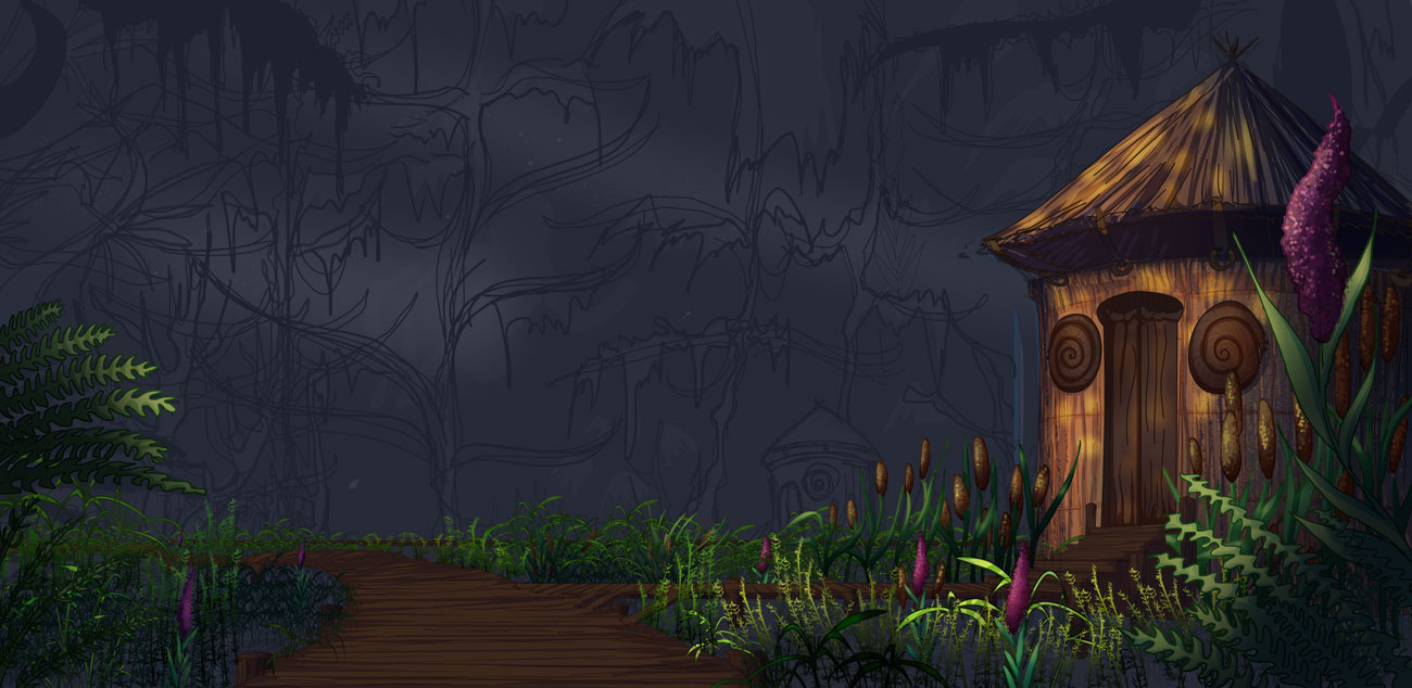
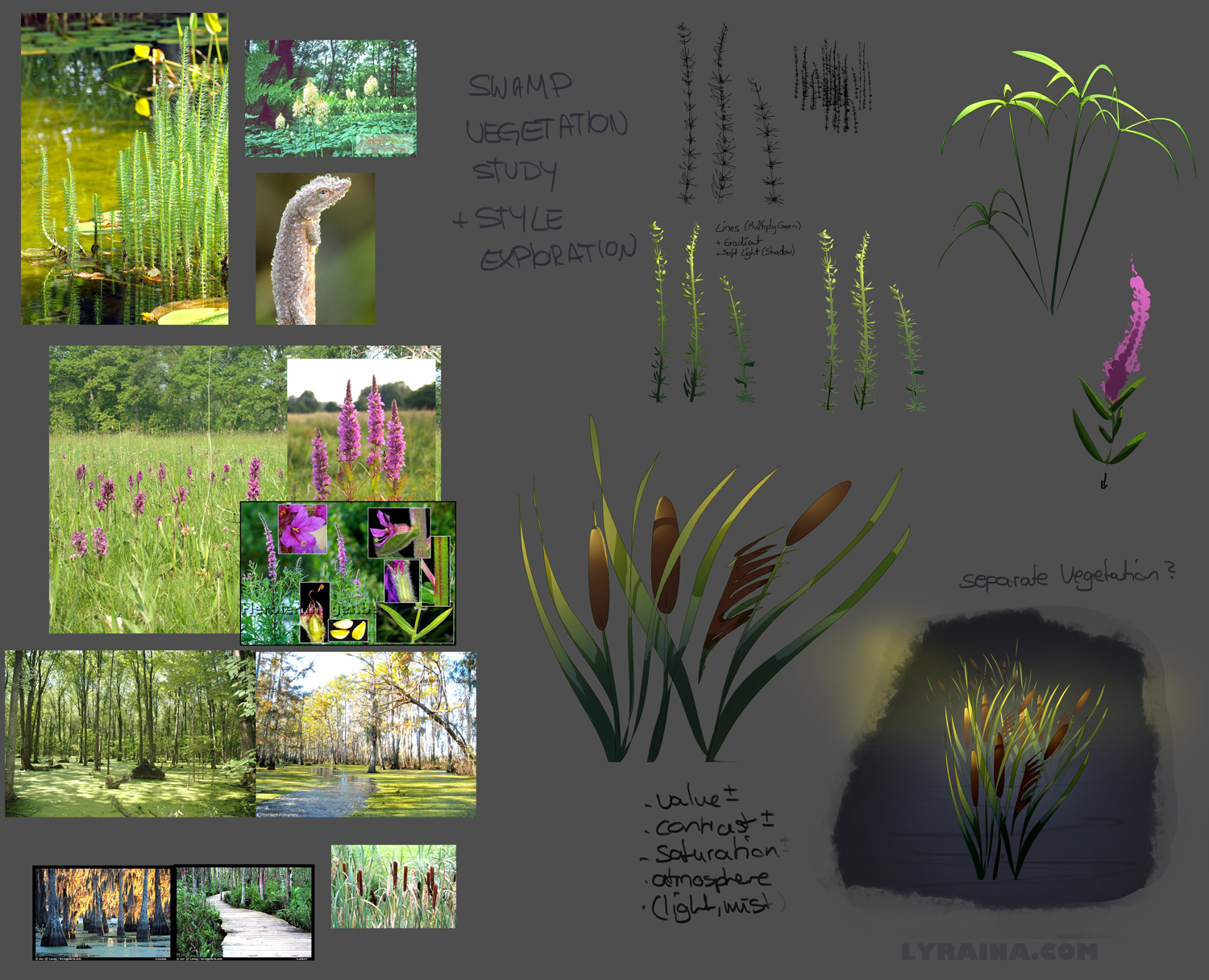
Mostly started "rendering", I hope I can seperate that mess with fog and atmosphere later on. Also did some studies on the vegetation.


|
Bloodsport 2 Revived: Swamp Elder
|
|
02-11-2014, 07:57 AM
Mostly started "rendering", I hope I can seperate that mess with fog and atmosphere later on. Also did some studies on the vegetation.
 
02-11-2014, 08:04 PM
Hey guys!
I haven't had internet yesterday, but made some progress nevertheless. I'll upload some progress shots as well. Glad to see everyone so invested in this! Lyrania: Nice overall concept, the part I don't understand is the pose - somehow it doesn't convey the concept of what the title suggests IMO.. is he a gatekeeper of some sort? It kinda feels like if he was guarding something, standing in our way.. I love the way you make exploration sheets for yourself for vegetation etc. - I'd never be able to be that organized in a project, I'd just jump in, I think I'll actually try this approach sometime! Crackedskull: I like the reptile-approach to this, I'd possibly try to embed him in the surroundings - like if he was so old he is immobile and kinda lives and breathes with the swamp. Now he kinda looks like a menacing creature who could just wreak havoc on the marshes if he wanted to. One more thing: The saturated purple in his eye might not be the best choice with such a greenish-yellowish palette. I think if you just made that part less saturated it would elevate the color scheme that instant. Meat: I agree with the others, keep at it man, this whole thing was created for us to be able to learn through failures - it would be pointless otherwise :) The fact that you made such a huge and well structured design brief for yourself shows that you are invested in this so come at it! Nous: Nice job there, the second thumb in the series with values has a really interesing lighting feeling to it! Jaik: I might try to unify the palette in this stage, the colors can turn muddy easily as right now you'll focus on values I guess.. also there is a bit of disturbing tangent in the left part where a sharp rock meets the tree in the middle ground. Ok so I went on with my initial sketch, I kinda liked that one, then put a moodboard together and started adding colors.. this video actually helped a lot:http://www.youtube.com/watch?v=9kQllLy_X4I&list=PLV2X3tgajVlFROS5fuIVKLGs78_fC4JTN I highly recommend it! After I started rendering I made a line drawing of the Elder, and started painting under it. I also changed the crop and the other guy's pose beacuse I felt it's not appropriate. So right now it's 11 AM in Hungary so I'll dive in some studies and in he afternoon will keep at this again! :) 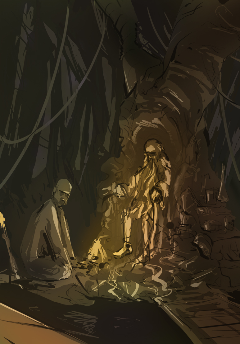 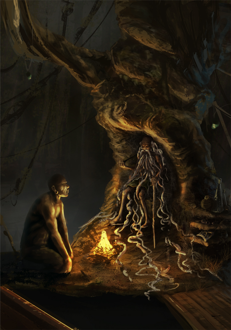
02-12-2014, 10:21 PM
That's looking great Kaffer, I like how you handled the light ( both me and you probably ran in to very similar problems) Good catch on the tangent too. The break where it looks like the horizon line is on yours looks like it may be a little too low, but I may be confusing horizon line with fog edge.
Noodle noodle.
02-13-2014, 02:35 AM
Thanks Kaffer, I did intend it to be this menacing beast who has handled everything that nature has thrown at him.
I want it to be finished, but there's more to do. Gonna return, when I feel refreshed because I dont wanna rush it like today. Also wanted to see what it would look like with a few enhancements. Probably gonna have to rework the scales and ornaments on the face, also I must imply oldness, to do this I do a build-break based kind of approach, when im finished and happy with the face I will break a few scales here and there. 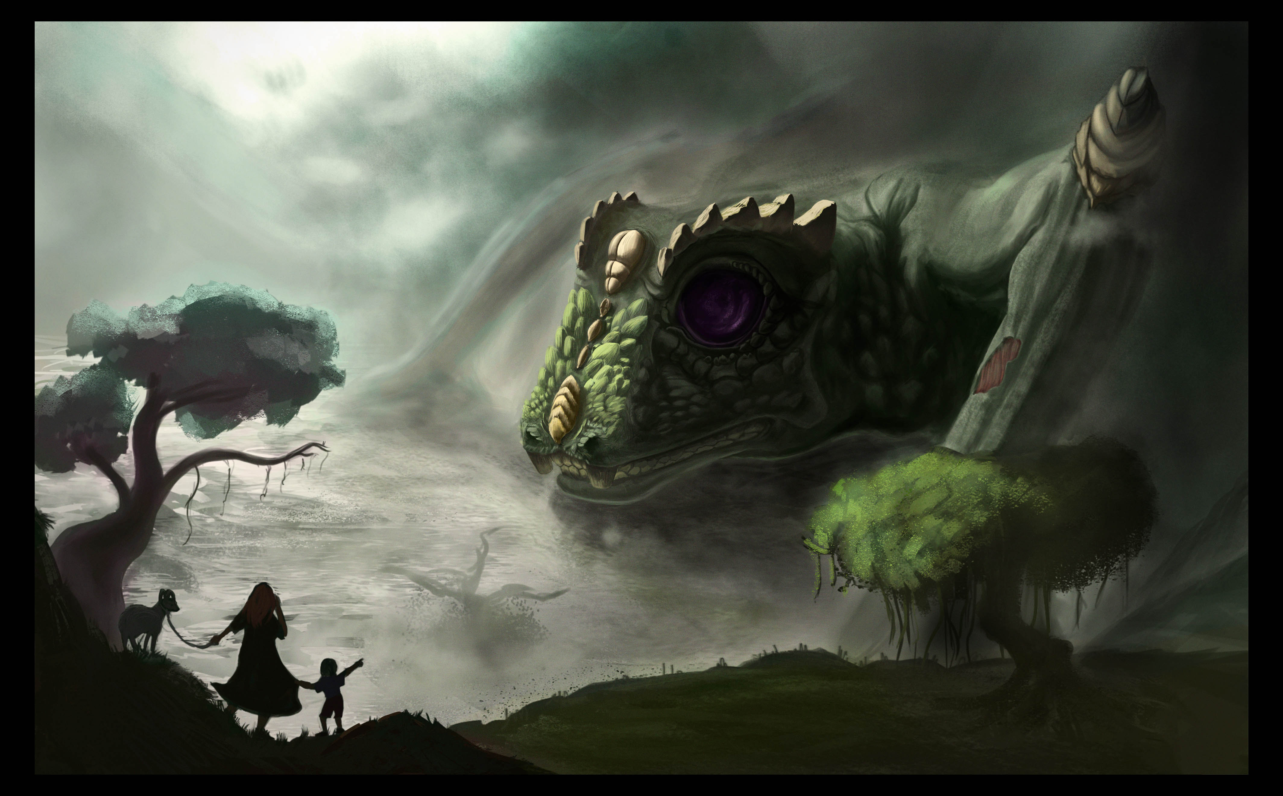
02-13-2014, 04:53 AM
Kaffer: Thanks for the feedback, I can see what you mean about "gatekeeper". I'm looking for a new pose tomorrow. Love how yours is coming along. Careful with the values and contrast though, right now the guy in the front is pulling the focus away from the elder because he is brighter. Also, you could try pushing the colors a bit more towards a warm/cold contrast with some more blues in the background, I imagine that could look really cool :)
crackedskull: Love the face, getting better with every update <3 Jaik: Great mood <3 I feel bad for pointing this out this late, but that branch that overlaps with the elder's willows (on the lit side) looks off to me... it's so stiff and straight and the angle looks forced. I think it should point more towards the man/the viewer, judging from where it is connected to the tree. Except if it were broken at the base. If you want the overlap with the elder, maybe let it come out of the side of the tree? More progress on the char sheet and background, next I will have to invent a better pose for the elder and paint him in. 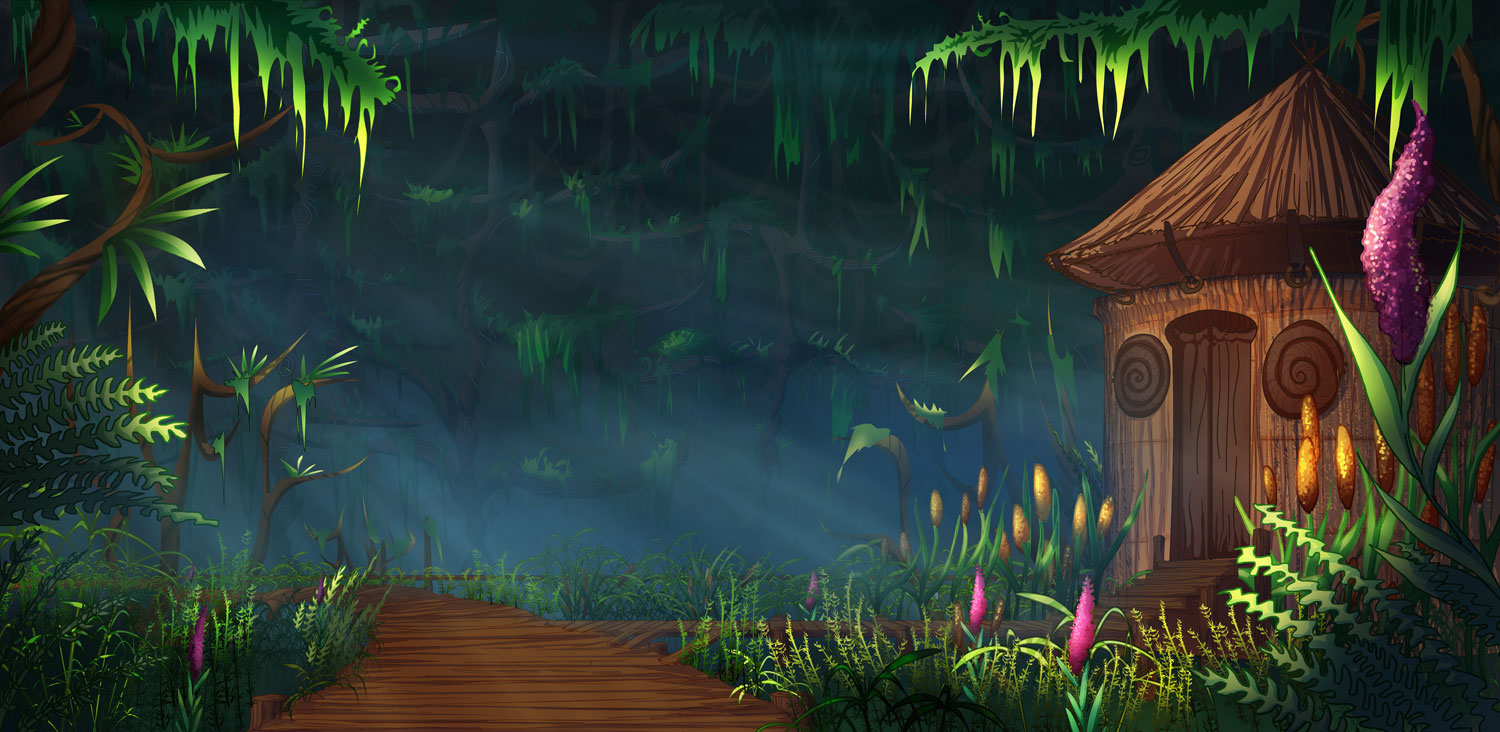 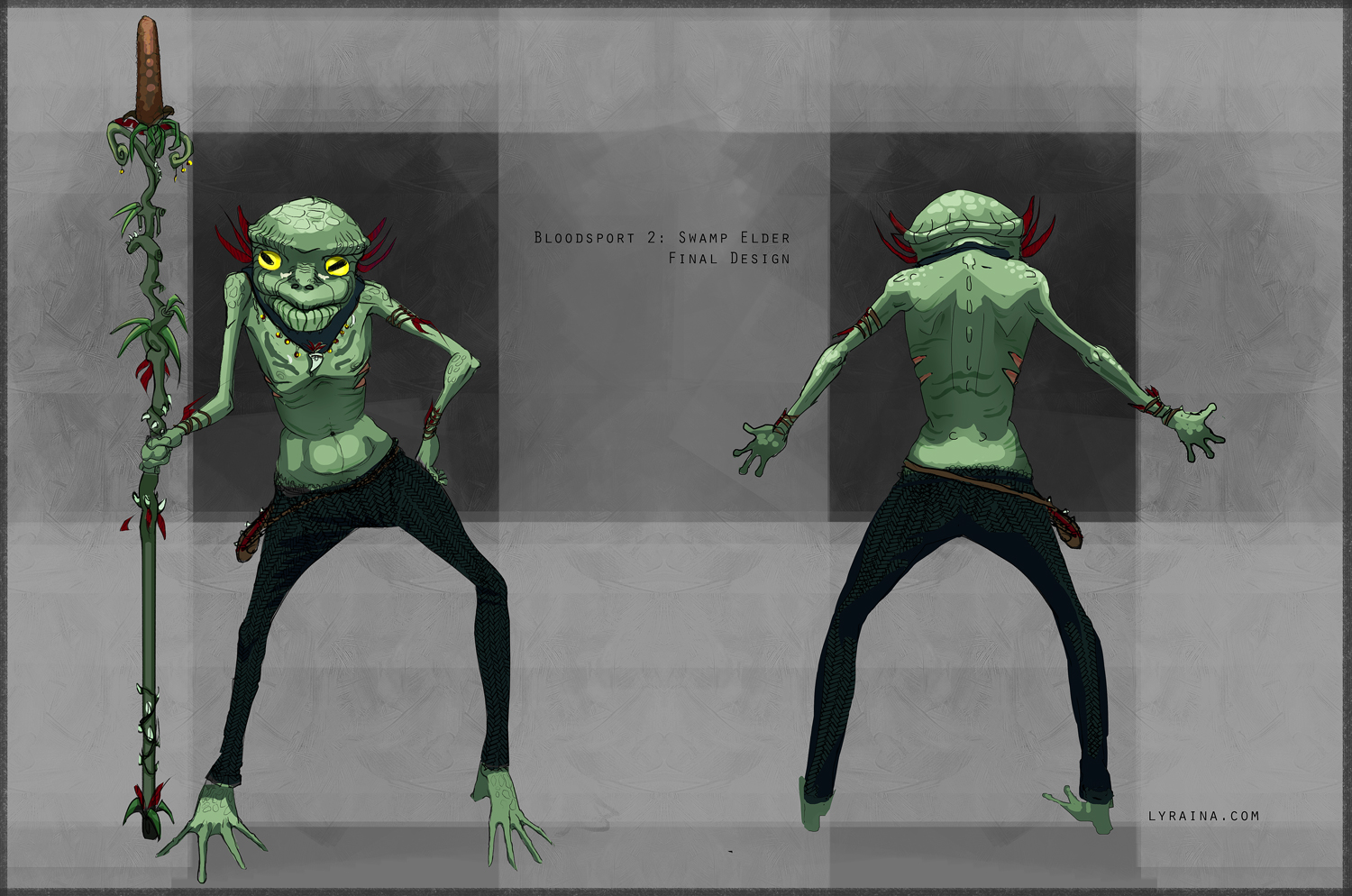
02-15-2014, 03:44 AM
Thank you Lyraina, your piece is coming along nicely aswell.
Finished! 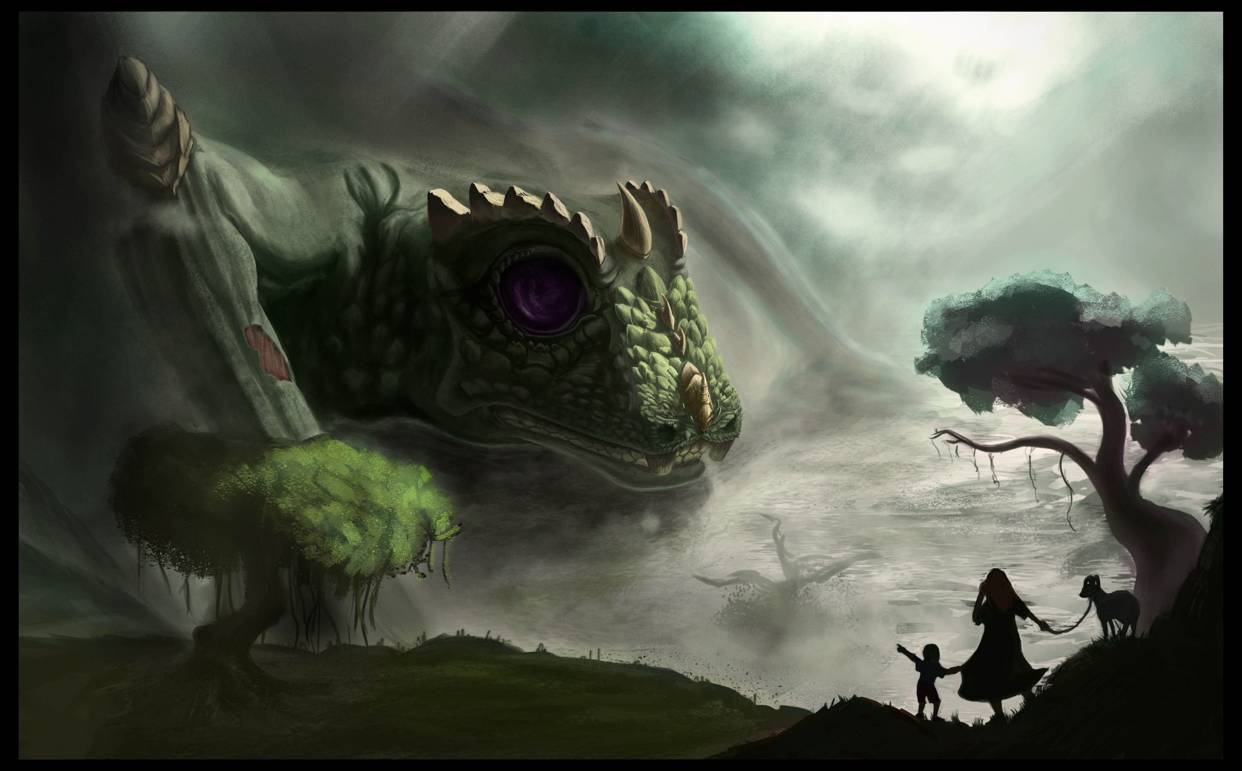
02-16-2014, 05:41 AM
Started this pretty late so theres no chance of meeting the dead line but better late than never. Got a bunch of different composition ideas. Im going to add lines and refine the values more on the thumbs. Hopefully I can pull off the creepy dark fantasy concept I have in mind. By the way, Crackedskull, that looks great! Cant wait to see everyone else's finished pieces.
02-16-2014, 09:53 AM
HH: Starting late is fine, theres still two weeks before we start the next one, so you can catch up and join at the beginning with everyone on the next one :D Deadlines don't really matter for these. I like the compositions I and D, I think you could do some really cool stuff with lighting for D but getting it to look legit will be a real challenge. I has a nice flow to it, but I think changing the size of the thing coming out of the water would be better for composition because at the moment it is roughly taking up the same amount of room as the main character.
Cracked: That looks great man. Really nice atmosphere with it all. You can feel that it is huge but it is still kind of hard to tell exactly how huge. A small tree (copy and pasted from one the the two on the image) would have helped. Just really simple small one by its head. Also, with the bit of skin flaking off on his arm, I would repeat that in other areas of his body, just having the one looks kind of strange (like is it an injury? But then it would be bleeding. An old injury? Then he would probably have more of them. Is he slowly decaying? Again he would probably have more areas.) Things like that, just repeat things as often as you can. But other than that its really looking killer. Nice texture too! :) Lyra: Looking forward to you uploading the finished piece xP --- Alright so here is my studies and my final. I realised I kind of stopped uploading my WIPs lol.. Whoops. I will try better next time. ![[Image: 140209-8.jpg]](http://jaikart.com/art/2014/02/140209-8.jpg) ![[Image: 140209-9.jpg]](http://jaikart.com/art/2014/02/140209-9.jpg) ![[Image: 140216-6.jpg]](http://jaikart.com/art/2014/02/140216-6.jpg) ![[Image: 140216-7.jpg]](http://jaikart.com/art/2014/02/140216-7.jpg)
02-17-2014, 02:55 AM
crackedskull: I'm kind of late with this, but I think in your piece a little bit of vignette would help push the focus even more towards the elder. Basically just a little darker in the bottom left corner and maybe on the top right. But anyway, love how it turned out <3
Hypnagogic_Haze: Yeah you're right, better late than never! I like D and K so far, especially K could make for a really cool concept with the high angle and such. Throw in a spotlight on the elder and that could make for a really interesting piece. Love the studies, you got some nice references there. Creepy pope made me laugh XD Jaik: I really like how yours turned out. I don't think the stylized figure looks out of place, if anything it adds character to the piece. Here's mine. Not too sure I like how the elder himself turned out, and there are stronger and weaker parts of the background as well, but it was interesting to try out a different approach this time. 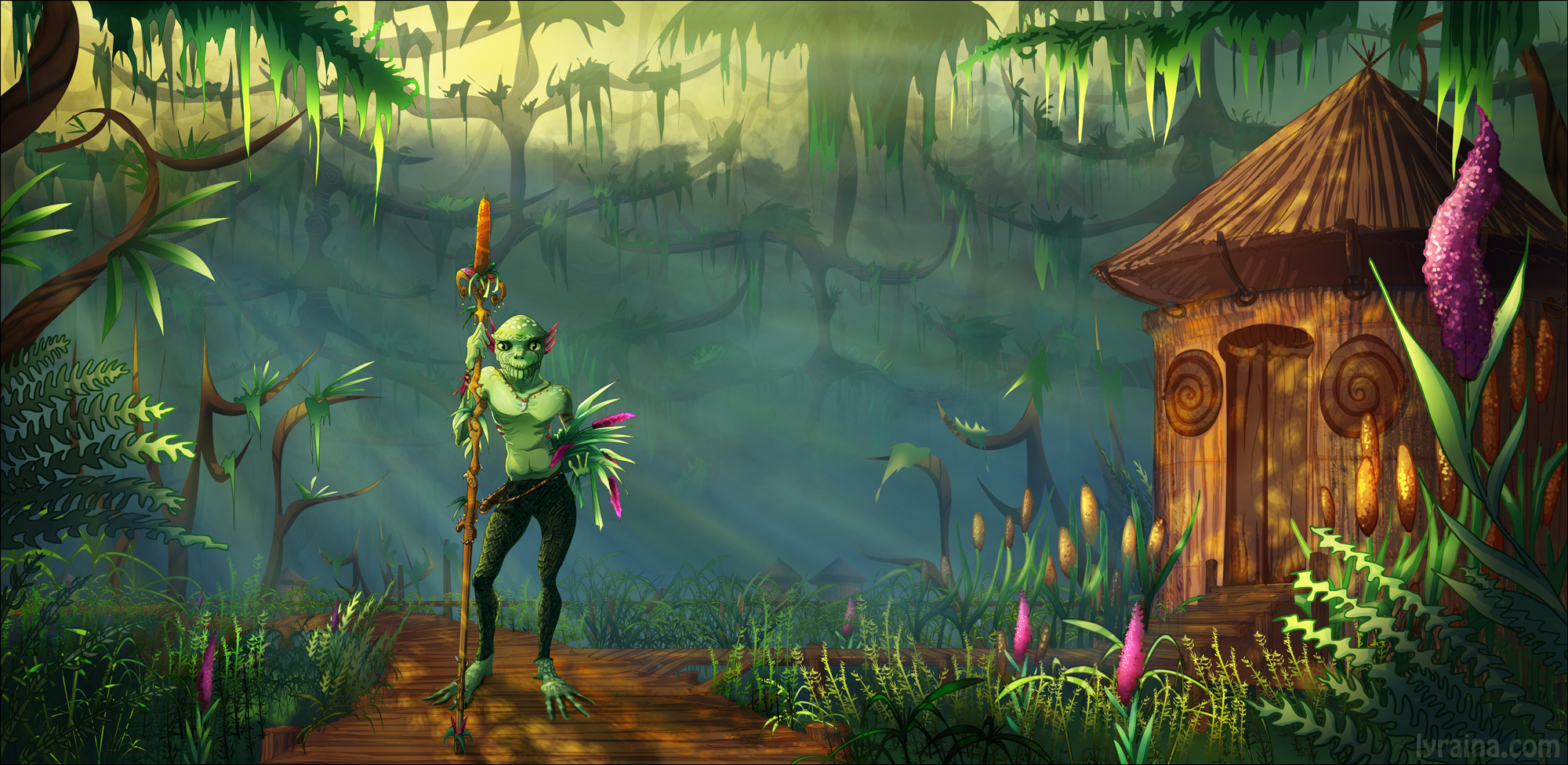
02-17-2014, 09:59 PM
Hey guys! Been off in the weekend, had a blast chilling but its time to dive back..
Cracked: Nice level of detail on the Elder, that tree in the midground before his hand is a bit weird to me.. somehow it creates a tangent I think.. maybe because its the only tree we see, maybe some vegetation around would make it seem more natural.. possibly indicating where his body would continue in the BG would give a sense of depth, and make the cut-out less "obvious".. The overall mood is great, I love how the fog flows off his further arm! Jaik: the amount of vegetation around is cool, it helps to bring us in the scene! Maybe separating FG-MG-BG would be worth a try, some athmospheric perspective maybe? It seems a bit flat to me.. its coming along nicely! (Oh and thanks a lot for the horizon line-tip, helped a lot!) Lyrania: I like your colorful and stylized approach, and his pose improved I think (altough I don't really get the sense of him being old), its the composition that could be given some thought I think.. The main character seems to get lost in the whole (I think mine could be suffering from the same problem..) Also the direction of the light might appear differently on him, since he is being lit from the back, but light is from the side on him. Also, if the backlight was properly adapted on him, that might give him a strong rim light which would give him more focus.. I love the diverseness of the vegetation! Its obvoious you made some serious preparation work :) I made some minor changes to mine, I think I am calling this one finished. (Oh and Lyrania: Yeah, I tried to push the color contrast, we were thinking along the same lines there :)) 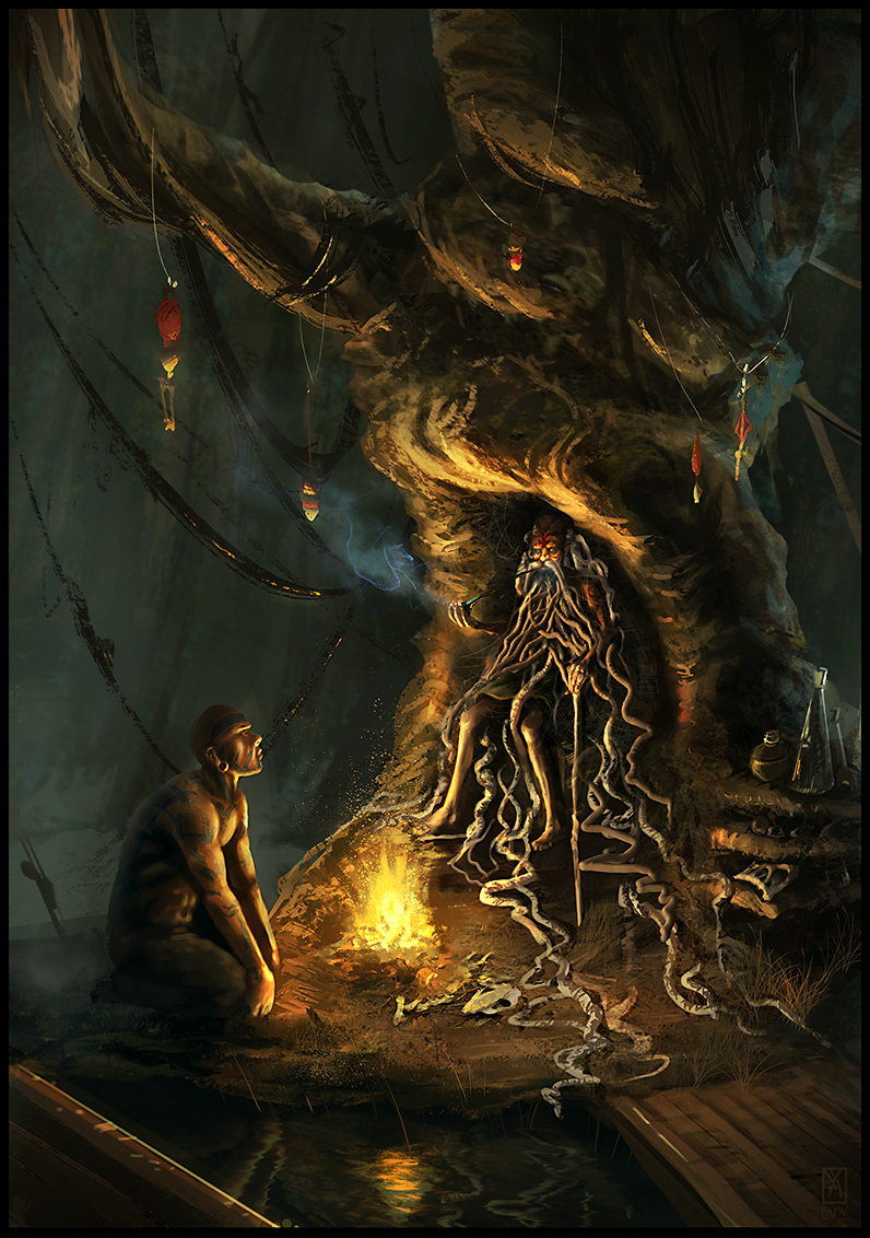
02-25-2014, 06:36 AM
Thanks a lot for the feedback, Kaffer! I like how yours turned out... that blue smoke is a really cool contrast, drawing the eye right towards the elder. Some of the edges, especially at the outer parts of the image, could need some softening maybe.. for example where the form of the tree turns away from the viewer. Still, great work! :)
02-26-2014, 01:45 AM
Thanks a lot Lyraina and you're welcome! :) Yeah it definitely could use some softening around the far parts, I see that now.. I just like the freshness of hard edged brushes and always overdo 'em.. thx for the feedback! (So how about next Bloodsports? :))
02-26-2014, 04:19 AM
We're doing one each month, so next one will start in March! We'll open a new thread then :)
03-03-2014, 11:48 AM
I'm still not finished with this one, but I'm going to submit what I have for this month. Well done all.
|
|
« Next Oldest | Next Newest »
|