05-05-2014, 08:42 AM
Bloodsports 5: Miyazaki Re-Marketed!
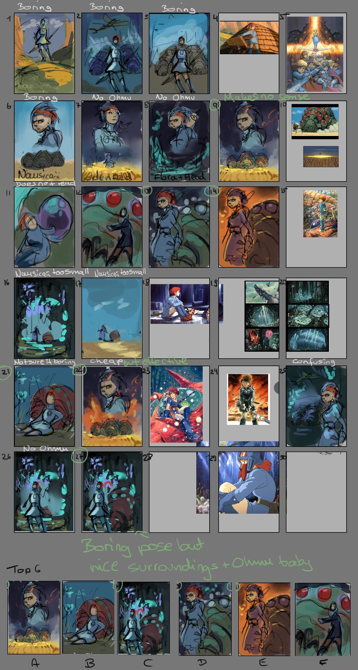
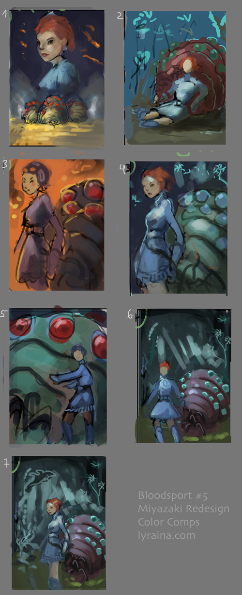
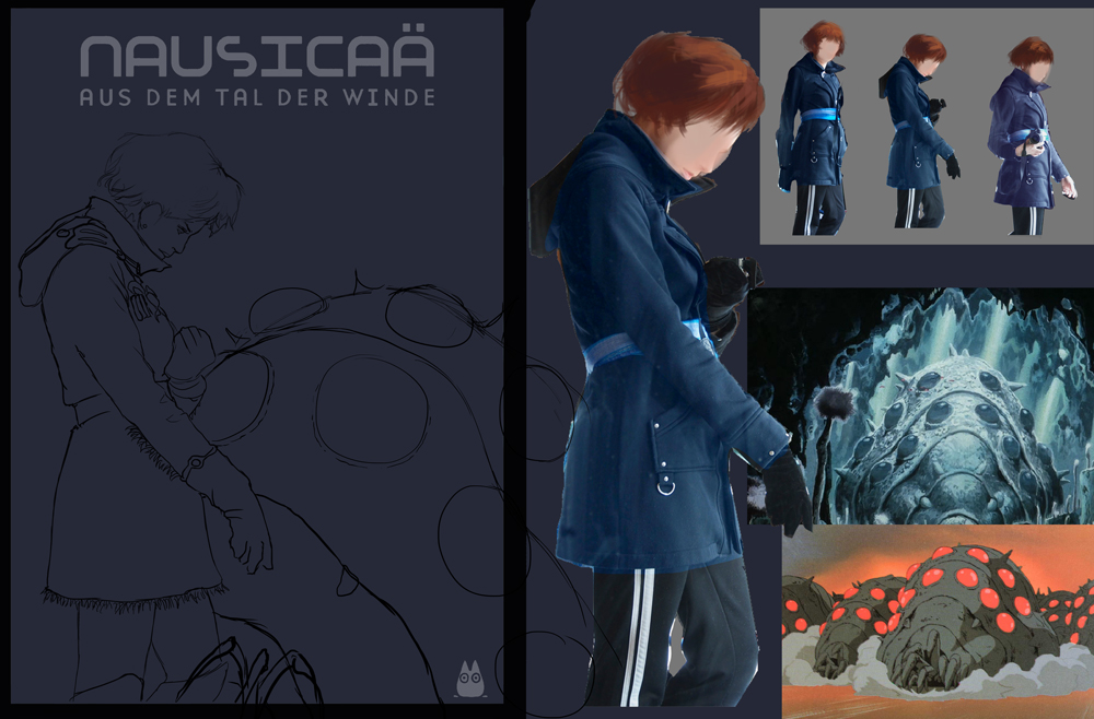
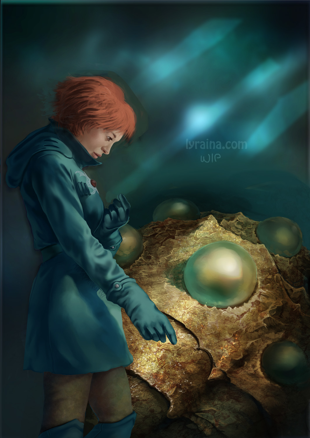
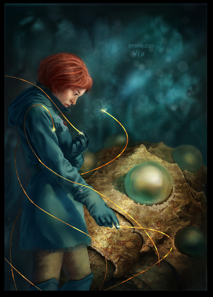
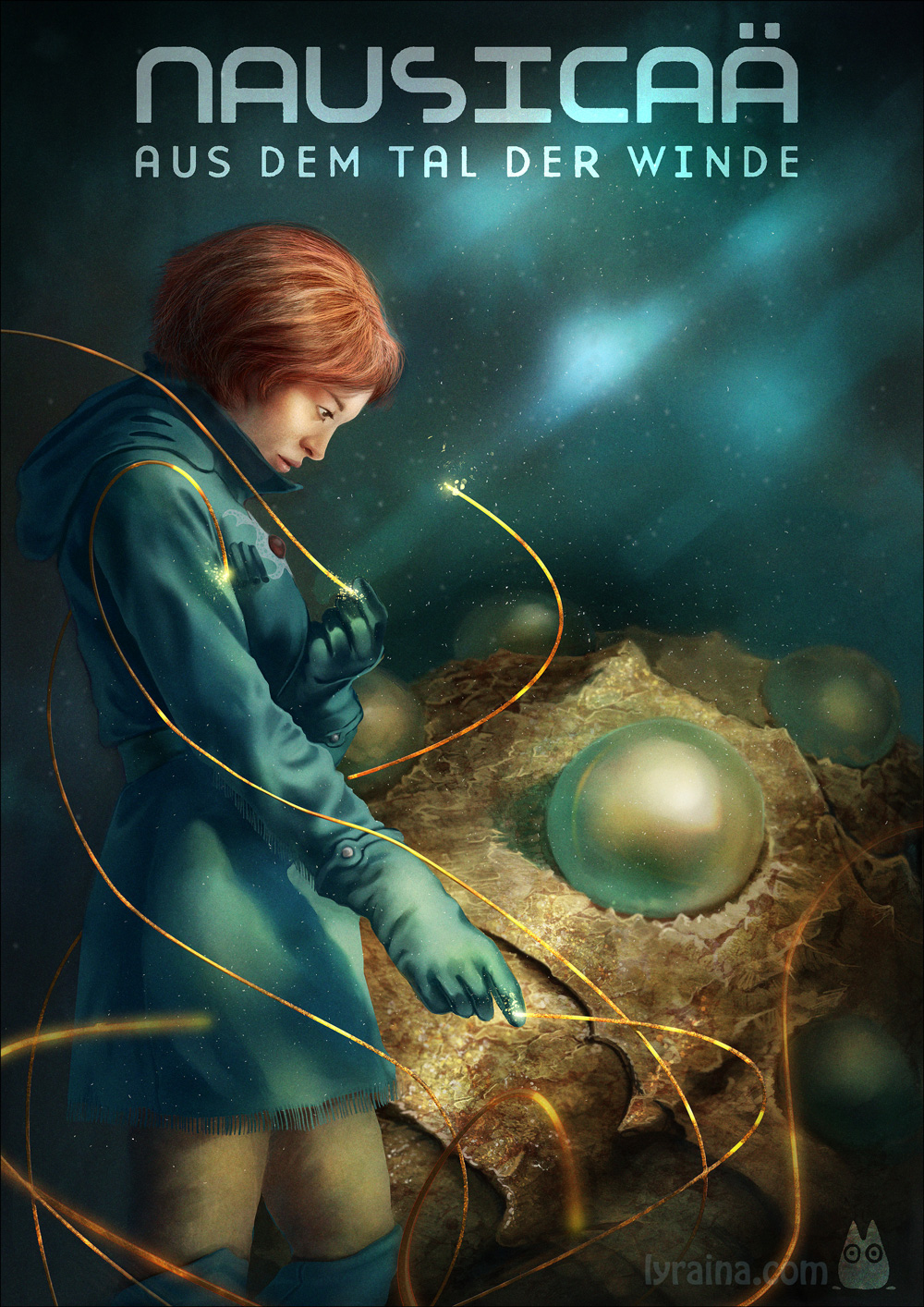
Been waiting a while for this. This is the first one I saw Dan doing on Livestream more than 2 years ago now. Will be fun to take a shot at it. I think I am going to be doing Nausicaa.
As a little bit of a change to the brief, I think we can say that you can do any Miyazaki film and not limit yourself. But it will probably be most successful if you choose one of the main ones though.
Originally Created by: Dan Warren
Requirements:
- Must create a composition that works as a DVD cover AS WELL as a POSTER. format should be a VERTICAL RECTANGLE similar to the gauntlet piece. include space for the title and credits, tho including them IS NOT required.
- Must use one of Miyazaki's 9 canon films. they are listed below!
- Images must include a MINIMUM of ONE CHARACTER. feel free to add more! image MUST also include an ENVIRONMENT or ELEMENTS of an environment! no single shot portraits!
-character designs MUST be relative to the look and feel of the movie chosen! feel free to make alterations to small details or expand on vague elements, but no total costume overhauls! no genre mixing! stick to the films visual feel!
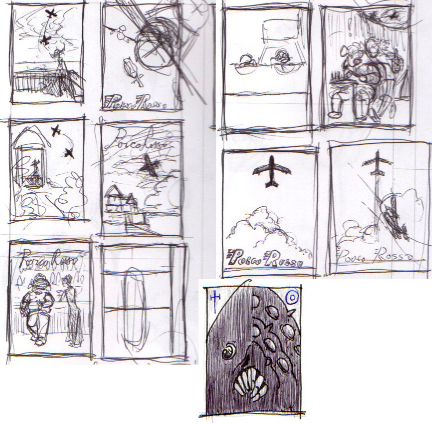
- Studies must be provided and must be relevant to the character design and elements used in the illustration. COMPOSITIONAL SKETCHES are also REQUIRED with studies in order to be eligible!
LASTLY! Images must be in a visual style that IS NOT ANIME! Images sent that are will be disqualified!
This challenge is all about an increasing trend in today's MOVIE MARKET! the challenge is to take an already developed and proven IP from a foreign market and re-imagine it for another audience. which audience that may be is up to you! whether you are taking a more serious miyazaki plot and pushing it to full realism or making one of his more whimsical stories even m ore childish is entirely your choice, just keep in mind that because the point here is to REIMAGINE and get your visual translation skills going, so NO ANIME! this would result in images for a market the film is already a major part of. were looking for new and exciting takes on some of the most influential animated films of all time, not fanart rehashes of movie stills! feel free to use ANY of the 9 films in Miyazaki's core Canon. films outside this list will not be eligible to win. they are-
Nausicaä of the Valley of the Wind
Castle in the Sky
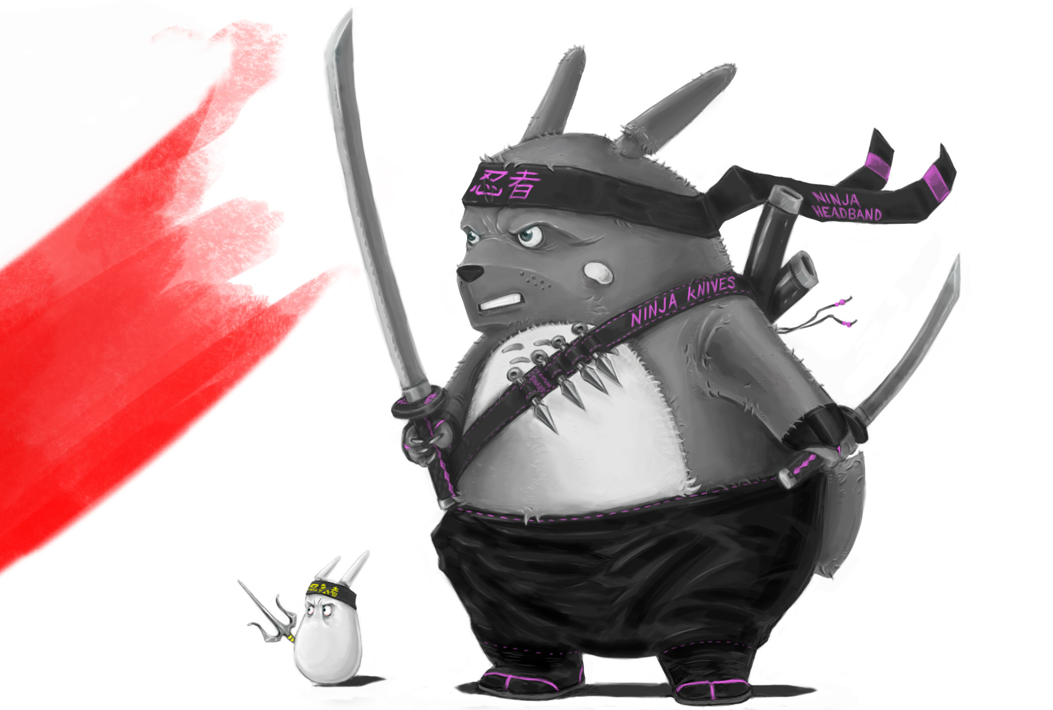
My Neighbor Totoro
Kiki's Delivery Service
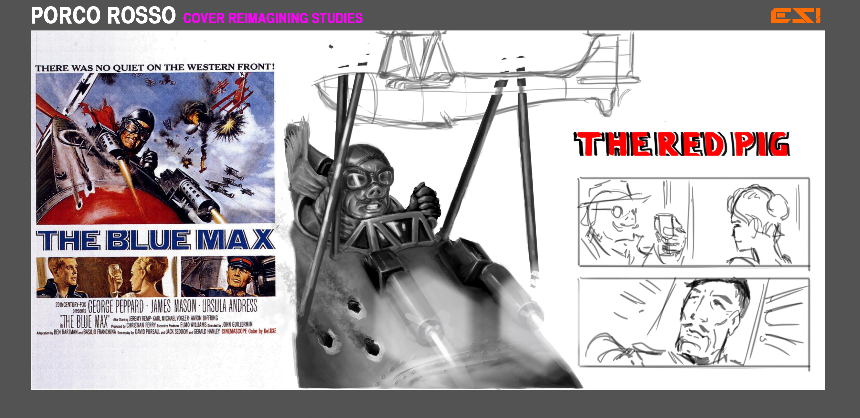
Porco Rosso
Princess Mononoke
Spirited Away
Howl's Moving Castle
Ponyo
'Deadline': 19th May 2014


