Lance's Juicy Fruity Sketchbook
#61
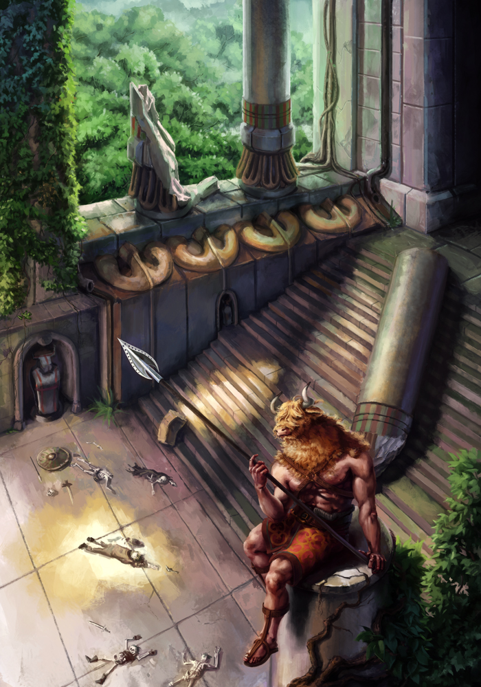
Woah! Tons of good stuff man! Really diggin the new pose for the minotaur, now it's more flowy, still feels a bit forced, but I dig the idea :)

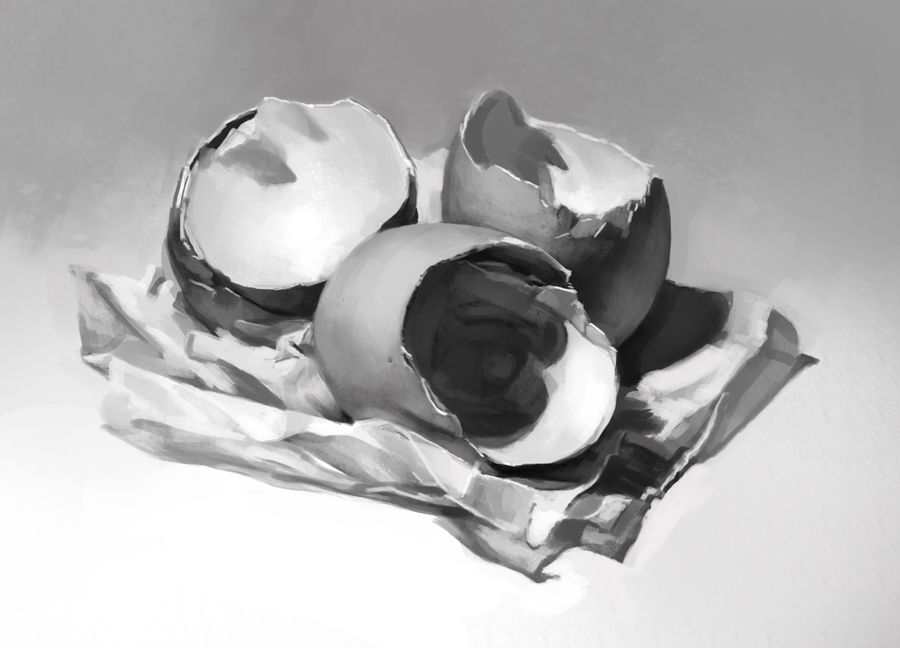
On the value studies I'd say that there's too much black, except for the lower left corner one ( in wich local value matches the shadow) the rest of them have a too excesive dark value for the cast shadow.Try to check out the theory called "Halfway to black" for values, it really helps wrap your mind around it, I'll try to find it later for you when I have some time. Overall nice to see so much quantity and effort man. Also glad that the brush control advise helped :) You're gonna be kicking it in no time.

I really like the feel of the faces but I feel they need some more structure since the perspective is off in some of them.

Tons of crits, but I really like the way you're heading man, nice job! :D

SB
Reply
#62
meat - Oh whoops I totally forgot about the leave size, thanks! I've push the vines a bit more too, though it might be possible to go even further.

As for the brush sketches, it is traditional, not photoshop (boy would making a brush to emulate that be tough). It is the Pentel Pocket Brush Pen, it is very nice and super convenient. Though the actual pen isn't too expensive for the quality (I find amazon and retailers sell it cheaper than the pentel site), the refills are a bit pricey. Also you do plein air painting, that is totally a form of studying!


JyohnnyNovice - That doesn't surprise me much, I have done quite a few sketches from old master paintings. The skeletons are sort of there to counter him, though maybe I should cluster them more... hmm


Kaffer - Thanks! I like to mix it up.


Suira - I definitely new to get a better feel for loose/naturalistic poses. I've found it is especially hard to keep them relaxed in long paintings.

I've heard of the halfway to black thing in the past, though it sort of faded out of my memory. Great to be reminded of it though, I shall check my notes and refresh, it is probably in there! I am definitely pushing the shadows too dark though (and too contrasty on the detail, looking back at the skulls as well). And I totally agree on the faces. It has been a while since I ran some head studies so a refresher is due this week I think!

---

Not much in volume of studies, I've been pushing it on that minotaur. (Should be getting lots of life sketching done tomorrow since I have to go to London though.)

Nearly done with this I think. It definitely needs a reasonable detail pass to tighten him up. Will probably wait a bit before doing it so I can get a fresh view, and just get a break from it.


Artist colour thumbs, since I haven't done any for ages.


Sketch studies, still trying to get the hang of scaley stuff, and trying out structure practise on motorbikes. I sort of failed at simplifying them though, and the proportion fell to pieces.


Hogarth arms study from photo. Really like the collarbone/trapezoid linking, I might use it more.


Another value study of course! Got a pile of egg shells (I keep old ones for the garden) on tissue - they were a good subject actually because though they are very simple, they have convex-concave forms, a mix of soft turns and sharp edges, and the outside has a different local value to the inside. Good for thinking about this stuff without any distracting detail


Speedpaint.


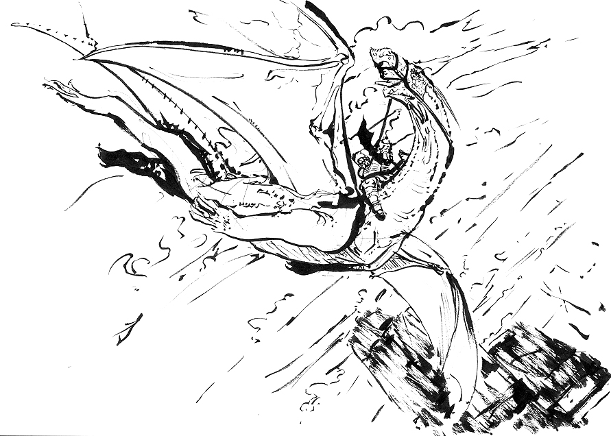
And various ink sketches. Tried to pull my socks up after how sloppy the first one was.


Reply
#63
Wohoooo! Tons of stuff man, you've been working your ass off! Nice to see. Love everything! The color thumbs are awesome, really readable and very well balanced ( I know it's master copies, but still) The inks are looking real sharp, specially the last 2 pages, I also like the litle fella with the weird mouth, pretty awesome. And the value study is really cool too. You might think eggs are simple but in fact getting eggs right is one of the most important things according to Dorian Iten, he had us draw a still life atelier style and it was a pain in the butt. If you keep at it you get awesome pressure control and improved patience hahaha. They read really well already so I'd say you're doing a fine job.

The collar bone/ shoulder / other thingies ( not good with anatomical names xD) are coming out alright, if you master that it's pretty much as smooth road for the rest since I think it's the hardest area of the body to get right. Also, I don't see much wrong with the bikes, they look quite ok, granted it's not Scott Robertson's but that dude made a bazillion of them before getting them to look super acurate, so cool stuff.

Only two crits this time:

- The speedpainting has nice colors, but it reads really badly. I can't , for the life of me, see what's going on. I see a snowy place and what seems like a car and a rocket ( only after focusing for a while) but I don't know what's happening. So maybe try to do stornger siluohettes or something so they read better. Not trying to be rude or anything, just honest advice because I have that problem too sometimes, I know what it is and then people goes like: " wtf's going on in there?" xD

- Something about the minotaur painting still bothers me. I feel it needs softer edges in some background areas ( not on the inside but on the outlines) and it's too cluttered, I feel like my eyes have nowhere to rest. Also, the leaves close to the minotaur are creating a tension, they're too prominent and there's no overlapping and thus create the "penus over vagina effect" that Kekai Kotaki talked about in the crimson conversations. Also, the position of the minotaur's foreshortening isn't following the overall perspective of the scene so it looks like he's falling off and doesn't belong in there. And you have worked so hard into detailing that I think you might have overdone it and thus the visual tension. I feel like shit for being so critical about it, and I realiose that, after all the hard work you put into rendering it it's not like you're gonna go and destroy it to adress such issues, but maybe it will help in the future. And hell, I might be wrong. Anyway man, dedicating to a piece like you have is always positive , no matter the end result, since it teaches you tons.

Overall, great update, now I'm all boosted to go draw! Oh btw! Awesome feedback you gave me man, saved my life, AGAIN hahaha, I'm gonna focus on that for a long time, it's totally worth it.

Cheers! ;D

SB
Reply
#64
Yeah you can push the leaves more... Maybe a cluster of big ones in the foreground so Mr. Mino won't start to look small next to a tree with huge leaves, and becomes Baby Mi. :P Some of the skeletons look kind of comical with its limbs spread out. I'd tighten their limb spread more. When someone dies from combat they tend to be holding some wounds, and when they're just falling down, the body often fall with limbs close to the sides and close to each other.

I'm really liking those brush drawings. It's hard to tell from the photo if brush is fiber or 1 solid chunk of rubbery material. I've had brush pen that is a solid chunk and squeaks when using, and Micron brush pen that lost its tip after a few frantic strokes, and dried up sooner than expected. Is the Pentel pen actual brush? How well does it hold the tip over time?

I've heard somewhere one of the Renaissance master painter was made to paint chicken egg for months during apprenticeship by his master for learning... sounds like you're on the right path to become a master painter! (eventually, lol) :D


Focus.
Reply
#65
ooo really cool pen markings, I started messing around with some cause you kicked so much ass with them :D Waiting for the next update man!
Reply
#66
Yes, we needs more update! Also really digging those ink sketches you've done. Gestural, dynamic, expressive. I have lots of good adjectives for them.
The lizard one is my favorite I think, cause you really managed to give it a sense of expression and personality. I find it really hard to do with creatures like that, they usually end up looking undeady and/or menacing.

Reply
#67
How did the minotaur peice end up clockodile? we must know WE MUST KNOW :P.

Really like them egg shell studies, I mean to do something like that a while back never got round to it though.

Reply


Forum Jump:


Users browsing this thread: 8 Guest(s)