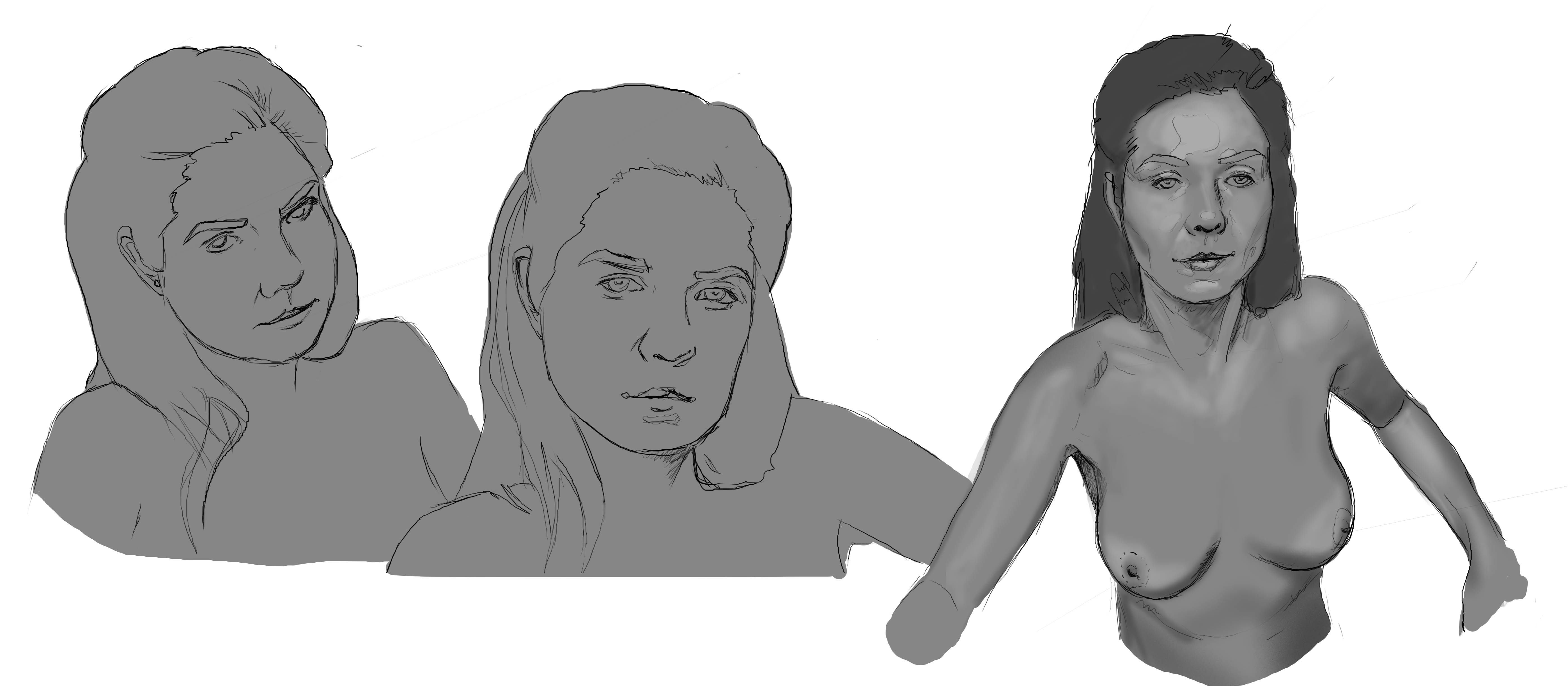
Posts: 172
Threads: 1
Joined: Sep 2014
Reputation:
10
Hey! Really good, varied subject matter here that covers a lot of bases - great work. Also good job with tackling a more complex scene - you'll learn a bunch that way as an application for your studies. One small crit I'd mention for that piece is that make sure your area of highest contrast is at your area of focus - in this case I'm assuming it's the figure. At the moment, the bright light outside the cave is distracting from that point, so consider fading out the values in the background to a lower contrast, while keeping the foreground values in higher contrast.
Hope that makes sense - keep up the great work!
Posts: 200
Threads: 1
Joined: Dec 2014
Reputation:
7
@Eristhe - Thank you, I will keep that in mind! i will probably change it to a dim, cold bluish color from the cave opening and a warm yellowish/orange from the lantern and make the character more detailed, while the background etc. is more blurry.
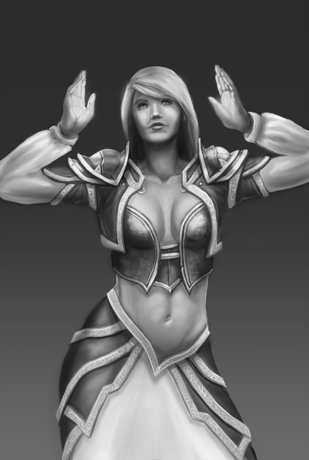
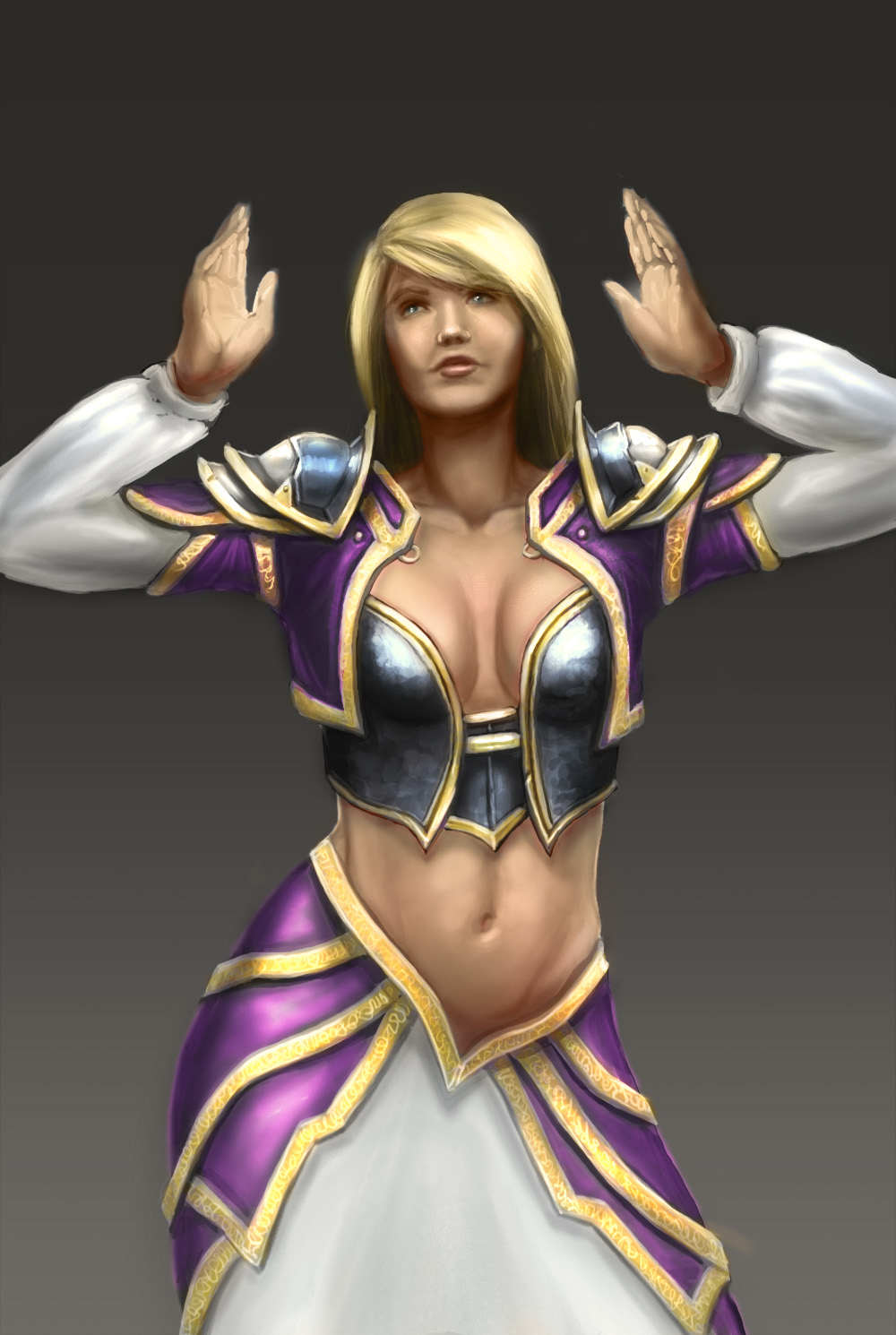
The study from some posts ago reminded me of Jaina Proudmoore so i did a quick render of her with the study as base:
Posts: 200
Threads: 1
Joined: Dec 2014
Reputation:
7
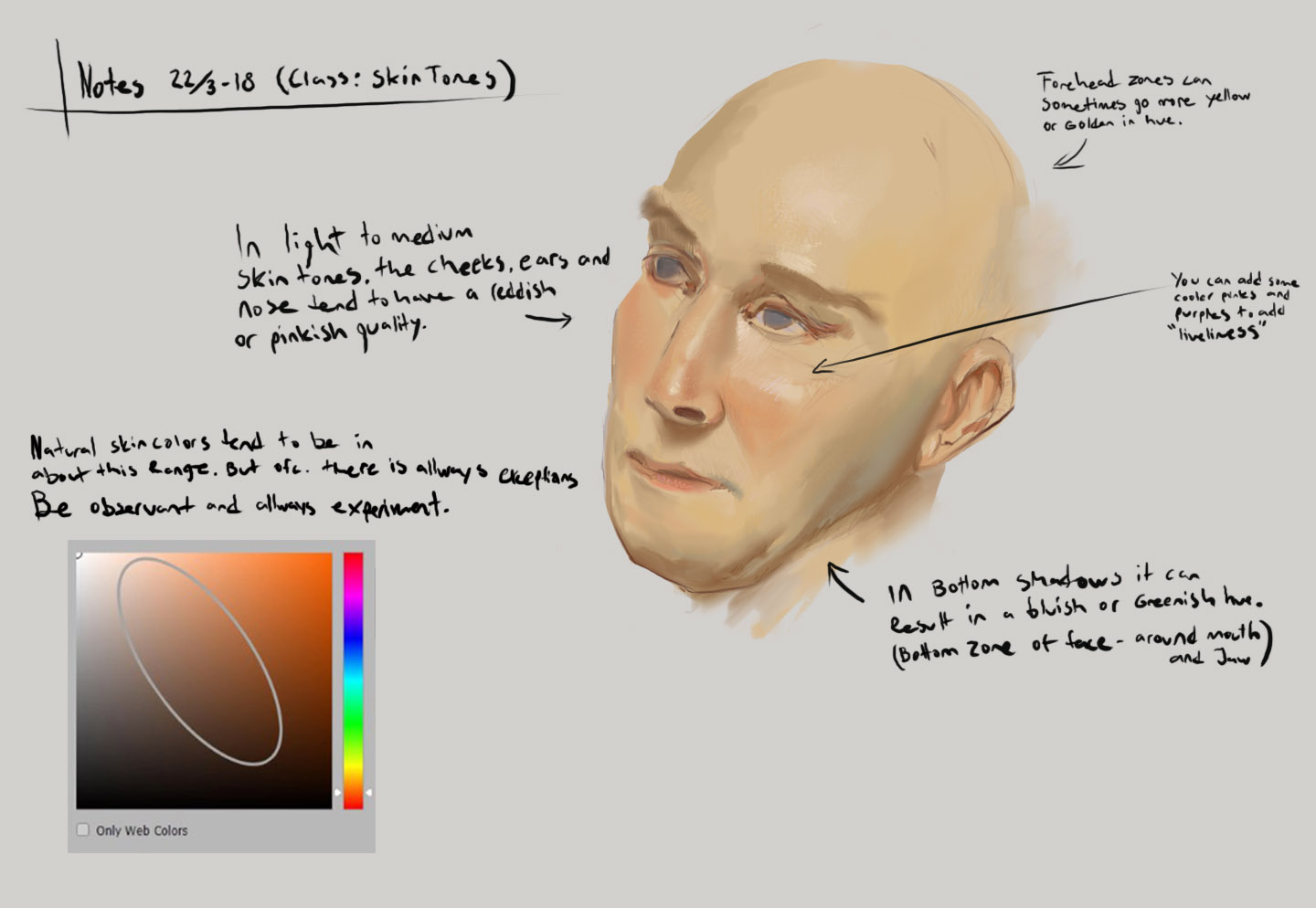
So I joined Skillshare, who offer 2 months for free right now. They offer tons of different classes on tons of different stuff, including painting. I Started watching Gabrielle Brickeys videos which i'm really liking so far. I really recommend to check it out if someone is interested: http://skl.sh/2tXBaZW
I'm taking some notes/drawing while watching:


Also did a quick update on this one:

Posts: 112
Threads: 2
Joined: Apr 2016
Reputation:
2
Very nice pencil work and love the skillshare stuff! keep up the good work. Great decision to make the cave opening go into the night, now the focus is better.
Posts: 200
Threads: 1
Joined: Dec 2014
Reputation:
7
@Alexdanila - Thank you, I appreciate it! :)
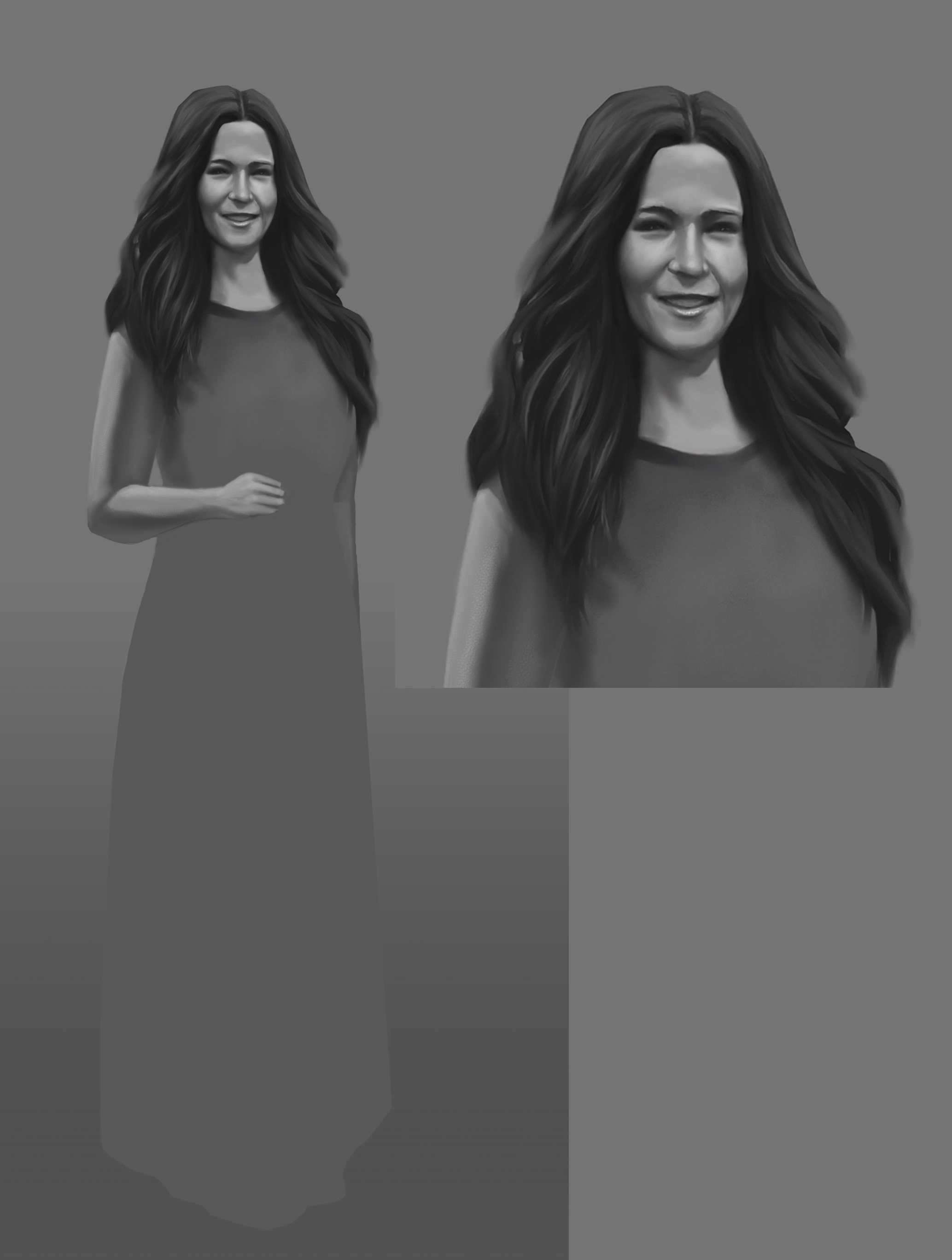
Today I began painting a portrait based on what I learnt in yesterday's Skillshare class. This is the result so far (w.i.p)
Posts: 200
Threads: 1
Joined: Dec 2014
Reputation:
7
Have a lot going on at the moment, but here is a quick update.
Skillshare stuff:

Posts: 200
Threads: 1
Joined: Dec 2014
Reputation:
7
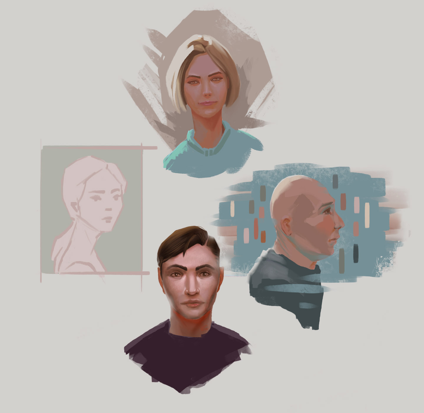
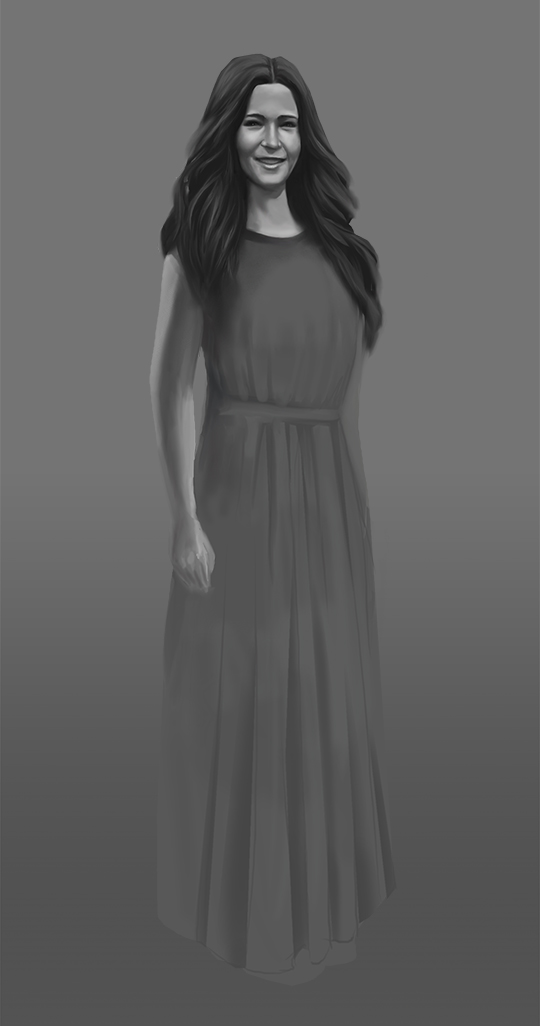
Just some sketches for fun while watching Skillshare art classes.
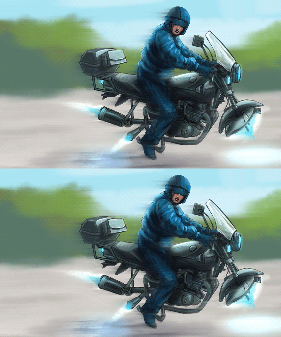
Minor changes to this one:
Posts: 200
Threads: 1
Joined: Dec 2014
Reputation:
7
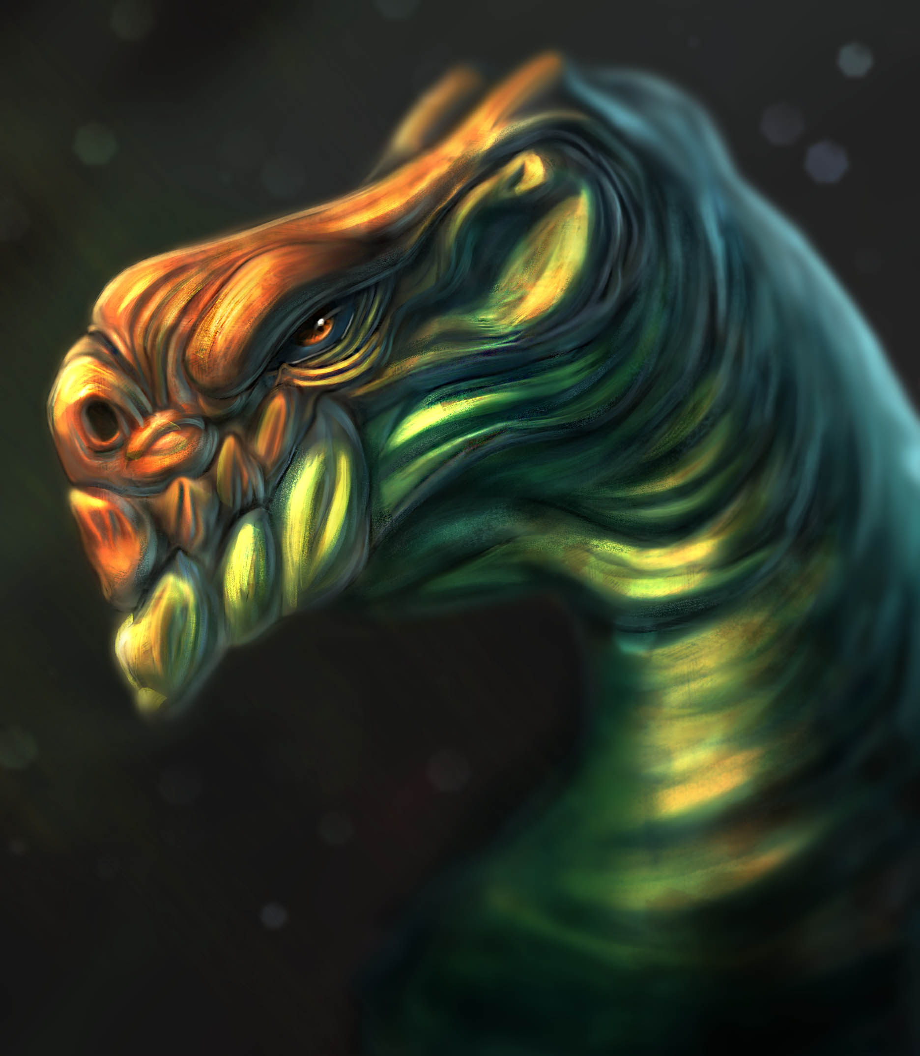
wip:

sketch:
Posts: 20
Threads: 0
Joined: Nov 2016
Reputation:
3
love the colors in that very last sketch
Posts: 200
Threads: 1
Joined: Dec 2014
Reputation:
7
@dangelowallaceart - Thanks man I appreciate it :-)
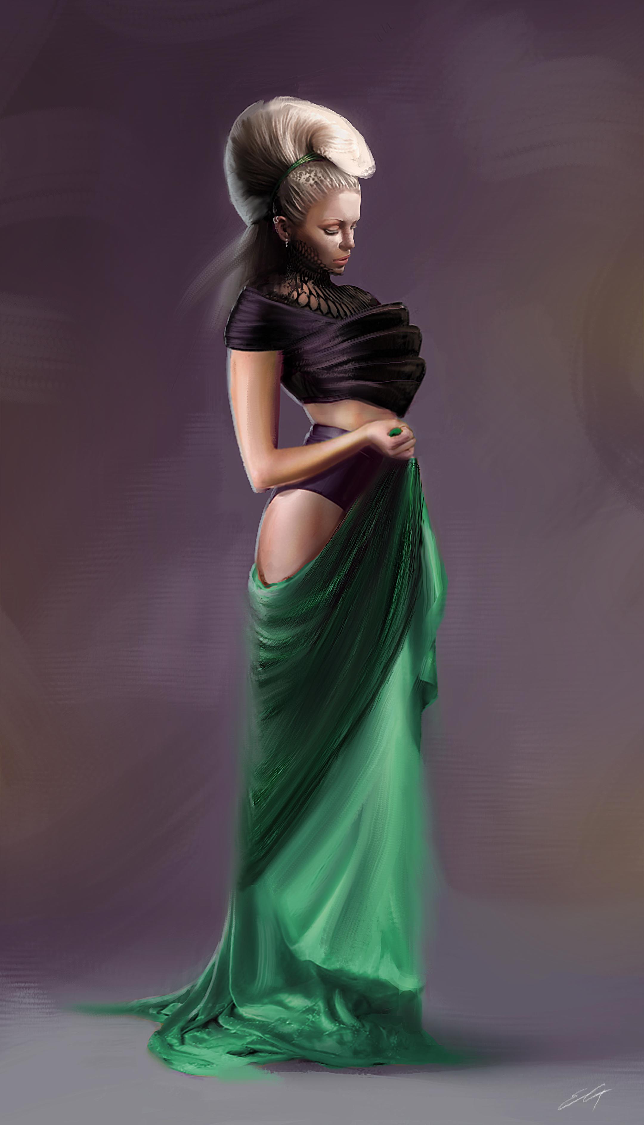
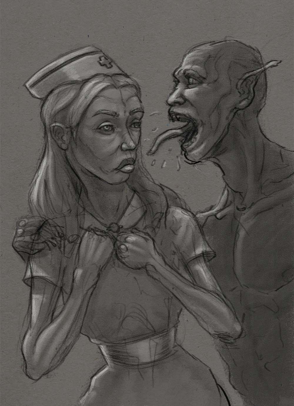
Been on vacation and done mostly traditional art lately especially watercolors, wish i'm trying to get better at... Anyways, quick update with some digital art:
Posts: 200
Threads: 1
Joined: Dec 2014
Reputation:
7
some progress, but still taking my time on this one.

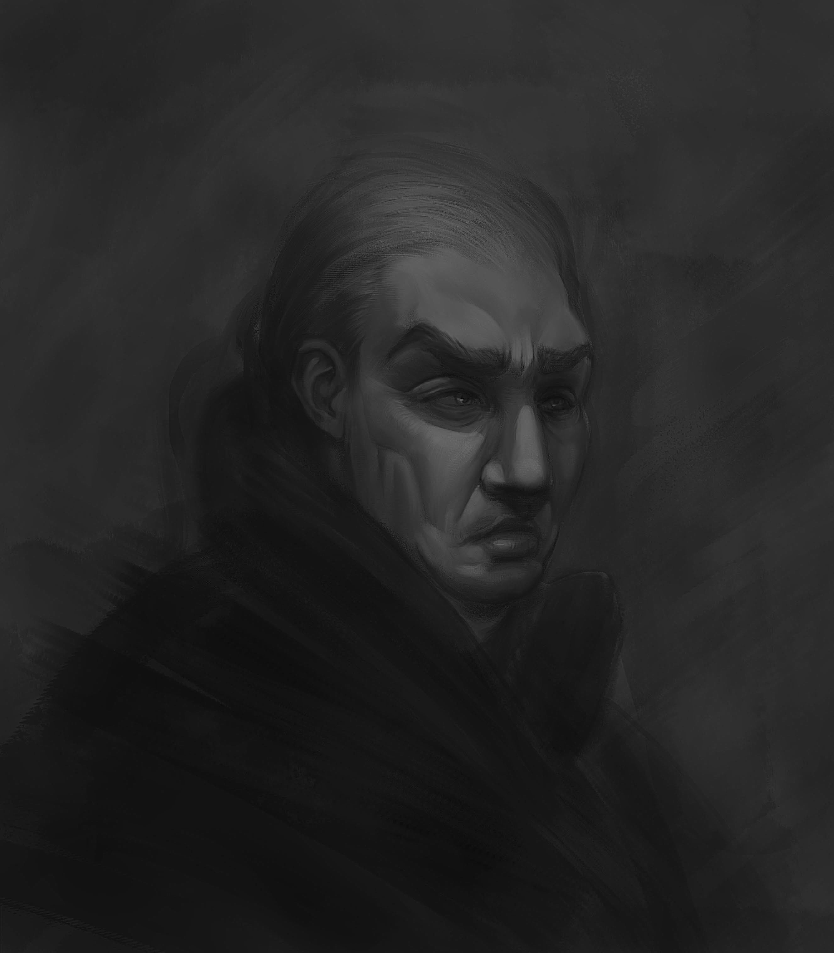
...and some random quick dude, trying out darker values and then building up to lighter ones.
Posts: 200
Threads: 1
Joined: Dec 2014
Reputation:
7
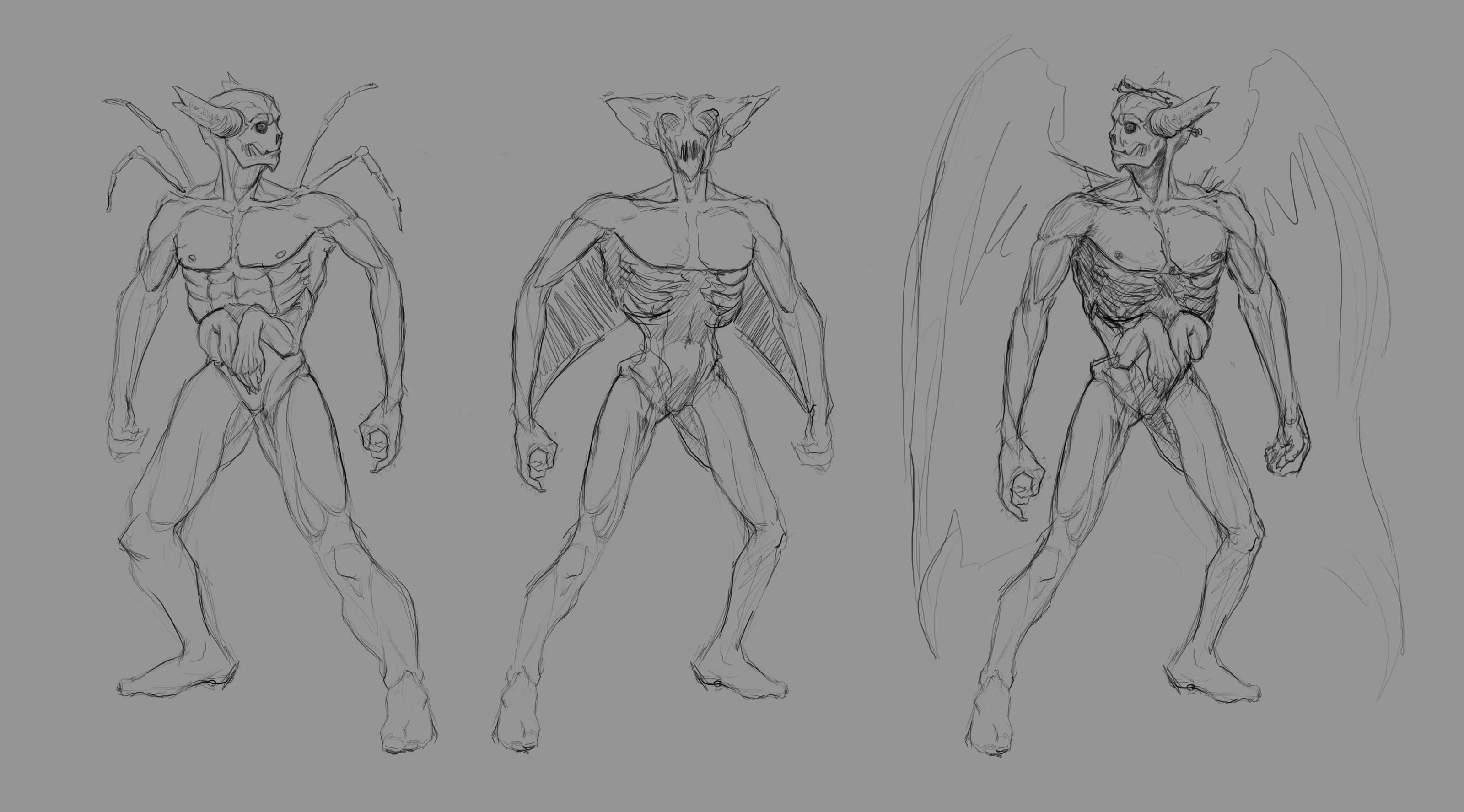
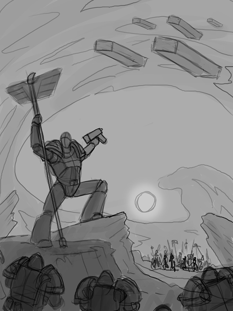
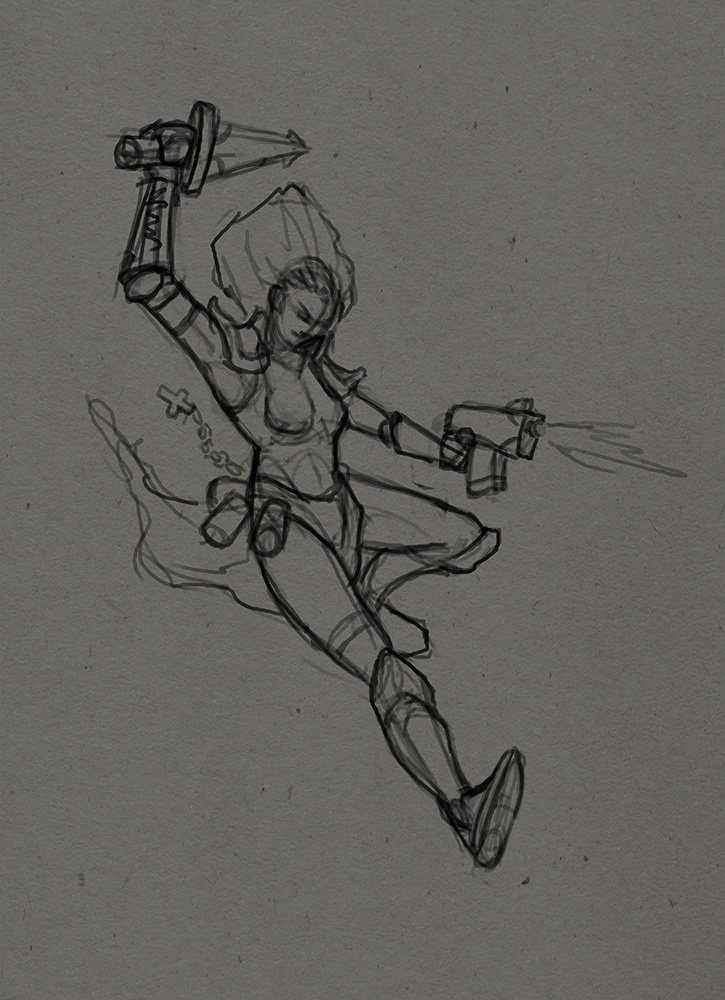
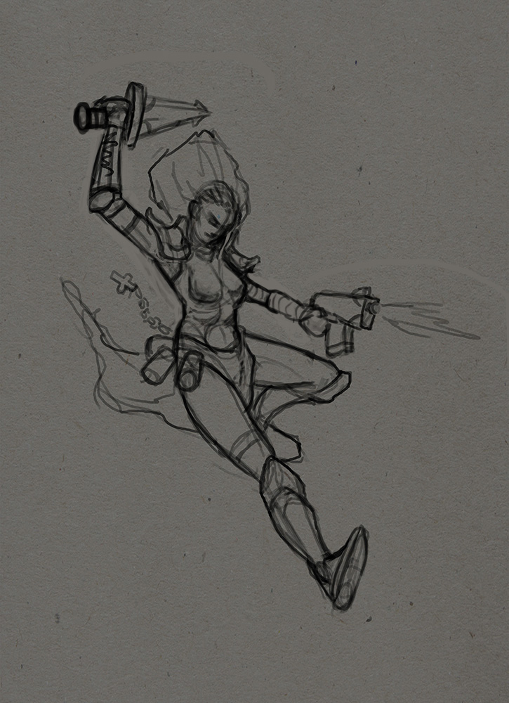
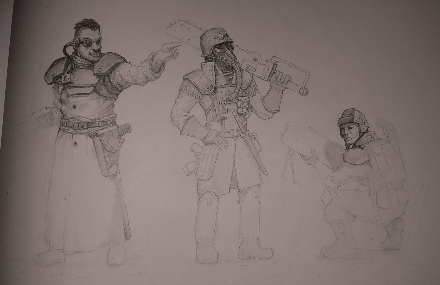
Practicing character design, doing some warhammer studies

Posts: 2,817
Threads: 15
Joined: Jun 2013
Reputation:
109
I think your designs are cool, the thing thats gonna hold them back isnt adding more widgets and pipes, its just foundations. my advice is to dig into the design of anatomy and how to make heads, bodies, hands etc look attractive on their own. Then the cool designs will look mega cool :)
Posts: 200
Threads: 1
Joined: Dec 2014
Reputation:
7
@Fedodika - I think you are right, and it was quite a while since I did some anatomy studies... So I started right away. Thank you for the advice! 

Posts: 2,817
Threads: 15
Joined: Jun 2013
Reputation:
109
awesome! some of these are really nice; pay attention to little things in the forms for instance
The back pose on the bottom left, make sure that trapezius is sitting properly on top of the ribcage, the muscle does not depress into the rib cage it sits on top of it, the rib pushes the form out, and the shoulder blades sit on top of it. I think the one to the top right of that is the best one, the forms are all in place, same with the gesture
Also pay attention to symmetry and how forms are aligning. Some of your heads are too big or too small, but you'll see that as time goes on. So yea, just push the gesture more, the curvature of the line of action, i see some stiffness here and there. Theres a good few vids on Youtube of Steve huston, he really explains it well ;)
Posts: 200
Threads: 1
Joined: Dec 2014
Reputation:
7
Posts: 200
Threads: 1
Joined: Dec 2014
Reputation:
7
Facestudy... I tend to get jagged lines while I'm zoomed out in photoshop, does anybody know how to fix it?

This sketch (from last post) bugged me out a bit... I thought it looked a bit weird, so i did a mannequin-paint-over, and fixed some anatomy/proportion mistakes.

Posts: 2,817
Threads: 15
Joined: Jun 2013
Reputation:
109
symmetry!! grid it out! it makes all the difference!
Posts: 3,357
Threads: 37
Joined: Aug 2013
Reputation:
234
The key is flow of the line and than you erase the extra.If you have example problem to draw a line create it on a new layer and that erase the extra part you don't need than use the option merge to fuse 2 layers into be aware of there order in the list before merging it as effect on what is gonna show on top of the other layer.You want a line that fluidity this mean not to fast not to slow.The problem is that some table doesn"t register sensitivity the same way you do.On paper you directly can see the relation between pressure speed unless you draw digitally on a screen it might feel alien to you to draw on a tablet.
Posts: 200
Threads: 1
Joined: Dec 2014
Reputation:
7
@Fedodika - I´m not sure if I know what you mean, on a specific piece or these last posts? Cause these last posts is just - pretty much - scribbles. Like I said in an earlier post; it is to hot to paint for longer sessions with the tablet. And with that said it takes too much time to draw grids at this moment :P
On the other hand, if I would paint a larger piece I would probably grid it out, and plan the piece before, I just dont see the point of doing that with quick sketches.
----------------------
@Darktiste - The jagged lines is not because I´m alien to the tablet or that i do not concentrate on my lines when necessary. I had similar problems with another tablet before and it is some setting in Photoshop that I now cant find. I Thought, maybe, someone in the forum might know. Otherwise i´ll just google for it.
|


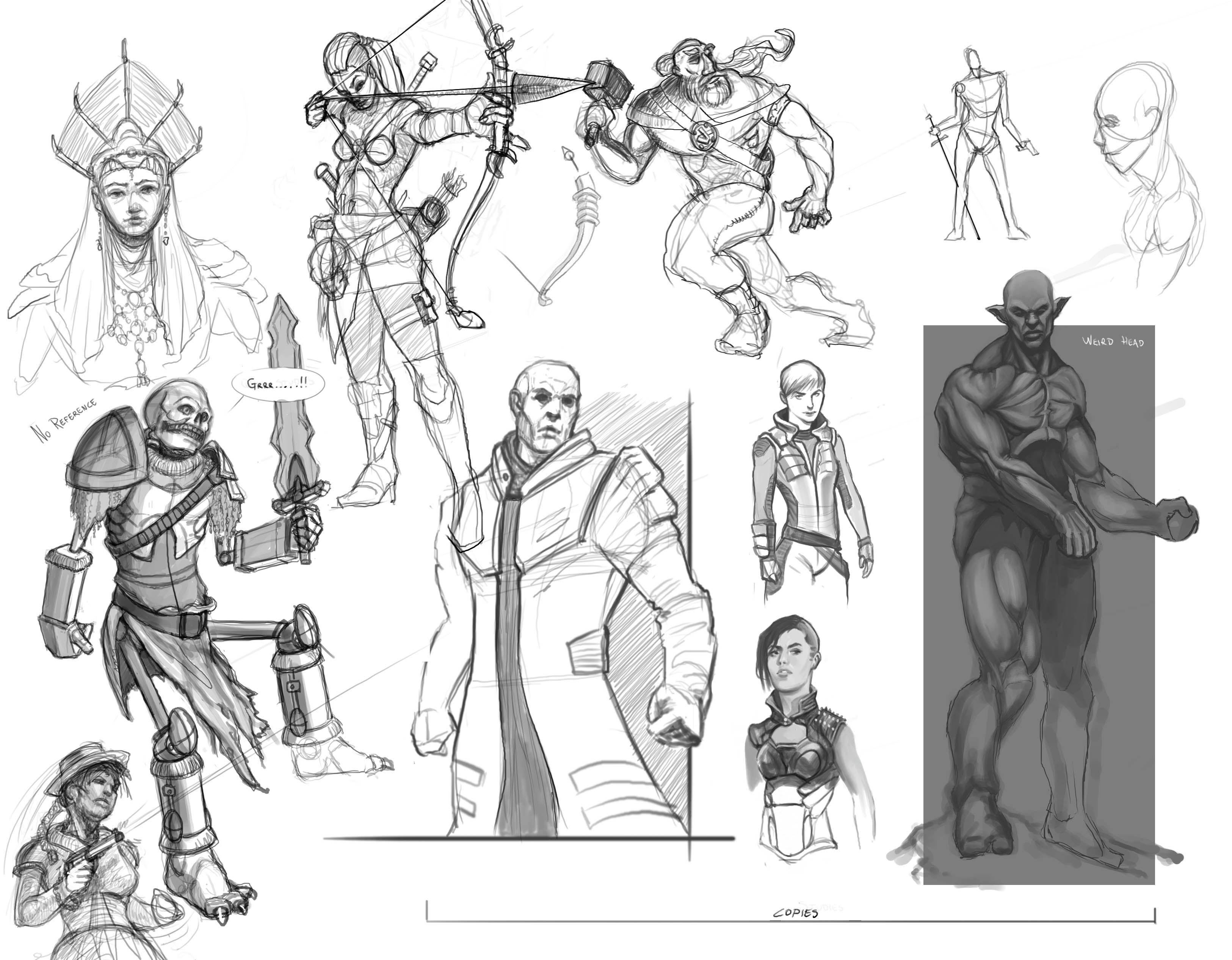
 But I did some digital doodles and quick studies from other artists/games etc. nothing fancy pancy.. just thumbnails, sketches and so on