05-20-2013, 11:09 PM
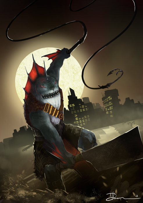
Here is the final image: Hi-res can be found here: http://tddigital.deviantart.com/art/Fishyface-372738621

Blog | CD Sketchbook | dA | Facebook |
|
The Art of Tyler Donnelly
|
|
05-20-2013, 11:09 PM
Here is the final image: Hi-res can be found here: http://tddigital.deviantart.com/art/Fishyface-372738621

Blog | CD Sketchbook | dA | Facebook |
05-23-2013, 04:58 PM
Enjoying the variety of stuff going on. Keep up the pace! :)
Sketchbook ~ Blog ~ Deviantart ~ Livestream
05-23-2013, 10:27 PM
Udpate on Astronaut Riding a Dragon.
Trying to come to color from greyscale is challenging. But I found something in the last issue (JUNE 2013) ImagineFX that really helped. First making sure you have appropriate values, and second, using a gradient map to overlay some tonal shifts.Then pushing those colors around using Soft light/ overlay layers. Interesting approach. got some neat colors out of it. 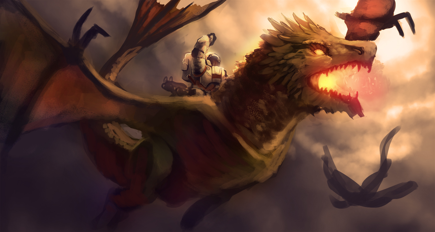
Blog | CD Sketchbook | dA | Facebook |
05-28-2013, 11:01 PM
I love your work, can't wait to see where your progress will take you!
06-04-2013, 07:48 AM
(05-28-2013, 11:01 PM)pgarbs Wrote: I love your work, can't wait to see where your progress will take you! Thanks a lot! That means so much! :)
Blog | CD Sketchbook | dA | Facebook |
06-09-2013, 06:21 AM
wow, theres so much work here in just 5 pages, it's really impressive. Your latest pieces are prety solid too, i love the composition of that latest fish fisherman piece. Asternaut riding a dragon too, thats something i can honeslty say ive never seen before ;)
08-05-2013, 11:36 AM
Some quick movie still studies from today..
Let me know if you know which is which! 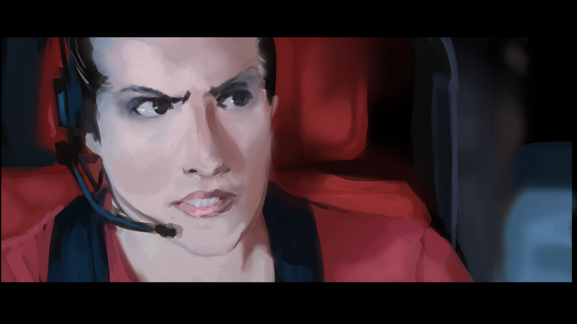 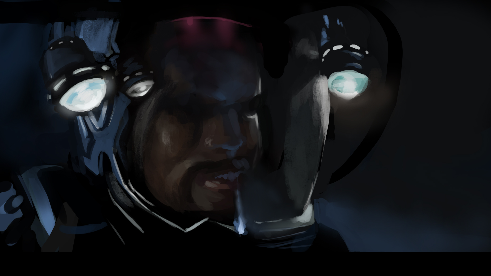
Blog | CD Sketchbook | dA | Facebook |
08-06-2013, 12:55 PM
Another film/ color/ environment study. Learned a good deal from this!
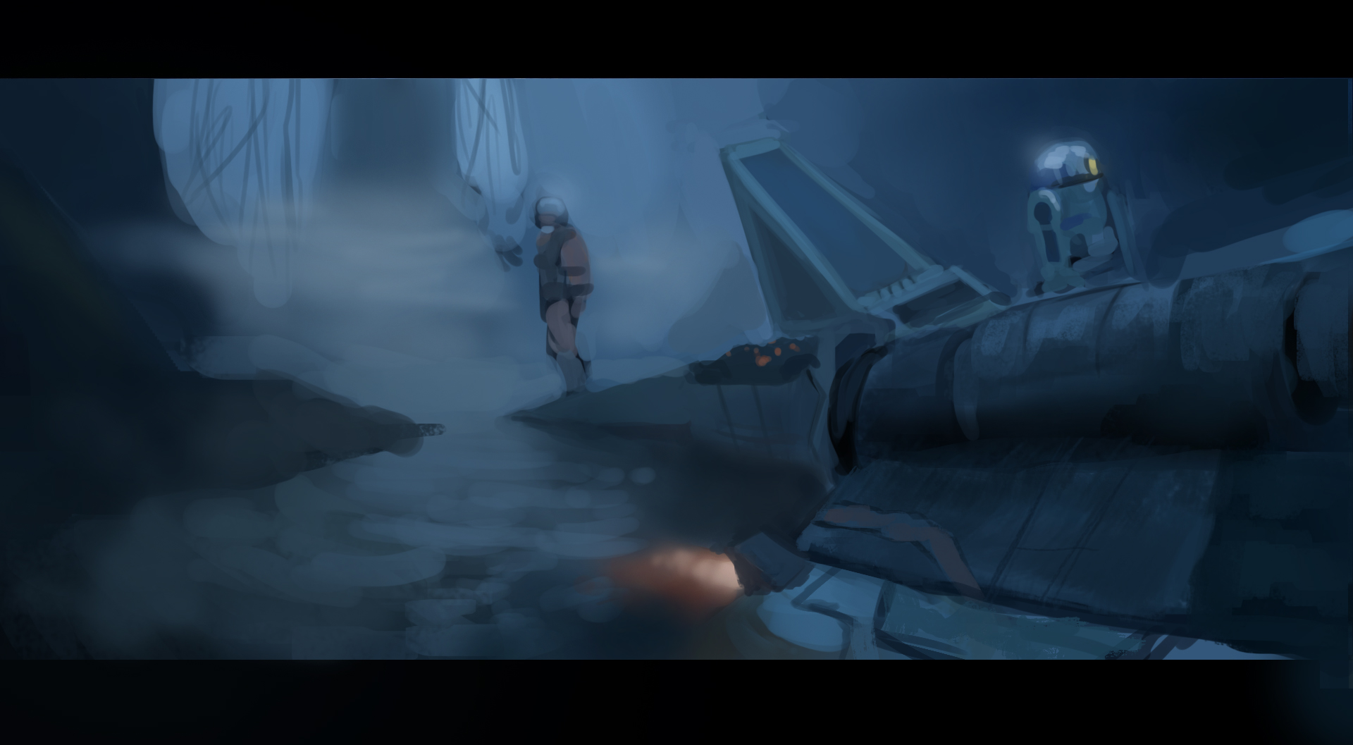
Blog | CD Sketchbook | dA | Facebook |
08-09-2013, 12:36 PM
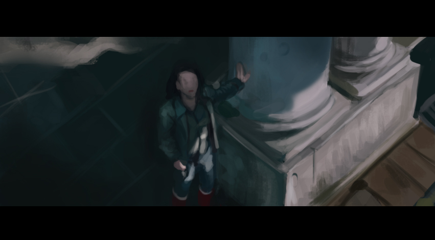 A quick application of what I was studying. 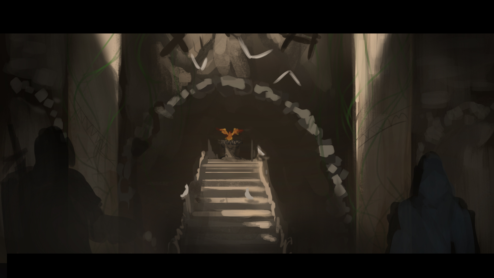
Blog | CD Sketchbook | dA | Facebook |
08-13-2013, 11:17 PM
Pilot- WIP Process
Applying what I've learned from the film studies I've been doing. Figured it was about time too. Trying to get some of the anatomy i'v been practicing on the T as well... 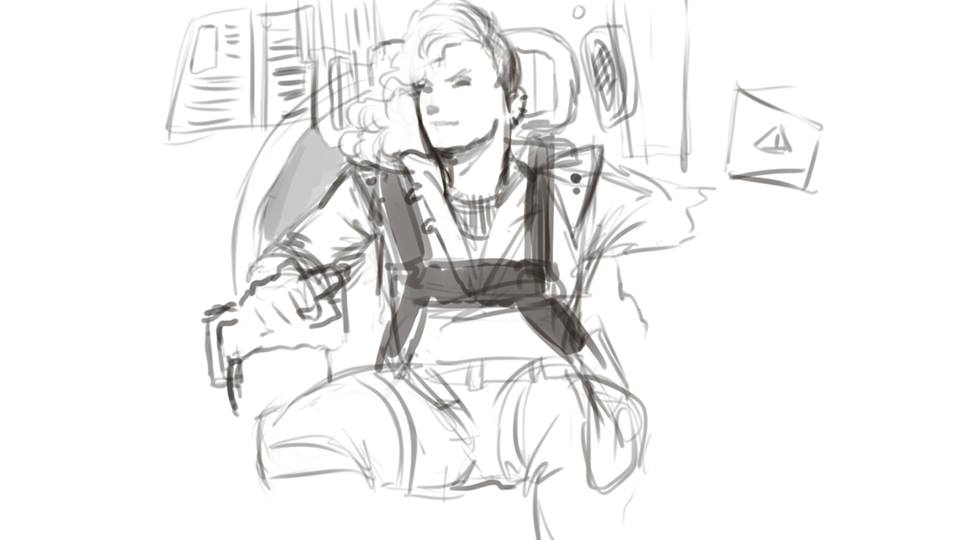 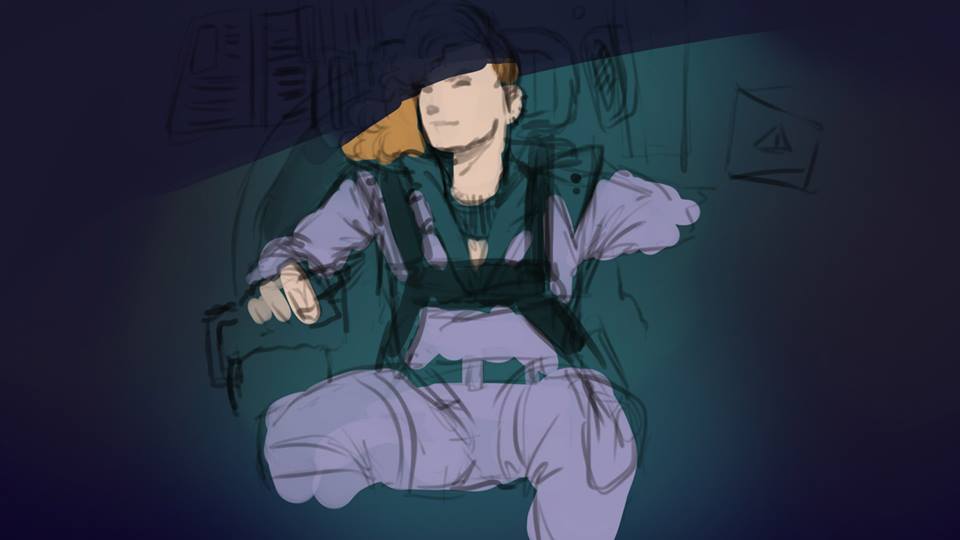 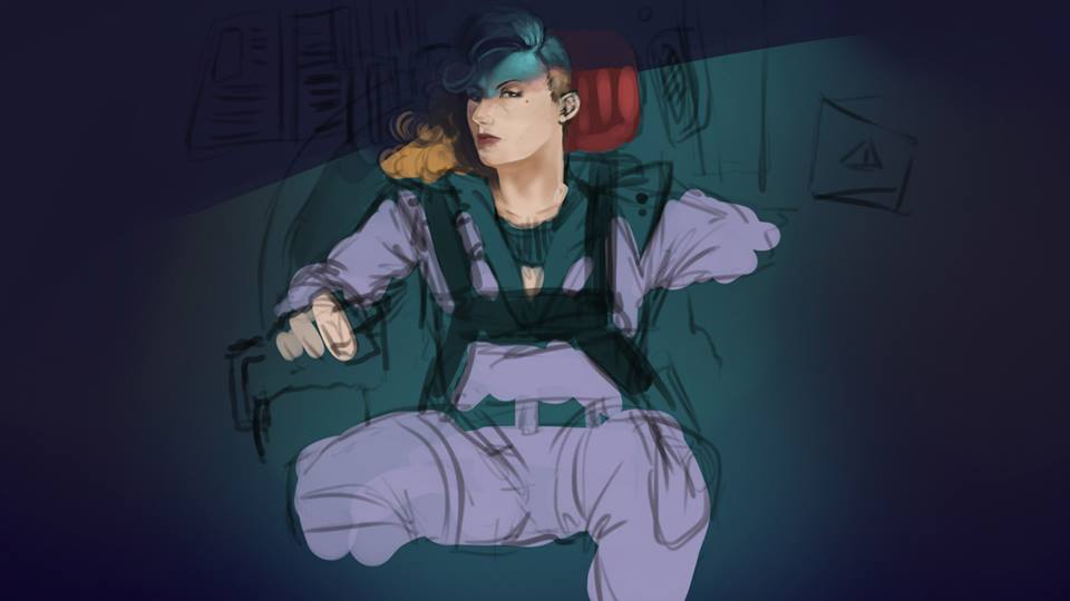 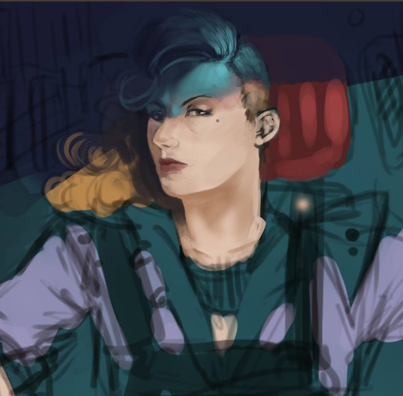
Blog | CD Sketchbook | dA | Facebook |
08-17-2013, 10:16 PM
Great job on doing studies and trying to apply it in personal work. I'm just trying to use this method. It looks to be very beneficial.
08-28-2013, 12:15 PM
Nice amount of studies and that pilot looks promising, just be careful to 'explain' the form before going into tiny details! Keep it up :)
09-12-2013, 02:53 AM
Hey! I see lots of improvement! The lat character has a really pretty face, interesting clothes. I see a major issue with her hip though, it seems she doesn't have huge hips because the area under her waist os too slim for that, it looks like her leg bones are just kinda detached and taken appart from each other. I'd push them a bit together ^^; I know you were going for big hips, they are super sexy. But the slip area just seems blown out of proportion. Anyway great design, keep going!
|
|
« Next Oldest | Next Newest »
|