Posts: 1,076
Threads: 4
Joined: Jan 2016
Reputation:
43
darktiste: Great suggestions, thanks! I worked a great deal on the skin to give it a more natural look, and a less plastic one. Hopefully it's more natural looking now!
chubby cat: That's some excellent input, thanks for taking the time to do a paintover to illustrate your point; It was a major help and helped me re adjust the values quite significantly, so I'm very grateful for that. I implemented all your feedback you mentioned, hopefully it looks better now :)
.......................................
I worked on the image significantly, did some changes to the lighting and refined the skin heavily to soften the values a bit and give it a less of a plastic look:

Posts: 1,076
Threads: 4
Joined: Jan 2016
Reputation:
43
I did some changes to the image and finalized it. I'm quite pleased with it and ready to move on to the next illustration. Here is the final illustration:

Next up I started an illustration for a friend, with the theme 'Lady Justice'. I spent many hours on the sketch to make it as refined as possible. I had a reference for the general pose, which can be seen here .
The pose suits the theme quite well, the pros being its very iconic. On the downside, its a bit stiff. Here is the final sketch:
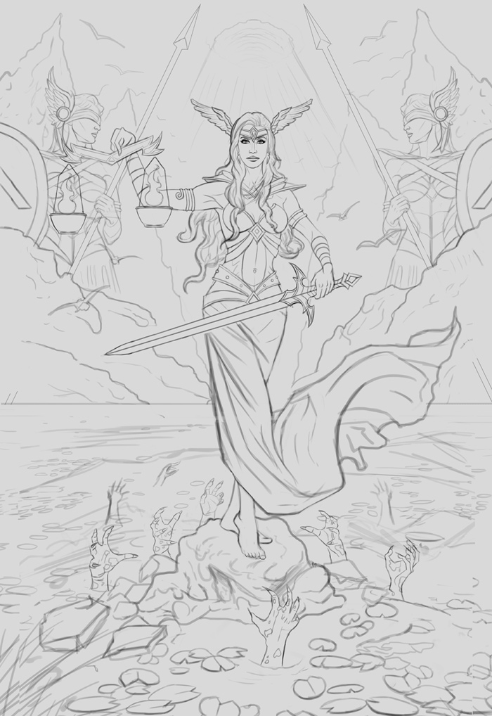
Any feedback is always appreciated as always!
Posts: 3,361
Threads: 37
Joined: Aug 2013
Reputation:
234
My advise would be to make sure to add alot of atmospheric perspective if you know what i mean.For the women in the background i would say there out of proportion to fit the composition i can't find a work around for that but i just want to let you know.
Posts: 1,076
Threads: 4
Joined: Jan 2016
Reputation:
43
darktiste: Thank you, will most definitely make use of that during the painting process. Also regarding the figures in the background, they are actually large statues placed in the environment, should have made mention of that before... Will try to make them appear more natural during the painting process!
Posts: 2,817
Threads: 15
Joined: Jun 2013
Reputation:
109
so my critique of the pose is kind of philosophical. Im tempted to think of the Columbian pictures woman, with the strong upright pose, and her feet are planted, with this she is taking a dainty step forward, and her body is not. I think it be better if she were floating, and her feet pointed down eloquently, and you got rid of the stumps and lava/water/hands because they add just more things to busy up the drawing, while you have a lot going on up top.
Also how shes holding the scales is strange, put your arm out like that, try to hold like a cup or something and tell me that feels like a powerful grip. https://pmcvariety.files.wordpress.com/2...563&crop=1
Even the sword, bend your like that, does that feel powerful? not to me, id say it should be all the way up, or all the way down, you already have a cross shape with the figures behind in the clouds and adding the bent elbows makes it redundant since her main gesture is straight up and down. maybe angle the dress blowing more subtely, and the sword arm behind her but the sword still visible. and yea definitely lose the swamp hands and lily pads, i know you got a thing for those girls in the water but i dont think they help this picture.
less is more, think big shapes less on detail. and on the figures in the back the breast straps feel kinda corny to me, like theyre trying to be really sexy. thats just a taste thing, but there are some epic breast plate designs that could be possible there, instead of the cliche boob armor weve seen a million times. even if it is boob armor, it can still be designed in a fresh interesting way, im sure you know what im talking about
Posts: 1,076
Threads: 4
Joined: Jan 2016
Reputation:
43
Fedodika: That's some excellent input, thank you! I just tried her floating and the results were good, but overall I preferred the grounded look as that gives her a sense of weight... and makes the 'hands' more threatening. I re-adjusted her arm with the scale as suggested, I feel it works much better now! I got rid of the breast straps as well on the background figures/statues. I think I'm going to keep the hands and the lilies, I feel they add some much needed contrast to the image!
.............
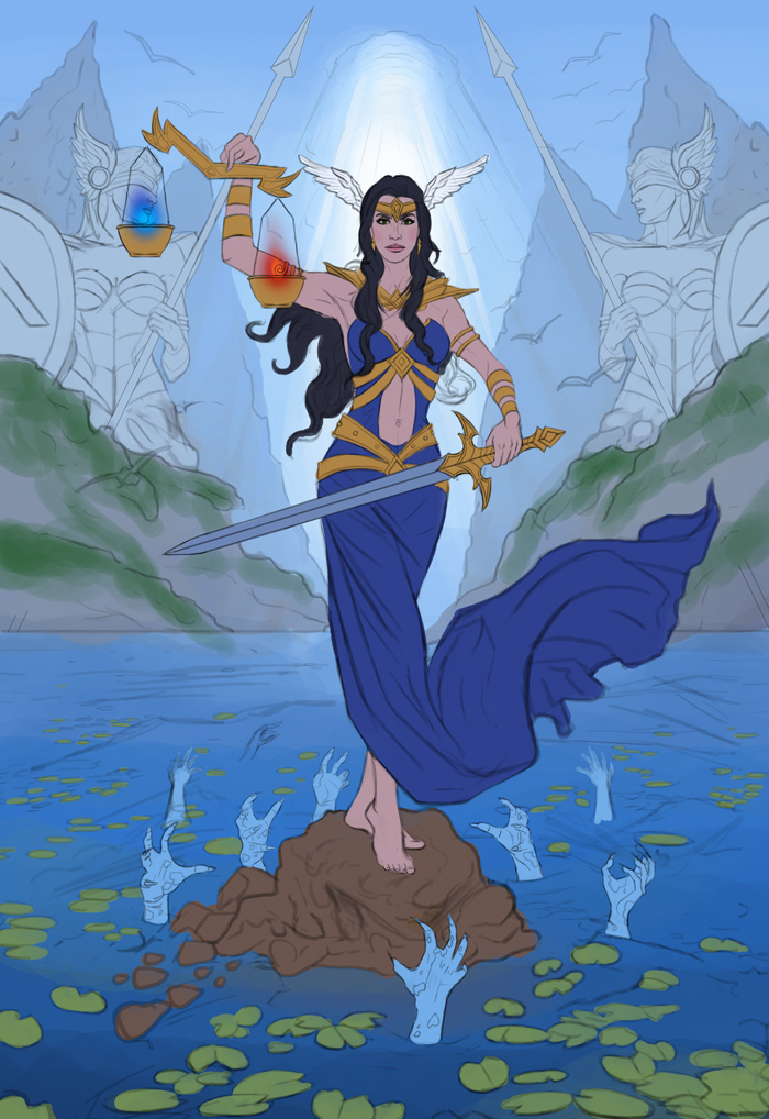
I updated the sketch a bit and blocked in the basic colors. Pretty happy with my color choices so far, but feel free to let me know any input!
Posts: 3,361
Threads: 37
Joined: Aug 2013
Reputation:
234
There an issue for me with the scale she holding it create a strong emphais on the statue just something to consider if it not a point of emphasis you where working toward.If you have isolate your element it would be easier to move the element around but it might be a bit harder at this stage if you work on a single layers.That why i recommend to start an illustration by isolating each element for easier resize and manipulation around the canva.
Posts: 740
Threads: 1
Joined: Mar 2017
Reputation:
11
I agree with darktiste, there's a lot of tangents that are messing with the composition. Here's an example of what I mean
![[Image: 0vQNBeA.jpg]](https://i.imgur.com/0vQNBeA.jpg)
edges touching like this or elements that are very close to the edge of the canvas should generally be avoided
quick paintover because I suck at explaining
![[Image: A1TTw8c.jpg]](https://i.imgur.com/A1TTw8c.jpg)
scales going over the statue's face is a nightmare to deal with but it could be fixed in the painting as long as you don't detail the statues too much. Painting this will be really hard I think you should play around with changing the time of day
Posts: 3,361
Threads: 37
Joined: Aug 2013
Reputation:
234
The rule of tangent is to make organize the element so that line doesn't converge toward a singular point or that 2 object edge doesn't meet it also include the frame that count as an edge.Tangent have the tendency to flatten composition.I think if there so many tangent as Coinhero shown that you might want to be more actively thinking about them in future painting.It not something that you have to practice separately necessary but you should not be testing you color and be seing still seeing any tangent who should have been dealt with before so next time i recommend that when you finish the composition before going into color you check for 2 thing line that converge and meet in a single point and object with confusion ''fusioning'' edge.
Here a video if my explanation fail to explain what tangent mean
I recommend it because it as visual example that make the concept easy to grasp.
https://www.ctrlpaint.com/videos/avoidin...l-tangents
Posts: 1,076
Threads: 4
Joined: Jan 2016
Reputation:
43
darktiste: Great point regarding the statue's face, I think it's the blue 'flame' that I added on the scale that brings more emphasis on the statue, so I got rid of it. Thanks for the detailed explanation regarding tangents, I admit I haven't put much emphasis on avoiding them during the sketching problem. The video you posted was ridiculously helpful in that regard, so thank you!
Coinhero: Thank you for the detailed paintover, very much appreciate it! I reworked the sketch a bit and got rid of most of them (or at least made them less severe).
.............
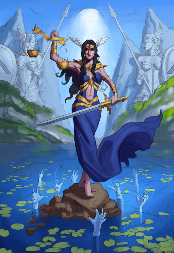
I worked on the illustration a bit more, tried to get rid of the unnecessary tangents as was pointed out, and also established the lighting. Pretty happy with that aspect so far. Here is the current progress:

Posts: 181
Threads: 0
Joined: Oct 2017
Reputation:
41
I'm just going to echo what Fedodika said a few posts back - the way she's holding the scales is strange and awkward. She has a powerful grip on the sword, but she's holding the scales like they weigh nothing even though they are made of gold(?). It's really how the hand and fingers are positioned; there's nothing powerful behind them that follows the rest of the images' vibe.
With the bowl as well, just be careful of the left one - the statues face almost looks like it's resting on it
Posts: 1,076
Threads: 4
Joined: Jan 2016
Reputation:
43
chubby cat: Great point regarding the hand; I just repainted it, hopefully it looks more natural now!
..........
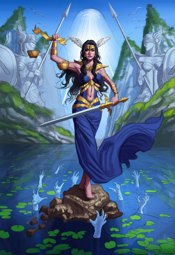
Worked on the image a bit more, refined the illustration as a whole. Current progress:

Posts: 181
Threads: 0
Joined: Oct 2017
Reputation:
41
Just to pester you a bit more on the scales (lol) - I think it's worth considering whether or not these are actually functional scales? How would they actually measure anything without her hand placement being an influence? Take a look at old fashion scales, or even statues holding scales; the beam is always supported by something else in which someone holds onto.
![[Image: images?q=tbn%3AANd9GcRdimJFkXGYzXMzq9i_k...eTpzEKBR0J]](https://encrypted-tbn0.gstatic.com/images?q=tbn%3AANd9GcRdimJFkXGYzXMzq9i_kNLWWdWsRj-hFO5MgoyoJzeTpzEKBR0J)
Posts: 3,361
Threads: 37
Joined: Aug 2013
Reputation:
234
It make more sense for the scale to be leveled with each other and it would help move away the unwanted focus on the statue face.
Posts: 1,076
Threads: 4
Joined: Jan 2016
Reputation:
43
chubby cat: Great input, thank you! I admit I haven't thought too much of that practicality of the scales. I do like the example you posted so I'll think about doing something similar for the next update!
darktiste: Hmm... I'm not sure to be honest regarding the scales; I think having them perfectly straight would be a bit boring composition wise. I did however fix an anatomy mistake with her arm being a bit too long, so I was able to move the scale a bit so there's no more necessary attention to the statue, thankfully!
..................
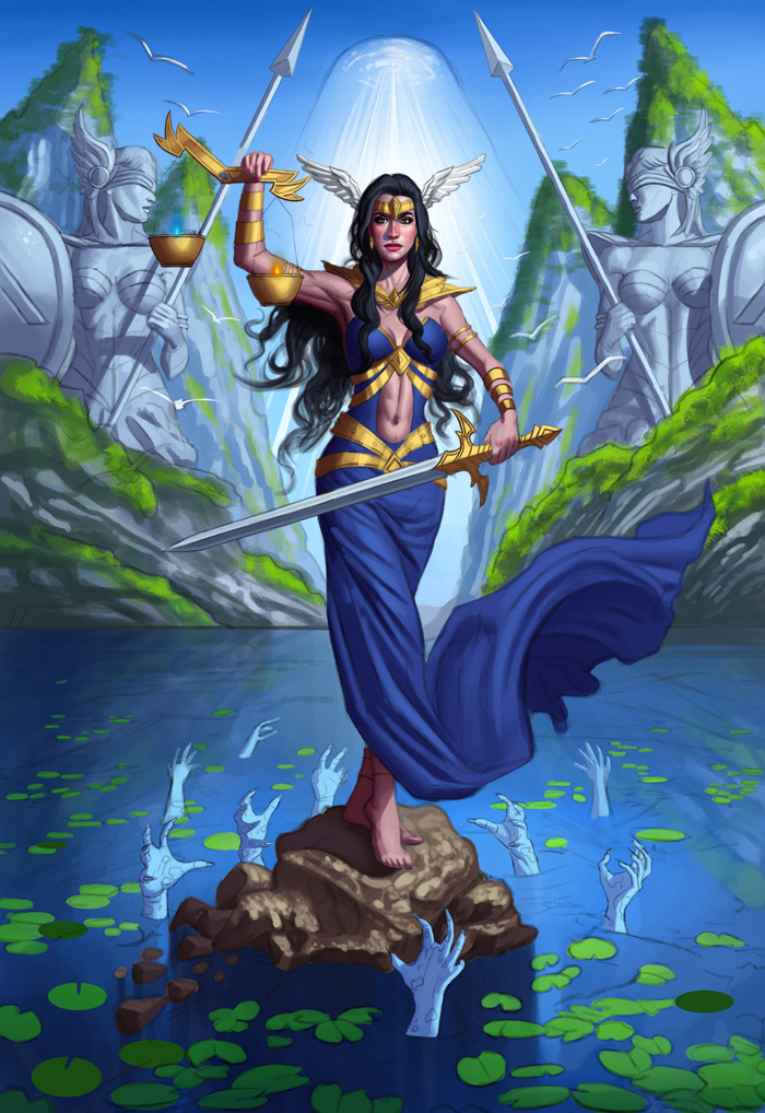
Worked more on the image, made the arm a bit smaller and continued refining. Here is the current update:

Posts: 1,076
Threads: 4
Joined: Jan 2016
Reputation:
43
I worked on the image a great deal more, it's coming along fairly well I'd say. Here is the current progress:

Posts: 1,076
Threads: 4
Joined: Jan 2016
Reputation:
43
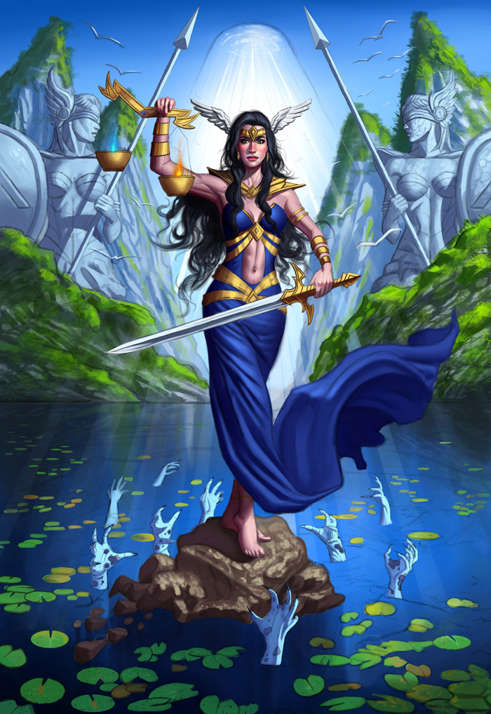
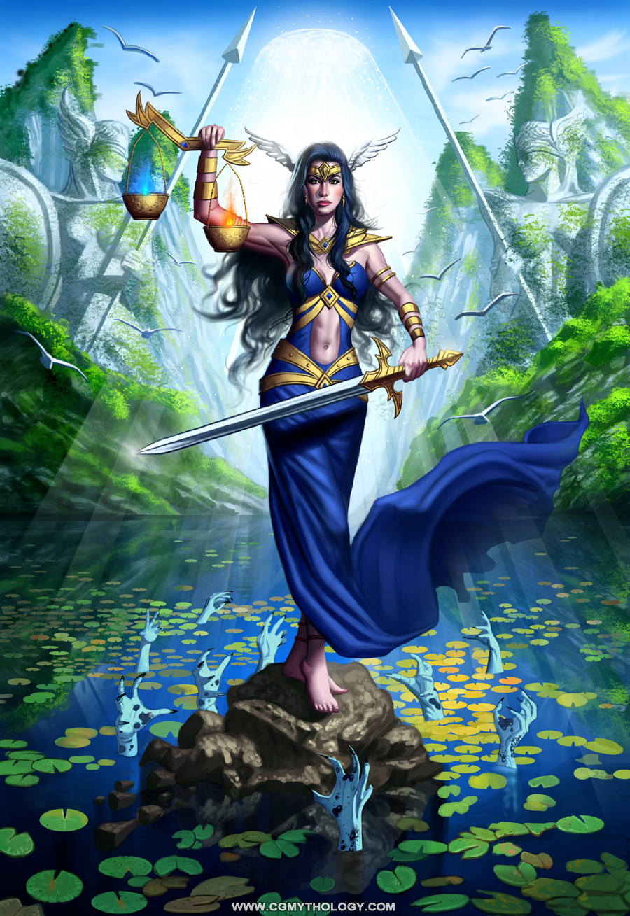
Finished the image a few weeks ago, been ridiculously busy so haven't had time to post. Pretty pleased with how it turned out; Thanks again to everyone who contributed feedback, as the image is much stronger as a result!! Here's the final illustration:

........
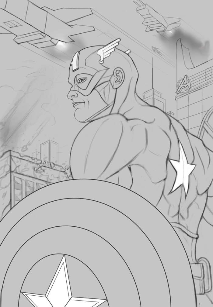
Next up I began work on an illustration of Captain America. Spent a ton of time on the sketch as I wanted to make it as strong as possible, always makes things easier for me during the painting process. The inspiration came from a cool looking cosplay I found online, which you can view here: https://ibb.co/yPw6xnm
Here is the current sketch:

Any feedback is always welcome and encouraged as always :)
Posts: 151
Threads: 2
Joined: Oct 2019
Reputation:
20
Man, I'm seriously in awe with your SB. You are always working towards an illustration, and pushing and working, and having something done. Amazing. I need you as my pilot, come work your magic on me! Ha.
So, this last one, lady justice? (oh, it's on the title, I'm clueless! ha ha) I personally liked a bit more the rather more saturated version you had on the previous stage, before the two weeks you mention, but I seem to be biased towards colorful stuff, so pay no heed. You also had not as much overexposure with the light, it was more pleasing to me. What was your reasoning behind the changes? I guess before it was more comic book, now is a bit more realistic or photographic.
Composition is great, loved the hands coming out of the water. I guess the fires could had a bit of glow but again with so much overexposure it would not stand out so I guess it makes sense. Awesome job again.
Oh I forgot to say, I like the crossover, or influence about the lady of the lake, from Excalibur which is fair, fairnes, so justice, and that threads into lady justice. Was it on purpose? Or am I reading more into it that there is? I gotta say the background of the piece is very entertaining, like how did you plan it?
I saw a previous one you did with a girl and very colorful gradations. I noticed one thing tho, while I'm not an expert painter and all that, mainly the eyes, if lit from below, think that you will have the shadow inverted as how they usually are (it's a hollow cavity covered by a dome), so highlight goes down, but shadow goes down too, and light is up. Here, a reference and a paint over. I did other tweaks but, I can't really stand by any of them because again, not a clue about painting personal pieces, as of now, ha.
A reference for lit from below I liked it, mainly to see the eyes:
https://live.staticflickr.com/5331/69442...9a13_b.jpg
Small paintover:

Now go ride those winds of progress! Ha. Impressive stuff.
Posts: 21
Threads: 1
Joined: Nov 2019
Reputation:
2
Hey Cgmythology,
I have to agree with Rotohail. Your sketchbook is super impressive in terms of consistancy and drive towards finished work. That's really awesome. I also like how confident you are in your use of colour.
One thing that I find creeps up in a lot of your work though is a smooth, clean quality to the rendering style which I find looks a little "digital" for lack of a better word. That may be part of your intentional style which is fine by all means but if not maybe that's something worth paying attention to in the future. I think a lot of the reason for this effect comes from your treatment of edges and of detail placement. Looking at your recent Lady Justice illustration I'm seeing kind of a sameness of edges all the way around the figure, including the cloth. I think you can make more varied choices there, especially in areas that are not supposed to draw focus.
I also think the way you detailed the cliffs in the background hurts the depth in the image somewhat. The harshness of the custom brush you used for the trees really creates a lot of busy detail in an area that is supposed to be quite far away. Maybe you can try and soften those kind of details in the future.
That said I think it's great how much thought and detail you do put into your illustrations. Don't lose that! Maybe just try to choose more carefully how you place your details to make your image more focused.
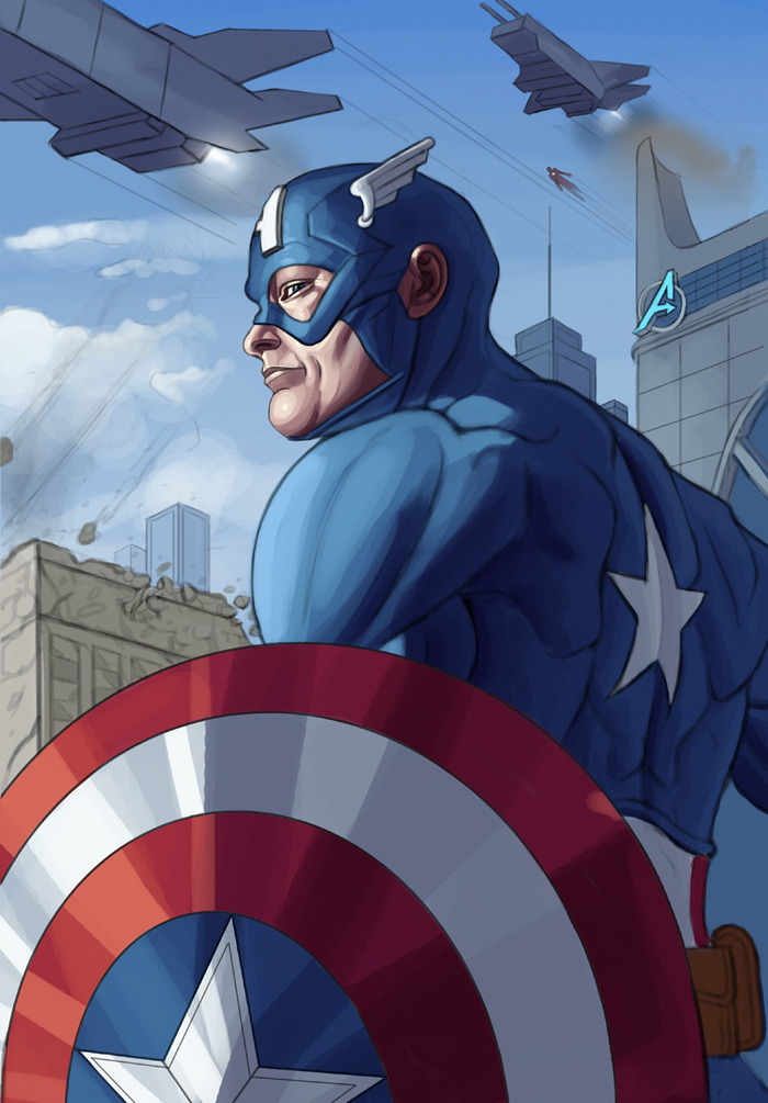
I'm looking forward to seeing what you do with your Captain America piece :)
Posts: 1,076
Threads: 4
Joined: Jan 2016
Reputation:
43
Rotohail: Thank you!! Regarding Lady Justice, it's interesting to hear you prefer the more saturated version. I have a tendency to oversaturate as many pointed out, so it's interesting to hear a different view! And yes, the reason for the changes was to go for a more photo realistic look as well, which I think suits it more. Regarding the inspiration, the image itself was inspired by 'Wonder Woman' the most I'd say!
Great point regarding the eyes on the portrait as well, great catch! I believe I experimented with that light on the eyes like in the paintover/fix you posted, but it gave her a bit of an ominous look which I felt didn't suit the image at all, even though it would be technically correct. So I admit I took some artistic license there!!!
Thanks again for the kind words and support, very much appreciate it! :)
jondawo: Thank you!! Glad to hear you appreciate my color choices! Regarding the smooth clean quality, that is very much intentional on my part. I prefer a clean look to my illustrations, but I do admit I can overdo this. I agree that it can benefit a bit more from texture work, so I'll try to incorporate more of that for future pieces!
Excellent point regarding the background on 'Justice', agree with you completely. Might go back to it and blur it a bit to make it less harsh when I find the time. Thanks for your honesty!!
..............
I began the painting process on 'Cap', pretty pleased with how it's turning out so far. Using mostly hard edged brushes so far (except on the sky which was done primarily with soft brushes), I'm thinking of incorporating more texture with this piece so I'm going to play around with speckled brushes as I continue to work on it. Any feedback is appreciated as always!!!

|


![[Image: 0vQNBeA.jpg]](https://i.imgur.com/0vQNBeA.jpg)
![[Image: A1TTw8c.jpg]](https://i.imgur.com/A1TTw8c.jpg)
