11-28-2019, 04:42 AM
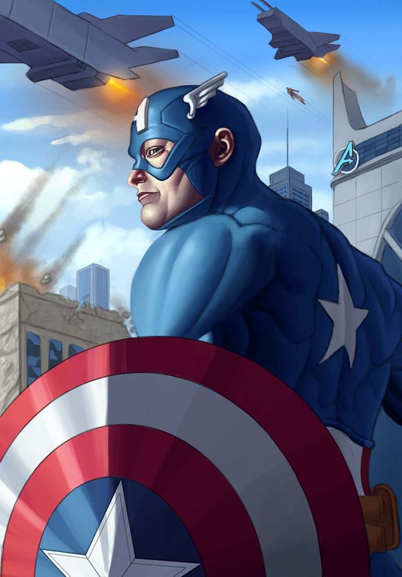
I worked on the image a great deal, refined the skin heavily, made more progress on the environment. Enriched colors a bit as well to make them a bit more lively. Here is the current progress:

|
CGMythology's Sketchbook
|
|
11-28-2019, 04:42 AM
I worked on the image a great deal, refined the skin heavily, made more progress on the environment. Enriched colors a bit as well to make them a bit more lively. Here is the current progress:

12-08-2019, 04:53 AM
I did some significant work on Cap, I think it's pretty much done at this point. Don't want to overwork it. Here is the current progress, any final input would be very much appreciated!
 I worked on a new sketch as well of a Pirate Girl. I spent a lot of time on it to really bring it to life, it's easily one of my most detailed sketches to date. The figure was referenced from a stock photo which was the inspiration for the illustration, and can be viewed here: https://imge.to/i/vw1DRw Here is the new sketch: 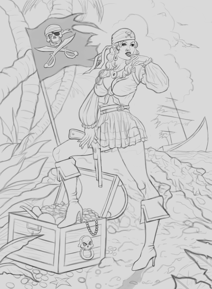 ........... And that'll be all for now! Thanks in advance for any feedback, always very grateful and appreciate of them!
12-08-2019, 05:36 AM
I can see what you mean with the eyes, you could go with lighter values on them if they feel too dark! The issue of having the reversed lightning just there is that the eyes then look like if they wearing those halloween colored contact lenses? They feel fake, which can be unsettling, and I would only do so if you wanted an horror vibe with the piece, alternatively you could make them just have a glow or be self-illuminating? Have you seen Supernatural show? or any other glowy eye media thing ha ha.
Captain America really got better as you went, those extra saturated tones and texture did it for me. I think you could make the background have different local values. While I'm not to deft at it yet, I've been reading and practicing those things a bit and it feels like the background buildings, captain and all have the same value hierarchy? Like the lighter values feel about the same, the midtones, all feels like is the same material, just a different color and texture, like their tonal range is similar or close? if that makes sense, but it could be done different or start with different local values. In any case I can't really say yet, I'm still trying to figure this out myself. So just a thought. The girl I would say the weakest point at the moment is the hand on the pistol, is it pushing it against the leg or grabbing it lightly? Feels a bit like is gonna fall off. I think turning the tip of the fingers or playing with that hand a bit more, hands are always tough tho. I would also turn the feet/leg a bit in different directions but that's mostly because I've read best not to make limbs follow the same direction, have them show some asymmetry, but is just a personal thing I agreed with, they look fine to me as they are now. If you notice the reference does show that very subtly, her left left (right side pic) is slightly opening outwards. The hand is mostly hidden but I would say the index and middle finger could be holding the gun. Anyhow, how do you plan your illustrations topics? Or how do you choose the theme?
12-08-2019, 06:05 AM
i agree with alot roto said here, i think the buildings in your captain america painting feel like toys. in the raven painting a did a while back, i spent a lot of time texturing and making the buildings feel like they were immersed in the atmosphere. you know if theres a few jets and explosions going on, maybe emphasize that in the atmosphere, more dust smog and debris shows like something happening.
the perpsective feels fine, i think your biggest problem in rendering is just making it feel immersive and like its all fitting in the same scene. its hard to teach that sort of thing, it requires a lot of observation... i get that you want a clean and sharp look, and i respect that, but even people like art germ who have a squaky clean looks still have a concern for texture and atmosphere. i think the only things in this image that have texture are his deltoid, his face mask thing, the clouds and the crumbling buiilding (the shield looks rather nice as well.) the building just doesnt feel very convincing to me, it feels like something made of clay being pulled apart. Dilapidation usually has deeper crevices and billowing debris coming out, i know its hard to balance in a composition... Also the sky like its so blue, i know its a good guy kinda portrait but even the recent marvel films can make the heroes look like a good guy with lots of grittiness because it adds an element of danger and emergency to the situation. So maybe look at some avengers screencaps, look how they work in the greys and gritty values to sell the danger of the scene https://www.indiewire.com/wp-content/upl....jpg?w=780 Keep workin hard, and yea the pirate girls hand is goofy with the gun. i have no idea why her leg is so CRAZY bent like that. i mean the calf on the inside is almost a C curve, which the tibia would never ever curve that much unless you had some very whimsical style that heavily pushed that. I feel like her torso is too... small, in a sense that her butt is too high up, it feels goofy; and all these little plants and sailboats and details and stuff... why do you need all that? the reference is so much simpler and therefore has a stronger composition. See what you can do with less, think large, medium and small when setting up the elements in the scene and dont assume because you have tons of little funny details itll make the image more convincing. https://cdna.artstation.com/p/assets/ima...1511961496 This by mullins, notice theres not treasure chest, no parrot, none of that but you KNOW hes a pirate. you feel it, boil it down to the essentials and push the quality of those things https://arthive.com/res/media/img/orig/w...115617.jpg do research on stuff, like dont just bang out a line drawing and buckle in, take your time and really think about this stuff, itll give you a much better piece
70+Page Koala Sketchbook: http://crimsondaggers.com/forum/thread-3465.html SB
Paintover thread, submit for crits! http://crimsondaggers.com/forum/thread-7879.html [color=rgba(255, 255, 255, 0.882)]e owl sat on an oak. The more he saw, the less he spoke.[/color]
12-09-2019, 09:39 AM
Don't forget to give your props as much love as your character. That treasure chest need some dimension - it's more cardboard box than heavy wooden chest at the moment. It reads very flat in general, so study some chests and take note of how things bevel, how materials overlap and what holds everything together.
12-09-2019, 11:44 AM
Something like this.Also don't just make thing sit on a flat surface when it outside for example here she clearly outside you could make the sand do some bumb think of how you can overlap element to give more depth to your image and give perspective cue for scale.Also a trick to give more volume to your scene is to use cast shadow intelligently to imply volume.
12-09-2019, 02:49 PM
Rotohail: I see what you mean regarding the eyes. It's been a while that I've 'finished' the piece so I'm reluctant to go back to it I admit. Don't like reworking things too much once I finalize them, but we'll see!!
Great points regarding values for the Cap piece, I lightened the background a bit as well as the environment a bit to help give Cap more 'pop', hopefully that helped! For the Pirate Girl I reworked her hand as suggested, tried to make it more natural looking. Hope it's an improvement! As for how I chose Illustration topics, it's very random I admit. I try to go with whatever inspires me at the moment. One thing I'm trying to do more often nowadays is to always sketch the idea asap, this is to help keep me inspired and not forget what I had in mind. But generally speaking inspiration can come from anywhere, from Greek Mythology to a movie that I watched. But altogether it's extremely random I admit! Thanks for your input as always,you're always on point so I appreciate it! Fedodika: Some great input, thank you! I just worked on the environment a great deal to really bring it to life using your suggestions, and I feel it improved dramatically, so thank you! I reworked the Pirate Girl a bit with your suggestions implemented as well. As for the complexity of the scene, that was intentional on my part as I wanted to paint something that put a lot of emphasis on the environment, not just the character. In the future I'll be more careful not to overdo this as I understand it might take too much away from the figure as you stated. Thanks again for your input and advice! chubby cat: Great input, thank you! I'll try to focus on the treasure chest a bit during the painting process, I admit I didn't put as much emphasis on it on the sketch as I would have liked! darktiste: Great point, that effect would be very easily achievable during the painting process, so I'll keep that in mind for the next update! ...................... Received some great input and reworked the Cap environment significantly, I think it's a huge improvement! Not sure what else I can do to it at the moment, but any suggestions are welcome! 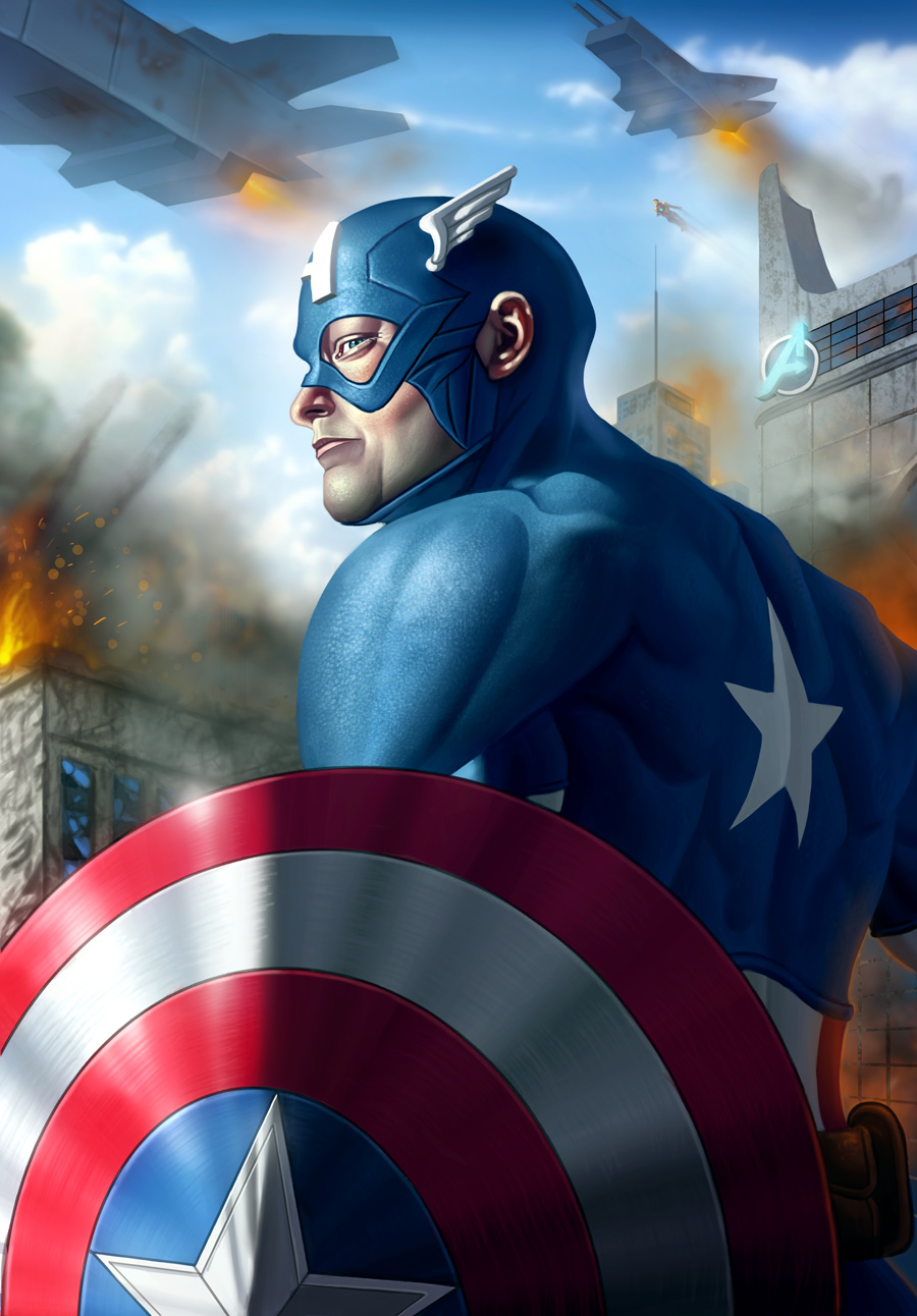 Next up is the Pirate Girl, made some changes to the line art and began the painting process. I spent a great deal of time on it so far so it has come quite a long way. Environment needs a lot of work but I'm pretty pleased with the progress so far: 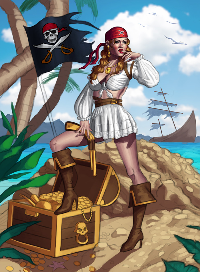 .... and that'll be all for now. Any input is always appreciated!
12-09-2019, 10:57 PM
Why is the chest side facing us so lite when you clearly see the cast shadow going in an other direction meaning there not getting that much light from the light source?If there 2 light source you get 2 cast shadow normally.
Secondly. I think it would be a good idea to add some tint of your ground element into the color of your gold. Here a few thing i played with the chest the inside as been shaded to add volume and it help bring contrast between the boot and the chest who had similar temperature. I played with the ground and add a bit of texture brush to break the flat color. I added a more profound core shadow to your tree trunk I choose to darken the flag a bit to avoid the face of the girl and the flag competing for attention I also choose a darker skin tone to reflect her being i would assume often outside with little to no protection from the sunlight I finished by adding more atmospheric depth adding more haze as we go back in distance and decreasing the haze as we go up toward the sky since moisture is mostly near the ground
12-15-2019, 04:24 PM
darktiste: Thanks for your input and paintover, extremely helpful so very much appreciated! I just updated the image based on your feedback for the better!
............. Worked a great deal on the illustration and it's almost finalized. Refined it as much as I could and reworked the colors (I've worked too many times with cool colors so I opted to do something a bit different and went for a much warmer color scheme). Would definitely love to hear any input before calling it final, however, so any input would be greatly appreciated as always! Here is the current WIP: 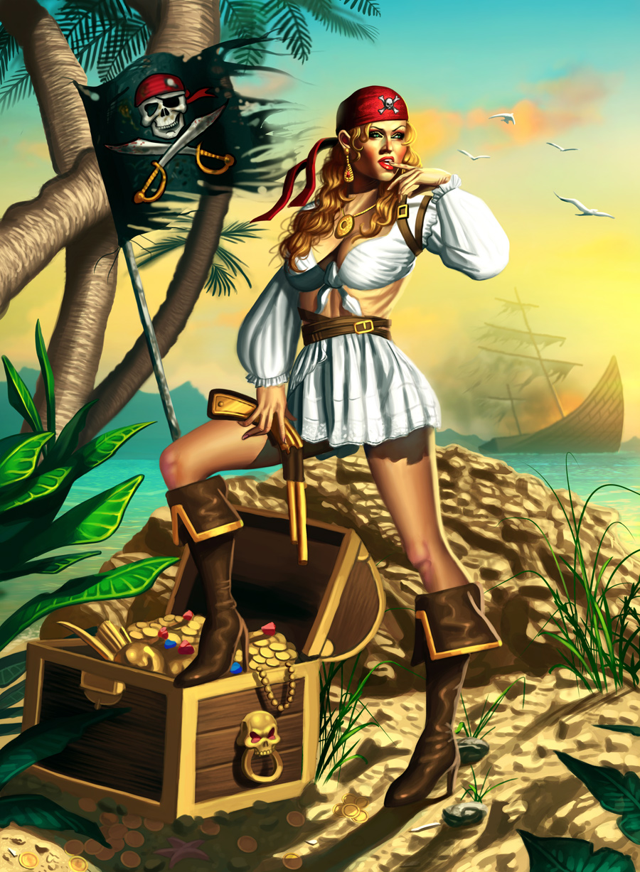
12-15-2019, 10:53 PM
The lighting is totally confusing as i keep point out how are we seeing so much light from the direction she looking at if the sun is the other way projecting the cast shadow of that box?You made two light source but it an outdoor scene so it make it hard for a viewer to imagine how this would be possible unless she on a movie set...
I think the big problem that lighting inconsistency can throw off a piece and i don't feel like this make sense.If you want to fix the issue you need to take in consideration your two light source as it seem to be the case.On that treasure box and the cast shadow of that boot direction should be going toward an 11 o clock direction if i am correct and it create two cast shadow due to two light source. Here what i did use the burn tool on the bottom piece specially on the left side to darker the chest to separate hit from the character a little more and create the need contrast to give the full focus on the figure i also push a bit with the dodge tool on her face and i desaturated the ground color to give the room to the saturate color to breath.Lastly i also use the burn on the treasure content since it the bottom left corner it doesn't attract the eye that much in a verticale composition.This serve to also to remove some of the focus on the chest that competing for the viewer attention.A good way to think is primary focus point a secondary and a third one so for me how i see it in this piece it the girl face than the pirate flag and third the chest.
12-21-2019, 08:44 PM
darktiste: Great feedback, thanks! I think the problem was that I was trying to stick closely to the lighting in the reference photo, although that probably had artificial lighting as well. At any rate, I reworked the image and omitted unnecessary light sources and fixed the drop shadows, hope it's better now! Thank you for taking the time to do the paintover as well, very helpful!!!
............. I worked on Pirate Girl some more and corrected the lighting. Also lowered the contrast of the background a bit as it was too distracting before, hopefully it works better now. I'm calling it finished for now unless there's anything off that's noticeable! 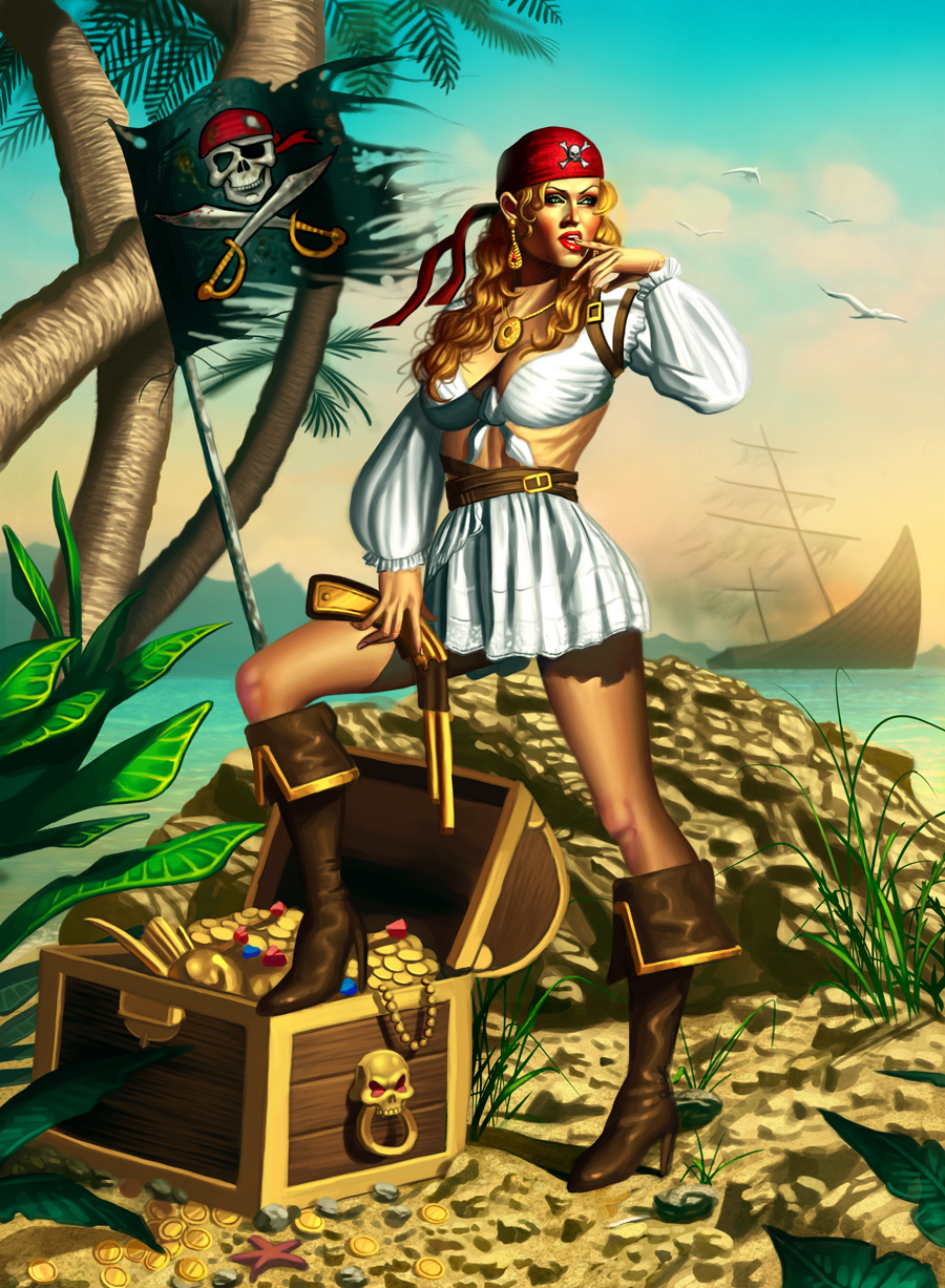 Next up I worked on a pin up sketch for Harley Quinn. Quite happy with this one, I opted for something more simple this time as my previous illustrations were more complex, so I waned to catch a bit of a break. Any feedback would be very helpful before I begin the painting process on this one, so please feel free to leave any input! 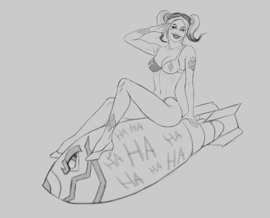
12-21-2019, 09:26 PM
The harley quine one is very solid. The hands though. They are not at all on the same level as the rest of the piece, I would elaborate a bit on that before going in to painting. Other than that It'll be fun to see how the painting comes out. :)
12-22-2019, 01:46 AM
its not bad, id reccomend pushing the gesture way more though, like you can really emphasize the sexiness of a pose by just pushing it further up and back, for the leaning back pose
example https://i.etsystatic.com/14608849/r/il/6...7_n2zs.jpg you also have a missed opportunity with her shoes, they could be planting down on the rocket but it ssems like theyre hovering at the side of the rocket also read up on paul richards babelab to learn how to do more stuff on pinups http://babelab.blogspot.com/
70+Page Koala Sketchbook: http://crimsondaggers.com/forum/thread-3465.html SB
Paintover thread, submit for crits! http://crimsondaggers.com/forum/thread-7879.html [color=rgba(255, 255, 255, 0.882)]e owl sat on an oak. The more he saw, the less he spoke.[/color]
12-22-2019, 06:41 PM
Moscito: Thanks! Took your advice and revised the hands a bit before I began the painting process, hope it's better now!
Fedodika: Thanks, I agree that the pose is a bit stiff. Should have pushed the gesture further as recommended. I'll take note of your input however for future reference as I'm planning on doing another pin up in the future that's much more sensual, so I'll be sure to study the link you posted in further detail, thank you for that! ................. OK some updates on the current pieces. 'Pirate Girl' I think is done for now, revised the hand and ship a bit, hopefully it's OK now! 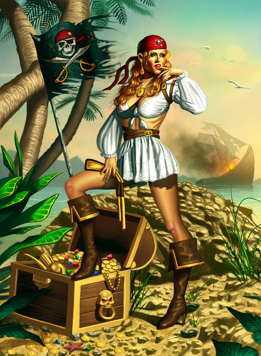 Next up is the Harley Pin Up, I began the painting process and it has come quite a long way. Initially I wanted to do something more colorful for the background but it was drowning out Harley who has a very desaturated tone, so I went with a blue color scheme to make her pop out a bit. It's still fairly early but I'm pleased with how the face is turning out! 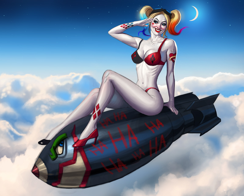 Any input is appreciated as always :)
12-23-2019, 01:25 AM
harley, like her body isnt sexy to me, it takes a lot of really fine studying of the female body to make it actually sexy; Armando huerta for example like, hes internalized every little plane change in the female body.
like this, https://pbs.twimg.com/media/C-hJhTuUQAAgI5c.jpg see that feels like a woman i just wanna bite into, the proportions are full and actually feel sexy https://www.antiquesnavigator.com/archiv...168739.jpg This one is more your body type, but still has nice full calves and her body is exaggerated in all the right places; see the dramatic difference how he pushed the spine back in his compared to yours, how it gives the bust so much more gravity and despite having the similar body type, feels so much less emaciated and zombie like I think the pirate girl is a lot stronger actually, but her legs are so harshly bent it ruins alot of the good illusion you have up at the top As usual, ill hopelessly suggest that you stop painting for a long time and just focus on drawing and shading accurately and appealing figures and portraits; then when you come back to painting, you'll not only pick it back up quickly, but you're paintings will sing because the base theyre built on will be appealing without color!
70+Page Koala Sketchbook: http://crimsondaggers.com/forum/thread-3465.html SB
Paintover thread, submit for crits! http://crimsondaggers.com/forum/thread-7879.html [color=rgba(255, 255, 255, 0.882)]e owl sat on an oak. The more he saw, the less he spoke.[/color]
12-23-2019, 05:53 AM
Got a question for the harley piece what lite her from the front?If the moon is in the back?The sun?If she lite from the sun why is she not more yellowish?
01-01-2020, 06:31 PM
Fedodika: Thanks for your feedback, I agree the sexiness and gesture can be improved for my female figures. I made note of the links you posted and will be studying them in the future for future pin ups, subject matter is a lot of fun so I would love take another shot at it again!
I agree about focusing on drawing, in fact that's exactly what I'm going to do after the Harley image. I do have some ideas for a ton of paintings, so what I'll do for those is only work on the line art and paint them at a much later point, this will help me concentrate on drawing. Thanks again for your comments/suggestions! darktiste: Harley Quinn is actually painted white typically (I mean that literally :D), so I tried to stay true to that. With that said I agree that a more yellowish tone would look more natural, and give her a bit more of a more appealing skin tone, so I just implemented your feedback, thanks! Mariyan-Hristov: Thanks you, very much appreciate it :) ..................... Current update, it's almost done!! Will probably work on it for an hour more to do some final changes and some subtle effects, probably a bit more motion blur and such to make it more convincing. Any final feedback is appreciated! 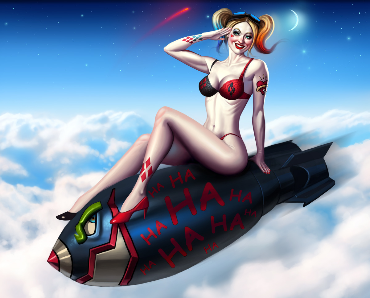
01-27-2020, 05:36 AM
Yep Harley looks great dude, the slightly warmer skin tone works well and you've still managed to keep her paleness - certainly an eye-catching piece :).
Keep going fella!
“Today, give a stranger one of your smiles. It might be the only sunshine he sees all day.” -- H. Jackson Brown Jr.
CD Sketchbook
01-27-2020, 11:49 AM
For me what throw off this piece is how the lettering doesn't follow the shape of the object is sit on.Have try the warp tool ?
02-02-2020, 07:54 PM
Artloader: Thank you! The skin tone was tricky, because having it too desaturated doesn't look to appealing, so I'm glad to hear I found the right balance!
darktiste: Great idea, just tried it out and it worked wonderfully, thank you! ............... I finalized the image based on the critiques I received, very happy with it! Below is the final image: 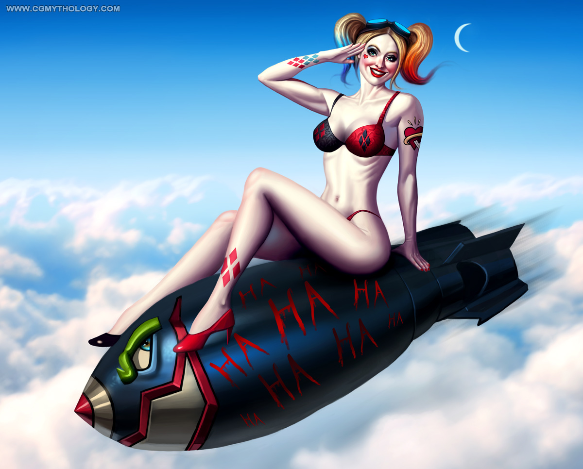 Taking a big break from digital painting to concentrate on drawing, starting with leg anatomy which is a bit of mine. Need to do more detailed studies of the muscles and so forth, so I'll be doing those both tradionally and digitally to help improve my skills. Should be fun and challenging! Thanks again to everyone for their awesome feedback, you guys are great! :D |
|
« Next Oldest | Next Newest »
|