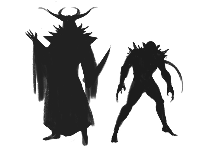
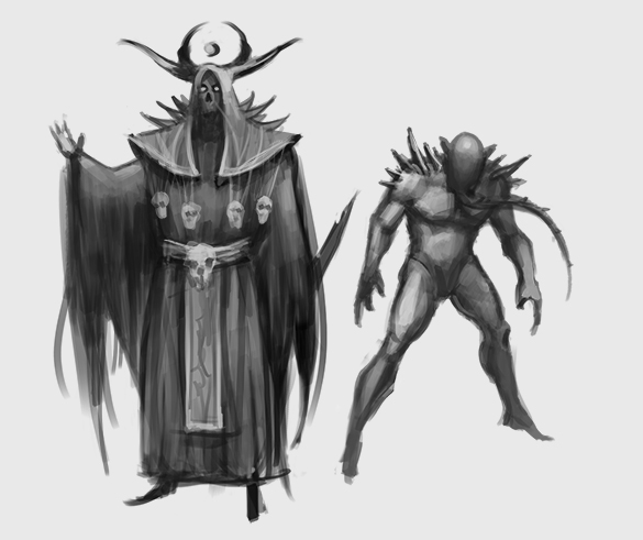
CC06: Necromancer and Ghoul
#1
It's high time I got in on one of these challenges.
I'm a huge fan of horror and horror fantasy so this one is a perfect fit for me.
I don't have much of a developed backstory for this project, just thought I'd wing it and see how it evolves naturally.


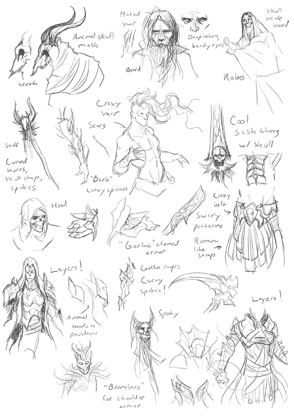
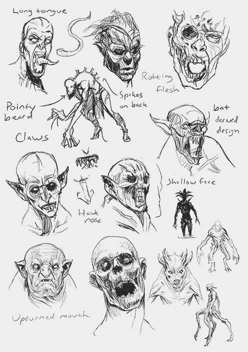
So! I'm going for something Brom-esque, a Necromancer and his familiar, a pet ghoul. 

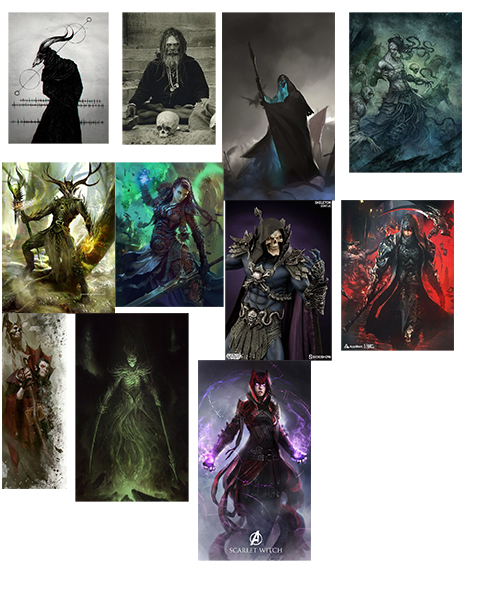
Initial round of reference studies and thumbnails


Reply
#2
Damn, these are really good.

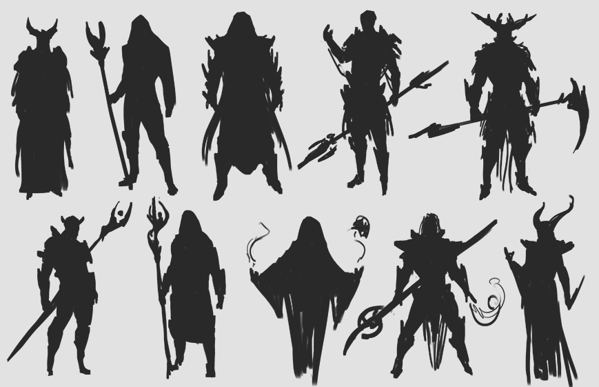
Liking the silhouette of the necromancer as well.

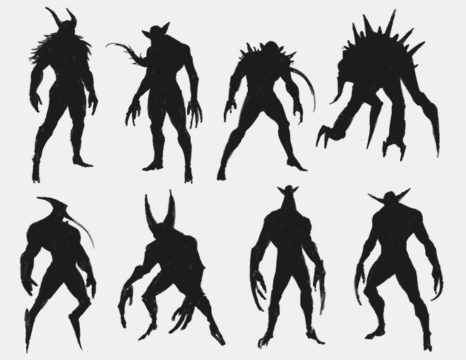
It might be going against the guidelines of the challenge seeing as the ghoul is still very humanoid itself. Although, I'm unsure how much wiggle room there is in regard to that. The design to the right of the one you chose seems like it may be a better fit. Much more creature-esque.

Reply
#3
Concise start! These explorations are looking great. Those silhouettes and creature designs are really readable and interesting.

I'd agree with Archreux, and err on the side of caution with a less humanoid creature. Other than that this is already shaping up nicely.

||SKETCHBOOK||. Bomb
Youtube Channel (Process, Tips on how to get work, etc...)
Reply
#4
DQ! Great to see you in on this too: ).

Awesome design work dude, you've got some great silhouettes there. Looking forward to more.

“Today, give a stranger one of your smiles. It might be the only sunshine he sees all day.” -- H. Jackson Brown Jr.

CD Sketchbook


Reply
#5
The silhouettes look tight! looking forward to more.

Reply
#6
Nice process Nick. Keen to see how you make these unique and fit the brief as well.

 YouTube free learnin! | DeviantArt | Old Folio | Insta
Reply
#7
@Archreux and Einver 
Taking a closer look, you guys are absolutely right about the ghoul silhouette reading too humanoid. There's a whole lot I can play with there; distorted features, elongated limbs, claws, animal traits, etc, to make him read more "monster"


@Artloader 
Hey thanks man, I'm long overdue to get in on one of these

@Amit
Thanks Amit! I've got a lot of work ahead of me if I don't want to end up with something bland or too simple.

 I've added some values on top of the silhouettes. Not the most original designs, but it's a start!


Reply


Forum Jump:


Users browsing this thread: 7 Guest(s)