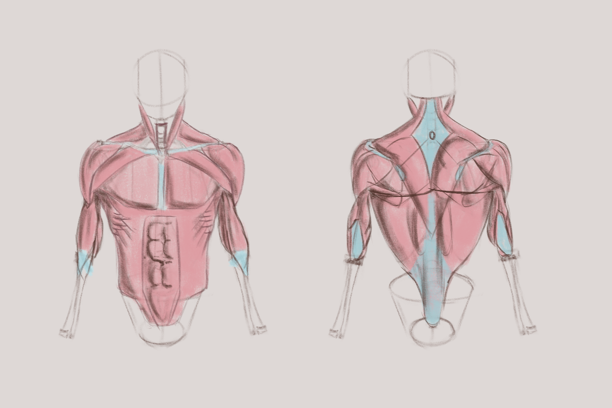
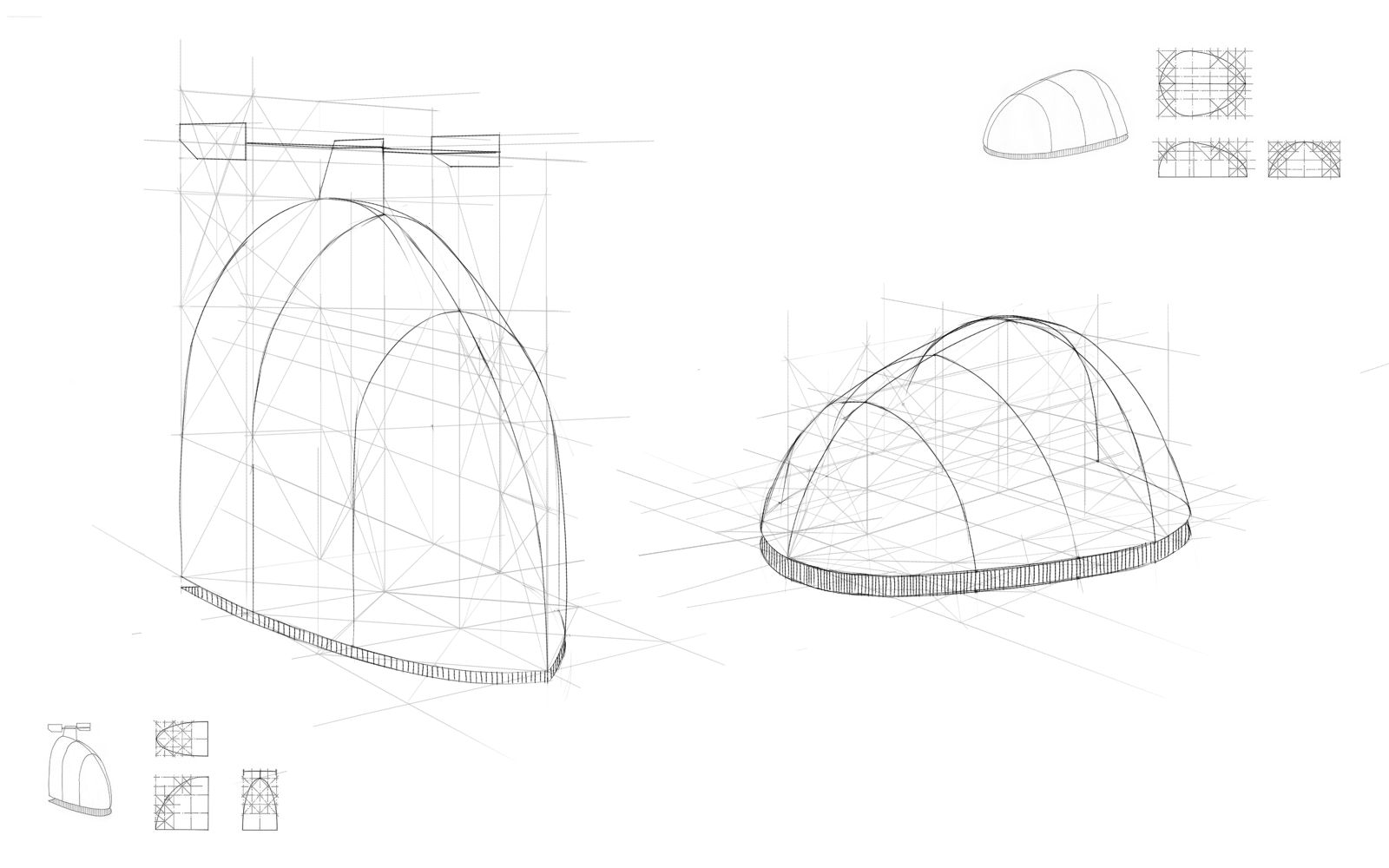
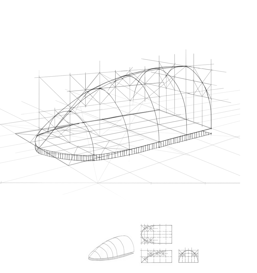
razvanc-r's sketchbook dump
About hands - you didn't show a perspective of those hands, it just looks smaller. You didn't capture the shape of a palm. It's not a box or triangle. It's more of a trapezium. You didn't place fingers correctly. Try using references first and only then try it from imagination. And your fingers are not the right size. On the left drawing there are 5 fingers but there is no thumb.

Reply
Well I didn't expect to get it right, back to the reference drawing board :)

Reply


Reply


Reply
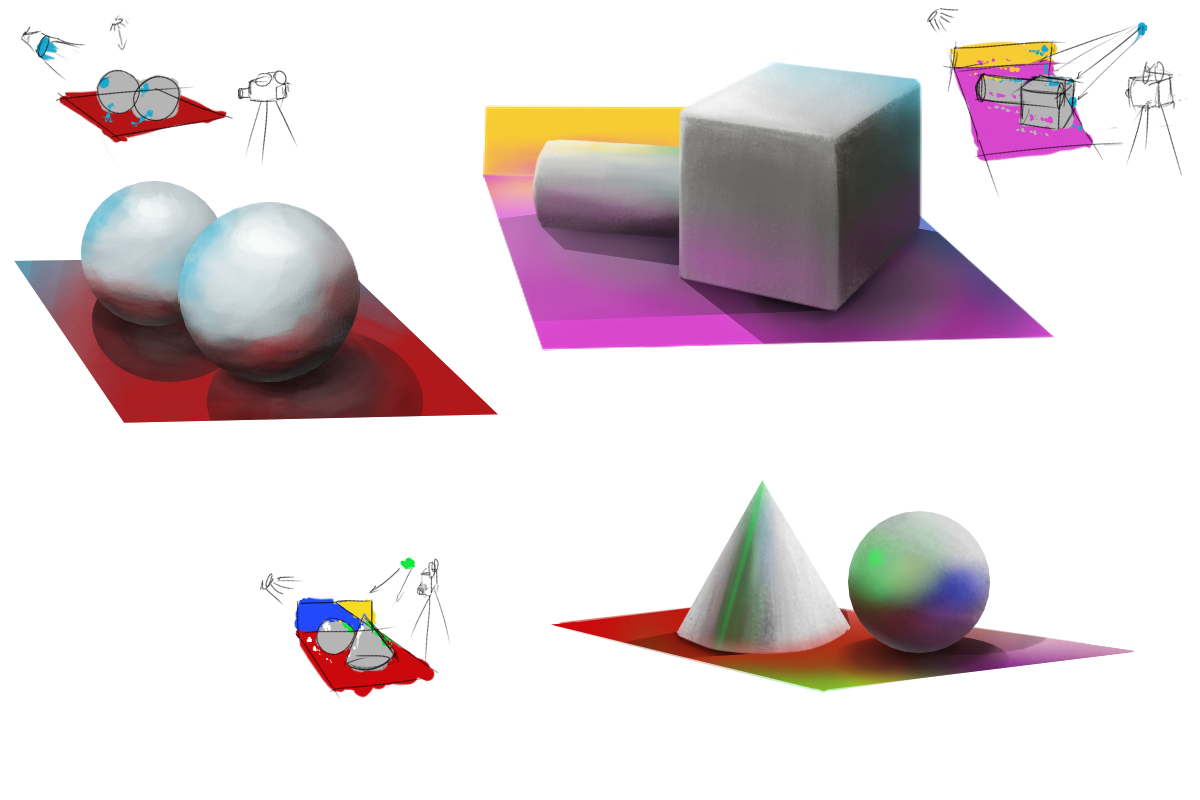
The material you showed in the last post is supposed to be quite reflective right? At least the spheres look so, while the cube seems matte. Just to make sure it wasn't supposed to be the same material.
You've been quite persistent with your stuff recently, keep it up :)

Reply
Good progress here Razvan :).

I think you're on the right track with focussing on the fundamentals.  Remember that 80% of your progress can be achieved by focussing on just the right 20% of the skills.

The right 20% being the fundamentals: perspective, lighting and colour.

Practicing construction in perspective using primitive forms is a great way to get better at perspective and lighting.

Another principle that I find very helpful is to focus on the process instead of the result.  If you become good at executing the right process, then the result will take care of itself.

You're also being smart by following the teachings of artists who have mastered the areas you want to conquer.  Finding good teachers will point you down the most effective learning paths.

Check out this link on effective learning, I found it most helpful:  http://www.lifehack.org/381775/5-powerfu...ing-faster

Anyway, hope this was helpful, if not, please ignore :).

“Today, give a stranger one of your smiles. It might be the only sunshine he sees all day.” -- H. Jackson Brown Jr.

CD Sketchbook


Reply
Thanks @Artloader, useful link :)


Attached Files Image(s)


Reply


[Image: AFlE2up.jpg]


Reply
Holy shiiiitt how have you gotten so good o.o give me some of your magic I need it more than you haha xd keep rocking. I love that you are posting regularly again

Reply
haha, I wish I've gotten as good as you think I have. It's easy when I do studies, but I'm nowhere near starting to do anything that good of my own creation :)...

Reply
immagination time


Attached Files Image(s)


Reply
time to try some freehand perspective & imagination works


Attached Files Image(s)


Reply
I'm a bit busy with a game jam I'm participating in. Before that I started this balloon game experiment in godot. So

the godot balloon experiments (colors are a bit strange - inverted - cause a problem with screenshot & opengl software... anyway):
[Image: DIYtkK6XUAA1OsQ.jpg:large]

these 2 are some concepts I'm exploring
[Image: DIYtlj3XUAAQgIC.jpg:large]
[Image: DIYtmF0XgAAVTnp.jpg:large]

and thse are some concepts for the game jam:
[Image: unknown.png]
[Image: unknown.png]

Question, do you think that the concepts for gamejam are high enough quality to be put in some form of portfolio? I've been focused too much on them and I can't look at them objectively. Thanks

Reply
Another idea for the abyss phase, I like the progression, just like me, going down the depths of hell or something :))

[Image: DJEDpVBW0AAT2Pu.jpg:large]

Reply
Your folio is as good as the pieces in it, pieces aren't intrinsically good or bad for a folio. if you think it's the best example of your work put them in. if you don't, don't. The underwater one blue, is ok, but the sub blends in too much. remove it, move it or make it stand out more. if this was really in game the sub would be a fail as you can't tell it from the bg. design wise the background is ok, probably could use vignetting and better value separation /  lighting to create better focus and more charm. go to ref and compare your piece side by side with a real game of similar kind

[Image: underworld_sidescroller_concept_art_by_d...872sj6.jpg]

 YouTube free learnin! | DeviantArt | Old Folio | Insta
Reply
Hey Amit, thanks for dropping by, I do agree that the sub blends a tiny little bit too much on the first one. The first piece is actually made with the in-game assets I created (unlike the other two). And that first one is where the sub needs to stand out, not so much for the other, we're actually exploring having a hard time to see the sub as a mechanic in game, unfortunately we don't have that much time left for exploration, in any case, you're right, I should do more exploration of other games. Actually I have, I just haven't done it *while making the paintings* :).

About the portfolio material I disagree, I mean I agree that the portfolio is as good as the pictures in them, that's why I'm asking if they're good enough quality wise or if I should work on them more, I am happy with them but at this stage I'm biased so I need fresh eyes.

Thanks.

Reply
ok, well to answer from my own perspective, no they aren't good enough, and I wouldn't put them into my folio. You might think differently since it's your folio and it might be the best you have, in which case i would say go for it. The first one could be improved enough if you can bring it up to the quality similar to what i posted. you might get decent jobs with that, otherwise you are likely in indie game work for 'profit share' or minimal pay territory with the quality of finish as it is now.

 YouTube free learnin! | DeviantArt | Old Folio | Insta
Reply
Yep, that's the feedback I was looking for. Thanks.

Reply
i can see your imagination working here!

There's one thought on checking composition that someone shared with me. Shrink down the image to the size of a postage stamp. Can you see what the image is about? If so, awesome. If not, it likely needs a change. Ideally you check periodically to see if you're on the right track.

_________________________________________________________________________
The best time to plant a tree was 20 years ago.  The second best time is now.  
-Chinese proverb

Sketchbook

Reply
Sooooo... through trial & error I found out that I make best improvements (I think) if I work on projects... thus I present to you my first illustration of Jal's Adventures (working title) - personal project. Want to make a comic out of it if I can... now you can destroy it if you like :) it's the best I can at this instant.

[Image: razvan-radulescu-illustration.jpg?1505734690]

Reply


Forum Jump:


Users browsing this thread: 12 Guest(s)