Posts: 485
Threads: 2
Joined: Feb 2017
Reputation:
5
(04-09-2019, 11:36 AM)Fedodika Wrote: for the background just try a plain flat circle, keep it simple and dont get bogged down on other things while youre still trying to execute a nice figure. i also like the little tree or shape you have going behind her, just making that a flat graphic shape could look nice. you drew a nicer pose for the hand but now its too small, like a childs hand. Like if she were to put her hand on her chin, itd barely cover her nose. Put your own hand on your chin, it'll probably come up to your brow ridge.
the other resting hand looks weird, like it ends too abruptply like your hiding it intentionally. I didnt notice before she was sitting, i think it looks strange, itd probably be better if you just have her dress cut off and shes standing within the abstract shape. when someones sitting you have to like draw in other things in the scene to show they're sitting, but i feel that her doing that adds nothing to the scene but clutter. It wouldnt really affect the impact of the piece if she were doing either.
Its like i told chubby cat, dont hide those hands they are some of the biggest opportunities you have to show character. we as humans constantly look at hands, our own and others, they do everything we do, hiding them is nooby looking. her arm definitely looks better, her dress, its just too tight against the titties, if you google "medieval dress" you wont find one dress that is that tight against the breasts and shows a perfect outline of the nipple. Hell even Elviras dress isnt that tight! good job fixing the hair btw
If you even look at my raven piece i looked up body suits and found none of them perfectly outlined the breast, its quite unusual for that to happen unless the body suit has some kind of ringlet to split them like Taki from Soul Calibur (but even most cosplayers dont pull off that split.) theres always this wrinkle between the masses. you could probably get away with it in anime, but not in realism. I just cannot find a bodysuit or a dress that hugs bosoms that tight, its weird i know!
however! if your dress was like a really loose fabric, it might drape over like that if her arm was tucking under the middle its just the way youve drawn it, specially with the green the fabric looks thicker.
You did improve the image though, it is easier on the eyes, just has some goofy stuff, i believe in u!
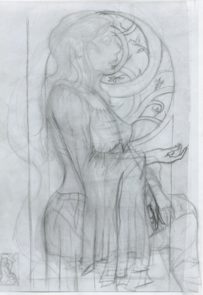
I've taken what you said into account and reworked it some more.
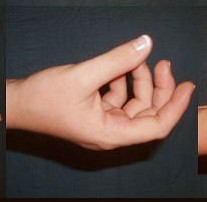
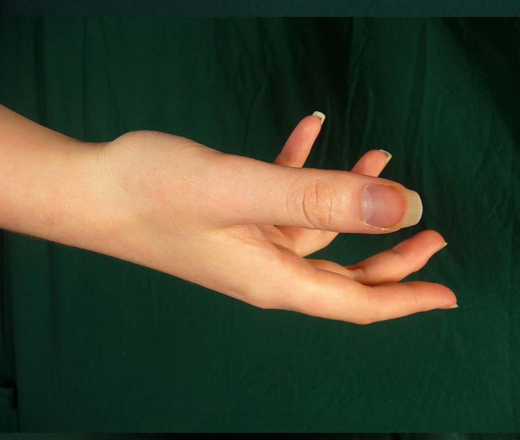
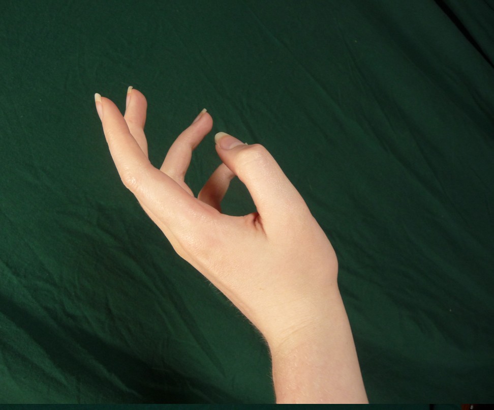
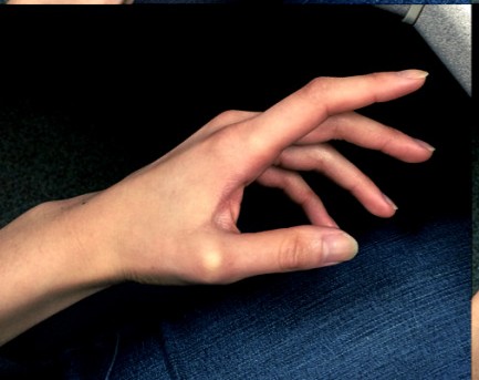
Used some ref for her right hand and invented her left but unsure about their sizes (particulary her left hand), and looked at some models in medievel clothing to help with re-working the breasts.
Traced over my layers to create a clean line drawing so if it all looks good I'll turn it into a value drawing and do some colour comps. I've also decided to paint it traditionally instead (oils) since I've got some panels I prepared ages ago. Got some time off during Easter so I'll paint it then, prob spend a few days on it and really push myself.
Posts: 2,817
Threads: 15
Joined: Jun 2013
Reputation:
109
its lookin better, the hands are kinda small but maybe you can beef em up a tad later
Posts: 77
Threads: 1
Joined: Sep 2018
Reputation:
9
Geeee... You have cool drawings!!! I'm in love. I agree with @Fedodika but to me only her right hand (closer to viewer) is small. You have this tiny dip between thenar eminence and hypothenar eminence and this creates a feeling that a bottom part of a palm is too short. Also, imho, from this position viewer couldn't see this hollow. And make a connection between hand and palm more distinguishable. I mean palm is a bit wider than the end of radius+ulna.
Posts: 485
Threads: 2
Joined: Feb 2017
Reputation:
5
Fedodika - I've increased both hands slightly so hopefully now it looks better.
Roanna - Thanks Roanna :) My knowledge of hands is not the best but I'll try and make the changes you reccommended...will need to google a few of the things you said haha.
Been busy the last few days so didn't get as far along as I wanted but oh well, went to see a Charles Rennie Mackintosh
exhibition which was interesting.
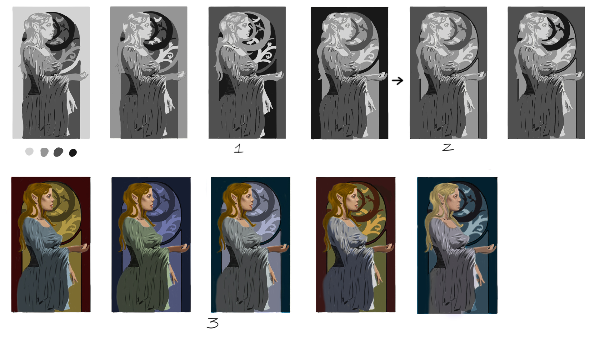
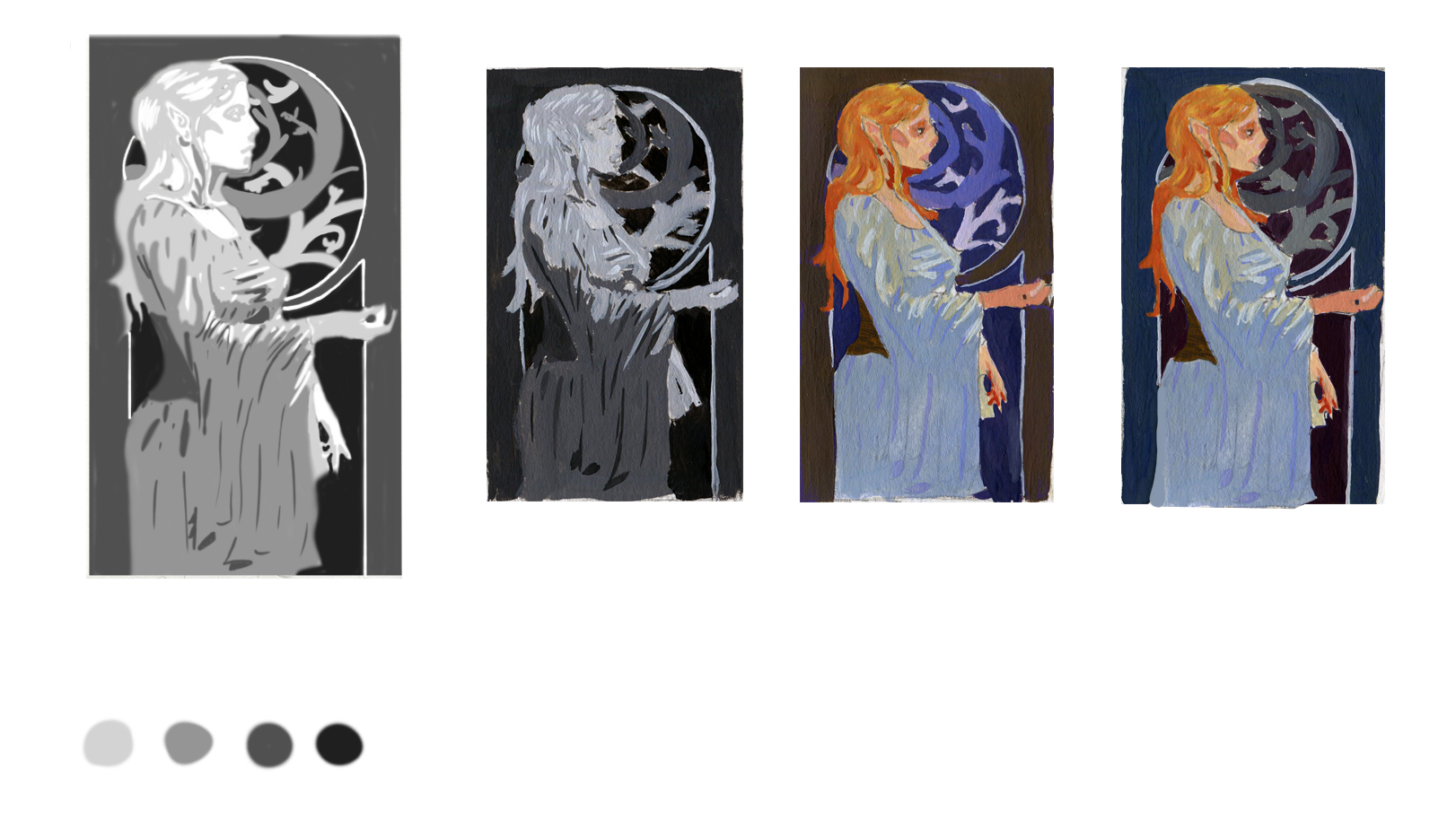
Anyway been working on the illustration more, mainly trying to figure out my value scheme and colour comp. Followed Loomis's value schemes from his book and then tweaked one of the ones I thought worked and changed 1 or 2 of the values round. Messed up a few times and restarted 1 or 2 of the comps again so definnitely took me longer than I expected.
Today I've been working on some colour comps but finding it difficult since my colour theory is not the best. Again restarted these a few times as I was originally trying to match my colours to the value scheme but in the end decided to just set a new layer to multiply and glaze some colour on top. Not sure if that is the best approach or not...
After seeing my colour comps I'm thinking of changing some of my values round and see if I can make it better, mainly switching the value of her dress and skin tone round so her dress is the lightest value and then bring the values of her dress in shade and the creases down a value just to lighten it overall and perhaps try and select my colours and painting over the value comps rather than being lazy and glazing hopefully someone here could point me in the right direction.
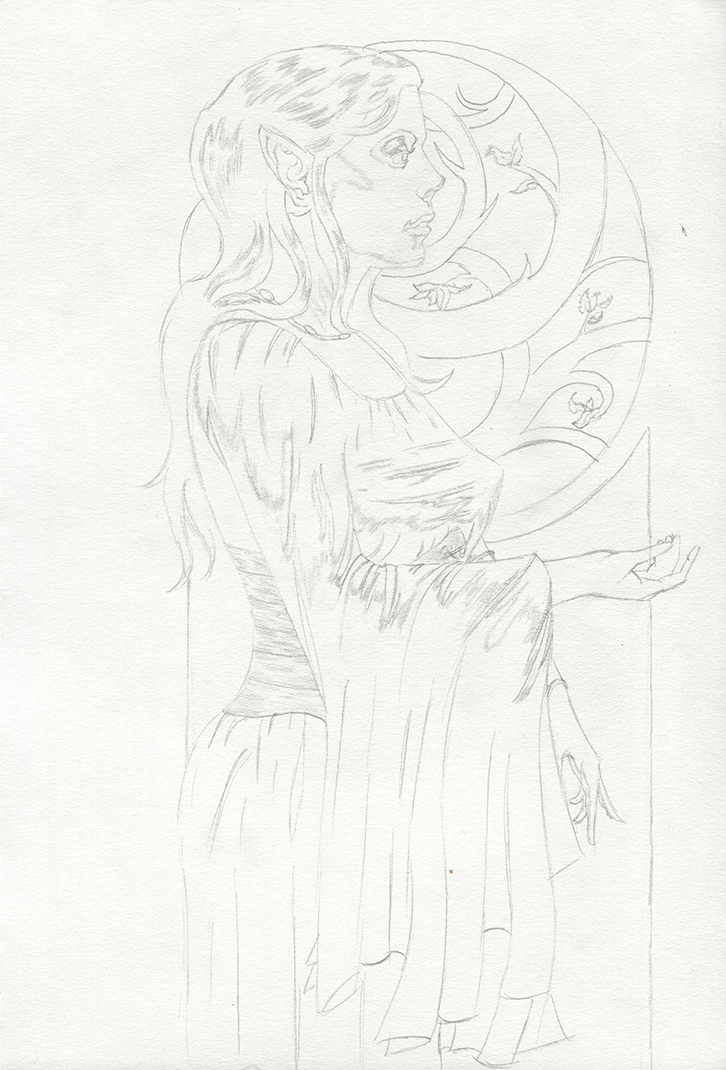
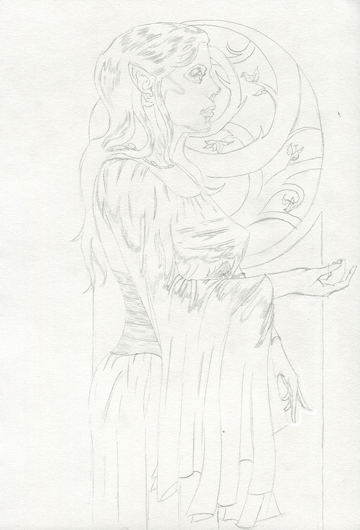
Fixed line drawing
Value/Colour Comps
P.s got some stuff from my life and portrait class but been too lazy to snap a pic so will do it tomorrow.
Posts: 2,817
Threads: 15
Joined: Jun 2013
Reputation:
109
i think the color one with 3 under it is the best colorwise it has warm vs cool pretty well, maybe make the branches a tad darker as well so they feel more uniform but leave the whiter ones unchanged
Posts: 77
Threads: 1
Joined: Sep 2018
Reputation:
9
I can't help with colors, but as for values I like 3rd and 4th from the left in the first row the most. The third one reminds me about her being in candle-lit castle in front of the window, that leads into the evening\night\magical garden. The 4th one is almost the same except the fact that it is a bright sunny day out there.
So, I suppose, the choice of scheme depends only on feeling you want to convey.
Posts: 485
Threads: 2
Joined: Feb 2017
Reputation:
5
Thanks Fedodika and Roanna for the feedback. :)
Played around with my vlaue comp again to see if I could improve on it. Decided to add white to my value plan taking it to 5 values instead of the original 4 and decided to drop all of the vlaues of her clothes making them 1 value lighter as I wanted to go for more of a mystical look and really make her pop from the background.
Been reading up on gamut masking and tried it in photoshop but I'm no good at mixing colours in the programme so I decided to whip out the gouache paints and try mixing my colours traditonally. Limited my pallette to 5 colours which were:
. Titanium White
. Cad Yellow Light
. Ultramarine
. Alizarin Crimson
. Burnt Sienna
Looked at some illustrations that I liked the colour scheme of and tried to emulate them. Liked her colours in the first one but not the background so re did it and pasted her on top. Still not 100% on it but I'm gonna go with the 2nd choice, emulate it in photoshop and have a go at painting it next week when I'm off rather than constantly trying to improve it when I should really be moving on since this is the best I can do atm. (Colours aren't 100% accurate here, generally all colours are lighter than they appear here.)
Posts: 485
Threads: 2
Joined: Feb 2017
Reputation:
5
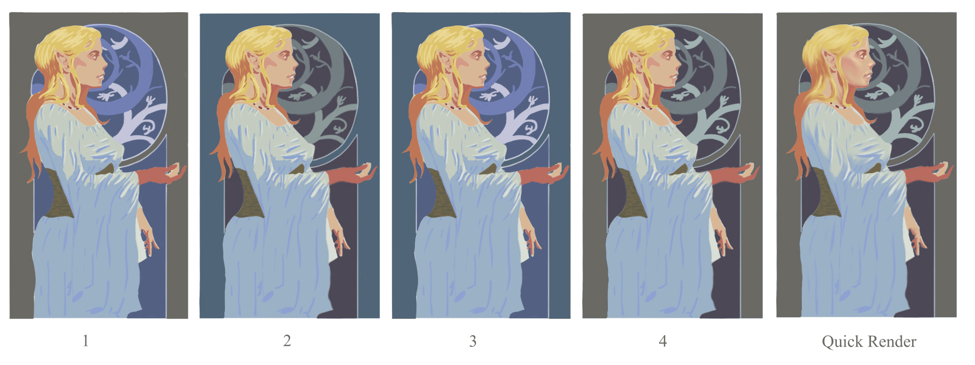
Alright think I finally settled on a colour scheme that I like. Basically did what I said I was gonna do the other day which was to emulate my goauche colour comps digitally by using the eye drop tool. Still wasn't sure with the first 2 so I tried swapping the background colours round to see if the new colour combinations worked any better than the original.
Really liked how 4 was looking so I had a quick go at rendering to get a better impression of how it will look finished. Feel like adding something to the out reached hand might work such as flower petals but I might just restrain from altering it anymore otherwise I'll never actually paint it haha.
Got my life class tomorrow and need to sort some things out on Friday so will prob make a start on this on Saturday and spend a few days on it since I'm off work all next week.
Posts: 77
Threads: 1
Joined: Sep 2018
Reputation:
9
Great work you've done, I also prefer the 4th thumbnail. My only advice would be to make hair and skin a bit less saturated right now they are both too bright and seem to be unnatural. Generally, human skin doesn't have a lot of saturated colors, but receives huge amount of reflection from the surroundings. So, it's better to paint grey-ish but with variety of colors.
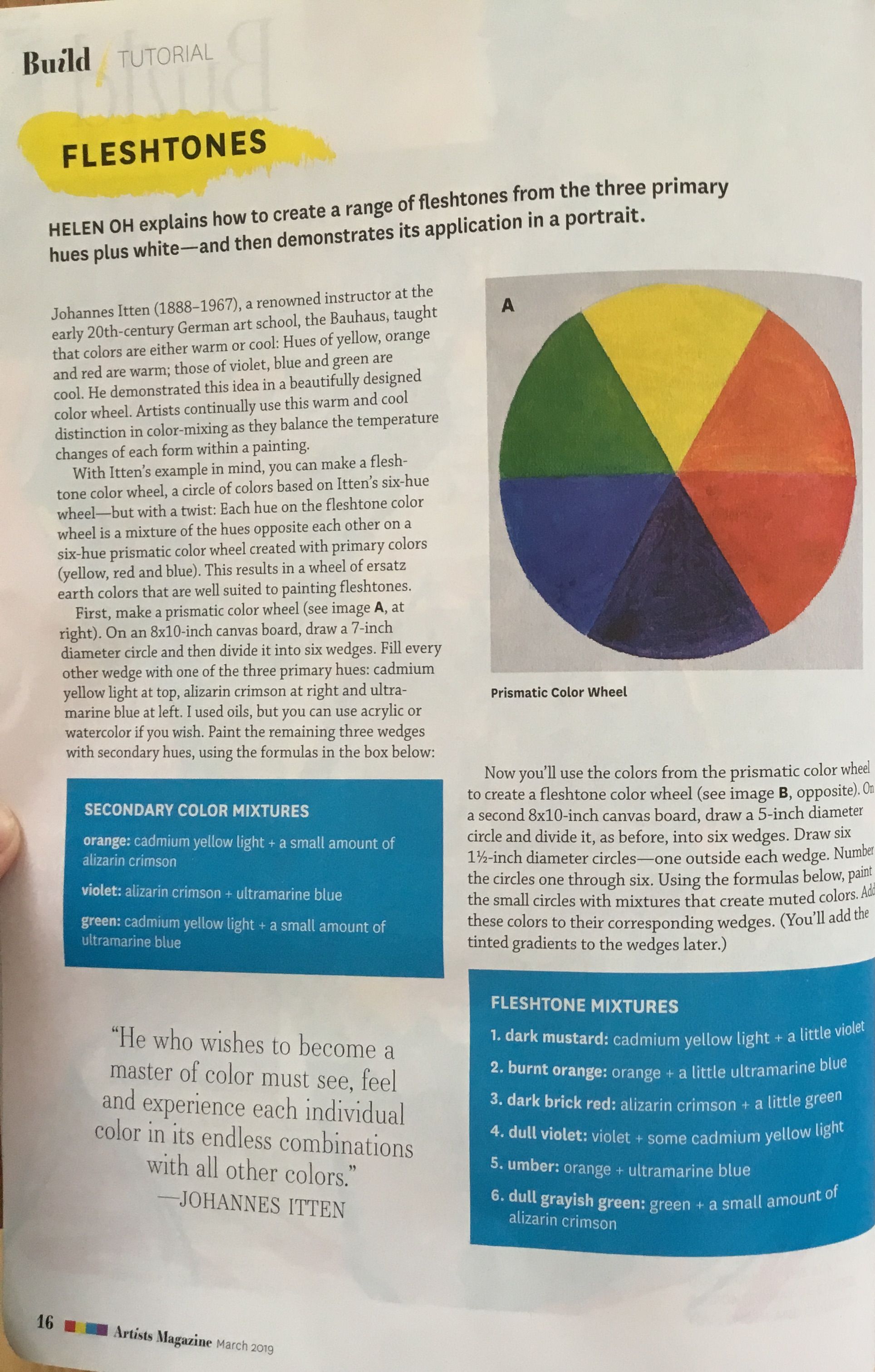
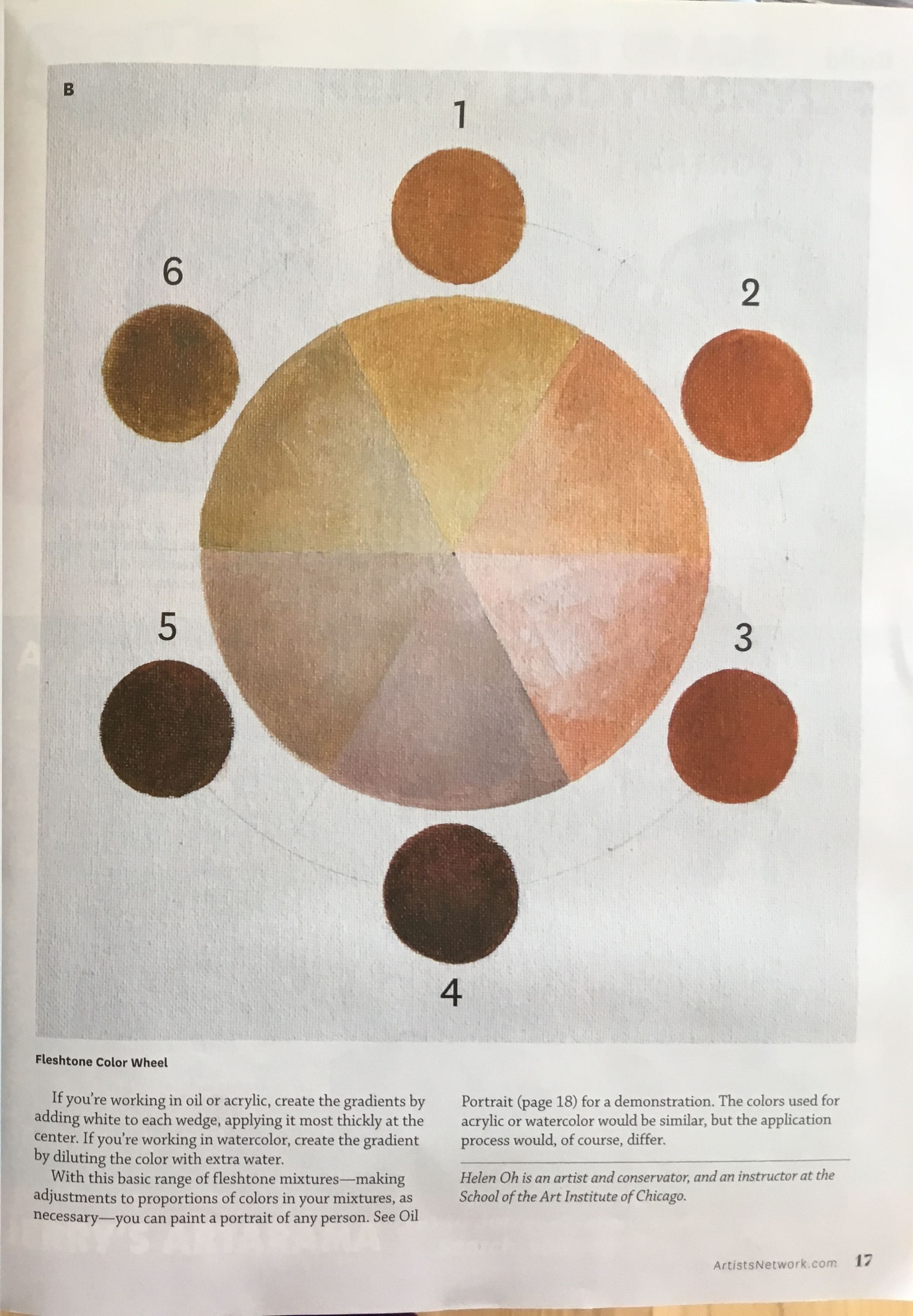
Since you'd be painting it in real media (btw, oils or gouache?) I'd suggest you to create a fleshtone color wheel. It's like a regular color wheel with primaries+secondaries but with premixed complementary pairs. For example, at the place of yellow you'd have dark mustard: cad yell + a bit of violet, at the place of regular violet color you'd have dull violet: violet + some of cad yell. Surprisingly, this method creates a variety of harmonized colors.
Hope, I described it more or less understandable, if not feel free to ask.
Posts: 485
Threads: 2
Joined: Feb 2017
Reputation:
5
(04-18-2019, 07:07 AM)roanna Wrote: Great work you've done, I also prefer the 4th thumbnail. My only advice would be to make hair and skin a bit less saturated right now they are both too bright and seem to be unnatural. Generally, human skin doesn't have a lot of saturated colors, but receives huge amount of reflection from the surroundings. So, it's better to paint grey-ish but with variety of colors.
Since you'd be painting it in real media (btw, oils or gouache?) I'd suggest you to create a fleshtone color wheel. It's like a regular color wheel with primaries+secondaries but with premixed complementary pairs. For example, at the place of yellow you'd have dark mustard: cad yell + a bit of violet, at the place of regular violet color you'd have dull violet: violet + some of cad yell. Surprisingly, this method creates a variety of harmonized colors.
Hope, I described it more or less understandable, if not feel free to ask.
Thanks Roanna that's the one i ended up going with. Thanks for the imput her skin did feel abit off to me but I wasn't really sure how to fix it, it's been ages since I've painted skin so I'm rather rusty.
Going to be painting with oils, starting with a burnt umber pick out and then aplying colour on top. I think Iget what you mean regarding the "skin colour wheel", is it like the colour wheels James Gurney does in his book (Imaginative Realism I think) when he is trying to harmonize his colours? I'll definitely give it a go using my limited pallette once I've done the pick out stage.
Posts: 485
Threads: 2
Joined: Feb 2017
Reputation:
5
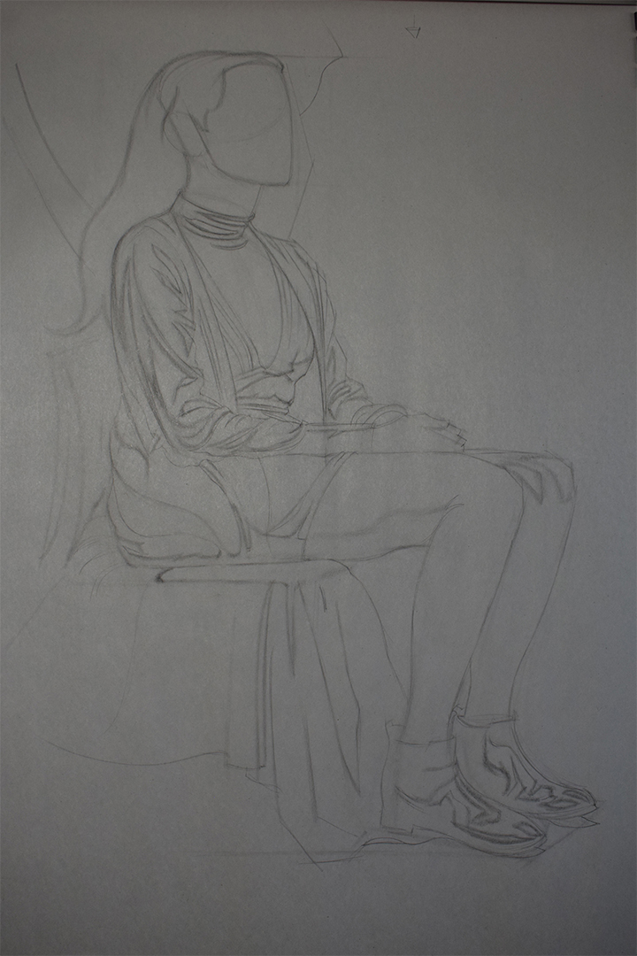
Life work from the past 2 weeks. Been sorting my room out so only have 1 of my lights in use atm so the pictures aren't the best. Need to start using my tripod as I feel like my pictures are slightly distorted and cock eyed.
Portrait Class
Been doing really shit the last few weeks when drawing portraits almost as if I've gone back in my progress. Not sure if I'm just burnt out from doing them or what but I've decided to take a break from heads for abit anyway. Decided to instead work on drapery since the models are clothed, going to re watch Erik's drapery videos since I'm rather rusty.
Life Class
Usual 3/10 min poses. Going to really dive into quicksketch when this coming term starts as I really want to get good at it.

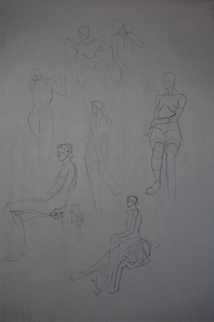
For the 40 min poses I've mostly been working on the overal "envelope shape" of the figure. Still measuring just not as much careful measuring as I'm used to doing and more measuring with my eye and working on that. (as you can tell by the realllly long legs on my clothed figure). Also been struggling with my 2 value block in from life, think I'm scared/un trusting of really squinting and getting that strong 2 value read as I'm also mapping the mid-tones as a seperate mapping when really I should be combining it with the shadows. Gonna force myself next time to squint hard and trust in what I see.
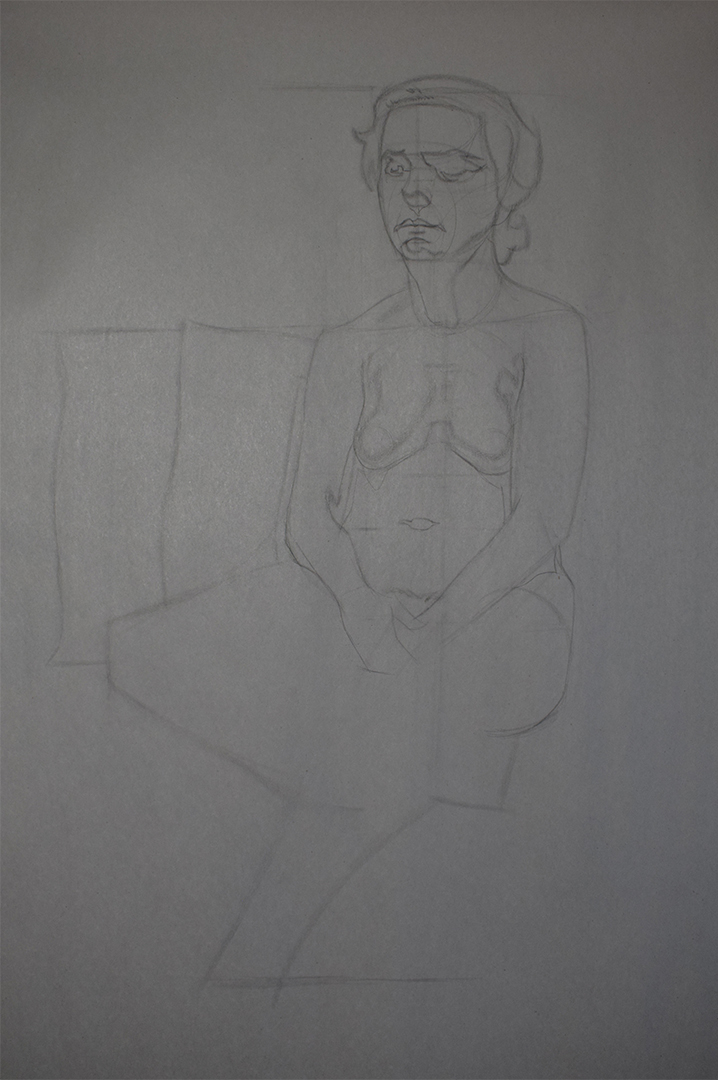
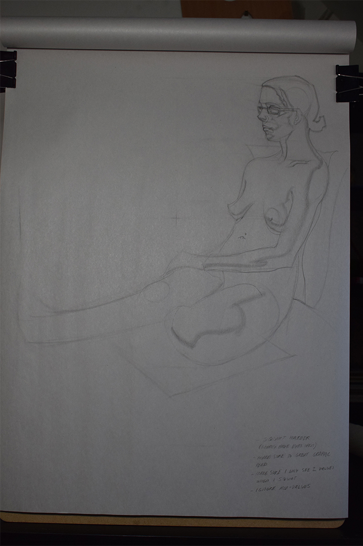
Illustration
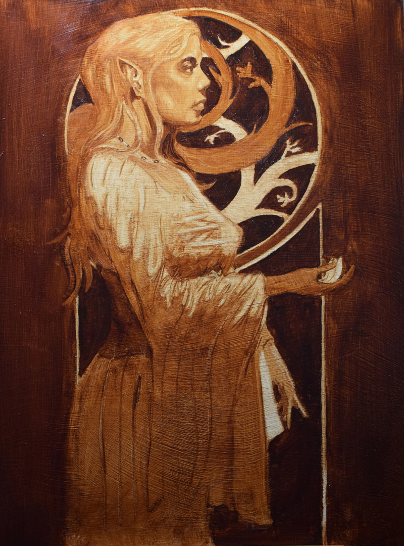
Transfered my drawing to my masonite board and fixed it. Going to start painting it tomorrow and do a burnt umber pick out to get my values correct and that should hopefully be dry by Monday so I can start applying colour.
Going to attempt and "skin colour wheel" like Roanna suggested so might give myself abit more time to complte the painting, hopefully get it done by either Monday or Tuesday.
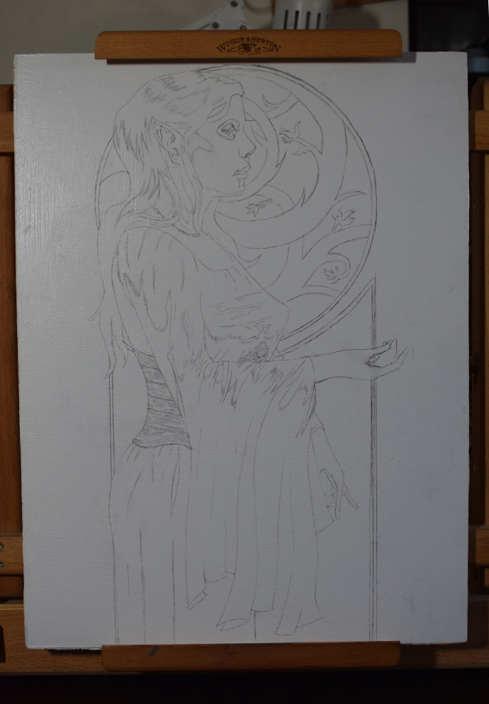
Posts: 374
Threads: 16
Joined: May 2013
Reputation:
59
Curious to see where the painting goes.
If you're concerned about the umber fully drying you could stiffen in and it should be more than dry in like 12 hours.
Will you be using the same pigments as the study? Generally it's a good practice to try and make your studies and final painting as similar in materials as possible while still being practical. If so, the palette seems a bit weirdly balanced, going super opaque with titanium white and cad yellow but then turning transparent. It could be a good idea to go for a palette that harmonises better, substituting the cad yellow for just an ochre.
If you're going to be using a transparent black mix you'll probably want to approach the painting from dark to light, being very conservative in your painting as you move forward. Because it's so small, it's going to be difficult getting the transparent darks to remain clean when working on it, any titanium or cadmium pigment practically destroying their depth.
If this was mine, I'd spend a lot of time thinking about how I'd be able to control the paint on that small of a scale. I'd maybe go for an absorbent ground just to keep things steady with all the fine details. I'd probably add a lot of marble dust or any other coarse material to the ground to give it a mild sandpaper like tooth. Maybe using a resin in the paint, like copal, mastic or damar, would help keep it from gliding too much. It really depends on your personal technique but it is worth contemplating how to keep it from becoming one big slip and slide.
Anyway, good luck and godspeed
Discord - JetJaguar#8954
Posts: 485
Threads: 2
Joined: Feb 2017
Reputation:
5
(04-21-2019, 08:09 AM)Tristan Berndt Wrote: Curious to see where the painting goes.
If you're concerned about the umber fully drying you could stiffen in and it should be more than dry in like 12 hours.
Will you be using the same pigments as the study? Generally it's a good practice to try and make your studies and final painting as similar in materials as possible while still being practical. If so, the palette seems a bit weirdly balanced, going super opaque with titanium white and cad yellow but then turning transparent. It could be a good idea to go for a palette that harmonises better, substituting the cad yellow for just an ochre.
If you're going to be using a transparent black mix you'll probably want to approach the painting from dark to light, being very conservative in your painting as you move forward. Because it's so small, it's going to be difficult getting the transparent darks to remain clean when working on it, any titanium or cadmium pigment practically destroying their depth.
If this was mine, I'd spend a lot of time thinking about how I'd be able to control the paint on that small of a scale. I'd maybe go for an absorbent ground just to keep things steady with all the fine details. I'd probably add a lot of marble dust or any other coarse material to the ground to give it a mild sandpaper like tooth. Maybe using a resin in the paint, like copal, mastic or damar, would help keep it from gliding too much. It really depends on your personal technique but it is worth contemplating how to keep it from becoming one big slip and slide.
Anyway, good luck and godspeed
Thanks for the input Tristan :)
Forgot to mention it in my last post but the panel is 30x40 cm, not massive but I'm guessing bigger than you thought (it looks tiny in the photo). Probably should of painted bigger but I had this panel ready to go.
Yes the pallette that I mentioned a few posts ago will be the one I'm using which was my intention from the start for the same reasons you mentioned haha. Don't know a whole lot about colour apart from the basics or how to choose a good pallette, I've been reading bits of Gurney's books again to help and want to dive back into plein air painting but apart from that I'm not really sure where else to learn about colour. I'll definitely switch out my cad yellow for yellow ochre though!
Haven't even heard about some of those materials you've mentioned  Been watching the painting videos on the Watts Online programme but they don't really use awhole lot of extra materials apart from clove oil and gamsol. Won't have time to use any of those materials in this painting but I will read up on them. If you have any useful links or reccomendations for learning more about colour and different painting materials I'm all ears! :)
Posts: 77
Threads: 1
Joined: Sep 2018
Reputation:
9
Posts: 485
Threads: 2
Joined: Feb 2017
Reputation:
5
Roanna - Thanks for rmeinding me about that! completely forgot to fix it in the drawing phase. tried correcting it in the underpainting but I can always re-work it some more whne I start applying colour.
Progress on the painting. Worked all day yesterday trying to get the burnt umber pick out complete as I feared it would dry overnight (and I was right). Thought this stage would be alot easier than it actually was as I had my value/colour comp as an aid I thought it would be fairly simple.......but I was wrong.
Kept re-working areas as I was having a hard time getting it right (especially the face) and as I feared the paint was drying completely as I progressed so had to rush in the evening to paint her dress which I'm not happy with but I will see if I can fix it when I start adding colour.
I was referring back to Jeff's handouts for the burnt umber pick out and compared to mine he had what appeared to be a much darker inital stain of colour and even though I let the paint set for a good 30 mins the paint seeemd to move around alot more than in his. I was using bristle brushes (filberts) at first but quickly started using my synthetics to blend better.
I used the same procedure as Jeff so maybe I thinned my paint down too much compared to him, used a couple of drops of refined linseed oil aswell to see if that would slow the drying time more but didn't make much of a difference. Apprantly people inline have said that burnt umber dries quicker anyway so perhaps it was a mix of the paint itself and me thinning the paint too much aswell as taking all day.
Photos aren't the best quality wise but didn't realise until now (sorry!) and the border behind her is straight even though it looks wonky in the photo, every photo I take turns out cock-eyed for some reason....
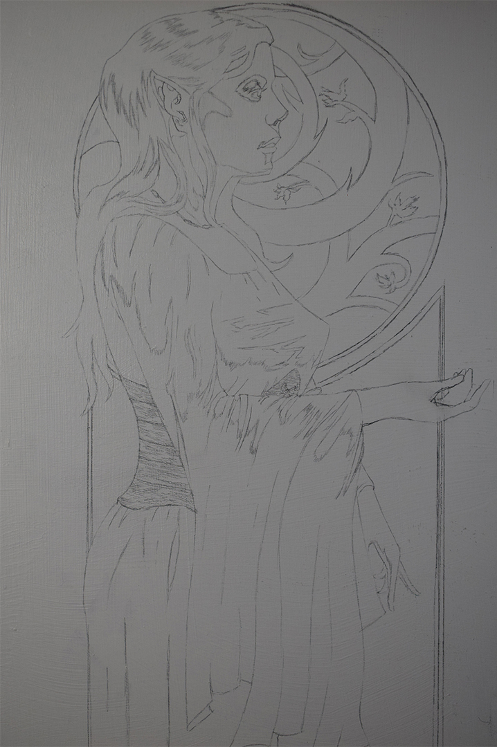
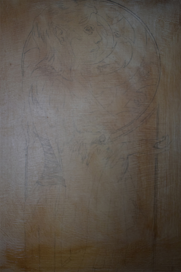
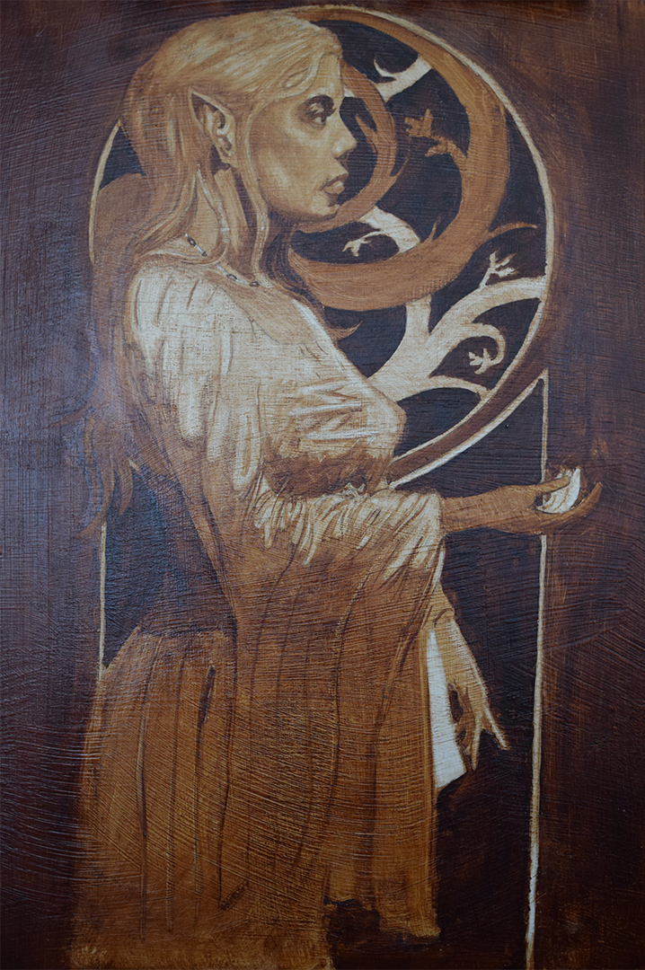
Taking today off as my arm was absolutely killing me yesterday after I had finished (think I've strained my elbow) and is still sore today so hopefully I should be fine tomorrow to continue. Think I'm gonna take it slow and tackle one area of the painting at a time rather than the whole thing since I thought I would be quicker than this so might spread it out over a few days.
Once this is complete I'm gonna do a few tests on a piece of masonite board and test the drying time of oil paint thinned with gamsol compared to using mediums such as linseed oil and clove oil for future reference. Apologies for the rambling but I wanted to make some clear and precise notes as this is fresh in my mind.
Posts: 77
Threads: 1
Joined: Sep 2018
Reputation:
9
I dunno what to critique about, for me in looks stunning! I've never ever tried oils, although I have 4 basic tubes of paint and surface, but for me it's soooo intimidating, that's why I'm so excited to see your progress.
For me it looks great, ear is gorgeously modeled, maybe you should add a tiny bit of nose bottom. The nasal spine and septum is missing (actually I don't know a lot of anatomy titles, I'm just so lazy to search refs and pointing them out with red arrows).
See, septum is a biiiiiit lower than the nostrils and aka wings?
![[Image: c9d42f30350e915eddb55a6c2a8f491f.jpg]](https://i.pinimg.com/originals/c9/d4/2f/c9d42f30350e915eddb55a6c2a8f491f.jpg)
![[Image: minor-planes-of-the-ball.jpg]](https://www.proko.com/wp-content/uploads/2016/08/minor-planes-of-the-ball.jpg)
Also, you've asked me about color wheel. The thing I was talking about is at page 74-75 at Color and Light, but to be even more precise I was referring to Johannes Itten color wheel
![[Image: a3eef595523e5823b956159fd1ce42ff--johann...theory.jpg]](https://i.pinimg.com/474x/a3/ee/f5/a3eef595523e5823b956159fd1ce42ff--johannes-itten-color-theory.jpg)
It's a great exercise to do.
But let me just post here a photo from some magazine where you could read about "skin tone color wheel" (and again, sorry for not posting it earlier, I'm a lazy ass). And I'm terrible at expaining, so I hope that original article help you =)


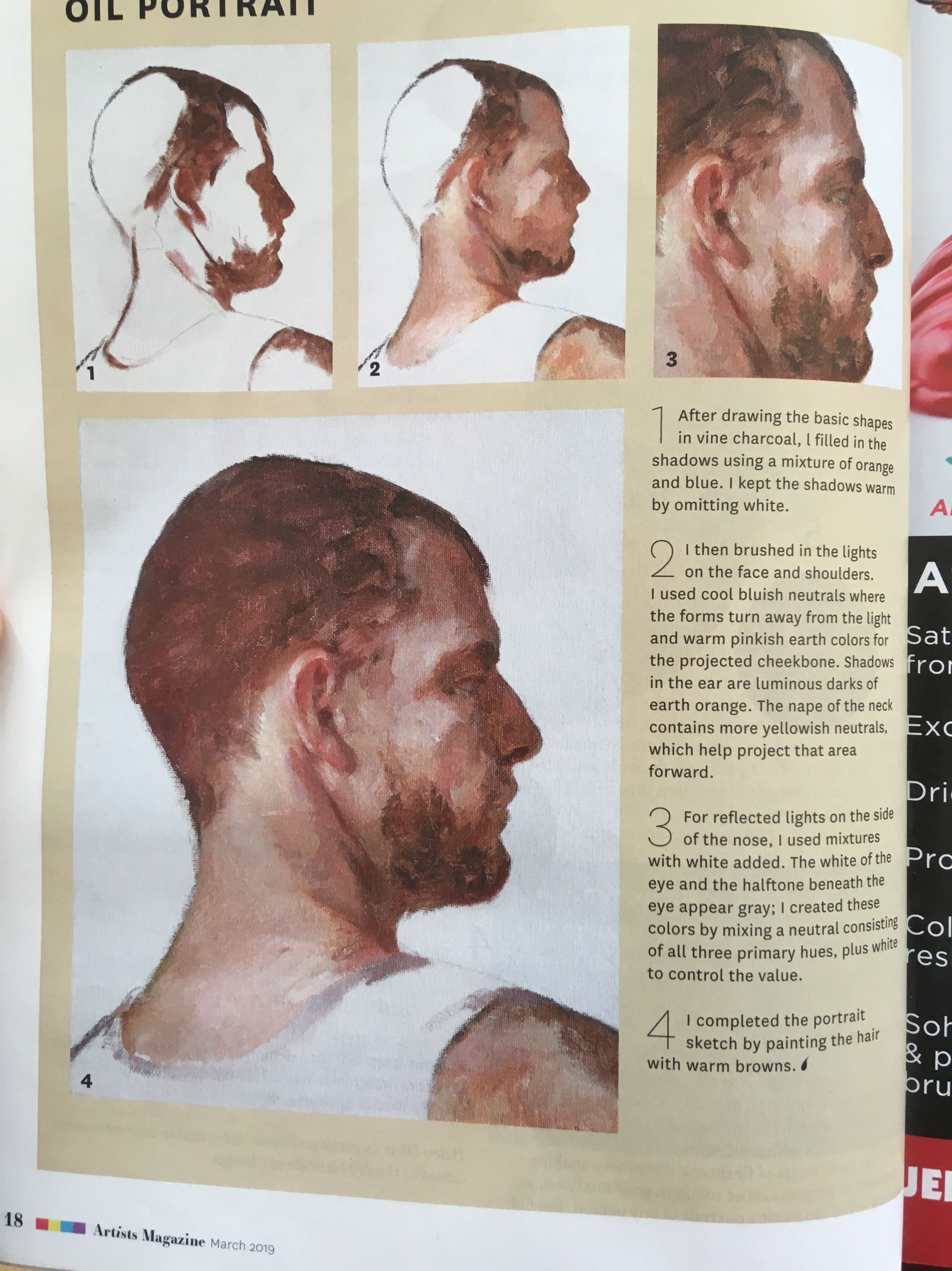
Posts: 2,817
Threads: 15
Joined: Jun 2013
Reputation:
109
looks good peter, i could see it hanging in a tavern or dimly lit bar, hands still too small bro
Posts: 374
Threads: 16
Joined: May 2013
Reputation:
59
You still have the drawing in place so there's not much harm done if you're not 100% happy with it, it's thin and easy to paint over.
Generally, the point of using umber in the beginning is because it dries super fast. It lets you paint over it the next day without trouble, if you're not into that you should avoid that pigment and use one with a longer drying time.
If you want to extend the drying time of your paints, I find poppy oil to be a good alternative. When I used it I used a mixture of 4 parts poppy and 1 part stand oil and it worked just fine. You don't want to use linseed oil to extend drying because that's the fastest drying oil. Walnut and poppy are the best alternatives. Clove oil is an antioxidant and it's debated if it's a good idea to use, I'd be careful with it. It's wasn't commonly used historically can may turn black with age.
My general recommendation is to learn how to work with the drying time rather than against it.
There are several reasons your paint may be moving around more. One big factor is your ground. It's really worth getting a bit of an absorbent acrylic ground and a nonabsorbent oil ground and comparing how the same paints move on them. There's also just the surface quality that can be different. Yours looks very shiny and if someone is working on a surface that feels like sandpaper, they're going to pick up the paint differently. Also, different umbers are different. Some of the cheaper ones mix in black pigment, other's mix in blue and a bunch of stuff. Most of them have too much oil in the tube but some have less than others, changing how opaque your marks will be so that can be a reason it's different.
You generally don't want to mix in linseed oil in this stage. This is supposed to be the leanest stage with the last amount of oil in it so if you wanted more fluid paint, solvents are your friend at the start but they speed up drying. Think of this stage as just setting up some context for what comes later, rendering, halftones and detail don't really matter much at this stage, big light and dark relationships do.
I don't know what type of painting you're into but because you're doing the watts stuff I'm guessing you're going for a more modern style. if so, you should probably experiment with meyer's medium. It's almost synonymous with modern alla prima painting and everyone from Schmid to Lipking uses it, Lipking literally drowns his paint in the stuff. It's a mix of 1 part damar, 1 part stand oil (sometimes linseed oil but it's best to use stand if you use a lot of the stuff) and 5 parts turpentine.
Think of it as a medium that can feel fluid, even wet on the brush but becomes tacky, feeling half dried in just a few minutes, allowing you to layer your alla prima painting quickly without having to worry about the paint mixing too much with what's bellow. It doesn't technically dry fast, just becomes so tacky it feels half dried (depending on how much you use). It also prevents your painting from sinking in and keeps the colors very vivid.
I don't use the stuff but it's very popular and if you wanted to experiment with interesting mediums, that's a fun one to start with. It has come to replace a lot of driers because of their harmful effects on some 19th century paintings. Bouguereau sometimes used a lot of driers that helped him quickly make very refined paintings but it caused some damaged to a few of his works. Mediums with damar seek to provide a similar effect although it's still brittle and that's why you mix it with stand oil and should still be careful with it.
50/50 linseed oil and turpentine is very common and was used a lot historically. I haven't used gamsol but I think it's like a refined mineral spirit, no? It's similar, just evaporates slower (and kills less brain cells) so you can use that instead of turps.
Also, synthetic brushes generally suck. Hog bristle brushes have a benefit over all other brushes in that the surface gets a mild texture. The hairs are so stiff that they often cut into the paint leaving a mildly rough surface. This can of course be worked over and smoothed but a benefit it has is that the next layer of paint, after it has all dried, has some texture to grip on to, picking up the paint better and providing much better adhesion. It's a good tool for multi-layered paintings.
You mentioned before that you wanted to learn more about materials. I usually recommend is Tad Spurgeon's book when it comes to fairly in-depth material talk. It's well researched and collects a lot of information from various sources, although some of his own ideas should be taken with a grain of salt. A lot of people recommend Meyer's book but I find it over-hyped and lacking in information you can actually use. You can learn a lot just by looking into certain artists you like and figure out how they do something, as well as a lot of experimentation is good. There are a lot of manuals out there from Solomon to Collier that somewhat cover materials and to be honest, you don't have to go much more complicated than what they outline. There are fun books like Schmid's Companion book that goes over his personal materials and techniques but they're not a "must have" unless you're interested in the artist specifically.
Learning about color mostly involves just looking at stuff and painting it. Most modern books on color are like 95% "yeah duh" information so there's not a lot of interesting stuff there. I think Harold Speed's book on painting does a fine job, also I think John Collier's manual has some good info in the second part. It's cliche but the interesting stuff just is learning about values, then just applying the same ideas to color.
Discord - JetJaguar#8954
Posts: 485
Threads: 2
Joined: Feb 2017
Reputation:
5
Roanna - Haha don't worry about not posting it sooner, I know everyone here is busy working on their own work. Thanks for images :) I'll give it ago today and see what flesh tones I can create with the palette I'm using I'm guessing I can achieve similar results? My colour mixing knowledge is not the best. p.s. didn't realize I made a mistake with her nose, I'll see if I can fix it, I just wish I didn't work on a larger board!
Fedodika - Thanks man :) I'll see what I can do with her hand is it just the outreached one or both?
Tristan - Thanks for such a detailed response! :) Wasn't aware that different colours have different drying times. I do like using burnt umber I just need to work on being able to paint faster.
I'm using a piece of hardboard which I've coated with gesso. I know you can sand it after each coat to get a smooth surface but I've been leaving my brush marks visible for some texture so that could also be a factor. I've got some more boards to prepare so I'll try a couple of smooth boards to compare. The surface doesn't look shiney in person, had a light next to my board when taking the pics so I'm guessing it's that.
I thought the purpose of this stage was to figure out your value relations to make it easier when it's time to add colour?
Kind of painting I like is James Gurney/Dean Cornwell type of work if that's of any help.
I thought the purpose of synthetic brushes was to blend your paint to create a smooth finish?
I was aware painting was more doing rather than reading, thought some colour theory books might go over things like how to create a good palette or what colours to generally use etc. I've got Speed's book but haven't read it in awhile so I'll have to dive back into it.
Again thanks for such a detailed response, you've given me alot to read up about and try. I want to get back into painting again and do alot of plein air work but work in gouache as Jeff says it's a good in-between between drawing and oil. Been reading Gurney's blog and he had some advice about getting started in plein air and just using a simple palette or blue,red and yellow with white so I'm thinking of sticking with that for awhile and work on my colour mixing.
Posts: 485
Threads: 2
Joined: Feb 2017
Reputation:
5
Spent Monday resting my arm which feels better now, did some reading mostly about painting. I was reading a Watts blog from Erik and Lucas and they went over their painting set up which was really basic. I do want to experiment with different materials and so on but moving forward with oil painting I want to stick to their set ups, just to get use to painting and as I progress start experimenting with materials. I don't want to overwhelm myself while I'm still learning to paint.
The Watts live sreaming classes are expanding on the number of classes they offer and want to start offering painting classes aswell which I'm really looking forward to, they didn't give a set date for those classes but hopefully it's soon as I really want to take them!
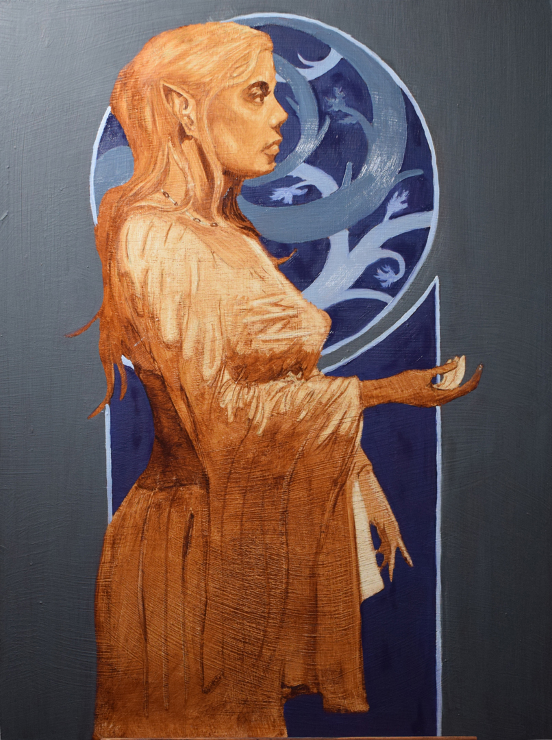
Progress on the painting. Took some better photos too :)


Started with my darks first which was the backgroun. Wanted to get the value relations right first so when I start working on my lights, which is mostly the figure, I have something to base it off. Redid the colours a few times as I either got the colour wrong (even though it looked correct on my palette) or got the value wrong.
Going to work on the "skin colour wheel" that roanna suggested, hopefully I can get her skin and hair done today and finish the body tomorrow, or I'll work out my colours for both today and paint the entire figure tomorrow and call it done.
|


 Been watching the painting videos on the Watts Online programme but they don't really use awhole lot of extra materials apart from clove oil and gamsol. Won't have time to use any of those materials in this painting but I will read up on them. If you have any useful links or reccomendations for learning more about colour and different painting materials I'm all ears! :)



![[Image: c9d42f30350e915eddb55a6c2a8f491f.jpg]](https://i.pinimg.com/originals/c9/d4/2f/c9d42f30350e915eddb55a6c2a8f491f.jpg)
![[Image: minor-planes-of-the-ball.jpg]](https://www.proko.com/wp-content/uploads/2016/08/minor-planes-of-the-ball.jpg)
![[Image: a3eef595523e5823b956159fd1ce42ff--johann...theory.jpg]](https://i.pinimg.com/474x/a3/ee/f5/a3eef595523e5823b956159fd1ce42ff--johannes-itten-color-theory.jpg)
