Posts: 414
Threads: 27
Joined: Jul 2013
Reputation:
8
Hey, guys! So I'm working on my thesis for my senior year of uni, and it is officially starting to drive me nuts. I would love some crit on my comic layout! I'm sketching each panel individually, scanning them in, putting them together and inking them in photoshop.
This is my first comic: a four-page comic about a plant witch. I only have the sketches for the first two pages, and the thumbs for the final pages. I'm mostly worried that the layout and story aren't actually too good or compelling, and I'm totally willing to adjust things to make it read better.
Note that these are very much WIPs, they're pretty rough.
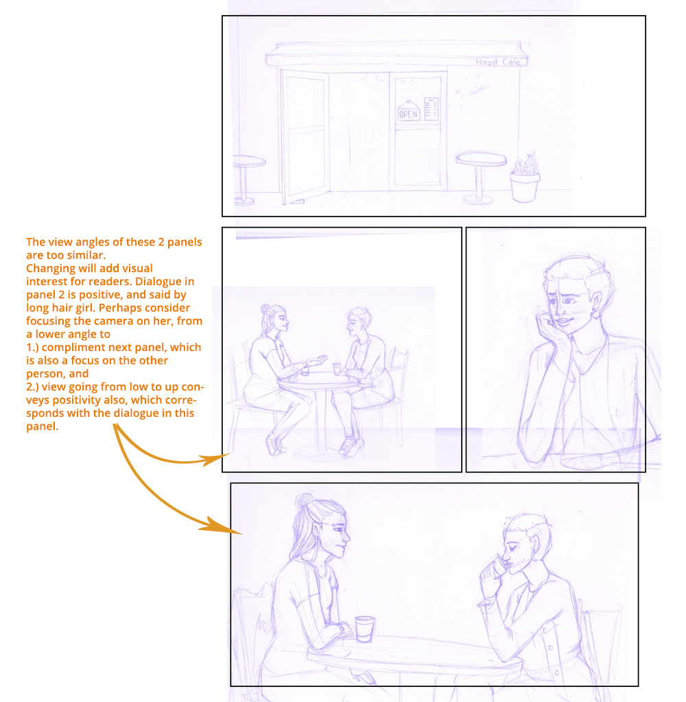
Page 1:
![[Image: page1wip_zpszvqoiab5.jpg]](http://i233.photobucket.com/albums/ee268/Charlie342/page1wip_zpszvqoiab5.jpg)
Dialogue: 1. "Please let me set you up with a blind date!"
2. "I don't know..."
3. "C'mon, what's the worst that could happen?"
4. "Do I really need to say?"
5. "You're always so pessimistic."
6. "Yeah..."
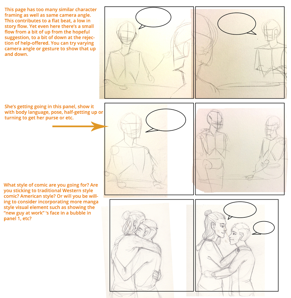
Page 2:
![[Image: page2wip_zps0s77de8w.jpg]](http://i233.photobucket.com/albums/ee268/Charlie342/page2wip_zps0s77de8w.jpg)
Panels 1 and 2 I'm still messing around with, but I want them to start leaving the cafe.
2. "You promise to tell me if you change your mind?"
3. "Sure."
I'm also starting to realize I sort of formatted this wrong, as I wanted to have a panel of the one character walk away in between panels four and five.
Pages 3 and 4:
![[Image: C12BA802-D6DA-4E24-9A47-6BAA1DB8B9F8_zpsy4vxjykq.jpg]](http://i233.photobucket.com/albums/ee268/Charlie342/C12BA802-D6DA-4E24-9A47-6BAA1DB8B9F8_zpsy4vxjykq.jpg)
Page 3 shows the MC leaving on her broomstick and being pensive. On page 4, she arrives home, revealing plants everywhere, hovering in the air thanks to magic. That bit of dialogue on the last panel is "Why would I need anyone when I have all of you?"
I'm a little worried that the comic is too generic and flat, but I can't think of how to fix it. I would love some help and crits, and I'll probably end up posting more here as the semester progresses.
Thanks sooo much for everything, guys!
Posts: 1,424
Threads: 12
Joined: Dec 2015
Reputation:
139
What a cool subject for a thesis Zombie :).
OK I have a few thoughts for you.
Story
As far as I understand it, the main character is under pressure to go on a blind date but she doesn't want to because she has a houseful of pet plants to keep her company.
If you want the big punch line as being the fact that she already has her plants for company, my suggestion would be to build a bit more pressure on her to go on the blind date. Here's a few ideas for you:
- Have her friend be a bit more forceful in pushing her into a blind date.
- Have her friend be curious about why she doesn't want to go on a blind date - this will set up a question in your reader's minds hopefully drawing them into the story.
- Make it more of a mystery as to why the MC won't go on a blind date by having her be evasive and mysterious e.g. "I don't need a partner, I have my ..." she leaves us hanging in the air and doesn't finish the sentence.
Panel Layout
I'm a fan of keeping panel layouts simple like you have - it means your readers won't get thrown out of the story by having to work out which panel to read next. Your panels are also of a decent size in case you ever want this to be read on small screen mobile devices.
Whilst keeping the simple panel layout I think you could inject a bit more drama and dynamism by playing about with camera angles. For example, on Page 1 Panel 2 - instead of using a flat side on shot, try raising the camera a little and have a shot from slightly above looking down? Or even a shot from below looking up?
I also recommend the articles at ComixTribe for writing and layout out comics:
http://www.comixtribe.com/columns/bolts-...h-of-nuts/
That's all I got for now, please feel free to ignore, I'll post more if anything else occurs to me - hope this helps and good luck!
“Today, give a stranger one of your smiles. It might be the only sunshine he sees all day.” -- H. Jackson Brown Jr.
CD Sketchbook
Posts: 33
Threads: 4
Joined: Oct 2015
Reputation:
2
I agree with what Artloader said about having more dynamic or dramatic 'camera' angles. On the first page, panels 2 and 4 are essentially the same. Panel 2 could be an aerial view down on the cafe, zoomed out slightly, showing other tables, etc. The first panel is the 'establishing shot', the second panel could be a more specific establishing shot.
So far, page 2 is 6 identical panels, 4 of which you've drawn, are paired up, very very similar layouts within the 2 pairs. Think about how this would play out in a movie. If they are leaving, theyd ask for the check or something to start the action of leaving, then the next shot would be them stepping out of the door (the stepping out the door, being the more important element of that part of the story). So maybe the first panel of page 2, a small circle of them asking for the check (or whatever action that starts the process of leaving) then the rest of the panel is a new establishing shot of them stepping out of the cafe door. That could also be an aerial shot, based on your preference. That small circle might be enough to break up the current page layout of 6 identical panels.
Of course I'm interjecting my own preference here, but I hope it helps! Best of luck to you 
Posts: 671
Threads: 8
Joined: Feb 2016
Reputation:
113
Looking forward to see this have legs. It's too early for me at this stage to do a decent critique. Not sure how the entire story goes so withhold any changes I might have for panel pacing.
So on to the short crit:
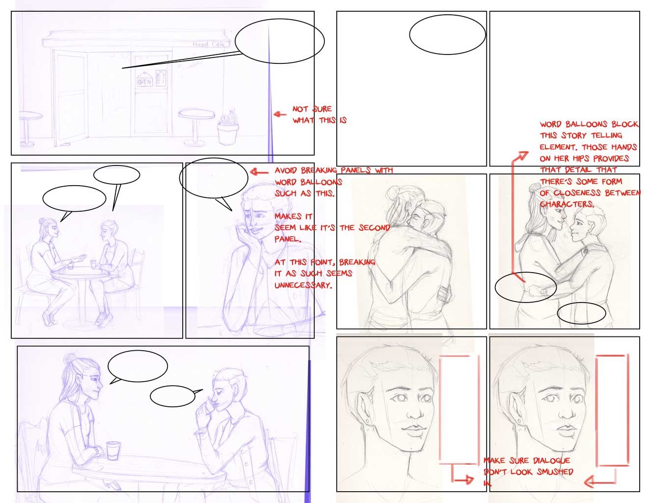
Edited:
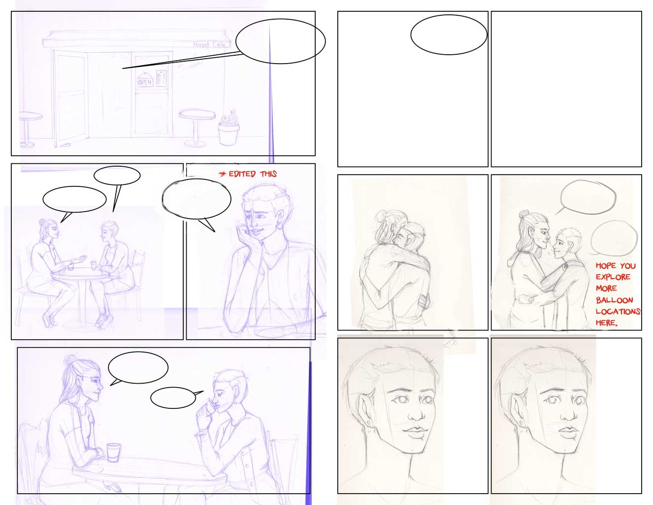
If you are reading this, I most likely just gave you a crappy crit! What I'm basically trying to say is, don't give up!
----
IG: @thatpuddinhead
Posts: 548
Threads: 6
Joined: Jul 2015
Reputation:
68
Graphic Novels are a visual medium, so essentially a person is more likely to be drawn into the story, no matter how ridiculous, so long as it reads well visually. Like really, I own comics that make less than 10% of an acceptable level of sense:
-
-
-
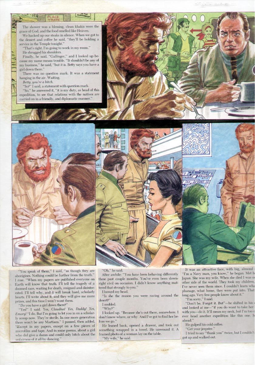
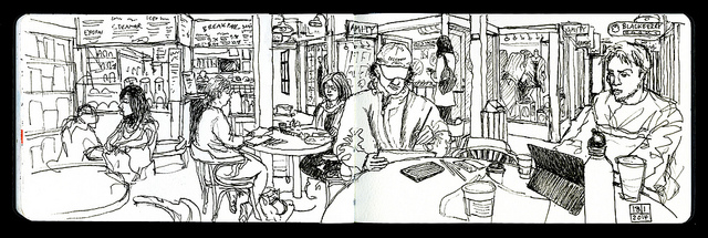
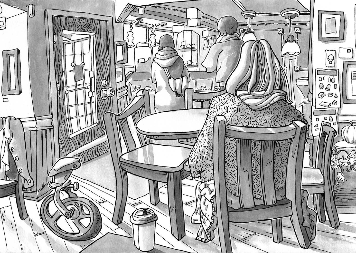
Having said that, I've an issue with how flat the scenes are. Too much like an observer. Good scene designs do more than just show the reader what's happening. The direction as proposed by the character's sight, speech and action should change depending on where you want the focus. Make it less so we are watching two people chat and more like the reader is almost there, sitting at their table:
-
-
-
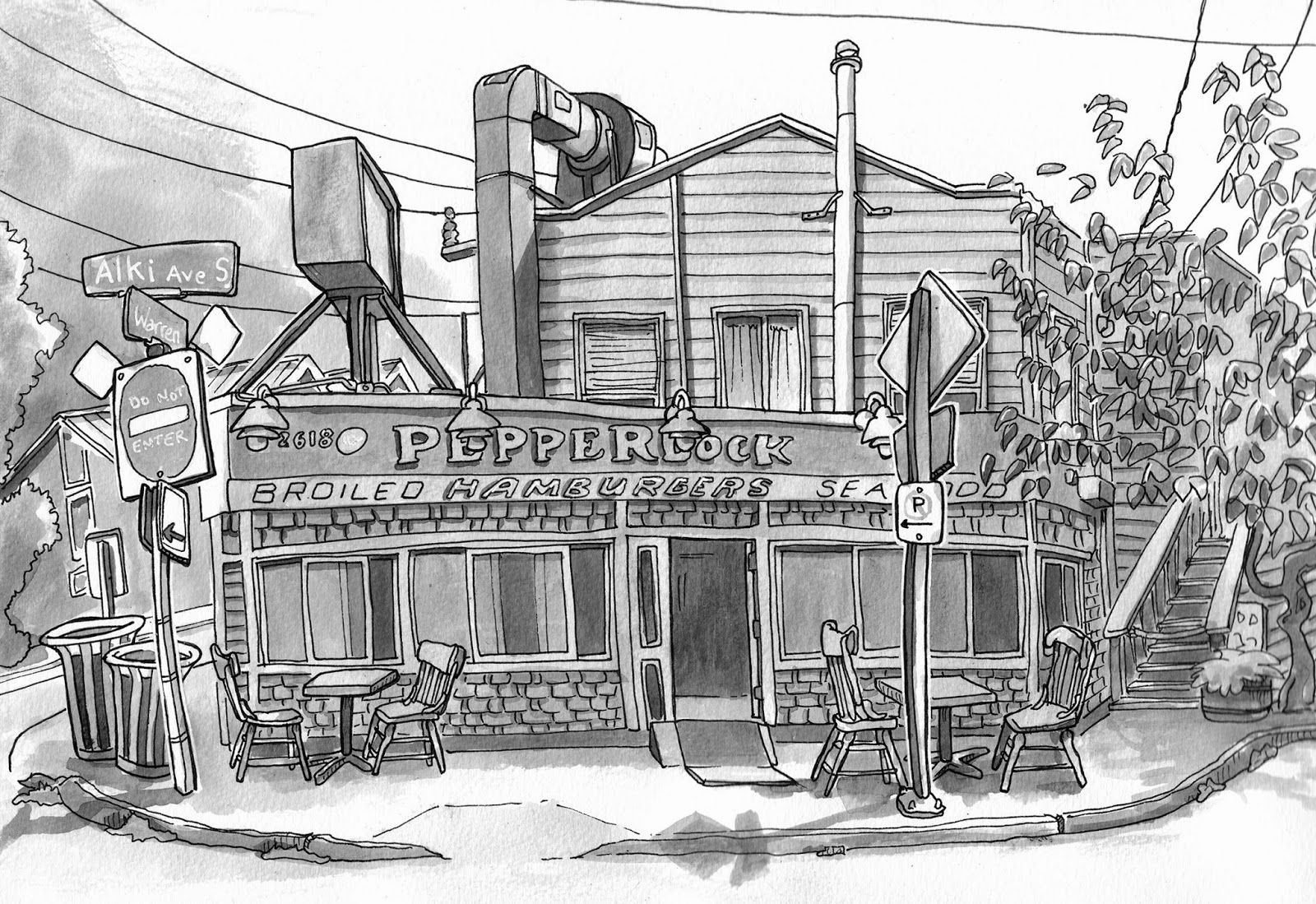
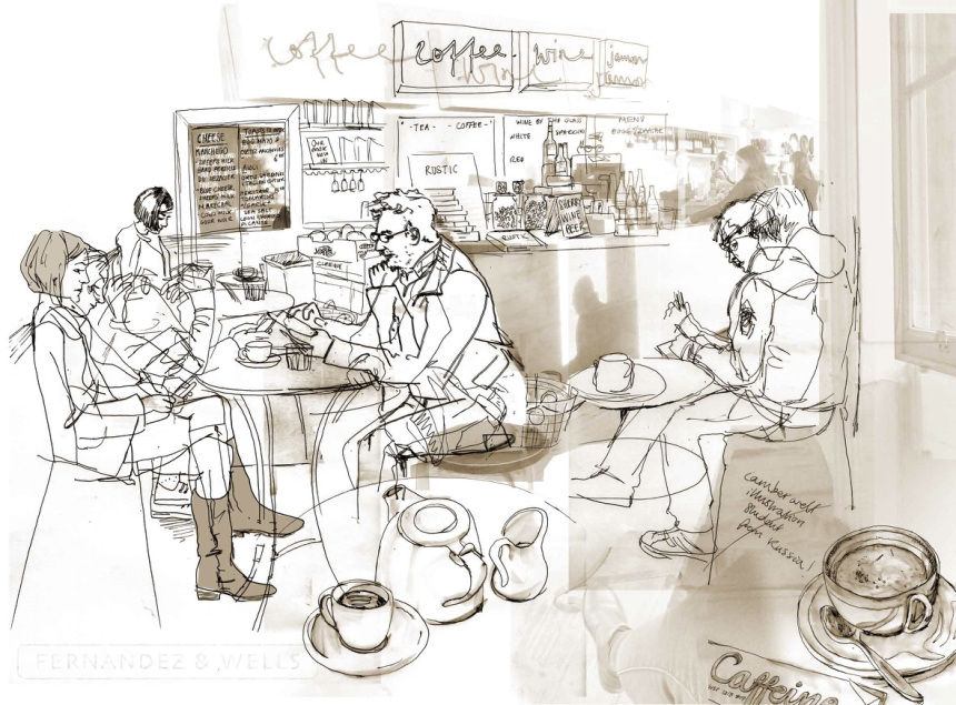
Your characters aren't the whole story. Take a special interest in filling out the world they exist in. Right now it's a very basic use of general symbols - a cafe front, a table, two friends chatting. I suggest looking up 'urban sketchers' for various places to draw inspiration from. Cafes, Subways, Shopping centers, Restaurants etc. Plenty of examples of an artist's representation of life to choose from. Or, you know, go out and find your own, no pressure:
-
-
-
It all depends on how you want to approach the project as well as how you want it to be in the end. You need to be asking yourself questions about your own work as you do it. What is this character doing? Where are they looking? Are they speaking to someone? Where are the situated? Questions questions. Your answers are the building blocks for your work. So have fun and keep building.
Posts: 414
Threads: 27
Joined: Jul 2013
Reputation:
8
Thank you so much to everyone for the thoughtful, awesome responses! I worked on the script and layout of the first two pages some today.
Artloader- Thanks for the tips! I've been wrestling with the script internally for a while, I think because I was aware of how boring it was, and you definitely helped me add some life to it. I haven't gotten around to playing with camera angles in page 1 quite yet (ahh, perspective?!), but I certainly plan on it!
Admbrns- Cool, thanks for the insight! Like I mentioned to artloader, I definitely plan on playing around with camera angles, I want to try it out over the next days but I'm so bad at perspective, I'm quite nervous. And thanks for pointing out the monotony of the panels on page 2, I think I mixed it up a little for the better.
John- Yooo, thanks for the paintovers, man! Your insight is very appreciated, I took most of your advice (some things you mentioned where not intentional decisions that I intended on keeping in, but I appreciate it all the same).
RottenPocket- Hey, thanks for the example images! The second group of images especially are super nice. I took your advice and attempted to add more life to the scenes, although right now all I have is the loose sketches.
Okay, so here are pages 1 and 2 again:
![[Image: page1wip2_zpsu5i8vpxn.jpg]](http://i233.photobucket.com/albums/ee268/Charlie342/page1wip2_zpsu5i8vpxn.jpg)
I didn't really change the dialogue for this page, but I'll add it here (may be confusing since I forgot to add the bubbles, woops!):
1. "Please let me set you up with a blind date!"
2. "I don't know..."
3. "C'mon, what's the worst that could happen?"
4. "Do I really need to say?"
5. "You're always so pessimistic."
6. "Yeah..."
![[Image: page2wip2_zpsmupc1ac4.jpg]](http://i233.photobucket.com/albums/ee268/Charlie342/page2wip2_zpsmupc1ac4.jpg)
Page 2 shows some more dialogue happening.
1) *Character 1* There's a new guy at work, he's nice, you would love him!
2) *Character 2* I don't need a partner, I'm happy with...what I have...
3) *Ch 1* Sigh... Well, I should get going. My shift starts soon.
4) *Ch 2* Yeah, I should go home.
5) *Ch 1* Promise you'll call me if you change your mind?
6) *Ch2* ...Sure.
Panel 4 shows the two of them standing, putting their coats on, and leaving a tip at the table. I want to get pages 3 and 4 sketched out by the end of this week, and hopefully have more polished panels drawn out, too.
I'd still appreciate any insight from anyone, and I'll probably continue to add more stuff here over the next few weeks, along with possibly the next comic I work on as well? Either that or I'll make a new thread for the new comic, but that won't be quite yet.
Thanks again to everyone!
Posts: 671
Threads: 8
Joined: Feb 2016
Reputation:
113
Quote: I definitely plan on playing around with camera angles, I want to try it out over the next days but I'm so bad at perspective, I'm quite nervous
Props for going at it. Seriously. Never be afraid to provide something that is essential to the storytelling. There are a lot of things perspective can tell to a reader, don't rob yourself of that opportunity. There's a saying the art should always serve the story and not the other way around.
About being conscious that the art is going to look bad, I think Jason Latour sums it up with this:
![[Image: tumblr_oj0zyeuOq51vto8c7o1_1280.png]](https://68.media.tumblr.com/b8dbfe51032b59e0947f487c35a0dcc8/tumblr_oj0zyeuOq51vto8c7o1_1280.png)
If you are reading this, I most likely just gave you a crappy crit! What I'm basically trying to say is, don't give up!
----
IG: @thatpuddinhead
Posts: 905
Threads: 39
Joined: Sep 2013
Reputation:
51
Posts: 414
Threads: 27
Joined: Jul 2013
Reputation:
8
John- Thanks again! I've been wanting/attempting to tackle perspective for a few years now, it's just really painful because I don't enjoy it, haha. But I certainly don't want to avoid drawing it my whole life, so I need to know how to at least make it look decent! And thanks for that quote, it's actually pretty inspiring.
Meat- Thanks for the paint overs! Definitely took your pointers into consideration.
Okay, pages 1 and 2 I'm fairly happy with. Goal for this week before classes start on Tuesday is to get the sketches all completed. Fingers crossed!
![[Image: page1wip4_zpsalc8sbkc.jpg]](http://i233.photobucket.com/albums/ee268/Charlie342/page1wip4_zpsalc8sbkc.jpg)
![[Image: page2wip3_zpsdif6euis.jpg]](http://i233.photobucket.com/albums/ee268/Charlie342/page2wip3_zpsdif6euis.jpg)
Posts: 33
Threads: 4
Joined: Oct 2015
Reputation:
2
I love the direction you're going. You've made an improvement. One thing that jumped out at me on a second glance, is the 3rd panel of page 1, her forearm is about 25% longer than is should be. There are other smaller things, but they can be forgiven as a stylistic decision.
Posts: 414
Threads: 27
Joined: Jul 2013
Reputation:
8
Thanks, Admbrns! Yeah, that panel's been kind of bugging me, I just haven't gotten around to taking new reference and fixing it. I definitely will, though!
Here's my current page 3.
![[Image: page3wip_zpsodcze0xl.jpg]](http://i233.photobucket.com/albums/ee268/Charlie342/page3wip_zpsodcze0xl.jpg)
Not quite sure how I feel about the panels here. Should I add another one between panels 5 and 6 showing her kicking off the ground? I'm not quite sure how to show that, and I'm worried that the current panels are a little hard to read.
Posts: 414
Threads: 27
Joined: Jul 2013
Reputation:
8
Aaand page 4! I think I'm good on the perspective for the first panel, could someone tell me if it's off? Another thing I'm somewhat unsure of is whether I should somehow show magic around the plants to show them levitating? I'm just a little worried it isn't immediately obvious that they're magically levitating. But I think I'll tackle that issue when I start inking.
In the last panel, she's saying "Why would I need anyone when I have all of you?"
![[Image: page4wip_zpszrtepr10.jpg]](http://i233.photobucket.com/albums/ee268/Charlie342/page4wip_zpszrtepr10.jpg)
Then I think I have the idea for the second comic figured out...it'll take place in China, I think. The story so far follows a girl who keeps spying on this small house in the woods, where a weird woman lives. She eventually trips and hurts herself outside the house, and wakes up to find the woman watching over her, where her house is filled with all kinds of potions and odd ingredients. I haven't nailed it down quite yet, and will probably end up changing it. I also haven't done any sketches of them yet, so expect them eventually!
Posts: 12
Threads: 2
Joined: Jan 2017
Reputation:
0
I'm reluctant to critique on the one hand because I don't consider myself very knowledgeable yet from the technicalities of art standpoint, but on the other hand I do want to help. I do read a lot of comics, so I thought I'd mention a couple of things.
I love your concept first off. I think it has a lot of potential. Second off, I thought I'd mention something else about the word bubbles. Like someone else mentioned earlier, which is something I was going to bring up and it looks like you fixed, was that word bubbles usually don't extend beyond a certain panel unless the reader's eye is intentionally being directed through where the break is.
I also don't think I've seen word bubbles cut off horizontally against the sides of panels. I could be mistaken, but just to be sure I flipped through some of my comics, and it looks like if the word bubble is broken by a panel, it's almost always cut off against the top or bottom of the panel like this:
![[Image: break_zpsjgoyr9nd.jpg]](http://i839.photobucket.com/albums/zz311/Necryn/break_zpsjgoyr9nd.jpg)
Not saying it HAS to be done that way, but that seems to be the way it's done most often if a word bubble is cut off based on all the comics I read.
There's also a technique used to signify a pause between statements that's used in comics. A lot of comics do this with word bubbles:
![[Image: after_zpsj7rzzoba.jpg]](http://i839.photobucket.com/albums/zz311/Necryn/after_zpsj7rzzoba.jpg)
Though you should orchestrate it so that there would verbally be a pause between what's in the top and bottom parts of the bubble, I just wanted to be sure you knew that was an option if you needed more room for text and wanted to signify pauses in conversation between statements made by a single character. Sorry if you already knew that, I just noticed you weren't using the technique and thought it might be useful for adding a bit more to the conversation at the cafe.
May add more later if I think of more, hope that wasn't too obvious. Nervous about critiquing stuff because I'm not used to it, but I wanted to try to offer a little assistance where I could.
Posts: 12
Threads: 2
Joined: Jan 2017
Reputation:
0
Actually, on the word bubble cutoff thing, I just picked up one of my Marvel comics (I don't read much Marvel) and noticed that they did cut off against the side or corners sometimes, though in those cases it looked like there was a lot of dialogue in those panels. So maybe it's individual comic company guidelines or something done out of necessity when there are several word bubbles in an individual panel. Sorry, not trying to nitpick, it's just something weird I noticed and got curious about.
Posts: 1,424
Threads: 12
Joined: Dec 2015
Reputation:
139
Good to see you progressing with this Zombie :).
Just a couple more thoughts for you if I may.
On your page 3, she is leaving on her broomstick and being pensive - it's not clear to me why she is being pensive, even after seeing how the story ends - is this deliberate? Is it a mystery that you will reveal to us later on? If not you might need to help the reader understand the pensiveness a little more.
Also being pensive and taking off might not need to take up the whole of page 3. Please feel free to ignore this as an idea but how about just using 2 or 3 panels to show pensiveness and taking off and then use the second half of page 3 to show her approaching her house. Then you could use most of page 4 to tackle your fears about making it obvious that her plants are magical. Maybe use a couple of panels to show them levitating around her welcoming her home? Just a thought.
Keep it going though Zombie - good work so far :).
“Today, give a stranger one of your smiles. It might be the only sunshine he sees all day.” -- H. Jackson Brown Jr.
CD Sketchbook
Posts: 414
Threads: 27
Joined: Jul 2013
Reputation:
8
Posts: 414
Threads: 27
Joined: Jul 2013
Reputation:
8
Hey, everyone! It's been a long month since I've posted! I've been plugging along, working long hours on classes and thesis and everything in between. Spring break is in two weeks and my goal is to have the first two comics and paintings completed. I still have some lining for the first one, a few minor details in the painting, a few panels left to sketch in the second comic plus the lines, and finally the second painting to do. Fingers crossed I get it done, but it'll be a lot of work!
Here's the sketches I have so far for the second comic.
![[Image: page1%202-Recovered_zpsrv85p7jw.png]](http://i233.photobucket.com/albums/ee268/Charlie342/page1%202-Recovered_zpsrv85p7jw.png)
I plan on adding a hand to the second-to-last panel.
![[Image: page2%202-Recovered_zpsmbnkdqhp.png]](http://i233.photobucket.com/albums/ee268/Charlie342/page2%202-Recovered_zpsmbnkdqhp.png)
That blank panel is the witch reaching across the table to grab the cup.
![[Image: page3%201_zpsf1n4fmj3.png]](http://i233.photobucket.com/albums/ee268/Charlie342/page3%201_zpsf1n4fmj3.png)
At the bottom, I'm going to add them hugging and then the girl wiping away her tears while thanking the witch.
![[Image: page4%201_zpsjtxhhil6.png]](http://i233.photobucket.com/albums/ee268/Charlie342/page4%201_zpsjtxhhil6.png)
And finally, I'm thinking the panel on the left is the witch's hand, the next one is them holding hands, and finally them embracing and kissing.
Posts: 414
Threads: 27
Joined: Jul 2013
Reputation:
8
Finished pages 3 and 4! I took out the fifth and sixth panels on page 4, still not quite convinced it would without them.
![[Image: page3%201_zpsdigbeygj.png]](http://i233.photobucket.com/albums/ee268/Charlie342/page3%201_zpsdigbeygj.png)
![[Image: page4%201_zpshfzwwscb.png]](http://i233.photobucket.com/albums/ee268/Charlie342/page4%201_zpshfzwwscb.png)
Posts: 1,424
Threads: 12
Joined: Dec 2015
Reputation:
139
I like the emotional content here Zombie :).
Although it might help if you put a simple tail pointing to which character was speaking each of the bubbles - I'm having trouble working that out - also, I believe the girl on the right is the witch - is that right?
Keep on truckin!
“Today, give a stranger one of your smiles. It might be the only sunshine he sees all day.” -- H. Jackson Brown Jr.
CD Sketchbook
|
![[Image: page1wip_zpszvqoiab5.jpg]](http://i233.photobucket.com/albums/ee268/Charlie342/page1wip_zpszvqoiab5.jpg)
![[Image: page2wip_zps0s77de8w.jpg]](http://i233.photobucket.com/albums/ee268/Charlie342/page2wip_zps0s77de8w.jpg)
![[Image: C12BA802-D6DA-4E24-9A47-6BAA1DB8B9F8_zpsy4vxjykq.jpg]](http://i233.photobucket.com/albums/ee268/Charlie342/C12BA802-D6DA-4E24-9A47-6BAA1DB8B9F8_zpsy4vxjykq.jpg)


![[+] [+]](images/collapse_collapsed.png) Spoiler
Spoiler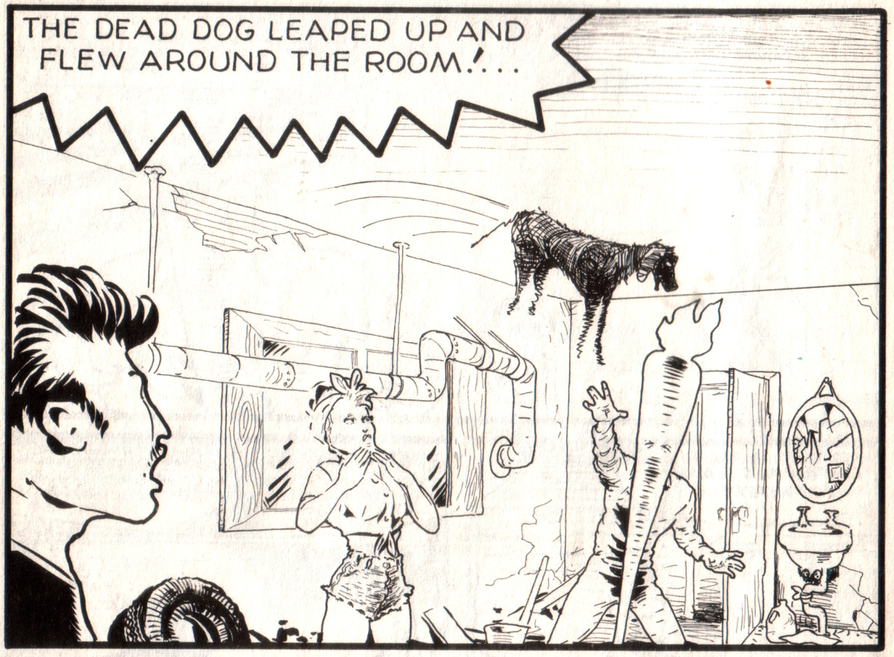
![[Image: page1wip2_zpsu5i8vpxn.jpg]](http://i233.photobucket.com/albums/ee268/Charlie342/page1wip2_zpsu5i8vpxn.jpg)
![[Image: page2wip2_zpsmupc1ac4.jpg]](http://i233.photobucket.com/albums/ee268/Charlie342/page2wip2_zpsmupc1ac4.jpg)
![[Image: tumblr_oj0zyeuOq51vto8c7o1_1280.png]](https://68.media.tumblr.com/b8dbfe51032b59e0947f487c35a0dcc8/tumblr_oj0zyeuOq51vto8c7o1_1280.png)

![[Image: page1wip4_zpsalc8sbkc.jpg]](http://i233.photobucket.com/albums/ee268/Charlie342/page1wip4_zpsalc8sbkc.jpg)
![[Image: page2wip3_zpsdif6euis.jpg]](http://i233.photobucket.com/albums/ee268/Charlie342/page2wip3_zpsdif6euis.jpg)
![[Image: page3wip_zpsodcze0xl.jpg]](http://i233.photobucket.com/albums/ee268/Charlie342/page3wip_zpsodcze0xl.jpg)
![[Image: page4wip_zpszrtepr10.jpg]](http://i233.photobucket.com/albums/ee268/Charlie342/page4wip_zpszrtepr10.jpg)
![[Image: break_zpsjgoyr9nd.jpg]](http://i839.photobucket.com/albums/zz311/Necryn/break_zpsjgoyr9nd.jpg)
![[Image: after_zpsj7rzzoba.jpg]](http://i839.photobucket.com/albums/zz311/Necryn/after_zpsj7rzzoba.jpg)
![[Image: page1bwip_zpsab9kjqai.png]](http://i233.photobucket.com/albums/ee268/Charlie342/page1bwip_zpsab9kjqai.png)
![[Image: page2wip4_zpssxk1kefc.png]](http://i233.photobucket.com/albums/ee268/Charlie342/page2wip4_zpssxk1kefc.png)
![[Image: page3wip2_zpsprpwf1mb.png]](http://i233.photobucket.com/albums/ee268/Charlie342/page3wip2_zpsprpwf1mb.png)
![[Image: page4wip2_zpsatzemtz1.png]](http://i233.photobucket.com/albums/ee268/Charlie342/page4wip2_zpsatzemtz1.png)
![[Image: 3C759027-8ED0-448D-A551-8A985D94E408_zpsrxu9xlre.jpg]](http://i233.photobucket.com/albums/ee268/Charlie342/3C759027-8ED0-448D-A551-8A985D94E408_zpsrxu9xlre.jpg)
![[Image: page1%202-Recovered_zpsrv85p7jw.png]](http://i233.photobucket.com/albums/ee268/Charlie342/page1%202-Recovered_zpsrv85p7jw.png)
![[Image: page2%202-Recovered_zpsmbnkdqhp.png]](http://i233.photobucket.com/albums/ee268/Charlie342/page2%202-Recovered_zpsmbnkdqhp.png)
![[Image: page3%201_zpsf1n4fmj3.png]](http://i233.photobucket.com/albums/ee268/Charlie342/page3%201_zpsf1n4fmj3.png)
![[Image: page4%201_zpsjtxhhil6.png]](http://i233.photobucket.com/albums/ee268/Charlie342/page4%201_zpsjtxhhil6.png)
![[Image: page3%201_zpsdigbeygj.png]](http://i233.photobucket.com/albums/ee268/Charlie342/page3%201_zpsdigbeygj.png)
![[Image: page4%201_zpshfzwwscb.png]](http://i233.photobucket.com/albums/ee268/Charlie342/page4%201_zpshfzwwscb.png)