04-24-2019, 10:27 AM
I think i found one of your other influence.Alex Negrea if you don't know him check him out.
|
Zodd Sketchbook
|
|
04-24-2019, 10:27 AM
I think i found one of your other influence.Alex Negrea if you don't know him check him out.
04-24-2019, 03:04 PM
04-24-2019, 03:08 PM
The only thing that doesn't seem to have the volume it should had is the eye because it should have an highlight.I also think you should practice the volume of the neck.Is mouth is a little bit to croocked in relation to her nose.The lips should follow perspective also.
04-24-2019, 06:37 PM
Hello Zodd, nice study here, love your lighting and balance between cool and warm colors! Did you do it from refs or imagination? What was your goals, what you tried to learn by doing this portrait? It's not just a simple curiosity, but also this'd help with constructive critique.
I'm sorry if I understand your intentions\stylistic choices\goals in wrong way. But here is my critique: you need to study Asaro head, draw it, turn it, paint it, draw and paint from memory until you not just memorize outlines, but memorize shapes and planes this outlines represents. You understand major forms (and this is great), but you get lost in middle and small ones. For example, your eyes are lacking 3D not because there is no highlight, but because they don't feel spherical: no eye lids with decent thickness covering\wrapping the eye. Although I see that you've done a great job shading a visible portion of an eye like a sphere, your shapes and forms are a bit off, you need to build a 3D effect with lines first and on top to add shading and color'll go last. But don't worry, I'm struggling with 3D in my works too XD, in my several last posts at the Sketchbook there is a discussion of this issue here. And the last word about highlights. Think of them as of sweet cherry on top of the chocolate cake, it adds attractiveness but it won't make a cake to taste better (especially if it's tasteless one). Form is revealed by shadows, make good drawings with shadow-to-light relations and you might not want to add any highlights. Also one good thing to know, that highlights happen when 4 or more planes meet in one spot (see convex and concave pyramids at the last image, sorry I can't find a better image. Oh, also this is a great page to look at the way author builds the eye). Fuf, hope all I wrote could help you, sorry if I sounded too nerdy or intimidating, no offence, just desire to help. Keep practicing and you'll make a fantastic art! ![[Image: 832227a2787e8215fc8092422daad792.jpg]](https://i.pinimg.com/originals/83/22/27/832227a2787e8215fc8092422daad792.jpg) ![[Image: plaster-davids-eye-1.jpg]](https://www.lavenderhillcolours.com/wp-content/uploads/2018/06/plaster-davids-eye-1.jpg) ![[Image: Osnovy_Risunka_017-500x500.jpg]](http://4-art.org/image/cache/data/books/Mogil_Draw/Russian_version/Osnovy_Risunka_017-500x500.jpg)
04-25-2019, 04:14 AM
(04-24-2019, 06:37 PM)roanna Wrote: Hello Zodd, nice study here, love your lighting and balance between cool and warm colors! Did you do it from refs or imagination? What was your goals, what you tried to learn by doing this portrait? It's not just a simple curiosity, but also this'd help with constructive critique.Thank you very much Roanna! <3 I just used one reference, i'll use more in the next ones x) I think i've lost myself on the process, trying to discover new techniques and forgot the other things hahaha
04-25-2019, 04:15 AM
(04-24-2019, 03:08 PM)darktiste Wrote: The only thing that doesn't seem to have the volume it should had is the eye because it should have an highlight.I also think you should practice the volume of the neck.Is mouth is a little bit to croocked in relation to her nose.The lips follow perspective also.Yeah, that's real! i forgot the specular highlights, i'll try to slow down my process
05-03-2019, 11:19 AM
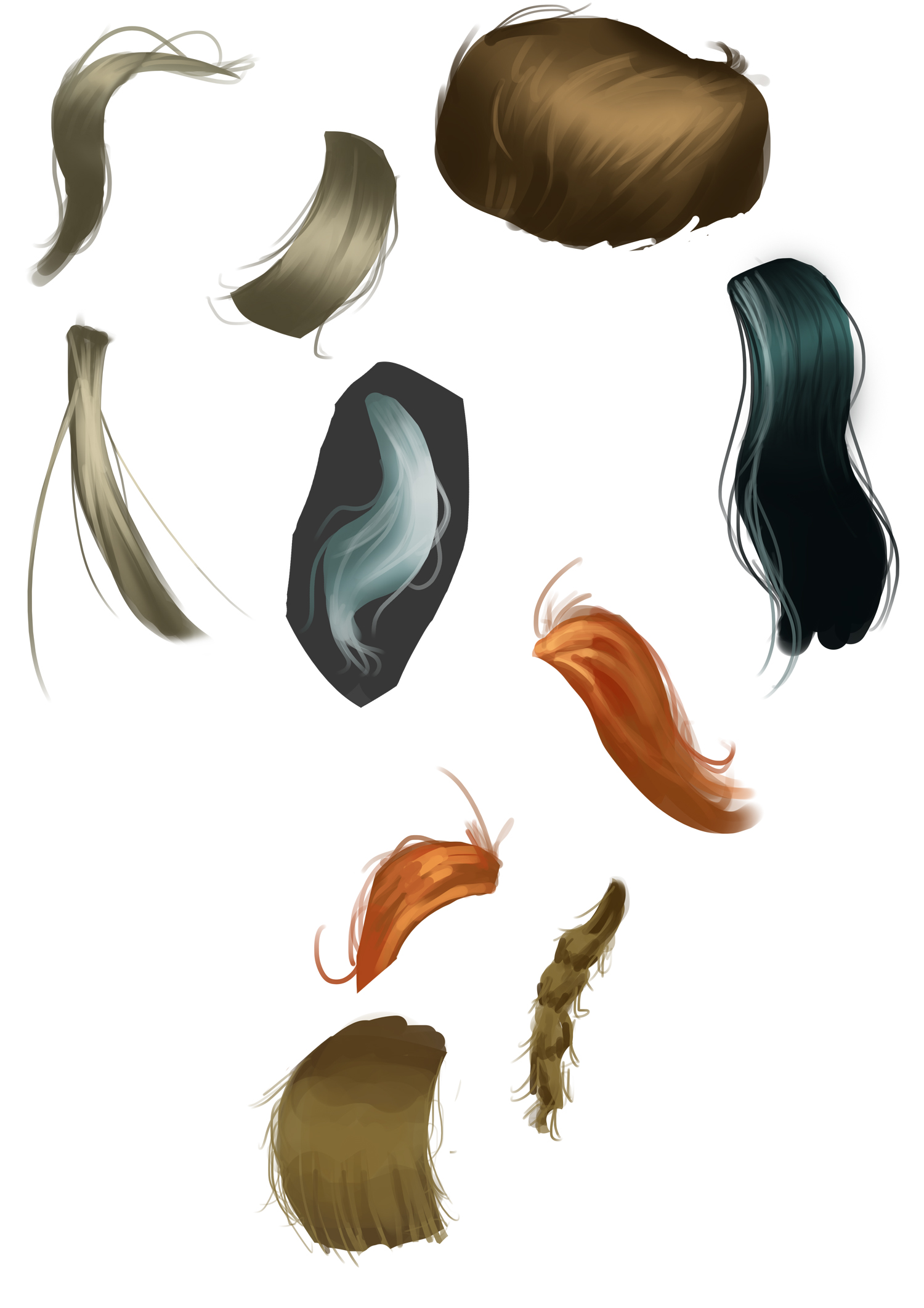
Long time guys LOL, here's a few studies for one illustration im working on:
05-03-2019, 01:50 PM
I suggest you try working in greyscale and work on the volume.It good to do both wigg construction and ribbon of hair.
05-04-2019, 01:25 AM
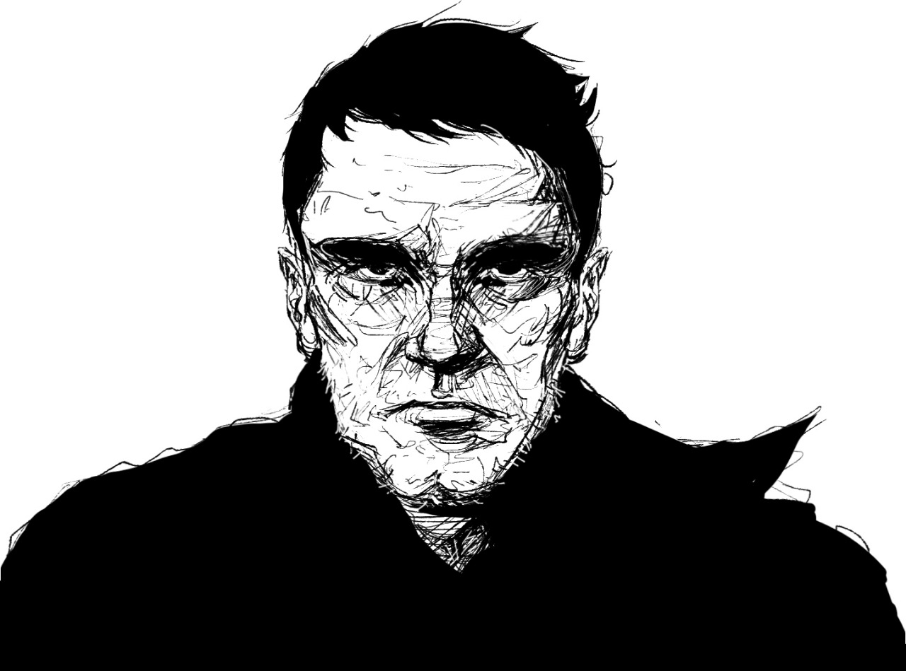
Sketch
05-04-2019, 09:43 AM
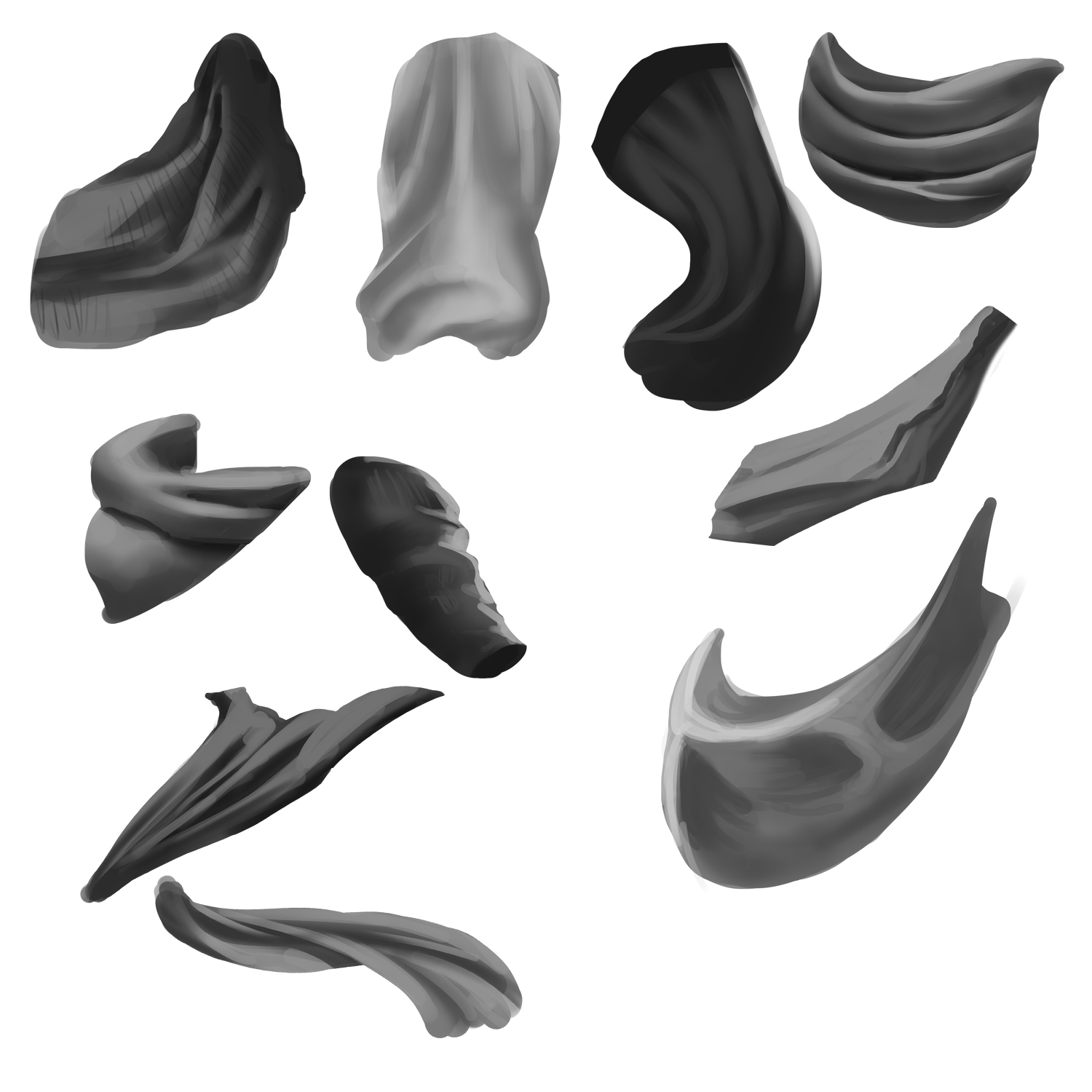
Drapery studies from references:
05-04-2019, 11:40 AM
05-05-2019, 11:53 PM
Wood material studies:

05-06-2019, 04:01 AM
Not so bad but i think it to similar to those drapery study in some way.I am not saying take a brush to do your texture but i advise to try to use a texture brush first and than try to emulate the texture with a round brush.Don't forget to use reference if you didn't next time.Do you work on photoshop?I might be able to send you a few brush if you want to try them out.Try to working on a grey background next time to avoid the flattening effect a white background give to the image to work on the volume. Also try to work on the silhouette of the shape so it doesn't contain none natural curve sorry i can't find any other way to explain it.
05-09-2019, 11:28 AM
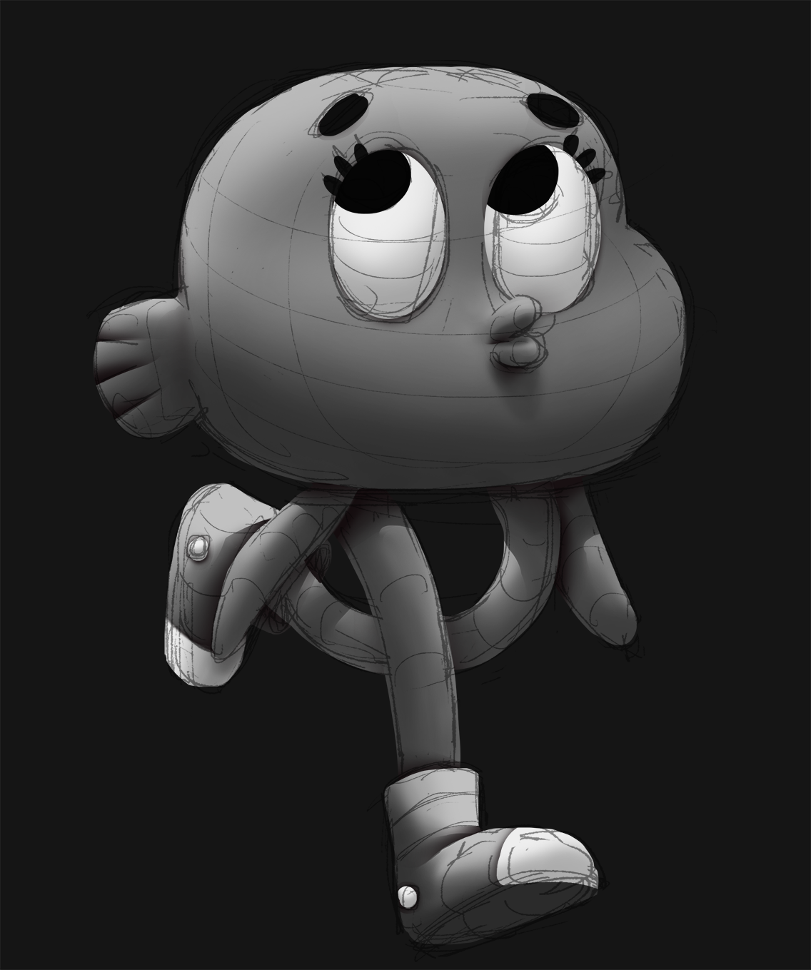
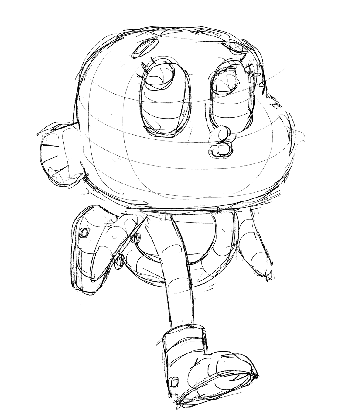
Darwin fanart and process from grayscale to colors (done in 2 hours)
05-14-2019, 03:50 AM
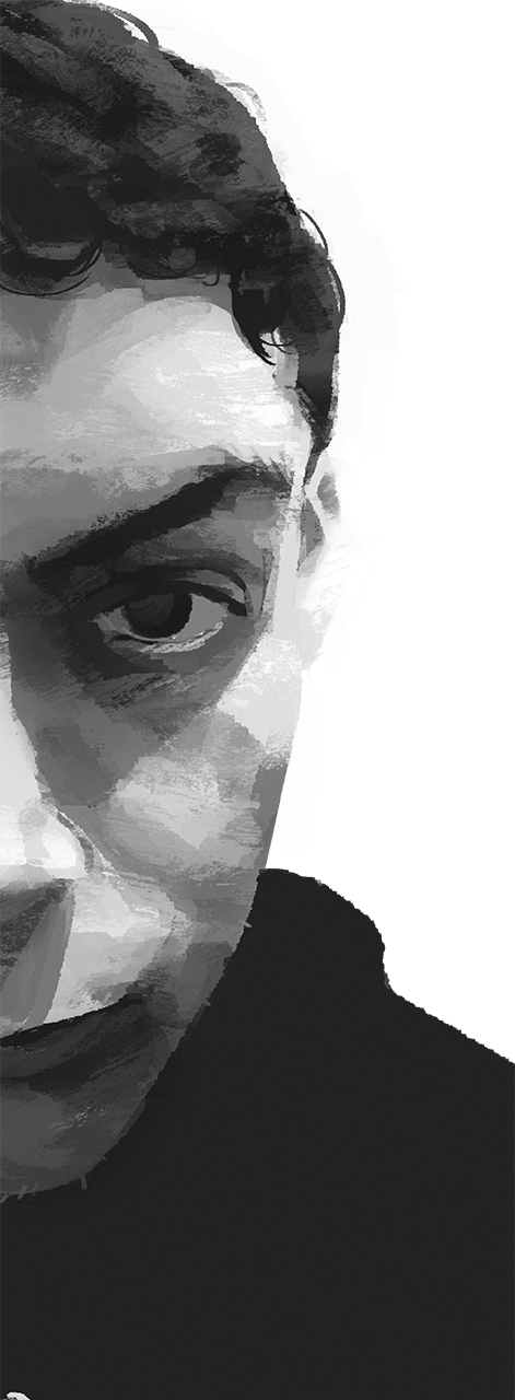
Self portrait using texture brush
05-20-2019, 08:53 AM
Quick sketches i did for the last episode of GOT
 
05-23-2019, 11:18 AM
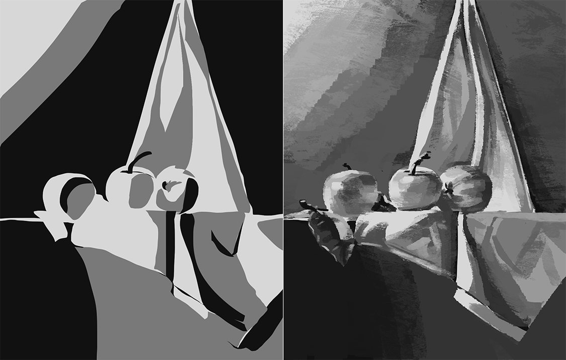
Still life, value simplification exercises (25-30 min each):
05-23-2019, 12:07 PM
Please post the refenrence when doing value study or there little to no use to showing them.One suggestion i have would be to check my sketchbook from page 14 to 16 i did some value study and i had many feed back maybe they can also benefit you.
05-23-2019, 01:42 PM
|
|
« Next Oldest | Next Newest »
|