Posts: 261
Threads: 7
Joined: Jan 2021
Reputation:
19
 02-24-2021, 02:09 AM
Hello everyone,
So I wanted to start my own sketchbook because really, I'm always on the hunt for feedback in order to improve. I like to set objectives for myself and frame them in time and aim to achieve them.
After being an English teacher for many years, I quit everything to dedicate myself to art. I saved up so I could survive for a while and then substitute teach to pay for food and rent when necessary.
* * *
I'll be sharing here for feedback and welcome any. Anything I could improve on. For feedback given, I'll set up objectives and try to fix whatever requires fixing.
I'm working on my own video game and I'm currently in the conceptualization phase. More specifically, I'm trying to design the framework of both environments and characters. Once this is done, everything can stem from there.
So I'll leave this here, which I'll update daily:
![[Image: vEoPzQa.png]](https://i.imgur.com/vEoPzQa.png) Current issues:
Current issues:
1. Some elements do not integrate the floor and clashes.
Posts: 460
Threads: 10
Joined: Mar 2016
Reputation:
64
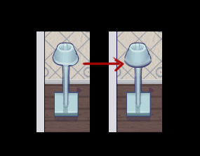
Welcome to the sketchbook section! I'm not an expert at this kind of game graphics, but one thing that stood out to me was that some of the ellipses in your art are a bit uneven. It's a nitpicky thing, but fixing it is helps a lot in making it look more professional.
Posts: 181
Threads: 0
Joined: Oct 2017
Reputation:
41
Hey Zizka. Loving your little project. I'm not the best with this perspective view, but maybe the quick paintover below is helpful?
![[Image: 79b40be1f9e24c84e1702f673a5fe369a928994a.jpg]](https://64.media.tumblr.com/79e9a6cd646401c6a8ca235aec4e7047/c0b2aa4e3a8c41f3-1d/s400x600/79b40be1f9e24c84e1702f673a5fe369a928994a.jpg)
A lot of the character's issues lies in the hair. If you isolate that hair itself and just focus on that, you can actually see it's very straight on, front facing in its perspective. So while you've got the lady in one perspective, her hair is in another. Because it doesn't follow the rest of the perspective the way it's placed means she has a massive forehead and big skull.
Before vs after:
![[Image: c73ef73a46c7c57c664e4121bff24e3c99f6bf3a.jpg]](https://64.media.tumblr.com/d1c4d8007f8e49aac9fdd5801a6018ff/0df9b96e8d267330-07/s540x810/c73ef73a46c7c57c664e4121bff24e3c99f6bf3a.jpg)
Posts: 1,424
Threads: 12
Joined: Dec 2015
Reputation:
139
Let me add my welcome to the sketchbook section Zizka, nice game project here.
Are you doing the coding as well as the art?
“Today, give a stranger one of your smiles. It might be the only sunshine he sees all day.” -- H. Jackson Brown Jr.
CD Sketchbook
Posts: 261
Threads: 7
Joined: Jan 2021
Reputation:
19
@Artloader:
Hello!
Coding is counterintuitive to me, although I tried, I could never understand it. Also, tackling concept, writing, art and animation is well, a lot. I've got my plate full as it is and most likely wouldn't handle code even if I could :).
@Zorrentos:
I've tried to fix the lamp! Thank you, nothing is considered nitpicking as far as I'm concerned. Every little bit counts.
@Chubby_Cat:
Agreed! This is my 22nd version of that character to get it right and the hair has been tough! I've tried fixing the hair, hopefully it works this time, if not, I'll try again:
![[Image: pOWGm6m.png]](https://i.imgur.com/pOWGm6m.png)
I'll wait so see if I can set more objectives to fix this screen and if not, I'll share the next area tomorrow.
Posts: 261
Threads: 7
Joined: Jan 2021
Reputation:
19
Alright then, new screen then. The background is a placeholder for now.
![[Image: HmkTfVW.png]](https://i.imgur.com/HmkTfVW.png)
Posts: 671
Threads: 8
Joined: Feb 2016
Reputation:
113
Dude I'm doing the same thing as you are! What game engine are you using? Coding part of game dev feels daunting!
If you are reading this, I most likely just gave you a crappy crit! What I'm basically trying to say is, don't give up!
----
IG: @thatpuddinhead
Posts: 261
Threads: 7
Joined: Jan 2021
Reputation:
19
Posts: 460
Threads: 10
Joined: Mar 2016
Reputation:
64
Wow! That pixel art is truly gorgeous!
Posts: 261
Threads: 7
Joined: Jan 2021
Reputation:
19
Thank you.
I found a mentor who is coaching me with my map, before after comparison:
![[Image: pOWGm6m.png]](https://i.imgur.com/pOWGm6m.png) ![[Image: RbPKwG5.png]](https://i.imgur.com/RbPKwG5.png)
Posts: 530
Threads: 14
Joined: Dec 2015
Reputation:
51
Nice! The bottom version definitely looks more intersting to play, + better contrast in certain areas :)
Posts: 261
Threads: 7
Joined: Jan 2021
Reputation:
19
Thank you, although I don't think it's quite game-ready just yet.
A new/old map (WIP):
![[Image: Vn7hEcT.png]](https://i.imgur.com/Vn7hEcT.png)
Any ideas on how to improve it would be great as usual, the more the nitpick the better.
Posts: 1,109
Threads: 18
Joined: Apr 2014
Reputation:
68
Hey there! Really cool to see the pieces of this project, I'm following with great interest!
To try and offer some feedback on the latest image. This background might scroll around, so some of this might not apply. Currently I feel that area with the little waterfall and the sign is really important, since there feels to be a concentration of details there. If this is the case all good! if it's supposed to be the well maybe move some of the little plants around that? The details in the water feel too isolated, like there is a lillypad at the bottom too, but the tulip looking plants in the top bit of water, the brown/mushroom stuff to the south of the bridge, the large rock in the north part, the small rock below the bridge, they feel like they are sitting in isolated groups instead of being a part of the water course. I don't know if that makes sense! Adding a couple more tulip type flowers below the bridge, a mushroom/brown rock above it etc, to integrate it more could be a solution, as well as removing a few elements!
Lastly there is an unfortunate coincidence with the lillypads in the north bit of water that kind of resemble eyes, the bridge as a mouth, the rock as a nose, the waterfall is hair - just a little distracting unintended accident with the placement of the lillypads makes that image pop out for me.
It's really awesome though, everything else is so awesome to look at!
Posts: 261
Threads: 7
Joined: Jan 2021
Reputation:
19
Quote:Adding a couple more tulip type flowers below the bridge, a mushroom/brown rock above it etc, to integrate it more could be a solution, as well as removing a few elements!
Hmm... I'm not sure I understand to be honest. I have trouble interpreting the text.
Posts: 261
Threads: 7
Joined: Jan 2021
Reputation:
19
Ok, here's another update, I tried moving things around and adding more stuff:
![[Image: xIMkKsm.png]](https://i.imgur.com/xIMkKsm.png)
Posts: 1,109
Threads: 18
Joined: Apr 2014
Reputation:
68
sorry about that! hard to explain with text! basically was trying to say there were too many different objects in the water, having less variety, spread out both above and below the bridge feels like it could give a more pleasing design! Just my opinion tho ^^
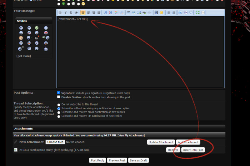
thx for the comment on my sketchbook too! About the attachment thing, the attachments all have a bbcode
[ attachment=4757 ] (without the spaces)
that will insert them in the text block. But you don't need to find the code cause after you've clicked 'add attachment', once it's uploaded, there is an 'insert into post' button next to the file that will print the right code into the post.
EDIT
Actually did you mean when posting an already uploaded attachment, like in my sketchbook? You have to go to the url of that image, and before the filename there's the attachment code
http://crimsondaggers.com/forum/attachme...s%2001.jpg
for that one it'd be [ attachment=121128 ]
Posts: 261
Threads: 7
Joined: Jan 2021
Reputation:
19
Posts: 261
Threads: 7
Joined: Jan 2021
Reputation:
19
Hello!
I need some help.
I'm trying to design some enemies for my game. While I can draw something from a photographic reference, I can't manage to move the image I've drawn in space. It always looks wrong.
Are there ways, methods to use in order to determine how to draw something in different positions? I could use tools for humans but I'm trying to draw a rabbot (robot rabbit).
![[Image: 3XtD1Or.png]](https://i.imgur.com/3XtD1Or.png)
I want to replace the tail with a screw from example but... I can't figure out how the screw would look like there!
Posts: 57
Threads: 3
Joined: Jan 2021
Reputation:
9
(03-10-2021, 10:12 PM)Zizka Wrote: Are there ways, methods to use in order to determine how to draw something in different positions? I could use tools for humans but I'm trying to draw a rabbot (robot rabbit).
Hey Zizka! I love the animations in your previous post, so fun and snappy!
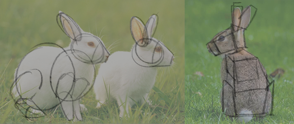
In regards to your question: try to break down the rabbit in basic shapes or geometry, and then redraw from there. It's much easier to draw a bunch of boxes in a different perspective than a whole rabbit!
"No man is more unhappy than he who never faces adversity. For he is not permitted to prove himself." - Seneca
Posts: 261
Threads: 7
Joined: Jan 2021
Reputation:
19
Hello and thank you,
I've tried to construct a picture in 3D boxes but I can't figure out where the vanishing point is.
![[Image: UHFw5em.png]](https://i.imgur.com/UHFw5em.png)
For instance, when it comes to the legs, I can see how the legs are 3D oriented... sort of.
![[Image: NywI00g.png]](https://i.imgur.com/NywI00g.png)
...but not the rest of the body.
Are there any tips to figure it out? It seems like my eyes can't see it.
|
![[Image: vEoPzQa.png]](https://i.imgur.com/vEoPzQa.png)
![[Image: vEoPzQa.png]](https://i.imgur.com/vEoPzQa.png)


![[Image: 79b40be1f9e24c84e1702f673a5fe369a928994a.jpg]](https://64.media.tumblr.com/79e9a6cd646401c6a8ca235aec4e7047/c0b2aa4e3a8c41f3-1d/s400x600/79b40be1f9e24c84e1702f673a5fe369a928994a.jpg)
![[Image: c73ef73a46c7c57c664e4121bff24e3c99f6bf3a.jpg]](https://64.media.tumblr.com/d1c4d8007f8e49aac9fdd5801a6018ff/0df9b96e8d267330-07/s540x810/c73ef73a46c7c57c664e4121bff24e3c99f6bf3a.jpg)
![[Image: pOWGm6m.png]](https://i.imgur.com/pOWGm6m.png)
![[Image: HmkTfVW.png]](https://i.imgur.com/HmkTfVW.png)
![[Image: 5LZf78X.gif]](https://i.imgur.com/5LZf78X.gif)
![[Image: 8hglhxH.gif]](https://i.imgur.com/8hglhxH.gif)
![[Image: sz0bKcj.gif]](https://i.imgur.com/sz0bKcj.gif)
![[Image: d1g2SMP.gif]](https://i.imgur.com/d1g2SMP.gif)
![[Image: f08uGgQ.gif]](https://i.imgur.com/f08uGgQ.gif)
![[Image: 1yEwLDx.gif]](https://i.imgur.com/1yEwLDx.gif)
![[Image: alrdHeR.gif]](https://i.imgur.com/alrdHeR.gif)
![[Image: DkpBeiQ.gif]](https://i.imgur.com/DkpBeiQ.gif)
![[Image: cZwNBMC.gif]](https://i.imgur.com/cZwNBMC.gif)
![[Image: YpSXbHN.gif]](https://i.imgur.com/YpSXbHN.gif)
![[Image: Vv5dlwC.gif]](https://i.imgur.com/Vv5dlwC.gif)
![[Image: gCsAjJS.gif]](https://i.imgur.com/gCsAjJS.gif)
![[Image: EYPFOkz.gif]](https://i.imgur.com/EYPFOkz.gif)
![[Image: QmyDDqo.gif]](https://i.imgur.com/QmyDDqo.gif)
![[Image: eINkEVw.gif]](https://i.imgur.com/eINkEVw.gif)
![[Image: RbPKwG5.png]](https://i.imgur.com/RbPKwG5.png)

![[Image: Vn7hEcT.png]](https://i.imgur.com/Vn7hEcT.png)
![[Image: xIMkKsm.png]](https://i.imgur.com/xIMkKsm.png)

![[Image: 1P2pxm0.png]](https://i.imgur.com/1P2pxm0.png)
![[Image: Li0c7zu.gif]](https://i.imgur.com/Li0c7zu.gif)
![[Image: sdplJWE.gif]](https://i.imgur.com/sdplJWE.gif)
![[Image: yjR7fP2.gif]](https://i.imgur.com/yjR7fP2.gif)
![[Image: pbVtgXC.gif]](https://i.imgur.com/pbVtgXC.gif)
![[Image: CoZH3kz.png]](https://i.imgur.com/CoZH3kz.png)
![[Image: 3XtD1Or.png]](https://i.imgur.com/3XtD1Or.png)

![[Image: UHFw5em.png]](https://i.imgur.com/UHFw5em.png)
![[Image: NywI00g.png]](https://i.imgur.com/NywI00g.png)